Create effective styles for carousels
This article is not about designing effective carousels, but about effectively creating style. In other words, we are not talking about UI design, but about CSS constructions - changing the elements of the carousel, their positioning and size.
Dependence on JavaScript in terms of interaction, not style
An “effective carousel” is a carousel that does not depend on JavaScript in terms of:
')
• responsiveness
• the content of any number of elements
• display any number of items
There are many ways to display elements in a side-by-side carousel (in a row), but some of these methods are better than others.
Use float
The carousel on disneystore.com demonstrates two main limitations of this style:
• The container must have a width greater than or equal to the sum of the widths of the child elements (their outer frame) in order to display all the elements in a row (to avoid their sliding).
• the width of elements cannot be specified as a percentage, since the block size (the frame that is used as the basis for calculating this width) is tied to the number of its children, and not to the visible area of the carousel.
To better understand the problem, look at the following example:
The above list includes five elements - all decorated with the float element. The list itself is created using overflow: hidden (to create a block formatting context), so the list aligns the floats instead of collapsing.
The problem here is that the elements slide when their container is not wide enough to fit all these elements in a row, as shown below:

Therefore, this solution requires the installation of the exact width of the container, which will not allow this container to be responsive (without the need for JavaScript).
Use position: absolute
In the carousel like on.aol.com, all elements are removed from the stream, so each of them depends on a separate offset value, being displayed immediately after the previous fellow.
Look at another example:

Since all frames have absolute positioning, they are removed from the stream and placed on the same x / y coordinates; The last frame shows the top of the stack.
As a result, authors need to do 3 things:
• decorate the container using the height element to prevent upward movement of subsequent elements (beyond).
• Arrange each frame with an offset to the left (left) to display the elements in a row.
• decorate the container using the position: relative element to turn it into a block containing child elements.
Same frames are created as follows:

This is exactly the way the carousel is made on aol.com , and all the displacements there are in pixels. But it is interesting that the width (width) of the container is set in the same way as in our example with float. The container is designed to have the same width as the total width of all its child elements — even though using position: absolute, it allows authors to use a simpler approach that improves the characteristics of container blocks.
Unlike float constructions, the width (width) of a container does not play a role in positioning nested frames. This means that you can use a percentage to display items in full width (100%) or as part of their container (the block in which they are contained); for example, each frame with a 50% ratio will show 2 items in a row, as shown below:

The width (width) of the above container is set at 30%, all other values (left-shift (left) and width (width) of the frames) are also shown as percentages.
In this case, the width of the container is 50%, and the width of each frame is 25%, which allows you to display four frames in a row inside the container.
This solution is definitely better than using float, but the disadvantage here is that removing all elements from the stream requires a container with a height indicating to prevent subsequent source elements from being displayed beyond all frames.
Roughly speaking, this solution requires making sure that the block containing the elements corresponds to the visible area of the carousel, and that nothing falls out of the stream — here the height of the carousel sets the content.
Use inline-block
Let's start with the basics:
With such a simple design and layout, as in the construction with float, nested frames slide down if they do not have enough space:
Magic pill
We can avoid sliding frames with the help of white-space: nowrap:

Now we have a solution that does not require setting the exact value of the height (height) of the container and the design of nested frames with an offset or adjusting their width (width) with exact values. And as a bonus, this solution is suitable for RTL:

Offset due to margin
Using the left margin on the first element is enough to move all the fields at once (left or right):

Making a container with overflow: hidden will hide elements that are outside the container:

The only thing worth remembering is to reset the nowrap description if this style is inherited.
Offset due to translate, position, etc.
Moving a container, not its first child, requires the use of an additional wrapper (note that all styles are moved from the list to this add-in):
Carousel with a peeping element
We can easily execute this solution as follows:

Notice that it is the images that set the height of the carousel, and that all fields are responsive and correctly positioned - without using JavaScript.
Pure CSS carousel with a smooth appearance effect
The logic, which does not require knowledge of mathematics!
You can edit the width value below to test the “responsiveness” of this solution.
How to display two elements separated by a gap by moving one element of the carousel at a time.

Dependence on JavaScript in terms of interaction, not style
An “effective carousel” is a carousel that does not depend on JavaScript in terms of:
')
• responsiveness
• the content of any number of elements
• display any number of items
Call
There are many ways to display elements in a side-by-side carousel (in a row), but some of these methods are better than others.
Use float
The carousel on disneystore.com demonstrates two main limitations of this style:
• The container must have a width greater than or equal to the sum of the widths of the child elements (their outer frame) in order to display all the elements in a row (to avoid their sliding).
• the width of elements cannot be specified as a percentage, since the block size (the frame that is used as the basis for calculating this width) is tied to the number of its children, and not to the visible area of the carousel.
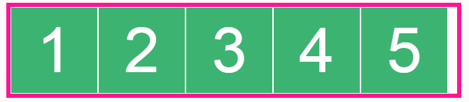
To better understand the problem, look at the following example:
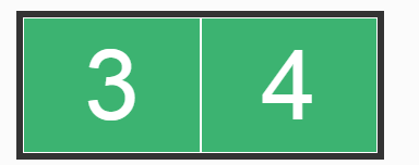
<ul> <li>1</li> <li>2</li> <li>3</li> <li>4</li> <li>5</li> </ul> ul { border: 5px solid deeppink; overflow: hidden; /* */ } li { border: 1px solid #fff; background: #3CB371; width: 100px; height: 100px; float: left; } The above list includes five elements - all decorated with the float element. The list itself is created using overflow: hidden (to create a block formatting context), so the list aligns the floats instead of collapsing.
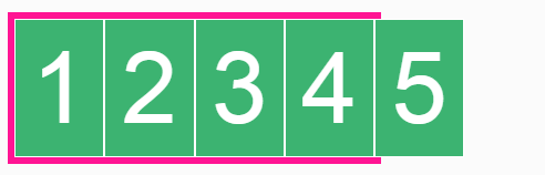
The problem here is that the elements slide when their container is not wide enough to fit all these elements in a row, as shown below:
ul { overflow: hidden; /* */ width: 450px; } li { float: left; } Therefore, this solution requires the installation of the exact width of the container, which will not allow this container to be responsive (without the need for JavaScript).
Use position: absolute
In the carousel like on.aol.com, all elements are removed from the stream, so each of them depends on a separate offset value, being displayed immediately after the previous fellow.
Look at another example:
ul { height: 100px; /* */ } li { position: absolute; } Since all frames have absolute positioning, they are removed from the stream and placed on the same x / y coordinates; The last frame shows the top of the stack.
As a result, authors need to do 3 things:
• decorate the container using the height element to prevent upward movement of subsequent elements (beyond).
• Arrange each frame with an offset to the left (left) to display the elements in a row.
• decorate the container using the position: relative element to turn it into a block containing child elements.
Same frames are created as follows:
ul { height: 100px; /* */ position: relative; /* , AP */ } li { position: absolute; } li:nth-child(2) { left: 100px; /* + / */ } li:nth-child(3) { left: 200px; /* + / */ } li:nth-child(4) { left: 300px; /* + / */ } li:nth-child(5) { left: 400px; /* + / */ } This is exactly the way the carousel is made on aol.com , and all the displacements there are in pixels. But it is interesting that the width (width) of the container is set in the same way as in our example with float. The container is designed to have the same width as the total width of all its child elements — even though using position: absolute, it allows authors to use a simpler approach that improves the characteristics of container blocks.
Unlike float constructions, the width (width) of a container does not play a role in positioning nested frames. This means that you can use a percentage to display items in full width (100%) or as part of their container (the block in which they are contained); for example, each frame with a 50% ratio will show 2 items in a row, as shown below:
ul { height: 100px; /* */ position: relative; /* , AP */ width: 30%; } li { position: absolute; width: 50%; } li:nth-child(2) { left: 50%; /* + / */ } li:nth-child(3) { left: 100%; /* + / */ } li:nth-child(4) { left: 150%; /* + / */ } li:nth-child(5) { left: 200%; /* + / */ } ul { height: 100px; /* */ position: relative; /* , AP */ width: 30%; } li { position: absolute; width: 50%; } li:nth-child(2) { left: 50%; /* + / */ } li:nth-child(3) { left: 100%; /* + / */ } li:nth-child(4) { left: 150%; /* + / */ } li:nth-child(5) { left: 200%; /* + / */ } The width (width) of the above container is set at 30%, all other values (left-shift (left) and width (width) of the frames) are also shown as percentages.
ul { height: 100px; /* */ position: relative; /* , AP */ width: 50%; } li { position: absolute; width: 25%; } li:nth-child(2) { left: 25%; /* + / */ } li:nth-child(3) { left: 50%; /* + / */ } li:nth-child(4) { left: 75%; /* + / */ } li:nth-child(5) { left: 100%; /* + / */ } In this case, the width of the container is 50%, and the width of each frame is 25%, which allows you to display four frames in a row inside the container.
This solution is definitely better than using float, but the disadvantage here is that removing all elements from the stream requires a container with a height indicating to prevent subsequent source elements from being displayed beyond all frames.
Decision
Roughly speaking, this solution requires making sure that the block containing the elements corresponds to the visible area of the carousel, and that nothing falls out of the stream — here the height of the carousel sets the content.
Use inline-block
Let's start with the basics:
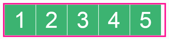
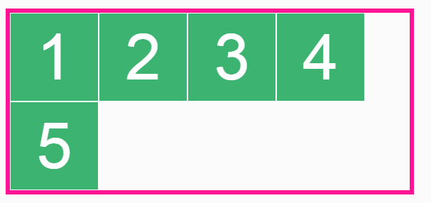
<ul> <li>1</li><!-- --><li>2</li><!-- --><li>3</li><!-- --><li>4</li><!-- --><li>5</li> </ul> li { display: inline-block; } With such a simple design and layout, as in the construction with float, nested frames slide down if they do not have enough space:
ul { width: 450px; } li { display: inline-block; } Magic pill
We can avoid sliding frames with the help of white-space: nowrap:
ul { width: 450px; white-space: nowrap; } li { display: inline-block; } Now we have a solution that does not require setting the exact value of the height (height) of the container and the design of nested frames with an offset or adjusting their width (width) with exact values. And as a bonus, this solution is suitable for RTL:
<ul class="example example-10" dir="rtl"> <li>1</li><!-- --><li>2</li><!-- --><li>3</li><!-- --><li>4</li><!-- --><li>5</li> </ul> Carousel implementation
Offset due to margin
Using the left margin on the first element is enough to move all the fields at once (left or right):
ul { width: 100px; white-space: nowrap; } li { display: inline-block; width: 100%; } li:first-child { margin-left: -100%; /* IE */ } Making a container with overflow: hidden will hide elements that are outside the container:
ul { width: 100px; white-space: nowrap; overflow: hidden; } li { display: inline-block; width: 100%; } li:first-child { margin-left: -100%; } The only thing worth remembering is to reset the nowrap description if this style is inherited.
Offset due to translate, position, etc.
Moving a container, not its first child, requires the use of an additional wrapper (note that all styles are moved from the list to this add-in):
<div> <ul> <li>1</li><!-- --><li>2</li><!-- --><li>3</li><!-- --><li>4</li><!-- --><li>5</li> </ul> </div> div { white-space: nowrap; width: 50%; overflow: hidden; border: 5px solid deeppink; } ul { border: none; *position: relative; /* oldIE */ *left: -100%; /* oldIE */ transform: translateX(-100%); } /* IE8 */ @media screen\0 { .example-13 { position: relative; left: -100%; } } li { white-space: normal; /* */ display: inline-block; width: 50%; } Carousel with a peeping element
We can easily execute this solution as follows:
div { padding-right: 12%; /* , */ } img { width: 100%; /* , */ vertical-align: bottom; } Notice that it is the images that set the height of the carousel, and that all fields are responsive and correctly positioned - without using JavaScript.
Pure CSS carousel with a smooth appearance effect
The logic, which does not require knowledge of mathematics!
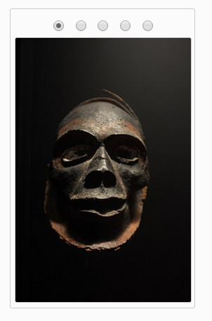
<div class="carousel"> <input role="presentation" name="carousel" type="radio" value="1" checked /> <input role="presentation" name="carousel" type="radio" value="2" /> <input role="presentation" name="carousel" type="radio" value="3" /> <input role="presentation" name="carousel" type="radio" value="4" /> <input role="presentation" name="carousel" type="radio" value="5" /> <ul class="carousel-list"> <li><img src="..." alt="Mask #1"></li><!-- --><li><img src="..." alt="Mask #2"></li><!-- --><li><img src="..." alt="Mask #3"></li><!-- --><li><img src="..." alt="Mask #4"></li><!-- --><li><img src="..." alt="Mask #4"></li> </ul> </div> <div class="carousel"> <input role="presentation" name="carousel" type="radio" value="1" checked /> <input role="presentation" name="carousel" type="radio" value="2" /> <input role="presentation" name="carousel" type="radio" value="3" /> <input role="presentation" name="carousel" type="radio" value="4" /> <input role="presentation" name="carousel" type="radio" value="5" /> <ul class="carousel-list"> <li><img src="..." alt="Mask #1"></li><!-- --><li><img src="..." alt="Mask #2"></li><!-- --><li><img src="..." alt="Mask #3"></li><!-- --><li><img src="..." alt="Mask #4"></li><!-- --><li><img src="..." alt="Mask #4"></li> </ul> </div> .carousel { width: 200px; padding: 5px; overflow: hidden; border: 1px solid #ccc; border-radius: 3px; text-align: center; /* - */ } .carousel-list { white-space: nowrap; padding: 0; margin: 0; transition: transform .3s; } .carousel-list li { white-space: normal; /* */ display: inline-block; width: 100%; } .carousel-list img { width: 100%; /* */ vertical-align: bottom; /* */ } /** * - */ input:nth-child(1):checked ~ ul { transform: translateX(0); } input:nth-child(2):checked ~ ul { transform: translateX(-100%); } input:nth-child(3):checked ~ ul { transform: translateX(-200%); } input:nth-child(4):checked ~ ul { transform: translateX(-300%); } input:nth-child(5):checked ~ ul { transform: translateX(-400%); } /** * */ .carousel-list li { opacity: .1; transition: all .4s; transform: scale(.1); } input:nth-child(1):checked ~ ul li:nth-child(1), input:nth-child(2):checked ~ ul li:nth-child(2), input:nth-child(3):checked ~ ul li:nth-child(3), input:nth-child(4):checked ~ ul li:nth-child(4), input:nth-child(5):checked ~ ul li:nth-child(5) { opacity: 1; transform: scale(1); } You can edit the width value below to test the “responsiveness” of this solution.
.carousel{width:200px} More complex carousel
How to display two elements separated by a gap by moving one element of the carousel at a time.
.carousel { display: inline-block; width: 200px; padding-right: 190px; /* 10px */ overflow: hidden; border: 1px solid #ccc; border-radius: 3px; text-align: center; /* - */ } .carousel-list { white-space: nowrap; padding: 0; margin: 0; border: none; transition: transform .3s; } .carousel-list li { white-space: normal; /* */ display: inline-block; width: 100%; box-sizing: border-box; padding-right: 10px; /* */ } .carousel-list img { width: 100%; /* */ vertical-align: bottom; } .carousel input { margin-left: -3px; } .carousel input:nth-child(1):checked ~ ul { transform: translateX(0); } .carousel input:nth-child(2):checked ~ ul { transform: translateX(-100%); } .carousel input:nth-child(3):checked ~ ul { transform: translateX(-200%); } .carousel input:nth-child(4):checked ~ ul { transform: translateX(-300%); } .carousel input:nth-child(5):checked ~ ul { transform: translateX(-400%); } .carousel input:nth-child(6):checked ~ ul { transform: translateX(-500%); } .carousel input:nth-child(7):checked ~ ul { transform: translateX(-600%); } Useful Paysto solutions for Habr readers:
→ Get paid by credit card right now. Without a site, PI and LLC.
→ Accept payments from companies via the Internet. Without a site, PI and LLC.
→ Acceptance of payments from companies for your site. With document circulation and exchange of originals.
→ Automation of sales and service transactions with legal entities. Without intermediary in the calculations.
→ Accept payments from companies via the Internet. Without a site, PI and LLC.
→ Acceptance of payments from companies for your site. With document circulation and exchange of originals.
→ Automation of sales and service transactions with legal entities. Without intermediary in the calculations.
Source: https://habr.com/ru/post/253111/
All Articles