Visual linear approximation with Gnuplot
It is said that nonlinear approximation is an art, but it is not easy with the usual linear case.
Many probably remember that the simplest and most accurate method of constructing direct MNCs is the “transparent ruler by eye”. Earlier, when calculating, this method allowed to save many hours of monotonous calculations, but now for obviously linear processes this is no longer relevant, the approximation can instantly read and draw even Excel.
')
However, in solving real problems, one often has to deal with processes in which the model is unknown. In such cases, it is reasonable to construct piecewise linear approximations. And here, when exact construction criteria simply do not exist - the “transparent ruler” method, based on the “art of approximation” (in a simple way - chuik), becomes relevant again.
Print charts and draw them straight with a pencil and a transparent ruler — it still works (and sometimes it’s even interesting to draw). And here we will use Gnuplot - it is well able to draw data in various representations, it can count approximations, and at the same time leaves enough space for the user to maneuver.
As an example of “vital” data with an unknown model, let us consider the dynamics of the body mass index (BMI) of the girls of the month of Playboy magazine over time. The task is to capture the general trends in dynamics.
Source data are taken from the article by Vadim Markov (@BubaVV) "Correlations for beginners" . The link to the files for building pictures in Gnuplot will be given below. A small note on the data: time (months) is postponed by the meaning of the data on the X axis, but in order not to complicate the task we will use not the time, but simply the ordinal number of the record.
Let's start with the fact that we construct a set of existing points and draw a linear trend for all points. Immediately note the problem areas with a question mark.

There is clearly something wrong with the linear approximation, it seems that the trend has changed in the process. We construct a quadratic approximation that allows us to catch the change in the angle of inclination of straight lines.

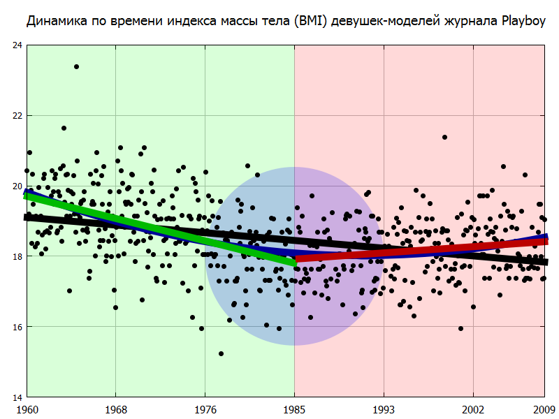
The quadratic approximation looks better (well, well, plus one parameter). It can be seen that the linear trend is changing in the middle of the set; we will mark this area with a colored circle. To the left of the circle is one character of the dynamics, to the right of the other, for better perception, the right and left areas are also marked with different colors.

The points in the left area will be approximated by one straight line, and in the right another. At the same time, and on the X axis, instead of abstract figures, we will put time stamps, we do not need many details, we note several years.

Now, at least in appearance, the approximation by straight lines is quite good, the values of the line parameters can be taken from the log-file that Gnuplot writes in the approximation process.
Summary. Without calculating anything, just looking at the graphs and drawing the lines, we determined the main trends of the model's dynamics. By the way, I wonder what happened around 1985, that girls with a higher BMI began to come into fashion?
Ps. All data and files for building images in Gnuplot can be downloaded at the link: drive.google.com/file/d/0BwHQSqFOG-7lU1BfbkdqTTFxdkU/view?usp=sharing
Pps. For the sake of interest - it will look like an approximation by a polynomial of the 4th degree. Judging by the schedule, it makes sense to see whether the trend for thinner models does not appear again in fashion.

Many probably remember that the simplest and most accurate method of constructing direct MNCs is the “transparent ruler by eye”. Earlier, when calculating, this method allowed to save many hours of monotonous calculations, but now for obviously linear processes this is no longer relevant, the approximation can instantly read and draw even Excel.
')
However, in solving real problems, one often has to deal with processes in which the model is unknown. In such cases, it is reasonable to construct piecewise linear approximations. And here, when exact construction criteria simply do not exist - the “transparent ruler” method, based on the “art of approximation” (in a simple way - chuik), becomes relevant again.
Print charts and draw them straight with a pencil and a transparent ruler — it still works (and sometimes it’s even interesting to draw). And here we will use Gnuplot - it is well able to draw data in various representations, it can count approximations, and at the same time leaves enough space for the user to maneuver.
As an example of “vital” data with an unknown model, let us consider the dynamics of the body mass index (BMI) of the girls of the month of Playboy magazine over time. The task is to capture the general trends in dynamics.
Source data are taken from the article by Vadim Markov (@BubaVV) "Correlations for beginners" . The link to the files for building pictures in Gnuplot will be given below. A small note on the data: time (months) is postponed by the meaning of the data on the X axis, but in order not to complicate the task we will use not the time, but simply the ordinal number of the record.
Let's start with the fact that we construct a set of existing points and draw a linear trend for all points. Immediately note the problem areas with a question mark.
There is clearly something wrong with the linear approximation, it seems that the trend has changed in the process. We construct a quadratic approximation that allows us to catch the change in the angle of inclination of straight lines.
The quadratic approximation looks better (well, well, plus one parameter). It can be seen that the linear trend is changing in the middle of the set; we will mark this area with a colored circle. To the left of the circle is one character of the dynamics, to the right of the other, for better perception, the right and left areas are also marked with different colors.
The points in the left area will be approximated by one straight line, and in the right another. At the same time, and on the X axis, instead of abstract figures, we will put time stamps, we do not need many details, we note several years.
Now, at least in appearance, the approximation by straight lines is quite good, the values of the line parameters can be taken from the log-file that Gnuplot writes in the approximation process.
Summary. Without calculating anything, just looking at the graphs and drawing the lines, we determined the main trends of the model's dynamics. By the way, I wonder what happened around 1985, that girls with a higher BMI began to come into fashion?
Ps. All data and files for building images in Gnuplot can be downloaded at the link: drive.google.com/file/d/0BwHQSqFOG-7lU1BfbkdqTTFxdkU/view?usp=sharing
Pps. For the sake of interest - it will look like an approximation by a polynomial of the 4th degree. Judging by the schedule, it makes sense to see whether the trend for thinner models does not appear again in fashion.
Source: https://habr.com/ru/post/252985/
All Articles