Material Design. Was there a boy?
Recently, my colleague (Konstantin Volkov) attended a Material Design master class and shared his impressions. Further, the story will go on his behalf.
Many have heard about Material Design [1] today, its principles are discussed in many Android news and professional blogs. But is this concept clear to mobile software developers? Is it possible to use Material Design in real combat, and will applications become more efficient? These questions were to be answered by a Material Design master class, which took place in the middle of February in the Moscow Technopolis.
For me, as a developer under the Android OS, the situation around the new concept of the mobile user interface seems to be a complete chaos. On the one hand, Google itself introduced the concept on paper, but most of the described components have not yet been implemented in Android 5.0 and are not represented in the SDK (not to mention the Support Library). On the other hand, third-party developers, inspired by the presentation from IO 2014, implement their own elements in the Material Design style and upload applications on Google Play that are close to the concept, but not 100%. As it turned out, I am not the only one who noticed this, but first things first. The first report from the creative director of Redmadrobot Maxim Tenth showed everything the same as Google at IO 2014 about Material Design, with comments and suggestions from the author. On this part of the report, everything was quiet and calm, many have already seen and reacted with extreme restraint. The tenths told about the four basic principles of design material: surface, printing, animation, uniformity of user experience across different platforms. True and timely classification is half the successful concept. Consider the principles in more detail.
Surface. Tactile sensations when using a smartphone is a serious point in spending for all vendors of the mobile market, without exception. These sensations are the result of the selection of materials and form, that is, physical parameters. But imagine that tactile sensations can transmit not only hardware, but also software. In fact, the idea was voiced several years ago, when smartphone developers were concerned with the function of a screen response to a click. Nothing remarkable has happened in this area at the materials level. At the hearing, only a few publications and patents [2] [3]. Therefore, today we have a quasi reverse user interface response. Surfaces in the material design - software implementation of the reverse response not only to the click, but also to navigate in the application (transitions between screens, dialogs). As it was implemented, Google described the physical parameters of the virtual environment in which our application runs. We stopped on a flat world in which all “beings” are planes. Moving in three-dimensional space is possible only within levels of conditional depth, which is determined by the shadow cast by the “creature”. The depth of the world is limited by the physical parameters of the device on which it is reproduced, for a smartphone it is 1 cm. So we get a layered interface, where each element is at its own level. Obviously, objects closer to the surface are of greater importance to the user, and deeper objects, on the contrary. So the designer designs the screen for a specific business task, operating with elements and their layouts arrangement. An example of surfaces in Material Design.
')

Polygraphy. Everything ingenious is simple, because the mobile device we hold in our hands works with graphic and textual information. This means that mobile content follows the same rules as glossy magazines. Over the long history of printing, many methods, tools and ways to display information have been developed so that it is noticed. This need to use. An example of a screen model, text and images are replaced by rectangles, which allows you to select the main and side elements, abstracting from the context.
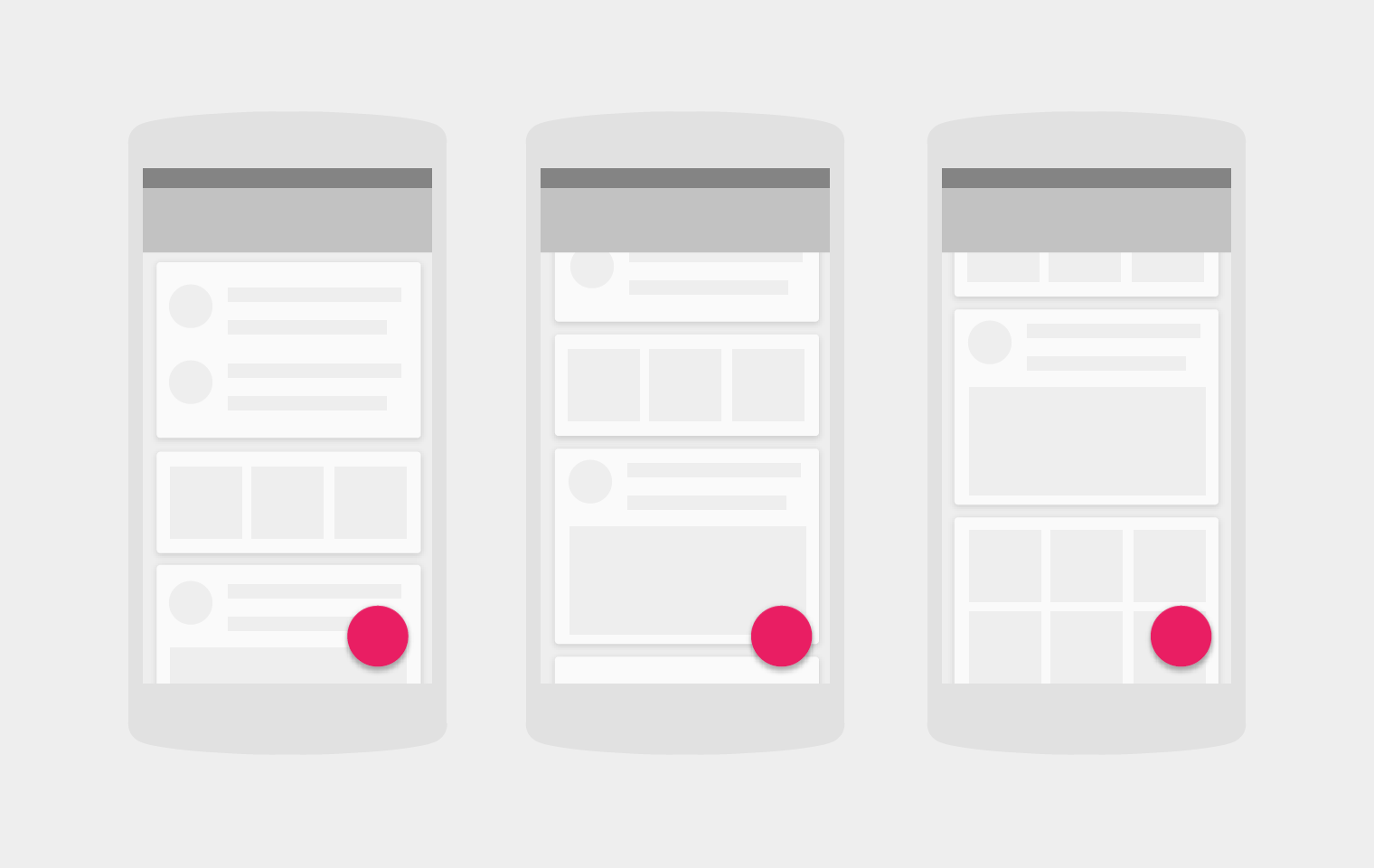
All that was left for Google was to conduct research on the specific conditions of mobile display (the screen of the phone is still smaller than the spread of the magazine) and record the results in the form of a Guide line. What they successfully coped with. What we were shown in the presentations and in the pictures looks very cool and modern. Therefore, you can safely take the standard font, size and color from the Google palette for your applications and create your own interfaces.
Animation. Obviously, the multiplication in its long history has accumulated methods and rules no less than polygraphy. It is worth recalling the 12 principles of animation, invented in the studio Disney. I will present them in a format applicable to mobile user interfaces, who are interested in more details can be read here [4].
All these principles are aimed at giving the artificial the features of the real. Google, following these principles, designed the animation for Material Design. The surfaces slide through the levels and, if they meet another surface at this level, they displace it as it would in the real world. The appearance of surfaces occurs by slipping. In this case, a disproportionate acquisition of a shape by the surface, either in the form of a spreading round drop, or a more restrained asynchronous stretching of a rectangle occurs. The key point here is precisely the asynchronous change of proportions, which indicates an action within one plane, if the proportions change synchronously, one would have the impression of an approaching object, which would violate the user's perception of what is happening. Floating Button is definitely an actor on stage, it has an accent color and attracts attention. Carries the most important functions needed by the user here and now: write a message, dial a phone number, start a timer, pay for a phone, and so on. The actor does not bother the viewer in those moments when he does not need him, when scrolling text in Google Plus, the floating button is hidden behind the screen. The button also moves across the screen from the extreme positions to the center in the Contacts application, indicating its significance. Example Floating Button.

In addition to animation within the same screen, it is equally important to animate transitions between screens, saving the transition threads that lead the user to a specific action and back. Material Design provides the ability to go to the drilldown screen with context disclosure animation. In the standard gallery example, this is represented as an increase and offset into the header area of the small image when clicked. Dialog boxes no longer appear on the screen from nowhere, they “pour out” (this word most accurately describes the behavior that in the real world could be compared to the spreading of ink on the surface) from the user's touch point. Agree, such a transition clearly gives an idea of what happened. Ripple animation (wave propagation after touching the screen) is used for buttons, list items and the entire clickable content of the application, also creates the effect of the inverse response of a flat surface.
Uniform user experience across devices. The user should not notice the difference between working with the application on the big screen of the TV or desktop and the small screen of the smart watch. Components, behavior and interaction should be similar for different platforms. To prove the validity of this principle, I am now writing this article in Google Docs, and on my screen is a Floating Button, which created a new document. The list of moss documents is represented by a set of surfaces in the form of a tile with a shadow. From less noticeable: the top panel of my document clings to the upper border. But not all Google applications had time to rebuild under the new design, "Mail", "Translator" while remained the same. Nevertheless, the implementation process of Material Design has already been launched, we will wait for the results. The implementation of components for web applications in the JS language is available here [5] and here [6]. All this proves the applicability of Material Design on different platforms. Now go back to the event.
Then began the analysis of specific implementations of the Material Design elements. Here the desperate hearts of the developers could not stand it, the lecturer was bombarded with questions about how exactly this or that effect was supposed to be realized. To help the creative director came the main developer of RedMadRobot, who, of course, understood the whole point and told the audience his tricks, which he used when working on real Android applications. As a living example, he prepared a demo application using the ready-made components Material Design. They turned out to be not so much: the tile, the transition to the screen of details with animation and the side menu in the full height of the application. The support library in the Support Library is also limited, so with support for older versions of the Android OS, things are still bad. At this the first part of the event came to an end, ahead of us the most interesting was waiting for us - the analysis of errors in existing applications on Google Play. Applications such as Bank Otkrytiye, Odnoklassniki, Moi Mir, Kivi, etc. have submitted applications for brave submissions. Since there were a lot of comments and suggestions and they were repeated in different applications, it will be useful to note the most significant ones.
In fact, a public analysis of applications was in a very benign manner than might be expected. Most likely, discussions of the most important controversial points were held for a private review in the third part of the event. The main drawbacks are related to the fact that the developers were not guided by the Guide line, but by what Google applications look like. As a result of the fact that Google applications themselves largely departed from the principles of Material Design, third-party developers made the same mistakes. The developers made only a part of the changes to the old design of their applications. The result is a hybrid of old and new design. The developers were not ready to abandon support for older versions of Android OS, which in turn limits their ability to follow the principles of Material Design. In my opinion, the master class was successful, did not leave any participant indifferent. I liked the heated discussions during the lectures, it very much revived the situation.
Google Play is filled with apps that follow Material Design. These are courageous attempts, although not always correct, but creating movement, and this means. There is a chance to turn chaos into order. Unfortunately, the previous version of the Holo design never managed to get to the level of general order. Most of the applications in the store never switched to the original UI. They are bogged down in dependencies on third-party user interface elements such as Sherlock and the like. You can draw some conclusions. Material design does not need to interfere with Holo, since the new system is complete and logical in itself. No need to rush into the implementation of material design, as the architecture of the application must be prepared for the new element base and animation. It is necessary to correctly understand the material design, because it is really a revolution in user interfaces. Unfortunately, we are only at the beginning of our journey, much is still not ready for full-fledged work.
What your applications will look like in the end is up to you. Do not forget to control your UI on four main points:
Following these rules, you can develop applications no worse than those presented in the presentations of Material Design.
[1] Material design specification
[2] Google planned to launch tactile feedback engine
[3] Apple patent tactile feedback touch screen
[4] 12 principles of animation
[5] Polymer project www.polymer-project.org
[6] Material angularJs
Introduction
Many have heard about Material Design [1] today, its principles are discussed in many Android news and professional blogs. But is this concept clear to mobile software developers? Is it possible to use Material Design in real combat, and will applications become more efficient? These questions were to be answered by a Material Design master class, which took place in the middle of February in the Moscow Technopolis.
Master Class
For me, as a developer under the Android OS, the situation around the new concept of the mobile user interface seems to be a complete chaos. On the one hand, Google itself introduced the concept on paper, but most of the described components have not yet been implemented in Android 5.0 and are not represented in the SDK (not to mention the Support Library). On the other hand, third-party developers, inspired by the presentation from IO 2014, implement their own elements in the Material Design style and upload applications on Google Play that are close to the concept, but not 100%. As it turned out, I am not the only one who noticed this, but first things first. The first report from the creative director of Redmadrobot Maxim Tenth showed everything the same as Google at IO 2014 about Material Design, with comments and suggestions from the author. On this part of the report, everything was quiet and calm, many have already seen and reacted with extreme restraint. The tenths told about the four basic principles of design material: surface, printing, animation, uniformity of user experience across different platforms. True and timely classification is half the successful concept. Consider the principles in more detail.
Surface. Tactile sensations when using a smartphone is a serious point in spending for all vendors of the mobile market, without exception. These sensations are the result of the selection of materials and form, that is, physical parameters. But imagine that tactile sensations can transmit not only hardware, but also software. In fact, the idea was voiced several years ago, when smartphone developers were concerned with the function of a screen response to a click. Nothing remarkable has happened in this area at the materials level. At the hearing, only a few publications and patents [2] [3]. Therefore, today we have a quasi reverse user interface response. Surfaces in the material design - software implementation of the reverse response not only to the click, but also to navigate in the application (transitions between screens, dialogs). As it was implemented, Google described the physical parameters of the virtual environment in which our application runs. We stopped on a flat world in which all “beings” are planes. Moving in three-dimensional space is possible only within levels of conditional depth, which is determined by the shadow cast by the “creature”. The depth of the world is limited by the physical parameters of the device on which it is reproduced, for a smartphone it is 1 cm. So we get a layered interface, where each element is at its own level. Obviously, objects closer to the surface are of greater importance to the user, and deeper objects, on the contrary. So the designer designs the screen for a specific business task, operating with elements and their layouts arrangement. An example of surfaces in Material Design.
')
Polygraphy. Everything ingenious is simple, because the mobile device we hold in our hands works with graphic and textual information. This means that mobile content follows the same rules as glossy magazines. Over the long history of printing, many methods, tools and ways to display information have been developed so that it is noticed. This need to use. An example of a screen model, text and images are replaced by rectangles, which allows you to select the main and side elements, abstracting from the context.
All that was left for Google was to conduct research on the specific conditions of mobile display (the screen of the phone is still smaller than the spread of the magazine) and record the results in the form of a Guide line. What they successfully coped with. What we were shown in the presentations and in the pictures looks very cool and modern. Therefore, you can safely take the standard font, size and color from the Google palette for your applications and create your own interfaces.
Animation. Obviously, the multiplication in its long history has accumulated methods and rules no less than polygraphy. It is worth recalling the 12 principles of animation, invented in the studio Disney. I will present them in a format applicable to mobile user interfaces, who are interested in more details can be read here [4].
- Stretching and compression should keep the volume of the physical body when changing shape. Each movement is preceded by preparation.
- Since each scene has a main idea, it is necessary to keep the user's attention on it. Make the main character attractive to the user.
- Any movement in the real world has inertia, it is necessary to take this into account.
- In the natural world, movement is directed along an arc-shaped trajectory only if it is not mechanical.
- The main action must always be accompanied by an additional action.
All these principles are aimed at giving the artificial the features of the real. Google, following these principles, designed the animation for Material Design. The surfaces slide through the levels and, if they meet another surface at this level, they displace it as it would in the real world. The appearance of surfaces occurs by slipping. In this case, a disproportionate acquisition of a shape by the surface, either in the form of a spreading round drop, or a more restrained asynchronous stretching of a rectangle occurs. The key point here is precisely the asynchronous change of proportions, which indicates an action within one plane, if the proportions change synchronously, one would have the impression of an approaching object, which would violate the user's perception of what is happening. Floating Button is definitely an actor on stage, it has an accent color and attracts attention. Carries the most important functions needed by the user here and now: write a message, dial a phone number, start a timer, pay for a phone, and so on. The actor does not bother the viewer in those moments when he does not need him, when scrolling text in Google Plus, the floating button is hidden behind the screen. The button also moves across the screen from the extreme positions to the center in the Contacts application, indicating its significance. Example Floating Button.
In addition to animation within the same screen, it is equally important to animate transitions between screens, saving the transition threads that lead the user to a specific action and back. Material Design provides the ability to go to the drilldown screen with context disclosure animation. In the standard gallery example, this is represented as an increase and offset into the header area of the small image when clicked. Dialog boxes no longer appear on the screen from nowhere, they “pour out” (this word most accurately describes the behavior that in the real world could be compared to the spreading of ink on the surface) from the user's touch point. Agree, such a transition clearly gives an idea of what happened. Ripple animation (wave propagation after touching the screen) is used for buttons, list items and the entire clickable content of the application, also creates the effect of the inverse response of a flat surface.
Uniform user experience across devices. The user should not notice the difference between working with the application on the big screen of the TV or desktop and the small screen of the smart watch. Components, behavior and interaction should be similar for different platforms. To prove the validity of this principle, I am now writing this article in Google Docs, and on my screen is a Floating Button, which created a new document. The list of moss documents is represented by a set of surfaces in the form of a tile with a shadow. From less noticeable: the top panel of my document clings to the upper border. But not all Google applications had time to rebuild under the new design, "Mail", "Translator" while remained the same. Nevertheless, the implementation process of Material Design has already been launched, we will wait for the results. The implementation of components for web applications in the JS language is available here [5] and here [6]. All this proves the applicability of Material Design on different platforms. Now go back to the event.
Then began the analysis of specific implementations of the Material Design elements. Here the desperate hearts of the developers could not stand it, the lecturer was bombarded with questions about how exactly this or that effect was supposed to be realized. To help the creative director came the main developer of RedMadRobot, who, of course, understood the whole point and told the audience his tricks, which he used when working on real Android applications. As a living example, he prepared a demo application using the ready-made components Material Design. They turned out to be not so much: the tile, the transition to the screen of details with animation and the side menu in the full height of the application. The support library in the Support Library is also limited, so with support for older versions of the Android OS, things are still bad. At this the first part of the event came to an end, ahead of us the most interesting was waiting for us - the analysis of errors in existing applications on Google Play. Applications such as Bank Otkrytiye, Odnoklassniki, Moi Mir, Kivi, etc. have submitted applications for brave submissions. Since there were a lot of comments and suggestions and they were repeated in different applications, it will be useful to note the most significant ones.
- In Material Design, the sidebar covers the entire application area, since Google abandoned the ActionBar in favor of the ToolBar. Some applications did not have time to change the architecture and remained on the ActionBar.
- In some applications, the accents on the screen were incorrectly chosen.
The buttons, which are clearly the main action, did not stand out from the general background. This violates the printing principles of Material Design. - The confirmation / save buttons on the screen with a large set of input fields were located at the top, while Guide Line should be located under the content. In this case, the problem was that the application used an ActionBar attached at the top and buttons on it (on the basis that the user will always see the buttons). In Material Design ToolBar is pushed off the screen when scrolling. While in the Google Salendar application, the buttons for saving events are exactly the same as, and in the application in question, which is misleading the developers.
- Buttons switches were made not in the style of Material Design.
Such a violation of the Guide line is not justified, especially since the implemented switches were very much like iOS. - The appearance of the standard search field in the ToolBar has changed; the developers
did not have time to take this into account. - General remarks on transitions between screens and dialogs were present, but were not considered, since the analysis of applications was carried out on screenshots.
In fact, a public analysis of applications was in a very benign manner than might be expected. Most likely, discussions of the most important controversial points were held for a private review in the third part of the event. The main drawbacks are related to the fact that the developers were not guided by the Guide line, but by what Google applications look like. As a result of the fact that Google applications themselves largely departed from the principles of Material Design, third-party developers made the same mistakes. The developers made only a part of the changes to the old design of their applications. The result is a hybrid of old and new design. The developers were not ready to abandon support for older versions of Android OS, which in turn limits their ability to follow the principles of Material Design. In my opinion, the master class was successful, did not leave any participant indifferent. I liked the heated discussions during the lectures, it very much revived the situation.
Conclusion
Google Play is filled with apps that follow Material Design. These are courageous attempts, although not always correct, but creating movement, and this means. There is a chance to turn chaos into order. Unfortunately, the previous version of the Holo design never managed to get to the level of general order. Most of the applications in the store never switched to the original UI. They are bogged down in dependencies on third-party user interface elements such as Sherlock and the like. You can draw some conclusions. Material design does not need to interfere with Holo, since the new system is complete and logical in itself. No need to rush into the implementation of material design, as the architecture of the application must be prepared for the new element base and animation. It is necessary to correctly understand the material design, because it is really a revolution in user interfaces. Unfortunately, we are only at the beginning of our journey, much is still not ready for full-fledged work.
What your applications will look like in the end is up to you. Do not forget to control your UI on four main points:
- watch for surfaces;
- Remember that they are located in a three-dimensional space with restrictions;
- follow the printing, use the design of printing design for the selection of font size and color from the design material;
- watch your animation, it must be physically sound;
- Try to keep the user experience consistent across platforms.
Following these rules, you can develop applications no worse than those presented in the presentations of Material Design.
Links
[1] Material design specification
[2] Google planned to launch tactile feedback engine
[3] Apple patent tactile feedback touch screen
[4] 12 principles of animation
[5] Polymer project www.polymer-project.org
[6] Material angularJs
Source: https://habr.com/ru/post/252895/
All Articles