Design Books
Good time! This time we will publish our recently published books for creative people.
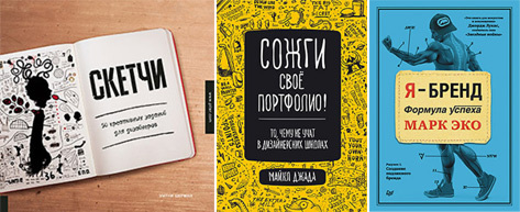
1. Sketches. 50 creative tasks for designers . By: Whitney Sherman
2. Burn your portfolio! That which is not taught in design schools . Posted by: Michael Janda
3. I am a brand. Formula for success . Posted by: Mark Eco
')

This is a practical guide to the study of the principles of design and the development of new ways of creative thinking. The book contains creative tasks that you can later put into the basis of your projects. Experimenting with words, two-dimensional figures, unusual sketches, fonts and so on, you will feel the whole process of the designer’s work, as well as learn how it can be modified to make it interesting to work, and the result is stunning. Numerous examples of works by leading designers and artists will give you the opportunity to see how these professionals think and how they look at the world. The exercises proposed in the book will be of interest to artists with any level of training. They are aimed at developing your creative abilities and teaching you to actively use them at all stages of work, starting with the generation of the idea and ending with its embodiment.
About the author : Whitney Sherman has been a practicing designer and teacher for over 25 years. She is engaged in training students and graduate students, as well as the professional development of beginner and experienced artists. Her goal is to teach both students and professionals all kinds of non-standard design tricks. She does it in the form of a game, so it will be not only useful, but also fun! The ideas that you will have as a result of the proposed tasks, you can then use in your real projects.
Table of contents
Excerpt

This book will give much more for a successful career in design than a specialized design education or an impressive portfolio. You will get acquainted with the realities of the design business, the existing practitioners and the unwritten rules of doing business, which most designers, photographers and representatives of other creative professions will learn about only by plunging into real work.
About the author: Michael Janda, the owner of his own design studio in a sophisticated humorous manner, shares hundreds of tips that he has suffered in 10 years, which he spent in the design business. An amazingly funny, but extremely useful, book contains invaluable information about teamwork, building relationships with customers and colleagues, interacting with customers, and much more. You will learn that brainstorming is often more harm than good; that any employee in a design studio is replaceable, even if it is an art director; that "designers are from Mars, and customers are from Venus"; that you have only 65 seconds to get a job or an order. The book presents 111 unique author tips, without an understanding of which, starting in the design business will seem like a living hell.
Table of contents
Excerpt

Brands are often negatively attributed to advertising. While properly built personal brand is a very powerful tool: it gives solidity in moments of success, and in difficult times helps to maintain self-confidence. This book is a personal story and invaluable experience for those who want to create their own brand. You will learn how to get rid of the labels that society assigns to us, how to reject all possible classifications and start developing in both creative and business terms.
Exploring the brand's anatomy, the author introduces the concept of an Authenticity Formula to explain key points in the brand's anatomy. Each chapter describes one of the variables. And just like doctors use the body as a demonstration object for their students, the author provides his own experience as an object for conducting anatomy classes, commenting on how to use it.
The publication will be interesting to everyone who faces a difficult choice of self-determination. You can create your own unique image - a brand that captures the attention of people who decide everything - your target audience.
Also, the book will be useful to owners and managers of companies, aspiring entrepreneurs and everyone who just creates their own business. The stated principles are equally suitable for any direction - whether it is the promotion of a new product, the creation of a website from scratch or a sale. This visual project will teach you how to grow both creatively and commercially.
Table of contents
Excerpt
For Habrozhiteley 25% discount on books and the entire category "Design" on the coupon Design books
1. Sketches. 50 creative tasks for designers . By: Whitney Sherman
2. Burn your portfolio! That which is not taught in design schools . Posted by: Michael Janda
3. I am a brand. Formula for success . Posted by: Mark Eco
')
Sketches. 50 creative tasks for designers
This is a practical guide to the study of the principles of design and the development of new ways of creative thinking. The book contains creative tasks that you can later put into the basis of your projects. Experimenting with words, two-dimensional figures, unusual sketches, fonts and so on, you will feel the whole process of the designer’s work, as well as learn how it can be modified to make it interesting to work, and the result is stunning. Numerous examples of works by leading designers and artists will give you the opportunity to see how these professionals think and how they look at the world. The exercises proposed in the book will be of interest to artists with any level of training. They are aimed at developing your creative abilities and teaching you to actively use them at all stages of work, starting with the generation of the idea and ending with its embodiment.
About the author : Whitney Sherman has been a practicing designer and teacher for over 25 years. She is engaged in training students and graduate students, as well as the professional development of beginner and experienced artists. Her goal is to teach both students and professionals all kinds of non-standard design tricks. She does it in the form of a game, so it will be not only useful, but also fun! The ideas that you will have as a result of the proposed tasks, you can then use in your real projects.
Chapter 06. DRAWING REVERSE (DRAWING WITH PASTENS)
Drawing the opposite allows you to worry less about lines and more about meaning, form and tone. The examples taken to illustrate this exercise were carried out using either coal or powdered graphite, which was erased, scraped, or the top layer removed to change the tone. In a sense, this process is associated with the exercise on transferring texture to paper, which was described earlier. To draw with an eraser, use a piece of pressed charcoal or with a brush and put graphite powder [ 01 ] on a sheet of paper. Before you begin, pay attention to whether the sheet is exactly painted or you need to make adjustments. Evenly distribute the coal by hand, paper towel or a piece of velvety fabric [ 02 ]. It is important to experiment with the tools, since you must understand which combination of them suits you best. To change the tone, use Pink Pearl Eraser, a vinyl eraser, or a soft eraser. To get different color saturation of your objects, change the pressure. Other tools for brightening the background can be feathering sticks, razor blades, a metal sponge, coarse sandpaper and an electric eraser.

CLUBS RUBIN-KUNDA
[ 03 ] Leslie Rubin-Kunda was born in Canada, and now works in Israel. She does the work that binds the general direction "structuring and building on the ordinary." Her work Drawing in an Empty Space (“Drawing in Empty Space”), shown here, was made with the help of natural coal on the walls of the Kibbutz Nachshon (Israel) gallery. Rubin-Kunda uses drawing in reverse to show the “cracks and holes from nails, peeling paint layers and invisible cobwebs” that appear on the surface of the wall. Many of the artist's works, performed by drawing on the contrary, are included in her latest book, "Walls i have known ... and marked ... and drawn on ... and incised into ... and erased ..." ("The walls I recognized ... and marked ... and on which drew ... and cut something on it ... and removed traces ... ").

[ 04 ] The work of Rubin-Kund under the title The Consolation of Philosophy 2 (Consolation of Philosophy 2) refers to a series of drawings from a book on classical western philosophy. She uses graphite and rubs it all over the surface of a book devoted to Hegelian reflections. The works are hung on the wall so that a grid effect is created. She says that the drawings with "a dry systematically applied layer, under which sometimes the destructive text sometimes appears," contrast with the "print of chaos, vibrations and dynamics."

Deboro zlotski
[ 05 ] The artist from New York Deborah Zlotsky in her works also resorts to drawing the other way around. Her small illustrations of Hunnyschneckle (“Hannisnekl”) [ a ] and Vilosopher (“Vilosofer”) [ b ], each of which is about 13 × 18 cm in size, have a powerful visual impact. For Zlotsky, the softness of the tones of the pattern corresponds to reproducible forms. She says that powdered graphite is "infinitely malleable" because it can be scattered, it can be painted, it can be blown on it, it can be washed, scraped and smeared. Zlotsky uses a variety of tools to create a tone that allows the form she represents to occur. “To me, drawing the opposite, or subtractive work, is more like modeling or painting, rather than drawing,” she notes. For Zlotsky, drawing the opposite is a change in relations in the process of accumulation, connection, revision, erasure and repeated repainting, which blurs our sense of time.


METT WOODWORD
[ 07 ] The scale of these images (7.6 × 2.7 m) is impressive. Retaining the softness and visual effect of drawing on the contrary, the series of works by Matt Woodward Milwaukee Avenue II (Milwaukee Avenue II) conveys the accuracy that underlies the architectural forms - the objects of his graphics. In fact, Woodward points out that the more graphite powder gets on the paper, the more it has to "tear the paper to remove it." Because of this, his large-scale work acquires three-dimensional characteristics that bring it closer to the sculpture.


OLENA KASSIAN
[ 08 ] Olena Kassian also uses powdered graphite on mylar. These materials are preferred when the artist wants to get a soft gray gradient. Cassian sees it as follows: “The willingness of these materials to make the transition from strength to subtlety allows me to explore the relationship of light and space, surface and edges, movement and atmosphere, language, understandable to emotions.” Her works Fling ("Chug") [ a ] and Jump. Diptych (“Jump. Diptych”) [ b ] are distinguished by scale and imagery, leading the viewer to the idea of dancers.


CLUBS RUBIN-KUNDA
[ 03 ] Leslie Rubin-Kunda was born in Canada, and now works in Israel. She does the work that binds the general direction "structuring and building on the ordinary." Her work Drawing in an Empty Space (“Drawing in Empty Space”), shown here, was made with the help of natural coal on the walls of the Kibbutz Nachshon (Israel) gallery. Rubin-Kunda uses drawing in reverse to show the “cracks and holes from nails, peeling paint layers and invisible cobwebs” that appear on the surface of the wall. Many of the artist's works, performed by drawing on the contrary, are included in her latest book, "Walls i have known ... and marked ... and drawn on ... and incised into ... and erased ..." ("The walls I recognized ... and marked ... and on which drew ... and cut something on it ... and removed traces ... ").
[ 04 ] The work of Rubin-Kund under the title The Consolation of Philosophy 2 (Consolation of Philosophy 2) refers to a series of drawings from a book on classical western philosophy. She uses graphite and rubs it all over the surface of a book devoted to Hegelian reflections. The works are hung on the wall so that a grid effect is created. She says that the drawings with "a dry systematically applied layer, under which sometimes the destructive text sometimes appears," contrast with the "print of chaos, vibrations and dynamics."
Deboro zlotski
[ 05 ] The artist from New York Deborah Zlotsky in her works also resorts to drawing the other way around. Her small illustrations of Hunnyschneckle (“Hannisnekl”) [ a ] and Vilosopher (“Vilosofer”) [ b ], each of which is about 13 × 18 cm in size, have a powerful visual impact. For Zlotsky, the softness of the tones of the pattern corresponds to reproducible forms. She says that powdered graphite is "infinitely malleable" because it can be scattered, it can be painted, it can be blown on it, it can be washed, scraped and smeared. Zlotsky uses a variety of tools to create a tone that allows the form she represents to occur. “To me, drawing the opposite, or subtractive work, is more like modeling or painting, rather than drawing,” she notes. For Zlotsky, drawing the opposite is a change in relations in the process of accumulation, connection, revision, erasure and repeated repainting, which blurs our sense of time.
METT WOODWORD
[ 07 ] The scale of these images (7.6 × 2.7 m) is impressive. Retaining the softness and visual effect of drawing on the contrary, the series of works by Matt Woodward Milwaukee Avenue II (Milwaukee Avenue II) conveys the accuracy that underlies the architectural forms - the objects of his graphics. In fact, Woodward points out that the more graphite powder gets on the paper, the more it has to "tear the paper to remove it." Because of this, his large-scale work acquires three-dimensional characteristics that bring it closer to the sculpture.
OLENA KASSIAN
[ 08 ] Olena Kassian also uses powdered graphite on mylar. These materials are preferred when the artist wants to get a soft gray gradient. Cassian sees it as follows: “The willingness of these materials to make the transition from strength to subtlety allows me to explore the relationship of light and space, surface and edges, movement and atmosphere, language, understandable to emotions.” Her works Fling ("Chug") [ a ] and Jump. Diptych (“Jump. Diptych”) [ b ] are distinguished by scale and imagery, leading the viewer to the idea of dancers.
Table of contents
Excerpt
Burn your portfolio! What is not taught in design schools
This book will give much more for a successful career in design than a specialized design education or an impressive portfolio. You will get acquainted with the realities of the design business, the existing practitioners and the unwritten rules of doing business, which most designers, photographers and representatives of other creative professions will learn about only by plunging into real work.
About the author: Michael Janda, the owner of his own design studio in a sophisticated humorous manner, shares hundreds of tips that he has suffered in 10 years, which he spent in the design business. An amazingly funny, but extremely useful, book contains invaluable information about teamwork, building relationships with customers and colleagues, interacting with customers, and much more. You will learn that brainstorming is often more harm than good; that any employee in a design studio is replaceable, even if it is an art director; that "designers are from Mars, and customers are from Venus"; that you have only 65 seconds to get a job or an order. The book presents 111 unique author tips, without an understanding of which, starting in the design business will seem like a living hell.
Chapter 62: '' Designers are from Mars, and Clients are from Venus ''
About a year after the wedding, my wife and I were invited to a dinner at which a family relations expert spoke and talked about how to make the marriage a success. Although our marriage was and remains happy, we decided to go to this meeting. The invited expert made a wonderful and witty speech. Honestly, I did not try to memorize everything he said, just noted some moments for myself.
He explained to young spouses how women are different from men. For example, when faced with difficulties, women seek understanding and comfort, while men seek a solution to a problem. Therefore, in difficult situations, women offer you understanding and comfort, and men offer you a solution. He further explained that men can think one thing, and women another.

It is amusing that his time is over, but he never told how to resolve such contradictions. My young wife and I went home, where she sobbed for a whole hour, asking how can we build a happy family when we are so different. Of course, I immediately offered her many solutions.
The relationship of the graphic designer with the client is in many ways similar to the marital. Sometimes love is in the air. Sometimes irritation builds up. And sometimes inevitable divorce. Most divorces - the result of the fact that the designer thinks one thing, and the client another.
By reading this section, you can decide that you are dealing with a family and marriage specialist. I intend to show you how designers think, and how clients, but I am not going to offer you solutions. To some extent, this book itself is a kind of solution. However, the harsh reality is that there are no ready-made solutions. Nevertheless, even the fact that you understand the difference between customers and designers will help you avoid possible mistakes. Let's start by showing what exactly distinguishes a designer from other people. You probably became a designer because you have an insatiable desire to create and create.
You want to create cool designs . This is the first point, and it does not need clarification.
You want to make good money by creating cool designs . Otherwise, you would choose another activity.
That is, everything is quite simple. Designers want to make cool stuff and make good money. Therefore, designers spend so much time trying to inculcate into the mind of customers that they can do something cool. They develop sites with chic portfolio. Or they publish books in which they demonstrate their works. And in my company, we even put images from the portfolio on the backs of business cards so that we can immediately see what cool things we can do. We do all this to make money by the labor we love.
And what does the client need? My experience shows that customers have different wishes.
Investment income . They spend money to make a profit. Typically, customers turn to the services of a graphic designer in order to gain more from sales.
Look good in the eyes of the boss . Many of those with whom you work have a boss or investor who dictates the terms. Clients hire you to help them look good in the eyes of the boss or investor.
Relieve stress . Clients often are under stress, anxiety or misunderstanding of what is needed to complete a project in the field of graphic design. They appeal to you to help them remove this burden of excitement or misunderstanding. They just want to sleep at night. They want to trust you and believe in your ability to complete their project.
Good deal . Customers bargain for a good deal. They want to pay you as little as possible. Of course, not every client is trying to cheat you, but many want it.
Relationship Most customers are looking for someone who can solve their problems on a regular basis. They want to build a relationship with the seller so that they no longer have to look for other sellers.
Good design . In some rare cases, customers really want a good design job. But in most cases they think of design only as a way to solve the previously mentioned tasks.
Designers are trying to sell their work. They really need to sell what the customer, the boss or the investor wants. People buy trust. People buy faith. People buy relationships. People buy stress medicine. People buy good deals. If you can give it to your client, and even make a cool design, then consider yourself a happy person. And do not forget to pinch your hand on the way to the bank!

He explained to young spouses how women are different from men. For example, when faced with difficulties, women seek understanding and comfort, while men seek a solution to a problem. Therefore, in difficult situations, women offer you understanding and comfort, and men offer you a solution. He further explained that men can think one thing, and women another.
It is amusing that his time is over, but he never told how to resolve such contradictions. My young wife and I went home, where she sobbed for a whole hour, asking how can we build a happy family when we are so different. Of course, I immediately offered her many solutions.
The relationship of the graphic designer with the client is in many ways similar to the marital. Sometimes love is in the air. Sometimes irritation builds up. And sometimes inevitable divorce. Most divorces - the result of the fact that the designer thinks one thing, and the client another.
By reading this section, you can decide that you are dealing with a family and marriage specialist. I intend to show you how designers think, and how clients, but I am not going to offer you solutions. To some extent, this book itself is a kind of solution. However, the harsh reality is that there are no ready-made solutions. Nevertheless, even the fact that you understand the difference between customers and designers will help you avoid possible mistakes. Let's start by showing what exactly distinguishes a designer from other people. You probably became a designer because you have an insatiable desire to create and create.
You want to create cool designs . This is the first point, and it does not need clarification.
You want to make good money by creating cool designs . Otherwise, you would choose another activity.
That is, everything is quite simple. Designers want to make cool stuff and make good money. Therefore, designers spend so much time trying to inculcate into the mind of customers that they can do something cool. They develop sites with chic portfolio. Or they publish books in which they demonstrate their works. And in my company, we even put images from the portfolio on the backs of business cards so that we can immediately see what cool things we can do. We do all this to make money by the labor we love.
And what does the client need? My experience shows that customers have different wishes.
Investment income . They spend money to make a profit. Typically, customers turn to the services of a graphic designer in order to gain more from sales.
Look good in the eyes of the boss . Many of those with whom you work have a boss or investor who dictates the terms. Clients hire you to help them look good in the eyes of the boss or investor.
Relieve stress . Clients often are under stress, anxiety or misunderstanding of what is needed to complete a project in the field of graphic design. They appeal to you to help them remove this burden of excitement or misunderstanding. They just want to sleep at night. They want to trust you and believe in your ability to complete their project.
Good deal . Customers bargain for a good deal. They want to pay you as little as possible. Of course, not every client is trying to cheat you, but many want it.
Relationship Most customers are looking for someone who can solve their problems on a regular basis. They want to build a relationship with the seller so that they no longer have to look for other sellers.
Good design . In some rare cases, customers really want a good design job. But in most cases they think of design only as a way to solve the previously mentioned tasks.
Designers are trying to sell their work. They really need to sell what the customer, the boss or the investor wants. People buy trust. People buy faith. People buy relationships. People buy stress medicine. People buy good deals. If you can give it to your client, and even make a cool design, then consider yourself a happy person. And do not forget to pinch your hand on the way to the bank!
Table of contents
Excerpt
I am a brand. Formula for success
Brands are often negatively attributed to advertising. While properly built personal brand is a very powerful tool: it gives solidity in moments of success, and in difficult times helps to maintain self-confidence. This book is a personal story and invaluable experience for those who want to create their own brand. You will learn how to get rid of the labels that society assigns to us, how to reject all possible classifications and start developing in both creative and business terms.
Exploring the brand's anatomy, the author introduces the concept of an Authenticity Formula to explain key points in the brand's anatomy. Each chapter describes one of the variables. And just like doctors use the body as a demonstration object for their students, the author provides his own experience as an object for conducting anatomy classes, commenting on how to use it.
The publication will be interesting to everyone who faces a difficult choice of self-determination. You can create your own unique image - a brand that captures the attention of people who decide everything - your target audience.
Also, the book will be useful to owners and managers of companies, aspiring entrepreneurs and everyone who just creates their own business. The stated principles are equally suitable for any direction - whether it is the promotion of a new product, the creation of a website from scratch or a sale. This visual project will teach you how to grow both creatively and commercially.
CHAPTER 4. PERSONALITY
Personality . Words such as a sole , selfish , clearly repulsive character. But the meaning of the word person is the true driving force that energizes your brand. You have to go deep inside yourself, in your flesh and blood, in order to comprehend the true meaning of your Person . And then you have to connect with that person — with all of your being, from the heart to the surface of the skin.
In our formula, the value of the Personality cannot be equal to zero, since no one is able to be completely disinterested (it is equal to — deprived of its own “I”), only the dead. But you can actually be very, very close to dedication. For example, like Gandhi: let's say he has this value - one tenth. Or you can be at the other extreme and be so selfish that, regardless of the number of advisors, you cannot hear anyone but the voice in your head. Something like Hitler. Or, if this is too odious for you, there is the option of a slimy-like Jabba the Hutt.
Try to move closer to your goal. Gandhi knew who he was: he lived in complete harmony with himself. Nike, for example, also knows what it is. Whether it is any product or sport - they also have their own clear and understandable purpose. Troubles begin when you conflict with yourself as a person.

As a corporation Microsoft, which undertook to release the Zune player, simply because it considered itself obliged to do so. Or as a schoolboy who comes to school after spring break with a hairstyle of fake braids. Or athletes who start raping (sorry, Shaquille O'Neill). You will experience greater self-satisfaction if you remain faithful to your nature, and will not worship shine or stereotypes.
I. APSCO
Seth drove up in a mini-truck, which clearly belonged to his landscape firm. On one side of the car there was a large plastic poster with an Echo inscription, just like plumbers and plumbers' machines. Seth jumped out of the car and handed me a bag with five thousand dollars. All twenties. Like Seth's hands, the bag was dirty. But the money was clean.
I took the package from him and realized that:
1. Now I am responsible for everything.
2. This is all for real.
- Do you need a receipt?
That was the only thing I could say.
Seth laughed and said in a commanding voice:
“You take the money to APSCO, to Brooklyn.” Ask Big Phil. Agreed on me.

5000 dollars. This is all that we had then, our joint capital. I told Seth that we would turn those five thousand into fifty million, and for some reason he believed me. The business plan, if only it could be called that, suggested using cash for printing prints on t-shirts according to six sketches prepared by me. Until now, all the things I did in a single copy. To expand, we needed a real APSCO type offset factory where we could start production. We were going to sell T-shirts to local retail outlets, then invest in the second line to start working with larger retail stores. Well, then it would roll like a snowball, right?
I pretty much wandered the subway lines before I got to the intersection of First Avenue and Fifteenth Street in Brooklyn. The district was a semi-industrial zone with a series of concrete boxes, at the sight of which night fights from the thriller “Warriors” surfaced in the head. I immediately liked it here. As if I was thousands of miles from Lakewood. I entered the freight elevator and climbed to the fourth floor, listening to all the squeaks and whistles of the mechanism.
It was the middle of summer, and it was pretty hot. I felt a strong smell of epoxy, plastics and dyes. At the reception I introduced myself asleep to a teenage girl. She pointed to a huge man, taller than two meters, sitting in one of the corners of the room, who looked like a character from the space cartoon series Equal to God. He spoke on the big and very noisy mobile phone of a long outdated model.
On the secretary’s desk, the telephone rang.

- Big Phil, take line three.
“I don't have a damn time!” Let Little Phil answer! - barked a man.
He put the phone down and looked at me. I saw a small pistol that was tucked into his belt. How does Seth know these types?
I managed to greet Phil, but he did not answer, leafing through his papers. I said hello again.
“Um, Seth Gerzberg sent me,” I squeezed uncertainly.
- Seth? “Phil didn't take his eyes off his desk.” - Did you bring the money?
I opened the bag, letting Phil look inside. He nodded.
- Baby, you have prepared the screens?
- Screens? ..
- Well, the film. You've already divided all the colors? - He put his hand on my shoulder and led me to the entrance to the factory.
I absolutely did not understand what he was talking about. He quickly poured questions, and I still looked at his gun.
- How many units of the range?
- Assortment?
- Well, types of products. How many flowers?
- Six colors. Maybe nine, I said.
- Nine colors? Try to get along with six, kid, - Phil seemed to have casually touched his gun.
- Six T-shirts. I have six sketches for six kinds of t-shirts.
He looked at me in such a way as if I had thrown out something completely ridiculous. As if I said, “Hey, would you sell me a strawberry ice cream tub?” I was so naive. I didn’t know anything about screen printing, water dyes, color separation or dotted tones. I did not know anything about the mass production of T-shirts. I thought that the whole process would be reduced to the fact that I would give them drawings with sketches, and they would just print them on T-shirts.
Little Phil came in. He was much smaller than Big Phil and looked like Bob Odenkirk, a comedian from the TV series Mr. Show.
- Are you from Seth?
I nodded.
- Good. - And Little Phil shouted into the radio: - Body!
Some creature crawled out from under the mechanisms. A skinny young guy, like the bald Billy Corgan of The Smashing Pumpkins. He looked like he was born in this factory and never saw the sun.
“Bodie, bring this little thing up to date,” Big Phil asked, pointing at me.
Bodie nodded and took me on a tour of the factory. Undoubtedly, he was an excellent technical specialist who knew the whole production. He knew exactly how each knot should be adjusted. The body was supposed to be my Yoda in learning the art of color separation .
I quickly learned that the key to making shirts and T-shirts look bright and cool was precisely the right separation of colors. No matter how good the original design may be, when printing at low resolution, it will turn the thing into a cheap one, devoid of all appeal. Body and Phil constantly repeated to me that the quality of the picture depends on the correct combination of colors in it.
I realized that Bodie can help me more than others, so for several weeks I followed him with a shadow, delving into the subtleties of printing on fabric and the entire production process. Given the knowledge gained, I re-prepared six of my sketches for prints. I almost felt bad when I saw Bodie cut out the stencils of dotted halftone on film. Based on this stencil, separate screens were subsequently made for each color. It took so much time! I kept asking Bodie:
- Is there any faster and easier way to make screens?
- Not. Now, come on, and he pulled the X-Acto cutter to me so that I cut the film myself.

The back of the factory went straight to the Gowanus Canal. He was so dirty and untidy. Especially a lot of dirt accumulated on abandoned piers. I liked it here. Every day at lunchtime, just by the hour, you could look out from the second floor and see how the police are having fun with local prostitutes. They did it right in the patrol cars. Hour of the day - and the spectacle in front of you. You could check the clock. We ate our sandwiches, drank them with fruit drinks or tea and enjoyed the show. No wonder Big Phil carried a gun with him.
After weeks of making screens for printing and preparing whole mountains of clean T-shirts, everything was finally ready to go into production. I was standing near a huge, octopus-like printing press and I was worried, waiting for the first t-shirt with a pattern to come off the line. Finally it was removed from the wooden plate of the conveyor.
She looked terrible.
The subsequent T-shirts were no better.
Drawing on them was vague, they themselves - some kind of crumpled. When I looked at them, I felt discomfort in my stomach. Under no circumstances could I come to terms with such a quality. In another factory workshop, where large orders from clients such as the National Hockey League were being carried out, I saw ready-made T-shirts with a clear pattern of almost photographic resolution.
I understood that we, of course, not the NHL. But I also understood that I would never make compromises with regard to my work and art. My images should look good. They should look like real ones.
I grabbed a t-shirt with the logo of the hockey team of the New York Rangers and showed it to both Filam.
- See it? Why can't my t-shirts look the same?
“The NHL can pay for more sophisticated printing technology,” said Little Phil, with a shrug.
“And you are not,” finished Big Phil.
While I was tormented with the separation of six colors, it turns out, it was possible to achieve the separation of twelve colors and make such a seal. But for this there was little mind and experience Body. To do this, it was necessary to find the opportunity to work in the technology of Serichrome.

Good. If this is the case, I will try to come up with something. And I called the Serichrome office in Dallas. A company representative called the package price: $ 5,000.
- Five thousand? - I tried not to show that panic.
This left us no means to pay for the printing of T-shirts.
- I am not the National Football League. I am not a reebok. Our project is very important. It's about art. You must see my drawings, and then you will understand that you must help us! Do you have student rates?
“Yes, there is,” answered the employee.
- And how much will that cost?
- 5000 dollars.
I hung up and called Seth.
“We have no more money,” he said.
“These guys are rascals,” I complained. - Bloody Body! We need Serichrome.
- We print our t-shirts at APSCO. Stop whining about this.
- They kill my art!
- Deal with it yourself.

I accepted the challenge and once again took on Body, sucking everything he knew from it to the last drop. In the end, I mastered all the subtleties in the separation of colors. I found that I can increase the print resolution on a fabric using very tedious manual technology.
The solution was to spend long hours at my desk, manically trying to improve the screens for printing. To cut a stencil on the screen, a special cutter is used, which is called squeegee. And I bought myself such a cutter - a new one, which was larger in size than that of Bodie. I called the knife “Hold on, Body!” And treated him with the same respect with which the chef of a Japanese restaurant treats his favorite knife. I worked with this cutter as if my life depended on it.
. , . , . , , , .
, , - .
« ». , , , , . . .
. , . .
— , — .

. 50 . . . - , Echo .
, , . , . Serichrome. .
, APSCO. . . Serichrome, 12 . .
- .

In our formula, the value of the Personality cannot be equal to zero, since no one is able to be completely disinterested (it is equal to — deprived of its own “I”), only the dead. But you can actually be very, very close to dedication. For example, like Gandhi: let's say he has this value - one tenth. Or you can be at the other extreme and be so selfish that, regardless of the number of advisors, you cannot hear anyone but the voice in your head. Something like Hitler. Or, if this is too odious for you, there is the option of a slimy-like Jabba the Hutt.
Try to move closer to your goal. Gandhi knew who he was: he lived in complete harmony with himself. Nike, for example, also knows what it is. Whether it is any product or sport - they also have their own clear and understandable purpose. Troubles begin when you conflict with yourself as a person.
As a corporation Microsoft, which undertook to release the Zune player, simply because it considered itself obliged to do so. Or as a schoolboy who comes to school after spring break with a hairstyle of fake braids. Or athletes who start raping (sorry, Shaquille O'Neill). You will experience greater self-satisfaction if you remain faithful to your nature, and will not worship shine or stereotypes.
I. APSCO
Seth drove up in a mini-truck, which clearly belonged to his landscape firm. On one side of the car there was a large plastic poster with an Echo inscription, just like plumbers and plumbers' machines. Seth jumped out of the car and handed me a bag with five thousand dollars. All twenties. Like Seth's hands, the bag was dirty. But the money was clean.
I took the package from him and realized that:
1. Now I am responsible for everything.
2. This is all for real.
- Do you need a receipt?
That was the only thing I could say.
Seth laughed and said in a commanding voice:
“You take the money to APSCO, to Brooklyn.” Ask Big Phil. Agreed on me.
5000 dollars. This is all that we had then, our joint capital. I told Seth that we would turn those five thousand into fifty million, and for some reason he believed me. The business plan, if only it could be called that, suggested using cash for printing prints on t-shirts according to six sketches prepared by me. Until now, all the things I did in a single copy. To expand, we needed a real APSCO type offset factory where we could start production. We were going to sell T-shirts to local retail outlets, then invest in the second line to start working with larger retail stores. Well, then it would roll like a snowball, right?
I pretty much wandered the subway lines before I got to the intersection of First Avenue and Fifteenth Street in Brooklyn. The district was a semi-industrial zone with a series of concrete boxes, at the sight of which night fights from the thriller “Warriors” surfaced in the head. I immediately liked it here. As if I was thousands of miles from Lakewood. I entered the freight elevator and climbed to the fourth floor, listening to all the squeaks and whistles of the mechanism.
It was the middle of summer, and it was pretty hot. I felt a strong smell of epoxy, plastics and dyes. At the reception I introduced myself asleep to a teenage girl. She pointed to a huge man, taller than two meters, sitting in one of the corners of the room, who looked like a character from the space cartoon series Equal to God. He spoke on the big and very noisy mobile phone of a long outdated model.
On the secretary’s desk, the telephone rang.
- Big Phil, take line three.
“I don't have a damn time!” Let Little Phil answer! - barked a man.
He put the phone down and looked at me. I saw a small pistol that was tucked into his belt. How does Seth know these types?
I managed to greet Phil, but he did not answer, leafing through his papers. I said hello again.
“Um, Seth Gerzberg sent me,” I squeezed uncertainly.
- Seth? “Phil didn't take his eyes off his desk.” - Did you bring the money?
I opened the bag, letting Phil look inside. He nodded.
- Baby, you have prepared the screens?
- Screens? ..
- Well, the film. You've already divided all the colors? - He put his hand on my shoulder and led me to the entrance to the factory.
I absolutely did not understand what he was talking about. He quickly poured questions, and I still looked at his gun.
- How many units of the range?
- Assortment?
- Well, types of products. How many flowers?
- Six colors. Maybe nine, I said.
- Nine colors? Try to get along with six, kid, - Phil seemed to have casually touched his gun.
- Six T-shirts. I have six sketches for six kinds of t-shirts.
He looked at me in such a way as if I had thrown out something completely ridiculous. As if I said, “Hey, would you sell me a strawberry ice cream tub?” I was so naive. I didn’t know anything about screen printing, water dyes, color separation or dotted tones. I did not know anything about the mass production of T-shirts. I thought that the whole process would be reduced to the fact that I would give them drawings with sketches, and they would just print them on T-shirts.
Little Phil came in. He was much smaller than Big Phil and looked like Bob Odenkirk, a comedian from the TV series Mr. Show.
- Are you from Seth?
I nodded.
- Good. - And Little Phil shouted into the radio: - Body!
Some creature crawled out from under the mechanisms. A skinny young guy, like the bald Billy Corgan of The Smashing Pumpkins. He looked like he was born in this factory and never saw the sun.
“Bodie, bring this little thing up to date,” Big Phil asked, pointing at me.
Bodie nodded and took me on a tour of the factory. Undoubtedly, he was an excellent technical specialist who knew the whole production. He knew exactly how each knot should be adjusted. The body was supposed to be my Yoda in learning the art of color separation .
I quickly learned that the key to making shirts and T-shirts look bright and cool was precisely the right separation of colors. No matter how good the original design may be, when printing at low resolution, it will turn the thing into a cheap one, devoid of all appeal. Body and Phil constantly repeated to me that the quality of the picture depends on the correct combination of colors in it.
I realized that Bodie can help me more than others, so for several weeks I followed him with a shadow, delving into the subtleties of printing on fabric and the entire production process. Given the knowledge gained, I re-prepared six of my sketches for prints. I almost felt bad when I saw Bodie cut out the stencils of dotted halftone on film. Based on this stencil, separate screens were subsequently made for each color. It took so much time! I kept asking Bodie:
- Is there any faster and easier way to make screens?
- Not. Now, come on, and he pulled the X-Acto cutter to me so that I cut the film myself.
The back of the factory went straight to the Gowanus Canal. He was so dirty and untidy. Especially a lot of dirt accumulated on abandoned piers. I liked it here. Every day at lunchtime, just by the hour, you could look out from the second floor and see how the police are having fun with local prostitutes. They did it right in the patrol cars. Hour of the day - and the spectacle in front of you. You could check the clock. We ate our sandwiches, drank them with fruit drinks or tea and enjoyed the show. No wonder Big Phil carried a gun with him.
After weeks of making screens for printing and preparing whole mountains of clean T-shirts, everything was finally ready to go into production. I was standing near a huge, octopus-like printing press and I was worried, waiting for the first t-shirt with a pattern to come off the line. Finally it was removed from the wooden plate of the conveyor.
She looked terrible.
The subsequent T-shirts were no better.
Drawing on them was vague, they themselves - some kind of crumpled. When I looked at them, I felt discomfort in my stomach. Under no circumstances could I come to terms with such a quality. In another factory workshop, where large orders from clients such as the National Hockey League were being carried out, I saw ready-made T-shirts with a clear pattern of almost photographic resolution.
I understood that we, of course, not the NHL. But I also understood that I would never make compromises with regard to my work and art. My images should look good. They should look like real ones.
I grabbed a t-shirt with the logo of the hockey team of the New York Rangers and showed it to both Filam.
- See it? Why can't my t-shirts look the same?
“The NHL can pay for more sophisticated printing technology,” said Little Phil, with a shrug.
“And you are not,” finished Big Phil.
While I was tormented with the separation of six colors, it turns out, it was possible to achieve the separation of twelve colors and make such a seal. But for this there was little mind and experience Body. To do this, it was necessary to find the opportunity to work in the technology of Serichrome.
Good. If this is the case, I will try to come up with something. And I called the Serichrome office in Dallas. A company representative called the package price: $ 5,000.
- Five thousand? - I tried not to show that panic.
This left us no means to pay for the printing of T-shirts.
- I am not the National Football League. I am not a reebok. Our project is very important. It's about art. You must see my drawings, and then you will understand that you must help us! Do you have student rates?
“Yes, there is,” answered the employee.
- And how much will that cost?
- 5000 dollars.
I hung up and called Seth.
“We have no more money,” he said.
“These guys are rascals,” I complained. - Bloody Body! We need Serichrome.
- We print our t-shirts at APSCO. Stop whining about this.
- They kill my art!
- Deal with it yourself.
I accepted the challenge and once again took on Body, sucking everything he knew from it to the last drop. In the end, I mastered all the subtleties in the separation of colors. I found that I can increase the print resolution on a fabric using very tedious manual technology.
The solution was to spend long hours at my desk, manically trying to improve the screens for printing. To cut a stencil on the screen, a special cutter is used, which is called squeegee. And I bought myself such a cutter - a new one, which was larger in size than that of Bodie. I called the knife “Hold on, Body!” And treated him with the same respect with which the chef of a Japanese restaurant treats his favorite knife. I worked with this cutter as if my life depended on it.
. , . , . , , , .
, , - .
« ». , , , , . . .
. , . .
— , — .
. 50 . . . - , Echo .
, , . , . Serichrome. .
, APSCO. . . Serichrome, 12 . .
- .
Table of contents
Excerpt
For Habrozhiteley 25% discount on books and the entire category "Design" on the coupon Design books
Source: https://habr.com/ru/post/252865/
All Articles