Material Design: to the moon and back
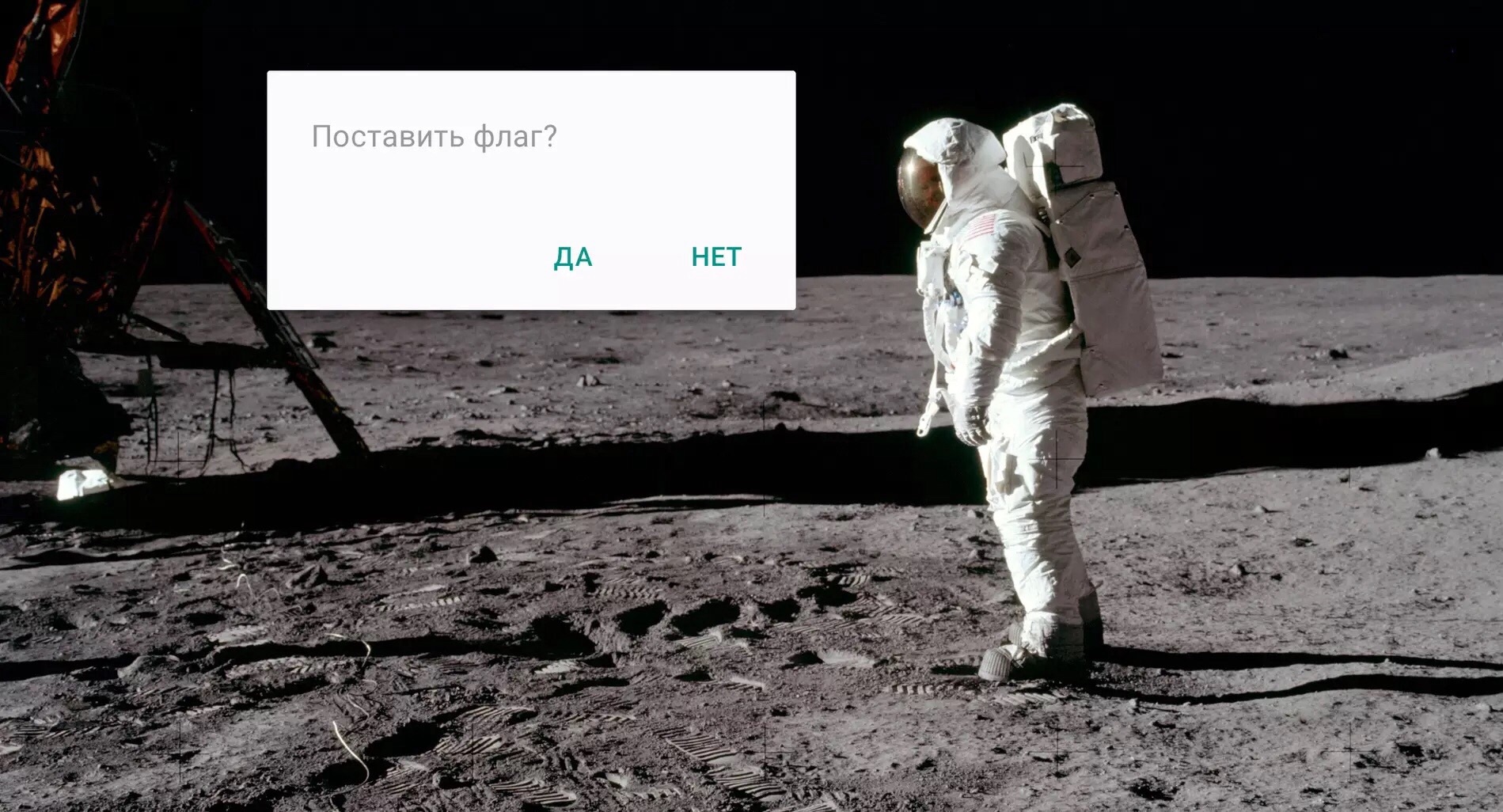
“Is this dull dialog really necessary?”
In this article, I outlined the main principles of Material Design and gave advice on their implementation. The text is written in the wake of the master class for developers, which we, the Robots, arranged together with the Russian office of Google (Think Mobile).
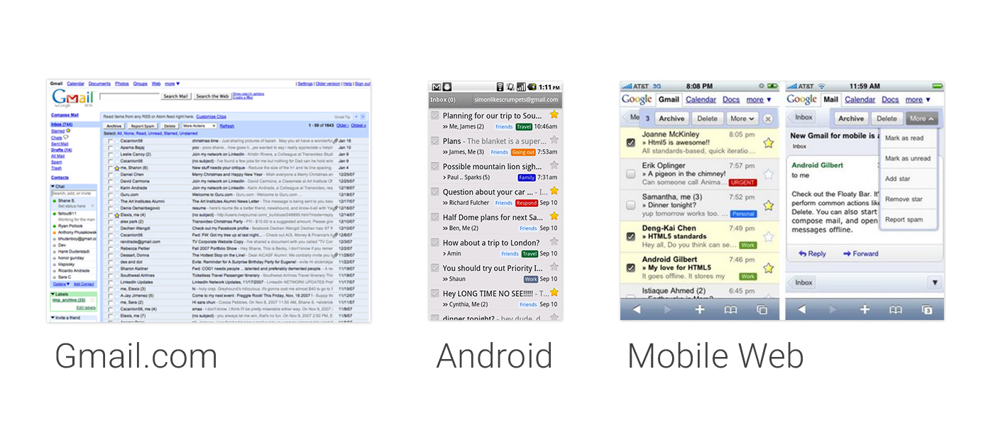
Once, all Google products looked differently bad. Even a single product on different platforms looked inconsistent.
')
Everything began to change in 2011, when Google began to work hard to unify the visual part of the ecosystem of its products and called it all Project Kennedy.
What does this have to do with Kennedy?
The legend is as follows: President Kennedy initiated a man’s flight to the moon (if you believe that this flight has ever been). Larry Page’s big boss at Google professes the principle that there’s no point in improving products by 10% - they should be 10 times better than competitors. If we are to launch a product, then immediately to the moon. So here it was decided to change everything cool.
The result primarily touched the web, but also touched on some mobile products. At the same time, there was a separate work on the design of Android - Holo, which replaced the not very aesthetically pleasing interfaces of the old Android.
But one problem remained: Holo was still different from Project Kennedy.

Users had to adapt to the new interface when switching, to get used to the appearance, the location of controls, and so on.
Therefore, at some point, a group of designers from different parts of Google gathered and began to fight this problem in order to solve it once and for all.
In 2014, a new design system was introduced at the I / O conference, an approach called Material Design. The new design system allows you to create consistent user experience on all screens: desktop, smartphone, tablets, watches, TVs, cars. For Android applications, Material Design is an evolution of the visual language Holo and design guidelines. In many ways, it is a more flexible system, which was created taking into account the fact that it will be used by other designers - Google was only the first user.
Material Design allows for a more objective approach to making design decisions: how something looks, how something works, how animation is performed, and so on. It sets a reasonable framework, but not unnecessary restrictions.
4 principles of Material Design

Material Design is based on four basic principles:
- Tactile surfaces. In Material Design, the interface is made up of tangible layers of the so-called “digital paper”. These layers are located at different heights and cast shadows on each other, which helps users better understand the anatomy of the interface and the principle of interaction with it.
- Print design. If you count the layers as pieces of “digital paper”, then in terms of “digital ink” (everything that is depicted on “digital paper”), an approach is used from traditional graphic design: for example, magazine and poster.
- Meaningful animation. In the real world, objects do not arise from nowhere and do not disappear into nowhere - this happens only in the movies. Therefore, in Material Design, we always think about how using animation in layers and in “digital ink” to give users tips on how the interface works.
- Adaptive design. It’s about how we apply the previous three concepts on different devices with different resolutions and screen sizes.
So, we will move in order.
Tactile surfaces

Let's start with tactile surfaces. These are the very pieces of “digital paper” that, unlike ordinary paper, have supernormal abilities - they are able to stretch, connect and change their shape. Otherwise, they behave in full accordance with the laws of physics and the laws of the Russian Federation.
Surface

What is a surface? Basically, it is a “container” with a shadow and nothing more. But this is quite enough to distinguish one object from another and show how they are located relative to each other. The philosophy of Material Design is committed to simplicity and “clean” design.
There is no need to go too far and use texture, apply gradients for the image of light and shade. No need to give the visual properties of the skin like a grandmother's door to the apartment - a neat shadow can express a lot. But each surface has its own height - the location on the Z axis. And each of the surfaces casts a shadow on the bottom, as in the real world.
Depth

In the traditional “flat design”, shadows like all manifestations of volume are avoided, but they perform an important function of designating the structure and hierarchy of elements on the screen. For example, if the rise of the element is greater, then it has more shadow. This increased depth helps to focus the user's attention on critical things and to do it elegantly.
Depth also sets interaction tips. Here, as the user scrolls, the green plate sticks to the top layer and a shadow is added. This shows that not only the “ink” moves, but the white background is below and moves entirely.

It is important to note that depth has a “bottom”. It is assumed that it is limited by the thickness of the mobile device itself. That is, if the smartphone is a centimeter from the glass to the back wall, and you have a credit card in the interface, then you can’t just turn it over - it will rest on the glass and the back wall.
NB!
- Depth should make sense. Ask yourself the question: “Why is it so and not otherwise?” If there is no answer, it makes sense to look for another solution.
- Take care of the logistics. Floating buttons, toolbars and dialog boxes are at a certain height. Sometimes they need to move along the Z axis to avoid collisions when something happens. With this choreography you need to be extremely attentive.
- Do not force the button. The floating button is a very distinctive feature. Many people think that it is worth adding it to the interface: this is how Material Design immediately becomes. But it should only be used for key action in your application. If you need to close some window or confirm the action, then you do not need to use the floating button. For this there are other elements.
- Not everything should be on the card. If an object has many forms and it contains a lot of different content, then the card is suitable. And if not, then maybe it's better to do this in plain text or a text list?
- Is this dull dialog really necessary? Google designers have tried to make dialog boxes better, but still Bottom Sheets are more suitable for most tasks. There are still Snackbars. Dialog boxes are only needed to ask a question to the user.
- Use list disclosure. This is an underestimated pattern, but it is quite a Material and solves a problem well.
Print design

Once the surfaces in Material Design are called “digital paper”, then everything that is placed on it — text, images, icons — is applied with “digital ink”. And Material Design uses the classic principles of print design in the design of interfaces.
Elegant typography
In print design typography plays a crucial role. Take any magazine, and you will notice that typography performs two important functions there. First, the choice and composition of the font is the style element of the brand's edition. Secondly, typography sets the content structure.

There is a lot of text on this screen. But if we discard the icons and turn the text into gray blocks, it will become obvious that the structure is completely distinguishable.
Before us is a large header and a set of smaller elements, which are distinguished by their saturation - the more important ones are darker. At the same time, we clearly distinguish the grouping due to the fact that some rectangles are located closely, and there is a significant indent between the blocks. In general, everything is in the best traditions!
Font size

Google.com/design/spec has a standard font palette that you can safely use. The palette uses the Roboto font, but it can be replaced with its own corporate font to support the brand. It is important to test everything carefully, as on different devices font rendering can work in different ways. Normally, OTF fonts work better than TTF.
Contrast typography

Another principle from the world of printing, which gets along well in Material Design, is the contrast typography - a really noticeable contrast between the font sizes of the heading and typesetting text. It is beautiful and well highlights the main thing.
Modular grid and guides
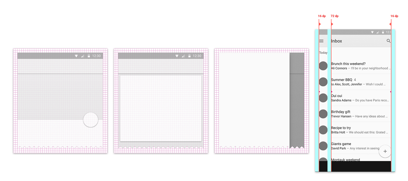
Now to the layout of the content on the screen. In the print design, modular grids are used, in the on-screen design they are more basic grids with very small modules. So, Material Design uses a grid in 8dp steps. DP is a density-independent pixel, a unit largely similar to a point unit in iOS.
But the main distinguishing feature of content placement in accordance with the principles of Material Design is the location of the key guides. They set indents from the edges of the screen, structuring information and controlling the user's view. If you are familiar with the design of multi-page publications or have read Chikhold , then you probably know a lot about the grid and the fields and understand where your legs grow from.
In fact, we see a text column in the middle and a large field on the left, which makes it possible to focus attention on the main content, and give auxiliary elements in the fields.
Geometric Iconography

If we talk about iconography, then simple icons have been used in Android for some time, but in Material Design they have become even simpler and friendlier. In the unofficial resource materialdesignicons.com, designers can find icons for their own purposes and contribute as much as possible.
Colour

As in print design, color is an important means of expression in interface design. In the old Android, the color was something extra, but now it plays a more prominent role. In Material Design, the standard color palette of the application consists of primary and accent colors.

The main one is used for large areas like the action bar, and the status bar is painted in its darker variation. Brighter accent color is used dotted in controls, buttons, stripes, indicators, etc. Accent color is intended to draw the user's attention to key elements, such as a floating button.
How much color to apply? Accents are put on a dot, in a small amount. There is a simple basic rule for coloring the rest of the interface. When there is a lot of text, for example, this is a mail list, you should leave the standard size app bar and paint it to allow the user to focus on the content. If there is not so much content, for example, a detailed view of a single item, a photo or a calculator, then this is a great opportunity to use large color dies - 2 or 3 app bar heights.

Android supports a library called Palette, which allows you to extract color from photos. That is, it is possible to dynamically paint the interface based on the photo illustrations in the application.

We took a photo, and the algorithm extracted 6 colors from it with different characteristics:
- there are 3 juicy and 3 muffled colors;
- they are divided into light, standard and dark tones;
- for each background color is determined by its own text color, which can also be used.
Nice pictures

Finally, as in print design, Material Design encourages the use of photographs and illustrations in all its glory. Pictures are mostly placed without frames, often “bleed through”. Even the status bar is specifically made transparent so as not to interfere. At the same time, every drop of “digital ink” on the screen has a function, almost nothing is just for decoration.
NB!
- Brand with pleasure. Google is in a better position so that it can use bright colors as brand colors, but this should not be taken as a problem. The colors can be chosen from the corporate brand book and generally use the logo.
- Do not forget the indents and “give air”. The base grid is 8dp and the left margin is 72dp - practically the rule. Let the content be good and free.
- Expressive photos make the weather. Photographs and illustrations as expressive means are our choice.
Meaningful animation

In the real world, objects cannot simply appear from nowhere or disappear into nowhere. It would be puzzling and puzzling people. Therefore, in Material Design, meaningful animation is used to show exactly what just happened.
Example 1. Animation shows that it was this particular card that came to the forefront after pressing, opened, and more information became visible.
Example 2. The event in the calendar after pressing is detached from the surface, turns into a separate layer of "paper", begins to transform and is revealed as detailed information about the event.
An interesting point is that the active movement attracts the eye - this is natural for our eyes. With the help of animation we manage the attention of the user.
Asymmetry
Since the depth of the interface is limited by the thickness of the device, all transformations of objects have to be performed in the plane. This also leads to the fact that the transformation animation must be asymmetric - that is, the change in the width and height of the object must be independent. Otherwise, there is an illusion of approaching or moving away from the viewer, and at a very long distance.
Reaction
Another very important principle of animation in Material Design is the reaction to user actions. Where possible, the epicenter of changes in the interface should be a touch on the device screen. For example, a wave that appears and comes from the point of contact with your finger. This effect is easily implemented in Android L.
Microanimations
In Android L, we can animate every element of an application — be it transitions between content or small action icons. Every detail of the application is important, and micro-animation adds more complete detail and responsiveness to the application for each user action.
Sharpness and sharpness
And last, the key principle of animation: the movement should be fast and clear. In contrast to the banal acceleration at the beginning and slowing down at the end, the animation curve in Material Design is more natural and interesting. Objects react faster and reach the target state, come back more sharply, but go a little longer to the state of rest at the end. As a result, the user needs to wait less (this is less annoying). At the same time, where the object is already out of the interests of users, it allows itself to behave more naturally.
NB!
- Do not leave the animation at last. Do not leave the animation at the very end - it can be a key factor in user experience, and you need to think it over in advance.
- Know the measure. Too much animation too bad. Keep yourself in hand and remember that it must be meaningful.
Adaptive design

The final major aspect of Material Design is the concept of responsive design. That is, how can we apply all three first concepts on different devices and screens in different form factors.
From general to specific

The most common technique is to reduce the amount of information displayed on the screen as the screen shrinks. If on the big screen we can afford to show both the list and detailed information on the selected item, then on smartphones the list is displayed first, and for details you need a separate screen. In the case of tablets, the app bar can sometimes be increased to cope with a little extra space.
Indentation

Placing content using blocks greatly simplifies working with free space on large screens. We know the contents of each block, we understand how wide it can be, so as not to lose readability, and also how narrow it is so that it is not too crowded. On wide screens, the blocks are stretched to their limits of readability, and then indents are added to the edges, which may well be large. They can be filled with a floating button and colored dies.
Whiteframes

Ideas for organizing space and padding for different screens can be found on google.com/design/spec in the Whiteframes section. This is a great place to start, to understand the general meaning and then continue your own experiments.
Guides

Guides set us indents for "ink" on separate sheets of "paper". On the smartphone, we have one sheet and one good margin on the left, and on the tablet there are two, and in both cases there is indentation. It is important that the indentation will be different for these two form factors. On the tablet it is 80dp, and on the smartphone - 72dp. Indents from the edges of the screen are also different.
Dimensions

It is recommended to take multiple proportions for all elements. In particular, choosing the size of the app bar is much more convenient if you make it multiple: 1x, 2x, 3x. On smartphones and tablets, this size is different, but the application adapts without problems.
Blocks

Thinking in blocks can be helpful. If you set such a modular grid of blocks that are multiples of 8dp, you get an excellent visual rhythm and it will be more convenient to make decisions. Go to the website with the whiteframes and look at the materials.
Toolbar

Action bar is one of the most important parts of the interface. It contains the title, action buttons and navigation. In Android, the Lollipop action bar has evolved from a pinned top bar to a full-fledged widget - a functional and beautiful application control unit. This was possible due to the fact that now you can put a lot of functional elements in the toolbar, which you never had to dream about before:
- input fields, forms;
- floating main action button;
- the toolbar is hidden by the advanced navigation, but here we see a fully functional widget;
- the toolbar is convenient to manage if necessary.
NB!
- Not always need a navigation drawer. Google very often uses pull-down navigation in its applications, so you can see it in different examples. But Google has a lot of tasks that can be solved with its help: post help, settings, login / logout, user information, and so on. If you have similar tasks, then everything is OK, and if you are doing a simple tool, then it is not worth it.
- Bolder and wittier with toolbars. The ability to change the size of the toolbar dynamically, making it double and triple in size is very cool and convenient. Most designers are afraid to mess with it and choose one size once and for all, but here you can and should be bolder.
- Do not make the bottom corner of the ghetto for a floating button. The floating button can be anywhere: bottom, top, right, left. Of course, in the corner it can be convenient to reach it, but this is not the only option. The button can move from place to place depending on the tasks.
- And smartphones and tablets; both vertically and horizontally. The line of Android devices is great, and this does not make life easier for developers. But the truth is that users really have all these devices that they turn this way and that way (even if we are talking about smartphones). This moment needs to work out.
This is Material Design. Do not be afraid to experiment and make mistakes: do not get hung up on copying existing solutions. Try it!
Source: https://habr.com/ru/post/252773/
All Articles