Quantitative CSS selectors
Have you ever wanted to count in the CSS code, in the menu 4 elements or 10? For four, ask them a width of 25%, and if you’ve got ten, press them together and reduce indents?
As it turned out, CSS can work with a different number of elements, allowing you to get rid of headaches and excess js code.
Responsive design is usually associated with one variable - space. When we test the responsive grid, we take some amount of content and see how much space it takes, how it looks and where it goes, and where it doesn't. That is, content is considered constant, and space is variable.
')
Media query are the basis of responsive design, as they allow you to mark the boundaries, passing which one grid changes to another. However, the arrangement of elements and the space around them can be influenced not only by the size of the screen, but also by the content itself.
Just like site visitors can use a variety of devices with different screen sizes, your content managers and editors can add or delete content. They even have whole CMS for this. That is why the page designs in Photoshop have lost their relevance - they always have a fixed screen width and always have fixed content.
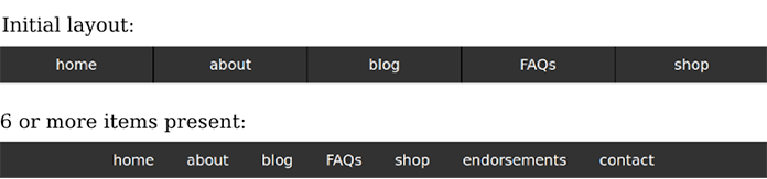
In this article I will describe the technique of creating CSS, devoid of problems with the number (counting) of elements. This is achieved through specially designed selectors. I will use them in the contest for solving a classical problem: how to divide the layout of elements in the horizontal menu of the site, when there are few and many elements in it. For example, how to achieve that with 6 or more menu items, the elements had a display: inline-block style, and with a smaller number, display: table-cell.
I will not use templating or js, I will not even need to prescribe classes for menu items. The technique of using only CSS selectors is consistent with the principle of interest sharing , according to which content (HTML) and display (CSS) have clearly designated roles. Markup is the work of CSS and, if possible, CSS alone.
The demo is available on CodePen and will still be mentioned in the course of the article.
To simplify understanding, I will use pictures with squid instead of HTML tags. Green squids will be for elements that fall under a particular selector, red ones for those that do not, and gray ones will mean that the element does not exist.

To find out the number of elements, they need to count.
Selector: only-child works on the elements, which are always one thing. In essence, this allows us to “apply styles to all children of a particular element, if their total is exactly 1”. This is the only simple selector that can be described as “counting” (except, of course, similar to it: only-of-type).
In the example below, I use: only-of-type to apply styles to all buttons, which are the only button-children among their neighbors.
It is important to understand that the order of the lines here is of key importance. In addition, it is useful to see this code from the point of view of a less-than-two select:

Likewise, we can now make a more-than-one select using negation .

Applying styles based on “more-than-one” and “less-than-two” is a clever trick, but we need a more flexible tool to handle any number. We want to use selects greater than or equal to N for any N. In addition, I want to have select exactly 745 or totally exactly 6.
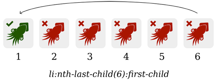
For this we have a selector : nth-last-child (n) , to which we pass any number to the parameter. It allows you to count so many items back from the end of the list. For example,: nth-last-child (6) will select an element that is the sixth from the end among its neighboring elements.
Everything becomes more interesting when we combine: nth-last-child (6) and: first-child, resulting in all the elements that are the sixth from the end and the first from the beginning.
If such an element exists, it will mean that we have exactly 6 elements. Thus, I wrote CSS code that can tell how many elements I see in front of me.
It remains now to take advantage of this at the same time the “sixth from the end and the first from the beginning” element in order to also place all the other 5 elements. For this, I will use the common neighbor combinator .
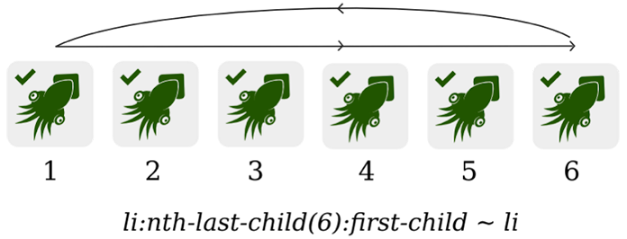
If you are not familiar with this combinator, then I explain, ~ li in li: nth-last-child (6): first-child ~ li means “any li that comes after li: nth-last-child (6): first-child ". In our case, the elements will have a green font color, if there are exactly 6 of them.
Selecting a fixed number, be it 6, 19, or 653, is not very useful, since such a need is very rare. It's like in media queries - it's not very convenient to use a fixed width instead of min-width or max-width:
In the navigation menu, I want to switch styles with a border based on the number of elements, for example, change the necessary styles if I have 6 or more elements (and not exactly six).
The question is how to make such a selector? and this is a matter of bias.
The selector: nth-child () can accept as an argument not only a number, but also the formula “n + [number]”. For example,: nth-child (n + 6) will be applied to all elements, starting from the sixth.

Although this selector is a powerful tool in itself, it does not allow you to operate with a quantity. It will not apply when we have more than six elements, but simply to elements with a number greater than five.
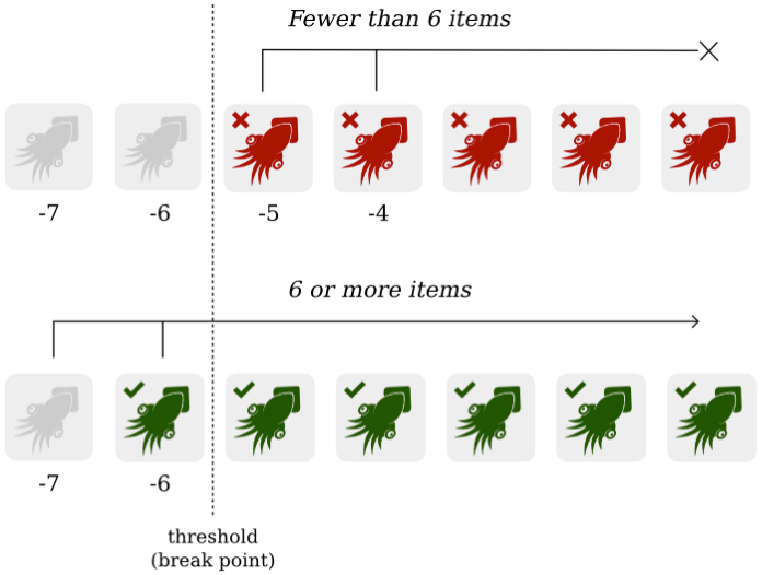
To get around this problem, we need to create a select that will select all the elements except the last five. Using the inverse of: nth-child (n + 6) select: nth-last-child (n + 6) we can select all the elements "from the sixth from the end to the very first from the beginning."
Such a select cuts off the last five elements from a set of any length, which means that if you have less than six elements, then nothing will get into the select.

If there are six or more elements in the list, we need to add the remaining five elements to the select. This is easy - if there are more than six elements, then the nth-last-child (n + 6) condition is triggered, and by combining it with "~" we will be able to select all the elements we need.
Such a short entry is the solution to our problem:
Of course, there can be any positive integer, even 653,279.
As in the previous example with: only-of-type, the selector can be used both ways, as “greater than or equal to N” and as “less than or equal to N”. Which option will you use? It depends on which grid you will consider the main one.
In the case of "Less or N", we take n with a minus and add the condition: first-child.
As a result, the use of "-" changes the direction of the select: instead of counting from the beginning to six, the countdown will go from end to six. In both cases, the sixth item will be included in the select.
Notice that in the previous examples I used: nth-child () and: nth-last-child (), not: nth-of-type () with: nth-last-of-type (). Since I select the <li> tags and the correct descendants of <ul>, they can only be: last-child () and: last-of-type () turn out to be equally effective.
Both groups of selects: nth-child () and: nth-of-type () have their advantages based on what you want to achieve. Since: nth-child () is not tied to a specific tag, the technique described above can be applied to mixed children:
(Note that in order not to attach to tags, I use the universal selector .: Last-child (n + 3) ~ *. In this case, it means "any element of any tag that follows: last-child (n + 3) . "
On the other hand, the advantage: nth-last-of-type () is that you can select elements with one tag among many other neighbors. For example, you can count the number of tags <p>, despite the fact that they are in the same heap with <div> and <blockquote>.
All CSS2.1 and CSS3 selectors used in the article are supported in Internet Explorer 9 and higher , as well as all modern mobile and desktop browsers.
Internet Explorer 8 is well supported by most selects, but it won't hurt to think about the js polyfill. Alternatively, you can arrange special classes for older versions of IE and assign them to your selectors. In the case of the navigation menu, the code will look something like this:
Suppose our navigation menu belongs to a site with a CMS. Depending on who fills it and uses it, there will be a different number of elements in the menu. Someone tries not to complicate and he lacks “Home” and “About”, and someone wants to stuff everything he has on the site into the menu.
Creating styles that take into account different grids for a different number of elements in the menu, we make the layout more harmonious and suitable for a variety of formats - whatever the content, we have everything taken into account.
Congratulations, now in your CSS arsenal there is the ability to handle the number of elements.
Responsive design solves one important problem: it allows you to comfortably position the same content on many different devices. It would be unacceptable to see different content just because you have the wrong screen size. It is also unacceptable to dictate to the designer how many menu items the site should be sharpened. "Do not draw like this, we have the whole grid will go, if there are so many elements."
What form will take the content and how much it will be at a particular point in time - no one knows. And we cannot always rely on scripts or text clipping, this is wrong. That's right - to be independent of the amount of content and create the necessary mechanisms and tools for this. Quantitative selectors are just one of the ideas for this.
Web design is always variability, flexibility and uncertainty. In him you rather do not know what you know. It is unique in that it represents with itself a kind of visual design that does not define forms, but foresees what forms something can take. For some, this is unacceptable and incomprehensible, but for you and me this is a challenge and a pleasure.
As it turned out, CSS can work with a different number of elements, allowing you to get rid of headaches and excess js code.
Dynamic content
Responsive design is usually associated with one variable - space. When we test the responsive grid, we take some amount of content and see how much space it takes, how it looks and where it goes, and where it doesn't. That is, content is considered constant, and space is variable.
')
Media query are the basis of responsive design, as they allow you to mark the boundaries, passing which one grid changes to another. However, the arrangement of elements and the space around them can be influenced not only by the size of the screen, but also by the content itself.
Just like site visitors can use a variety of devices with different screen sizes, your content managers and editors can add or delete content. They even have whole CMS for this. That is why the page designs in Photoshop have lost their relevance - they always have a fixed screen width and always have fixed content.
In this article I will describe the technique of creating CSS, devoid of problems with the number (counting) of elements. This is achieved through specially designed selectors. I will use them in the contest for solving a classical problem: how to divide the layout of elements in the horizontal menu of the site, when there are few and many elements in it. For example, how to achieve that with 6 or more menu items, the elements had a display: inline-block style, and with a smaller number, display: table-cell.
I will not use templating or js, I will not even need to prescribe classes for menu items. The technique of using only CSS selectors is consistent with the principle of interest sharing , according to which content (HTML) and display (CSS) have clearly designated roles. Markup is the work of CSS and, if possible, CSS alone.
The demo is available on CodePen and will still be mentioned in the course of the article.
To simplify understanding, I will use pictures with squid instead of HTML tags. Green squids will be for elements that fall under a particular selector, red ones for those that do not, and gray ones will mean that the element does not exist.
Score
To find out the number of elements, they need to count.
Note per
CSS does not provide an explicit “counting API”, but we can work around this problem by by combining selectors as necessary.Captain
Count to one
Selector: only-child works on the elements, which are always one thing. In essence, this allows us to “apply styles to all children of a particular element, if their total is exactly 1”. This is the only simple selector that can be described as “counting” (except, of course, similar to it: only-of-type).
In the example below, I use: only-of-type to apply styles to all buttons, which are the only button-children among their neighbors.
button { font-size: 1.25em; } button:only-of-type { font-size: 2em; } It is important to understand that the order of the lines here is of key importance. In addition, it is useful to see this code from the point of view of a less-than-two select:
Likewise, we can now make a more-than-one select using negation .
/* "--" */ button { font-size: 2em; } button:not(:only-of-type) { font-size: 1.25em; } N items
Applying styles based on “more-than-one” and “less-than-two” is a clever trick, but we need a more flexible tool to handle any number. We want to use selects greater than or equal to N for any N. In addition, I want to have select exactly 745 or totally exactly 6.
For this we have a selector : nth-last-child (n) , to which we pass any number to the parameter. It allows you to count so many items back from the end of the list. For example,: nth-last-child (6) will select an element that is the sixth from the end among its neighboring elements.
Everything becomes more interesting when we combine: nth-last-child (6) and: first-child, resulting in all the elements that are the sixth from the end and the first from the beginning.
li:nth-last-child(6):first-child { /* */ } If such an element exists, it will mean that we have exactly 6 elements. Thus, I wrote CSS code that can tell how many elements I see in front of me.
It remains now to take advantage of this at the same time the “sixth from the end and the first from the beginning” element in order to also place all the other 5 elements. For this, I will use the common neighbor combinator .
If you are not familiar with this combinator, then I explain, ~ li in li: nth-last-child (6): first-child ~ li means “any li that comes after li: nth-last-child (6): first-child ". In our case, the elements will have a green font color, if there are exactly 6 of them.
li:nth-last-child(6):first-child, li:nth-last-child(6):first-child ~ li { color: green; } Greater than or equal to 6
Selecting a fixed number, be it 6, 19, or 653, is not very useful, since such a need is very rare. It's like in media queries - it's not very convenient to use a fixed width instead of min-width or max-width:
@media screen and (width: 500px) { /* 500px */ } In the navigation menu, I want to switch styles with a border based on the number of elements, for example, change the necessary styles if I have 6 or more elements (and not exactly six).
The question is how to make such a selector? and this is a matter of bias.
Parameter n + 6
The selector: nth-child () can accept as an argument not only a number, but also the formula “n + [number]”. For example,: nth-child (n + 6) will be applied to all elements, starting from the sixth.
Although this selector is a powerful tool in itself, it does not allow you to operate with a quantity. It will not apply when we have more than six elements, but simply to elements with a number greater than five.
To get around this problem, we need to create a select that will select all the elements except the last five. Using the inverse of: nth-child (n + 6) select: nth-last-child (n + 6) we can select all the elements "from the sixth from the end to the very first from the beginning."
li:nth-last-child(n+6) { /* */ } Such a select cuts off the last five elements from a set of any length, which means that if you have less than six elements, then nothing will get into the select.
If there are six or more elements in the list, we need to add the remaining five elements to the select. This is easy - if there are more than six elements, then the nth-last-child (n + 6) condition is triggered, and by combining it with "~" we will be able to select all the elements we need.
Such a short entry is the solution to our problem:
li:nth-last-child(n+6), li:nth-last-child(n+6) ~ li { /* */ } Of course, there can be any positive integer, even 653,279.
Less or N
As in the previous example with: only-of-type, the selector can be used both ways, as “greater than or equal to N” and as “less than or equal to N”. Which option will you use? It depends on which grid you will consider the main one.
In the case of "Less or N", we take n with a minus and add the condition: first-child.
li:nth-last-child(-n+6):first-child, li:nth-last-child(-n+6):first-child ~ li { /* */ } As a result, the use of "-" changes the direction of the select: instead of counting from the beginning to six, the countdown will go from end to six. In both cases, the sixth item will be included in the select.
nth-child vs nth-of-type
Notice that in the previous examples I used: nth-child () and: nth-last-child (), not: nth-of-type () with: nth-last-of-type (). Since I select the <li> tags and the correct descendants of <ul>, they can only be: last-child () and: last-of-type () turn out to be equally effective.
Both groups of selects: nth-child () and: nth-of-type () have their advantages based on what you want to achieve. Since: nth-child () is not tied to a specific tag, the technique described above can be applied to mixed children:
<div class="container"> <p>...</p> <p>...</p> <blockquote>...</blockquote> <figure>...</figure> <p>...</p> <p>...</p> </div> .container > :nth-last-child(n+3), .container > :nth-last-child(n+3) ~ * { /* */ } (Note that in order not to attach to tags, I use the universal selector .: Last-child (n + 3) ~ *. In this case, it means "any element of any tag that follows: last-child (n + 3) . "
On the other hand, the advantage: nth-last-of-type () is that you can select elements with one tag among many other neighbors. For example, you can count the number of tags <p>, despite the fact that they are in the same heap with <div> and <blockquote>.
<div class="container"> <div>...</div> <p>...</p> <p>...</p> <p>...</p> <p>...</p> <p>...</p> <p>...</p> <p>...</p> <blockquote>...</blockquote> </div> p:nth-last-of-type(n+6), p:nth-last-of-type(n+6) ~ p { /* */ } Browser Support
All CSS2.1 and CSS3 selectors used in the article are supported in Internet Explorer 9 and higher , as well as all modern mobile and desktop browsers.
Internet Explorer 8 is well supported by most selects, but it won't hurt to think about the js polyfill. Alternatively, you can arrange special classes for older versions of IE and assign them to your selectors. In the case of the navigation menu, the code will look something like this:
nav li:nth-last-child(n+6), nav li:nth-last-child(n+6) ~ li, .lt-ie9 nav li { display: inline-block; /* .. */ } In the real world
Suppose our navigation menu belongs to a site with a CMS. Depending on who fills it and uses it, there will be a different number of elements in the menu. Someone tries not to complicate and he lacks “Home” and “About”, and someone wants to stuff everything he has on the site into the menu.
Creating styles that take into account different grids for a different number of elements in the menu, we make the layout more harmonious and suitable for a variety of formats - whatever the content, we have everything taken into account.
Congratulations, now in your CSS arsenal there is the ability to handle the number of elements.
Content Independent Design
Responsive design solves one important problem: it allows you to comfortably position the same content on many different devices. It would be unacceptable to see different content just because you have the wrong screen size. It is also unacceptable to dictate to the designer how many menu items the site should be sharpened. "Do not draw like this, we have the whole grid will go, if there are so many elements."
What form will take the content and how much it will be at a particular point in time - no one knows. And we cannot always rely on scripts or text clipping, this is wrong. That's right - to be independent of the amount of content and create the necessary mechanisms and tools for this. Quantitative selectors are just one of the ideas for this.
Web design is always variability, flexibility and uncertainty. In him you rather do not know what you know. It is unique in that it represents with itself a kind of visual design that does not define forms, but foresees what forms something can take. For some, this is unacceptable and incomprehensible, but for you and me this is a challenge and a pleasure.
Source: https://habr.com/ru/post/252181/
All Articles