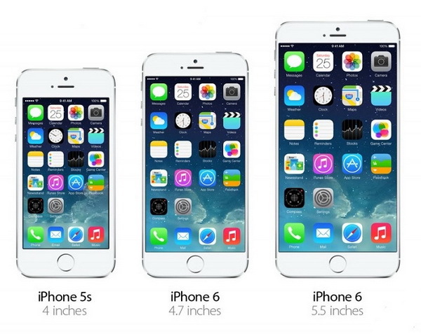
How many interface designs do you really need to draw for iPhone 4, 5, 6, and 6+?
The output of the iPhone 6 and 6+ smartphones introduced some disorientation in the ranks of designers and programmers, because before you could just draw one layout for the iPhone 5 and proportionally reduce by 2 times when marking for previous devices. But now the situation has changed somewhat: the pioneers of programmers complain that the layout, beautifully drawn and designed for the iPhone 6, looks absolutely unattractive, unreadable and unsuitable for the iPhone 5, because it was just proportionally reduced as before. IOS HIG doesn’t contain any specific advice about this, so for designers, the question of how many interface designs actually need to be drawn in order to cover the entire current line of iPhone devices is particularly acute. Let's figure it out.
Not many people take into account, but in addition to pixels, iOS uses the same universal units - points (pt, point) and the layout should be tied to them. Previously, programmers solved this problem for designers: they took the layout .psd sent by the designer for iPhone 5, divided all pixel values into 2 and described them in the code with those very points (at best, if they didn’t tie everything to pixels). But now this handicraft method is not very suitable for designers, because you will have to draw graphics in maximum resolution, which means that each screen will be 1500-2000 px in size, which will require a huge amount of computer resources, especially if the designer keeps all the screens in one source . Therefore, now it is more important than ever to follow the Android path in terms of a single unit of measure, namely, to use those same pt.
In essence, the designer’s work can be summarized as follows: we draw screens at a ratio of 1 px = 1 pt (point), i.e. 1 pixel = 1 point. We take a canvas with a size of 320x568 px (which corresponds to the proportion of iPhone 5 640x1136 px) and draw a design, carefully monitoring compatibility with the iPhone 4 (in our version its height is 480 px). But what about graphics? It should be larger, much larger than the base 320x 568 px! Exactly! And this is where Adobe Illustrator comes to the rescue. Illustrator is a vector graphics editor, which means that any graphics drawn in it can be adapted to any size without loss of quality. You can do this: draw a layout in the above resolution in Adobe Illustrator and, if necessary, export it to .psd from Photoshop in density, above the base 72, namely - 216. All vector layers will be converted to raster (no getting around), but this It will be quite enough to export graphics to all the necessary screen densities. But what about the customer to show the design stages? After all, 320x568 px is too small a resolution to evaluate the quality of the layout! And here again Adobe Illustrator comes to the rescue: we export the layout for the customer to ... pdf. Often, such a file weighs ten times smaller than normal raster layouts and is fully compatible with Apple devices. All screens or whatever you want will fall into one file and at the first client request you will be able to quickly and easily demonstrate to him the current stage of work.
Total: it is more rational to draw a single layout of the design of the application right away in Adobe Illustrator under the lowest density of the iPhone screen and mark the dimensions for programmers in pt. You can draw a design in Photoshop, but this option is less responsive, even with smart objects. In any case, no matter what graphics editor you prefer, it is enough to take care of the possibility of three-fold scaling of the graphics for the iPhone 6 Plus (@ 3x) and layout layouts in pt.
')
And for those who have not tried, but became interested in the design work in Adobe Illustrator, I strongly advise to go to these pages on Habré: “UI-Ai: We draw the interface in Adobe Illustrator” and “Integration of mobile application design. Part 2: iOS, Windows Phone . ”
Source: https://habr.com/ru/post/252063/
All Articles