All on schedule: how to monitor user activity on the main Mail.Ru helps to live and solve problems
The graph of user activity on the Mail.Ru main page is a kind of thermometer, and an oversensitive one. Sometimes classroom indicators reflect problems that have arisen in another great Internet service, or show a reaction to any important events in public life.
How we use user activity monitoring to solve problems, as well as other applications that we found, I will discuss in this article.
How the main page works, we follow the technical graphs:
But often we see that the behavior of users changes dramatically, while there are no deviations on the technical graphs. In order to have a complete picture of what is happening on the main page, we supplemented them with graphs of user activity. They show transitions from the main page to other projects. We separately monitor both the “big” main and mobile (we have three mobile versions - for different phone models). As a bonus, we received a kind of user interest thermometer for various topics and events.
Abrupt changes in activity graphs almost always mean something from the following:
Practice shows that a sharp increase in user activity on any project most often indicates not a sudden outburst of users' love for the service, but, unfortunately, the appearance of some problems. Just not always the problems on our side. I will talk about the most memorable cases to me.
')
Sometime late in the evening, we saw that on the charts all of a sudden growth of activity was abnormal for this time of day. Views of all versions of the main page, both big and mobile versions, have grown. We rushed to find out what was wrong. The page refresh schedule, JS-errors, load time and others showed standard data, there were no deviations. As a result, it turned out that the surge of activity is a consequence of a football match that was important for the Russian team that ended at that moment. People en masse went to the Internet to discuss this event (the transitions in the social network increased) and to look for more detailed information about it (the transitions to search and news increased). Now we quickly distinguish such events from technical difficulties, as we see not only an increase in the number of page views, but also an increased interest in certain projects.
In the described situation, the graphics look like this: the growth of the main page views corresponds to the growth of transitions to the Mail.Ru News project. The graphs below show the increased user activity triggered by another significant match: Russia vs. USA at FMC 2013 (May 16, 2013). This is + 10% to the main page views and + 50% to go to the News.

Sports events - the most predictable in time and causing a stable interest among users. Last year was especially rich in them. At the beginning of the year, we regularly observed bursts on the graphs of user activity - these were numerous victories and rare defeats in the Olympics, the World Hockey Championships and the World Cup. By the way, according to our schedules we can even determine which event caused the greatest resonance. For example, during the World Cup, the Algeria-Russia match was the most interesting for the Russians. Knowing that immediately after the end of a similar event, people begin to more actively behave on the Internet (look for information, read news, etc.), we began to meet the "excited" fans with holiday logos in case of victory in major competitions.
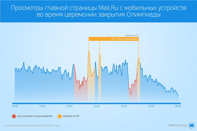
Another factor that can have a significant impact on user activity is TV programs. There are things that look so massive that it is noticeable on our charts! For example, when the broadcasting of the closing of the Olympics began, we immediately saw how people “left” the Internet - the views and activity decreased. But at the time of the commercial break, the number of views of the mobile main page increased by 30-40%.
Correlating the class schedules and the program of events, we began to make assumptions about which subjects are most and least interesting to users. For example, the most interesting for TV viewers moments of the closing of the Olympics were the beginning and the end of the presentation - rooms with children and symbols of the Olympics.
Another TV program that consistently attracts the attention of the mass of users is the annual message and press conference of the president. On our charts at this time, a decline in attendance is seen from the usual level - people are distracted by the TV more than usual. By the way, partly because of such high interest, we began to show broadcasts of such events directly on the project News Mail.Ru.
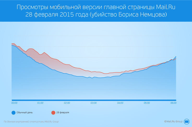
Major incidents (death of famous people, catastrophes, etc.) often cause bursts on charts that are comparable to sporting events. The murder of Boris Nemtsov, about which it became known last Saturday, February 28, is so resonant that the appearance of the first information about the incident not only caused a noticeable increase in the transitions to news and an increase in the number of search queries, but also reflected in a surge in views of the main page: people went to the Internet for details. This is especially noticeable on the mobile version of the main page.
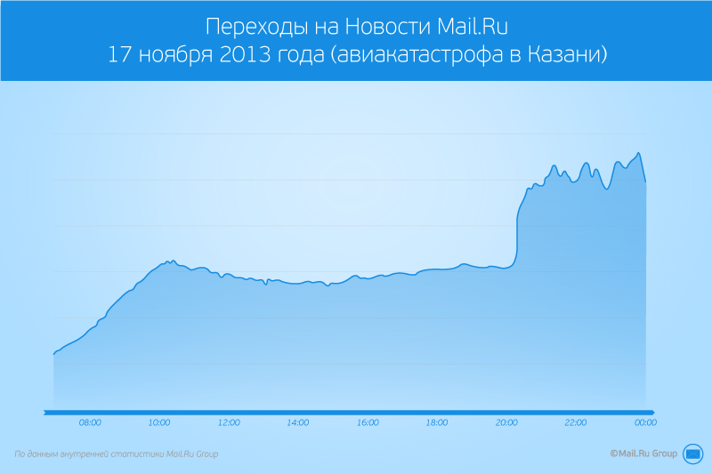
Our colleagues have prepared a special project about the events that have most interested people in the past years - the newest history of Russia 2006-2014 . Many of these events were expressed in bursts on the graphs of user activity. For example, avikatastrofa, which occurred in Kazan in 2013. The incident happened at about eight o'clock in the evening, very soon news appeared on the topic. And, already expected, there was a huge interest in the incident:
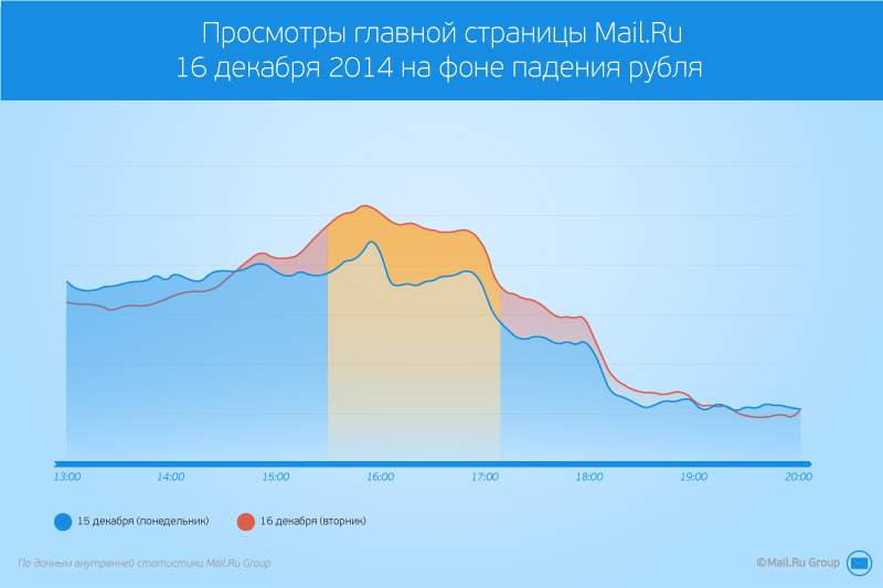
Finally, economic upheavals cause a great resonance among users. For example, interest in blocks with currency rates on the main one grew steadily during the autumn of 2014 and reached its peak on December 16, when the Central Bank raised the key rate to 17%. At the same time, as on the MICEX stock exchange, the value of the euro rose to 100 rubles, the number of views on the Mail.Ru home page, from which users moved to a block with exchange rates, increased. As a result, transitions to exchange rates increased 9 times compared with the usual day.
The transition schedule to Mail.Ru News from the main page allows you to distinguish such a natural increase in activity from bursts caused by other reasons, which will be discussed further. In general, I read news on charts - if a splash is visible on them, it means that something noticeable happened and you should read the news on the main Mail.Ru.
Interestingly, other large Internet projects also affect the behavior of Mail.Ru users. Anyone, even a large and very reliable service, sometimes has technical problems (such accidents, as a rule, happen only a few times a year), and the behavior of users at this moment looks interesting. You can see how people literally run from one resource to another.
The growth of transitions from the main page to several Mail.Ru projects at the same time, as a rule, means that the user has problems accessing some other major service — a social network or a search engine. If there are problems with other search services on the main page, users are noticeably added and the number of search queries is growing. If technical difficulties are experienced by social networks, people begin to look for something to entertain themselves, and it seems that they are switching to all projects in general - to Mail, Search, News, download the Agent, etc.
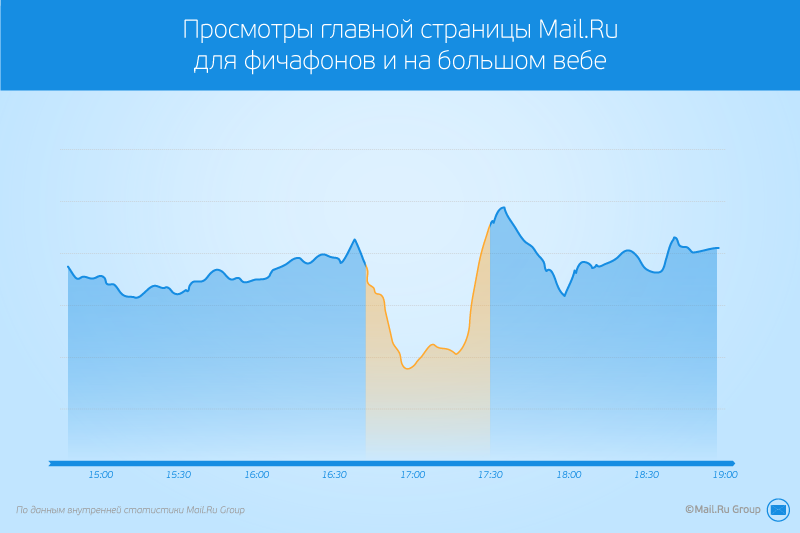
Another interesting case - problems with access from a large provider. In Russia, serious problems in my memory did not happen, but in Kazakhstan, where a significant percentage of Mail.Ru's audience lives, sometimes it happens. Here you need to add that the main page has three mobile versions: a touch version for iOS, Android and WP, a mobile version for users with the Opera Mini browser, and a version for feature phones — weak phones and small screen phones. The geography of users differs between versions, so on the touch-version there is a bias towards users from Moscow, and on the version for features, there are much more, including users from Kazakhstan. Due to this difference, problems in Kazakhstan can be guessed by stronger deviations in the graphs of the feature for feature phones. In this example, the audience of this version is much more noticeable by attendance than other versions of the main page.
The availability of transition schedules for projects from the main page allows, among other things, to quickly distinguish our technical problems from others. Without them, we would constantly twitch, trying to figure out the reasons, and one glance at the dashboards, which combines all the graphs, is enough to decide whether to take active steps.
In conclusion, I will give an example of how we traced the problem on our charts. Just as in previous cases, at first we saw an increase in views and refresh of the main page. Graphs of user activity made it possible to quickly determine where the problem was, since the transitions to weather and a change of city to the main one increased. It turned out that during the automatic update of the geobase part of the ip-addresses was incorrectly assigned the wrong city. Users instantly responded to this by clicking on a change of region in order to return "their" city to the main one. Thanks to this, we quickly noticed and fixed the error, and later covered this place with additional tests.
***
Examples of interesting user behavior, of course, much more. We have collected and classified the most typical situations for the main page. The addition of technical graphs with graphs of user activity in the case of the main page allows you to more quickly and accurately understand the causes of the dramatic change in user behavior. This reduces troubleshooting time or gives an understanding that there are no problems on the project side. In addition, the activity charts allow you to see which topics are of particular concern to people and take this into account in the future.
Do you have experience in systematically monitoring audience activity? Share interesting facts!
By the way, we are looking for a person who will help us develop the Mail.Ru main page. If you are interested in such tasks, here is the link to our job: brainstorage.me/jobs/27333
How we use user activity monitoring to solve problems, as well as other applications that we found, I will discuss in this article.
How the main page works, we follow the technical graphs:
- Schedule page loading time by blocks. We look not only at the total load time of the main page, but also at the indicators for individual key blocks - Mail, News, etc.
- Schedule "refresh" (download page from the cache). It makes it possible to distinguish an increase in the audience for natural reasons from page reloads by the same users. The second one often indicates that users are faced with a technical problem.
But often we see that the behavior of users changes dramatically, while there are no deviations on the technical graphs. In order to have a complete picture of what is happening on the main page, we supplemented them with graphs of user activity. They show transitions from the main page to other projects. We separately monitor both the “big” main and mobile (we have three mobile versions - for different phone models). As a bonus, we received a kind of user interest thermometer for various topics and events.
Abrupt changes in activity graphs almost always mean something from the following:
- an event that excites a large number of people (for example, large sports events, emergencies, etc.);
- technical problems on other large or closely related Mail.Ru services;
- technical problems are actually on the main Mail.Ru page (this happens really rarely, but it is precisely the presence of such monitoring allows us to distinguish problems on the main from problems on other major services).
Practice shows that a sharp increase in user activity on any project most often indicates not a sudden outburst of users' love for the service, but, unfortunately, the appearance of some problems. Just not always the problems on our side. I will talk about the most memorable cases to me.
')
Exciting people events
Sometime late in the evening, we saw that on the charts all of a sudden growth of activity was abnormal for this time of day. Views of all versions of the main page, both big and mobile versions, have grown. We rushed to find out what was wrong. The page refresh schedule, JS-errors, load time and others showed standard data, there were no deviations. As a result, it turned out that the surge of activity is a consequence of a football match that was important for the Russian team that ended at that moment. People en masse went to the Internet to discuss this event (the transitions in the social network increased) and to look for more detailed information about it (the transitions to search and news increased). Now we quickly distinguish such events from technical difficulties, as we see not only an increase in the number of page views, but also an increased interest in certain projects.
In the described situation, the graphics look like this: the growth of the main page views corresponds to the growth of transitions to the Mail.Ru News project. The graphs below show the increased user activity triggered by another significant match: Russia vs. USA at FMC 2013 (May 16, 2013). This is + 10% to the main page views and + 50% to go to the News.
Sports events - the most predictable in time and causing a stable interest among users. Last year was especially rich in them. At the beginning of the year, we regularly observed bursts on the graphs of user activity - these were numerous victories and rare defeats in the Olympics, the World Hockey Championships and the World Cup. By the way, according to our schedules we can even determine which event caused the greatest resonance. For example, during the World Cup, the Algeria-Russia match was the most interesting for the Russians. Knowing that immediately after the end of a similar event, people begin to more actively behave on the Internet (look for information, read news, etc.), we began to meet the "excited" fans with holiday logos in case of victory in major competitions.
Another factor that can have a significant impact on user activity is TV programs. There are things that look so massive that it is noticeable on our charts! For example, when the broadcasting of the closing of the Olympics began, we immediately saw how people “left” the Internet - the views and activity decreased. But at the time of the commercial break, the number of views of the mobile main page increased by 30-40%.
Correlating the class schedules and the program of events, we began to make assumptions about which subjects are most and least interesting to users. For example, the most interesting for TV viewers moments of the closing of the Olympics were the beginning and the end of the presentation - rooms with children and symbols of the Olympics.
Another TV program that consistently attracts the attention of the mass of users is the annual message and press conference of the president. On our charts at this time, a decline in attendance is seen from the usual level - people are distracted by the TV more than usual. By the way, partly because of such high interest, we began to show broadcasts of such events directly on the project News Mail.Ru.
Major incidents (death of famous people, catastrophes, etc.) often cause bursts on charts that are comparable to sporting events. The murder of Boris Nemtsov, about which it became known last Saturday, February 28, is so resonant that the appearance of the first information about the incident not only caused a noticeable increase in the transitions to news and an increase in the number of search queries, but also reflected in a surge in views of the main page: people went to the Internet for details. This is especially noticeable on the mobile version of the main page.
Our colleagues have prepared a special project about the events that have most interested people in the past years - the newest history of Russia 2006-2014 . Many of these events were expressed in bursts on the graphs of user activity. For example, avikatastrofa, which occurred in Kazan in 2013. The incident happened at about eight o'clock in the evening, very soon news appeared on the topic. And, already expected, there was a huge interest in the incident:
Finally, economic upheavals cause a great resonance among users. For example, interest in blocks with currency rates on the main one grew steadily during the autumn of 2014 and reached its peak on December 16, when the Central Bank raised the key rate to 17%. At the same time, as on the MICEX stock exchange, the value of the euro rose to 100 rubles, the number of views on the Mail.Ru home page, from which users moved to a block with exchange rates, increased. As a result, transitions to exchange rates increased 9 times compared with the usual day.
The transition schedule to Mail.Ru News from the main page allows you to distinguish such a natural increase in activity from bursts caused by other reasons, which will be discussed further. In general, I read news on charts - if a splash is visible on them, it means that something noticeable happened and you should read the news on the main Mail.Ru.
Changes to other major online projects
Interestingly, other large Internet projects also affect the behavior of Mail.Ru users. Anyone, even a large and very reliable service, sometimes has technical problems (such accidents, as a rule, happen only a few times a year), and the behavior of users at this moment looks interesting. You can see how people literally run from one resource to another.
The growth of transitions from the main page to several Mail.Ru projects at the same time, as a rule, means that the user has problems accessing some other major service — a social network or a search engine. If there are problems with other search services on the main page, users are noticeably added and the number of search queries is growing. If technical difficulties are experienced by social networks, people begin to look for something to entertain themselves, and it seems that they are switching to all projects in general - to Mail, Search, News, download the Agent, etc.
Problems with a major ISP
Another interesting case - problems with access from a large provider. In Russia, serious problems in my memory did not happen, but in Kazakhstan, where a significant percentage of Mail.Ru's audience lives, sometimes it happens. Here you need to add that the main page has three mobile versions: a touch version for iOS, Android and WP, a mobile version for users with the Opera Mini browser, and a version for feature phones — weak phones and small screen phones. The geography of users differs between versions, so on the touch-version there is a bias towards users from Moscow, and on the version for features, there are much more, including users from Kazakhstan. Due to this difference, problems in Kazakhstan can be guessed by stronger deviations in the graphs of the feature for feature phones. In this example, the audience of this version is much more noticeable by attendance than other versions of the main page.
The availability of transition schedules for projects from the main page allows, among other things, to quickly distinguish our technical problems from others. Without them, we would constantly twitch, trying to figure out the reasons, and one glance at the dashboards, which combines all the graphs, is enough to decide whether to take active steps.
Technical problems on the main page
In conclusion, I will give an example of how we traced the problem on our charts. Just as in previous cases, at first we saw an increase in views and refresh of the main page. Graphs of user activity made it possible to quickly determine where the problem was, since the transitions to weather and a change of city to the main one increased. It turned out that during the automatic update of the geobase part of the ip-addresses was incorrectly assigned the wrong city. Users instantly responded to this by clicking on a change of region in order to return "their" city to the main one. Thanks to this, we quickly noticed and fixed the error, and later covered this place with additional tests.
***
Examples of interesting user behavior, of course, much more. We have collected and classified the most typical situations for the main page. The addition of technical graphs with graphs of user activity in the case of the main page allows you to more quickly and accurately understand the causes of the dramatic change in user behavior. This reduces troubleshooting time or gives an understanding that there are no problems on the project side. In addition, the activity charts allow you to see which topics are of particular concern to people and take this into account in the future.
Do you have experience in systematically monitoring audience activity? Share interesting facts!
By the way, we are looking for a person who will help us develop the Mail.Ru main page. If you are interested in such tasks, here is the link to our job: brainstorage.me/jobs/27333
Source: https://habr.com/ru/post/251907/
All Articles