Visualize it
Several years ago I made a fishing site and published a map of the city’s surroundings on it, noting interesting places. I was so carried away by the maps that today I am also engaged in the design of geoservices, and at leisure I experiment with cartographic visualizations. Recently, I visualized the statistics of the work of the Moscow bike rental , and earlier I published a high-altitude model of the city in the form of a multi-colored street grid.
It is great when large data sets about the world around us become visual, tangible. What attracts me in this is not a multitude of multi-colored lines or points on a dark background, but the opportunity to visually show and tell people around an interesting story, to make this data useful to people. I would like people who are keen on this topic to become more - to share knowledge with each other, to discuss ideas.

Houses in the center of Moscow in different colors depending on the area of the building.
Data: © OpenStreetMap Members
')
I have already talked about design in cartography , and I will continue to talk about it, because you can tell a lot about this. In this story, we are not talking about traditional cards.
I planned to collect what I know about cartographic visualization and tell about it. As a result, I got an online course "Visualization of geodata" - a series of mini-lectures on general principles and tools for working with geodata. For each part, I collected links to additional materials and examples of working files so that you can dive into the details and try to do something yourself. This post is compiled from course materials.
In fact, there is no fundamental difference between ordinary paper maps and new-fangled cartographic visualizations - the principle of any map: a visual representation of our knowledge of the real world.
I would single out a few characteristic components of a good cartographic visualization:
By combining well-chosen data, technology and design, you can make a lot of interesting visualizations. I will show a few for example:
One of the clearest examples of good history with geodata is the visualization of all Dutch buildings by year of construction . In addition to entertainment, this map very clearly tells the story of how cities were built up.
All buildings in the Netherlands are stylized by year of construction
In addition to the visualization of the Dutch buildings there are similar projects: Brooklyn , New York , Moscow .
The guys from MapBox visualized 1 500 000 tracks RunKeeper - jogging, walking, riding a bike. Well seen popular places for walking. I even found bike routes from home to work in the summer.

1,500,000 RunKeeper tracks Map data: © OpenStreetMap Members
A good example in which data, technology and design were connected was Watercolor Maps from Stamen Design , a California-based design studio that has long and very successfully engaged in cartographic visualizations. In the case of this card, it is safe to say that we have a great art object.

© Watercolor Maps by Stamen . Map details: © OpenStreetMap Members
No card can be a card if it does not contain data. The data receives the prefix "geo" at the moment when the information appears to be linked to the terrain and can be displayed on the map. Usually, an object is tied to a terrain using geographic coordinates — longitude and latitude, and where a three-dimensional representation is required, it is also indicated the height.
Geodata are divided into two main types: raster and vector.
Raster geodata, as you might guess, these are regular georeferenced raster images. The most familiar example of all raster geodata is satellite imagery.
“Cloudy Streets” on the Black Sea, January 8, 2015 image © NASA Earth Observatory
In addition to satellite images, the raster is used for digital elevation models, where each pixel of the image contains altitude information at this point in the area. For better recognition of parts of the city, I added a picture with a grid of main streets.
High-altitude model of Moscow © US Geological Survey , SRTM30, map data © Participants OpenStreetMap
Raster data may not be static images, technology allows you to embed video in an interactive map.
Vector geodata are described by a set or sequence of coordinates, geometry, and attribute values. There are three main types of vector data:
In addition to the type of geometry and location, attribute information is equally important. In vector data, each object may contain additional attribute information. Using these attributes, you can make selections of objects and apply various style rules to them. Using the example of a road layer from OpenStreetMap: using the “type” attribute, you can select roads with a value corresponding to “primary” and select them on the map with a special style.
An example of a layer of roads, according to the value of the “type” attribute, the main streets are highlighted. Map Data © Members OpenStreetMap
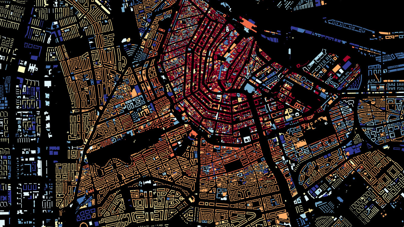
For the convenience of working with attributes, most tools have the ability to view data in a table. By the way, the attributes can be filled in advance, and can be calculated depending on any parameters of the object. The cover picture for this post is a building from OpenStreetMap in the center of Moscow, the color of which depends on the area of the house.
For vector geodata a large number of various formats have been developed, I will tell about the most popular ones:
The topic of cartography only seems to be specific, complex and confusing, now more and more different technologies and tools for “household cartography” are becoming available to ordinary users. I will try to give a brief overview of what I often use myself.
Quantum GIS (QGIS for short) is a true GIS in the classic sense. The product is cross-platform with open source and is an excellent alternative to expensive GIS packages.
Working with cartography, QGIS has become for me an indispensable tool for working with geodata. First of all, it is the ability to view, edit, import and export various formats, as well as the ability to analyze and work with samples of objects. For example, I often need to filter objects by some attribute or select them in a particular area.
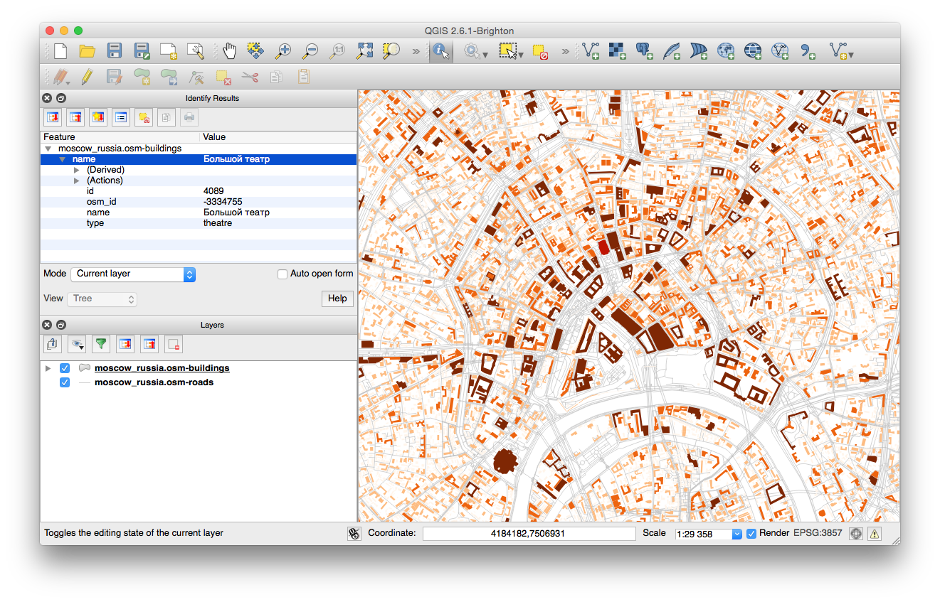
Quantum GIS 2.6.1: Building layer © OpenStreetMap with categories by area, view object attributes.
In addition, QGIS has the possibility of styling the map, exporting the image of the map for printing and publishing on the Internet. Quantum has a large community of developers interested in the development of the project, and today a large number of plug-ins have been developed, which significantly expand the functionality of the program.
CartoDB is an online service for working with your geodata, essentially hosting geodata with the ability to visualize and publish your data. The basic scheme of working with the service is this: you need to download data, set up their display and you can already use ready-made visualization - publish a link to the project or place a map on the site.
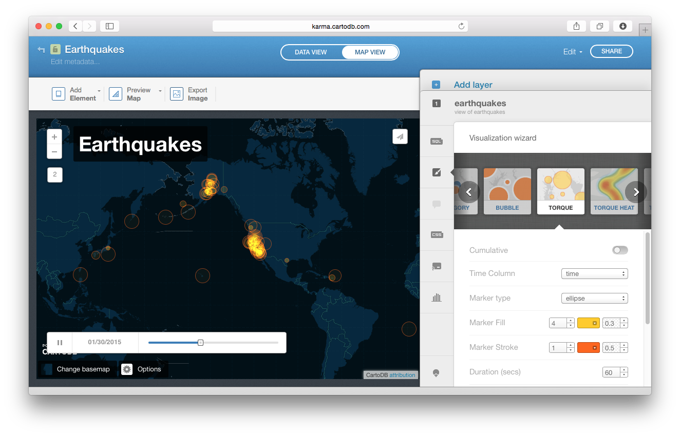
Setting up the visualization of earthquakes in CartoDB
In a screencast about CartoDB, I showed how to create animated visualization of earthquakes in a few minutes (occurred in 30 days, according to the USGS). CartoDB is very convenient, everything is done so that a user with any level of training can deal with the service, and for those who need help, the guys started the special site The Map Academy where they publish examples and screencasts, teaching how to work with the service, and in a blog The best map of the week created using this service is published. For more advanced features, CartoDB has an API.
In fact, the company MapBox , which developed TileMill *, has already run far ahead in these couple of years: a more functional product Design Studio has been released to customize maps, the online service also has rich capabilities for working with geodata, and a wide range of APIs are being offered for developers . The team regularly publishes impressive examples of visualization on their blog .
MapBox as CartoDB allows you to store your geodata in the cloud and publish them on various platforms. The main difference: CartoDB allows you to stylize and display them on top of a ready-made map, and in MapBox services you can customize both the map and the objects you would like to display on it. At the same time, in CartoDB you can connect tiles of the map prepared in MapBox.
The main idea of styling maps in TileMill is as follows: you add data by layers to the map, and you can stylize to customize the display style of the layer using CartoCSS, which is an appearance-setting language very similar to CSS. The pictures in the post about the data types, or the picture for the cover just prepared in TileMill, and if you understand and understand the principle once, it becomes convenient, quick and easy.
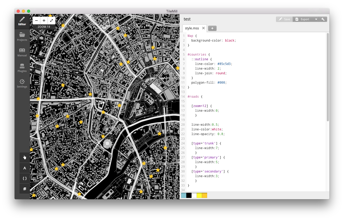
MapBox TileMill
The prepared map can be exported either as a static image or published to the cloud storage for further use of the map on the Internet or on mobile devices. Data storage in MapBox is a paid subscription service, while there is a free data plan, which is enough to familiarize yourself with the basic features of the service.
* - MacOS 10.10 Yosemite users need to download the dev version
The Maps API from Yandex is incredibly rich in various map features. For the first acquaintance with the JavaScript API, I recommend looking at the examples from the Sandbox - here you can quickly figure out how to add an interactive map to a page with various parameters, customize the behavior of the map, or add various objects.
In the screencast about the API, I downloaded information about bicycle rental stations in CSV format, converted this data into GeoJSON using QGIS and further visualized it using the Yandex.Map API in several ways:
By the way, it is possible to work with GeoJSON files in a slightly more elegant way, using ymaps.GeoQuery . For example, all loaded objects can be immediately added to the collection of geo- objects and the display parameters can be controlled for the entire data set.
The code for these examples can be found on GitHub in screencast materials .

Clustering of bike rental points
I used clustering and drawing circles in an experiment with the visualization of public toilets - the circles were very useful for me to show 5-minute radii, and the heat map module I used in the project statistics of the work of the Moscow bike rental .
Heat map in the draft statistics of Moscow Velobaykov
This, of course, is not all the features of the API. If you wish, you can build a rather interesting interactive project based on the Maps API. You can find interesting examples of visualizations in a blog , a developers club , a sandbox or in documentation .
The topic of cartography is endless, and the more I plunge into it, the more boundless this cartographic universe seems to me. Particularly attentive readers probably noticed that the story turned out about the data and about technology, and little was said about design in this story. We will go on this adventure later - for the time being I collect materials on the topic, structure and reflect on the collected.
So, the most important links for further immersion in the topic of visualization of geodata.
Screencast footage:
Links and working files for examples: github.com/minikarma/geotalk
To discuss the topic, I started a group on Facebook - “ Household Cartography ”. It will be great to find like-minded people and discuss similar topics there, share experiments and experience.
I plan to continue to replenish materials as far as possible and I will be happy with additions and wishes.
Preparing information for the course, I gathered up some set of links for self-study. I share with you. It will be great if you share something interesting with me in the comments.
Interesting examples:
It is great when large data sets about the world around us become visual, tangible. What attracts me in this is not a multitude of multi-colored lines or points on a dark background, but the opportunity to visually show and tell people around an interesting story, to make this data useful to people. I would like people who are keen on this topic to become more - to share knowledge with each other, to discuss ideas.
Houses in the center of Moscow in different colors depending on the area of the building.
Data: © OpenStreetMap Members
')
I have already talked about design in cartography , and I will continue to talk about it, because you can tell a lot about this. In this story, we are not talking about traditional cards.
I planned to collect what I know about cartographic visualization and tell about it. As a result, I got an online course "Visualization of geodata" - a series of mini-lectures on general principles and tools for working with geodata. For each part, I collected links to additional materials and examples of working files so that you can dive into the details and try to do something yourself. This post is compiled from course materials.
In fact, there is no fundamental difference between ordinary paper maps and new-fangled cartographic visualizations - the principle of any map: a visual representation of our knowledge of the real world.
I would single out a few characteristic components of a good cartographic visualization:
- data - a good visual history is based only on high-quality data;
- technologies - it just so happens that technologies simplify the processing of large amounts of data and make it possible, what could not be done manually;
- design - the process of creating, constructing a map and a conscious desire to make the map convenient and understandable for users.
By combining well-chosen data, technology and design, you can make a lot of interesting visualizations. I will show a few for example:
One of the clearest examples of good history with geodata is the visualization of all Dutch buildings by year of construction . In addition to entertainment, this map very clearly tells the story of how cities were built up.
All buildings in the Netherlands are stylized by year of construction
In addition to the visualization of the Dutch buildings there are similar projects: Brooklyn , New York , Moscow .
The guys from MapBox visualized 1 500 000 tracks RunKeeper - jogging, walking, riding a bike. Well seen popular places for walking. I even found bike routes from home to work in the summer.
1,500,000 RunKeeper tracks Map data: © OpenStreetMap Members
A good example in which data, technology and design were connected was Watercolor Maps from Stamen Design , a California-based design studio that has long and very successfully engaged in cartographic visualizations. In the case of this card, it is safe to say that we have a great art object.
© Watercolor Maps by Stamen . Map details: © OpenStreetMap Members
Geodata
No card can be a card if it does not contain data. The data receives the prefix "geo" at the moment when the information appears to be linked to the terrain and can be displayed on the map. Usually, an object is tied to a terrain using geographic coordinates — longitude and latitude, and where a three-dimensional representation is required, it is also indicated the height.
Geodata are divided into two main types: raster and vector.
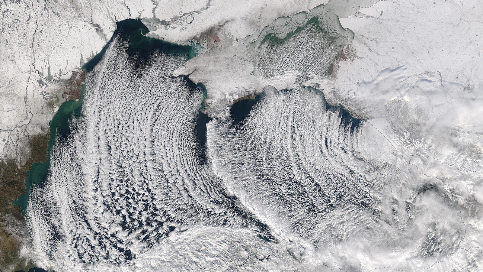
Raster geodata, as you might guess, these are regular georeferenced raster images. The most familiar example of all raster geodata is satellite imagery.
“Cloudy Streets” on the Black Sea, January 8, 2015 image © NASA Earth Observatory
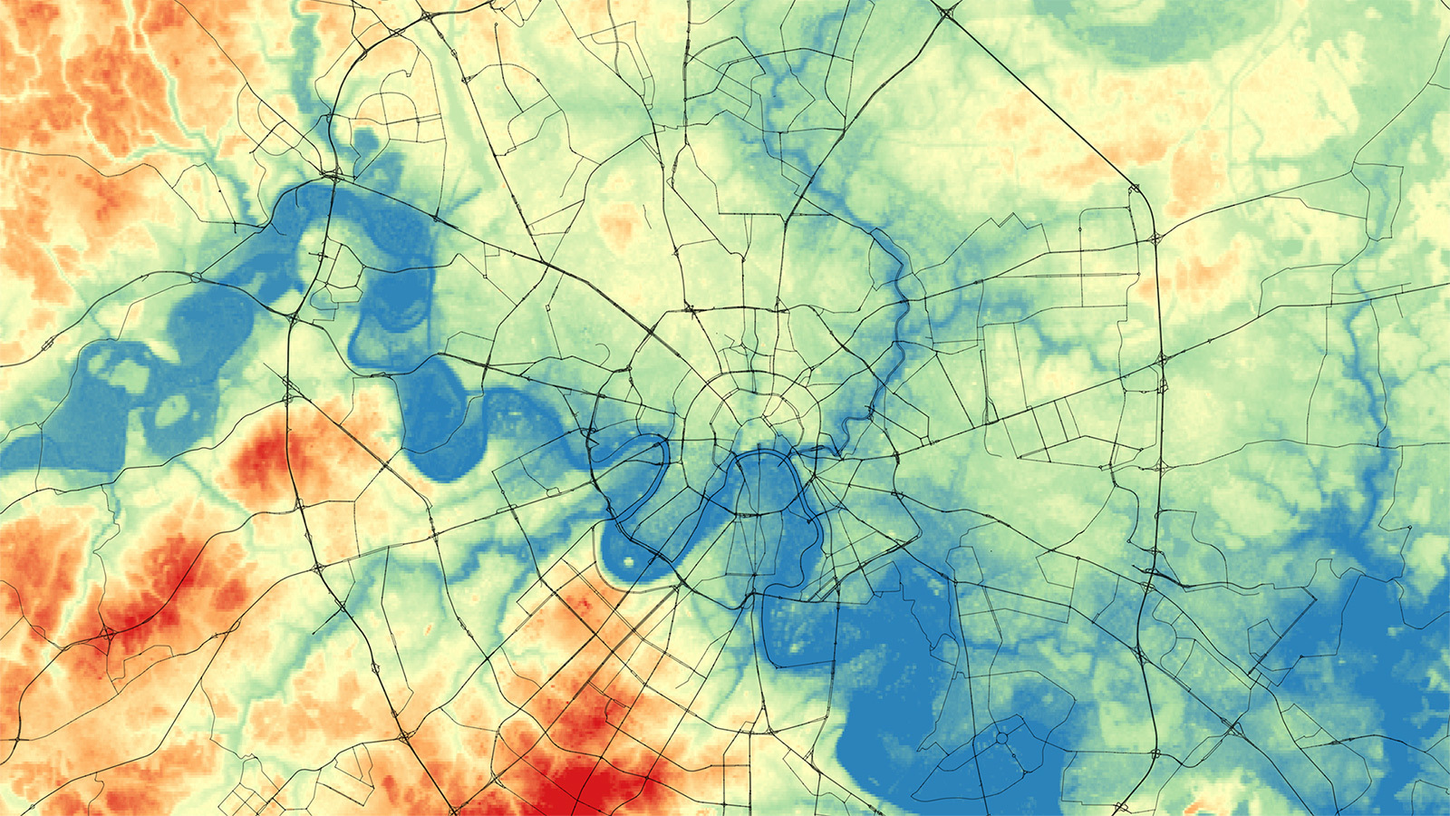
In addition to satellite images, the raster is used for digital elevation models, where each pixel of the image contains altitude information at this point in the area. For better recognition of parts of the city, I added a picture with a grid of main streets.
High-altitude model of Moscow © US Geological Survey , SRTM30, map data © Participants OpenStreetMap
Raster data may not be static images, technology allows you to embed video in an interactive map.
Vector geodata are described by a set or sequence of coordinates, geometry, and attribute values. There are three main types of vector data:
- points — a pair of coordinates is enough to specify a point object; an example of point objects on the map is POI (points of interest)
- lines — the line geometry is defined by a sequence of pairs of coordinates; the most familiar example of linear features is the road on the map
- polygons - coordinates of peaks are set, buildings - an example of polygonal geodata
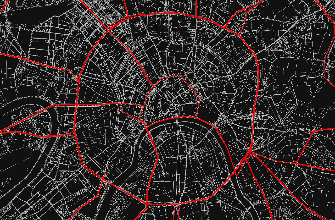
In addition to the type of geometry and location, attribute information is equally important. In vector data, each object may contain additional attribute information. Using these attributes, you can make selections of objects and apply various style rules to them. Using the example of a road layer from OpenStreetMap: using the “type” attribute, you can select roads with a value corresponding to “primary” and select them on the map with a special style.
An example of a layer of roads, according to the value of the “type” attribute, the main streets are highlighted. Map Data © Members OpenStreetMap
For the convenience of working with attributes, most tools have the ability to view data in a table. By the way, the attributes can be filled in advance, and can be calculated depending on any parameters of the object. The cover picture for this post is a building from OpenStreetMap in the center of Moscow, the color of which depends on the area of the house.
For vector geodata a large number of various formats have been developed, I will tell about the most popular ones:
- Shapefiles - initially this format was used only for Esri's GIS packages, but it turned out to be easy to use and became the standard for other geographic information applications;
- KML (Keyhole Markup Language) is an XML based markup language. For a very long time, Google Earth has been the most accessible tool for working with geodata on the Internet, therefore, KML files are widely used on the Internet and map services;
- GPX - text format, again based on XML, is mainly used extensively for recording GPS tracks. A sample GPX file can be exported from RunKeeper;
- GeoJSON is a text format, due to the convenience of using this format in JavaScript, it has recently been actively used for interactive cartography;
- CSV - due to its simplicity, the text format is a common format for storing geodata, the coordinates are indicated in the columns of the table and, as a rule, CSV is used for point objects.
Instruments
The topic of cartography only seems to be specific, complex and confusing, now more and more different technologies and tools for “household cartography” are becoming available to ordinary users. I will try to give a brief overview of what I often use myself.
QuantumGIS
Quantum GIS (QGIS for short) is a true GIS in the classic sense. The product is cross-platform with open source and is an excellent alternative to expensive GIS packages.
Working with cartography, QGIS has become for me an indispensable tool for working with geodata. First of all, it is the ability to view, edit, import and export various formats, as well as the ability to analyze and work with samples of objects. For example, I often need to filter objects by some attribute or select them in a particular area.
Quantum GIS 2.6.1: Building layer © OpenStreetMap with categories by area, view object attributes.
In addition, QGIS has the possibility of styling the map, exporting the image of the map for printing and publishing on the Internet. Quantum has a large community of developers interested in the development of the project, and today a large number of plug-ins have been developed, which significantly expand the functionality of the program.
Cartodb
CartoDB is an online service for working with your geodata, essentially hosting geodata with the ability to visualize and publish your data. The basic scheme of working with the service is this: you need to download data, set up their display and you can already use ready-made visualization - publish a link to the project or place a map on the site.
Setting up the visualization of earthquakes in CartoDB
In a screencast about CartoDB, I showed how to create animated visualization of earthquakes in a few minutes (occurred in 30 days, according to the USGS). CartoDB is very convenient, everything is done so that a user with any level of training can deal with the service, and for those who need help, the guys started the special site The Map Academy where they publish examples and screencasts, teaching how to work with the service, and in a blog The best map of the week created using this service is published. For more advanced features, CartoDB has an API.
Tilemill
In fact, the company MapBox , which developed TileMill *, has already run far ahead in these couple of years: a more functional product Design Studio has been released to customize maps, the online service also has rich capabilities for working with geodata, and a wide range of APIs are being offered for developers . The team regularly publishes impressive examples of visualization on their blog .
MapBox as CartoDB allows you to store your geodata in the cloud and publish them on various platforms. The main difference: CartoDB allows you to stylize and display them on top of a ready-made map, and in MapBox services you can customize both the map and the objects you would like to display on it. At the same time, in CartoDB you can connect tiles of the map prepared in MapBox.
The main idea of styling maps in TileMill is as follows: you add data by layers to the map, and you can stylize to customize the display style of the layer using CartoCSS, which is an appearance-setting language very similar to CSS. The pictures in the post about the data types, or the picture for the cover just prepared in TileMill, and if you understand and understand the principle once, it becomes convenient, quick and easy.
MapBox TileMill
The prepared map can be exported either as a static image or published to the cloud storage for further use of the map on the Internet or on mobile devices. Data storage in MapBox is a paid subscription service, while there is a free data plan, which is enough to familiarize yourself with the basic features of the service.
* - MacOS 10.10 Yosemite users need to download the dev version
Yandex.Maps API
The Maps API from Yandex is incredibly rich in various map features. For the first acquaintance with the JavaScript API, I recommend looking at the examples from the Sandbox - here you can quickly figure out how to add an interactive map to a page with various parameters, customize the behavior of the map, or add various objects.
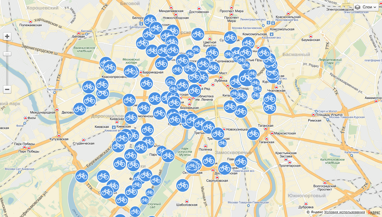
In the screencast about the API, I downloaded information about bicycle rental stations in CSV format, converted this data into GeoJSON using QGIS and further visualized it using the Yandex.Map API in several ways:
- simple labels with default style; in standard styles there are still a few presets ;
- tags with your badge , and since we have data on bike rental capacity, you can, for example, vary the size of the badge depending on the capacity of the bike station;
- label clustering , clustering is a very handy thing that groups closely spaced tags into special group tags;
- points of rental points can be displayed as circles with a radius specified in meters;
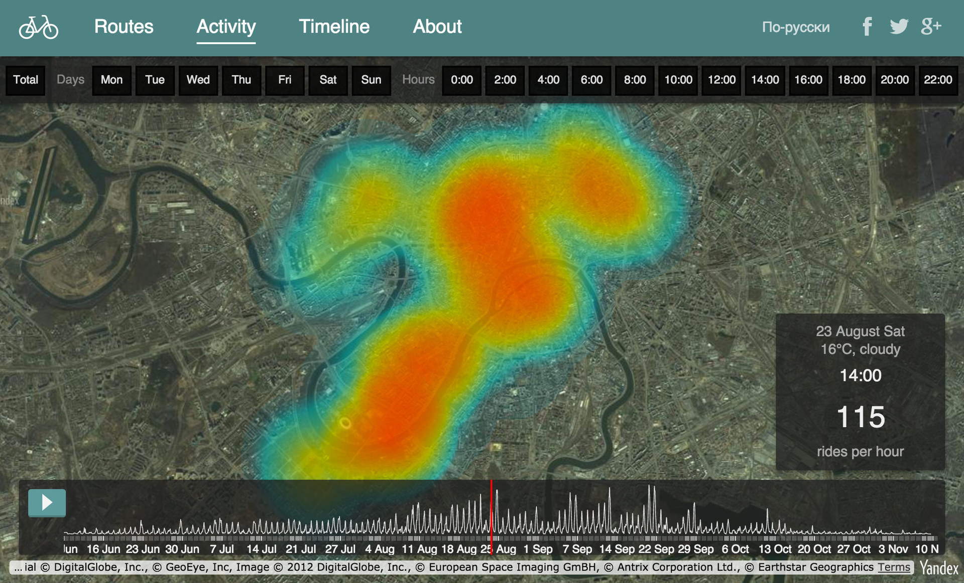
- using a special module, display bicycle rentals as heat maps ;
By the way, it is possible to work with GeoJSON files in a slightly more elegant way, using ymaps.GeoQuery . For example, all loaded objects can be immediately added to the collection of geo- objects and the display parameters can be controlled for the entire data set.
The code for these examples can be found on GitHub in screencast materials .
Clustering of bike rental points
I used clustering and drawing circles in an experiment with the visualization of public toilets - the circles were very useful for me to show 5-minute radii, and the heat map module I used in the project statistics of the work of the Moscow bike rental .
Heat map in the draft statistics of Moscow Velobaykov
This, of course, is not all the features of the API. If you wish, you can build a rather interesting interactive project based on the Maps API. You can find interesting examples of visualizations in a blog , a developers club , a sandbox or in documentation .
The topic of cartography is endless, and the more I plunge into it, the more boundless this cartographic universe seems to me. Particularly attentive readers probably noticed that the story turned out about the data and about technology, and little was said about design in this story. We will go on this adventure later - for the time being I collect materials on the topic, structure and reflect on the collected.
So, the most important links for further immersion in the topic of visualization of geodata.
Screencast footage:
- “ Introduction to the course and examples ” (2:25)
- " Types and formats of geodata " (3:50)
- " Quantum GIS " - an overview of the basic features (9:51)
- CartoDB - online data visualization service (11:38)
- “ MapBox TileMill ” - styled maps with CartoCSS (19:27)
- API Yandex.Maps - showing points on the map in JavaScript (10:25)
Links and working files for examples: github.com/minikarma/geotalk
To discuss the topic, I started a group on Facebook - “ Household Cartography ”. It will be great to find like-minded people and discuss similar topics there, share experiments and experience.
I plan to continue to replenish materials as far as possible and I will be happy with additions and wishes.
Links
Preparing information for the course, I gathered up some set of links for self-study. I share with you. It will be great if you share something interesting with me in the comments.
Interesting examples:
- Watercolor Maps
- Space Station Maps
- Burningmap stamen
- Pinterest maps
- Foursquare Pulse - visualization of user check-ins
- Map 6 billion tweets
- Animated weather visualization - Earth
- 1.5 million tracks from RunKeeper
- Amsterdam buildings by year
- Taxi in New York and another visualization
- Maps Mania (formerly Google Maps Mania)
- Mapbox Blog
- Blog CartoDB
- Esri Blog
- Axismaps
- Maptime.io
- Stamen design
- "A brief introduction to GIS" translation of the book "A Gentle Introduction to GIS" into Russian from GIS-lab
- Anatomy of the Web Map - a good presentation about the basics of web cartography
- QGIS Documentation in Russian.
- QGIS by Alan McConchie - Presentation
- QGIS tutorials - a large collection of examples on working with QGIS
- Maps and the Geospatial Revolution - course on Coursera pro cartography
- Geodesign: Change Your World - course about card design on Coursera, starts from July 2015
- From GPS and Google Maps to Spatial Computing (Coursera)
- Selection of links to tools for visualization of geodata from Ordnance Survey
- The presentation of Andy Kirk - about data visualization in general
- Links to open geodata and extracts of OSM data on the GIS-Lab website
- Metro Extracts - OpenStreetMap data for major cities from Mapzen
- Links to other projects where you can download data OpenStreetMap
- Portal of open data of the Government of Moscow
- data.gov.uk - UK
- data.gov - US public data
- NYC OpenData - a site with open data from the municipality of New York
- Useful resources for open data - a large collection of links to open data in Russia
- List of Russian public data open portals
- Geonames is an open database of geographical names (about 8 million objects).
- A good presentation about the main data types from the maptime.io community
- Geographic coordinates - Wikipedia article
- GIS formats - English-language article on Wikipedia
- JSON.org and GeoJSON.org and - more about JSON and GeoJSON formats
- GeoJSON specification - translation of the GeoJSON format specification on the site
Source: https://habr.com/ru/post/251755/
All Articles