RE: Is everything so simple with ellipsis?
Reading yesterday's article on dots , I caught myself thinking that I very disagree with one point in that article. Initially, I wanted to publish this idea of my own, as a comment in the same topic, but as I read more and more I had more and more of these very thoughts, so I decided to write a separate note on this subject.
To begin with, I will immediately state two things: first, in no case do not think that I am going to “drive over” to rumkin 'a - the author of the article. The article is very good, quality, and I would be glad if there were as many articles as possible on Habré. I just had some disagreements with the author, and I would like to share them with you.
Secondly, I am not a professional designer / coder, and I do not want to claim the title thereof. However, I have interest, and taste.
It can be said that I am just a connoisseur and lover of these arts, so everything that I will write further is based on my personal tastes and understandings, rather than on a rich professional experience.
Now that you know the above, get down to business.
')
In my opinion, combining dots with other punctuation marks is a terrible deformity and carelessness.
First, because the initially conceived visual effect of emptiness, stretching, incompleteness of intonation stupidly disappears:
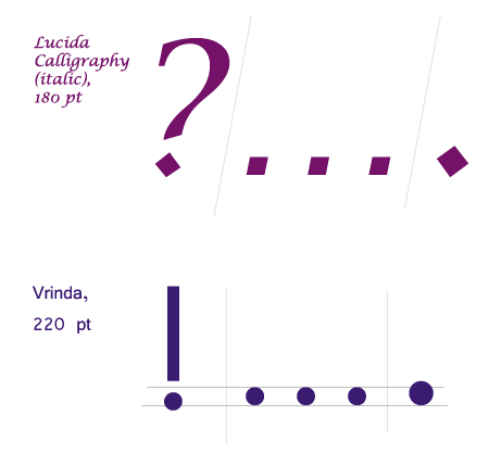
Secondly, because in most cases it just looks awfully ugly , because in many fonts (or certain outlines of them), the “independent point” is much larger than the “dot from the dot” (or from exclamation / question marks):
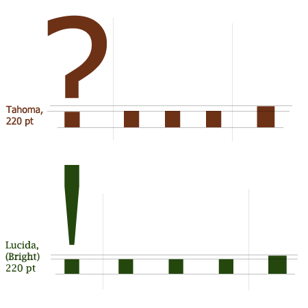
Why even go far, and something there to increase in Photoshop? In the italic type of the same Verdan, in which you are reading this note, the thickness of the “independent point” is visually perceived two or three times fatter than the “dot from the dot”: !….
And sometimes the points even come in different shapes and indents:
And even if the dots in all punctuation marks and all the outlines of a certain font look the same (as, for example, in Times New Roman), you still should not merge ellipsis and other signs together, because, besides “first,” who Someone may want to quote you, or copy the text to your blog (or do anything else with your text, after which the font is likely to change).
Well, what are you thinking again? ... [Pause]
[Gloomily] Well, what are you thinking again ...?
Eh, now here would have a swim in the river! ... [:)]
[Doomed] Ehh, you ...!
* After the sandycat comment , I decided to add examples, and register for each of them the emotions with which I would read the sentence depending on the sequence of use of ellipsis and interrogative / exclamation marks.
Both notations are correct, but, from the point of view of typography, and, in principle, of the same mathematics, periods of pure periodic fractions are better (more unambiguous) to put on brackets:
⅓ = 0, (3)
While non- periodic fractions it is convenient to end with ellipsis (that is, just like in the quote).
There is already a purely subjective opinion, but in my opinion square brackets are much more elegant with this:
The article was sharp, sharp, but although Pushkin, starting the publication of the journal, did not “strive to exacerbate journalistic polemics [...], Pushkin appreciated the article by Gogol and accepted it in the first issue, advising the author to soften the most sharp expressions” .
In addition, subconsciously, everyone understands that the square brackets are like an “editor's note”, a kind of “hint” to the reader, giving additional (optional) information. At the sight of <...> I unconsciously expect
To begin with, I will immediately state two things: first, in no case do not think that I am going to “drive over” to rumkin 'a - the author of the article. The article is very good, quality, and I would be glad if there were as many articles as possible on Habré. I just had some disagreements with the author, and I would like to share them with you.
Secondly, I am not a professional designer / coder, and I do not want to claim the title thereof. However, I have interest, and taste.
It can be said that I am just a connoisseur and lover of these arts, so everything that I will write further is based on my personal tastes and understandings, rather than on a rich professional experience.
Now that you know the above, get down to business.
')
Terms of use, paragraph 3
When ellipses, and question or exclamation marks are found in one place, they are combined using the point of the question or exclamation mark:
Well, what are you thinking again? ..
In my opinion, combining dots with other punctuation marks is a terrible deformity and carelessness.
First, because the initially conceived visual effect of emptiness, stretching, incompleteness of intonation stupidly disappears:
Yes, how much can you dig, at the end of something?!.Well, what is this "dots", eh?
Secondly, because in most cases it just looks awfully ugly , because in many fonts (or certain outlines of them), the “independent point” is much larger than the “dot from the dot” (or from exclamation / question marks):
Why even go far, and something there to increase in Photoshop? In the italic type of the same Verdan, in which you are reading this note, the thickness of the “independent point” is visually perceived two or three times fatter than the “dot from the dot”: !….
And sometimes the points even come in different shapes and indents:
And even if the dots in all punctuation marks and all the outlines of a certain font look the same (as, for example, in Times New Roman), you still should not merge ellipsis and other signs together, because, besides “first,” who Someone may want to quote you, or copy the text to your blog (or do anything else with your text, after which the font is likely to change).
Personally, I always prefer typing like this *:
Well, what are you thinking again? ... [Pause]
[Gloomily] Well, what are you thinking again ...?
Eh, now here would have a swim in the river! ... [:)]
[Doomed] Ehh, you ...!
* After the sandycat comment , I decided to add examples, and register for each of them the emotions with which I would read the sentence depending on the sequence of use of ellipsis and interrogative / exclamation marks.
And now a couple of comments are not about dots :)
Terms of use (in mathematics), paragraph 8
To record periodicals or transcendental numbers:
1/3 = 0.33333333 ...
Pi = 3.14159 ...
Both notations are correct, but, from the point of view of typography, and, in principle, of the same mathematics, periods of pure periodic fractions are better (more unambiguous) to put on brackets:
⅓ = 0, (3)
While non- periodic fractions it is convenient to end with ellipsis (that is, just like in the quote).
Terms of use (in quotations in the form of direct speech), paragraph 12
If quoting cut out large parts of the text or whole sentences, it is customary to surround the ellipsis with angle brackets:
The article was sharp, sharp, but although Pushkin, starting the publication of the journal, did not “strive to exacerbate journalistic polemics <...>, Pushkin appreciated the article by Gogol and took it in the first issue, advising the author to soften the most sharp expressions”
There is already a purely subjective opinion, but in my opinion square brackets are much more elegant with this:
The article was sharp, sharp, but although Pushkin, starting the publication of the journal, did not “strive to exacerbate journalistic polemics [...], Pushkin appreciated the article by Gogol and accepted it in the first issue, advising the author to soften the most sharp expressions” .
In addition, subconsciously, everyone understands that the square brackets are like an “editor's note”, a kind of “hint” to the reader, giving additional (optional) information. At the sight of <...> I unconsciously expect
</…> at the end of the quote :)Source: https://habr.com/ru/post/25171/
All Articles