Interfaces in the real world (more examples)
A conventional hot and cold water faucet is very tough to the user. Ideally, its interface solves three main tasks:
Here you can find out a couple of your familiar cranes:

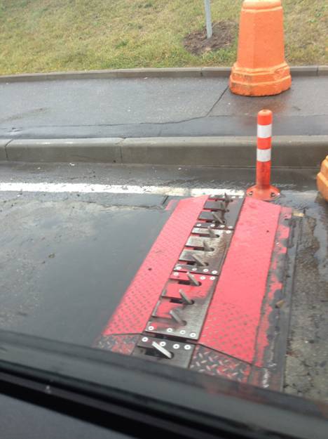
And this is a very scary car diode, only forward on it:
')
So, if you are interested in the continuation of the interfaces in the real world - go to the post. Caution traffic .
Here is a prototype, roughly corresponding to the basic task of washing hands in a public place:

This is how it might look:

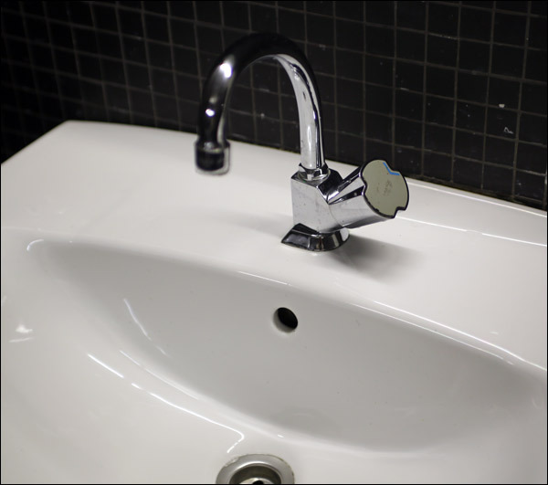
But let's first look at the standard faucet. Everything is quite simple with him - one valve determines the water pressure, the stand is fixed; of temperatures, only one preset value:
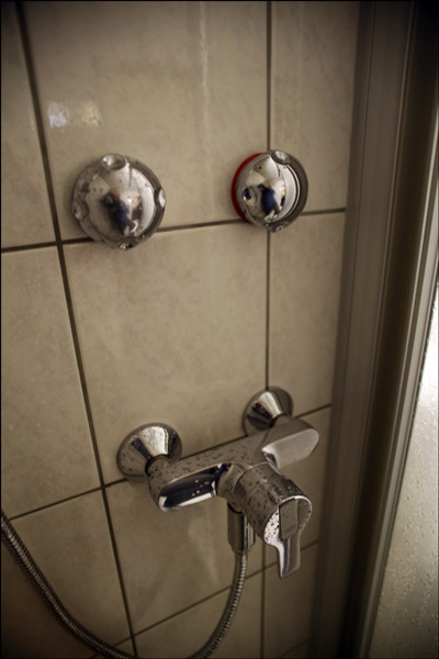
Here is his more complex, but still perfectly familiar to us older brother:

Again, there is no single universal interface of the crane and, it seems, it is not needed. Why? Yes, because the universal interface is the way of the object, which is useful to you when there is nothing better than specialized for the task. Here is an example:
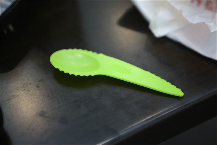
Logically, this thing you can eat soup, share a meatball and even cut something. But ordinary forks, spoons and knives, although less functional, do better. The classic case of the “less is more” principle.
It would seem that the simplest and predictable interface of the faucet is two valves: with hot and cold water. The user adjusts the pressure separately for each and rejoices. But not everything is so simple, and this interface will not be able to become a common standard. Even within the same apartment, it is often convenient to use several faucet interfaces: for fine adjustment in the bathroom, for quick one-handed operation in the kitchen, for typing water into the cup from the cooler, etc.
The disadvantages of the basic two-way version are:
- Not the fastest to launch or requires two hands to quickly start (“one-armed gangster” is much more convenient, for example, to wash the dishes).
- It is not clear without habit, where is cold, and where is hot water.
- It is difficult to regulate at the same time And the pressure, And the temperature. What gives rise to such tricks for precise adjustment:
In Soviet apartments, the same role is played by cranes at the riser: you can “press” two to three times hot, if you have very difficult adjustment on it
A crane with one lever moving in two axes is already a bit of an engineering interface: it negates the user's past experience, but if you learn to use it, it will be convenient for solving a specific task. With the "one-armed bandit" it is more difficult to get into the right temperature-pressure, but you can get an acceptable result in one motion. As such a tap comes into use, the interest turns from engineering to normal user.
The next level of control complexity is switching to a shower. If you have never washed your head right under the tap, then either you are very inquisitive, or you are not in a hurry, or travel a little. In my memory a couple of times only reverse engineering helped to guess how the switch works. For example, the classic UI-error - the assumption that the user first selects the mode, and then begins to regulate the pressure and temperature. And at head, the mode selection element is blocked due to the water pressure being generated. Familiar? Now imagine how much it might cost a guest to hysteria from the other end of the planet in our hotel.
And there is such a wonderful tradition - to make mistakes with color coding. Red is hot, blue is cold. But in the usual case, you need to open the faucet and wait to make sure that this is true. By the way, I thought that this was only a Russian peculiarity, but no - I met a whole flock of such cranes in South Africa. Here is a solution in a house where guests are often:

It may be thought that the traditionally more used (or safer) valve is inserted under the user's working hand (cold on the right in European countries), but this is not always the case. Until you try it, you won't know. By the way, the same with salt-pepper shakers. The fact is that someone manages to make them opaque. The default is simple: if you are in a European country, then the pepper is where there are fewer holes. If in Asia, where there are more holes. If you are in Russia, salt can be in both.

But with them it is simple, they can be glass
Let's continue about cranes. Complementing the best features of the interfaces, it is worth noting the lag in temperature adjustment. A number of special systems of hot water, found in Khrushchev, allows you to get a lag of up to 10 (!) Seconds. In conjunction with the millimeter adjustment, we probably get first a scalded user, and then - fix the valve tightly in one position with a blue tape.
The traditional problem of learning the interface is IR sensors on cranes. For 10 minutes of monitoring such a crane in a more or less popular airport, you can definitely meet people who fail to launch it. I am a clear representative of plumbers who complain to each other on their Shvabrashvabr about stupid users.
There are taps that have two valves one above the other - one to adjust the head, the other to adjust the temperature. This means that you can remember the temperature the next time (the ball valve allows you to do this approximately).
In general, I am surprised at how people do not go crazy, trying to turn on the faucet.

The task "to turn on the steam cooker for 5 minutes" was solved by a three (system programmer, engineer and system architect) for 10 minutes. At first they used logic, then they downloaded the instructions, and then the hostess came up.
The main lesson of cranes - simple interfaces are often more functional. Very, very simplifying, let's imagine a situation where:
The brain (in general) tries to save our energy, so if the user finds sufficient N to solve his task, he does not try to increase it and K. Hence the chains like “search Yandex in Google, and in Yandex find the address of the site and click on the first link ". Works? Works. Need to change? No, because it works the same.
The more complex the system, the greater the cost of expanding the K set — that is, studying the operation of the interface. But there are visual interfaces, but there are - not very. Therefore, the problem is solved more likely if the interface:
The ideal situation is when N = K = M = 1. For example, a button with a unique action. The doorbell works just like that (if, of course, there is no similar button for starting oxygen-displacing gas at the data center machine: some people had this error about 800 thousand rubles). One control - one action. One item - one function.
Naturally, in practice, everything is a little more complicated. The most mocking situation is the buttons of an electronic clock and some microwaves. At the electric kettle M = 1 - pressed the button, got the result. And for microwaves, steam boilers and clocks, the same hardware button, depending on the modal state of the system (mode), can perform different functions. Plus, these same buttons can drive you crazy with short taps, long, double, long clutches for 5-6 seconds and so on.
In fact, this means that the user will learn K = 1 to solve his task and will no longer expand the set of possible actions K. Does the microwave have 40 different modes (M = 40) and are controlled by a button, two twisters and a toggle switch? Ok, we have a retiree user, and for him N = K = 1. The same stove with two buttons “warm up” and “defrost” to the pensioner is clearer (N = K = 2) and therefore has exactly twice as many functions for it. Surprise ! With 40 possible functions , the stove turned out to be more functional , which has only 2 functions.
Have you seen elevators? They have a "stop" button specifically for blocking at the moment when you need to drag oversize. This is in the instructions in the elevator. But, of course, the issue of the oversize importation is solved by a regular user, not at all:

And since we are talking about elevators: you need to go to the 4th floor, and in the elevator there are buttons -2, -1, 1, 2, 3, 4, 5 - where to press?
Once again - the user will not use all the possibilities, but only those that he understood. The fewer the functions, the easier it is to understand and quickly type in the extensive K, and then choose N. easily from it. Each choice is pain, and the brain will by all means protect the user from this waste of energy.
Another simplification principle is insurance. For example, we reduce the functionality of medical scissors in comparison with the usual good universal knife, but we know that with shaking hands a person with a first aid kit will still cut the bandage, and not cut off the bandage and a pair of fingers.
But the hangers with cropped functionality, but with an important insurance against accidental or intentional removal from the room:
Something similar to IE6, right? Pre-installed in the cabinet and not to demolish.
In general, yes, but minimalist is not always easier. Here is an example about ordering coffee:
In general, there is a choice between “I want coffee” and “I do not want coffee”. But there is not enough information here. For example, in the option “[x] And I also want to subscribe to your spam after ordering” has everything you need to confidently remove the checkbox. And here - suddenly if I take off, will it be tea? Or nothing will happen? Or juice?
A good interface gives an understanding of what will happen after making the choice BEFORE its actual performance. Here, compare:
Redundancy does not always harm. Sometimes it's damn useful. Sometimes it gives rise to the feeling that the choice is made correctly.
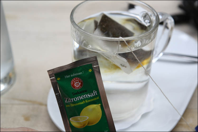
Simplifying the tap is a constantly on stream (in some places it is actually used). In addition, the device can only be preloaded with warm water (in theory, in the same public places solves most of the problems).
Simplification of redundancy in the example with a crane is when the control has a “temperature optimum point” —the user turns it to this point with a slight movement of his hand, and then he can continue to twist after some resistance and a click. This is a good default setting (adjustable, but pre-installed at about +40 degrees).
It happens that redundancy works on some other function that the user doesn’t even have to guess about. For an example from the real world, again, slippers. This element is considered by many to be very decorative:

Next time you catch a table leg in the dark with your little finger, remember this photo.
Here is another redundant interface - paper memory cells, they are also disposable checkboxes. When there is a rush hour and you need to quickly distinguish products in identical packages, this will be very useful:

There is also a borderline case - a combination of engineering interface and minimalist. As a rule, it is something that disguises itself as a very simple thing, but with a certain amount of training it can use it a little differently. The most vivid example is the “turn off computer” button as a user interface and hotkeys for the same as engineering (and, yes, an example of a mode error is to write sudo halt in the wrong window, which is why the physical button is perfectly safe).
Here is a miracle thing that has a minimal engineering interface and is backward compatible with basic user experience:
In a transparent bottle, it is like a cork, but a particularly cunning user can unscrew it with her hands.
Quite often the interface is combined with the architectural device of the system. For example, the tap may even be without hand controls, but with pedals, because the pedals help pump water. Here "incomprehensible-inconvenient" is less important than the very possibility of receiving a stream. It happens that the interfaces work contrary to the physical design of the device, or they take it into account. Here, look at how wonderful the embodiment of the chairs for the crowded train (to make you understand, "crowded" in the local sense is when three are standing):
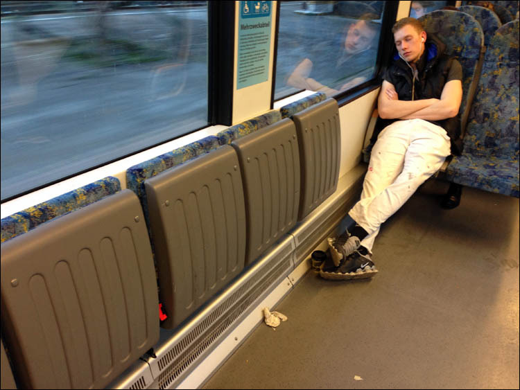
Seats in the aisle, which open up when needed. Until there is a need for them - they are part of the interior. As soon as it becomes difficult to stand, the user will turn on the built-in brain, and he will fold one. They are closed on a spring. UPD: in the comments suggest that this is a solution for placing disabled people in a wheelchair.
A good interface takes into account human physiology and anatomy. On phones, for example, a familiar example for sure is the controls that are easy to reach with your thumb with one-handed grip. The most frequent should be where it is more convenient to poke. Just look at the pictures and see how the interfaces increase the convenience of familiar tasks:
This soap is convenient to take.
A plate with a grater is not uncommon for national cuisines, where there are many spices
Sachet 2.0, which is not necessary to break (but still possible)

As it is: and at the same time hands will be clean
The same interface task by another means
Bench gently straightens your back
The floor of the subway station with an inconspicuous slope: people do not notice, but water, slush and debris do not accumulate
Finally, I will show one of the most complex consumer interfaces, creating a sea of problems on a level surface for people every day. Here he is:

You need to remember the number above the product, then bring the product and make sure that the number matches. Apples, potatoes, tomatoes, cucumbers, onions ... oh, why aren't there 100? Aah, it's fruits, and I need vegetables. So ... yeah, now I forgot, 825 or 852? Well, to hell with him, we find so. I wonder if a melon is a fruit or a vegetable? Now the tomatoes. Ops, everything is painted the same here, and mine are not similar to any of the drawings. And this is Baku? How to find them? Damn, it seems they are sorted alphabetically ... but, no, also in groups by type of vegetable!
Hell, right? Different types of sorting, different pictures, hardware errors (the tape ran out) - all this is tormenting the users coolly. Recently, I saw the final chord - the pensioner repeatedly svayp over this screen, trying to turn the vegetables further. Because the arrow below doesn’t look like a button to her, and the tablet from her grandson taught her what to do when something is expected on the next screen.
One more thing. All the same, all this garbage is weighed at the checkout. Why? Because suddenly the user will weigh three bananas, and then put two more to them?
Do you know how to make this interface easier? It's simple - throw the nafig terminal out of the room, put in place the usual switch scales (so that users know how much they take - sometimes it is needed) and just weigh at the checkout.
Now I propose to guess what problems are solved on these pictures, and they are good or bad:
UPD : I sign them, because you can already get lost in the comments.
1. This is a board game training: on top of that is a phone that tells someone what to do and why, and why. He will bring the game to move 5 and continue to invite players to continue on their own, already knowing how to play.
2. The official noted the difference between the already paid check and the pre-order: “two such glasses and another 2.20 euros”
3. Traditional sorting in Russia, as you can see from the contents of containers, does not work. More familiar, for example, "glass", "plastic and paper", "the rest."
4. Lodging nastolki - upon delivery, you will have a ready-made layout on the table. Pay attention to the many intermediate levels of laying on this picture. The important part is to make a finger notch.

This is a "Holiday in Cuba: Pirate Party" - a set for a children's party. It is a screenwriter, and the script is pushed into pieces by the box. In general, a very funny decision, here you can see what and how.
6. This is a key ring for those who lose keys in an apartment, and at the same time - the development of a good habit of sticking keys in the socket. Very strange thing.
PS And this is another similar post, just another .
- Allows you to select the water pressure.
- Allows you to select the water temperature.
- And protects the system from water hammer.
Here you can find out a couple of your familiar cranes:
And this is a very scary car diode, only forward on it:
')
So, if you are interested in the continuation of the interfaces in the real world - go to the post. Caution traffic .
Here is a prototype, roughly corresponding to the basic task of washing hands in a public place:
This is how it might look:
But let's first look at the standard faucet. Everything is quite simple with him - one valve determines the water pressure, the stand is fixed; of temperatures, only one preset value:
Here is his more complex, but still perfectly familiar to us older brother:
Again, there is no single universal interface of the crane and, it seems, it is not needed. Why? Yes, because the universal interface is the way of the object, which is useful to you when there is nothing better than specialized for the task. Here is an example:
Logically, this thing you can eat soup, share a meatball and even cut something. But ordinary forks, spoons and knives, although less functional, do better. The classic case of the “less is more” principle.
It would seem that the simplest and predictable interface of the faucet is two valves: with hot and cold water. The user adjusts the pressure separately for each and rejoices. But not everything is so simple, and this interface will not be able to become a common standard. Even within the same apartment, it is often convenient to use several faucet interfaces: for fine adjustment in the bathroom, for quick one-handed operation in the kitchen, for typing water into the cup from the cooler, etc.
The disadvantages of the basic two-way version are:
- Not the fastest to launch or requires two hands to quickly start (“one-armed gangster” is much more convenient, for example, to wash the dishes).
- It is not clear without habit, where is cold, and where is hot water.
- It is difficult to regulate at the same time And the pressure, And the temperature. What gives rise to such tricks for precise adjustment:
In Soviet apartments, the same role is played by cranes at the riser: you can “press” two to three times hot, if you have very difficult adjustment on it
A crane with one lever moving in two axes is already a bit of an engineering interface: it negates the user's past experience, but if you learn to use it, it will be convenient for solving a specific task. With the "one-armed bandit" it is more difficult to get into the right temperature-pressure, but you can get an acceptable result in one motion. As such a tap comes into use, the interest turns from engineering to normal user.
The next level of control complexity is switching to a shower. If you have never washed your head right under the tap, then either you are very inquisitive, or you are not in a hurry, or travel a little. In my memory a couple of times only reverse engineering helped to guess how the switch works. For example, the classic UI-error - the assumption that the user first selects the mode, and then begins to regulate the pressure and temperature. And at head, the mode selection element is blocked due to the water pressure being generated. Familiar? Now imagine how much it might cost a guest to hysteria from the other end of the planet in our hotel.
And there is such a wonderful tradition - to make mistakes with color coding. Red is hot, blue is cold. But in the usual case, you need to open the faucet and wait to make sure that this is true. By the way, I thought that this was only a Russian peculiarity, but no - I met a whole flock of such cranes in South Africa. Here is a solution in a house where guests are often:
It may be thought that the traditionally more used (or safer) valve is inserted under the user's working hand (cold on the right in European countries), but this is not always the case. Until you try it, you won't know. By the way, the same with salt-pepper shakers. The fact is that someone manages to make them opaque. The default is simple: if you are in a European country, then the pepper is where there are fewer holes. If in Asia, where there are more holes. If you are in Russia, salt can be in both.
But with them it is simple, they can be glass
Let's continue about cranes. Complementing the best features of the interfaces, it is worth noting the lag in temperature adjustment. A number of special systems of hot water, found in Khrushchev, allows you to get a lag of up to 10 (!) Seconds. In conjunction with the millimeter adjustment, we probably get first a scalded user, and then - fix the valve tightly in one position with a blue tape.
The traditional problem of learning the interface is IR sensors on cranes. For 10 minutes of monitoring such a crane in a more or less popular airport, you can definitely meet people who fail to launch it. I am a clear representative of plumbers who complain to each other on their Shvabrashvabr about stupid users.
There are taps that have two valves one above the other - one to adjust the head, the other to adjust the temperature. This means that you can remember the temperature the next time (the ball valve allows you to do this approximately).
In general, I am surprised at how people do not go crazy, trying to turn on the faucet.
Cognitive resilience
The task "to turn on the steam cooker for 5 minutes" was solved by a three (system programmer, engineer and system architect) for 10 minutes. At first they used logic, then they downloaded the instructions, and then the hostess came up.
The main lesson of cranes - simple interfaces are often more functional. Very, very simplifying, let's imagine a situation where:
- The system contains a possible set of functions M, each of which determines a particular state of the system.
- The user as a whole is able to understand K of them at the current moment (K ≤ M). The value of K depends on the cognitive resilience of the system and the abilities, state, mood of the user, as well as his free time and motivation to understand.
- From what the user understands, he can use N functions to solve his problem. N ≤ K ≤ M.
The brain (in general) tries to save our energy, so if the user finds sufficient N to solve his task, he does not try to increase it and K. Hence the chains like “search Yandex in Google, and in Yandex find the address of the site and click on the first link ". Works? Works. Need to change? No, because it works the same.
The more complex the system, the greater the cost of expanding the K set — that is, studying the operation of the interface. But there are visual interfaces, but there are - not very. Therefore, the problem is solved more likely if the interface:
- It has an easily perceived set M, that is, solves the necessary minimum of problems.
- It is clear and understandable (for example, it is based on past user experience, understandable metaphors or principles of Affordants), that is, it allows you to quickly increase K.
- This requires a minimum of N actions to solve the problem.
The ideal situation is when N = K = M = 1. For example, a button with a unique action. The doorbell works just like that (if, of course, there is no similar button for starting oxygen-displacing gas at the data center machine: some people had this error about 800 thousand rubles). One control - one action. One item - one function.
Naturally, in practice, everything is a little more complicated. The most mocking situation is the buttons of an electronic clock and some microwaves. At the electric kettle M = 1 - pressed the button, got the result. And for microwaves, steam boilers and clocks, the same hardware button, depending on the modal state of the system (mode), can perform different functions. Plus, these same buttons can drive you crazy with short taps, long, double, long clutches for 5-6 seconds and so on.
In fact, this means that the user will learn K = 1 to solve his task and will no longer expand the set of possible actions K. Does the microwave have 40 different modes (M = 40) and are controlled by a button, two twisters and a toggle switch? Ok, we have a retiree user, and for him N = K = 1. The same stove with two buttons “warm up” and “defrost” to the pensioner is clearer (N = K = 2) and therefore has exactly twice as many functions for it. Surprise ! With 40 possible functions , the stove turned out to be more functional , which has only 2 functions.
Have you seen elevators? They have a "stop" button specifically for blocking at the moment when you need to drag oversize. This is in the instructions in the elevator. But, of course, the issue of the oversize importation is solved by a regular user, not at all:
And since we are talking about elevators: you need to go to the 4th floor, and in the elevator there are buttons -2, -1, 1, 2, 3, 4, 5 - where to press?
Once again - the user will not use all the possibilities, but only those that he understood. The fewer the functions, the easier it is to understand and quickly type in the extensive K, and then choose N. easily from it. Each choice is pain, and the brain will by all means protect the user from this waste of energy.
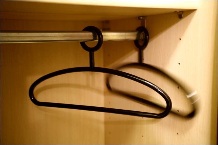
Another simplification principle is insurance. For example, we reduce the functionality of medical scissors in comparison with the usual good universal knife, but we know that with shaking hands a person with a first aid kit will still cut the bandage, and not cut off the bandage and a pair of fingers.
But the hangers with cropped functionality, but with an important insurance against accidental or intentional removal from the room:
Something similar to IE6, right? Pre-installed in the cabinet and not to demolish.
But does this mean that the interface should be minimalist?
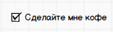
In general, yes, but minimalist is not always easier. Here is an example about ordering coffee:
In general, there is a choice between “I want coffee” and “I do not want coffee”. But there is not enough information here. For example, in the option “[x] And I also want to subscribe to your spam after ordering” has everything you need to confidently remove the checkbox. And here - suddenly if I take off, will it be tea? Or nothing will happen? Or juice?
A good interface gives an understanding of what will happen after making the choice BEFORE its actual performance. Here, compare:
Redundancy does not always harm. Sometimes it's damn useful. Sometimes it gives rise to the feeling that the choice is made correctly.
Simplifying the tap is a constantly on stream (in some places it is actually used). In addition, the device can only be preloaded with warm water (in theory, in the same public places solves most of the problems).
Simplification of redundancy in the example with a crane is when the control has a “temperature optimum point” —the user turns it to this point with a slight movement of his hand, and then he can continue to twist after some resistance and a click. This is a good default setting (adjustable, but pre-installed at about +40 degrees).
It happens that redundancy works on some other function that the user doesn’t even have to guess about. For an example from the real world, again, slippers. This element is considered by many to be very decorative:
Next time you catch a table leg in the dark with your little finger, remember this photo.
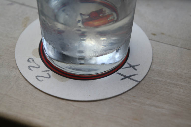
Here is another redundant interface - paper memory cells, they are also disposable checkboxes. When there is a rush hour and you need to quickly distinguish products in identical packages, this will be very useful:
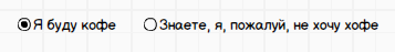
There is also a borderline case - a combination of engineering interface and minimalist. As a rule, it is something that disguises itself as a very simple thing, but with a certain amount of training it can use it a little differently. The most vivid example is the “turn off computer” button as a user interface and hotkeys for the same as engineering (and, yes, an example of a mode error is to write sudo halt in the wrong window, which is why the physical button is perfectly safe).
Here is a miracle thing that has a minimal engineering interface and is backward compatible with basic user experience:
In a transparent bottle, it is like a cork, but a particularly cunning user can unscrew it with her hands.
Quite often the interface is combined with the architectural device of the system. For example, the tap may even be without hand controls, but with pedals, because the pedals help pump water. Here "incomprehensible-inconvenient" is less important than the very possibility of receiving a stream. It happens that the interfaces work contrary to the physical design of the device, or they take it into account. Here, look at how wonderful the embodiment of the chairs for the crowded train (to make you understand, "crowded" in the local sense is when three are standing):
Seats in the aisle, which open up when needed. Until there is a need for them - they are part of the interior. As soon as it becomes difficult to stand, the user will turn on the built-in brain, and he will fold one. They are closed on a spring. UPD: in the comments suggest that this is a solution for placing disabled people in a wheelchair.
More examples
A good interface takes into account human physiology and anatomy. On phones, for example, a familiar example for sure is the controls that are easy to reach with your thumb with one-handed grip. The most frequent should be where it is more convenient to poke. Just look at the pictures and see how the interfaces increase the convenience of familiar tasks:
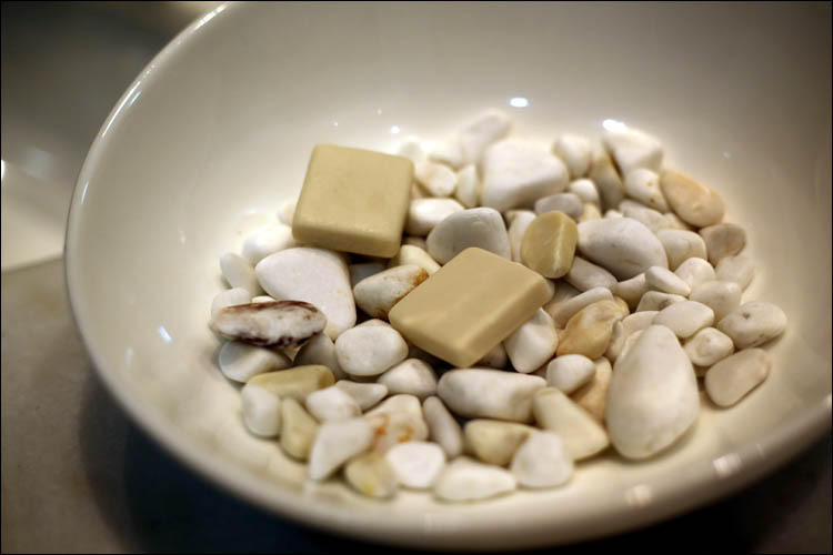
This soap is convenient to take.
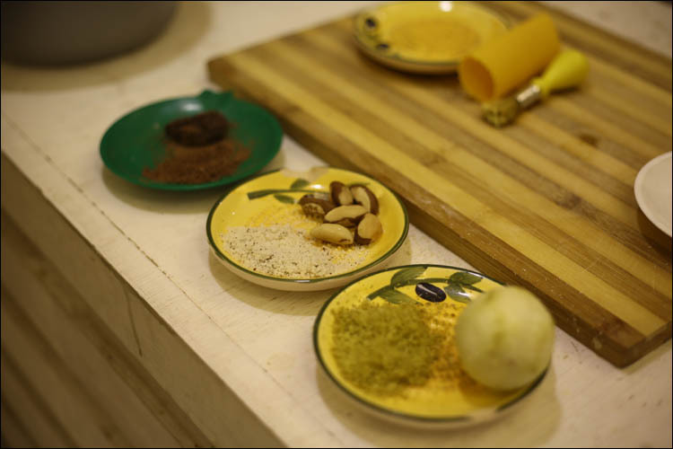
A plate with a grater is not uncommon for national cuisines, where there are many spices
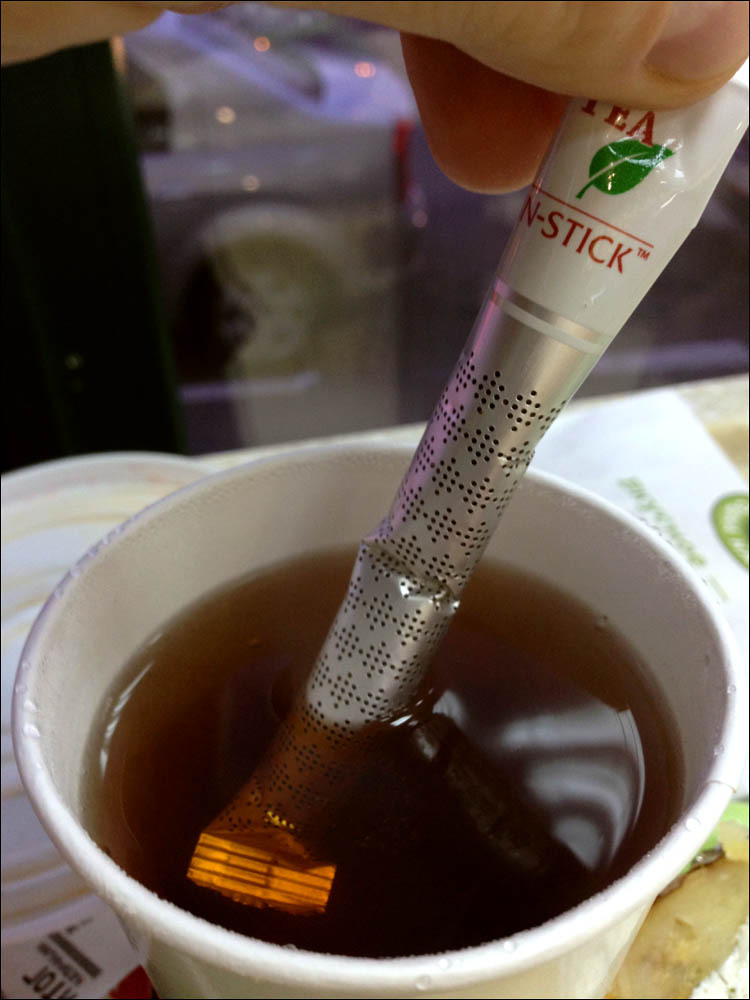
Sachet 2.0, which is not necessary to break (but still possible)
As it is: and at the same time hands will be clean
The same interface task by another means
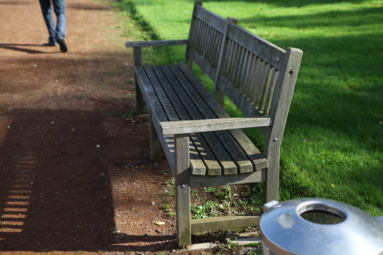
Bench gently straightens your back
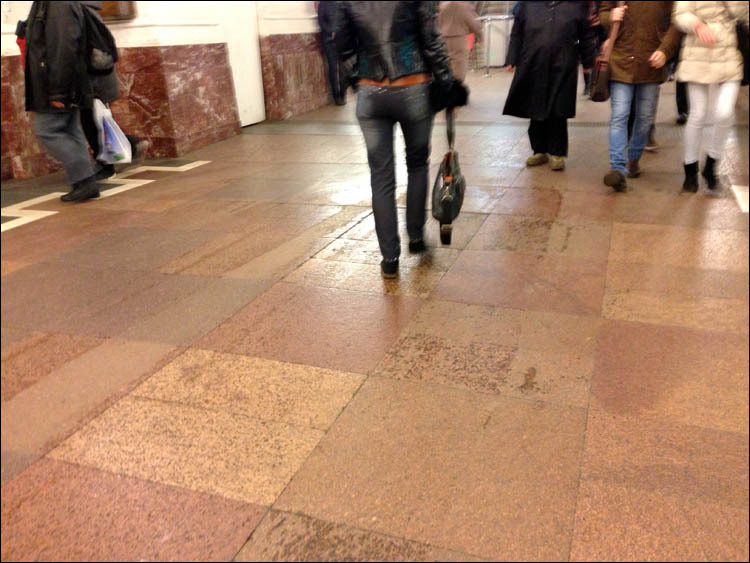
The floor of the subway station with an inconspicuous slope: people do not notice, but water, slush and debris do not accumulate
Finally, I will show one of the most complex consumer interfaces, creating a sea of problems on a level surface for people every day. Here he is:
You need to remember the number above the product, then bring the product and make sure that the number matches. Apples, potatoes, tomatoes, cucumbers, onions ... oh, why aren't there 100? Aah, it's fruits, and I need vegetables. So ... yeah, now I forgot, 825 or 852? Well, to hell with him, we find so. I wonder if a melon is a fruit or a vegetable? Now the tomatoes. Ops, everything is painted the same here, and mine are not similar to any of the drawings. And this is Baku? How to find them? Damn, it seems they are sorted alphabetically ... but, no, also in groups by type of vegetable!
Hell, right? Different types of sorting, different pictures, hardware errors (the tape ran out) - all this is tormenting the users coolly. Recently, I saw the final chord - the pensioner repeatedly svayp over this screen, trying to turn the vegetables further. Because the arrow below doesn’t look like a button to her, and the tablet from her grandson taught her what to do when something is expected on the next screen.
One more thing. All the same, all this garbage is weighed at the checkout. Why? Because suddenly the user will weigh three bananas, and then put two more to them?
Do you know how to make this interface easier? It's simple - throw the nafig terminal out of the room, put in place the usual switch scales (so that users know how much they take - sometimes it is needed) and just weigh at the checkout.
Now I propose to guess what problems are solved on these pictures, and they are good or bad:
UPD : I sign them, because you can already get lost in the comments.
1. This is a board game training: on top of that is a phone that tells someone what to do and why, and why. He will bring the game to move 5 and continue to invite players to continue on their own, already knowing how to play.
2. The official noted the difference between the already paid check and the pre-order: “two such glasses and another 2.20 euros”
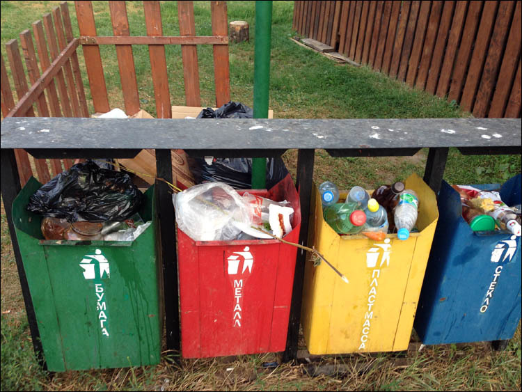
3. Traditional sorting in Russia, as you can see from the contents of containers, does not work. More familiar, for example, "glass", "plastic and paper", "the rest."
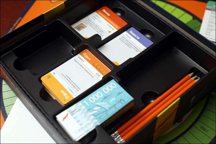
4. Lodging nastolki - upon delivery, you will have a ready-made layout on the table. Pay attention to the many intermediate levels of laying on this picture. The important part is to make a finger notch.
This is a "Holiday in Cuba: Pirate Party" - a set for a children's party. It is a screenwriter, and the script is pushed into pieces by the box. In general, a very funny decision, here you can see what and how.
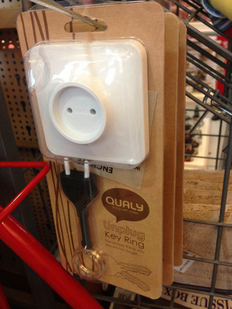
6. This is a key ring for those who lose keys in an apartment, and at the same time - the development of a good habit of sticking keys in the socket. Very strange thing.
PS And this is another similar post, just another .
Source: https://habr.com/ru/post/251465/
All Articles