10 examples of data visualization
Regular search for information on the Internet is gradually becoming second nature. The new generation is already losing the ability to learn in some other way. This entails the need to organize the provision of information to users as quickly and efficiently as possible.
Designers who are engaged in the visualization of large amounts of data have two important tasks. First, it is necessary to segment the data so that the principles of use are intuitive. Secondly, it would be nice to make the design so interesting that it is remembered, and forced users to return to the resource again and again.
The Visarton team collected 10 examples of how to organize a large amount of analytical data, at the same time suggesting the rules for its use, without tediousness and unnecessary instructions.
So:
')
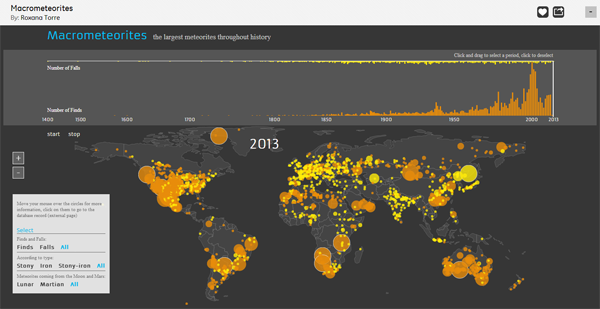
1 - The site Macrometeorites tells about the largest meteorites ever fell to Earth. On a gray background, a map is shown, on which bright yellow and orange circles indicate the places where meteorites fall. Clicking on the circle of interest, you will go to a page with detailed information about this meteorite.
2 - The Wind Map is an incredible resource that displays wind speed and direction in real time. True, he does it only in the United States. This way of displaying data does not look overloaded or difficult to read thanks to the use of a monochrome color scheme.

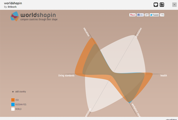
3 - Worldshapin this resource allows you to compare the level of health, carbon footprint, level of employment, population and living standards in different countries. Visual design is unusual, but at the same time simple and understandable.
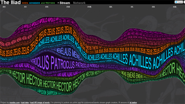
4 - Any high school student had difficulty trying to decipher Homer's Iliad. The Iliad website helps to understand exactly who is told in each chapter. Thanks to bright markers for classifying each character, it is easy to trace their appearance in the poem and immediately find the right place in the text.
5 - Speaking about the rights of gays, you always need to be particularly delicate. The presented scheme democratically shows in which states of America they have, or not, special rights.

6 - Audiomap is an excellent site for finding new music, choosing the direction you want, and moving from one artist to another. Simply select an artist, and click the extension to see similar options. Thus, you can stumble upon recordings of those times when your favorite artist sang in a long-forgotten band, or a song that you have not heard before.

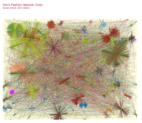
7 - Micro Fashion Network: Color - data on the most popular colors, collected in Cambridge, in themselves are the subject of art. Using a fixed camera and shooting the surrounding reality, the designer has created a comprehensive network of interconnected colors.
8 - By gathering information about emotions from across the web, We Feel Fine brought together more than 15,000 web-based emotions, which can be sorted by demographic. By selecting one of the bright dots on a black background, the user will be able to find out what others are saying about this emotion.

9 - The Yearlight Calendar shows the time of day in your area (dawn, day, dusk, sunset) for each day of the year.

10 - Liveplasma has created an interesting resource for finding artists, books and movies. By entering a request, you will find not only the work you were looking for, but all the related projects (with the same actor, or similar in style).

Designers who are engaged in the visualization of large amounts of data have two important tasks. First, it is necessary to segment the data so that the principles of use are intuitive. Secondly, it would be nice to make the design so interesting that it is remembered, and forced users to return to the resource again and again.
The Visarton team collected 10 examples of how to organize a large amount of analytical data, at the same time suggesting the rules for its use, without tediousness and unnecessary instructions.
So:
')
1 - The site Macrometeorites tells about the largest meteorites ever fell to Earth. On a gray background, a map is shown, on which bright yellow and orange circles indicate the places where meteorites fall. Clicking on the circle of interest, you will go to a page with detailed information about this meteorite.
2 - The Wind Map is an incredible resource that displays wind speed and direction in real time. True, he does it only in the United States. This way of displaying data does not look overloaded or difficult to read thanks to the use of a monochrome color scheme.
3 - Worldshapin this resource allows you to compare the level of health, carbon footprint, level of employment, population and living standards in different countries. Visual design is unusual, but at the same time simple and understandable.
4 - Any high school student had difficulty trying to decipher Homer's Iliad. The Iliad website helps to understand exactly who is told in each chapter. Thanks to bright markers for classifying each character, it is easy to trace their appearance in the poem and immediately find the right place in the text.
5 - Speaking about the rights of gays, you always need to be particularly delicate. The presented scheme democratically shows in which states of America they have, or not, special rights.
6 - Audiomap is an excellent site for finding new music, choosing the direction you want, and moving from one artist to another. Simply select an artist, and click the extension to see similar options. Thus, you can stumble upon recordings of those times when your favorite artist sang in a long-forgotten band, or a song that you have not heard before.
7 - Micro Fashion Network: Color - data on the most popular colors, collected in Cambridge, in themselves are the subject of art. Using a fixed camera and shooting the surrounding reality, the designer has created a comprehensive network of interconnected colors.
8 - By gathering information about emotions from across the web, We Feel Fine brought together more than 15,000 web-based emotions, which can be sorted by demographic. By selecting one of the bright dots on a black background, the user will be able to find out what others are saying about this emotion.
9 - The Yearlight Calendar shows the time of day in your area (dawn, day, dusk, sunset) for each day of the year.
10 - Liveplasma has created an interesting resource for finding artists, books and movies. By entering a request, you will find not only the work you were looking for, but all the related projects (with the same actor, or similar in style).
Source: https://habr.com/ru/post/251381/
All Articles