iOS application - development, top App Store, Techcrunch and Facebook grant for $ 60,000 services
I have already shared tips on developing a custom keyboard, as well as experience in promoting the application before and immediately after the release - article . This time I want to talk about the development process and give a couple of tips on what to do after downloading the application in the App Store.
')
In my case, the type of insight that comes into the “prepared mind” worked. The desire to make the application was born a long time ago, but the ideas that came to mind were too risky and difficult to implement. I was looking for the very one - with the appropriate ratio of resources required for the realization and the planned return.
You can of course just wait and hope for a miracle, but it is better to try to bring this miracle closer. And the approach of a miracle, in my understanding, takes the form of a lengthy drawing - reading articles and books on the topic, tracking the apstor tops, studying the market situation and trends towards which this market is moving.
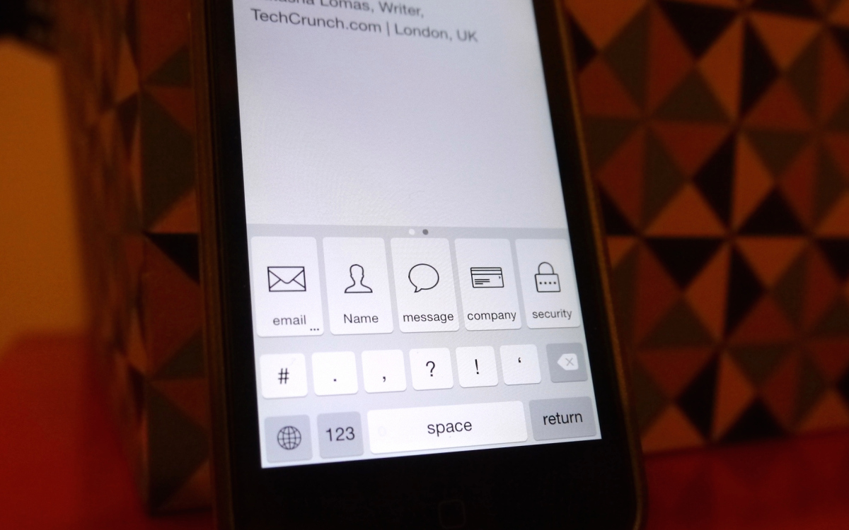
Once again, logging in to the new application for studying the inside, I thought that it would be nice to add “email” and “password” buttons to the keyboard (instead of foolish Emoji) and noticeably simplify your life. Checked in the App Store and Google - nothing like this for iOS was not there. Eureka!!!
But, of course, everything could not be so simple ...
Next, you need to think about how our application will work. In my case, besides the application itself, it was necessary to somehow complement the keyboard with custom keys.
Began to look how Emoji appy are arranged. After installation, these applications added Emoji to the list of phone languages, and add a standard keyboard with smiles. This principle of working through language layouts was quite appropriate. So, as a result of the research, a concept- application was born , which adds an additional layout (like Emoji) to the keyboard, which contains buttons with the user-specified text content in the application.
Moving on to the interface. The prototyping tools on the web are a million. Articles where they are compared too. If you are not working in a graphic editor, start with paper and pencil. Further - any free service or service with the trail-period.
But this is only the first step. After you have done the wireframes yourself, having put all your thoughts about the interface into the application's screen layouts, look for an experienced specialist. Let it be the rule - always involve a UX-specialist for interface development. Whether it is a website or an application, there are too many products created by programmers, managers, or people even more distant from thinking through interfaces. Often the designer can also perform this function. But I recommend to separate them all the same. Thus, the designer and UX-er will be able to challenge each other's decisions and find the truth.
Here is our example. First, the schemes that I drew (it seemed to me that everything was thought out), and what I got from the designer.

Here I can give 2 tips:
About the need for a good designer, too, written hundreds of articles. Yes, for the iOS environment, look for a strong professional.
At first glance, in our case, the designer just had to “paint out” the wireframes, but in fact there are much more details. This is the correct grid, the calculation of the size of the elements, the creation of a set of icons, recommendations for animation, and some management solutions that "surfaced" during development.
Again, we had the task of making the interface and the layout itself as native as possible so that the user would not interrupt the experience of interacting with the iPhone keyboard. This requirement primarily concerned the keys themselves and the icons for them, but automatically spread to the rest of the interface to preserve the style.
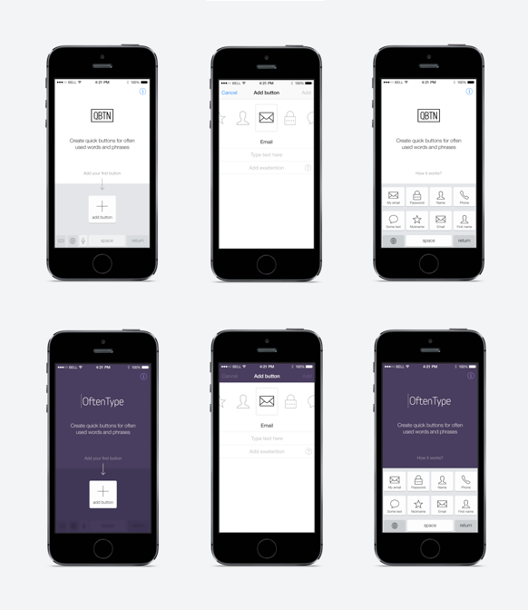
In the picture there are 2 versions of the design - the first one is “maximally native” and the second one “let's add some color”.
The design is almost ready - go to the programmer. The first big problem pops up. Only the programmer opened his eyes to the fact that in iOS at that time the keyboard was completely closed for external interference.
It turns out that the developers of Emoji-applications do not add any additional functions to the phone, since the layout with smiles is already built into iOS (somewhere from version 6 or even earlier). Many of these developers have earned tens or even hundreds of thousands of dollars, correctly using the illiteracy of users. An excellent example of how you can “straddle” the trend.
But back to the process of creating app. The concept was invented, the UX is ready, the design is in process, but the keyboards are closed - the situation is not veryshit ...
I returned to the study. This is about January 2014, when there were not even rumors about iOS 8 and its innovations. I had to read everything I could find about custom keyboards in iOS. It turned out that the closed keyboard at that time was almost the main argument of Android supporters in the battle of platforms. I do not know why, but between the lines I read that Apple will try to change this situation in the very near future.
So, I decided not to postpone the project - to continue working as if the keyboards were open and to follow the development of the situation.
A few months later came the announcement of iOS 8 and, finally, Apple officially announced the addition of the functionality of custom keyboards. Good news and proof of the correctness of our path.
Completely complete the application turned out just before the New Year holidays Apple cobblers (yes, yes, Apple also has a vacation). We poured into the storage, modified the application several times, and finally achieved approval.
You can read what we did immediately after the publication of the application for promotion here .
In fact, it is easy to get to the top applications, it’s harder to stay there. On the first day, we were in the first place in the Utilities category in Ukraine. At first it inspires, but then you look at the numbers and understand that there are only a few dozen downloads behind it. In addition, getting into the top of small countries gives almost no organic matter, so that the early euphoria quickly passes.
Especially if you have a paid application. With the Paid model, organics go with great difficulty.
In total, we made our way to the top 10 in 11 countries around the world. Of the richest - Spain, Italy, Holland, Denmark, Israel.
In the first place were in Spain and Ukraine.
All with zero investment, only thanks to free reviews on sites about applications and startups.
Tried and giveaway. For 3 days, when the application was free, we received almost 15,000 installations. The result was very pleased, but when you return to the paid version, your earned place in the top is not saved.
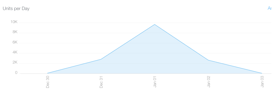
I don’t know how this mechanism works for others, but after the price returned for about 24 hours, the application dropped out of the top at all and returned to the Paid-top for the previous positions (according to analytics services SensorTower and AppAnnie).
Of the benefits - basically, this is an increase in knowledge about the application and relying on word of mouth in the future. Also, these jumps can raise you in the search results for keywords. But, in my opinion, you cannot earn big money for a paid model here.
Of course, the crown of our progress was a review on Techcrunch. It’s not for nothing that everyone rushes with him - the article about OftenType received more than 400 reposts, and caused an additional wave of reviews on niche local resources.
Techcrunch doesn't give in to everyone. It took me 3 attempts to reach out to their journalists.
I can advise the following:
Well, for dessert - another utility.
FbStart is a little-known program for using indie applications from Facebook.
Everything is very simple - submit an application and after its consideration, you can be given a grant for product development. Grants 2 types - for beginners (up to $ 20,000 services) and for more advanced applications (up to $ 60,000).
The number is steep, but this is not a cache, but the amount you can spend on Facebook and partners services (MailChimp, Parse, Adobe, and many others).
The most useful - Facebook loan of $ 2,500, which can be spent on advertising inside the social. network. I think from such assistance would not be superfluous to independent developers.
How is the selection and what criteria - I do not know. The only condition - at the time of application the application must be already 30 days in the App Store.
Full list of partners and goodies:
')
Idea
In my case, the type of insight that comes into the “prepared mind” worked. The desire to make the application was born a long time ago, but the ideas that came to mind were too risky and difficult to implement. I was looking for the very one - with the appropriate ratio of resources required for the realization and the planned return.
You can of course just wait and hope for a miracle, but it is better to try to bring this miracle closer. And the approach of a miracle, in my understanding, takes the form of a lengthy drawing - reading articles and books on the topic, tracking the apstor tops, studying the market situation and trends towards which this market is moving.
Once again, logging in to the new application for studying the inside, I thought that it would be nice to add “email” and “password” buttons to the keyboard (instead of foolish Emoji) and noticeably simplify your life. Checked in the App Store and Google - nothing like this for iOS was not there. Eureka!!!
But, of course, everything could not be so simple ...
Concept
Next, you need to think about how our application will work. In my case, besides the application itself, it was necessary to somehow complement the keyboard with custom keys.
Began to look how Emoji appy are arranged. After installation, these applications added Emoji to the list of phone languages, and add a standard keyboard with smiles. This principle of working through language layouts was quite appropriate. So, as a result of the research, a concept- application was born , which adds an additional layout (like Emoji) to the keyboard, which contains buttons with the user-specified text content in the application.
Ux
Moving on to the interface. The prototyping tools on the web are a million. Articles where they are compared too. If you are not working in a graphic editor, start with paper and pencil. Further - any free service or service with the trail-period.
But this is only the first step. After you have done the wireframes yourself, having put all your thoughts about the interface into the application's screen layouts, look for an experienced specialist. Let it be the rule - always involve a UX-specialist for interface development. Whether it is a website or an application, there are too many products created by programmers, managers, or people even more distant from thinking through interfaces. Often the designer can also perform this function. But I recommend to separate them all the same. Thus, the designer and UX-er will be able to challenge each other's decisions and find the truth.
Here is our example. First, the schemes that I drew (it seemed to me that everything was thought out), and what I got from the designer.
Here I can give 2 tips:
- On the first screen of the application, try not to give the user a large selection. A few (and preferably one) button that leads to the next step is ideal for a good conversion.
- Use native controls of the environment in which the application will work. I really liked the solution with the "carousel" when choosing an icon. Now it seems obvious, but this is the task of a good designer - the interface should be such that the question “could it be possible differently?”.
Another example - in the application itself, we duplicate the keyboard at the bottom of the screen. Although there is no need for this functionally, it immediately helps to show the essence of the application using the iOS environment.
Design
About the need for a good designer, too, written hundreds of articles. Yes, for the iOS environment, look for a strong professional.
At first glance, in our case, the designer just had to “paint out” the wireframes, but in fact there are much more details. This is the correct grid, the calculation of the size of the elements, the creation of a set of icons, recommendations for animation, and some management solutions that "surfaced" during development.
Again, we had the task of making the interface and the layout itself as native as possible so that the user would not interrupt the experience of interacting with the iPhone keyboard. This requirement primarily concerned the keys themselves and the icons for them, but automatically spread to the rest of the interface to preserve the style.
In the picture there are 2 versions of the design - the first one is “maximally native” and the second one “let's add some color”.
And here is the problem
The design is almost ready - go to the programmer. The first big problem pops up. Only the programmer opened his eyes to the fact that in iOS at that time the keyboard was completely closed for external interference.
It turns out that the developers of Emoji-applications do not add any additional functions to the phone, since the layout with smiles is already built into iOS (somewhere from version 6 or even earlier). Many of these developers have earned tens or even hundreds of thousands of dollars, correctly using the illiteracy of users. An excellent example of how you can “straddle” the trend.
But back to the process of creating app. The concept was invented, the UX is ready, the design is in process, but the keyboards are closed - the situation is not very
Attempt to predict the future
I returned to the study. This is about January 2014, when there were not even rumors about iOS 8 and its innovations. I had to read everything I could find about custom keyboards in iOS. It turned out that the closed keyboard at that time was almost the main argument of Android supporters in the battle of platforms. I do not know why, but between the lines I read that Apple will try to change this situation in the very near future.
So, I decided not to postpone the project - to continue working as if the keyboards were open and to follow the development of the situation.
A few months later came the announcement of iOS 8 and, finally, Apple officially announced the addition of the functionality of custom keyboards. Good news and proof of the correctness of our path.
Completely complete the application turned out just before the New Year holidays Apple cobblers (yes, yes, Apple also has a vacation). We poured into the storage, modified the application several times, and finally achieved approval.
You can read what we did immediately after the publication of the application for promotion here .
Top App Store
In fact, it is easy to get to the top applications, it’s harder to stay there. On the first day, we were in the first place in the Utilities category in Ukraine. At first it inspires, but then you look at the numbers and understand that there are only a few dozen downloads behind it. In addition, getting into the top of small countries gives almost no organic matter, so that the early euphoria quickly passes.
Especially if you have a paid application. With the Paid model, organics go with great difficulty.
In total, we made our way to the top 10 in 11 countries around the world. Of the richest - Spain, Italy, Holland, Denmark, Israel.
In the first place were in Spain and Ukraine.
All with zero investment, only thanks to free reviews on sites about applications and startups.
Price Drop
Tried and giveaway. For 3 days, when the application was free, we received almost 15,000 installations. The result was very pleased, but when you return to the paid version, your earned place in the top is not saved.
I don’t know how this mechanism works for others, but after the price returned for about 24 hours, the application dropped out of the top at all and returned to the Paid-top for the previous positions (according to analytics services SensorTower and AppAnnie).
Of the benefits - basically, this is an increase in knowledge about the application and relying on word of mouth in the future. Also, these jumps can raise you in the search results for keywords. But, in my opinion, you cannot earn big money for a paid model here.
Techcrunch
Of course, the crown of our progress was a review on Techcrunch. It’s not for nothing that everyone rushes with him - the article about OftenType received more than 400 reposts, and caused an additional wave of reviews on niche local resources.
Techcrunch doesn't give in to everyone. It took me 3 attempts to reach out to their journalists.
- The first time I wrote to a journalist a few days before the release. The authors of such large resources love to be the first, and this can be played. I described the application in a few words, specifying that this is my first press appeal, and dropped the link to the video. To my surprise, there was no limit when, literally in a few minutes, the answer came: “This is pretty cool, but surely there are no other similar keyboards, no?”. I replied that yes, there are other solutions to this problem, but we are the first to use this concept of shortcuts. At this our dialogue subsided.
- Then, several times I sent a letter with the release anos to different authors, but they also remained unanswered.
- A month after the release, I noticed on the site a review of a content simple keyboard app and decided that if they did it, it’s worth trying again. I found the contact of a journalist who made a review and tweeted her, asking if she would like to receive the promo code of my application, since she is interested in the theme of iOS keyboards. She answered - they say, no question.
I sent the code and materials about the application by mail and waited. Several days passed, there was no answer again. I thought that did not work out again. I began to analyze what needs to be completed in the next updates in order to finally achieve success.
And suddenly - the cherished letter has come! First, please send another promotional code, then questions about the application.
In general, the publication did take place. As a result, an article on Techcrunch gave a wave of sherov in social. networks and additional reviews. One of them on the Spanish site Applesfera allowed to reach the 1st place in Spain. In just a few days, when the hyip from the article lasted, we received about 1,000 paid purchases. Our application is designed for a rather narrow niche, plus a paid-model, so with other introductory figures these can be many times better.
I can advise the following:
- Look for a journalist who writes on your topic, and try to learn about his preferences as much as possible.
- Find “triggers” with which you can hook the author - an exclusive, first press, interesting topic, etc.
- Twitter works well for first contact. The main thing is to conduct a preliminary study and find the right “lead”.
- Descriptions of the application for journalists should be as concise as possible if they are interested - they will find all the necessary information or ask you. This is their job.
- Link to the contacts of all journalists Techcrunch - thecrowdfundamentals.com/tech-crunch-shares-staff-email-addresses/
Facebook grant
Well, for dessert - another utility.
FbStart is a little-known program for using indie applications from Facebook.
Everything is very simple - submit an application and after its consideration, you can be given a grant for product development. Grants 2 types - for beginners (up to $ 20,000 services) and for more advanced applications (up to $ 60,000).
The number is steep, but this is not a cache, but the amount you can spend on Facebook and partners services (MailChimp, Parse, Adobe, and many others).
The most useful - Facebook loan of $ 2,500, which can be spent on advertising inside the social. network. I think from such assistance would not be superfluous to independent developers.
How is the selection and what criteria - I do not know. The only condition - at the time of application the application must be already 30 days in the App Store.
Full list of partners and goodies:
Facebook - $ 2,500 ad credit for new spenders
Preferred Marketing Developer Program
Parse - $ 20,000 mobile app platform credit
Adobe - 1 license software for creative tools and services
Appurify - 60 hours on-device for mobile app testing and 10 licenses for on-device testing
Asana - Premium plan (50 members) for task tracking and project management
Bluejeans - Unlimited videoconferencing calls for up to 50 accounts per company
Desk.com - Up to 10 agents for customer care application
MailChimp - Email marketing support for up to 4.4 million emails per month
Proto.io - Agency plan (5 users, 15 active projects) for mobile app prototyping
Quip - Quip Business plan (document sharing with unlimited number of users)
SurveyMonkey - Gold plan (unlimited online survey questions)
UserTesting - 10 credits for remote usability and UX testing
Workable - Standard plan (5 active job listings) for recruiting
Transifex - Premium plan for app localization
HootSuite - HootSuite Pro, social media management SAAS platform
Android and iOS apps 3 months
Braintree
Get Satisfaction - Professional plan
Stripe
Source: https://habr.com/ru/post/251047/
All Articles