Plotting in LaTeX / PGFPlots
This article describes how to work with the PGFPlots package, developed for the popular LaTeX desktop publishing system. However, if you are not even familiar with the latter, this is not a reason to get upset and stop reading this article, after all, perhaps those wonderful examples that will be further given, and the extraordinary power and convenience of PGFPlots will inspire you to learn LaTeX.
Introduction and Motivation
There are a large number of different systems for graphing and data visualization. Of course, it cannot be said that PGFPlots can replace them all (for example, when working with the R environment it is sometimes more convenient to rely on its own graphing mechanism and simply add the constructed graphs to the document as images), however there is a definite and significant niche in which to apply it Convenient: study materials; the various reports that, as students, probably did everything in one way or another; simple data visualization, etc.
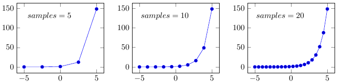
Below are examples that not only confirm what has been said, but also show that the capabilities of this system often even exceed our daily requirements for such systems (click on the image to see the source code of the example):
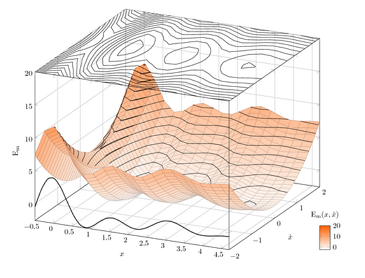 | 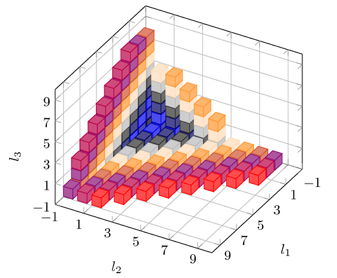 |
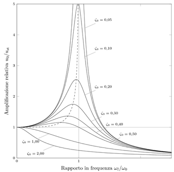 |  |
')
To work with examples, you will need the LaTeX distribution installed. Unfortunately, its installation and configuration are beyond the scope of this article, so those who do not want to mess with installing and configuring, but want to experiment with the features described here, can try online services such as Overleaf , ShareLaTeX and Papeeria .
So, let's begin!
Package connection
To connect PGFPlots, add the following command to the document preamble:
\usepackage{pgfplots} After that, the package will be downloaded and installed. However, if this does not happen for one reason or another, you should refer to the documentation (p.11), which describes in detail the various ways to install this package.
In addition, you should pay attention to the fact that PGFPlots was designed with backward compatibility, and projects created using old versions of this package will be opened and displayed without changes, regardless of how much the new version costs you. However, the package, however, introduces changes that violate backward compatibility and in order to connect them, it is necessary to state the version used explicitly in the preamble (in the example below, version 1.9 is indicated):
\pgfplotsset{compat=1.9} Basics of graphing
We first consider the simplest example of plotting and explain the purpose of the main components of which almost any graph in PGFPlots consists:
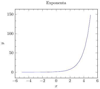
% \documentclass{article} \usepackage{pgfplots} \pgfplotsset{compat=1.9} % \begin{document} \begin{tikzpicture} \begin{axis}[ title = Exponenta, xlabel = {$x$}, ylabel = {$y$}, minor tick num = 2 ] \addplot[blue] {e^x}; \end{axis} \end{tikzpicture} \end{document} Tikzpicture setting
Since PGFPlots is based on TikZ (this is another great package designed to create graphic images in LaTeX), any graph is placed in the appropriate tikzpicture environment of this package.
\begin{tikzpicture} ... \end{tikzpicture} It should be noted that such a close relationship between TikZ and PGFPlots is a big plus, since it allows, firstly, to integrate graphs very well into various drawings made in TikZ, and also, on the contrary, to use TikZ's capabilities when working with graphs (see illustrative example ).
Environment, setting the axis of the graph
Further, inside the above environment, there is another environment that defines the axis of the graph. The table below lists the main types of such environments:
| Environment type | Purpose |
| axis | Standard axes with linear scaling |
| semilogxaxis | Logarithmic scaling of the x axis and standard scaling of the y axis |
| semilogyaxis | Logarithmic y- axis scaling and standard x- axis scaling |
| loglogaxis | Logarithmic scaling of both axes |
\pgfplotsset{title = Undefined chart} There are a lot of such properties, they allow you to customize almost any aspect of the appearance of the graph and all of them are listed in the manual. For example, here is a list of the properties most typical for the environment under consideration:
| Property | Purpose | Possible values |
| width, height | Set the width and height of the graph, respectively | |
| domain = min: max | Sets the range of values for the function in the range from min to max | |
| xmin, xmax | Set the minimum and maximum values on the x-axis, respectively | |
| ymin, ymax | Set the minimum and maximum values on the y-axis, respectively | |
| xlabel, ylabel | Set the signature to the x-axis and y-axis respectively | |
| view | Sets the camera rotation, while the property is specified as follows view = {azimuth} {elevation angle}; the azimuth is the angle between the camera position and the z axis, and the elevation angle is the angle between the camera position and the x axis. | |
| grid | Specifies the type of grid | major - grid lines pass only through the main divisions, minor - grid lines pass through additional divisions (between the main ones), both - grid lines pass through both types of divisions, none - there is no grid [default] |
| colormap | Sets the color scheme to use. | hot, hot2, jet, blackwhite, bluered, cool, greenyellow, redyellow, violet and others created by the user |
Add graphics
Recall that in the above example, the graph was added using the addplot command , which had the function, whose graph was plotted, and the color of this graph as the main parameter:
\addplot[blue] {e^x}; The addplot command used (for a two-dimensional graph) and its analogue addplot3 (for a three-dimensional graph) are the most common means for creating a graph. The general format of this command is as follows:
\addplot[<options>] <input data> <trailing path commands>; The <options> options are an optional parameter, which specify: type of chart, its color, style, type of markers, etc.
The input data <input data> is determined on the basis of which the graph will be constructed; in the example, the function was specified as the input data, however, as will be shown later, the choice of input data is much wider.
How small the result
So let's summarize a little about our acquaintance with PGFPlots.
- All graphics are placed in the tikzpicture environment:
\begin{tikzpicture} ... \end{tikzpicture} - To display a graph, you need to create an environment that determines the type of axes used in it, for example, axis :
\begin{axis} ... \end{axis} - Then, within the created environment, charts are added most often using the \ addplot and \ addplot3 commands :
\addplot[<options>] <input data> <trailing path commands>;
Input data
Having no desire to duplicate what is written in the documentation (pp.40 - 63) and set forth all the subtleties of working with the input data, we will focus on the consideration of the main methods in the most general form, and give a number of examples of their explanatory.
Plotting based on mathematical expression
A general view of a graph construction command based on a mathematical expression should already be familiar:
\addplot[<options>] {math_expression} <trailing path commands>; For processing a mathematical expression, the built-in parser is used, which has a sufficiently close syntax to many computer algebra systems, and therefore working with it is not particularly difficult. A complete list of mathematical operators and functions can be found in this document (p. 933). Some of them for making up the general impression are given below.
| Operator | Purpose |
| + | Addition operator |
| - | Subtraction operator |
| * | Multiplication operator |
| / | Division operator |
| ^ | Exponentiation operator |
| mod | Residual operator |
| ! | Postfix factorial operator |
| < , > , == , <= , > = | Comparison operators |
| Function | Purpose |
| abs | Module take function |
| sin, cos, tan, asin, acos, atan | Basic trigonometric functions and their inverse |
| ln, log2, log10 | Natural, binary and decimal logarithms |
| deg | The conversion function radians to degrees (it is especially useful when you consider that by default the parser in question works with degrees, not radians) |
Below is an example of building 3D graphics based on a mathematical expression:
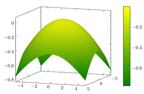
% \documentclass{article} \usepackage{pgfplots} \pgfplotsset{compat=1.9} % \begin{document} \begin{tikzpicture} \begin{axis}[ view={110}{10}, colormap/greenyellow, colorbar ] \addplot3[surf] {-sin(x^2 + y^2)}; \end{axis} \end{tikzpicture} \end{document} Notice that the previously not mentioned colorbar command was used here , which adds a scale that establishes the correspondence between the color and the value of the function.
Plotting based on input coordinates
This method is much simpler than the previous one and means that the user simply specifies a list of ordered pairs (x, y) (for a two-dimensional graph) or (x, y, z) (for a three-dimensional graph) and based on them a graph will be constructed later.
\addplot[<options>] coordinates {<coordinate list>} <trailing path commands> Immediately consider an example:
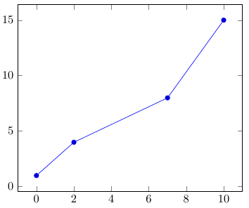
% \documentclass{article} \usepackage{pgfplots} \pgfplotsset{compat=1.9} % \begin{document} \begin{tikzpicture} \begin{axis} \addplot coordinates { (0,1) (2,4) (7,8) (10,15) }; \end{axis} \end{tikzpicture} \end{document} Note that ordered pairs are simply separated by spaces without using any special separator characters.
Plotting based on the table
Plotting graphs based on a table is one of the very common and convenient ways of plotting various graphs.
\addplot table [<column selection>] {(file or inline table)}. First of all, we define the basic principles of working with tables:
- Strings are separated by a newline character. To use the \\ character in this role, you must set the following property:
table/row sep = \\ - Columns are usually separated by spaces or tabs. You can set this role for other characters using the following property:
table/col sep = space|tab|comma|colon|semicolon|braces|&|ampersand - Any line starting with # or % will be ignored.
An example of a valid table is shown below:
abc 1 1 1 2 3 4 3 5 5 4 8 6 5 2 7 The <column selection> parameter defines the correspondence between a specific axis (or a source of meta-information, about which we will say a little bit later) and a column, and the correspondence is set on the first line of the table, which is clearly seen in the examples below.
Plotting based on inline table (inline)
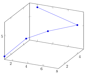
% \documentclass{article} \usepackage{pgfplots} \pgfplotsset{compat=1.9} % \begin{document} \begin{tikzpicture} \begin{axis} \addplot3 table [x = b, y = a, z = c] { abc 1 1 1 2 3 4 3 5 5 4 8 6 5 2 7 }; \end{axis} \end{tikzpicture} \end{document} Plotting based on a table in an external file
Consider a more practical example. The following link is the .csv file, which contains data on the demographic situation in Russia (RSFSR) for about a century of its history.
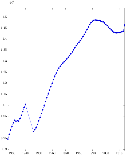
% \documentclass{article} \usepackage{pgfplots} \pgfplotsset{compat=1.9} % \begin{document} \begin{tikzpicture} \begin{axis}[ table/col sep = semicolon, height = 0.6\paperheight, width = 0.65\paperwidth, xmin = 1927, xmax = 2014, /pgf/number format/1000 sep={} ] \addplot table [x={Year}, y={Average population}] {RussianDemography.csv}; \end{axis} \end{tikzpicture} \end{document} Naturally, this is by no means all of the methods, and so far beyond the scope of our consideration, there are PGFPlots interaction with other applications (for example, GNUPlot), the use of scripts in plotting graphs, the introduction of external graphics, etc.
Graph Setup
Now that we have figured out how the input data for the graph may look, it's time to pay attention to how to customize the graphs, make them more understandable and intuitive.
Graphic legend
A legend is a caption explaining what is shown on the graph. The use of legend is especially useful when we have several different graphs.
For the legend description, you can use the \ legend {...} command, inside which the graph descriptions are listed separated by commas (PGFPlots determines the correspondence between the description and the graph in the order of descriptions and the order of adding the graphs themselves).
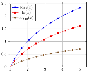
% \documentclass{article} \usepackage{pgfplots} \pgfplotsset{compat=1.9} % \begin{document} \begin{tikzpicture} \begin{axis} [ legend pos = north west, ymin = 0, grid = major ] \legend{ $\log_2(x)$, $\ln(x)$, $\log_{10}(x)$ }; \addplot {log2(x)}; \addplot {ln(x)}; \addplot {log10(x)}; \end{axis} \end{tikzpicture} \end{document} In the example in the legend, mathematical expressions are indicated, on the basis of which these graphs are built, but, in general, there can be any text there.
In addition, it used the legend pos property, which allows you to indicate the position of the legend on the graph ( south west, south east, north west, north east, outer north east ).
Custom styles
Consider the simplest example: in our document it is accepted that the graph reflecting the experimental data is highlighted in red, and the graph of the function reflecting the graphs of the mathematical model has a blue color. This was taken exactly until the publishing house told us that they accept only black and white articles and, accordingly, the appearance of the graphs needs to be changed, and within the framework of a large document this is a complex and dreary task.
Therefore, it is much better in such situations to describe styles in one place of the document and then apply them to the charts. To create such custom styles, we know the \ pgfplotsset command with the following arguments:
\pgfplotsset{<style_name>/.style={<key-value-list>}}; Immediately consider an example similar to the one we talked about earlier:
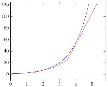
% \documentclass{article} \usepackage{pgfplots} \pgfplotsset{compat=1.9} % \pgfplotsset{model/.style = {blue, samples = 100}} \pgfplotsset{experiment/.style = {red}} % \begin{document} \begin{tikzpicture} \begin{axis}[xmin = 0, ymax = 125] \addplot[model]{e^(x)}; \addplot[experiment] table { xy 0.1 1.5 1.3 2.1 2.7 12.2 3.5 25.6 4.1 57.0 5.3 121.6 }; \end{axis} \end{tikzpicture} \end{document} Markers
Markers are, in the most general terms, points on a chart. A detailed list of various types of standard markers can be found in the documentation (p. 160).
As always, there are a lot of tools for their configuration, even in the documentation to which we refer, not all of them are described. Consider the most typical ways to customize.
Marker type selection is performed using the following property:
mark = <type_of_marker> The three main parameters (size, fill color of the marker and its outline) can be configured using the following property:
mark options={scale = <relative_scaling>, fill = <color>, draw = <color> There are a lot of predefined colors, but you can always add your own, for example, using the following command:
\definecolor{<name_of_color}{rgb}{..., ..., ... } Consider an example:

% \documentclass{article} \usepackage{pgfplots} \pgfplotsset{compat=1.9} \definecolor{chucknorris}{rgb}{192,0,0} % \begin{document} \begin{tikzpicture} \begin{axis} \addplot[ mark = *, mark options = { scale = 1.5, fill = pink, draw = chucknorris } ]{x^2}; \end{axis} \end{tikzpicture} \end{document} Lines of graphics and their color
When we spoke earlier about black and white graphics for the publisher, for sure, each of you remembered that one of the ways to distinguish one graphic from another is to select one dotted line and the other as a solid line. All this, of course, can be done here.
All line styles (first of all, various types of dashed lines) can be found in the documentation (p. 165). They are set by specifying explicitly the name of the style in the options, for example, graphics.
The thickness of the graphic line is configured using the line width property:
line width = <width_of_line> The color of the graphic line is configured using the draw property:
draw = <color> 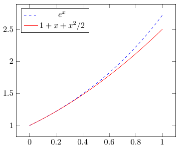
% \documentclass{article} \usepackage{pgfplots} \pgfplotsset{compat=1.9} % \begin{document} \begin{tikzpicture} \begin{axis}[ domain=0:1, legend pos = north west ] \legend{$e^x$, $1 + x + x^2/2$} \addplot[dashed, draw = blue]{e^x}; \addplot[solid, draw = red]{1 + x + x^2/2}; \end{axis} \end{tikzpicture} \end{document} Examples of some types of 2D graphics
By default, any two-dimensional graph is a linear graph (for an explicit choice of this type, you must specify the sharp plot property in the options of the graph being added). In fact, this type of graph simply connects the indicated points with a straight line. However, in reality, the types of two-dimensional graphs are much more and they are described in the documentation (pp.75 - 114).
Next, we consider for example a number of other types of graphs, which often have to be used in practice.
bar chart
To create a histogram, there are two types of graphics: a horizontal histogram, which corresponds to the xbar property, and a vertical histogram, which corresponds to the ybar property.
Below is an example of creating a vertical histogram reflecting the regional structure of those credited to budget places in 2010-2014. in HSE:

% \documentclass{article} \usepackage{pgfplots} \pgfplotsset{compat=1.9} % \begin{document} \begin{tikzpicture} \begin{axis}[ ybar, width = 250pt, /pgf/number format/1000 sep={}, legend style={ at={(0.5,-0.25)}, anchor=south, legend columns=-1 } ] \addplot coordinates { (2010, 34) (2011, 39) (2012, 39) (2013, 36) (2014, 32.6) }; \addplot coordinates { (2010, 12) (2011, 11) (2012, 14) (2013, 12) (2014, 10.7) }; \addplot coordinates { (2010, 54) (2011, 50) (2012, 47) (2013, 52) (2014, 56.7) }; \legend{Moscow, Moscow region, Other regions} \end{axis} \end{tikzpicture} \end{document} Scatter plot
The scatter plot is a loud name for a chart that contains only markers, in other words, it is a set of points on a chart. To select this type of schedule, use the only marks property.
Consider at once a practical example: we have a table, the first two columns of which reflect the two-dimensional coordinates of a point and the third one belongs to one of three clusters. It is necessary to build a graph that would reflect on the one hand the position of the points in space, and on the other, their belonging to one or another cluster.
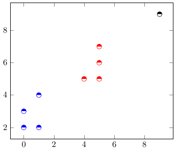
% \documentclass{article} \usepackage{pgfplots} \pgfplotsset{compat=1.9} % \begin{document} \begin{tikzpicture} \begin{axis} \addplot[ mark=halfcircle*, mark size=3pt, only marks, point meta=explicit symbolic, scatter, scatter/classes={ a={blue}, b={red}, c={black} }] table [meta=class] { xy class 1 4 a 1 2 a 0 3 a 0 2 a 5 6 b 5 5 b 4 5 b 5 7 b 9 9 c }; \end{axis} \end{tikzpicture} \end{document} The first thing you should pay attention to is that in the properties of the table we specify the “column” of the meta , with the result that the selected class column is responsible for some of the meta-properties of the table element.
Then, the parameters indicate the appearance of the markers that we previously did, and then use the point meta command, which shows PGFPlots where and how to take meta information.
point meta = none|<math_expression>|x|y|z|f(x)|explicit|explicit symbolic You can read more in the documentation (p. 185), we’ll just dwell on the fact that the explicit symbolic value was chosen, which means that the meta-data is taken from the column that is specified in the table properties, more specifically as symbols, not numbers.
And finally, the remarkable scatter property was indicated, which includes changing the appearance of the markers depending on their coordinates or belonging to one or another cluster. Together with it, the scatter / classes property is used, which sets how the appearance of the marker should change depending on the membership of a particular cluster.
Summing up
So, the article has come to an end, and thanks to all who read to here. I am well aware that only the tip of the iceberg was considered here, only a part of the possibilities that PGFPlots gives us, and, of course, there are a lot of interesting and useful things beyond consideration. But, I hope, nevertheless, the article fulfilled its task: to introduce and interest.
Feel free to express your wishes on what you would like to see in such an introductory article, maybe something was missed or, on the contrary, somewhere something was considered in too much detail.
Literature and links for further study
 1. The main and most reliable source of information on this package is the previously mentioned massive official documentation .
2. A large number of examples can be found on PGFPlots.net , as well as here .
3. A large number of questions related to PGFPlot were answered here .
Source: https://habr.com/ru/post/250997/
All Articles