Design unification: The Mail.Ru Group mobile web framework
Companies with a large portfolio of products eventually face the question of simplifying work on them. Mail.Ru Group has about 40 of them, not counting mobile and tablet versions, as well as a huge gaming track. Our Post and Portal division is engaged in almost half of these forty. That together with the accompanying applications, mobile sites and promotional resources - for hundreds of projects. Now we are conducting their gradual updating and unification around several guidelines. Using the example of one of them, I will talk about how to redesign the design process from the classic “prototype → layout → layout → code” for each screen to a more efficient and modern framework-based framework .
Article written for Smashing Magazine .
')
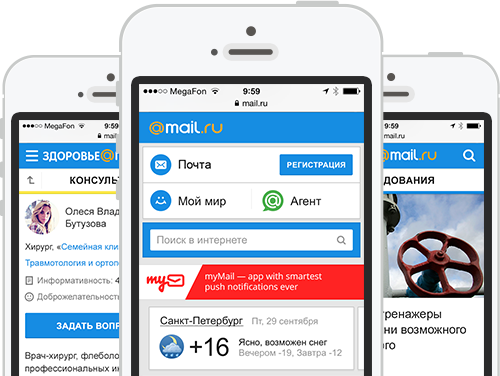
In mid-2012, we restarted Mobile News - the first project on a new design-technical platform, something like Twitter's Bootstrap . Now a dozen of services are working on it and a couple more will soon restart.

What good is this approach?
In general, this is a key part of our UX strategy. But the most important thing is that the framework has also become a technical unification. We made many approaches to the “shell” - we wrote specifications, collected a single source, made libraries of elements, etc. But all this quickly faded out, because it was in a cozy design world and was little demanded by developers. And we all know how often the design is “twisted” on the way from layouts to implementation. But if once you make the code correct and distributed, then there are a lot more reasons for confidence in the quality of the design that works in the real product. Therefore, one of the main criteria for the success of any unification projects is their transfer to the level of concrete implementation.
The general principle of the first version of the framework is as follows:
A large canvas with the source of all interface blocks and sample screens in PSD. As well as the library in Adobe InDesign, which is as close as possible to the design layouts in the visual part. When we start a new project - we design all the necessary screens in InDesign. This prototype is easily linked and works fine on the device if you export it to PDF. If some blocks are unique for a new project and they have not yet been in the UI Kit, we draw them in Photoshop and, after agreement, add them to the InDesign library.

All new blocks fall into a single code base . The layout of all screens is assembled from the finished components in the form of a prototype. Some of them are fully standardized - for example, comments or photo galleries. Designers check the assembly before launch, if necessary - modify the layouts and interface interaction logic. Indeed, in a working bundle there are always inconsistencies with respect to the original vision.
To display the site page in the user's browser, a template engine is used. He collects the final layout on the fly from separately laid out blocks, graphics, styles and scripts. For all types of pages, rules for their assembly are defined - a set of blocks and their sequence. Moreover, the template and data for drawing a specific URL are divided and loaded in parallel. For example, if a user has already opened a news feed, his page layout will be cached and the next time only content will be downloaded.

If we find a new solution for an old block or component (for example, a new type of photo galleries), it changes in the layouts, prototype, and code base. After that, each project updates it from the common repository, almost like an application from the AppStore. In this case, the designer needs to check only one implementation in a single code base instead of tracking each of the services. And you can be confident in the quality of implemented design.

In the near future, we plan to revise the first stage - designers will move from working with layouts and prototypes in Photoshop and InDesign to building new pages from code. But for this it is important to go through the whole process of creating and implementing the framework:
Now we have in parallel the third and fourth stages of implementation of the framework. But we felt the benefits of working with him at the very beginning - the development of the platform is easy, the amount of unnecessary work has decreased to a minimum. Looking back, we could certainly make the process of creating and implementing the framework more correct and shorter. But I will tell you about our correct and erroneous decisions in detail so that you can go this way faster.
It all started with the main page for mobile in early 2012. The general approach to design was defined - cards for highlighting blocks with different information, general style of caps and headers, controls, etc. Everyone liked these solutions and we decided to transfer the concept to News. At the same time, the main one is, albeit a long one, but one-page, and in the content project there is much more information and a more complex structure. Fortunately, News is the simplest of them, there are no service sections except basic search and comments, only text and media content.

It was necessary to think over the principles of navigation, ways of presenting content and materials on the topic, layout of typical pages. Moreover, they should take into account future mobile versions for other content projects that should be created on the basis of this guideline. Fortunately, we have already managed to make a mobile poster with a rather complex structure and a mass of services. Interface solutions differed from what we need for the News, but the presentation of information and some of the navigation patterns came in handy.

For the Mobile Poster, usability testing was conducted, from which we made many useful conclusions both for the development of the product itself and for the presentation of content projects on mobiles in general. For example, duplicate search appeared at the bottom of the page. And in slider slides, the last element should lead to the list of all objects. In addition, the approach to the separation of blocks without the use of cards showed a number of problems - it is difficult to work with long pages, the content of which is often too heterogeneous. I rejected the cards in iOS7 and I am sure that this hinders the work with complex screens - it is more difficult to understand the principle of grouping elements.

We have assembled the first prototype in InDesign, in many respects similar in design to the design, but not repeating it in detail. It raised the first questions about the use of patterns. For example, can you save traffic or show illustrations for each material in lists? Or what to do with cards in ambiguous situations - news with accompanying materials? It was also important to remember that some users access content projects via a link from the main page to specific material, and some go through them from the main page of the project. Where in this case should the “Back” button lead in the interface?

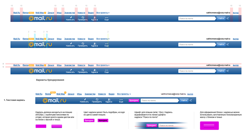
After the key pages were shown in the design layouts, the designer suggested collecting them in one file to simplify further work. It should have been a simple UI Kit, allowing you to quickly draw the remaining project screens. But we decided to go further and put together a guideline in addition to it - other designers had to get involved in the task, and the developers should refer to something when building the project. We described it in Confluence with this structure:
For running the guideline, we drew on its basis also Horoscopes. Except for minor problems, the style worked - the adaptation was quick and easy. Such a run-in is very important - before scattering everything for a dozen projects, you need a pilot. It allows you to detect problems in the concept before you have to redo too much.

Discussing the idea of unification with developers and managers, we remembered that we already have a similar technical unification mechanism - for example, portal navigation and the blue cap work. And a lot more is being done for the Post, general portal authorization popups and other parts of the interface. Although the technology required serious improvement - the whole products on it have not yet been launched.
The developers went to investigate the problem in detail and see if there are ready-made solutions and products. BEM (block-element-modifier) from Yandex was perfectly suited as a general ideology. For unification, it is important that the same interface blocks are used on as many pages as possible. And without the need to double-check every time, is everything good on each of them. BEM guarantees the independence of the design of a particular block of what is happening around it. This is a methodology, to simplify the work with which Yandex created the open source toolkit bem-tools - by the way, our developers even sent several patches to the project repository. Previously, the rudiments of this methodology were called “absolutely independent blocks”, and now this approach is actively penetrated in the West — for example, the Inuit CSS and TopCoat frameworks. Smashing Magazine has published an excellent detailed article on BEM from the former developer of Yandex.

But the BEM template engine was not productive enough, and the task was not very suitable. Therefore, we have taken JavaScript-based technologies that have already been used, using Node.js to execute code on the server. Thanks to this, both the server and the user have the same page template, which is shown exactly the same. Data is transferred separately from it. And when the template is cached in the browser after the first download, only content is transferred to the user, which greatly reduces the amount of traffic and download speed.
The developers returned to us in a couple of weeks with the prototype - the approach worked! The framework was tested and expanded, so that everything was ready for large-scale deployment. For 2.5 months we were able to redraw 12 projects - we have not set such speed records yet. Guideline has grown noticeably and described the construction of a common style and many concrete blocks — a variety of navigation solutions, lists, different types of cards, ways of presenting content, forms, pop-ups, diagrams specific to specific projects of the solution. Both the library in InDesign and the UI Kit in Photoshop have grown.
However, supporting three libraries at once (code, InDesign, Photoshop) is expensive, and not very convenient. Therefore, we found a way to make the guideline automated. This is a “live guide”, i.e. generated page in which real pieces of code from the UI Kit are substituted instead of images. There is also a description for each of them. In this form, it is much easier to check the quality of implementation - already implemented blocks are visible in the guideline, and not their source pictures, which can be incorrectly wrapped along the way from the layouts. While this document exists in the form of a prototype, after restarting all the projects on the framework, we will finish it. By the way, using this automated guideline you can assemble prototypes from pieces of ready-made code, bypassing InDesign - this is another way to get closer to the final implementation.

So in the end it’s better than Bootstrap. After all, it is in fact - a set of ready-made styles and scripts, as well as examples of layout. And when updating the framework, it is not so easy to transfer changes to your project - you may have to customize the layout to the new rules. In our case, the project receives a set of ready-to-use blocks, which will be updated in the project with changes in the framework. In addition, Bootstrap does not adhere to the model of independent blocks, which leads to conflicts - for example, in a bunch of Bootstrap and jQuery UI, they will interrupt each other's styles. True, he solves a slightly different problem - a quick start to the project on the finished elements. Although this is also a problem of ours, and of any custom solution, it takes more time to create it.
And a few numbers on how our workflow has changed thanks to the framework:
, . .
, UI Kit 3 — (Android, iPhone, Windows Phone), (Bada, Symbian) . , Android, Chrome, — . , UI Kit, . , . . , , .


— . , (, ) , . . , . UI Kit .

- — , ? , . , . . , . Smashing Magazine .
, — . « », — .
. . , . , . , . , , .
- — . — Google Android, .

UI Kit — , . , — . , - . . . The restarts take a lot of energy and lose thousands of small developments bolted to the design for a long time of its development.

- :) , — . However, in our industry, periodically quite sharp breaks in the visual paradigm occur, as was the case last year with the release of iOS7, and companies must respond promptly to them.
- . , , . :) — . ( , , , , , ) ( , , , , , ), . — , .

, . — . - — , . UI Kit . , .
Article written for Smashing Magazine .
')
In mid-2012, we restarted Mobile News - the first project on a new design-technical platform, something like Twitter's Bootstrap . Now a dozen of services are working on it and a couple more will soon restart.
What good is this approach?
- Unified visual style and principles of the interface , as well as its information architecture. It is convenient for the user - a group of similar products works in the same clear and familiar way. And also good for the brand - the entire line of services looks complete.
- Simplify the launch of new products and redesign existing ones . In the framework there are most of the necessary blocks and components for all occasions, which allows you to quickly build a new interface.
- Controlling a large pool of projects becomes easier when they are the same. Instead of hundreds of individual projects, you follow a pair of guidelines.
- Modern design process . Instead of the classic chain “prototype → layout → layout → code” for each screen that generates a bunch of unnecessary artifacts - go to the design assembly directly in the code.
- The cumulative effect of good product decisions . For example, having raised the viewing depth on one of the services, it is easy to apply these improvements to the others.
- The transition from large redesigns every few years to the constant maintenance of the relevance of the interface . The restarts take a lot of energy and lose thousands of small developments bolted to the design for a long time of its development.
In general, this is a key part of our UX strategy. But the most important thing is that the framework has also become a technical unification. We made many approaches to the “shell” - we wrote specifications, collected a single source, made libraries of elements, etc. But all this quickly faded out, because it was in a cozy design world and was little demanded by developers. And we all know how often the design is “twisted” on the way from layouts to implementation. But if once you make the code correct and distributed, then there are a lot more reasons for confidence in the quality of the design that works in the real product. Therefore, one of the main criteria for the success of any unification projects is their transfer to the level of concrete implementation.
How does the framework work?
The general principle of the first version of the framework is as follows:
A large canvas with the source of all interface blocks and sample screens in PSD. As well as the library in Adobe InDesign, which is as close as possible to the design layouts in the visual part. When we start a new project - we design all the necessary screens in InDesign. This prototype is easily linked and works fine on the device if you export it to PDF. If some blocks are unique for a new project and they have not yet been in the UI Kit, we draw them in Photoshop and, after agreement, add them to the InDesign library.
All new blocks fall into a single code base . The layout of all screens is assembled from the finished components in the form of a prototype. Some of them are fully standardized - for example, comments or photo galleries. Designers check the assembly before launch, if necessary - modify the layouts and interface interaction logic. Indeed, in a working bundle there are always inconsistencies with respect to the original vision.
 <code>
   touch.news/
     blocks /
       logotype /
         logotype.png
     bundles /
       article
     <span class = "code-comment"> / * Collected from blocks and toolkit.  Includes pseudo-bundle common.css * / </ span>
     toolkit /
       blocks /
         logotype /
           logotype.xml
         section /
           header /
 </ code>
To display the site page in the user's browser, a template engine is used. He collects the final layout on the fly from separately laid out blocks, graphics, styles and scripts. For all types of pages, rules for their assembly are defined - a set of blocks and their sequence. Moreover, the template and data for drawing a specific URL are divided and loaded in parallel. For example, if a user has already opened a news feed, his page layout will be cached and the next time only content will be downloaded.
If we find a new solution for an old block or component (for example, a new type of photo galleries), it changes in the layouts, prototype, and code base. After that, each project updates it from the common repository, almost like an application from the AppStore. In this case, the designer needs to check only one implementation in a single code base instead of tracking each of the services. And you can be confident in the quality of implemented design.
In the near future, we plan to revise the first stage - designers will move from working with layouts and prototypes in Photoshop and InDesign to building new pages from code. But for this it is important to go through the whole process of creating and implementing the framework:
- Creating a model design and platform . It is necessary to find a scalable interface solution suitable for our products, determine the style and implement the technical part of the framework.
- Transfer all products to the platform . The UI Kit and the unified code base are actively expanding with new solutions, and the back-end services are brought in line with the requirements of the framework.
- Simplify the design process . The technical solution has already been run in and the main tasks have been solved, so you can refuse to create multiple artifacts and assemble new screens from ready-made blocks in a single code base.
- Refactoring design . The launch of a dozen products deals with a rather impressive time, during which problems in real life of services are identified. Yes, and design trends are changing.
Now we have in parallel the third and fourth stages of implementation of the framework. But we felt the benefits of working with him at the very beginning - the development of the platform is easy, the amount of unnecessary work has decreased to a minimum. Looking back, we could certainly make the process of creating and implementing the framework more correct and shorter. But I will tell you about our correct and erroneous decisions in detail so that you can go this way faster.
Background, Part 1: Design
It all started with the main page for mobile in early 2012. The general approach to design was defined - cards for highlighting blocks with different information, general style of caps and headers, controls, etc. Everyone liked these solutions and we decided to transfer the concept to News. At the same time, the main one is, albeit a long one, but one-page, and in the content project there is much more information and a more complex structure. Fortunately, News is the simplest of them, there are no service sections except basic search and comments, only text and media content.
The first mobile version of Mail.Ru Group appeared in 2004 - it was Mail.

It was necessary to think over the principles of navigation, ways of presenting content and materials on the topic, layout of typical pages. Moreover, they should take into account future mobile versions for other content projects that should be created on the basis of this guideline. Fortunately, we have already managed to make a mobile poster with a rather complex structure and a mass of services. Interface solutions differed from what we need for the News, but the presentation of information and some of the navigation patterns came in handy.
For the Mobile Poster, usability testing was conducted, from which we made many useful conclusions both for the development of the product itself and for the presentation of content projects on mobiles in general. For example, duplicate search appeared at the bottom of the page. And in slider slides, the last element should lead to the list of all objects. In addition, the approach to the separation of blocks without the use of cards showed a number of problems - it is difficult to work with long pages, the content of which is often too heterogeneous. I rejected the cards in iOS7 and I am sure that this hinders the work with complex screens - it is more difficult to understand the principle of grouping elements.
We have assembled the first prototype in InDesign, in many respects similar in design to the design, but not repeating it in detail. It raised the first questions about the use of patterns. For example, can you save traffic or show illustrations for each material in lists? Or what to do with cards in ambiguous situations - news with accompanying materials? It was also important to remember that some users access content projects via a link from the main page to specific material, and some go through them from the main page of the project. Where in this case should the “Back” button lead in the interface?
After the key pages were shown in the design layouts, the designer suggested collecting them in one file to simplify further work. It should have been a simple UI Kit, allowing you to quickly draw the remaining project screens. But we decided to go further and put together a guideline in addition to it - other designers had to get involved in the task, and the developers should refer to something when building the project. We described it in Confluence with this structure:
  <code>
 Overview
 Visual style
   Grid
   Color palette
   Typography
   Icons
 Interaction
   Navigation
   Gestures
   Selection
   Scroll
   Notifications
 Typical elements
   Screen structure
     Cap
     Page title
     Search
     ...
     Basement
   Controls
     Data input
       Entry field
       Text field
       Drop-down list
       date
       Checkbox
       Radio button
       ...
     Buttons
     ...
   Navigation
     Tabs
     Slider
     Links
     Alphabetical index
     ...
   Dialogs and windows
     Popup
     View photo
     Photo upload
     The calendar
     ...
   List
     Articles
     Developments
     Matches
     searching results
     ...
   Widgets
     Weather
     Currencies
     Horoscope
     ...
   Media
     A photo
     Video
     ...
 Typical screens
   Authorization
   check in
   Settings
   Help
   ...
 Advertising
   Banners
   Internal promo
   ...
 </ code>
For running the guideline, we drew on its basis also Horoscopes. Except for minor problems, the style worked - the adaptation was quick and easy. Such a run-in is very important - before scattering everything for a dozen projects, you need a pilot. It allows you to detect problems in the concept before you have to redo too much.
Background, part 2: Technology
Discussing the idea of unification with developers and managers, we remembered that we already have a similar technical unification mechanism - for example, portal navigation and the blue cap work. And a lot more is being done for the Post, general portal authorization popups and other parts of the interface. Although the technology required serious improvement - the whole products on it have not yet been launched.
The developers went to investigate the problem in detail and see if there are ready-made solutions and products. BEM (block-element-modifier) from Yandex was perfectly suited as a general ideology. For unification, it is important that the same interface blocks are used on as many pages as possible. And without the need to double-check every time, is everything good on each of them. BEM guarantees the independence of the design of a particular block of what is happening around it. This is a methodology, to simplify the work with which Yandex created the open source toolkit bem-tools - by the way, our developers even sent several patches to the project repository. Previously, the rudiments of this methodology were called “absolutely independent blocks”, and now this approach is actively penetrated in the West — for example, the Inuit CSS and TopCoat frameworks. Smashing Magazine has published an excellent detailed article on BEM from the former developer of Yandex.
But the BEM template engine was not productive enough, and the task was not very suitable. Therefore, we have taken JavaScript-based technologies that have already been used, using Node.js to execute code on the server. Thanks to this, both the server and the user have the same page template, which is shown exactly the same. Data is transferred separately from it. And when the template is cached in the browser after the first download, only content is transferred to the user, which greatly reduces the amount of traffic and download speed.
I describe the technical in general terms, since the purpose of this article is to tell about the design process as a whole. In the third part it will be described in detail.
The developers returned to us in a couple of weeks with the prototype - the approach worked! The framework was tested and expanded, so that everything was ready for large-scale deployment. For 2.5 months we were able to redraw 12 projects - we have not set such speed records yet. Guideline has grown noticeably and described the construction of a common style and many concrete blocks — a variety of navigation solutions, lists, different types of cards, ways of presenting content, forms, pop-ups, diagrams specific to specific projects of the solution. Both the library in InDesign and the UI Kit in Photoshop have grown.
However, supporting three libraries at once (code, InDesign, Photoshop) is expensive, and not very convenient. Therefore, we found a way to make the guideline automated. This is a “live guide”, i.e. generated page in which real pieces of code from the UI Kit are substituted instead of images. There is also a description for each of them. In this form, it is much easier to check the quality of implementation - already implemented blocks are visible in the guideline, and not their source pictures, which can be incorrectly wrapped along the way from the layouts. While this document exists in the form of a prototype, after restarting all the projects on the framework, we will finish it. By the way, using this automated guideline you can assemble prototypes from pieces of ready-made code, bypassing InDesign - this is another way to get closer to the final implementation.
So in the end it’s better than Bootstrap. After all, it is in fact - a set of ready-made styles and scripts, as well as examples of layout. And when updating the framework, it is not so easy to transfer changes to your project - you may have to customize the layout to the new rules. In our case, the project receives a set of ready-to-use blocks, which will be updated in the project with changes in the framework. In addition, Bootstrap does not adhere to the model of independent blocks, which leads to conflicts - for example, in a bunch of Bootstrap and jQuery UI, they will interrupt each other's styles. True, he solves a slightly different problem - a quick start to the project on the finished elements. Although this is also a problem of ours, and of any custom solution, it takes more time to create it.
And a few numbers on how our workflow has changed thanks to the framework:
- Increased speed of design and interface design . If earlier we completely drawn most of the screens in InDesign and Photoshop for each project, now there is often a sketch on a whiteboard or paper, as well as several pre-made layouts with visual design of new blocks. Previously, it took about a month, now - in most cases, about a week.
- The launch of new projects was accelerated and the addition of functions to existing ones was simplified . No need to re-type layouts and think through the database structure; ready-made interface blocks can be immediately included in the new service. Even if some small project-specific additions are required, it is inexpensive if the unit was well thought out at creation. As a result, the launch of a new service usually fits into the month, although earlier it was possible to spend a few.
- Simplified design coordination with top management . In many ways, this decides any guideline, but being fixed in the code, it gives more confidence in the final quality. We hold for this less meetings and make fewer edits on their results.
- The number of layout errors has decreased . If earlier the design review of the implemented design could have included more than fifty bugs, now it is around a dozen. On the other hand, a new problem has arisen - before rolling out the updated block, you need to check whether it has broken on all projects.
- More stringent requirements for front-end specialists. The focus of the examination has changed - before all the calculations were made on the back-end side, the front simply inserted it into the template. So all that could slow down, all ineffective sorting algorithms, etc. - It was on the conscience of the developers. Now, development produces only data, and the template is actually a JS code, where auxiliary functions can affect the performance of the entire page. Roughly speaking, if earlier the probability of typesetting brakes gave 2% of risk, now - under 70%. In addition, when creating a new unit, it is necessary to immediately lay down the possibility of growth of its functionality in the future, in order not to redo it globally. So overall, the entry threshold rises.
- Interchangeability of personnel and ease of redistribution of resources . A coder from project A can intercept work from project B - the principles of work, as well as the standards of code and data are the same everywhere. Unified data requirements also allow you to formulate the task of preparing them once, then the task in the same form is set for all projects. In addition, parallel connection to work on one project at once several layout designers has become significantly easier and more expedient.
- Due to all this, the team remains small and focused . The entire line was updated by 2 UX designers, 2 visual designers, 6 front-end specialists and 3 back-end developers. While they were engaged in other tasks.
- Simplified experiments with design , and the introduction of improvements has become faster. It was our little design dream - to learn how to implement ideas into life faster than competitors.
- . .
- - 1-2% 7-12%. 15-20%! , — . .
- -, . .
, . .
UI Kit
, UI Kit 3 — (Android, iPhone, Windows Phone), (Bada, Symbian) . , Android, Chrome, — . , UI Kit, . , . . , , .
— . , (, ) , . . , . UI Kit .
- — , ? , . , . . , . Smashing Magazine .
, — . « », — .
. . , . , . , . , , .
- — . — Google Android, .
UI Kit — , . , — . , - . . . The restarts take a lot of energy and lose thousands of small developments bolted to the design for a long time of its development.
- :) , — . However, in our industry, periodically quite sharp breaks in the visual paradigm occur, as was the case last year with the release of iOS7, and companies must respond promptly to them.
findings
- . , , . :) — . ( , , , , , ) ( , , , , , ), . — , .
, . — . - — , . UI Kit . , .
http://www.slideshare.net/jvetrau/wud2013-yvetrovmail-rumobileuikit .
Source: https://habr.com/ru/post/250783/
All Articles