Converting raster graphics to a data table
Introduction
Such tasks sometimes arise. For example, quite recently I got into the hands of the data of a full-scale experiment conducted 10 years ago. Those graphics that are necessary for me turned out to be in the form of ... ordinary raster * .bmp-files. Tables with values among the material for the experiment was not found. A table of values would be very useful, because these data should be compared with my simulation results, and then arrange the whole thing at the proper level.
This problem has occurred a couple of times in the past. For example, when I helped my beloved woman do coursework on electric cars - the calculations were carried out in Maple, and most of the calculated data were in the textbook of Kopylov in the form of graphs. And this is also a raster. And a lot of blood was spoiled before the necessary tables were hammered into the program.
In general, if a person has no problems, he comes up with them in order to successfully and heroically solve them. Having scratched my head and armed with Google, I began to look for a not too painful solution to the problem.
')
It is clear that the first stage - raster graphics should be turned into vector. And from the vector format, especially if it is open, numerical data can be pulled out, scaled and converted into a table.
The first thing I tried was Inkscape. I use this editor very often - although it was hard to start working with him, today he is the main tool for drawing various pictures for articles, reports and other scientific documentation.
However, automatic vectorization tools did not cope with the task, they did it more correctly, but not as much as we would like. It is possible that I did not fully understand with them. In any case, attempts to use Inkscape were left indefinitely and the gaze turned to Google again.
The answer was found ... on the ENT! The answer was - Easy Trace Pro . According to the authors, this program is an intellectual map data tracer, and is intended for the vectorization of maps.
This program is proprietary software for OS Windows, however, together with the paid version 9, the authors offer a fully functional previous version - 7.99 for free download and unlimited use. In addition, the site has instructions for launching Easy Trace using wine. I did not try the last - I launched a virtual machine with Windows and installed a free version.
The result exceeded my expectations. Probably, the used equipment is another “bicycle”, but it gave its fruits, and if you are also interested in it, I ask for a cat.
1. Statement of the problem
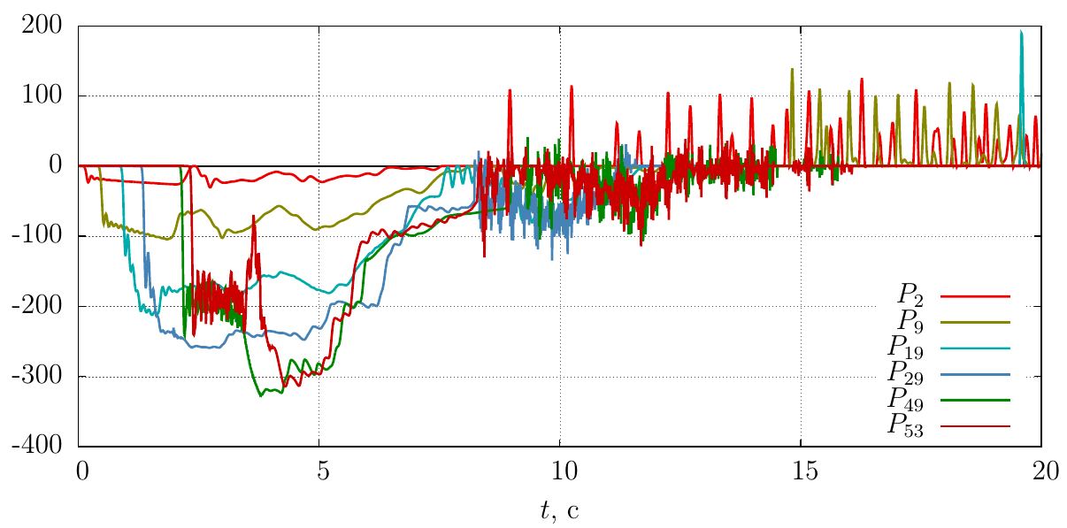
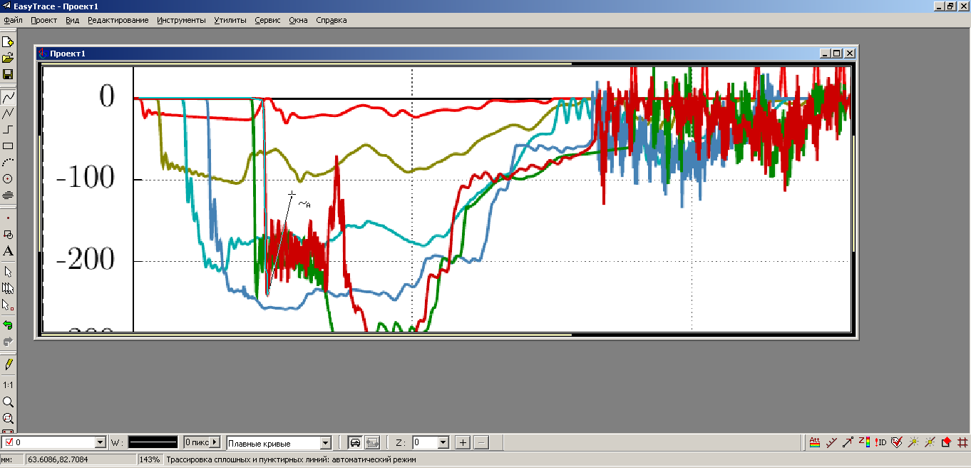
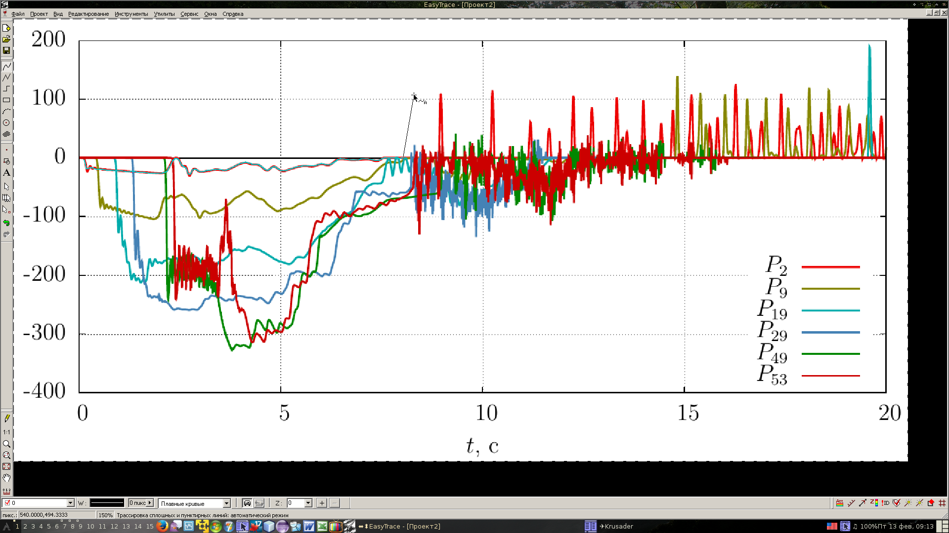
So, we have a raster chart. For good for this example, it would be necessary to take the schedule for the experiment that caused all the fuss. But (no need to throw a slipper at me) I will not publish it. The data was transmitted to me for personal use, and no one gave permission for publication, but I did not ask. So, to illustrate the solution of the problem, let's take my schedule, having previously turned it into a raster one, for example, the same PNG. PNG is taken to spare the time and nerves of my readers, to speed up the loading of images.
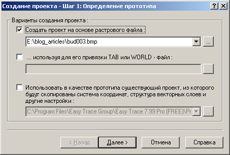
Install Easy Trace Pro and create a new project there based on the raster file
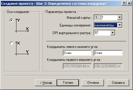
We set the units of measurement and the position of the origin of coordinates - I took millimeters and the lower left corner
As a result, our project is ready

2. Tracing the line graph and convert to tabular format
Raster vectorization is a process that does not exclude manual labor. Especially here are a few graphs, my experiment data was also such a plan. Therefore, the first thing we do is choose the color to be traced.
Tools -> Tracing -> Color Set
Use the mouse cursor to point at the desired schedule and click on the desired color in the window at the cursor.
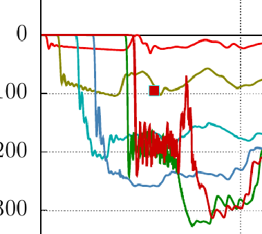
On this screen, the mouse cursor did not work - apparently shy, but the selected graph is visible on the next screen - it is highlighted in pink

Now we will trace. I did not read the program manual, so I acted on the obum, and I must say, the program is friendly enough for a new user.
Tools -> Tracing -> Curvilinear
After that click the cursor at the beginning of the graph.
And the program draws along the curve of the graph a rather long line, selecting it from the entire contents for the color we set. And it stops only where it is not clear where to go next. The screenshot shows - stumbled upon a high-frequency "daub." This section will have to be carefully passed by hand.
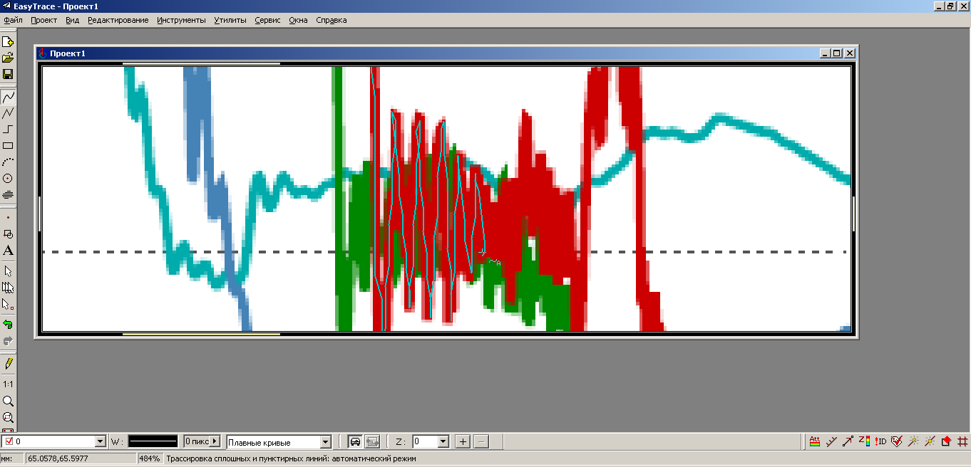
After we pass it, the trace will surely explode further, just following the curve
and stop again. You will have to go to the end manually, but it is obvious that for fairly smooth curves, the process will automatically run without interference.
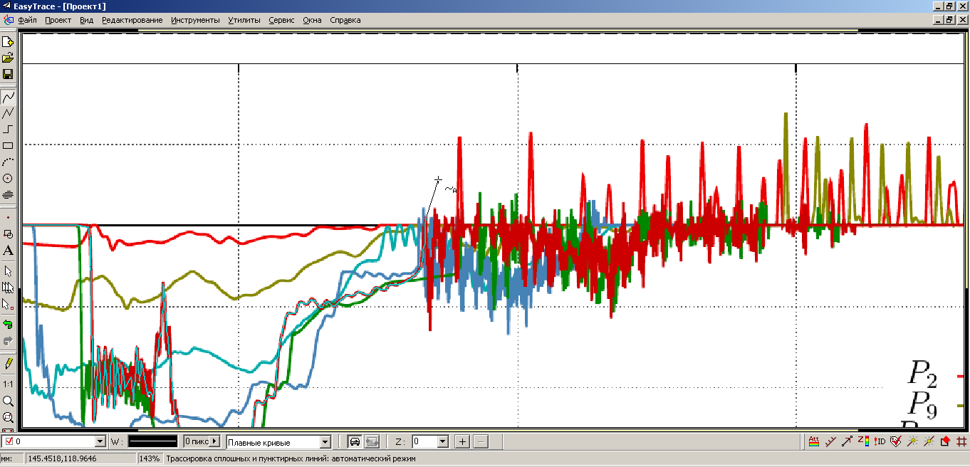
After we have gone through the entire graph, we have a vector curve that needs to be converted into a table of points.
File -> Export
In the window that appears, select the format.
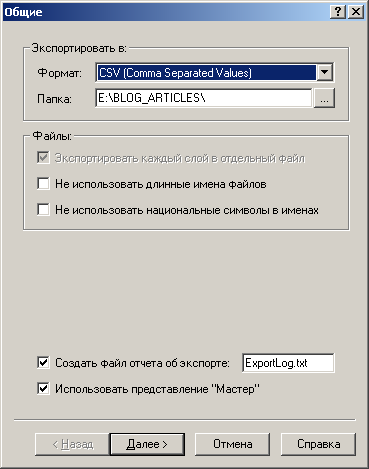
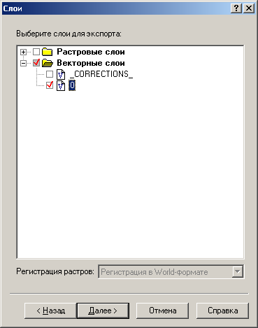
I must say, the choice is not great, and the only position that will interest us is the CSV, which can be opened in Excel or LibreOffice Calc. Next, set up the export parameters, in particular, select the vector layer in which our graph is located
set the file name

and pay attention to the type of data column separator - comma, which is the default, we are satisfied

Everything, in the graph.csv file there are data taken from the raster graph.
3. Translation of data into units of interest
Naturally, we are interested in X, Y not in millimeters from the lower left corner, but in units of measurement, plotted along the axes. In addition, it is necessary to adjust the position of the origin. We will deal with this in LibreOffice Calc, although you can use any other software suitable for processing data arrays.
Open the data table in LibreOffice Calc.
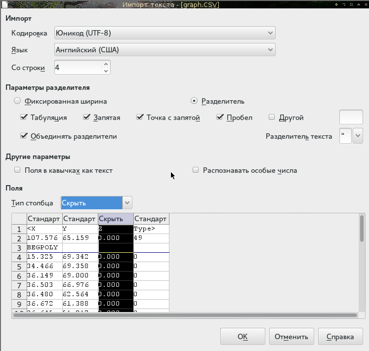
Here we pay attention to the encoding, choose the language "enemy" - so that the separator of the whole and fractional parts was a point. We import the table starting from the 4th row, ignoring the last two columns with zeros. Click OK and get the data table.
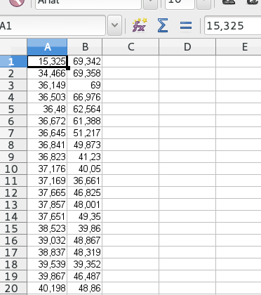
Now adjust the zero. For this measure, at what distance is zero from the bottom and left edges of the picture. From the left it is obvious to 15,325 mm, since this is the first point of the graph. Subtract this value from all values in the first column.
The ordinate of the first point is also zero, so 69,342 should be subtracted from the second column. But it is in this case. Otherwise, in Easy Trace there is a ticker, which can determine the zero offset.

Done, zero is where necessary. Now we calculate the scale along the axes. Let's measure the time axis and the ordinate axis with a ruler. It turns out this alignment: 20 seconds corresponds to 184.4 mm of the x-axis, and 600 kiloons - 80.4 mm of the ordinate axis. In proportion, we adjust the values from column C and D of our table.
In general, hurray - we have a data table torn out from the raster graph. It remains to verify how this all corresponds to the truth.

For the original graph from the example, I have data (I received it myself), so I’ll just build both graphs and we will compare them
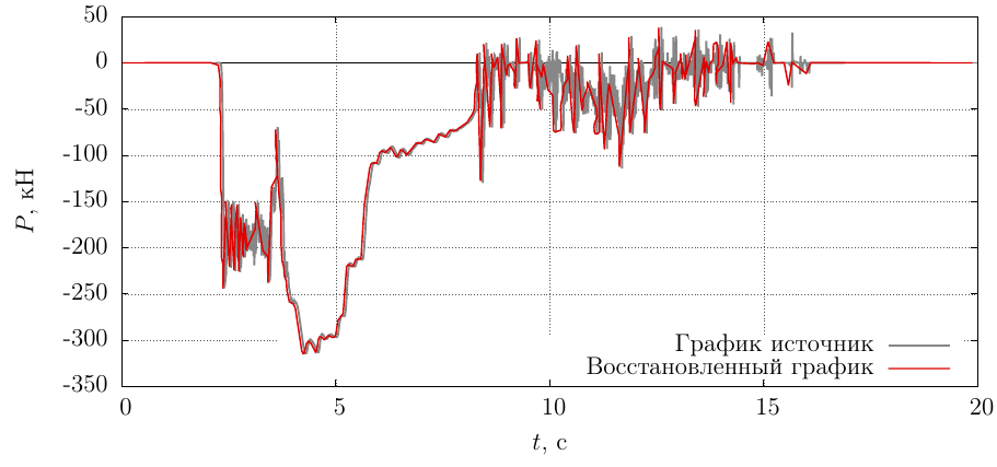
The coincidence is lame only in places where the line of the graph was smeared on a raster, but with proper skill it was possible to adjust it even better.
However, we have a data table that can be built into a vector, interpolated, and processed as we need.
Conclusion
The stated approach is rather simple-minded and accessible to everyone. I myself do this for the first time, according to the first prompt that worked, so I can not navigate in the technique of such work. If the reader can offer something more rational, then the author is open to constructive criticism.
Thank you for attention!
PS: Easy Trace Pro runs perfectly and works under wine, so there is no need for virtual Windows
Source: https://habr.com/ru/post/250441/
All Articles