Flames in CSS
After reading the article about drip transformation in CSS, I decided to play around with the settings in the code of the example on CodePen and randomly selected moving blocks . It seemed to me beautiful and similar to the burning process. After some thought, the code was artisanally sawn into pieces, flavored with transparency of the background, animation and color shadows, and this is what came of it .
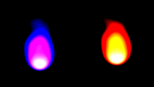
The essence is simple: we have several transparent blocks with a shadow of the desired color (I called them magnets, because visually they attract flames to themselves, although, formally, their shadows form it) and a round block from below (we will call it a sphere). With the help of CSS-animation, we make the "magnets" move over the "sphere", the main thing is to set different circulation times, and, preferably, using numbers for which the NOC will be large enough so that the pattern of fire movement does not repeat too often. Approaching and moving away, these blocks contribute to the fact that their shadows are rendered as part of the “sphere”, creating a burning effect. And so that the fire does not drift in one direction, the animation of the “magnets” is designed to move clockwise and counterclockwise.
')
The background of the blocks is set to transparent , and the shadow is rendered, only approaching the lower block. As a final touch, a bright border-bottom has been added to the “sphere”, which, while also being blurred, mimics the bright base of the flame tongue quite well.
Interestingly, when changing the background color ( back-color ) to a lighter one, there are strong distortions in the drawing, and with even more highlight the image disappears altogether. So, the dark fire could not be done. If someone in the comments tells you how to get around this problem, I would be very grateful.
A little about the parameters, except for the background. The adequacy of the image is maintained approximately in the following ranges:
As in the publication that inspired me, I note that this is not for practical use , but only for the sake of experiment. I would be grateful for corrections and additions, for sure this method can be improved. You look, and for practical application somewhere will fit.
PS At the last check I noticed that the animation does not work in Firefox, perhaps this is CodePen incorrectly setting the prefixes when compiling LESS. But, rather, an error in my code, but it does not work out. I would be happy to help!
The essence is simple: we have several transparent blocks with a shadow of the desired color (I called them magnets, because visually they attract flames to themselves, although, formally, their shadows form it) and a round block from below (we will call it a sphere). With the help of CSS-animation, we make the "magnets" move over the "sphere", the main thing is to set different circulation times, and, preferably, using numbers for which the NOC will be large enough so that the pattern of fire movement does not repeat too often. Approaching and moving away, these blocks contribute to the fact that their shadows are rendered as part of the “sphere”, creating a burning effect. And so that the fire does not drift in one direction, the animation of the “magnets” is designed to move clockwise and counterclockwise.
')
The background of the blocks is set to transparent , and the shadow is rendered, only approaching the lower block. As a final touch, a bright border-bottom has been added to the “sphere”, which, while also being blurred, mimics the bright base of the flame tongue quite well.
Interestingly, when changing the background color ( back-color ) to a lighter one, there are strong distortions in the drawing, and with even more highlight the image disappears altogether. So, the dark fire could not be done. If someone in the comments tells you how to get around this problem, I would be very grateful.
A little about the parameters, except for the background. The adequacy of the image is maintained approximately in the following ranges:
- brightness - from 1.4 to 2.0;
- contrast - from 8 to 12;
- blur - from 15 to 22;
- intensity - from 50% to 90%.
As in the publication that inspired me, I note that this is not for practical use , but only for the sake of experiment. I would be grateful for corrections and additions, for sure this method can be improved. You look, and for practical application somewhere will fit.
PS At the last check I noticed that the animation does not work in Firefox, perhaps this is CodePen incorrectly setting the prefixes when compiling LESS. But, rather, an error in my code, but it does not work out. I would be happy to help!
Source: https://habr.com/ru/post/250193/
All Articles