Creating an iOS application. From idea to result
It all started when I looked around and, not seeing the car of my dreams, decided to design it myself
Ferdinand Porsche
Hi, Habr. I want to tell you how I created my first iOS application and what came of it.
Idea
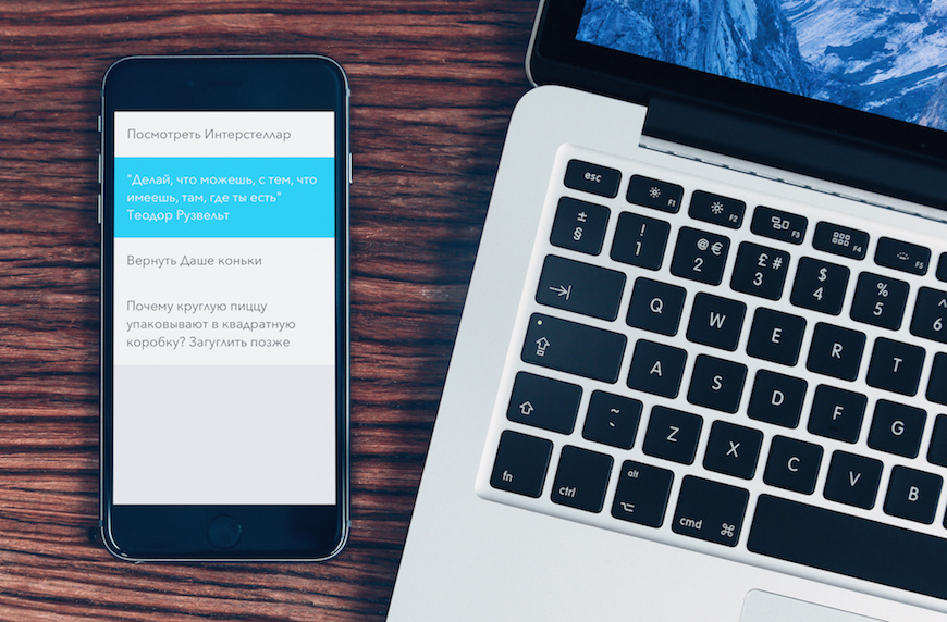
The idea for the application arose by itself: create something that you would gladly use yourself. I constantly write notes. After all, every busy person there is a certain set of facts that he receives during the day, and which is worth remembering. And since all people forget (and this is normal!), There is no better solution than just writing it down. All the time I felt some inconvenience when working with the app-store applications presented in the AppStore. Excessive complexity in management, the presence of unnecessary categories, the accumulation of additional information - all this prevents the application from performing its main function. Plus, many of these things just look ugly.
Therefore, putting all the bets on simplicity and convenience, I started to create a concept. Model application with a single list of notes. All in one place, what could be easier? If something has more value or relevance, it’s not at all necessary to label it, because it is enough just to move the more important note to the top of the list. Old and unnecessary records will be gradually lowered and subsequently deleted by the user.
')
Functional
After the concept was invented, I wrote out the main functionality - those things that I would like to emphasize in management:
- One main list for all notes;
- All actions with zamety should be performed in one motion - creating, editing, deleting, selecting, moving to the top and sharing;
- The ability to easily share notes on Facebook, Twitter, copy or send to e-mail;
- Highlighting a note in several colors, depending on priority and urgency;
- Easy editing in portrait and landscape orientation;
- Day and night themes for comfortable work at any time of the day
Pretty standard functionality for this kind of applications, agree. But this is only the tip of the iceberg, the devil is in the details.
Tools
Before writing code in Xcode, I completely recreated the appearance of the application in the Sketch vector editor. This program is great for quickly creating layouts. There are a lot of plug-ins available for this application, among them is Sketch Preview - viewing an artboard right on your device through the Skala Preview program. Just need to download free software Skala Preview on your computer and mobile device and install the plugin. After that, select the desired artboard, press the Command + P combination and within a second the appearance of the application is transmitted to the device.
In addition, the application is very convenient to create screenshots for publication in the AppStore. For each screen size created its own set of artboards, along with the use of styles, the time spent on formatting is minimal. But about the publication a little later.
Development
In the application, I used only two controllers - one directly for all-all-all notes, the other - to display a small tutorial on the first run. I organized the work with the database using the CoreData framework.
After creating the basic functionality (creating, deleting, editing notes), I decided to improve each of these functions.
You must admit that editing text in iOS is rather inconvenient. If you make a mistake in the word to move the cursor to the desired position, you must make a touch and without removing your finger from the screen, try to get to the selected area. In addition, after correcting the error, you need to move the cursor back to the end of the line. In my application, I decided to rework the mechanism for moving the cursor: in order to make a change to a word, you only need to make a swipe in the area between the keyboard and the typed phrase without blocking the text review.
I decided to implement the animations for removing and moving to the top on my own, and to bring the visual accompaniment as close as possible to real life. Something has gained a higher priority - swipe to the right and the note is moved to the top of the list. To delete - swipe to the left and the strikethrough animation will show how much more you need to extend the swipe to complete the deletion. In case of accidental deletion - you just need to shake the device (“Shake”), and the note will return to its original place.
In order to highlight the note, I used LongTapGesture and the three primary colors of the application - white, blue and red, which formed the main color palette.
To share notes from the application, I added an additional lower bar, for the appearance of which you need to make a swipe from under the bottom edge of the device (Bottom Edge Swipe). In the panel for sharing all the most important actions are collected - posting on Facebook or Twitter, sending a list of notes by e-mail, or simply copying for further use. The mechanism is very simple - you need to select the necessary records, after - click on the desired function. If you need to return to the normal mode - svayp on the bar, but already down.
I decided to make the transition between day and night themes automatic - why hasn't anyone thought of changing the appearance depending on the position of the sun in the sky? It's very simple - after dark and after sunrise the theme changes, and the user does not need to be distracted from creating notes, because the application will always automatically adjust to the surrounding conditions.
Naming
The name of the application - the most important part in the development, this is the first thing that the user sees in the store. On Habré there is an excellent article about this. I decided to approach the selection of the name thoroughly: for a start, I went through the list of 1000 most popular words in English and wrote out all sorts of combinations that would be suitable for the name of the mobile application for notes, besides I wanted to keep within 8-10 characters. But I didn’t want to choose the name SuperNotes or NotesPlus etc, I wanted something new. I liked the mad note combination, which I stumbled upon in the Urban Dictionary:
mad note - excellent, entertaining, unexpected, unexpected or awe-inspiring
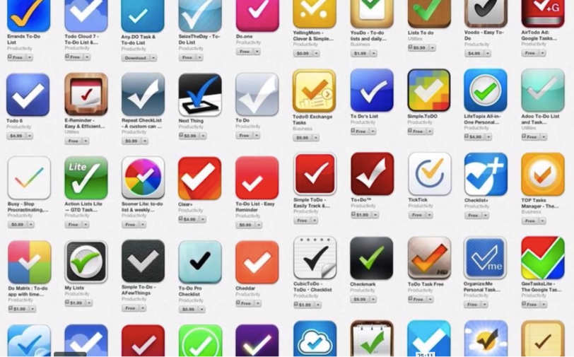
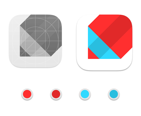
Immediately, a slogan appeared: MadNotes - Note your passion. Since my primary color palette was already ready (white, blue, red), I decided to immediately come up with a suitable icon. The situation with the logos for applications of this kind deplorable:
Since the notes on paper are written in pencil or pen, I decided to display it on the icon - a pencil rotated at a 45 degree angle. It turned out like this:
Result
Since the project was originally conceived as a designer, I decided to participate with my application in the Ukrainian Design Awards: The Very Best Of All-Ukrainian competition in the Digital Design category. There were a few weeks left before the competition, during which time I managed to publish at Behance, where I visually showed all the main functions of the application, and also recorded a video preview.
Since the winners of the competition were not disclosed until the very last moment, it was incredibly pleasant to see their work at the exhibition of the winners' works - the jury saw and appreciated the main concept - a minimalist and, at the same time, a functional application for taking notes.

The application has been in the AppStore for several months already, during this time I made six updates and rewrote the code in Swift. In the latest version (1.2), synchronization with iCloud has been added, so the notes have already managed to move to the cloud.
Thank you attention.
Note your passion
Source: https://habr.com/ru/post/250171/
All Articles