Use SVG (Part One)
I like to use SVG wherever possible.
When creating a front-end, I divide the entire graphics into two categories:
Names are not very important, but to recognize these two categories is important. We can combine all the icons into one sprite (which will be discussed in the second part), but you will never do this for the images used in the article.
For images of "content" there is nothing better than the good old. It will work * with SVG and raster images (PNG, JPEG, etc.). It all depends on what the site owner loads.
In my opinion, good browser support for the tag does not force us to look for any alternatives for working with SVG.
But!
When using responsive design, Internet Explorer does not scale, although many expect it. Let's use the following example:
')
When testing SVG and PNG, an error is found that is unique only to IE (currently, SVG is supported in versions 9–11):
Usually we can set the
We have to set the
Or you can set the global parameter
The same can be done when you want to streamline text next to the image:
Ideally, we should use
In this lesson we talked about creating responsive images. Why not? The fact is that it is wrong to add them using only one tag. You must at least specify the width and height, and even better to create a separate element for full control over the image
It sounds easy, but if you haven’t previously used SVG, IE may be in trouble. If you want to see everything with your own eyes, then a demo is available here: problem , solution , and streamlined text .
In Part 2, we will look at using SVG for the “UI” category.
All the fun ahead!
When creating a front-end, I divide the entire graphics into two categories:
- “Content” - images that change depending on content
- “UI” - everything that is integrated into the site
Names are not very important, but to recognize these two categories is important. We can combine all the icons into one sprite (which will be discussed in the second part), but you will never do this for the images used in the article.
Content
For images of "content" there is nothing better than the good old. It will work * with SVG and raster images (PNG, JPEG, etc.). It all depends on what the site owner loads.
* in case the server and CMS do not block MIME type: image/svg+xmlIn my opinion, good browser support for the tag does not force us to look for any alternatives for working with SVG.
But!
When using responsive design, Internet Explorer does not scale, although many expect it. Let's use the following example:
')
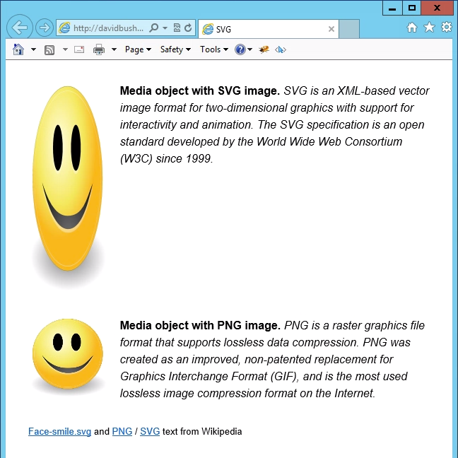
<article class="media"> <img class="media__image" src="smile.svg" alt="Smiley"> <div class="media__body"> <p><strong>Media object with SVG image.</strong> … </p> </div> </article> .media__image { max-width: 20%; } When testing SVG and PNG, an error is found that is unique only to IE (currently, SVG is supported in versions 9–11):
Usually we can set the
max-width parameter in CSS, and all images will be well scaled (but they will not become larger than the original image). In IE, this principle does not work.We have to set the
width for the images. Like this: .media__image { width: 20%; max-width: 300px; } Or you can set the global parameter
max-width for the parent element: img { display: block; width: 100%; } .media__image { max-width: 20%; } <article class="media"> <div class="media__image"> <img src="smile.svg" alt="Smiley"> </div> <div class="media__body"> <p><strong>Media object with SVG image.</strong> … </p> </div> </article> The same can be done when you want to streamline text next to the image:
<article class="prose"> <img src="smile.svg" class="prose__image"> <p><strong>Media object with SVG image.</strong> … </p> </article> Ideally, we should use
.prose__image { max-width: 20%; } .prose__image { max-width: 20%; } . As a result, they will fulfill these conditions:- May not be more than 20% wider than the parent element;
- No wider than the original image (300px).
Conclusion
In this lesson we talked about creating responsive images. Why not? The fact is that it is wrong to add them using only one tag. You must at least specify the width and height, and even better to create a separate element for full control over the image
It sounds easy, but if you haven’t previously used SVG, IE may be in trouble. If you want to see everything with your own eyes, then a demo is available here: problem , solution , and streamlined text .
In Part 2, we will look at using SVG for the “UI” category.
All the fun ahead!
Source: https://habr.com/ru/post/250129/
All Articles