Sticky effect
Just recently, Chris wrote about "The Effect of Drip Conversion to CSS . " The effect is really cool and the technique itself is implemented rationally, but this approach through conventional CSS filters has certain drawbacks: you cannot use opacity, add content to inside drops, problems with background colors.
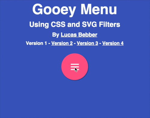
In recent days, I have experimented quite a lot with SVG filters and noticed that with their help one can solve the problems described above in the CSS implementation. Look at the sticky menu that I made for the demonstration:
Codepen
')
SVG filters are a very powerful thing. But this is a very broad topic, so we will talk only about the essentials for solving our problem.
Despite the name, we can apply these filters to DOM elements using CSS and this will work in most browsers .
Classic syntax to describe filters:
Apply a filter to a DOM element:
You may need vendor prefixes for the filter property.
The element contains one or more filter signs (filter primitives) that perform the functions of blur, color transform, and shading. A complete list of these primitives is here .
Take a look at a couple of examples:
Codepen
This simple filter performs a three-pixel blur element. It is important to pay attention to the in = "SourceGraphic" attribute. In is determined by what exactly the filter will be applied to. The SourceGraphic value returns the original element. Thus, we indicate that blurring should occur for the original graphic object. Everything is quite simple.
Let's look at an example a bit more complicated: drop shadow. It clearly shows how the filter chain works by noting together:
Codepen
Take a look at the result and in attributes. The result indicates the name of the result with the use of a filter, which subsequently allows us to filter this result, unlike the original graphic object. Ie in this example, we made a blur for an element, darkened a specifically blurred object, and then changed the position for blurred and darkened objects.
Notice the notice of <feBlend> . It contains two attributes to indicate the scope: in with the value of SourceGraphic and in2 with the value of shadow.
Now that we understand the basic principles of SVG filters, let's figure out how to make a sticky effect.
The basic technique is described here . Let me remind you that the idea is to simultaneously blur and contrast elements. And it will work in a magical way.
Codepen
However, we still have:
All this does not allow to apply this trick in a real project.
With the help of SVG filters, we can implement what was not possible with CSS: we can increase the contrast only for the alpha channel, without changing colors; and with the help of SourceGraphic, we can only apply blur to the element itself, without changing the content. Also, since we work with the alpha channel, not only should it be transparent, a transparent background is necessary, be careful with this.
Main code:
Briefly about what we did:
If you have not used color matrix filter before, then you need to explain how it works. Present a table of four rows and five columns. It will look like this.
Each line is a channel (red, green, blue and alpha) and uses to set the value of the channel. The first four columns are also channels. The number in the cell is the multiplier of the channel in the column for the channel in the row. For example, 0.5 in the R row and the G column adds the current Green value * 0.5 to the red channel. The last column is no longer a channel and is used to add or subtract. The numbers specified in it are multiplied by 255 and assigned to the appropriate channel.
This is a long time to explain, but in fact the use of the filter is extremely simple. In our case, we only change the value of the alpha channel and our matrix will look like this:
RGB channels remain unchanged. The value of the alpha channel is multiplied by 18, and then 7 * 255 is subtracted from it, effectively increasing the contrast of the transparency alone. All values can be customized to your needs.
To apply this matrix to the feColorMatrix filter, we need to write all the values in a specific order:
As a result, our intended effect works. Example:
Codepen

You can customize everything you need, add a shadow, change the color of each element, everything is at your disposal!
SVG filters have good support, but not all browsers support their application to DOM elements, in particular, Safari. However, they do work, at least, on Firefox and Chrome, even the Android version. But the filter noticeably spoils the picture if not supported. If you need to use it, then use it for SVG elements instead of DOM elements.
In recent days, I have experimented quite a lot with SVG filters and noticed that with their help one can solve the problems described above in the CSS implementation. Look at the sticky menu that I made for the demonstration:
Codepen
')
SVG Filters 101
SVG filters are a very powerful thing. But this is a very broad topic, so we will talk only about the essentials for solving our problem.
Despite the name, we can apply these filters to DOM elements using CSS and this will work in most browsers .
Classic syntax to describe filters:
<svg xmlns="http://www.w3.org/2000/svg" version="1.1"> <defs> <filter id="name-your-filter-here"> ... <!-- insert filters here --> ... </filter> ... </defs> </svg> Apply a filter to a DOM element:
.selector { filter: url('#name-of-your-filter-here'); /* you can also load filters from external SVGs this way: */ filter: url('filters.svg#name-of-your-other-filter-here'); } You may need vendor prefixes for the filter property.
The element contains one or more filter signs (filter primitives) that perform the functions of blur, color transform, and shading. A complete list of these primitives is here .
Take a look at a couple of examples:
Codepen
<filter id="blur"> <feGaussianBlur in="SourceGraphic" stdDeviation="3" /> </filter> This simple filter performs a three-pixel blur element. It is important to pay attention to the in = "SourceGraphic" attribute. In is determined by what exactly the filter will be applied to. The SourceGraphic value returns the original element. Thus, we indicate that blurring should occur for the original graphic object. Everything is quite simple.
Let's look at an example a bit more complicated: drop shadow. It clearly shows how the filter chain works by noting together:
Codepen
<filter id="drop-shadow"> <feGaussianBlur in="SourceGraphic" stdDeviation="7" result="shadow" /> <feOffset in="shadow" dx="3" dy="4" result="shadow" /> <feColorMatrix in="shadow" mode="matrix" values="0 0 0 0 0 0 0 0 0 0 0 0 0 0 0 0 0 0 0.6 0" result="shadow" /> <feBlend in="SourceGraphic" in2="shadow" /> </filter> Take a look at the result and in attributes. The result indicates the name of the result with the use of a filter, which subsequently allows us to filter this result, unlike the original graphic object. Ie in this example, we made a blur for an element, darkened a specifically blurred object, and then changed the position for blurred and darkened objects.
Notice the notice of <feBlend> . It contains two attributes to indicate the scope: in with the value of SourceGraphic and in2 with the value of shadow.
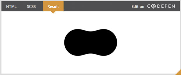
Now that we understand the basic principles of SVG filters, let's figure out how to make a sticky effect.
We fix already passed
The basic technique is described here . Let me remind you that the idea is to simultaneously blur and contrast elements. And it will work in a magical way.
Codepen
However, we still have:
- Problems in working with different colors.
- Blur for the entire element, including the content.
- Inability to use opacity.
All this does not allow to apply this trick in a real project.
With the help of SVG filters, we can implement what was not possible with CSS: we can increase the contrast only for the alpha channel, without changing colors; and with the help of SourceGraphic, we can only apply blur to the element itself, without changing the content. Also, since we work with the alpha channel, not only should it be transparent, a transparent background is necessary, be careful with this.
Main code:
<filter id="goo"> <feGaussianBlur in="SourceGraphic" stdDeviation="10" result="blur" /> <feColorMatrix in="blur" mode="matrix" values="1 0 0 0 0 0 1 0 0 0 0 0 1 0 0 0 0 0 18 -7" result="goo" /> <feBlend in="SourceGraphic" in2="goo" /> </filter> Briefly about what we did:
- First, we blur 10 pixels and assign a name to this result.
- Then for the result we applied the color matrix filter to increase the contrast of the alpha channel.
- And after that we inserted the original graphic object into this effect.
About Color Matrices
If you have not used color matrix filter before, then you need to explain how it works. Present a table of four rows and five columns. It will look like this.
| R | G | B | A | + ---|------------------- R | 1 | 0 | 0 | 0 | 0 ---|------------------- G | 0 | 1 | 0 | 0 | 0 ---|------------------- B | 0 | 0 | 1 | 0 | 0 ---|------------------- A | 0 | 0 | 0 | 1 | 0 ---|------------------- Each line is a channel (red, green, blue and alpha) and uses to set the value of the channel. The first four columns are also channels. The number in the cell is the multiplier of the channel in the column for the channel in the row. For example, 0.5 in the R row and the G column adds the current Green value * 0.5 to the red channel. The last column is no longer a channel and is used to add or subtract. The numbers specified in it are multiplied by 255 and assigned to the appropriate channel.
This is a long time to explain, but in fact the use of the filter is extremely simple. In our case, we only change the value of the alpha channel and our matrix will look like this:
| R | G | B | A | + ---|------------------- R | 1 | 0 | 0 | 0 | 0 ---|------------------- G | 0 | 1 | 0 | 0 | 0 ---|------------------- B | 0 | 0 | 1 | 0 | 0 ---|------------------- A | 0 | 0 | 0 |18 |-7 ---|------------------- RGB channels remain unchanged. The value of the alpha channel is multiplied by 18, and then 7 * 255 is subtracted from it, effectively increasing the contrast of the transparency alone. All values can be customized to your needs.
To apply this matrix to the feColorMatrix filter, we need to write all the values in a specific order:
values="1 0 0 0 0 0 1 0 0 0 0 0 1 0 0 0 0 0 18 -7" Demo
As a result, our intended effect works. Example:
Codepen
You can customize everything you need, add a shadow, change the color of each element, everything is at your disposal!
Summarize
- The filter should apply to the container with the elements, and not to the elements themselves.
- Due to the very pulling effect, the container should be a bit larger area than the contents. Otherwise, you can get similar defects at the edges:
- In order to apply this filter to the example for rectangles, we must use a slightly more sophisticated method. Instead of rendering the original object over the sticky effect, we need to apply the feComposite filter with the atop attribute in order to hide everything that goes beyond:
<filter id="fancy-goo"> <feGaussianBlur in="SourceGraphic" stdDeviation="10" result="blur" /> <feColorMatrix in="blur" mode="matrix" values="1 0 0 0 0 0 1 0 0 0 0 0 1 0 0 0 0 0 19 -9" result="goo" /> <feComposite in="SourceGraphic" in2="goo" operator="atop"/> </filter>
Codepen
You can use this approach not only to create a sticky effect, but also in more simple cases, for example, to round the corners of several rectangles. - Although this filter is light in volume, it can be very resource intensive if used for large areas. So be careful.
Support
SVG filters have good support, but not all browsers support their application to DOM elements, in particular, Safari. However, they do work, at least, on Firefox and Chrome, even the Android version. But the filter noticeably spoils the picture if not supported. If you need to use it, then use it for SVG elements instead of DOM elements.
Source: https://habr.com/ru/post/250005/
All Articles