The effect of drip transform in CSS
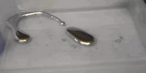
We recently talked about morphing forms in SVG , when one form is transformed into another. And now let's take a look at how forms can flow into each other. This sticky amebic amebic effect is familiar to many from the video with drops of mercury on the surface .
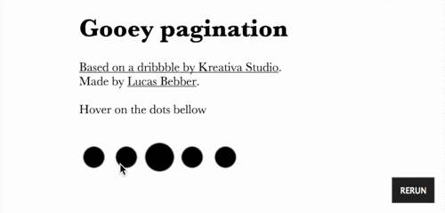
I’m not exactly sure who first discovered this application on the web, but initially I was guided by a demo from Lucas Bebber:
')
Codepen
Then I saw a demo from Felix Hornoiu (low quality gif for better performance on the web):

Blur, which obviously has the effect of blurring, while contrast gives shape to the spot in the center. With the right balance, the result is a “sharp enough” form.
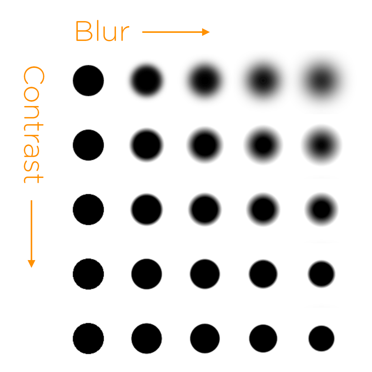
The main thing is that when two blocked elements are located close to each other, then when they are contrasted, they begin to look like a single whole.

The important point is that the contrast needs to be applied to the parent element.
You will get the final result after you animate your “drops”. Here is a demo on CodePen where you can play around with the values.
I am glad that now it works not only on WebKit / Blink! Firefox 35 fully supports filters without flags and other nuances. Beta Aurora is already v35 and I checked that everything works fine there.
Thus, the demo works in Chrome / Safari / Opera / Firefox / iOS / Android. Not bad. Only IE is not supported.
This is not for practical use !!! Take it easy.
Personally, I'm just crazy about this trick. Yes, a similar implementation with many elements decently loads the CPU, but with two circles everything works fine.
I am sure there are better ways to implement this idea.
I’m not exactly sure who first discovered this application on the web, but initially I was guided by a demo from Lucas Bebber:
')
Codepen
Then I saw a demo from Felix Hornoiu (low quality gif for better performance on the web):
The idea is quite simple - to apply the filter property for the element at the same time with the values of blur and contrast.
Blur, which obviously has the effect of blurring, while contrast gives shape to the spot in the center. With the right balance, the result is a “sharp enough” form.
The main thing is that when two blocked elements are located close to each other, then when they are contrasted, they begin to look like a single whole.
The important point is that the contrast needs to be applied to the parent element.
.stage { /* contrast */ background: white; /* , */ padding: 30px; -webkit-filter: contrast(20); filter: contrast(20); } .dot { border-radius: 50%; width: 50px; height: 50px; /* contrast */ background: black; -webkit-filter: blur(15px); filter: blur(15px); } You will get the final result after you animate your “drops”. Here is a demo on CodePen where you can play around with the values.
Browser Support
I am glad that now it works not only on WebKit / Blink! Firefox 35 fully supports filters without flags and other nuances. Beta Aurora is already v35 and I checked that everything works fine there.
Thus, the demo works in Chrome / Safari / Opera / Firefox / iOS / Android. Not bad. Only IE is not supported.
Comment Predictions
This is not for practical use !!! Take it easy.
Personally, I'm just crazy about this trick. Yes, a similar implementation with many elements decently loads the CPU, but with two circles everything works fine.
I am sure there are better ways to implement this idea.
Source: https://habr.com/ru/post/250001/
All Articles