The problem of diagonal boarders and Firefox
I recently encountered such a problem - I added a nonstandard frame for pictures using pseudo-elements and boarders and was faced with the fact that Firefox is completely unable to cope with the smoothing of the lines (anti-aliasing) of these same boarders.
Googling decisions, eventually came across this short article that miraculously solved the problem. I hope someone else will come in handy, even though the article is tiny.
Demo problems
Mozilla Firefox is one of the browsers that render diagonal boarders using anti-aliasing. And everything would be fine if he applied it correctly, as other browsers do (including IE 9 and IE10). But, unfortunately, it turns out not very.
')
Quite a while ago, I read and tweeted a good article from Chris Morgan , in which he explained how and why “transparent” in CSS may not be transparent , especially on diagonal boarders.
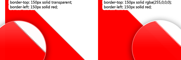
Let's say you have such a triangle on CSS:
This code is equivalent to the following, since “transparent” is the same as rgba (0, 0, 0, 0):
But what do we see?
So, in order for the code to work correctly and in Firefox, you need to avoid using the “transparent” value, instead of using the corresponding RGB color with a zero alpha channel.
In one small project, I used an abstract triangular divider made using a diagonal border. Newance was that this separator was quite large, separating one part of the site from another.
Here is an example of such a separator:

If you use Firefox, you may notice a vague effect on the border of colors, which is formed due to anti-aliasing. This is striking and the previous solution does not help.
A pretty dirty solution that I came across with this situation helps me: -moz-transform: scale (.9999). Surprisingly, a small scale, invisible to the eye, solves our problem. By the way, technically there is no need to write a prefix for this transformation, since Firefox supports the non-prefix version since version 16 .
But, since this hack is needed only for Firefox, the use of the prefix here is just in place.
Badly rendered on the following versions of Firefox:
As far as I could see, this problem is fixed in Mozilla Firefox Nightly 20.0a1.
PS From the translator: I have no first problem on Ubuntu Firefox 35.0.1, and in the second case, terrible teeth, as in my case. The second fix solves.
Googling decisions, eventually came across this short article that miraculously solved the problem. I hope someone else will come in handy, even though the article is tiny.
Demo problems
Mozilla Firefox is one of the browsers that render diagonal boarders using anti-aliasing. And everything would be fine if he applied it correctly, as other browsers do (including IE 9 and IE10). But, unfortunately, it turns out not very.
')
First problem
Quite a while ago, I read and tweeted a good article from Chris Morgan , in which he explained how and why “transparent” in CSS may not be transparent , especially on diagonal boarders.
Let's say you have such a triangle on CSS:
div { border-top: 150px solid transparent; border-left: 150px solid red; } This code is equivalent to the following, since “transparent” is the same as rgba (0, 0, 0, 0):
/* red = rgba(255,0,0,0) */ div { border-top: 150px solid rgba(255,0,0,0); border-left: 150px solid red; } But what do we see?
Decision
So, in order for the code to work correctly and in Firefox, you need to avoid using the “transparent” value, instead of using the corresponding RGB color with a zero alpha channel.
Second problem
In one small project, I used an abstract triangular divider made using a diagonal border. Newance was that this separator was quite large, separating one part of the site from another.
Here is an example of such a separator:
div { border-top: 70px solid rgba(0, 255, 0, 0); border-left: 600px solid green; } If you use Firefox, you may notice a vague effect on the border of colors, which is formed due to anti-aliasing. This is striking and the previous solution does not help.
My decision
A pretty dirty solution that I came across with this situation helps me: -moz-transform: scale (.9999). Surprisingly, a small scale, invisible to the eye, solves our problem. By the way, technically there is no need to write a prefix for this transformation, since Firefox supports the non-prefix version since version 16 .
But, since this hack is needed only for Firefox, the use of the prefix here is just in place.
div { border-top: 70px solid rgba(0, 255, 0, 0); border-left: 600px solid green; -moz-transform: scale(.9999); } Testing
Badly rendered on the following versions of Firefox:
- Mozilla Firefox 17.0.1
- Mozilla Firefox 18.0 - beta channel
- Aurora 19.0a2 (2012-12-06)
As far as I could see, this problem is fixed in Mozilla Firefox Nightly 20.0a1.
PS From the translator: I have no first problem on Ubuntu Firefox 35.0.1, and in the second case, terrible teeth, as in my case. The second fix solves.
Source: https://habr.com/ru/post/249735/
All Articles