The concept of "fold" is still relevant
What is at the top of the page, as opposed to what is hidden, always affects the user experience - regardless of the screen size. The average difference in the quality of assimilation of information “above the place of the fold” compared with the assimilation of information “under the place of the fold” is 84%.
Even though the exact location of the fold differs from device to device, it exists for each individual user on each individual screen. Responsive design may include 2, 3, 4 or more different folds, which differ depending on the devices and screen sizes for which the design is optimized. Each target device may have its hypothetical fold.
But bending is not only a dimension, it is a concept. Fold is important because what matters is what appears at the top of your page. Users scroll through it, but only if what is above the fold inspires confidence. What we see on the page without any action is what causes us to scroll further. This is true on the screen of any size, be it a mobile phone, tablet or computer: everything that is hidden and what the user needs to discover will only be visible if the user decides that it is worth it.
This is the same meaning as in the cost of information exchange:
')
• Visible without additional actions (ie, above the fold) = low cost of information exchange when viewing
• Invisible and requires additional actions to make visible (ie, below the fold, or hidden in some other way) = higher cost of information exchange, consisting of (a) mental effort to guess that something is hidden and accept positive the decision to open this content, and (b) a physical effort to do what it takes to see the content (for example, to scroll the page).
We do not go to the pages, do not look at useless and unnecessary content and do not scroll, guided by the blind hope that something interesting can be hidden 5 screens below. What we find at the top of the page helps us decide whether to continue scrolling, go to another page, go to another site, or abandon the task altogether. That is why long pages can be improved with pointers at the top of the page, which, using links or content, show users what they will see next.
As the screens shrink, we have to scroll more unnecessarily. When a small piece of information appears at the top of the small screen of a mobile phone, we look for the rest below. But we do it not because we like to scroll. We do this because we expect that there is more valuable information below the fold.
Stimulate scrolling
The webpage needs to create a whole story. Making users scroll the page can only be when they have a motive to do so. Visual elements of design can lead to a glance down the page. Attractive content can attract the user's attention. If the most interesting information is presented at the top of the screen, the user may be tempted to scroll page down.
If the page, regardless of its size, contains very little information at the top of the screen, it is difficult for the user to find out what else is on the page. This may play for an attractive page, but it may result in users refusing to scroll below. Such design examples create the impression of a “false bottom”, forcing the user to think that he saw without scrolling the entire page.

Mod Notebooks website opens with a full-screen image and video links. The only visual indication that there is still content below is the arrow placed here in an attempt to break the “false bottom”. The layout should not need arrows to force the user to scroll the page.

However, as soon as the user starts scrolling, Mod Notebooks site starts to motivate further scrolling very well. The site contains navigation based on anchor words, which allows the user to navigate directly to topics of interest. On screens of various sizes, text and images are placed on all pages, conveying more information to the user. Content is well ordered and tells about the product, motivating the user to scroll further.
If users do not see interesting information for themselves, they stop scrolling. In testing usability, only a few of the users make the “introductory” scrolling movement in order to roughly understand what is on the page, this behavior is far from typical. Users scroll the page only when they have a reason to do it.
The fold will always matter, since scrolling is an additional action that a user must take to get to the content. Just like waiting for the page to load, switching elements of the carousel or opening the accordion to see the text, scrolling is another step along the path of users to their goal.
Of course, there are design samples that successfully offer very little useful at the top of the page, at the same time encouraging users to scroll through the page. Successful design samples motivate to make an additional effort - they offer a pinch of interesting content, an intriguing introduction, a fascinating picture. Designers who create interesting and successful long pages know about the concept of fold - they know how to create a page that will stimulate the user's interest, the desire to study it, and not leave it. They value content more, which stimulates the user's desire to go down the page, content that makes an extra effort justified.
Fold effect example
In controversial issues related to interface design, the arguments for and against are usually taken into account, and the team responsible for user interaction questions needs to be assessed on which of the arguments is stronger. In this case, the theory has clearly defined boundaries: the price of interaction with the material above the fold and below it is significantly different, so that these two areas of the page will be completely differently perceived by users.
However, it is always good when empirical evidence supports the theory. And evidence of this is more than enough in the bend example. We have seen countless users in numerous usability studies in which the fold influenced behavior — most often in a negative way, since websites did not properly assess the importance of content over the fold. Users stopped scrolling the page before they found the necessary information or, even worse, did not realize that below the page may contain useful information for them.
There is also a quantitative evidence: when analyzing 57,453 studies with the fixation of the attention zone of the eyes, we found that the user's attention is significantly reduced in the area of the bend. The elements above the fold were viewed much more often than the elements below it: a 100 pixel wide zone directly above the fold was viewed 102% more often than a 100 pixel wide zone directly below the fold.
The image below is a consolidated “heat map” of all sites used in our study (excluding search engines and search pages). Content below the fold collects several views, but their number is incomparable with the number of views of content over the fold.
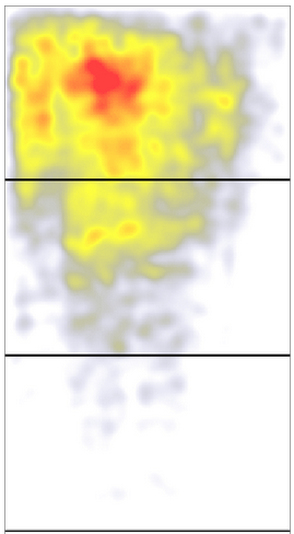
The summary "heat map" shows 57,453 points fixing the position of the eyes on a large number of pages, with the exception of search engines and pages with search results. Red color indicates areas where the user's eye was most often delayed, yellow - where users looked least often. White areas mean areas on which almost no sight has been fixed. The upper black bar shows the fold line in the study, the subsequent black lines are additional screens available after scrolling.
Another data array was obtained during the last analysis of screen advertising from Google, conducted using a large number of websites. In the course of the study, the “permissibility” of advertising was evaluated, and the browsing ability was determined as 50% of the pixels of graphic advertising present on the screen for one second. The ad located directly above the fold showed 73% visibility, while the advertisement directly below the fold received only 44% of the visibility. In a study conducted by Google, the fall caused by the fold was 66%, since this was the difference between how many ads were visible, located directly above the fold, compared to the advertisement located directly below the fold.
Why, according to the results of Google research, the difference was only 66%, while, according to our estimates, it reached 102%? The explanation lies in the difference between the measurement methods used. Google noted whether an advertisement is displayed on the screen so that the user can see it if he suddenly looks at the corresponding point on the screen. We fixed where the person actually looks at the screen and how much time he spends looking at it.
Two quantitative studies gave slightly different estimates of the effect of bending on user interaction. But both the resulting numbers are large: we are not talking about the difference of 5% or 10% between the perception of information over the fold and below the fold. The difference is about 66% –102%. If you need a single number as the average result of our estimates, you can take the golden mean of the range: 84% is the average difference between the perception of information over the fold and below the fold. It's a lot. Believe in the fold. It exists, and user interaction changes dramatically at this point.
Even though the exact location of the fold differs from device to device, it exists for each individual user on each individual screen. Responsive design may include 2, 3, 4 or more different folds, which differ depending on the devices and screen sizes for which the design is optimized. Each target device may have its hypothetical fold.
But bending is not only a dimension, it is a concept. Fold is important because what matters is what appears at the top of your page. Users scroll through it, but only if what is above the fold inspires confidence. What we see on the page without any action is what causes us to scroll further. This is true on the screen of any size, be it a mobile phone, tablet or computer: everything that is hidden and what the user needs to discover will only be visible if the user decides that it is worth it.
This is the same meaning as in the cost of information exchange:
')
• Visible without additional actions (ie, above the fold) = low cost of information exchange when viewing
• Invisible and requires additional actions to make visible (ie, below the fold, or hidden in some other way) = higher cost of information exchange, consisting of (a) mental effort to guess that something is hidden and accept positive the decision to open this content, and (b) a physical effort to do what it takes to see the content (for example, to scroll the page).
We do not go to the pages, do not look at useless and unnecessary content and do not scroll, guided by the blind hope that something interesting can be hidden 5 screens below. What we find at the top of the page helps us decide whether to continue scrolling, go to another page, go to another site, or abandon the task altogether. That is why long pages can be improved with pointers at the top of the page, which, using links or content, show users what they will see next.
As the screens shrink, we have to scroll more unnecessarily. When a small piece of information appears at the top of the small screen of a mobile phone, we look for the rest below. But we do it not because we like to scroll. We do this because we expect that there is more valuable information below the fold.
Stimulate scrolling
The webpage needs to create a whole story. Making users scroll the page can only be when they have a motive to do so. Visual elements of design can lead to a glance down the page. Attractive content can attract the user's attention. If the most interesting information is presented at the top of the screen, the user may be tempted to scroll page down.
If the page, regardless of its size, contains very little information at the top of the screen, it is difficult for the user to find out what else is on the page. This may play for an attractive page, but it may result in users refusing to scroll below. Such design examples create the impression of a “false bottom”, forcing the user to think that he saw without scrolling the entire page.
Mod Notebooks website opens with a full-screen image and video links. The only visual indication that there is still content below is the arrow placed here in an attempt to break the “false bottom”. The layout should not need arrows to force the user to scroll the page.
However, as soon as the user starts scrolling, Mod Notebooks site starts to motivate further scrolling very well. The site contains navigation based on anchor words, which allows the user to navigate directly to topics of interest. On screens of various sizes, text and images are placed on all pages, conveying more information to the user. Content is well ordered and tells about the product, motivating the user to scroll further.
If users do not see interesting information for themselves, they stop scrolling. In testing usability, only a few of the users make the “introductory” scrolling movement in order to roughly understand what is on the page, this behavior is far from typical. Users scroll the page only when they have a reason to do it.
The fold will always matter, since scrolling is an additional action that a user must take to get to the content. Just like waiting for the page to load, switching elements of the carousel or opening the accordion to see the text, scrolling is another step along the path of users to their goal.
Of course, there are design samples that successfully offer very little useful at the top of the page, at the same time encouraging users to scroll through the page. Successful design samples motivate to make an additional effort - they offer a pinch of interesting content, an intriguing introduction, a fascinating picture. Designers who create interesting and successful long pages know about the concept of fold - they know how to create a page that will stimulate the user's interest, the desire to study it, and not leave it. They value content more, which stimulates the user's desire to go down the page, content that makes an extra effort justified.
Fold effect example
In controversial issues related to interface design, the arguments for and against are usually taken into account, and the team responsible for user interaction questions needs to be assessed on which of the arguments is stronger. In this case, the theory has clearly defined boundaries: the price of interaction with the material above the fold and below it is significantly different, so that these two areas of the page will be completely differently perceived by users.
However, it is always good when empirical evidence supports the theory. And evidence of this is more than enough in the bend example. We have seen countless users in numerous usability studies in which the fold influenced behavior — most often in a negative way, since websites did not properly assess the importance of content over the fold. Users stopped scrolling the page before they found the necessary information or, even worse, did not realize that below the page may contain useful information for them.
There is also a quantitative evidence: when analyzing 57,453 studies with the fixation of the attention zone of the eyes, we found that the user's attention is significantly reduced in the area of the bend. The elements above the fold were viewed much more often than the elements below it: a 100 pixel wide zone directly above the fold was viewed 102% more often than a 100 pixel wide zone directly below the fold.
The image below is a consolidated “heat map” of all sites used in our study (excluding search engines and search pages). Content below the fold collects several views, but their number is incomparable with the number of views of content over the fold.
The summary "heat map" shows 57,453 points fixing the position of the eyes on a large number of pages, with the exception of search engines and pages with search results. Red color indicates areas where the user's eye was most often delayed, yellow - where users looked least often. White areas mean areas on which almost no sight has been fixed. The upper black bar shows the fold line in the study, the subsequent black lines are additional screens available after scrolling.
Another data array was obtained during the last analysis of screen advertising from Google, conducted using a large number of websites. In the course of the study, the “permissibility” of advertising was evaluated, and the browsing ability was determined as 50% of the pixels of graphic advertising present on the screen for one second. The ad located directly above the fold showed 73% visibility, while the advertisement directly below the fold received only 44% of the visibility. In a study conducted by Google, the fall caused by the fold was 66%, since this was the difference between how many ads were visible, located directly above the fold, compared to the advertisement located directly below the fold.
Why, according to the results of Google research, the difference was only 66%, while, according to our estimates, it reached 102%? The explanation lies in the difference between the measurement methods used. Google noted whether an advertisement is displayed on the screen so that the user can see it if he suddenly looks at the corresponding point on the screen. We fixed where the person actually looks at the screen and how much time he spends looking at it.
Two quantitative studies gave slightly different estimates of the effect of bending on user interaction. But both the resulting numbers are large: we are not talking about the difference of 5% or 10% between the perception of information over the fold and below the fold. The difference is about 66% –102%. If you need a single number as the average result of our estimates, you can take the golden mean of the range: 84% is the average difference between the perception of information over the fold and below the fold. It's a lot. Believe in the fold. It exists, and user interaction changes dramatically at this point.
Source: https://habr.com/ru/post/249559/
All Articles