How to create a website using YouTube videos as a background?
Large videos in the background of websites are quite a popular trend in web design. Cleverly applied videos can make a website more dramatic and attractive to users.
In addition, video backgrounds can be played back smoothly and without “brakes”, unlike backgrounds created using JavaScript, which require you to download certain code and images before the user sees the result of the animation.
')
There are companies, such as Powerhouse or Adidas , that use video as a site background to convey a specific message or story about a product or service to a user.
Although the most popular way to create a video background is to use the HTML5 video tag along with some CSS parameters, you should also pay attention to alternative video sources, such as YouTube. In this case, you do not have to worry about the slow response of the server, because the request will be sent directly to YouTube.
In this article, I will show you how to build a cool website that uses YouTube videos as a background. We will use jQuery.mb.YTPlayer.js to edit and control the appearance of our video. So let's get started!
Download source
Demo
You will need:
- Google Font ( Railway and Lato )
- Font awesome
- JQuery library
- mb.YTPlayer
Customization
Before we start creating the site itself, we need to determine what the user should see. You must consider the following points before proceeding to work:
- Video duration should be 15-30 seconds.
- It must be configured for autoplay.
- The volume should be at zero.
- Make sure the title and other text is readable in the background of the video.
- The message that carries the video must be clear and articulated.
HTML
Our template will consist of three sections:
- Big-background - background video
- About-section - "about us"
- Small-background-section - share
<section class="big-background"> //Big Background Content here </section> <div class="wrapper"> <section class="about-section"> //About Section Content here </section> <section class="small-background-section"> //Small Background Section Content here </section> </div> Now you need to fill each section with content. In the big-background and small-background-section sections, place the pattern class to create a light texture on our video. You also need to add h1, h2, paragraph and button.
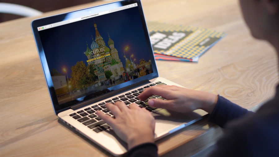
<section class="big-background"> <a id="bgndVideo" class="player" data-property="{videoURL:'http://www.youtube.com/watch?v=PKGjG_ZhF-A',containment:'body',autoPlay:true, mute:true, startAt:0, opacity:1}"></a> <div class="pattern"></div> <div class="big-background-container"> <h1 class="big-background-title">YOUTUBE</h1> <div class="divider"></div> <h1 id="colorize"> </h1> <a href="http://designmodo.com/video-background-website/" class="big-background-btn"> </a> </div> </section> <div class="wrapper"> <section class="about-section"> <div class="about-section-container"> <h2 class="about-section-title"> YouTube </h2> <p> , ? <br/> ! jQuery MB.YTPlayer, jQuery, YouTube .<br/> HTML . !</p> <a href="https://github.com/pupunzi/jquery.mb.YTPlayer" target="_blank" class="about-section-btn"> </a> </div> </section> <section class="small-background-section"> <div class="pattern"></div> <div class="small-background-container"> <h2 class="small-background-title"><span> </span></h2> <ul class="socials"> <li><a href="https://www.facebook.com/designmodo" target="_blank"><i class="fa fa-facebook-square fa-3x"></i></a></li> <li><a href="https://twitter.com/Designmodo" target="_blank"><i class="fa fa-twitter-square fa-3x"></i></a></li> <li><a href="https://plus.google.com/+Designmodo" target="_blank"><i class="fa fa-google-plus-square fa-3x"></i></a></li> </ul> </div> </section> I used the font Font Awesome for social icons, which are located in the small-background-section . Then we will add a template for our video using the jQuery.mb.YTPlayer plugin . Place the following code immediately below <section class = "big-background">.
<a id="bgndVideo" class="player" data-property="{videoURL:'https://www.youtube.com/watch?v=0WhoCe_2jpc', containment:'body',autoPlay:true, mute:true, startAt:0, opacity:1}"></a> Here is what we used to customize the video:
- class player - this class is used by the mb.YTPlayer plugin .
- videoURL - video link
- containment - CSS selector in which you want to play the video
- autoPlay - autoplay video
- mute - the presence of sound
- startAt - the time from which to start playing the video
- opacity - video transparency
CSS
Add styles to our site. First of all, we define the appearance of html, body, paragraph tags and a bulleted list.
html { height:100% } body { font:15px/23px 'Raleway',sans-serif; margin:0; padding:0; height:100%; width:100%; -webkit-font-smoothing:antialiased; -webkit-text-size-adjust:100% } p { font-size:20px; line-height:140%; text-align:center } ul li { display:inline-block; list-style:none; padding-right: 10px; } Next, add a style to the wrapper , pattern, divider and colorize .
.wrapper { z-index:600; position:relative } .pattern { background-image:url(../images/pattern.png); background-repeat: repeat; background-attachment:scroll; width:100%; height:100%; position:absolute; top:0; left:0 } .divider { background-image:url(../images/divider.png); display:block; width:300px; height:35px; margin:10px auto } #colorize { color:#f1c40f; font-family:'Lato',sans-serif; font-size:40px } It is time for the big-background section styles. Set the z-index to 550 and the overflow parameter to hidden. This is necessary so that the YouTube content (subtitles, annotations) is not displayed on our site. The remaining styles are needed for headers, buttons, and the default image (more on this later).
.big-background { z-index:550; text-align:center; height:100%; min-height:100%; position:relative; overflow:hidden } .big-background .big-background-container { width:830px; max-width:100%; display:inline-block; position:absolute; top:50%; left:50%; -webkit-transform:translate(-50%,-50%); -moz-transform:translate(-50%,-50%); -ms-transform:translate(-50%,-50%); -o-transform:translate(-50%,-50%); transform:translate(-50%,-50%) } .big-background-title { font-family:'Raleway',sans-serif; font-size:78px; color:#fff; font-weight:300; text-transform:uppercase; text-align:center; margin-bottom:22px; padding-top:20px; display:inline-block; background-attachment:scroll; background-repeat:repeat-x; background-position:top center } a.big-background-btn { font-family:'Lato',sans-serif; font-size:13px; text-transform:uppercase; text-decoration:none; color:#fff; background:transparent; border:2px solid #fff; padding:10px 14px; cursor:pointer; letter-spacing:2px; text-align:center; display:inline-block; -webkit-transition:.4s background ease; -moz-transition:.4s background ease; -o-transition:.4s background ease; transition:.4s background ease; } .big-background-btn:hover { color:#fff; background:rgba(255,255,255,0.20) } .big-background-default-image { background:url(../images/sunset.jpg); background-repeat:no-repeat; background-position:center center; background-size:cover; width:100%; height:100%; z-index:0; backface-visibility:hidden } We now turn to the section about-section . Set the background-color parameter to white and padding to 60px at the top and bottom and 20px to the left and right.
.about-section { font-family:'Lato',sans-serif; color:#7f8c8d; background:#fff; padding:60px 20px } .about-section-container { text-align:center; padding-bottom:50px } .about-section-title { font-family:'Raleway',sans-serif; font-size:40px; background:#fff; color:#3d566e; padding:0 35px; margin-bottom:22px; background-attachment:scroll; background-repeat:repeat-x; background-position:center center; text-transform:uppercase } a.about-section-btn { font-family:'Lato',sans-serif; font-size:13px; text-transform:uppercase; text-decoration:none; color:#34495e; background:transparent; border:2px solid #34495e; padding:10px 14px; cursor:pointer; letter-spacing:2px; text-align:center; display:inline-block; -webkit-transition:.4s background ease; -moz-transition:.4s background ease; -o-transition:.4s background ease; transition:.4s background ease; } .about-section-btn:hover { color:#fff; background: #34495e; } For the small-background-section section, which also serves as a basement, we will set the width to 100% and the overflow parameter to hidden. We will also add some padding to the top and bottom to make our video visible. Finally, let's add styles for social networking buttons.
.small-background-section { font-family:'Raleway',sans-serif; padding:100px 0; position:relative; width:100%; overflow:hidden } .small-background-container { position:relative; text-align:center } .small-background-title { font-size:40px; color:#f1c40f; font-weight:300; z-index:10; display:inline-block; text-transform:uppercase; margin-bottom:20px; margin-top: 20px; position:relative; background-attachment:scroll; background-repeat:repeat-x; background-position:top center } .socials a { color:#fff } .socials a:hover { color:#bdc3c7 } Media queries
To make our site responsive, add a few media queries.
@media screen and (max-width: 768px) { .about-section-title { line-height:1 } } @media screen and (max-width: 480px) { .big-background-title { font-size:58px } .small-background-title { line-height:1 } /*.player{ display: none;} -> If you want to remove the video bg on a specific viewport w/o plugin*/ } @media screen and (max-width: 360px) { .big-background-title,#colorize { line-height:1 } } @media screen and (max-width: 320px) { .small-background-title { font-size:30px } } jQuery
Now turn on our YouTube video. Call the class player inside the jQuery code. Place the following code before the closing body tag and inside the <script> </ script> tags .
$(function(){ $(".player").mb_YTPlayer(); }); Backup option
YouTube background video will not play on mobile devices and tablets, as YouTube rules do not allow this.
However, we can use jQuery to add a default background image if the browser determines that the user has logged into the site from a mobile device.
Manual solution
To determine that a user has logged in from a mobile device or tablet, we can hide an item on a specific screen size. For example, we want to remove the video background on 480px wide screens. You just need to add display: none to the player element:
@media screen and (max-width: 480px) { .player{ display: none; } } As for jQuery, here we set the is_mobile variable with the false parameter. Then make sure that the player class has the display: none parameters. If this is the case, then add the big-background-default-image class to the big-background and small-background-section sections to use the default background image. Otherwise, nothing will change.
(function($) { $(document).ready(function() { var is_mobile = false; if( $('.player').css('display')=='none') { is_mobile = true; } if (is_mobile == true) { //Conditional script here $('.big-background, .small-background-section').addClass('big-background-default-image'); }else{ $(".player").mb_YTPlayer(); } }); })(jQuery); Solution using jQuery plugin
Another way to set the default image is using the jQuery device.js plugin ( http://matthewhudson.me/projects/device.js/ ). This will simplify the process of describing conditions for different sizes of mobile device screens. Using this plugin, we can simply write the following code:
(function($) { $(document).ready(function() { //Device.js will check if it is Tablet or Mobile - http://matthewhudson.me/projects/device.js/ if (!device.tablet() && !device.mobile()) { $(".player").mb_YTPlayer(); } else { //jQuery will add the default background to the preferred class $('.big-background, .small-background-section').addClass( 'big-background-default-image'); } }); })(jQuery); Here I used the device.mobile () and device.tablet () methods to check the device from which the user came. If the condition is met, the big-background-default-image class is added to the big-background and small-background-section sections . Otherwise, the player class will remain unchanged and the video will play.
Tidy
Video is an excellent way to deliver a message to an audience. It can be a powerful tool for your site with proper use.
I am sure that with the development and improvement of web design, there will be more and more creative ideas for using video in website design. I hope you learned something in this tutorial. Write in the comments your thoughts and comments.
From the translator. With all the wishes and comments about the translation, please contact me in PM. Thank!
Source: https://habr.com/ru/post/249553/
All Articles