Submarine usability or why interfaces pull projects to the bottom
Hi, Habr!
Here is the simple interface for diving and surfacing of the B-413 submarine:

')
And this is a diesel engine monitor. One.

Rich Unclear - there is no switch
Our favorite startups are like that submarine: in case of failure, they will say about the team to the whole world - “she drowned”. And although it has not been proven that bad interfaces directly cut the path to popularity for most products (the components of success and failure are always many), no one will argue that it’s convenient to do it right, and the vulnerability of the UI is another reason for torpedoingitself .
The problem is that a small project often cannot attract a specially trained UX / UI designer, and design interfaces in it all in a row: developers, marketers, managers ... Therefore, respecting therights of user convenience so often follows the principle of “don't shoot the pythonist”.
What does this lead to and how to treat it - we want to talk about it.
Our site in its first version, for example, designed our CTO.
Our CTO - Misha Voldar , once ran a web studio: he conducted negotiations there and coded in Python. The experience of managing freelance designers plus a host of other factors influenced the fact that the entire “site from scratch” fell on it.
Task: to push existing products into a one-page site, but leave the prospect for rapid growth in breadth (sections for start-up ecosystem users) and inwards (admin panel for co-working residents).
When Seryoga flashbackflip and I came to work at #tceh, we would have been happy to deposit our 5 kopecks in Mishina's work, but the site layout was ready and approved, the backend was written more than half, the launch dates were burned at one glance at the calendar, and the freelancer it still happens, began to freeze and disappeared somewhere.
So, a one-page site without a menu is a few blocks, at the location of which it was necessary to sacrifice something. Such a victim was the calendar of our events.
Yes, and he looked like this:
The dates are almost today, because we still keep this version of the calendar in the basement on the internal pages of the site
The only usability that was quickly realized was the state of the system . That is, an alert, and partly a reminder for the user, that here he has already signed up, but this announcement is worth a look.
But to find this calendar, it was necessary to go down to the basement of tceh.com. It was a depth of 6 screens on my 13-inch laptop, if that.
Plus, the slider broke off at the most unexpected place.
These slides slider immediately became a headache. When the American professor on big data speaking at our place asked for a link to his presentation (we poured notes, videos and presentations right on the page, he liked it), we couldn’t find the event on the first attempt. This story was the reason to abruptly postpone everything and think about a convenient calendar.
But first we were looking for a designer in the state. And then fought for his time.
Here Seryoga and I would be able to master the same Axure in order to make interactive prototypes ourselves and test the logic in them, but ... That was possible, we learned later: the multivariate and speed “from idea to first implementation” increases by several times, and fonts - they can be played later.
And yes, the fact that it is loose, certainly, will create much more problems in the future. Drawing on sheets and napkins, then crossing the design and TK is, of course, a tribute to fashion, but sometimes the tribute is too expensive.
And in parallel, we learned to argue with arguments to the designer.
We began with a simple study of the brief contents of the works of the “fathers” of design. For example, Jacob Nielsen's heuristics. We found out that of his 10 criteria for a suitable interface, we had only one “input”: the state of the system.
Thinking a second time, we worked on it: we sat separately over the “you are registered” window and the auto-letter leaving after registration. And there are fewer organizational issues that we received.
Calendars immediately - it is also very convenient
Then we got three more from the “golden ten” of Nielsen's heuristics.
The fairy tale has a long effect, a long work is being done, and at the end of the autumn, having received some experience, we still sat down at the alteration of the calendar on the main one. With this option, we live now:
They picked it up on the second screen, and Google analytics started reporting about the decline in the percentage of failures on the main screen, and thankful users even wrote us a couple of times.
We got three more points from heuristics:
Well, it’s trivial to get people recruited easier - you’ll post an announcement at night, you’ll drop by mail in the morning (there, thanks to the CTO, the daily statistics on the site are falling), and there are already 9 people signed up. When the slider was not like this!
So when designing the internal interface for residents of our coworking, we were already “scientists”. We made it minimalist, only with really necessary signatures-instructions about what the action leads to. And first tested on the team.
By the test of this form on the team, we added one and a half points of heuristics.
One - by introducing cancellation and improving the information : which of your applications was accepted, which one waited for the queue, and which of them had problems.
For example, all applications in the picture are waiting in line - and will fall on the protection mail an hour before the arrival of a person.
Polpunkt - for simplifying the logic of avoiding errors in the top field. Introduced “one window system”, as in China. If you need to issue passes for several guests at once, you can do this by typing them in one column. And there are also difficult last names: we really have a resident with the last name “Ro Baten”. And those who cut to the initials, creating mistakes for the protection - it is easier to “kick” personally.
Then let a few projects inside. Dootunil. Now, by the end of January, we calmly transfer everyone from the mneumics to the figure.
Conclusion: knowledge of at least some basics of usability and interactive prototyping (at least Axure) can solve a lot of problems. Priority. Quality. The notorious cost reduction (less rewritten later).
But it would be okay that we alone were such, with our own rake scientists. After talking with the residents, we were convinced of the typicality of the problem.
Take a more difficult case - immediately CRM, distributed boxed way.
The guys from RedmineCRM have done great work already for building a fairly universal (here you’ll have bills, contacts, customers, tasks) a piece for studio managers who are used to using redmine. And they follow the idea of open source: along with the application you get the source code, and some of the free parts are generally in the public domain (see GitHub).
Well done doubly that they do not neglect prototyping when creating new features. This is reflected in the hand of a man from the backbone of the team, who understands the interfaces (although not pro), and the convenience of the tool they use - OmniGraffle, a product from former Apple-men, sharpened for Mac, is good at prism - even to an external customer, go.
It would seem that all the guys are good.
They created a market, becoming the first to make paid add-ons that allow them to do everything around Redmine (today they have competitors, which means that the market has taken place).
They have a sane support that tracks the feedback of users and sends it on: including suggestions for improvements and new modules.
They improve interfaces. Here is the “before” option:
All updates accumulated in the right column (and it is the most inconspicuous, Facebook users already know).
Option “after”:

After the update, there are tabs, they open up the necessary streams, and on the right only key and stable information (apparently, Ashton Kutcher approve :)
The guys honestly somewhere spied. But, actually, your interface should not amaze with uniqueness. It should be comfortable and meet the expectations, convenience and experience of users.
It would seem, really got better.
But better than what? No fly in the ointment. To the questions: “How do you evaluate, what innovations should be done first, and what effect do they give?”, There is one answer: “According to the flow”.
Well, that is, the “we all decide for the user” approach. But without analytics - quantitative and qualitative, however, it is impossible. Because now our guys, I repeat, have competitors. Perhaps more advanced in terms of analytics - one of the components of the UX.
Conclusion: practice is the criterion of truth, and the analyst measures your practice. If you are developing, earning and at the same time prototyping - bury yourself in analytics. Growth is there.
In the distant early 2010s, when no one did so except for “Patrick.info” Sergey Moskalev, three brave Jedi decided to create their own space hyper-locality. This is one of their first presentations.
In one of the client projects, the guys were faced with a problem: the inability to digitally receive local content (mainly information about events that are taking place very close) - and interact with it. And that was exactly what was needed.
What a project they were doing then, no one remembers anymore. But our heroes decided to make their own. They still didn’t understand how and where to take the events, however, the idea of the news feed didn’t give rest to what was going on in the district - and they started developing.
The project start period is remembered by the guys as “Usability Without Money”.
Because for a long time they invested their knowledge and free time into it, without being able to pay their salaries for Hello World - the application was originally called. In fact, among the founders was and remains a usability - his work on the logic of the screens even helped to attract an investor.
The investor dragged them to the “Music Night”, where the brand-new iOS application did not attract people, because the problem of collecting content remained. Investor disappointed guys too.
Do you know what prevented the project from drowning? Refusal of the idea “let's make a supercombine, suddenly it will fly!”, Which came after the first failure.

A piece of supercar. For some reason, it reminds cartoon “Dumb ways to die”.
A state of light panic is a good tool for generating ideas:
- Let's add a local chat!
- And let the event can be fumble through it!
- And generally fumble anywhere from our application!
- And everywhere funny graphics!
- And now let's draw all this?
“Write drunk, edit sober,” said Hemingway. When a usability designer with a fresh head sat down to design it all and draw a little, it turned out that there were too many functions, and it was unclear who would use all of this and how.
And he convinced the others to reject “everything and at once”, focusing only on clear models of work with the user.
At the same time, I found a new partner who offered to involve local businesses in content generation, offering them a platform for presence.

At that moment we met with the guys. After a couple of months of rework, they released the first build of the application - now it is called Round - in the App Store and almost immediately received 10,000 downloads.
Conclusion: the opinion of a person who understands usability can sometimes prevent the project from drowning.
And for this it is not necessary for usability to be your co-founder, - I prepared such an example for last.
Olya and her team Elementaree, which we wrote about in November, sell healthy food through the Internet. Cardboard boxes, where all proper nutrition is packaged for each day of the week ahead, strictly according to calories - and according to the instructions.
We did not get the interface right away. When they attached a bag with something viscous-red on a magnetic board in the kitchen, an internal meme “Elementary employee blood” was born. And when packaged herbs appeared in the same place - we tensed and waited for people from the prosecutor's office (who saw their advertisements “against” smoking mixtures in the subway, he does not laugh at the circus).
Old version of the instruction: for example - meals 5, points on the first sheet 8 ...
We learned that their main problem was not sales, but menu usability.
Here, according to the version from above, people could not compare which dish of the day, for example, pour in “the blood of an elementary employee” to make it tasty. And where to put the grass. And anyway, is this the day when weeds are needed?
The usability of the menu influenced retention - the return of users, the most important indicator of business. And the company is working at the intersection of online and offline - this area, where the user has even less motivation to communicate with you (because this requires additional steps), and you have almost no options to quickly jump.
And here, in Elementaree, a category appears in the database of those who bought the weekly supply of boxes with the thought “from this day I begin to eat right, I live,” opened, did not understand the menu - and threw the idea. That is, it was impossible to immediately say about them whether the client is “alive” or “dead”. Why are there ordinary people, even the kitchen of the project was confused about which instruction to put in which box ...
Yana, their marketer, was responsible for this business. And then the opportunity turned up.
Mikhail Asavkin from Photozeen - CTO and a great usability in one bottle (which is rare) - agreed with #tceh that he will lead an advanced course on analytics + working with interfaces for ux-designers in the evenings. To work with the listeners, he needed experimental subjects.
So we just locked up Jan with him and his students (professional ux-ers) in the negotiation.
At the exit it turned out like this:

And, most importantly, once having gained momentum in the right direction, the project team continues to constantly think about the convenience and capabilities for the user.
For example, they are now struggling with such a task: to make sure that the same interface helps to track progress (there were already two meals, now we need this), and at the end of the day it would help to evaluate the result per day.
Conclusion: any focus groups and usability testing will help not to lose: a) clients, b) time for rework, c) freshness in looking at the product.
At the intensive, where usabilityists were pumped, Aleksandra Postovalova was a second teacher, VTB24 was a usabilityist, and the founder of the UX Club.
She helped Yana from Elementaree the most.
We learned that Sasha independently mastered the methods of “fathers” of usability from books (which, in fact, not surprising for Russian specialists in this field), when her own project did not fly. At that time, she did not know anything about the design and study of users, so users would go into her own application, did not understand and left.
After that, she undertook to master the theory of available literature, and practice - on the projects of friends. So that there was where to collect useful materials on the topic and exchange views and experiences with others, she opened the Facebook UX Club community: today there are already three thousand participants.
Having gained experience, she started consulting - she was doing projects for both Rostelecom and startups. Then she went to the bank.
And today she is ready to share her knowledge - well, we invited her to our “working weekend”. There, in half an hour of one-on-one with the projects, she cleared the brains of many “authors of unique interfaces”, and she also gave us a couple of practical tips on drafting redesigns.
We wanted to continue: but to collect just a free lecture without working with our hands is somehow useless, and to cut a paid course, when you can’t present the recent “combat” merit of a teacher, is somehow dumb. So just put that thought away.
The box opened by the end of the year: in November, the updated by Alexandra interface of the VTB24 mobile site helped to increase KPI for products by 2-3 times. So for the beginning of January we have formed a course with her where she will sit down and will help everyone in the evenings who have the audacity to rethink their project's UX from scratch - learn how to prototype it and create a version to which you need to move from the current state of the product. Anyone who is ready to master prototyping from scratch.
To increase the benefit of this post, we decided to allocate a grant to one Habrayuzer for one place on this course. There will be no more than ten students in total. There is still a place - we decided to use this chance.
We believe that this is a really necessary thing - for the eyes and mind of the whole Runet.
Grant Application Rules:
Freely describe your project in the comments (it can be real or just made up)
separate what benefits it brings to people
tell me why you need to get on the course
applications are accepted until 5:30 pm, February 2
Winning selection criteria:
project benefits to people
human motivation
the severity of the UX situation
The selection is carried out by us as objectively as possible - each of the team (9 people) will vote for the project - we will count the votes and post the photoprints in the comments to this post. The winner will also write in a personal.
The timing of the announcement of the winner:
18:00 Monday, February 2
All participants who have placed an application will receive a promotional code from us with a 15% discount on any other course. And we have them! You can use the promotional code for six months.
We start on February 4 . We pass the analysis of the audience, Axure, usability tests, analytics and other necessary things for those who have never done this. Or did, but slightly and unsystematically.
Our D (s) en-designer will be there in the forefront, well, I will drop in. See you later!
PS And we still need help from many.
Here is a piece of Artofad (“hell” - from the word advertising;)
The guys make cool products at the intersection of wifi magic, universal gadgetization, love of games - and the needs of organizers of promotions and conferences somehow entertain and entice people. They call all this neologism “Fijital” = physical + digital.
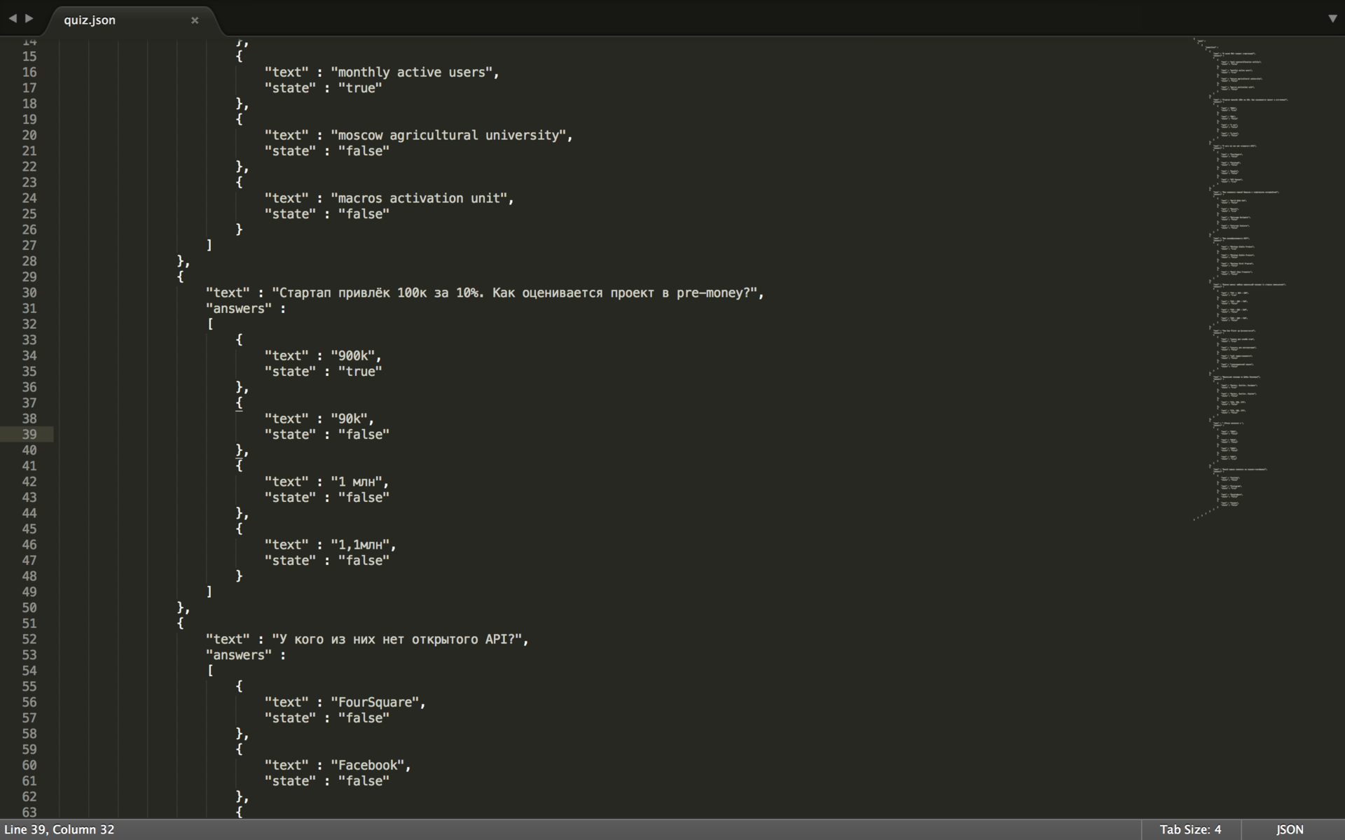
Specifically, in the screenshot, there is an admin panel, where conditions for a collective quiz with prizes are set, in which everyone plays from his smartphone / tablet: you don’t need to download anything additionally, and questions and progress are displayed simultaneously on your screen and on the big screen.
Of course, the tool is purely internal: that is, the guys constantly dab on the platforms for adjustment. But when Seryoga and I wanted to launch our geek version of the quiz before Bobuk’s performance, and nobody was around, we figured it out ourselves.
Conclusion: if the unfortunate girl manager saw such a window, she would close it faster than solitaire (when the boss suddenly appears behind her back).
But it is possible and necessary to make the interface human. When they do this, the guys will not have to, like now, wander around Moscow, setting everything up for themselves. And they will be able to earn their product with less cost.
Here is the simple interface for diving and surfacing of the B-413 submarine:
')
And this is a diesel engine monitor. One.
Rich Unclear - there is no switch
Our favorite startups are like that submarine: in case of failure, they will say about the team to the whole world - “she drowned”. And although it has not been proven that bad interfaces directly cut the path to popularity for most products (the components of success and failure are always many), no one will argue that it’s convenient to do it right, and the vulnerability of the UI is another reason for torpedoing
The problem is that a small project often cannot attract a specially trained UX / UI designer, and design interfaces in it all in a row: developers, marketers, managers ... Therefore, respecting the
What does this lead to and how to treat it - we want to talk about it.
Our site in its first version, for example, designed our CTO.
Our CTO - Misha Voldar , once ran a web studio: he conducted negotiations there and coded in Python. The experience of managing freelance designers plus a host of other factors influenced the fact that the entire “site from scratch” fell on it.
Task: to push existing products into a one-page site, but leave the prospect for rapid growth in breadth (sections for start-up ecosystem users) and inwards (admin panel for co-working residents).
When Seryoga flashbackflip and I came to work at #tceh, we would have been happy to deposit our 5 kopecks in Mishina's work, but the site layout was ready and approved, the backend was written more than half, the launch dates were burned at one glance at the calendar, and the freelancer it still happens, began to freeze and disappeared somewhere.
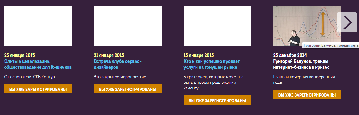
So, a one-page site without a menu is a few blocks, at the location of which it was necessary to sacrifice something. Such a victim was the calendar of our events.
Yes, and he looked like this:
The dates are almost today, because we still keep this version of the calendar in the basement on the internal pages of the site
The only usability that was quickly realized was the state of the system . That is, an alert, and partly a reminder for the user, that here he has already signed up, but this announcement is worth a look.
But to find this calendar, it was necessary to go down to the basement of tceh.com. It was a depth of 6 screens on my 13-inch laptop, if that.
Plus, the slider broke off at the most unexpected place.
These slides slider immediately became a headache. When the American professor on big data speaking at our place asked for a link to his presentation (we poured notes, videos and presentations right on the page, he liked it), we couldn’t find the event on the first attempt. This story was the reason to abruptly postpone everything and think about a convenient calendar.
But first we were looking for a designer in the state. And then fought for his time.
Here Seryoga and I would be able to master the same Axure in order to make interactive prototypes ourselves and test the logic in them, but ... That was possible, we learned later: the multivariate and speed “from idea to first implementation” increases by several times, and fonts - they can be played later.
And yes, the fact that it is loose, certainly, will create much more problems in the future. Drawing on sheets and napkins, then crossing the design and TK is, of course, a tribute to fashion, but sometimes the tribute is too expensive.
And in parallel, we learned to argue with arguments to the designer.
We began with a simple study of the brief contents of the works of the “fathers” of design. For example, Jacob Nielsen's heuristics. We found out that of his 10 criteria for a suitable interface, we had only one “input”: the state of the system.
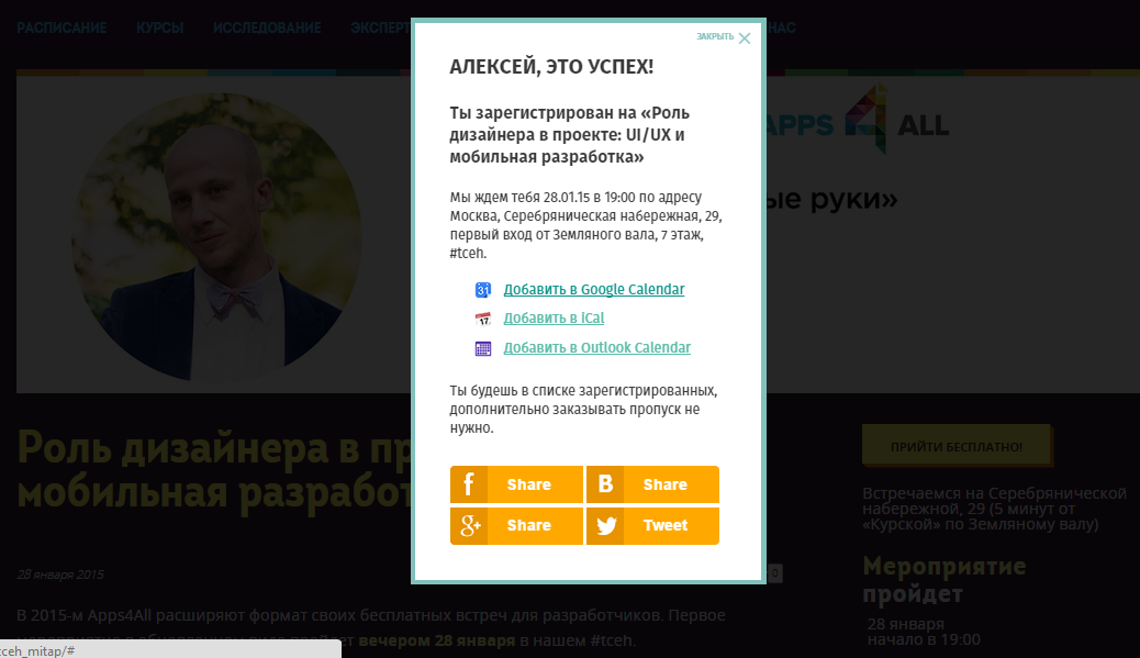
Thinking a second time, we worked on it: we sat separately over the “you are registered” window and the auto-letter leaving after registration. And there are fewer organizational issues that we received.
Calendars immediately - it is also very convenient
Then we got three more from the “golden ten” of Nielsen's heuristics.
- so-called “Standard” - when all the key information on any event is always displayed in the same area immediately coming into view.
- Error prevention - during data entry during registration.
- And the idea of “ everything should be in sight ” - sharpened the first screen of the internal pages of announcements for making a decision: a picture with key information + a title + a block of “standard”.
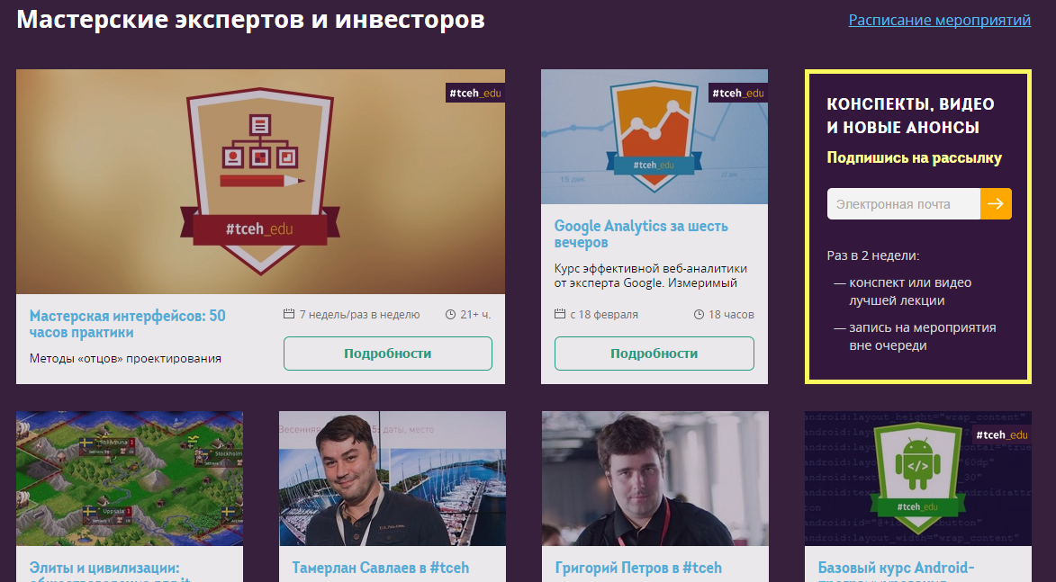
The fairy tale has a long effect, a long work is being done, and at the end of the autumn, having received some experience, we still sat down at the alteration of the calendar on the main one. With this option, we live now:
They picked it up on the second screen, and Google analytics started reporting about the decline in the percentage of failures on the main screen, and thankful users even wrote us a couple of times.
We got three more points from heuristics:
- Minimalism - less words, less noise.
- Repeat action is available immediately - those who are accustomed to go to open events, can register immediately with the main one. Due to the fact that they did not make an intermediate prototype, by which it would be easier to describe the logic in the TK, in the first hours after the update, by analogy, it was possible to enroll in the applied paid courses that we conduct (to the question of drawing on napkins). Quickly corrected.
- Plus, after collecting all the cones, they created an internal tool - the documentation on the section that influences what, made the necessary signatures in the admin panel.
Well, it’s trivial to get people recruited easier - you’ll post an announcement at night, you’ll drop by mail in the morning (there, thanks to the CTO, the daily statistics on the site are falling), and there are already 9 people signed up. When the slider was not like this!
So when designing the internal interface for residents of our coworking, we were already “scientists”. We made it minimalist, only with really necessary signatures-instructions about what the action leads to. And first tested on the team.
By the test of this form on the team, we added one and a half points of heuristics.
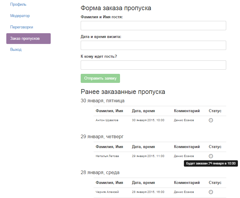
One - by introducing cancellation and improving the information : which of your applications was accepted, which one waited for the queue, and which of them had problems.
For example, all applications in the picture are waiting in line - and will fall on the protection mail an hour before the arrival of a person.
Polpunkt - for simplifying the logic of avoiding errors in the top field. Introduced “one window system”, as in China. If you need to issue passes for several guests at once, you can do this by typing them in one column. And there are also difficult last names: we really have a resident with the last name “Ro Baten”. And those who cut to the initials, creating mistakes for the protection - it is easier to “kick” personally.
Then let a few projects inside. Dootunil. Now, by the end of January, we calmly transfer everyone from the mneumics to the figure.
Conclusion: knowledge of at least some basics of usability and interactive prototyping (at least Axure) can solve a lot of problems. Priority. Quality. The notorious cost reduction (less rewritten later).
But it would be okay that we alone were such, with our own rake scientists. After talking with the residents, we were convinced of the typicality of the problem.
I guess what the user needs, with 3 notes
Take a more difficult case - immediately CRM, distributed boxed way.
The guys from RedmineCRM have done great work already for building a fairly universal (here you’ll have bills, contacts, customers, tasks) a piece for studio managers who are used to using redmine. And they follow the idea of open source: along with the application you get the source code, and some of the free parts are generally in the public domain (see GitHub).
Well done doubly that they do not neglect prototyping when creating new features. This is reflected in the hand of a man from the backbone of the team, who understands the interfaces (although not pro), and the convenience of the tool they use - OmniGraffle, a product from former Apple-men, sharpened for Mac, is good at prism - even to an external customer, go.
It would seem that all the guys are good.
They created a market, becoming the first to make paid add-ons that allow them to do everything around Redmine (today they have competitors, which means that the market has taken place).
They have a sane support that tracks the feedback of users and sends it on: including suggestions for improvements and new modules.
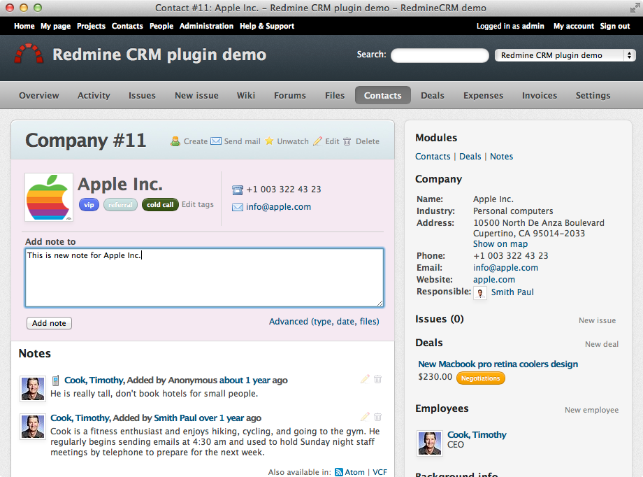
They improve interfaces. Here is the “before” option:
All updates accumulated in the right column (and it is the most inconspicuous, Facebook users already know).
Option “after”:
After the update, there are tabs, they open up the necessary streams, and on the right only key and stable information (apparently, Ashton Kutcher approve :)
The guys honestly somewhere spied. But, actually, your interface should not amaze with uniqueness. It should be comfortable and meet the expectations, convenience and experience of users.
It would seem, really got better.
But better than what? No fly in the ointment. To the questions: “How do you evaluate, what innovations should be done first, and what effect do they give?”, There is one answer: “According to the flow”.
Well, that is, the “we all decide for the user” approach. But without analytics - quantitative and qualitative, however, it is impossible. Because now our guys, I repeat, have competitors. Perhaps more advanced in terms of analytics - one of the components of the UX.
Conclusion: practice is the criterion of truth, and the analyst measures your practice. If you are developing, earning and at the same time prototyping - bury yourself in analytics. Growth is there.
Hello World: how to abandon a project at the pre-design stage and make a popular iOS application
In the distant early 2010s, when no one did so except for “Patrick.info” Sergey Moskalev, three brave Jedi decided to create their own space hyper-locality. This is one of their first presentations.
In one of the client projects, the guys were faced with a problem: the inability to digitally receive local content (mainly information about events that are taking place very close) - and interact with it. And that was exactly what was needed.
What a project they were doing then, no one remembers anymore. But our heroes decided to make their own. They still didn’t understand how and where to take the events, however, the idea of the news feed didn’t give rest to what was going on in the district - and they started developing.
The project start period is remembered by the guys as “Usability Without Money”.
Because for a long time they invested their knowledge and free time into it, without being able to pay their salaries for Hello World - the application was originally called. In fact, among the founders was and remains a usability - his work on the logic of the screens even helped to attract an investor.
The investor dragged them to the “Music Night”, where the brand-new iOS application did not attract people, because the problem of collecting content remained. Investor disappointed guys too.
Do you know what prevented the project from drowning? Refusal of the idea “let's make a supercombine, suddenly it will fly!”, Which came after the first failure.
A piece of supercar. For some reason, it reminds cartoon “Dumb ways to die”.
A state of light panic is a good tool for generating ideas:
- Let's add a local chat!
- And let the event can be fumble through it!
- And generally fumble anywhere from our application!
- And everywhere funny graphics!
- And now let's draw all this?
“Write drunk, edit sober,” said Hemingway. When a usability designer with a fresh head sat down to design it all and draw a little, it turned out that there were too many functions, and it was unclear who would use all of this and how.
And he convinced the others to reject “everything and at once”, focusing only on clear models of work with the user.
At the same time, I found a new partner who offered to involve local businesses in content generation, offering them a platform for presence.
At that moment we met with the guys. After a couple of months of rework, they released the first build of the application - now it is called Round - in the App Store and almost immediately received 10,000 downloads.
Conclusion: the opinion of a person who understands usability can sometimes prevent the project from drowning.
And for this it is not necessary for usability to be your co-founder, - I prepared such an example for last.
Schrödinger Box
Olya and her team Elementaree, which we wrote about in November, sell healthy food through the Internet. Cardboard boxes, where all proper nutrition is packaged for each day of the week ahead, strictly according to calories - and according to the instructions.
We did not get the interface right away. When they attached a bag with something viscous-red on a magnetic board in the kitchen, an internal meme “Elementary employee blood” was born. And when packaged herbs appeared in the same place - we tensed and waited for people from the prosecutor's office (who saw their advertisements “against” smoking mixtures in the subway, he does not laugh at the circus).
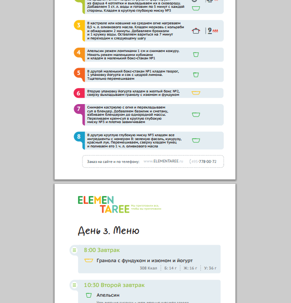
Old version of the instruction: for example - meals 5, points on the first sheet 8 ...
We learned that their main problem was not sales, but menu usability.
Here, according to the version from above, people could not compare which dish of the day, for example, pour in “the blood of an elementary employee” to make it tasty. And where to put the grass. And anyway, is this the day when weeds are needed?
The usability of the menu influenced retention - the return of users, the most important indicator of business. And the company is working at the intersection of online and offline - this area, where the user has even less motivation to communicate with you (because this requires additional steps), and you have almost no options to quickly jump.
And here, in Elementaree, a category appears in the database of those who bought the weekly supply of boxes with the thought “from this day I begin to eat right, I live,” opened, did not understand the menu - and threw the idea. That is, it was impossible to immediately say about them whether the client is “alive” or “dead”. Why are there ordinary people, even the kitchen of the project was confused about which instruction to put in which box ...
Yana, their marketer, was responsible for this business. And then the opportunity turned up.
Mikhail Asavkin from Photozeen - CTO and a great usability in one bottle (which is rare) - agreed with #tceh that he will lead an advanced course on analytics + working with interfaces for ux-designers in the evenings. To work with the listeners, he needed experimental subjects.
So we just locked up Jan with him and his students (professional ux-ers) in the negotiation.
At the exit it turned out like this:
- Five meals - and five points in the instructions for the day (instead of 8, as before).
- It is clear what and where to get to cook dinner. According to one user: “Now I can do everything on the machine, while thinking about the important, and not about the food.”
- The Elementaree kitchen now forms orders correctly, and customers write thankful letters.
And, most importantly, once having gained momentum in the right direction, the project team continues to constantly think about the convenience and capabilities for the user.
For example, they are now struggling with such a task: to make sure that the same interface helps to track progress (there were already two meals, now we need this), and at the end of the day it would help to evaluate the result per day.
Conclusion: any focus groups and usability testing will help not to lose: a) clients, b) time for rework, c) freshness in looking at the product.
Do not keep money in a savings bank
At the intensive, where usabilityists were pumped, Aleksandra Postovalova was a second teacher, VTB24 was a usabilityist, and the founder of the UX Club.
She helped Yana from Elementaree the most.
We learned that Sasha independently mastered the methods of “fathers” of usability from books (which, in fact, not surprising for Russian specialists in this field), when her own project did not fly. At that time, she did not know anything about the design and study of users, so users would go into her own application, did not understand and left.
After that, she undertook to master the theory of available literature, and practice - on the projects of friends. So that there was where to collect useful materials on the topic and exchange views and experiences with others, she opened the Facebook UX Club community: today there are already three thousand participants.
Having gained experience, she started consulting - she was doing projects for both Rostelecom and startups. Then she went to the bank.
And today she is ready to share her knowledge - well, we invited her to our “working weekend”. There, in half an hour of one-on-one with the projects, she cleared the brains of many “authors of unique interfaces”, and she also gave us a couple of practical tips on drafting redesigns.
We wanted to continue: but to collect just a free lecture without working with our hands is somehow useless, and to cut a paid course, when you can’t present the recent “combat” merit of a teacher, is somehow dumb. So just put that thought away.
The box opened by the end of the year: in November, the updated by Alexandra interface of the VTB24 mobile site helped to increase KPI for products by 2-3 times. So for the beginning of January we have formed a course with her where she will sit down and will help everyone in the evenings who have the audacity to rethink their project's UX from scratch - learn how to prototype it and create a version to which you need to move from the current state of the product. Anyone who is ready to master prototyping from scratch.
To increase the benefit of this post, we decided to allocate a grant to one Habrayuzer for one place on this course. There will be no more than ten students in total. There is still a place - we decided to use this chance.
We believe that this is a really necessary thing - for the eyes and mind of the whole Runet.
Grant Application Rules:
Freely describe your project in the comments (it can be real or just made up)
separate what benefits it brings to people
tell me why you need to get on the course
applications are accepted until 5:30 pm, February 2
Winning selection criteria:
project benefits to people
human motivation
the severity of the UX situation
The selection is carried out by us as objectively as possible - each of the team (9 people) will vote for the project - we will count the votes and post the photoprints in the comments to this post. The winner will also write in a personal.
The timing of the announcement of the winner:
18:00 Monday, February 2
All participants who have placed an application will receive a promotional code from us with a 15% discount on any other course. And we have them! You can use the promotional code for six months.
We start on February 4 . We pass the analysis of the audience, Axure, usability tests, analytics and other necessary things for those who have never done this. Or did, but slightly and unsystematically.
Our D (s) en-designer will be there in the forefront, well, I will drop in. See you later!
PS And we still need help from many.
Here is a piece of Artofad (“hell” - from the word advertising;)
The guys make cool products at the intersection of wifi magic, universal gadgetization, love of games - and the needs of organizers of promotions and conferences somehow entertain and entice people. They call all this neologism “Fijital” = physical + digital.
Specifically, in the screenshot, there is an admin panel, where conditions for a collective quiz with prizes are set, in which everyone plays from his smartphone / tablet: you don’t need to download anything additionally, and questions and progress are displayed simultaneously on your screen and on the big screen.
Of course, the tool is purely internal: that is, the guys constantly dab on the platforms for adjustment. But when Seryoga and I wanted to launch our geek version of the quiz before Bobuk’s performance, and nobody was around, we figured it out ourselves.
Conclusion: if the unfortunate girl manager saw such a window, she would close it faster than solitaire (when the boss suddenly appears behind her back).
But it is possible and necessary to make the interface human. When they do this, the guys will not have to, like now, wander around Moscow, setting everything up for themselves. And they will be able to earn their product with less cost.
Source: https://habr.com/ru/post/249237/
All Articles