CSS Report 2014: Testing the use of CSS in the “field”
CSS is the tool with which HTML turns into a fully crafted page. CSS is a language full of weirdness and unpredictable turns, and therefore most often the creation of style sheets is the least favorite work for the developer. Over the past few years, there has been a significant increase in the number of software shells and tools that make it easier to write CSS and reduce the likelihood of errors. SASS and LESS reign in pre-processing, and shells such as Bootstrap, Foundation, Bourbon, Susy, and Unsemantic (as well as many others) are used to speed up the creation of a page.
Browsers are also changing, so many modern browser versions no longer require a vendor prefix for CSS3 rules. The fact that several years ago was an advanced technique is no longer required, looking, of course, which browsers your website supports. In the course of our study, we uploaded CSS files from more than 8,000 domains, and collected some data about writing and using CSS. I think that this may be useful for the further development of the discussion about the organization, understanding and management of large CSS projects, as well as will allow to monitor the development of the Network.
Methodology
I wanted to make a broad “slice” of the Internet, including sites created by large development teams and with a long service life, as well as the latest features created by amateur enthusiasts.
')
The list of domains I have studied headed the top 1000 sites according to Alexa , which are a selection of "popular" and "large" sites. They report a million sites with the highest monthly traffic, so I just selected the first 1,000 of them.
In order to fill the rest of the list of studied domains, I chose arbitrary sites from the Quick Left mailing list, which is a mixture of past and potential customers, employees, fans and other people from all over the world. At first, I wanted to make a random sample of the Top 1,000,000 Alexa sites, but even this list includes only the largest sites, which is approximately 271 million domains registered worldwide, so our mailing list, I hope, is the best sample that may include MVP, personal pages and other "incoherent" web properties.
The final list was 10,400 domains, representing, roughly speaking, a representative sample of the Internet. I downloaded from these sites all the CSS files referenced by the main page:
This process gathered a total of about 28,000 CSS files from those 10,400 domains. Then they were driven through the CSS parsing module, which allowed me to save more than 8.7 million selector entries, properties and values (for example, span.important, font-weight, bold). They were stored in Postgres and deeply indexed for further investigation.
Summary
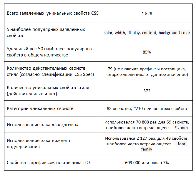
The distribution of the CSS properties used is approximately the same as the standard Pareto distribution. It turned out that unusual properties are used extremely rarely, and the study of the first 50, or so, properties should be the primary task of any novice developer.
It was also extremely curious to find out the number of typos and invalid rules. Surprisingly, these rules were typed, (most likely) checked, it turned out that they do not work in the browser, but they were still left in the style sheets and added to the finished product. Most of all I liked the typos bototm, foat and heith.
Selectors
Selector length distribution
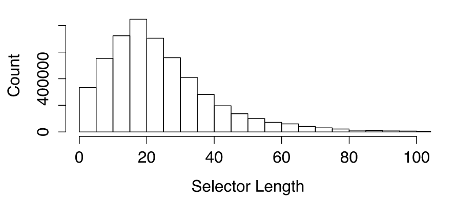
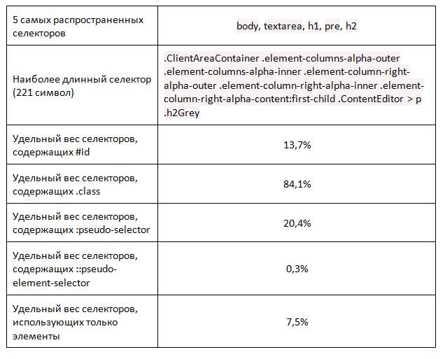
CSS selectors are for the most part short, with a few notable exceptions. The brevity of selectors in most cases is considered a positive property, since the general location of the element must consist of several rules relating to one element. Systems such as BEM provided a rationale for this. In general, long and unallocated selectors prevent reuse, and a reusable style set is considered the standard end use of CSS.
In selectors, classes are often used, and singleton selectors like body are widely used. I think that the reason for this was the fact that many sites first reset all types of elements embedded in the default browser settings and set the type of each element on their own. These types are usually chosen from the site’s CSS and the available base styles, with the result that at least two instances of this rule are selected.
Continuous improvement
Using prefixes
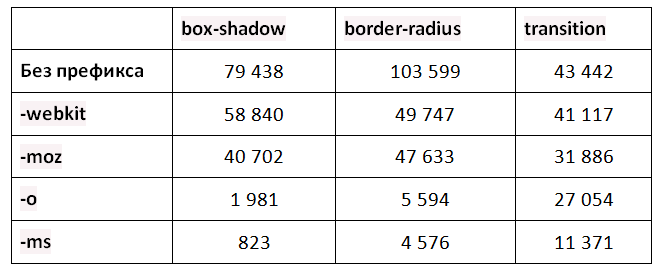
Software vendor prefixes for modern, self-updating browsers are no longer required. The good news is that for all CSS3 properties, the original form is used much more often than any of the prefixes. The prefixes -webkit and -moz prevail over -o and -ms with a significant margin.
Many IDEs, CSS shells, and websites generate rulesets with prefixes already included. Developers may try to get rid of this excess weight (depending on the audience), and adaptation to the browser is not the case when, out of habit, prefixes should be added. Using CanIUse, cross-reference Google Analytics for your site to determine if it makes sense to your audience.
I have seen many cases of support for older versions of IE, as indicated by hacks * and _. These are tools that allow you to write code that only certain versions of Internet Explorer can read. A well-known person on the Internet, Paul Irish, promoted alternatives to using hacks in a browser back in 2008, and the method approved by Microsoft is to use conditional comments to include separate or auxiliary style sheets for relevant browsers. However, in a hurry it is easier to skip such approaches, so khaki-stars and khaki-underscores still prevail.
Colors
THE MOST COMMON COLORS
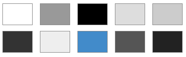
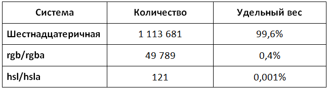
The color space offered by hexadecimal codes is 166 colors, and the most common colors are likely to be among shades of gray when R == G == B. Grayscale can refer to text color, border color, different dialog box shadows. . Branded colors are most often unique for each site, and I did not expect to see other colors, except shades of gray, in the top 10.
The fact that blue was in the top ten can be explained by the fact that until mid-November 2014, the value # 428BCA corresponded to the $ brand-primary variable in Bootstrap, which was later used throughout the project. This indicates the popularity of this software shell.
On average, the file has 169 declared colors. Several files were loaded for each page, and the abundance of colors demonstrates the lack of a uniform style policy or the use of color variables to preserve the color theme of the site.
Units
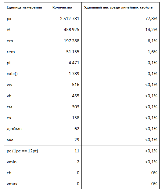
There is a huge selection of options available when defining dimensional properties in CSS. Each unit of measurement has its advantages and disadvantages: some adapt better to responsive design, while others guarantee scaling when printing. Familiar and widely known "absolute" (px) and "relative" (%) prevail in the number of use cases. It should be noted that browser support for more exotic units is not so widespread.
Text and Fonts
The presence of an established set of fonts allows the site to create the impression of a uniform and understandable. The font contributes to the design hierarchy and to the user's ability to read the content. The average domain has 31 declared different font sizes in all style sheets.
Number of font sizes
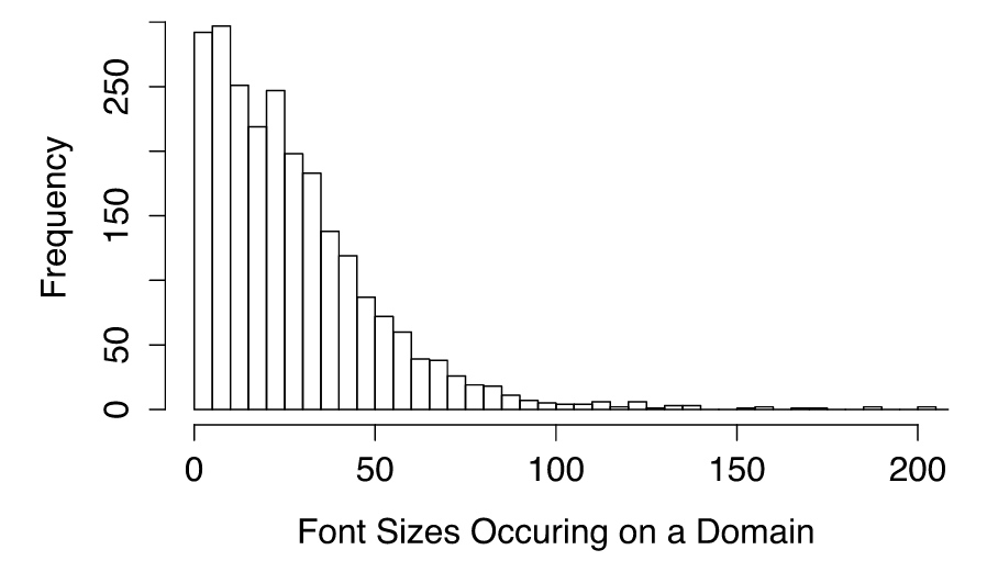
The number of font sizes per domain varies considerably. It is impossible to calculate how many fonts were used on the main page or how many were hidden in the bins of the application for special cases. Some great looking websites use a total of up to 20 fonts for their pages. I believe that it is better not to chase the number of font sizes. This creates the impression of a strong, uniform design, and also facilitates collaboration between designers and developers.
Responsive design
Responsive design was first introduced in 2010 by Ethan Mercott and swept across the network in a whirlwind, leaving about 64% of the sites cleaned up using some sort of media queries in CSS. Content must adapt to the size of the screen on which it will be displayed, and whether it will be displayed on a mobile or stationary device.
Media queries have been available since IE9, and they allow you to customize styles according to specific screen sizes, orientation, height-to-width ratio, allowing responsive design to show all its advantages.
The most common media queries are max or min-width, making up 89% of all media queries. Below are the most common widths to which developers force their styles to respond:
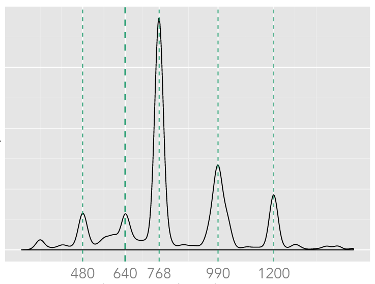
The curve in the region of the point 990 px is wider than the others, it also includes many other values: 960, 970, 980, and 990, 992, 1000 and 1024 px. The other areas on the curve, marked with green lines, are much narrower, which shows a smaller scatter of values relative to the control points at that width.
The points that people choose as reference points indicate what form factors they want to build on. There is a growing demarcation of devices on the so-called. "Phones", "tablets" and "desktop PCs". In particular, the current default Bootstrap control points are 768, 992, and 1200. Here are some of the device screen widths.
Frameworks
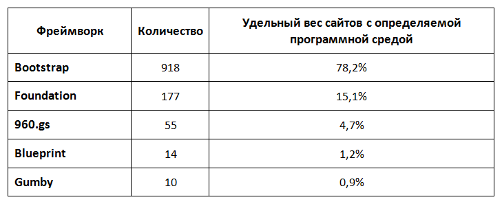
Determining the software environment used was not easy. To get the values, I used a combination of searching through file names, comments (often left by decent minimizers) and unique classes. This is the least accurate table in this report, but it shows that Bootstrap leads the hearts and minds of developers by a wide margin. Only about 10% of the total number of domains studied had a defined software environment.
Additional resources
Loading additional resources can also be defined in CSS; this usually refers to the definition of a background image (background-image). Below are the most common file formats that we identified in our study. A total of about 59,800 objects were investigated.
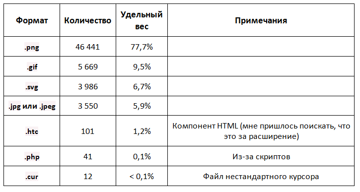
Such results are a good sign, since the .png extension is generally recommended for non-photographic pictures on the network. Such files have alpha opacity, a good compression ratio and wide browser support. I’m sure that .jpg files are more common on the web than shown here, but they are more often used as src attributes in tags than in CSS.
miscellanea
HUGE Z-INDEX
The highest z-index was an unimaginable number, 999999999999999999999999999 , or 9.99e26. With the default key repeat value for OS X, dialing this number will take 3 seconds to hold the key 9 continuously. If you take such a number of sheets of paper 0.05 mm thick, the height of the resulting stack will be 10 trillion times greater than the distance from Earth to the Sun . The worst thing is that such a large announced z-index will cause an overflow, and will never work as expected. The lowest detected value is more reasonable - -999999 .
NAMES OF FLOWERS IN CSS
The following color names in CSS are met only once: antiquewhite, azure, olive, bisque, aliceblue, lightsteelblue, blueviolet, firebrick, lightskyblue, lightseagreen, darkorange, seashell, ghostwhite, papayawhip, cornsilk, navajowhite. My favorite color is the papayawhip, a delightful orange-beige.
findings
After analyzing the data, I was able to draw the following general conclusions:
1. People don't care much about their CSS.
2. Well-executed style sheets can solve many common problems.
3. Modern CSS features are widely used.
The best thing a company can do (especially if a large number of employees are employed to write CSS) is to conduct a CSS audit ( note from the translator: we will give a brief description of the basic principles of this procedure in our next article). This will make it possible to identify the mistakes made earlier and to introduce tools into the production process that will make it possible to avoid mistakes in the future.
The order in your CSS tables is just as important as writing clean, well-developed code. I bet that bad CSS can slow down the work of developers more than any other technical aspect, proportionally devaluing their work. The team should ensure that the CSS is kept clean and tidy.
Browsers are also changing, so many modern browser versions no longer require a vendor prefix for CSS3 rules. The fact that several years ago was an advanced technique is no longer required, looking, of course, which browsers your website supports. In the course of our study, we uploaded CSS files from more than 8,000 domains, and collected some data about writing and using CSS. I think that this may be useful for the further development of the discussion about the organization, understanding and management of large CSS projects, as well as will allow to monitor the development of the Network.
Methodology
I wanted to make a broad “slice” of the Internet, including sites created by large development teams and with a long service life, as well as the latest features created by amateur enthusiasts.
')
The list of domains I have studied headed the top 1000 sites according to Alexa , which are a selection of "popular" and "large" sites. They report a million sites with the highest monthly traffic, so I just selected the first 1,000 of them.
In order to fill the rest of the list of studied domains, I chose arbitrary sites from the Quick Left mailing list, which is a mixture of past and potential customers, employees, fans and other people from all over the world. At first, I wanted to make a random sample of the Top 1,000,000 Alexa sites, but even this list includes only the largest sites, which is approximately 271 million domains registered worldwide, so our mailing list, I hope, is the best sample that may include MVP, personal pages and other "incoherent" web properties.
The final list was 10,400 domains, representing, roughly speaking, a representative sample of the Internet. I downloaded from these sites all the CSS files referenced by the main page:
cat domains.txt | xargs -I % wget http://% -r -A '*.css*' -H --follow-tags=link This process gathered a total of about 28,000 CSS files from those 10,400 domains. Then they were driven through the CSS parsing module, which allowed me to save more than 8.7 million selector entries, properties and values (for example, span.important, font-weight, bold). They were stored in Postgres and deeply indexed for further investigation.
Summary
The distribution of the CSS properties used is approximately the same as the standard Pareto distribution. It turned out that unusual properties are used extremely rarely, and the study of the first 50, or so, properties should be the primary task of any novice developer.
It was also extremely curious to find out the number of typos and invalid rules. Surprisingly, these rules were typed, (most likely) checked, it turned out that they do not work in the browser, but they were still left in the style sheets and added to the finished product. Most of all I liked the typos bototm, foat and heith.
Selectors
Selector length distribution
CSS selectors are for the most part short, with a few notable exceptions. The brevity of selectors in most cases is considered a positive property, since the general location of the element must consist of several rules relating to one element. Systems such as BEM provided a rationale for this. In general, long and unallocated selectors prevent reuse, and a reusable style set is considered the standard end use of CSS.
In selectors, classes are often used, and singleton selectors like body are widely used. I think that the reason for this was the fact that many sites first reset all types of elements embedded in the default browser settings and set the type of each element on their own. These types are usually chosen from the site’s CSS and the available base styles, with the result that at least two instances of this rule are selected.
Continuous improvement
Using prefixes
Software vendor prefixes for modern, self-updating browsers are no longer required. The good news is that for all CSS3 properties, the original form is used much more often than any of the prefixes. The prefixes -webkit and -moz prevail over -o and -ms with a significant margin.
Many IDEs, CSS shells, and websites generate rulesets with prefixes already included. Developers may try to get rid of this excess weight (depending on the audience), and adaptation to the browser is not the case when, out of habit, prefixes should be added. Using CanIUse, cross-reference Google Analytics for your site to determine if it makes sense to your audience.
I have seen many cases of support for older versions of IE, as indicated by hacks * and _. These are tools that allow you to write code that only certain versions of Internet Explorer can read. A well-known person on the Internet, Paul Irish, promoted alternatives to using hacks in a browser back in 2008, and the method approved by Microsoft is to use conditional comments to include separate or auxiliary style sheets for relevant browsers. However, in a hurry it is easier to skip such approaches, so khaki-stars and khaki-underscores still prevail.
Colors
THE MOST COMMON COLORS
The color space offered by hexadecimal codes is 166 colors, and the most common colors are likely to be among shades of gray when R == G == B. Grayscale can refer to text color, border color, different dialog box shadows. . Branded colors are most often unique for each site, and I did not expect to see other colors, except shades of gray, in the top 10.
The fact that blue was in the top ten can be explained by the fact that until mid-November 2014, the value # 428BCA corresponded to the $ brand-primary variable in Bootstrap, which was later used throughout the project. This indicates the popularity of this software shell.
On average, the file has 169 declared colors. Several files were loaded for each page, and the abundance of colors demonstrates the lack of a uniform style policy or the use of color variables to preserve the color theme of the site.
Units
There is a huge selection of options available when defining dimensional properties in CSS. Each unit of measurement has its advantages and disadvantages: some adapt better to responsive design, while others guarantee scaling when printing. Familiar and widely known "absolute" (px) and "relative" (%) prevail in the number of use cases. It should be noted that browser support for more exotic units is not so widespread.
Text and Fonts
The presence of an established set of fonts allows the site to create the impression of a uniform and understandable. The font contributes to the design hierarchy and to the user's ability to read the content. The average domain has 31 declared different font sizes in all style sheets.
Number of font sizes
The number of font sizes per domain varies considerably. It is impossible to calculate how many fonts were used on the main page or how many were hidden in the bins of the application for special cases. Some great looking websites use a total of up to 20 fonts for their pages. I believe that it is better not to chase the number of font sizes. This creates the impression of a strong, uniform design, and also facilitates collaboration between designers and developers.
Responsive design
Responsive design was first introduced in 2010 by Ethan Mercott and swept across the network in a whirlwind, leaving about 64% of the sites cleaned up using some sort of media queries in CSS. Content must adapt to the size of the screen on which it will be displayed, and whether it will be displayed on a mobile or stationary device.
Media queries have been available since IE9, and they allow you to customize styles according to specific screen sizes, orientation, height-to-width ratio, allowing responsive design to show all its advantages.
The most common media queries are max or min-width, making up 89% of all media queries. Below are the most common widths to which developers force their styles to respond:
The curve in the region of the point 990 px is wider than the others, it also includes many other values: 960, 970, 980, and 990, 992, 1000 and 1024 px. The other areas on the curve, marked with green lines, are much narrower, which shows a smaller scatter of values relative to the control points at that width.
The points that people choose as reference points indicate what form factors they want to build on. There is a growing demarcation of devices on the so-called. "Phones", "tablets" and "desktop PCs". In particular, the current default Bootstrap control points are 768, 992, and 1200. Here are some of the device screen widths.
Frameworks
Determining the software environment used was not easy. To get the values, I used a combination of searching through file names, comments (often left by decent minimizers) and unique classes. This is the least accurate table in this report, but it shows that Bootstrap leads the hearts and minds of developers by a wide margin. Only about 10% of the total number of domains studied had a defined software environment.
Additional resources
Loading additional resources can also be defined in CSS; this usually refers to the definition of a background image (background-image). Below are the most common file formats that we identified in our study. A total of about 59,800 objects were investigated.
Such results are a good sign, since the .png extension is generally recommended for non-photographic pictures on the network. Such files have alpha opacity, a good compression ratio and wide browser support. I’m sure that .jpg files are more common on the web than shown here, but they are more often used as src attributes in tags than in CSS.
miscellanea
HUGE Z-INDEX
The highest z-index was an unimaginable number, 999999999999999999999999999 , or 9.99e26. With the default key repeat value for OS X, dialing this number will take 3 seconds to hold the key 9 continuously. If you take such a number of sheets of paper 0.05 mm thick, the height of the resulting stack will be 10 trillion times greater than the distance from Earth to the Sun . The worst thing is that such a large announced z-index will cause an overflow, and will never work as expected. The lowest detected value is more reasonable - -999999 .
NAMES OF FLOWERS IN CSS
The following color names in CSS are met only once: antiquewhite, azure, olive, bisque, aliceblue, lightsteelblue, blueviolet, firebrick, lightskyblue, lightseagreen, darkorange, seashell, ghostwhite, papayawhip, cornsilk, navajowhite. My favorite color is the papayawhip, a delightful orange-beige.
findings
After analyzing the data, I was able to draw the following general conclusions:
1. People don't care much about their CSS.
2. Well-executed style sheets can solve many common problems.
3. Modern CSS features are widely used.
The best thing a company can do (especially if a large number of employees are employed to write CSS) is to conduct a CSS audit ( note from the translator: we will give a brief description of the basic principles of this procedure in our next article). This will make it possible to identify the mistakes made earlier and to introduce tools into the production process that will make it possible to avoid mistakes in the future.
The order in your CSS tables is just as important as writing clean, well-developed code. I bet that bad CSS can slow down the work of developers more than any other technical aspect, proportionally devaluing their work. The team should ensure that the CSS is kept clean and tidy.
Useful Paysto solutions for Habr readers:
→ Get paid by credit card right now. Without a site, PI and LLC.
→ Accept payments from companies via the Internet. Without a site, PI and LLC.
→ Acceptance of payments from companies for your site. With document circulation and exchange of originals.
→ Automation of sales and service transactions with legal entities. Without intermediary in the calculations.
→ Accept payments from companies via the Internet. Without a site, PI and LLC.
→ Acceptance of payments from companies for your site. With document circulation and exchange of originals.
→ Automation of sales and service transactions with legal entities. Without intermediary in the calculations.
Source: https://habr.com/ru/post/248911/
All Articles