Visualization of multidimensional data using Andrews charts
In the era of Big Data, the graphical representation of multidimensional data is a very urgent task. However, the visualization result does not always meet expectations. Here is an example of not the most visual graphics for the image of multidimensional data "Iris Fisher" :
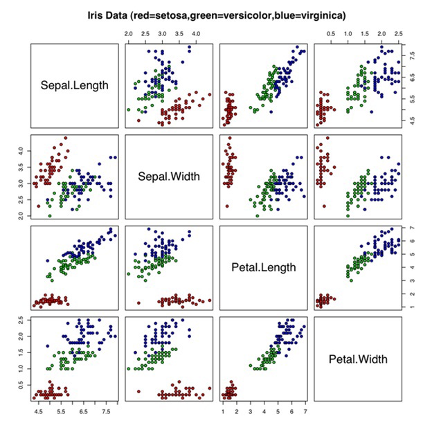
This is an ordinary scatter plot. You can even see a pattern in it. There is a group of points (marked in red setosa) which clearly stand out from the rest. But how much time did it take to view the whole diagram and figure it out? And here, after all, only 4 measurements. What will happen when you have data with 10 dimensions? It is not difficult to guess that then the task of visual classification will become much more difficult.
Andrews Charts
David Andrews (Andrews, David F.) in 1972 described a convenient way to visualize multidimensional data. The essence of this method is as follows:
Every point represented as a Fourier series:
')

The resulting function is depicted on the graph in the interval
Thus, each point from the dataset corresponds to a line in the graph in this interval.
Take for clarity, the same data set that was used for the scatter plot above, and draw this data using the Andrews chart.

You may notice that the lines corresponding to similar values also have a similar shape. In this case, the dimension of the data does not matter, each point will always correspond to one line on the graph. It is also not difficult to allocate the setosa variety (lines depicted in red) into a separate class. The main achievement of the Andrews chart in this case is that we got a clear and easily readable representation of our data.
Andrews charts are far from the only way to visualize multidimensional data. But this method is simple to implement, understandable and can be easily applied in practice.
Bibliography:
● en.wikipedia.org/wiki/Andrews_plot
● Andrews, David F. (1972). “Plots of High-Dimensional Data”. International Biometric Society 18 (1): 125–136. JSTOR 2528964.
● glowingpython.blogspot.ru/2014/10/andrews-curves.html
This is an ordinary scatter plot. You can even see a pattern in it. There is a group of points (marked in red setosa) which clearly stand out from the rest. But how much time did it take to view the whole diagram and figure it out? And here, after all, only 4 measurements. What will happen when you have data with 10 dimensions? It is not difficult to guess that then the task of visual classification will become much more difficult.
Andrews Charts
David Andrews (Andrews, David F.) in 1972 described a convenient way to visualize multidimensional data. The essence of this method is as follows:
Every point
represented as a Fourier series:')
The resulting function is depicted on the graph in the interval
Thus, each point from the dataset corresponds to a line in the graph in this interval.
Take for clarity, the same data set that was used for the scatter plot above, and draw this data using the Andrews chart.
YaP Python code
import numpy as np import pylab as pl def andrews_curve(x,theta): curve = list() for th in theta: x1 = x[0] / np.sqrt(2) x2 = x[1] * np.sin(th) x3 = x[2] * np.cos(th) x4 = x[3] * np.sin(2.*th) curve.append(x1+x2+x3+x4) return curve accuracy = 1000 samples = np.loadtxt('iris.csv', usecols=[0,1,2,3], delimiter=',') theta = np.linspace(-np.pi, np.pi, accuracy) for s in samples[:20]: # setosa pl.plot(theta, andrews_curve(s, theta), 'r') for s in samples[50:70]: # versicolor pl.plot(theta, andrews_curve(s ,theta), 'g') for s in samples[100:120]: # virginica pl.plot(theta, andrews_curve(s, theta), 'b') pl.xlim(-np.pi,np.pi) pl.show() You may notice that the lines corresponding to similar values also have a similar shape. In this case, the dimension of the data does not matter, each point will always correspond to one line on the graph. It is also not difficult to allocate the setosa variety (lines depicted in red) into a separate class. The main achievement of the Andrews chart in this case is that we got a clear and easily readable representation of our data.
Andrews charts are far from the only way to visualize multidimensional data. But this method is simple to implement, understandable and can be easily applied in practice.
Bibliography:
● en.wikipedia.org/wiki/Andrews_plot
● Andrews, David F. (1972). “Plots of High-Dimensional Data”. International Biometric Society 18 (1): 125–136. JSTOR 2528964.
● glowingpython.blogspot.ru/2014/10/andrews-curves.html
Source: https://habr.com/ru/post/248623/
All Articles