Full customization of select without using JS
 How much I did not torment the search engine, and there was no solution to this issue. Of course, you can always use JS and this is normal, but sometimes the
 In the title, I somewhat lied: we all know that select cannot be fully customized, so we will imitate select. We do this with the help of several radio, several labels and one div. Not so much, right?
Structure
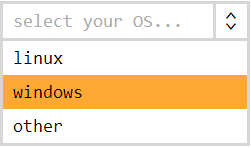
<!-- select --> <label class="selectGeneral" placeholder="select your OS..."> <!-- , , placeholder --> <!-- radio - select , - select --> <input type="radio" name="OS"> <!-- wrapper --> <div> <!-- radio option --> <input type="radio" name="OS" value="linux" id="OS[linux]" > <!-- option --> <label for="OS[linux]">linux</label> <input type="radio" name="OS" value="windows" id="OS[windows]" > <label for="OS[windows]">windows</label> <input type="radio" name="OS" value="other" id="OS[other]" > <label for="OS[other]">other</label> </div> </label> The root label will always be the visible part of our alternative select. When clicking on it, the main radio will switch, which is responsible for the open / closed state of this construction. Placeholder and traditional arrow will be implemented through pseudo-elements: before and: after the root label. Everything else, except the wrapper (the one and only div), is hidden by default. Why don't we hide the wrapper? Because it contains the selected element (if there is one), and it should always be visible.
Main part
label.selectGeneral { display: block; position: relative; } /** placeholder **/ label.selectGeneral:before { content: attr(placeholder); /** placeholder **/ display: inline-block; position: absolute; top: 0; left: 0; z-index: -1; max-width: 100%; text-align: left; white-space: nowrap; /** **/ color: #adadad; overflow-x: hidden; /** **/ } /** **/ label.selectGeneral:after { content: "<>"; display: inline-block; position: absolute; top: 0; right: 0; text-align: center; background-color: #ffffff; transform: rotate(90deg); } label.selectGeneral input, label.selectGeneral label { display: none; } label.selectGeneral div { min-width: 100%; max-height: 500px; /** **/ overflow-x: hidden; } It remains to add a little magic - to implement the behavior of all this good. The magic will be based on neighboring selectors and: checked for radio. The selected element is always visible and when closed, the select overlaps with a placeholder. When you open select, all other elements for selection are shown, and the wrapper in which they are nested slides down a bit, so that the placeholder can be seen and the user has not forgotten what he actually chooses.
Behavior
/** select , wrapper **/ label.selectGeneral input[type="radio"]:checked ~ div { position: absolute; /** **/ top: < label.selectGeneral>; /** , placeholder **/ overflow-y: auto; } /** label wrapper' select **/ label.selectGeneral input[type="radio"]:checked ~ div > label, /** **/ label.selectGeneral input[type="radio"]:checked + label { display: block; /** **/ } /** select **/ label.selectGeneral input[type="radio"]:checked ~ div > label:hover { background-color: #ffa834; } /** select, label **/ label.selectGeneral input[type="radio"]:not(:checked) ~ div > input[type="radio"]:checked + label { position: relative; z-index: -1; } At the end, a trick with z-index is applied, which allows you to position the child below (deeper along the z-axis) of the parent. This remarkable fact allows you to delegate the response to a click on the selected element of our select, so that it opens up.
')
A working example can be seen here .
Of the benefits of the approach can be noted:
- Cross-browser compatibility — it works wherever a label works.
- Relative ease - the code is not oversaturated with unnecessary elements
- Possibility of full customization - every detail is styled
- Flexibility - do not have to add new styles when adding items of choice
Of course, there are also disadvantages, where without them:
- The absence of degradation - if not supported, standard select will not save the situation (as commentators suggest is a very important point for portable devices)
- Ease is ease, but additional code will still be
- Nonvalid code - a div inside the label and the placeholder attribute on it, this is not according to the standard
- This is not really a minus, but this thing does not slam itself when you click anywhere on the screen
I do not think that someone will use it in production, but the approach clearly has the right to life.
UDPATE: Changed code - added auto close select function when selected.
Source: https://habr.com/ru/post/248243/
All Articles