Mobile interface for one hand
In his book Designing Mobile Interfaces (2011), designer Stephen Huber introduced the concept of The Thumb Zone (“thumb zone”) - the area of the screen, the most convenient when using the phone with one hand. Since the year of publication of the book, the average size of the smartphone has increased significantly, and the “dead zone” - an area that is difficult to reach with one hand - has also become larger.
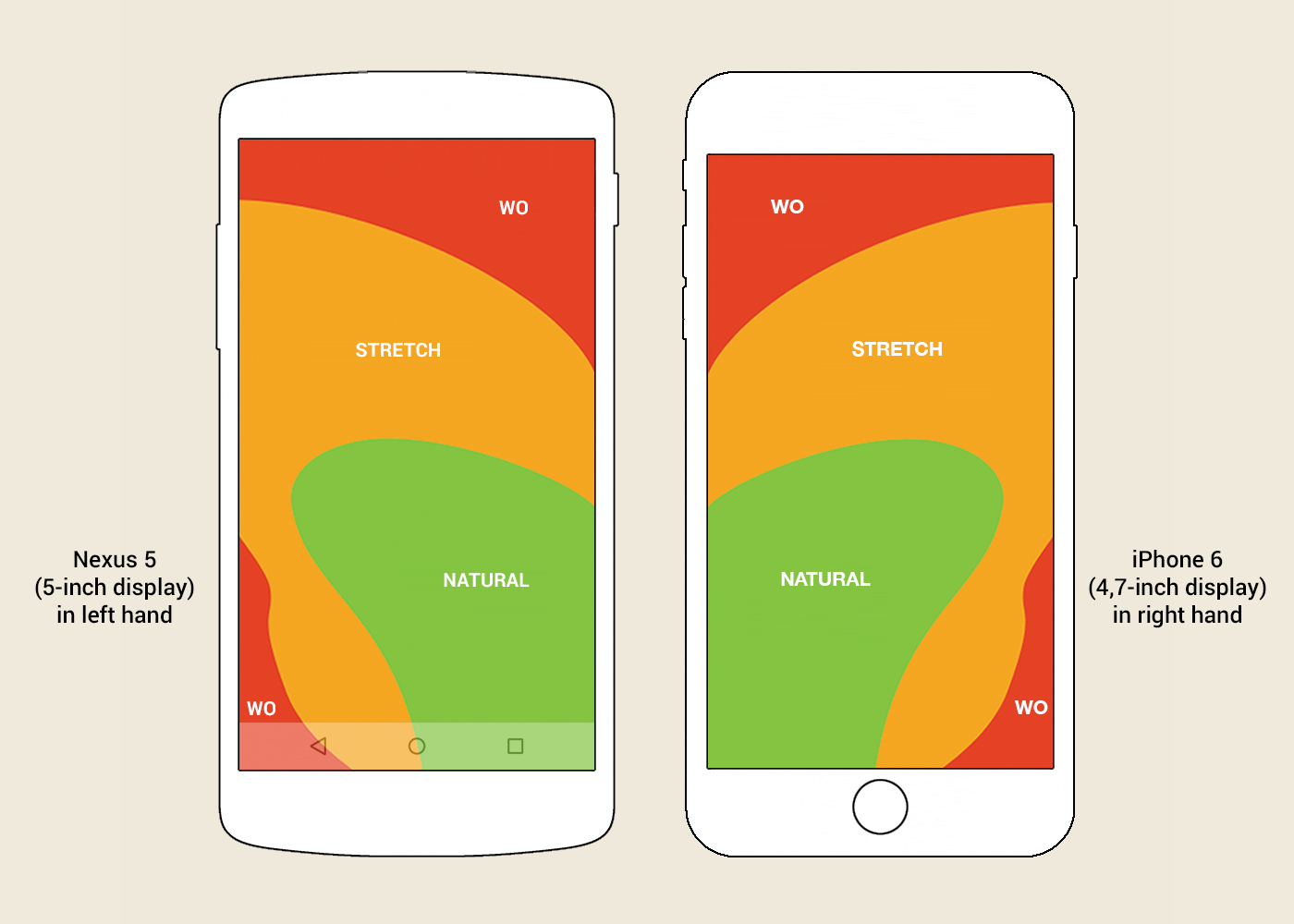 Picture. “Thumb area” for a 5–4.7-inch screen, if you hold the phone in your left and right hand, respectively. Image based on Scott Harff’s publication .
The “dead zone”, marked in red, includes application toolbars, which are both in the Android (App Bar / Primary Toolbar) and in the iOS (Navigation Bar) at the top of the screen.
')
On some Android phones, an attempt has been made to solve the “dead zone” problem. For example, Samsung S4 and LG G Pro 2 ) support the One-handed Mode: the phone interface is proportionally reduced and pressed against the bottom corner of the screen. A similar feature appeared in the iPhone 6: in Reachability mode, the interface shifts to the bottom of the screen, keeping its dimensions in width.
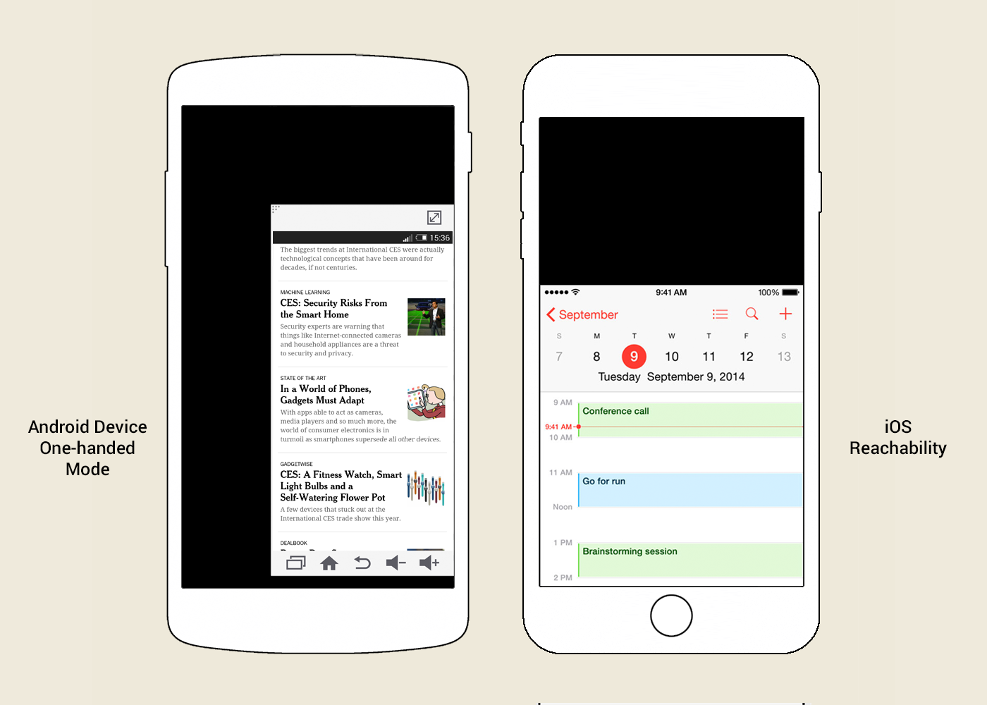 Picture. One-hand Mode on some Android phones and Reachability on iPhone 6.
But such regimes - only "crutches". They do not solve the problem completely, but only allow you to turn the use of the phone with one hand from the impossible to at least uncomfortable.
This solution should not help reach the desired button, and save the user from having to reach out.
In the epicenter of the “dead zone” iOS, the Back button is standardly located. However, in most applications there is no need to reach for it - just make a swipe from the left edge of the phone (hold your finger from the edge of the case to the center of the screen - Edge Swipe). Surprisingly, not all iPhone users know about it.
By the way, applications from Google for iOS are almost the only ones that do not support svaypas for returning back. Apparently, Google deliberately worsens the user experience, stimulating the purchase of phones with the “iron” button Back.
On Android phones, the button of the side menu (Navigation Drawer) falls into the “dead zone” area - you can also open this menu with a swipe from the left edge of the phone.
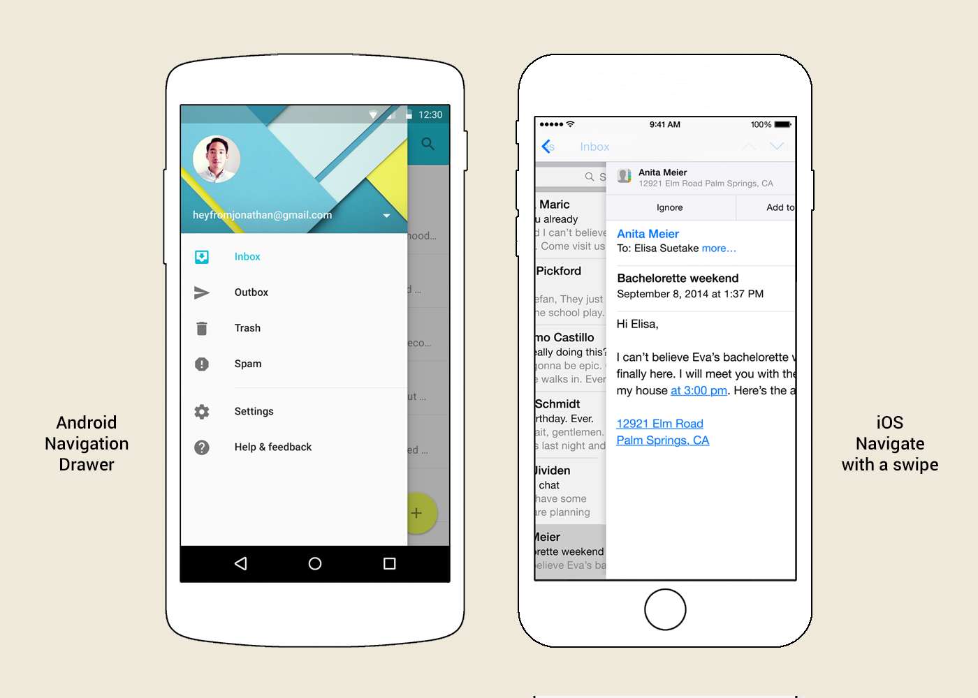 Picture. The side (main) menu (Navigation Drawer) in Android and the Navigare with a swipe function in iOS.
In the examples from the two platforms, the swipe from the left edge of the phone (Edge Swipe) is equal to clicking the left button in the top toolbar. Why not use this solution for the entire toolbar and any buttons located on it?
The left and right buttons of the top toolbar should stop being first of all buttons - they should prompt what action is hidden behind the swipe from the left and right edges of the phone, respectively.
Now in iOS Messages on the top right there is a button for creating a new message - in accordance with this rule, a swipe from the right edge of the phone will call up the screen for creating a new message.
 Animation. The concept of a mobile interface for one hand. Swipe from the edge of the phone activates the function indicated by the icon on the toolbar on the corresponding side of the phone. In this case, creating a new message in iOS Messages and returning back to the message list.
When viewing a letter in the current version of Android Gmail on the top right is the email control panel. It displays several main buttons, while others are hidden behind the button to open the context menu. In accordance with the new rule, a swipe from the right edge of the phone will open this context menu. The updated menu will contain a complete list of actions, including the main ones, bringing them closer to the “zone of the thumb”.
 Animation. The concept of a mobile interface for one hand. Swipe from the right edge of the phone activates the function indicated by the right icon on the toolbar. In this case, the context menu of the letter in Android Gmail.
On the same letter viewing screen in Android Gmail, there is a “Back” button on the left. But in the current version of the application on this screen, the swipe from the left edge of the phone opens the side menu. The users are misled by the wrong hint. Despite the presence of the “iron” Back button in Android phones, the svayp should duplicate the function of the “Back” button located on the screen on the left. That is, a swipe from the left edge should return the user back to the list of letters, and already in the list of letters, open the side menu.
But there are no rules without exceptions. On the right side of the toolbar, there may be a “Done” or “Send” button, which leads to irreversible action. Such a simple movement as a swipe should not lead to the performance of irreversible actions.
 Animation. The concept of a mobile interface for one hand. Swipe from the edge of the phone activates the function indicated by the icon on the toolbar on the corresponding side of the phone. In this case - search for emails in Android Gmail and return back to the list of emails.
The swipe from the edge of the phone (Edge Swipe) is difficult to confuse with the swipe inside the screen (Swipe). The difference between the two gestures is not difficult either for users or for developers. Swipe from the edge of the phone starts off-screen, and phones respond well to such a gesture. For example, when viewing a letter in the current version of Android Gmail svayp from the left edge opens the side menu, and svaypas inside the screen navigate to the next or previous letter.
Using the swipe from the left and right edges of the phone to activate the functions of the top toolbar is easily applicable to both iOS and Android. Moreover, similar functionality with respect to the left side has already been partially implemented on both platforms. This intuitive behavior has every chance of becoming a standard mobile interface.
The “dead zone”, marked in red, includes application toolbars, which are both in the Android (App Bar / Primary Toolbar) and in the iOS (Navigation Bar) at the top of the screen.
')
On some Android phones, an attempt has been made to solve the “dead zone” problem. For example, Samsung S4 and LG G Pro 2 ) support the One-handed Mode: the phone interface is proportionally reduced and pressed against the bottom corner of the screen. A similar feature appeared in the iPhone 6: in Reachability mode, the interface shifts to the bottom of the screen, keeping its dimensions in width.
But such regimes - only "crutches". They do not solve the problem completely, but only allow you to turn the use of the phone with one hand from the impossible to at least uncomfortable.
This solution should not help reach the desired button, and save the user from having to reach out.
In the epicenter of the “dead zone” iOS, the Back button is standardly located. However, in most applications there is no need to reach for it - just make a swipe from the left edge of the phone (hold your finger from the edge of the case to the center of the screen - Edge Swipe). Surprisingly, not all iPhone users know about it.
By the way, applications from Google for iOS are almost the only ones that do not support svaypas for returning back. Apparently, Google deliberately worsens the user experience, stimulating the purchase of phones with the “iron” button Back.
On Android phones, the button of the side menu (Navigation Drawer) falls into the “dead zone” area - you can also open this menu with a swipe from the left edge of the phone.
In the examples from the two platforms, the swipe from the left edge of the phone (Edge Swipe) is equal to clicking the left button in the top toolbar. Why not use this solution for the entire toolbar and any buttons located on it?
The left and right buttons of the top toolbar should stop being first of all buttons - they should prompt what action is hidden behind the swipe from the left and right edges of the phone, respectively.
Now in iOS Messages on the top right there is a button for creating a new message - in accordance with this rule, a swipe from the right edge of the phone will call up the screen for creating a new message.
When viewing a letter in the current version of Android Gmail on the top right is the email control panel. It displays several main buttons, while others are hidden behind the button to open the context menu. In accordance with the new rule, a swipe from the right edge of the phone will open this context menu. The updated menu will contain a complete list of actions, including the main ones, bringing them closer to the “zone of the thumb”.
On the same letter viewing screen in Android Gmail, there is a “Back” button on the left. But in the current version of the application on this screen, the swipe from the left edge of the phone opens the side menu. The users are misled by the wrong hint. Despite the presence of the “iron” Back button in Android phones, the svayp should duplicate the function of the “Back” button located on the screen on the left. That is, a swipe from the left edge should return the user back to the list of letters, and already in the list of letters, open the side menu.
But there are no rules without exceptions. On the right side of the toolbar, there may be a “Done” or “Send” button, which leads to irreversible action. Such a simple movement as a swipe should not lead to the performance of irreversible actions.
The swipe from the edge of the phone (Edge Swipe) is difficult to confuse with the swipe inside the screen (Swipe). The difference between the two gestures is not difficult either for users or for developers. Swipe from the edge of the phone starts off-screen, and phones respond well to such a gesture. For example, when viewing a letter in the current version of Android Gmail svayp from the left edge opens the side menu, and svaypas inside the screen navigate to the next or previous letter.
Using the swipe from the left and right edges of the phone to activate the functions of the top toolbar is easily applicable to both iOS and Android. Moreover, similar functionality with respect to the left side has already been partially implemented on both platforms. This intuitive behavior has every chance of becoming a standard mobile interface.
Source: https://habr.com/ru/post/247871/
All Articles