Draw an animated scene using css
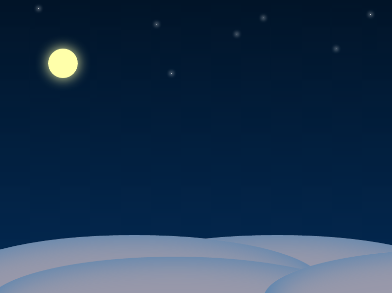
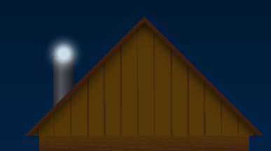
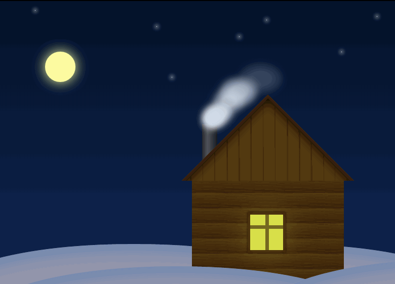
Let's take a break from the layout of any user interfaces and just draw on CSS. We will draw such a scene:
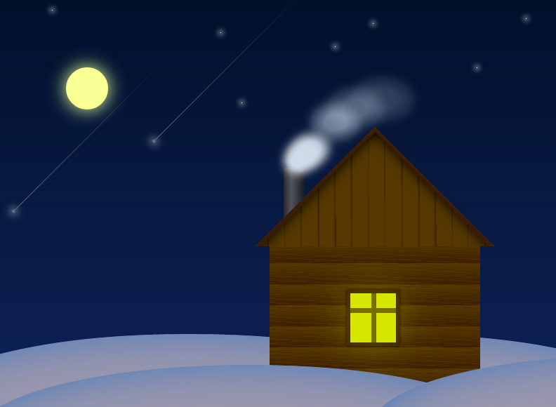
Look at jsfiddle.
')
In the article I will try to describe the step by step creation of this scene.
The described code works on webkit browsers (Chrome, Safari, Opera latest versions). To work in other browsers instead of the prefixes in -webkit, you need to use the appropriate prefixes (-moz, -ms, -o).
Create a scene and sky
With the help of linear-gradient (top, # 011428, # 032a54) we filled the scene with a gradient from a darkish (# 011428) to a lighter (# 032a54) shade of blue starting from the top (top)

Draw snowdrifts. We take as the basis the ellipses that can be created from divs by setting them border-radius: 50%
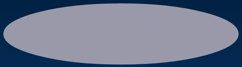
Position 4 ellipses at the bottom of the scene.
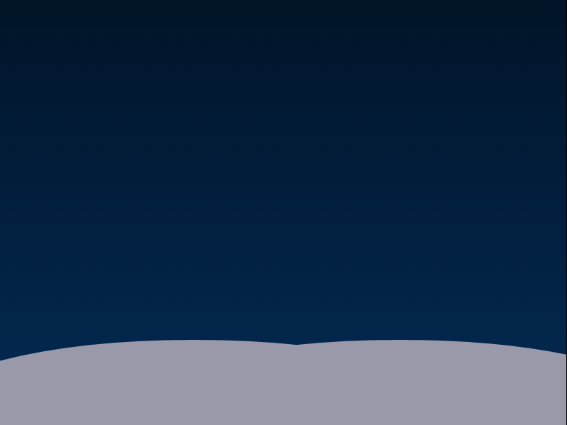
We make drifts voluminous adding an inner shadow to the class .ground

Draw the moon and the stars
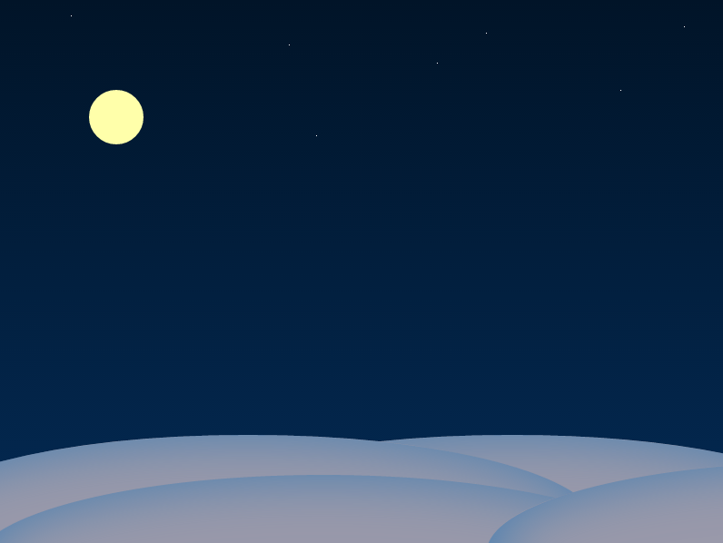
Add moon glow effect
And the stars too:
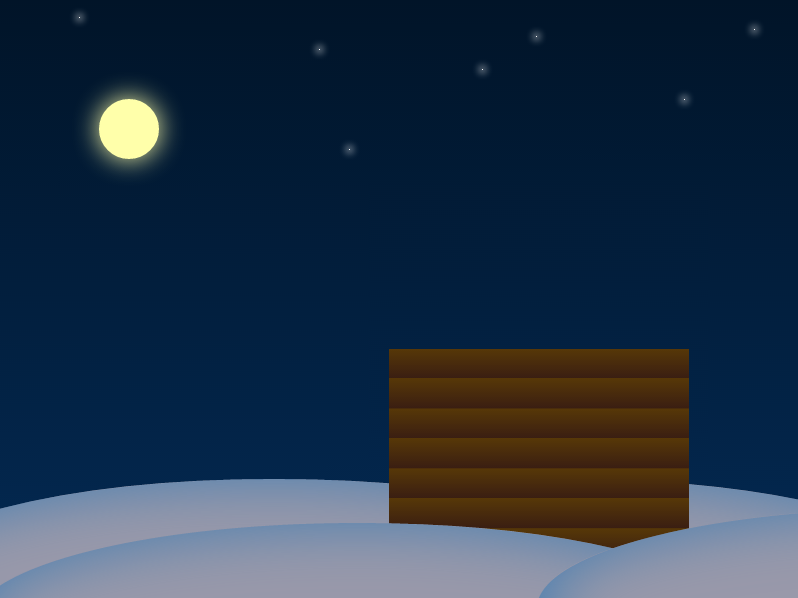
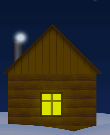
Now proceed to the house. The house will consist of a roof, walls, windows and chimney. We describe all this layout:
Draw a wall. The effect of a log cabin can be obtained using a repeating gradient:
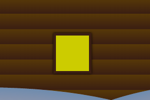
Making a window. It will be a div with a yellow background and a brown frame.
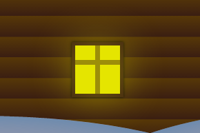
Add another frame and glow effect to it using box-shadow
Create a roof. This will be a div which will serve as a roof.
To create the effect of the wall paneling, again use the repeating gradient, which we rotate by 45 degrees
The roof is ready, we put it on the house turning 45 degrees with the help of transform: rotate (45deg) and cutting off half with the help of overflow: hidden at the container
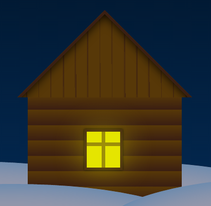
We attach a pipe drawn using a gradient
And add the roughness of the logs, putting on them a couple of repeating brown gradients turning into transparency
Well, we have already turned out quite a pretty picture
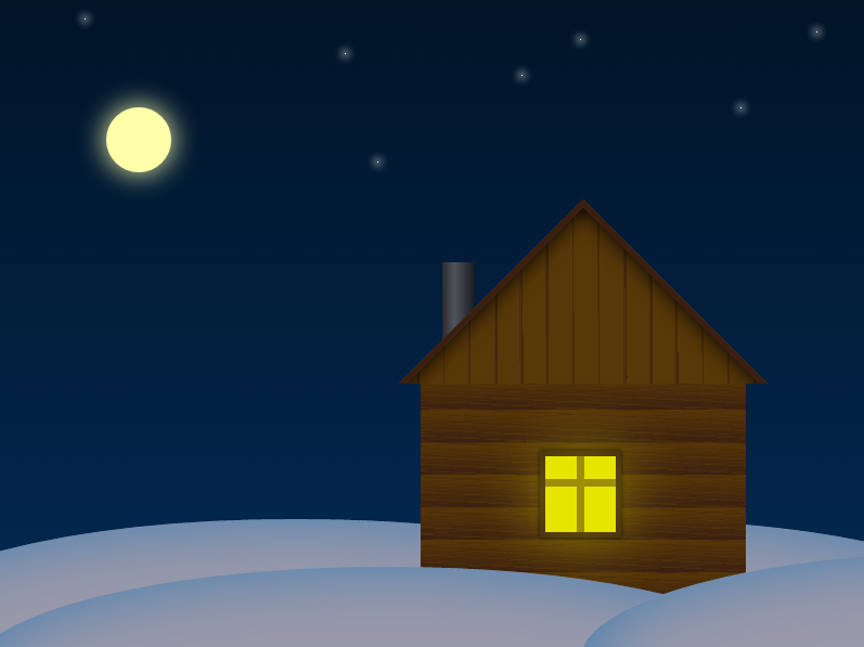
It is time to revive our static picture animations. To begin with, we’ll make smoke out of the chimney.
For now let's draw one cloud of smoke. It will be a translucent oval with a light box-shadow around and a radial gradient.
With the help of key frames we describe the trajectory of movement and transformation of this cloud. It will gradually increase and become transparent.
Now let's assign the animation just described to our cloud by adding a property to the class .smoke
Great, we already have a working chimney, but in its full form it should continuously and let out a lot of smoke so we will add a few more pieces to the layout.
Now there are several clouds of smoke, but so far there is little confusion from this, since they all move simultaneously along the same trajectory and it all looks like one cloud. To describe the new animation for each cloud is too clumsy and tedious. Here you want some randomness in their movement, for example, to apply something like Math.random () using javascript, but since the goal is to make a scene using only css, you will have to wriggle out with your friend. In our case, you can simply re-use for each element the already described smoke-move animation, but with different playing times:
Now clouds of smoke move along the same trajectory but for a different time, which gives the appearance of their random movement:
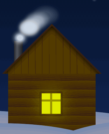
After some time, the cycle of animation of the movement of clouds of smoke will begin to repeat, but with a sufficiently large number of cycles this will not be much replaced. In order to select the largest motion cycle, we need to specify mutually simple numbers as the animation time .
And as a highlight add a few falling stars. As before, let's start with one, add it as .meteor to div.meteors
Description css begin with the tail of our meteor. It will be a white line turning into transparency.
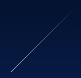
Now draw a star at the end of this tail:
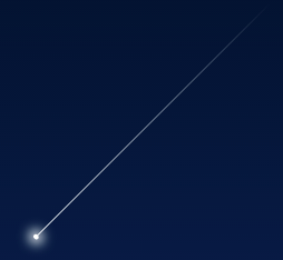
We describe the animation for the meteor, we will move it changing indents to create the effect of flight at an inclination of 45 degrees. The meteor will fall and gradually disappear.
We launch a meteor in flight:

Need more meteors!
Well, the scene is ready!
Look at jsfiddle.
')
In the article I will try to describe the step by step creation of this scene.
The described code works on webkit browsers (Chrome, Safari, Opera latest versions). To work in other browsers instead of the prefixes in -webkit, you need to use the appropriate prefixes (-moz, -ms, -o).
Create a scene and sky
<div class="scene"></div> .scene { position: relative; width: 800px; height: 600px; margin: 50px auto; overflow: hidden; background-image: -webkit-linear-gradient(top, #011428, #032a54); } With the help of linear-gradient (top, # 011428, # 032a54) we filled the scene with a gradient from a darkish (# 011428) to a lighter (# 032a54) shade of blue starting from the top (top)
Draw snowdrifts. We take as the basis the ellipses that can be created from divs by setting them border-radius: 50%
.ground { position: absolute; width: 770px; height: 200px; border-radius: 50%; background-color: #99a; } Position 4 ellipses at the bottom of the scene.
<div class="ground back-1"></div> <div class="ground back-2"></div> <div class="ground front"></div> <div class="ground front-2"></div> .ground { width: 400px; background-color: #f5f5f5; border-radius: 50%; width: 770px; height: 200px; position: absolute; bottom: 0; margin-bottom: -80px; right: 140px; background-color: #99a; } .ground.back-1 {left: 180px;} .ground.front {margin-bottom: -124px;left: -27px;} .ground.front-2 {margin-bottom: -109px;right: -508px;} We make drifts voluminous adding an inner shadow to the class .ground
box-shadow: 0 0 100px #457eb2 inset; Draw the moon and the stars
<div class="moon"></div> <div class="stars"> <div class="star"></div> <div class="star"></div> <div class="star"></div> <div class="star"></div> <div class="star"></div> <div class="star"></div> <div class="star"></div> </div> .moon { position: absolute; width: 60px; height: 60px; top: 100px; left: 100px; background-color: #ffffaa; border-radius: 50%; } .stars { position: absolute; width: 100%; height: 100%; } .star { position: absolute; border-radius: 50%; width: 1px; height: 1px; background-color: #ffffff; } .star:nth-child(1) {top: 100px;left: 685px;} .star:nth-child(2) {top: 37px;left: 537px;} .star:nth-child(3) {top: 150px;left: 350px;} .star:nth-child(4) {top: 50px;left: 320px;} .star:nth-child(5) {top: 30px;left: 755px;} .star:nth-child(6) {top: 70px;left: 483px;} .star:nth-child(7) {top: 18px;left: 80px;} Add moon glow effect
box-shadow: 0 0 40px #ffffaa; And the stars too:
box-shadow: 0 0 10px 2px white; Now proceed to the house. The house will consist of a roof, walls, windows and chimney. We describe all this layout:
<div class="house"> <div class="chimney"></div> <div class="roof"> <div class="roof-wall"></div> </div> <div class="wall"></div> <div class="window"></div> </div> .house { position: absolute; width: 300px; height: 365px; bottom: 50px; right: 110px; } Draw a wall. The effect of a log cabin can be obtained using a repeating gradient:
.house .wall { width: 100%; height: 200px; position: absolute; bottom: 0; background-color: #180c00; background: repeating-linear-gradient(to bottom, #573808 0%,#3a1e12 15%); } Making a window. It will be a div with a yellow background and a brown frame.
.house .window { position: absolute; height: 70px; width: 65px; background-color: #cccc00; border: 5px solid #3a1e12; bottom: 53px; left: 110px; box-shadow: 0 0 5px black; } Add another frame and glow effect to it using box-shadow
<div class="window"> <div class="frame"></div> <div class="frame"></div> <div class="light"></div> </div> .house .window .frame:nth-child(1) { position: absolute; height: 100%; left: 50%; margin-left: -3px; width: 7px; background-color: #3a1e12; } .house .window .frame:nth-child(2) { position: absolute; width: 100%; top: 30%; height: 7px; background-color: #3a1e12; } .house .window .light { width: 100%; height: 100%; background-color: #ffff00; opacity: 0.5; box-shadow: 0 0 100px yellow; } Create a roof. This will be a div which will serve as a roof.
.house .roof .roof-wall { position: absolute; width: 280px; height: 280px; background-color: #573808; left: 25px; top:60px; border: 5px solid #3a1e12; box-shadow: 0 0 30px black inset; } To create the effect of the wall paneling, again use the repeating gradient, which we rotate by 45 degrees
background: repeating-linear-gradient(45deg, #573808 0%,#573808 5%,#3a1e12 5%,#3a1e12 5%,#3a1e12 5%,#573808 5%,#3a1e12 6%) The roof is ready, we put it on the house turning 45 degrees with the help of transform: rotate (45deg) and cutting off half with the help of overflow: hidden at the container
.house .roof { width: 340px; height: 170px; right: -20px; position: absolute; overflow: hidden; } .house .roof .roof-wall { position: absolute; width: 280px; height: 280px; background-color: #573808; -webkit-transform: rotate(45deg); left: 25px; top:60px; border: 5px solid #3a1e12; box-shadow: 0 0 30px black inset; background: repeating-linear-gradient(45deg, #573808 0%,#573808 5%,#3a1e12 5%,#3a1e12 5%,#3a1e12 5%,#573808 5%,#3a1e12 6%); } We attach a pipe drawn using a gradient
.house .chimney { position: absolute; height: 80px; width: 30px; top: 58px; left: 20px; background: linear-gradient(to right, rgba(42,41,45,1) 0%,rgba(80,84,91,1) 36%,rgba(22,27,33,1) 100%); } And add the roughness of the logs, putting on them a couple of repeating brown gradients turning into transparency
<div class="wall"> <div class="crack"></div> <div class="crack"></div> </div> .house .wall .crack { position: absolute; width: 100%; height: 100%; opacity: 0.5; background: repeating-linear-gradient(3deg, rgba(0,0,0,0) 0%, rgba(0,0,0,0) 2%, rgba(0,0,0,0) 2%,#3a1e12 2%,#3a1e12 2%,#573808 2%,#3a1e12 3%); } .house .wall .crack:nth-child(2) { opacity: 0.3; background: repeating-linear-gradient(-4deg, rgba(0,0,0,0) 0%, rgba(0,0,0,0) 2%, rgba(0,0,0,0) 2%,#3a1e12 2%,#3a1e12 2%,#573808 2%,#3a1e12 3%); } Well, we have already turned out quite a pretty picture
It is time to revive our static picture animations. To begin with, we’ll make smoke out of the chimney.
For now let's draw one cloud of smoke. It will be a translucent oval with a light box-shadow around and a radial gradient.
<div class="smoke-area"> <div class="smoke"></div> </div> .smoke-area .smoke { position: absolute; width: 30px; height: 30px; border-radius: 50%; box-shadow: 0 0 20px lightgray; background: radial-gradient(ellipse at center, rgba(206,220,231,1) 33%,rgba(89,106,114,0) 100%); top: 120px; left: 20px; } With the help of key frames we describe the trajectory of movement and transformation of this cloud. It will gradually increase and become transparent.
@-webkit-keyframes smoke-move { 0% {top: 120px; left: 20px} 20% {top: 107px; left: 25px} 30% {top: 95px; left: 35px; opacity: 0.9} 40% {top: 80px; left: 40px; } 50% {top: 65px; left: 50px; } 60% {top: 50px; left: 62px; } 70% {top: 35px; left: 75px; } 80% {top: 25px; left: 90px; } 90% {top: 15px; left: 117px; } 100% {top: 7px; left: 127px; opacity: 0; width: 90px; height: 60px} } Now let's assign the animation just described to our cloud by adding a property to the class .smoke
-webkit-animation: smoke-move 2.3s linear infinite Great, we already have a working chimney, but in its full form it should continuously and let out a lot of smoke so we will add a few more pieces to the layout.
<div class="smoke-area"> <div class="smoke"></div> <div class="smoke"></div> <div class="smoke"></div> <div class="smoke"></div> <div class="smoke"></div> <div class="smoke"></div> <div class="smoke"></div> <div class="smoke"></div> </div> Now there are several clouds of smoke, but so far there is little confusion from this, since they all move simultaneously along the same trajectory and it all looks like one cloud. To describe the new animation for each cloud is too clumsy and tedious. Here you want some randomness in their movement, for example, to apply something like Math.random () using javascript, but since the goal is to make a scene using only css, you will have to wriggle out with your friend. In our case, you can simply re-use for each element the already described smoke-move animation, but with different playing times:
.smoke-area .smoke:nth-child(2) { -webkit-animation: smoke-move 2.5s linear infinite } .smoke-area .smoke:nth-child(3) { -webkit-animation: smoke-move 2.7s linear infinite } .smoke-area .smoke:nth-child(4) { -webkit-animation: smoke-move 2.2s linear infinite } .smoke-area .smoke:nth-child(5) { -webkit-animation: smoke-move 2.1s linear infinite } .smoke-area .smoke:nth-child(6) { -webkit-animation: smoke-move 2s linear infinite } .smoke-area .smoke:nth-child(7) { -webkit-animation: smoke-move 2.9s linear infinite } Now clouds of smoke move along the same trajectory but for a different time, which gives the appearance of their random movement:
After some time, the cycle of animation of the movement of clouds of smoke will begin to repeat, but with a sufficiently large number of cycles this will not be much replaced. In order to select the largest motion cycle, we need to specify mutually simple numbers as the animation time .
And as a highlight add a few falling stars. As before, let's start with one, add it as .meteor to div.meteors
<div class="meteors"> <div class="meteor"></div> </div> .meteors { position: absolute; width: 100%; height: 100%; } Description css begin with the tail of our meteor. It will be a white line turning into transparency.
.meteor { position: absolute; top: 50px; left: 280px; width: 300px; height: 1px; -webkit-transform: rotate(-45deg); background-image: -webkit-linear-gradient(left, white, rgba(255,255,255,0)); } Now draw a star at the end of this tail:
.meteor:before { content: ' '; position: absolute; width: 4px; height: 5px; background-color: white; border-radius: 50%; box-shadow: 0 0 14px 4px white; margin-top: -2px; } We describe the animation for the meteor, we will move it changing indents to create the effect of flight at an inclination of 45 degrees. The meteor will fall and gradually disappear.
@-webkit-keyframes meteor { 0% {margin-top: -300px; margin-right: -300px; opacity: 1} 8% {opacity: 0} 10% {margin-top: 300px; margin-left: -600px; opacity: 0} 100% {opacity: 0} } We launch a meteor in flight:
.meteor {top: 100px;left: 480px;-webkit-animation: meteor 10s linear infinite;} Need more meteors!
<div class="meteors"> <div class="meteor"></div> <div class="meteor"></div> <div class="meteor"></div> </div> .meteor:nth-child(1) {top: 100px;left: 480px;-webkit-animation: meteor 10s linear infinite;} .meteor:nth-child(2) {top: 200px;left: 280px;-webkit-animation: meteor 10s linear infinite;} .meteor:nth-child(3) {top: 250px;left: 790px;-webkit-animation: meteor 9s linear infinite;} Well, the scene is ready!
Source: https://habr.com/ru/post/247731/
All Articles