58 signs of a good interface
A good user interface has a high conversion rate and is easy to use. That is, it is good both for business, and for people using it. Here is a list of ideas we tested.
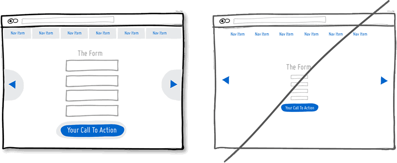
One column more accurately reflects what you want to convey. Users go from top to bottom in a more predictable way. In a multi-column design, there is a risk of distracting the user from the main task of the page.
The gift is a friendly gesture. But besides this, it is a powerful hidden persuading factor that works because of reciprocity. Although it is obvious, but if you have reacted well to someone, your assessment will grow in his eyes.
')

Over time, it is easy to create several different sections, elements and functions that perform the same thing. Keep track of duplicate functionality as it loads users. The more such duplicates, the more difficult it is for the user to use your service.
Another great persuasion tactic that directly affects conversion. The approval of your proposal by other people encourages action. Try to show reviews, or service usage statistics.
Call repetition works better on long pages, or it can be repeated on different pages. You should not show a sentence ten times on one page. But now long pages are in fashion, on which it doesn’t hurt to repeat the offer both from above and below. When people reach the bottom, they stop and reflect on their next step.

Visual design — color, depth, contrast — can be used as hints to help people understand how your interface works: where I am and where I can go. The styles of your clickable elements, the selected elements and the text should differ from each other and be the same across the interface. In the example, I chose blue for all clickable elements, and black for all that can be highlighted or for what your location suggests.
If you provide several options to choose from, then it would be nice to emphasize one of them. The more a person has a choice, the less likely he is to make it at all. To prevent such paralysis of choice, select one of the options.
The ability to undo an action looks like a respect for the user's intelligence and allows actions to pass without hesitation. Constant confirmations look like you think the user doesn’t know what he wants. I can assume that most actions are performed by people intentionally, and only a small part of them occurs by chance. Especially unpleasant confirmations appear in repetitive actions. Users will feel that they are better at controlling the situation if they can undo their actions, and if they are not asked to confirm at every step.
Do you count on all users, or do you know your audience exactly? By clearly explaining who can benefit from your product, you can achieve better results while hinting at the exclusivity of the service. There are risks of losing part of the audience. However, transparency inspires confidence.
You can say something in an uncertain, trembling voice, or you can say it with confidence. Finishing sentences with question marks and using the words “maybe”, “are you interested?”, “Do you want to?”, You seem indecisive. Add confidence!

Calling for action will be more effective if your interface highlights these actions visually. Contrast is achieved by different methods. Some elements can be made lighter, others darker. It is possible to ensure that some elements appear closer than others (shadows and gradients). You can choose different colors to enhance the contrast. Everything together should clearly separate the call to action from the rest of the page.

Disclosure of data on the origin of the service at the same time says more about it and takes communication to a more intimate level. Mention the country, state, city - it is a natural way for a person to introduce himself. If you do the same, you look more friendly. Often such a mention improves the quality of the product in the eyes of people.
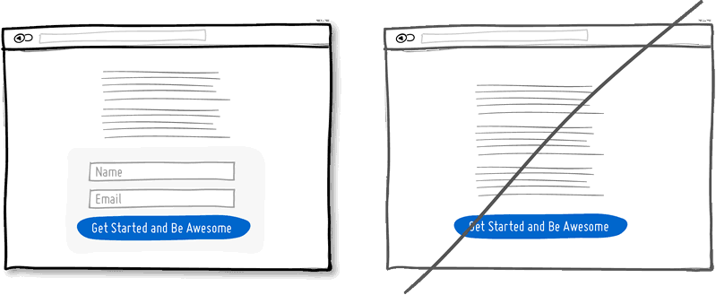
Man by nature avoids time-consuming activities - and among them is filling in the form fields. Each new field increases the risk of a visitor rejecting your service. Not everyone prints equally fast. Printing on mobile devices is inconvenient. Think about what fields are really needed, and remove all the others. If you really need a lot of optional fields, try moving some of them to the next page. The fewer the fields, the greater the conversion.
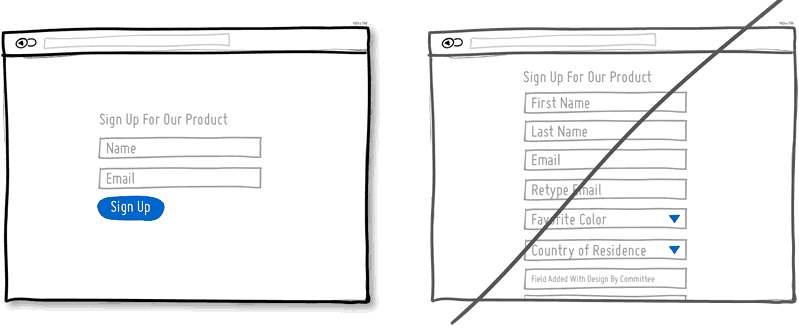
Each drop-down menu hides a set of features. If these opportunities are important for your product, it is better to bring them to the light. Leave dropouts for obvious things that do not require a trial (calendars, geographic location).

False ending kills conversion. You should not pretend that the page is over when the section just ended. If your pages need to be scrolled, try visualizing a template that will show the rhythm and continuation of the page material. Also beware of large empty spaces surrounding the main material, which may be misinterpreted as the end of the page.

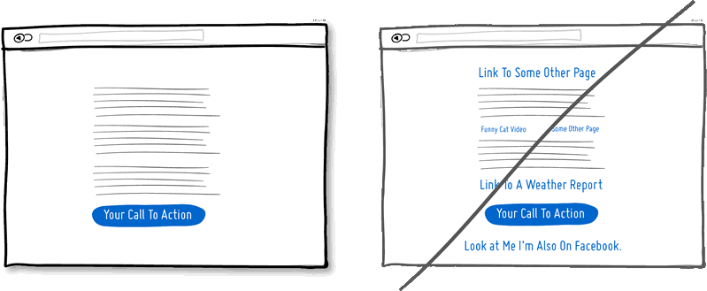
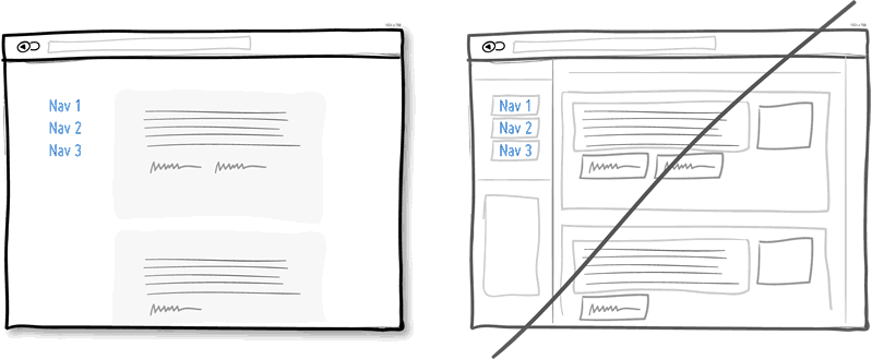
It is easy to reload the page with links leading left and right, hoping to catch as many customers as possible. If you create a narrative page that gradually brings a person to the desired action - think about whether you need so many links. Each link increases the risk of leaving the client from the desired path to a particular action. Keep a balance between the pages with a general description of the service and the pages leading the customer "along the tracks" to action. Remove unnecessary links, and you increase the chances that the client will click on that button.
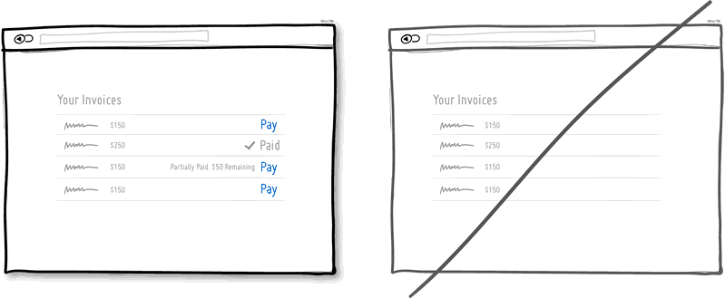
In any interface there are elements that can be in different states. Mail messages can be read or not, bills paid or not, etc. A good way of user feedback is to show the state of the elements. The states help the user figure out what to do next or not.
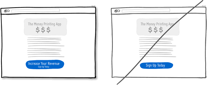
Imagine that “Save money” is written on one button, and simply “Sign up” on the other. I put on the fact that the first clickability above. The "subscription" does not show immediate benefits. On the contrary, the subscription process requires energy and is usually associated with long forms. The idea is that gain buttons can lead to greater conversion. Alternatively, the benefit information can be placed close to the button so that it reminds the user why he should press the button. Of course, there are buttons responsible for the functionality, but they should be reserved for those parts of the site where you need to perform more repetitive actions and less conviction.
Sometimes it makes sense to create interface elements with which the user can work directly. For example, by showing a list of data, we can allow editing it by clicking on an item. Or click on the data line can turn it into an input field. Such capabilities reduce the number of steps that must be taken to perform the required action.

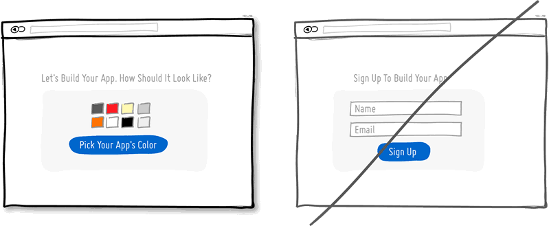
When creating landing pages, you can try to immediately display the fields for entering information, crossing the landing page with the registration form. There are several advantages to this. First, we remove the extra steps and the registration takes less time. Secondly, by showing the number of fields, we immediately tell the user how long the registration will take. Of course, this will be an advantage if our form contains few fields.
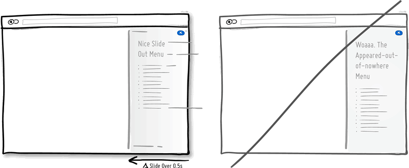
Often, interface elements appear, disappear, move, in response to user actions. It is often easier to understand what happened when these events do not occur instantaneously, when they are stretched over time. Of course, one has to take into account that often repeated very slow actions can, on the contrary, lead to irritation. If something needs to be done quickly, artificial delays will only interfere with perception.
Instead of immediately requiring registration, why not suggest the user to perform a task through which the advantage of your service will be visible. The product can be shown on the face and slightly personalized. When the user felt the benefits of the product and tried it on himself, he would be more inclined to consume. This is a way to postpone registration, while allowing the user to try your product.
Frames attract extra attention. Attention is a valuable resource because it is limited. Of course, the framework clearly delineates and delimits the elements, but they also waste our cognitive energy. To determine the relationship of different elements of the interface and not to overstate too much attention, elements can be grouped together, aligned, giving them a well-defined background or a similar typographic style. Sometimes the line-another helps to determine the overall appearance of the interface, but try to consider other visualization methods.
The basis of marketing is that people do not need the product’s capabilities, but the benefits it brings to them. Chris Gilbo in the book “One Hundred Dollar Startup” writes that people want to have more love, recognition and free time, and less stress, conflict, quarrels and uncertainty. Showing functionality, explain and benefit from it.
There are 10,000 items in lists, and sometimes even 10, 1, and even 0. Usually, data is accumulated, and data sets run from zero to a few points and beyond. Often the designer forgets about those cases when the data is not yet and there is nothing to show. In this case, there is a risk of alienating the user. When he looks at your application and sees just an empty space without any prompts, you lose your chance. The zero amount of data is a great chance to start training the user, showing him what to do next. A good interface is a scalable interface.
Let users be able to participate in anything by default, without having to perform any actions. Often, the user is asked to do something before taking part in or receiving something. The first option is better for several reasons. Firstly, it reduces the resistance to movement, because the user does not need to do anything. Secondly, it provides a recommendation implying belonging to something that is normal and normal. "Everyone else does this, so why shouldn't I do the same." Of course, bad marketers often abuse this technique. For example, by reducing the readability of the text confirming the action or by confusing it specifically, they slip something to the user who is not well aware of what he is subscribing to. Therefore, this approach requires crystal clarity.
Permanent interface means that the user does not need to constantly learn how to use it and spend energy on it. By clicking on the buttons and moving the sliders, we learn how to look and work. Constancy helps facilitate work, and as soon as we lose constancy, we are forced to learn again. Consistency can be achieved through colors, directions, behavior, location, size, shape, labels and language. Unusual elements are important when we need something to highlight or attract attention.
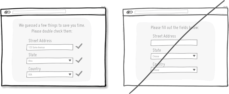
Smart or pre-filled form fields, which are based on known data, reduce the amount of work the user needs to do. This is a common technique of helping the user to advance in forms. Worse does not happen when the user is asked the same data time after time. Instead of empty fields that need to be filled out again, it’s better to have fields that are just filled out and you just need to check. The less work the better.
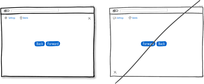
The agreement is the elder brother of permanence. If the interface elements are the same, the user should be less tense. If in different interfaces similar elements are also the same, then it is even more convenient. With the help of well-established agreements, we remembered that the button for closing the window is in the upper right, and we know how the settings icon usually looks. Of course, agreements do not always make sense, sometimes they become obsolete. If you are moving away from agreements - make sure that you have carefully thought out everything.
We love to win, but we hate to lose. According to the laws of the psychology of persuasion, people would rather choose not to suffer a loss than to gain an advantage. This fact applies to the offers of products and services. It is more profitable to advertise the product, as protecting the well-being and status of the user, than as giving any advantage or benefit that they do not yet have. Do insurance companies sell insurance claims, or protect what we already have?
In a good hierarchy, important elements are separated from less important ones. The hierarchy is built through alignment, closeness, color, padding, font size, element size, etc. Correctly positioned elements direct the user's attention, delaying it where necessary, and generally increase readability. Hierarchy creates friction that prevents us from slipping from top to bottom of the page. Because of this, we will spend a little more time on the page, but as a result we will learn more about the product. It's like a trip - if you drive along the highway, you will arrive faster, but if you choose a more beautiful road, you will see more interesting things along the way. Give an eye on something to rest.
Grouping related things is the main way to increase usability. Knife and fork, open and save - these things usually blow together. Connected things just have to be close by in order to give consistency to the interface and reduce cognitive friction. Losing time in search of items is not our method.
When filling out forms, it is better to immediately identify errors than to show them later. Showing the error immediately when it occurs (say, to the right of the input field), you give the opportunity to immediately correct it. When it becomes clear later, for example, after submitting a form, people have to do additional work and remember what they have already done.

When the computer forgives more errors to the user, it becomes more humane. Forgiving input fields allow for possible errors and variations, thus making the interface more friendly. A good example is a phone number. How many options for its input exist - brackets, extensions, hyphens, codes, etc. Let your code work more, and the user less.

Demonstration of urgency is a tactic of persuasion that forces people to act earlier rather than later (or never at all). Often, it implies some kind of shortage - when something available today is not available tomorrow. In addition, it works to eliminate losses - we do not like to lose opportunities. It can be argued that such a tactic is persevering and not very permissible - but you can still use it if you do it honestly. Do not create a false sense of haste - if you get caught up, it will lead to opposite results.
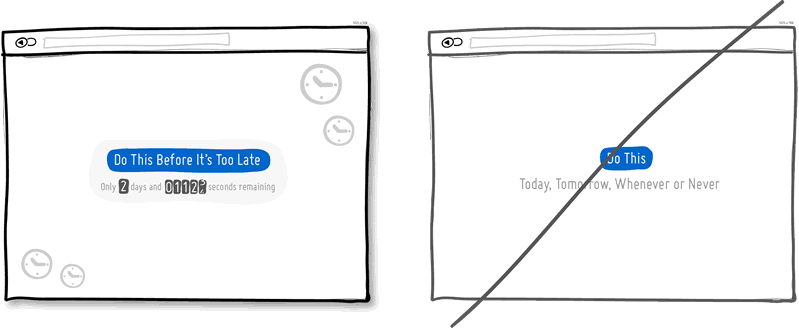
When something is scarce, we value it more. The deficit hints that before it was more, today it is less, and tomorrow it will be even less. The pricing policy of wholesalers is different from the boutique policy. Sometimes wholesalers deliberately limit the consignment of goods by quantity. When developing programs, we forget about the deficit, because bytes are easy to copy. In the design of interfaces, however, you can take advantage of the deficit and show the limitations of something. The number of tickets for the webinar, the number of customers that can be served per month, the number of products that can be produced over a certain period of time. Supply and demand. Less is more.
It is easier to recognize the existing option than to remember it yourself. Recognition is based on hints that help memory work. Remembering something from scratch is much more difficult. Perhaps that is why examinations with ready-made options are easier to pass than those where it is proposed to enter the answer yourself. Give users the opportunity to choose an item they have already encountered, instead of forcing them to remember everything.
Links, forms, and buttons are easier to click on when they are larger. According to Phyth's law, the farther and less the element is from us, the harder it is to click on it. Therefore, increase the forms, input fields, calls to action. You can also leave the element size unchanged, nevertheless increasing the area to which it responds when pressed.
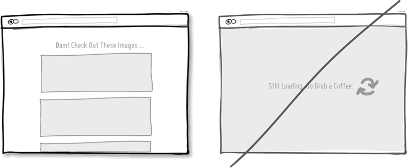
Speed matters, people don't like to wait. How quickly the page loads or how quickly it responds to user actions is very important. Every extra second attracts users and reduces conversion. You can reduce the load time technically by optimizing the code and images. And you can reduce the perceived load time psychologically. The display of the download indicator contributes to this, as well as the ability of the user to do something during the download.
When your product is used frequently, it is a good idea to remember advanced users who come back to you and spend a lot of time with it. People are looking for ways to perform repetitive tasks faster. After memorizing the hot keys, the speed of using the interface dramatically increases. For example, Gmail, Twitter and Tumblr offer the J and K keys as the “previous” and “next” navigation. There is nothing wrong with buttons, but it is always good to have an addition to them.

People have a set of cognitive features that are hard to resist. Studies claim that our decision-making mechanism is affected by the first of the numbers we have encountered. If we start with a higher price and arrive at a lower price, then it already seems not so big. Moreover, the first number does not have to be a price at all. A typical example of use in marketing is to show the recommended cost, followed by the discounted price.

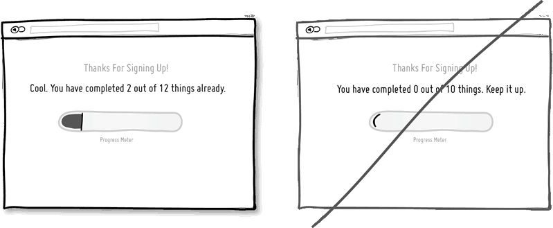
The closer we are to the finish line, the more we are motivated to complete the task. Make people feel that they have already achieved something on the way to completing the task you need, simply by visiting the site or filling out a form.
Gradual disclosure protects the user from an abundance of background information. Show information in chunks. Usually it is customary to accompany the expansion of something or suitable animation. If a large number of fields scares the user, try to show him gradually the fields that are needed right now.

First, encourage people to make small commitments, and put off big ones later. Serious commitments scare. Using commitments is a powerful persuasion strategy that works on people's desire to save their face. It is understood that it is easier for a person to perform a sequence of simple actions than one complex. A little agreement is followed by a large agreement. For example, a dating site can give people a look around and become familiar with something, instead of immediately making it necessary to register or find the love of their life or their spouse from the threshold. Regarding the price of the service, you can offer small monthly payments instead of a large annual. It is also useful to make it clear to the user that they can refuse at any time and leave, that no “contract” has yet been concluded.
A modal or dialog box is highly distracting. Sometimes it is useful to attract attention, but often with modal windows problems arise. Windows close information and block user actions. Some find it hard to get out of them. Windows distract from tasks when the user is absorbed in it and is not ready to perform other actions. Why not consider the possibility of softer and less intrusive options that, nevertheless, attract attention.
The simplicity of the interface is associated with ease of use. Too many controls violate perception. The more elements, the more problems with usability. One of the ways to achieve more with less effort is to create multi-functional controls. For example, combine a window for entering a search query with a filtering mechanism. You can also cross the display of the rating and rating. Unfortunately, when one element has several functions, it is sometimes difficult to guess about them. It may be worthwhile to reserve such an approach for regular customers who are willing to learn a little bit. Use it wisely and do not overdo it.

Icons can be ambiguous, and by adding them with inscriptions, you can eliminate ambiguity. For example, an icon with a down arrow - does it mean the ability to move something down, reduce priority, or download? Is an “x” icon a delete, undo or close? If there is not enough space at all, a good idea will show all the inscriptions to the icons when you hover over one of them (and not for each separately).
Natural language is less formal and conducive to communication. Create the feeling that the computer understands the user. There are two approaches to this. You can try to recognize fuzzy queries or user commands. You can also convey information to the user not in the form of strict forms, but in the form of live communication.

The tactic is not to conceal all the information, but to give out a small part of it to incite curiosity. Head on trial, demo version, trial version, something free, immediately available. "To see the rest, do this and that." By intriguing users and customers with probes, you can make them want to continue using your product. But do not provide all the information immediately. Try in a test mode to give them not all opportunities, but leave something for later.
Upon completion of the sale, reassure the user, give him a guarantee, promise to meet his needs, tell us about the security of the payment, confirm that the delivery is free of charge, and that they can cancel the order at any time. “Everything is good and everything will be fine. Don't worry and relax. Positive is a great tactic.
You can let people judge your product on their own, or you can do it for them. Using the irrationality of thinking, show your prices so that they look more attractive. Use the words “total,” “affordable,” “inexpensive.” The price can be divided into parts - for example, 30 kopecks per page instead of 300 rubles per book, or one hundred rubles per day instead of 3000 rubles per month. Also use the well-known trick with prices ending in "9". Show fewer numbers - 300 instead of 300.00.

Gratitude for using your service shows that you care about customers and are grateful to them. Thanks can also be used to continue the dialogue with the user. Therefore, the words “thank you” can always be turned into an offer to take another step and take advantage of another opportunity. Thank you for reading this paragraph.
The interface can make calculations and save users from such a need. Suppose, instead of showing the balance in the system, you can calculate how many days are left until the end of the subscription. Or, in the lists, the points of which need to be assessed as they are outdated, the inscription “3 minutes ago” looks better than “last updated at 15:47 on September 2nd”. Do not force the user to count.

You can force a person to do more if you confirm that he makes the choice. It is necessary to call the user to action, while indicating that this is "his choice", or "you can always refuse," etc. This works best when a similar inscription is next to a call to action.
Ever-changing rewards can attract users. When mice press the buttons of machines that give them pieces of food randomly, they do it more often than in cases of predictable and identical results. Many people love to constantly check incoming mail, because it is not known what might be inside.

It is worth directing attention to the most important actions. This can be achieved in different ways, starting with increasing the size or contrast of the element. Other options are non-standard forms, autofocus input fields, lights, floating elements and directional arrows. Of course, you do not need to make a lot of bright and screaming elements on the page, but you should emphasize the main calls to action.

Often you need to compare the changed content with the previous or several products among themselves. You can make such comparisons more understandable and readable. First, limit the number of compared items to two, preferably positioning them closer to each other. Secondly, the indication of "improved" or "freshest" things makes it easier to choose. Thirdly, clearly show what properties have changed, and which remained old. That is, what has been added (or improved), what has been removed (or deteriorated), and what remains the same.
People tend to gathering. Physical or virtual. If a person sees an unfinished set, he seeks to complete it. Often the purchase of a complete collection of something can be stimulated more strongly by promoting certain synergistic advantages (the cake is generally tastier than its ingredients). Perhaps the display of those things that have already been collected, serves as a description of the user's achievements. And, finally, the motivation to collect all the items in the collection will be stronger if it is clear that their number in the collection is limited.
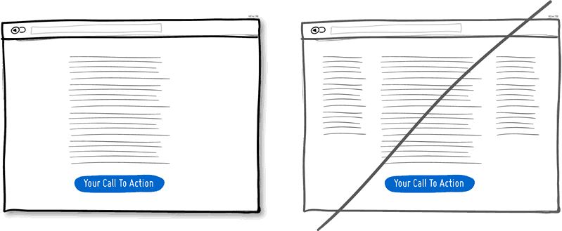
1 One column instead of several
One column more accurately reflects what you want to convey. Users go from top to bottom in a more predictable way. In a multi-column design, there is a risk of distracting the user from the main task of the page.
2 Present instead of immediately trying to sell
The gift is a friendly gesture. But besides this, it is a powerful hidden persuading factor that works because of reciprocity. Although it is obvious, but if you have reacted well to someone, your assessment will grow in his eyes.
')
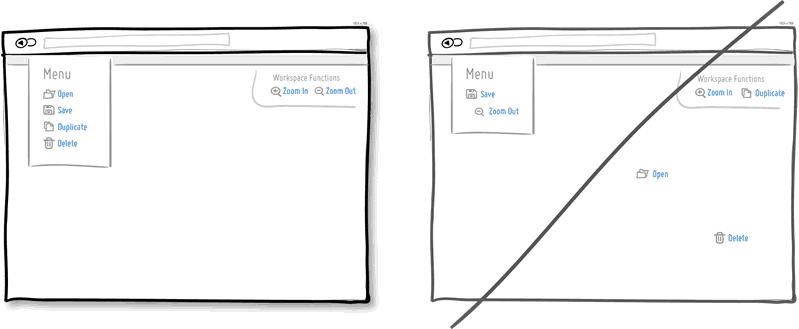
3 Combine similar functionality, not fragment UI
Over time, it is easy to create several different sections, elements and functions that perform the same thing. Keep track of duplicate functionality as it loads users. The more such duplicates, the more difficult it is for the user to use your service.
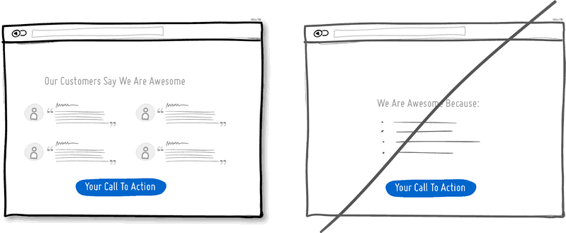
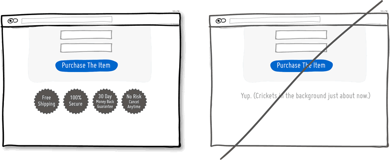
4 Provide evidence from other people, not just a story about yourself.
Another great persuasion tactic that directly affects conversion. The approval of your proposal by other people encourages action. Try to show reviews, or service usage statistics.
5 Repeat the call to main action.
Call repetition works better on long pages, or it can be repeated on different pages. You should not show a sentence ten times on one page. But now long pages are in fashion, on which it doesn’t hurt to repeat the offer both from above and below. When people reach the bottom, they stop and reflect on their next step.
6 Well distinguishable contrast styles instead of blurry.
Visual design — color, depth, contrast — can be used as hints to help people understand how your interface works: where I am and where I can go. The styles of your clickable elements, the selected elements and the text should differ from each other and be the same across the interface. In the example, I chose blue for all clickable elements, and black for all that can be highlighted or for what your location suggests.
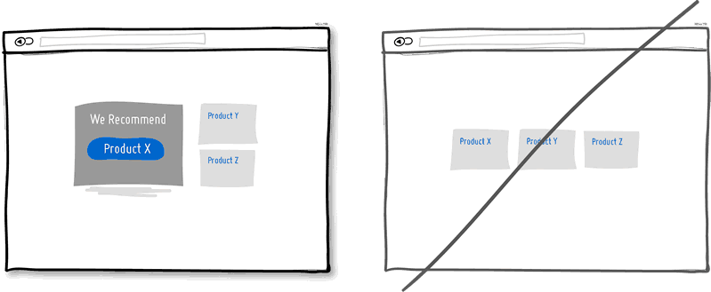
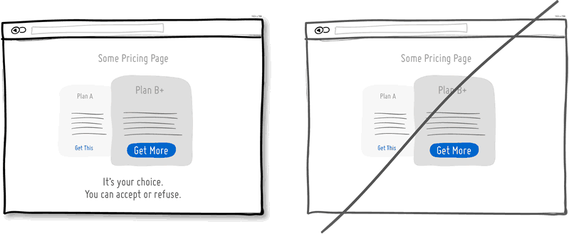
7 Recommendations instead of several equivalent options
If you provide several options to choose from, then it would be nice to emphasize one of them. The more a person has a choice, the less likely he is to make it at all. To prevent such paralysis of choice, select one of the options.
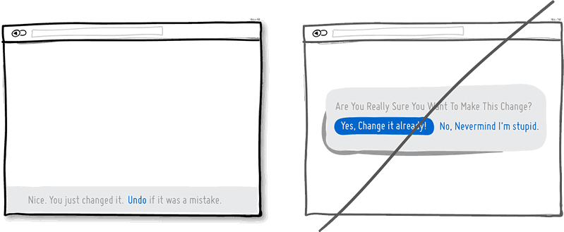
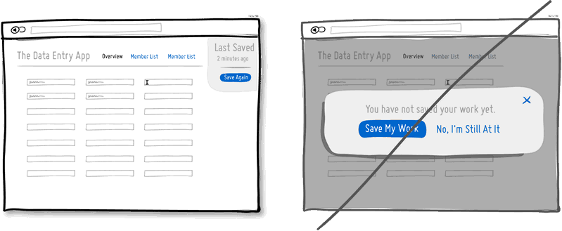
8 Undo instead of confirm
The ability to undo an action looks like a respect for the user's intelligence and allows actions to pass without hesitation. Constant confirmations look like you think the user doesn’t know what he wants. I can assume that most actions are performed by people intentionally, and only a small part of them occurs by chance. Especially unpleasant confirmations appear in repetitive actions. Users will feel that they are better at controlling the situation if they can undo their actions, and if they are not asked to confirm at every step.
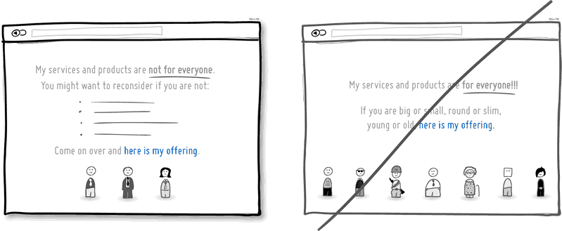
9 Select the audience of the service, and not offer it to everyone in a row
Do you count on all users, or do you know your audience exactly? By clearly explaining who can benefit from your product, you can achieve better results while hinting at the exclusivity of the service. There are risks of losing part of the audience. However, transparency inspires confidence.
10 Be decisive
You can say something in an uncertain, trembling voice, or you can say it with confidence. Finishing sentences with question marks and using the words “maybe”, “are you interested?”, “Do you want to?”, You seem indecisive. Add confidence!
11 Contrast instead of monotony
Calling for action will be more effective if your interface highlights these actions visually. Contrast is achieved by different methods. Some elements can be made lighter, others darker. It is possible to ensure that some elements appear closer than others (shadows and gradients). You can choose different colors to enhance the contrast. Everything together should clearly separate the call to action from the rest of the page.
12 Instead of a general description - specifics about the origin of your service
Disclosure of data on the origin of the service at the same time says more about it and takes communication to a more intimate level. Mention the country, state, city - it is a natural way for a person to introduce himself. If you do the same, you look more friendly. Often such a mention improves the quality of the product in the eyes of people.
13 Smaller Entries
Man by nature avoids time-consuming activities - and among them is filling in the form fields. Each new field increases the risk of a visitor rejecting your service. Not everyone prints equally fast. Printing on mobile devices is inconvenient. Think about what fields are really needed, and remove all the others. If you really need a lot of optional fields, try moving some of them to the next page. The fewer the fields, the greater the conversion.
14 Show opportunities, not hide them.
Each drop-down menu hides a set of features. If these opportunities are important for your product, it is better to bring them to the light. Leave dropouts for obvious things that do not require a trial (calendars, geographic location).
15 Display explicitly that the page material continues, instead of using false page endings.
False ending kills conversion. You should not pretend that the page is over when the section just ended. If your pages need to be scrolled, try visualizing a template that will show the rhythm and continuation of the page material. Also beware of large empty spaces surrounding the main material, which may be misinterpreted as the end of the page.
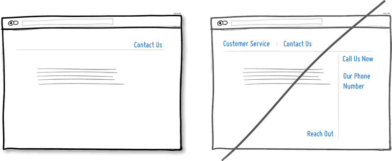
16 Hold attention and do not throw links.
It is easy to reload the page with links leading left and right, hoping to catch as many customers as possible. If you create a narrative page that gradually brings a person to the desired action - think about whether you need so many links. Each link increases the risk of leaving the client from the desired path to a particular action. Keep a balance between the pages with a general description of the service and the pages leading the customer "along the tracks" to action. Remove unnecessary links, and you increase the chances that the client will click on that button.
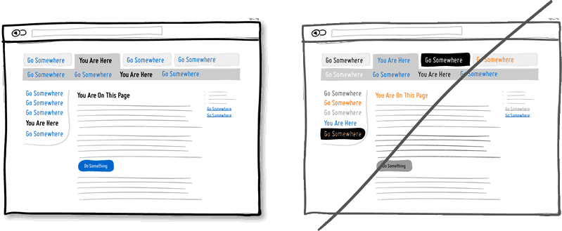
17 Display the current status of the service.
In any interface there are elements that can be in different states. Mail messages can be read or not, bills paid or not, etc. A good way of user feedback is to show the state of the elements. The states help the user figure out what to do next or not.
18 Buttons with explanations of benefits instead of the usual functional
Imagine that “Save money” is written on one button, and simply “Sign up” on the other. I put on the fact that the first clickability above. The "subscription" does not show immediate benefits. On the contrary, the subscription process requires energy and is usually associated with long forms. The idea is that gain buttons can lead to greater conversion. Alternatively, the benefit information can be placed close to the button so that it reminds the user why he should press the button. Of course, there are buttons responsible for the functionality, but they should be reserved for those parts of the site where you need to perform more repetitive actions and less conviction.
19 Direct manipulation instead of a menu without context
Sometimes it makes sense to create interface elements with which the user can work directly. For example, by showing a list of data, we can allow editing it by clicking on an item. Or click on the data line can turn it into an input field. Such capabilities reduce the number of steps that must be taken to perform the required action.
20 Immediately show the input fields, and do not hide them on a separate page
When creating landing pages, you can try to immediately display the fields for entering information, crossing the landing page with the registration form. There are several advantages to this. First, we remove the extra steps and the registration takes less time. Secondly, by showing the number of fields, we immediately tell the user how long the registration will take. Of course, this will be an advantage if our form contains few fields.
21 Smooth animation instead of sudden jumps.
Often, interface elements appear, disappear, move, in response to user actions. It is often easier to understand what happened when these events do not occur instantaneously, when they are stretched over time. Of course, one has to take into account that often repeated very slow actions can, on the contrary, lead to irritation. If something needs to be done quickly, artificial delays will only interfere with perception.
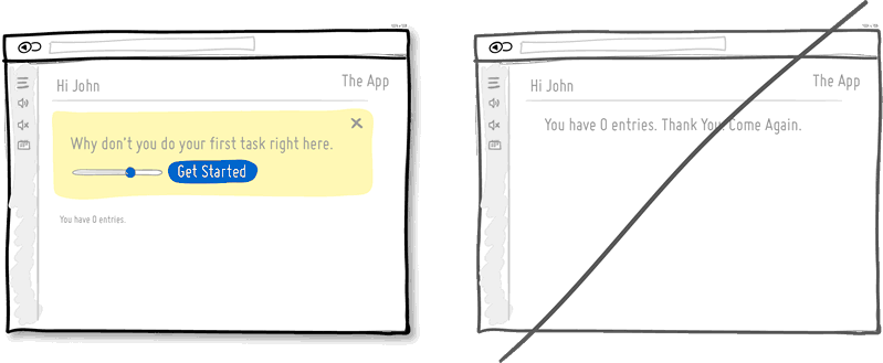
22 Gradual user involvement
Instead of immediately requiring registration, why not suggest the user to perform a task through which the advantage of your service will be visible. The product can be shown on the face and slightly personalized. When the user felt the benefits of the product and tried it on himself, he would be more inclined to consume. This is a way to postpone registration, while allowing the user to try your product.
23 Less Frames and Borders
Frames attract extra attention. Attention is a valuable resource because it is limited. Of course, the framework clearly delineates and delimits the elements, but they also waste our cognitive energy. To determine the relationship of different elements of the interface and not to overstate too much attention, elements can be grouped together, aligned, giving them a well-defined background or a similar typographic style. Sometimes the line-another helps to determine the overall appearance of the interface, but try to consider other visualization methods.
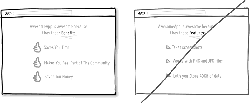
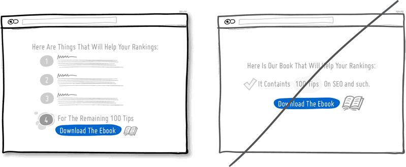
24 Sell benefits, not functionality.
The basis of marketing is that people do not need the product’s capabilities, but the benefits it brings to them. Chris Gilbo in the book “One Hundred Dollar Startup” writes that people want to have more love, recognition and free time, and less stress, conflict, quarrels and uncertainty. Showing functionality, explain and benefit from it.
25 Develop a design for the case when there is no data, and not only for those cases where there is a lot of data
There are 10,000 items in lists, and sometimes even 10, 1, and even 0. Usually, data is accumulated, and data sets run from zero to a few points and beyond. Often the designer forgets about those cases when the data is not yet and there is nothing to show. In this case, there is a risk of alienating the user. When he looks at your application and sees just an empty space without any prompts, you lose your chance. The zero amount of data is a great chance to start training the user, showing him what to do next. A good interface is a scalable interface.
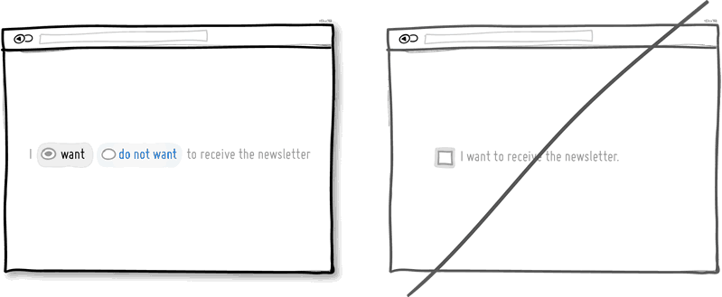
26 Default Verification
Let users be able to participate in anything by default, without having to perform any actions. Often, the user is asked to do something before taking part in or receiving something. The first option is better for several reasons. Firstly, it reduces the resistance to movement, because the user does not need to do anything. Secondly, it provides a recommendation implying belonging to something that is normal and normal. "Everyone else does this, so why shouldn't I do the same." Of course, bad marketers often abuse this technique. For example, by reducing the readability of the text confirming the action or by confusing it specifically, they slip something to the user who is not well aware of what he is subscribing to. Therefore, this approach requires crystal clarity.
27 Serial interface that does not require continuous learning
Permanent interface means that the user does not need to constantly learn how to use it and spend energy on it. By clicking on the buttons and moving the sliders, we learn how to look and work. Constancy helps facilitate work, and as soon as we lose constancy, we are forced to learn again. Consistency can be achieved through colors, directions, behavior, location, size, shape, labels and language. Unusual elements are important when we need something to highlight or attract attention.
28 Smart controls instead of extra work
Smart or pre-filled form fields, which are based on known data, reduce the amount of work the user needs to do. This is a common technique of helping the user to advance in forms. Worse does not happen when the user is asked the same data time after time. Instead of empty fields that need to be filled out again, it’s better to have fields that are just filled out and you just need to check. The less work the better.
29 Standards and conventions instead of the invention of the bicycle
The agreement is the elder brother of permanence. If the interface elements are the same, the user should be less tense. If in different interfaces similar elements are also the same, then it is even more convenient. With the help of well-established agreements, we remembered that the button for closing the window is in the upper right, and we know how the settings icon usually looks. Of course, agreements do not always make sense, sometimes they become obsolete. If you are moving away from agreements - make sure that you have carefully thought out everything.
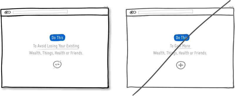
30 Offer to avoid losses instead of advertising acquisitions.
We love to win, but we hate to lose. According to the laws of the psychology of persuasion, people would rather choose not to suffer a loss than to gain an advantage. This fact applies to the offers of products and services. It is more profitable to advertise the product, as protecting the well-being and status of the user, than as giving any advantage or benefit that they do not yet have. Do insurance companies sell insurance claims, or protect what we already have?
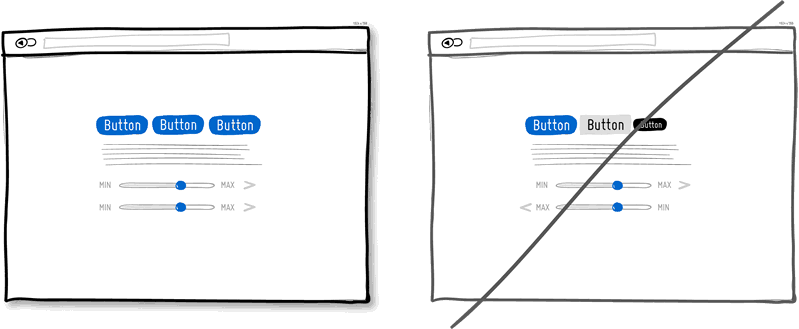
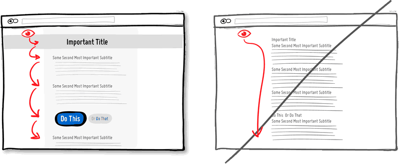
31 Visual hierarchy instead of monotony
In a good hierarchy, important elements are separated from less important ones. The hierarchy is built through alignment, closeness, color, padding, font size, element size, etc. Correctly positioned elements direct the user's attention, delaying it where necessary, and generally increase readability. Hierarchy creates friction that prevents us from slipping from top to bottom of the page. Because of this, we will spend a little more time on the page, but as a result we will learn more about the product. It's like a trip - if you drive along the highway, you will arrive faster, but if you choose a more beautiful road, you will see more interesting things along the way. Give an eye on something to rest.
32 Group items by meaning.
Grouping related things is the main way to increase usability. Knife and fork, open and save - these things usually blow together. Connected things just have to be close by in order to give consistency to the interface and reduce cognitive friction. Losing time in search of items is not our method.
33 On-site input validation
When filling out forms, it is better to immediately identify errors than to show them later. Showing the error immediately when it occurs (say, to the right of the input field), you give the opportunity to immediately correct it. When it becomes clear later, for example, after submitting a form, people have to do additional work and remember what they have already done.
34 Forgiving Input Fields
When the computer forgives more errors to the user, it becomes more humane. Forgiving input fields allow for possible errors and variations, thus making the interface more friendly. A good example is a phone number. How many options for its input exist - brackets, extensions, hyphens, codes, etc. Let your code work more, and the user less.
35 Customize user
Demonstration of urgency is a tactic of persuasion that forces people to act earlier rather than later (or never at all). Often, it implies some kind of shortage - when something available today is not available tomorrow. In addition, it works to eliminate losses - we do not like to lose opportunities. It can be argued that such a tactic is persevering and not very permissible - but you can still use it if you do it honestly. Do not create a false sense of haste - if you get caught up, it will lead to opposite results.
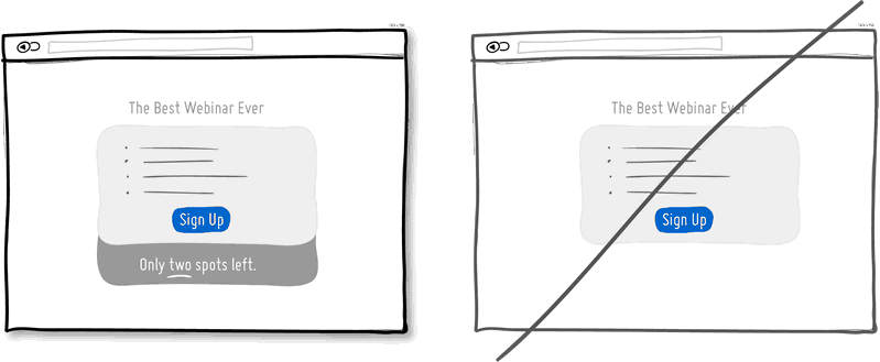
36 Deficit instead of abundance
When something is scarce, we value it more. The deficit hints that before it was more, today it is less, and tomorrow it will be even less. The pricing policy of wholesalers is different from the boutique policy. Sometimes wholesalers deliberately limit the consignment of goods by quantity. When developing programs, we forget about the deficit, because bytes are easy to copy. In the design of interfaces, however, you can take advantage of the deficit and show the limitations of something. The number of tickets for the webinar, the number of customers that can be served per month, the number of products that can be produced over a certain period of time. Supply and demand. Less is more.
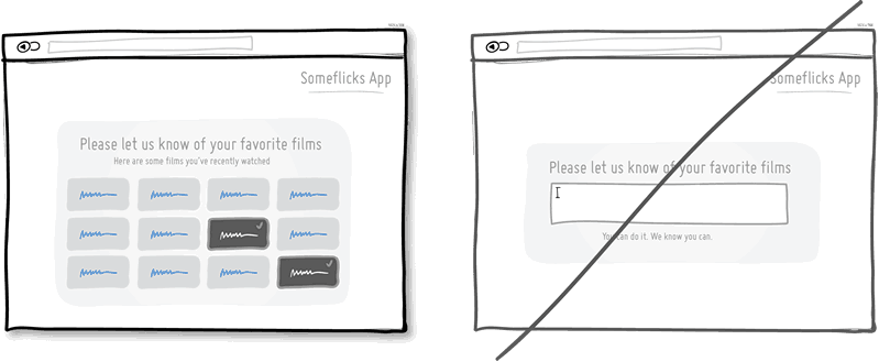
37 Recognition instead of remembering
It is easier to recognize the existing option than to remember it yourself. Recognition is based on hints that help memory work. Remembering something from scratch is much more difficult. Perhaps that is why examinations with ready-made options are easier to pass than those where it is proposed to enter the answer yourself. Give users the opportunity to choose an item they have already encountered, instead of forcing them to remember everything.
38 Larger Items
Links, forms, and buttons are easier to click on when they are larger. According to Phyth's law, the farther and less the element is from us, the harder it is to click on it. Therefore, increase the forms, input fields, calls to action. You can also leave the element size unchanged, nevertheless increasing the area to which it responds when pressed.
39 Reduce load time
Speed matters, people don't like to wait. How quickly the page loads or how quickly it responds to user actions is very important. Every extra second attracts users and reduces conversion. You can reduce the load time technically by optimizing the code and images. And you can reduce the perceived load time psychologically. The display of the download indicator contributes to this, as well as the ability of the user to do something during the download.
40 Hot Keys, Not Just Buttons
When your product is used frequently, it is a good idea to remember advanced users who come back to you and spend a lot of time with it. People are looking for ways to perform repetitive tasks faster. After memorizing the hot keys, the speed of using the interface dramatically increases. For example, Gmail, Twitter and Tumblr offer the J and K keys as the “previous” and “next” navigation. There is nothing wrong with buttons, but it is always good to have an addition to them.
41 Go from large numbers to smaller numbers.
People have a set of cognitive features that are hard to resist. Studies claim that our decision-making mechanism is affected by the first of the numbers we have encountered. If we start with a higher price and arrive at a lower price, then it already seems not so big. Moreover, the first number does not have to be a price at all. A typical example of use in marketing is to show the recommended cost, followed by the discounted price.
42 Advance progress instead of a clean slate
The closer we are to the finish line, the more we are motivated to complete the task. Make people feel that they have already achieved something on the way to completing the task you need, simply by visiting the site or filling out a form.
43 Gradual Disclosure
Gradual disclosure protects the user from an abundance of background information. Show information in chunks. Usually it is customary to accompany the expansion of something or suitable animation. If a large number of fields scares the user, try to show him gradually the fields that are needed right now.
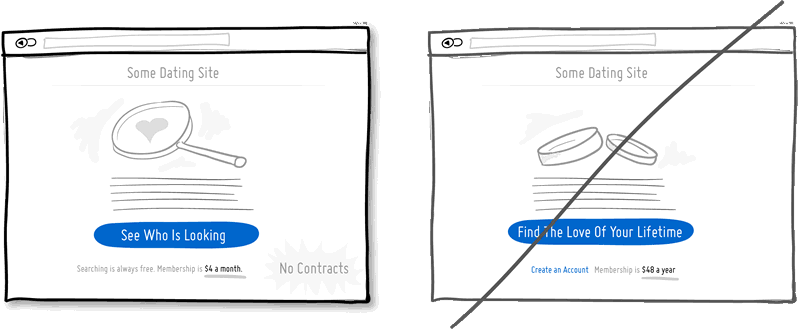
44 Small obligations
First, encourage people to make small commitments, and put off big ones later. Serious commitments scare. Using commitments is a powerful persuasion strategy that works on people's desire to save their face. It is understood that it is easier for a person to perform a sequence of simple actions than one complex. A little agreement is followed by a large agreement. For example, a dating site can give people a look around and become familiar with something, instead of immediately making it necessary to register or find the love of their life or their spouse from the threshold. Regarding the price of the service, you can offer small monthly payments instead of a large annual. It is also useful to make it clear to the user that they can refuse at any time and leave, that no “contract” has yet been concluded.
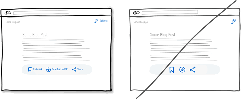
45 Unobtrusive requests instead of modal windows
A modal or dialog box is highly distracting. Sometimes it is useful to attract attention, but often with modal windows problems arise. Windows close information and block user actions. Some find it hard to get out of them. Windows distract from tasks when the user is absorbed in it and is not ready to perform other actions. Why not consider the possibility of softer and less intrusive options that, nevertheless, attract attention.
46 Multifunctional controls instead of several separate elements.
The simplicity of the interface is associated with ease of use. Too many controls violate perception. The more elements, the more problems with usability. One of the ways to achieve more with less effort is to create multi-functional controls. For example, combine a window for entering a search query with a filtering mechanism. You can also cross the display of the rating and rating. Unfortunately, when one element has several functions, it is sometimes difficult to guess about them. It may be worthwhile to reserve such an approach for regular customers who are willing to learn a little bit. Use it wisely and do not overdo it.
47 Icon Captions
Icons can be ambiguous, and by adding them with inscriptions, you can eliminate ambiguity. For example, an icon with a down arrow - does it mean the ability to move something down, reduce priority, or download? Is an “x” icon a delete, undo or close? If there is not enough space at all, a good idea will show all the inscriptions to the icons when you hover over one of them (and not for each separately).
48 Natural language instead of dry text.
Natural language is less formal and conducive to communication. Create the feeling that the computer understands the user. There are two approaches to this. You can try to recognize fuzzy queries or user commands. You can also convey information to the user not in the form of strict forms, but in the form of live communication.
49 Play on curiosity.
The tactic is not to conceal all the information, but to give out a small part of it to incite curiosity. Head on trial, demo version, trial version, something free, immediately available. "To see the rest, do this and that." By intriguing users and customers with probes, you can make them want to continue using your product. But do not provide all the information immediately. Try in a test mode to give them not all opportunities, but leave something for later.
50 Assure users
Upon completion of the sale, reassure the user, give him a guarantee, promise to meet his needs, tell us about the security of the payment, confirm that the delivery is free of charge, and that they can cancel the order at any time. “Everything is good and everything will be fine. Don't worry and relax. Positive is a great tactic.
51 Price Illusions Instead of Regular Prices
You can let people judge your product on their own, or you can do it for them. Using the irrationality of thinking, show your prices so that they look more attractive. Use the words “total,” “affordable,” “inexpensive.” The price can be divided into parts - for example, 30 kopecks per page instead of 300 rubles per book, or one hundred rubles per day instead of 3000 rubles per month. Also use the well-known trick with prices ending in "9". Show fewer numbers - 300 instead of 300.00.
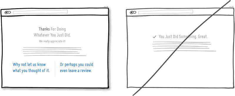
52 Give thanks instead of a simple statement of the end of the transaction.
Gratitude for using your service shows that you care about customers and are grateful to them. Thanks can also be used to continue the dialogue with the user. Therefore, the words “thank you” can always be turned into an offer to take another step and take advantage of another opportunity. Thank you for reading this paragraph.
53 Read it all yourself, do not force the user to do it.
The interface can make calculations and save users from such a need. Suppose, instead of showing the balance in the system, you can calculate how many days are left until the end of the subscription. Or, in the lists, the points of which need to be assessed as they are outdated, the inscription “3 minutes ago” looks better than “last updated at 15:47 on September 2nd”. Do not force the user to count.
54 Confirm the freedom of choice of the user.
You can force a person to do more if you confirm that he makes the choice. It is necessary to call the user to action, while indicating that this is "his choice", or "you can always refuse," etc. This works best when a similar inscription is next to a call to action.
55 Changing rewards
Ever-changing rewards can attract users. When mice press the buttons of machines that give them pieces of food randomly, they do it more often than in cases of predictable and identical results. Many people love to constantly check incoming mail, because it is not known what might be inside.
56 Manage user attention
It is worth directing attention to the most important actions. This can be achieved in different ways, starting with increasing the size or contrast of the element. Other options are non-standard forms, autofocus input fields, lights, floating elements and directional arrows. Of course, you do not need to make a lot of bright and screaming elements on the page, but you should emphasize the main calls to action.
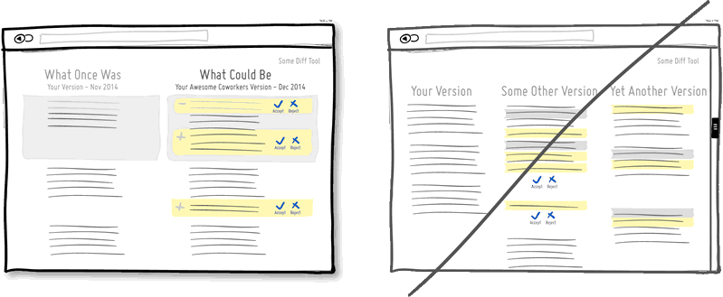
57 Friendly and clear comparisons
Often you need to compare the changed content with the previous or several products among themselves. You can make such comparisons more understandable and readable. First, limit the number of compared items to two, preferably positioning them closer to each other. Secondly, the indication of "improved" or "freshest" things makes it easier to choose. Thirdly, clearly show what properties have changed, and which remained old. That is, what has been added (or improved), what has been removed (or deteriorated), and what remains the same.
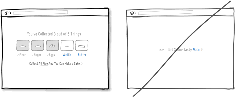
58 Sets of items instead of individual
People tend to gathering. Physical or virtual. If a person sees an unfinished set, he seeks to complete it. Often the purchase of a complete collection of something can be stimulated more strongly by promoting certain synergistic advantages (the cake is generally tastier than its ingredients). Perhaps the display of those things that have already been collected, serves as a description of the user's achievements. And, finally, the motivation to collect all the items in the collection will be stronger if it is clear that their number in the collection is limited.
Source: https://habr.com/ru/post/247367/
All Articles