"Pixel gallop - part one" - basic concepts, stages of maturation, applied exercises
“Gallop pixel”, part I - basic concepts, the stages of maturation, applied exercises ( link )
Gallop Pixel, Part II - Perspective, color, anatomy and applied exercises ( link )
“Gallop Pixel”, part III - Animation ( link )
“Gallop pixel”, part IV - Animation of light and shadow ( link )
"Gallop pixel", part V - Animation of characters. Walking ( link )
Everybody knows how mainstream spurs the appearance of publications related to what is popular “this week”. For the past six months, I have often stumbled upon articles on “acquaintance with pixel art.” They began, as a rule, with listing the possibilities of a certain software. However, after deducting the question of choosing a program and a cursory listing of known facts, they didn’t bring the reader closer to understanding how to create pixel art. It is this annoying omission that I would like to address on the very first pages of 2015.
')
In this publication, we do not consider the program, but we dig something more. The pixels themselves. From the beginnings, starting with the four-color CGA-era, until the Renaissance. In the publication we do not consider games, we don’t sing the praises of the artists of the past (except perhaps a little), doing exactly the process of creating the simplest pixel art. This material will be interesting to novice artists and interested. The article contains almost no theory, tedious conclusions and presents a side view of the world of pixel art from some self-taught person who chose to open each of the Americas on their own, without looking at the official, generally accepted and documented Columbians. The article is equipped with a plentiful amount of explanatory illustrations, examples, and tips.
The material is divided into several publications in view of the amount of text and images. Each article has its own degree of complexity, however, all of them are illustrative and can be used as a guide to action.

Chapter I - Graphic Theory
The title implies that there will be pictures. Blank text is often dry, salty and sore throat. Yes, and if you remember, where does learning begin? Is not it from the alphabet? The alphabets are provided with pictures-images that help identify the already known word oral, with a letter, and then with the word itself written. It would be nice if those who write about “how to learn to draw well”, or “I will teach you pixel art” remember this. Without turning the article into a gallery of pictures with a brief scribble or a description of the amazing functions of various software packages. All this does not fit well with the word "X is good" being a private phenomenon that does not affect the essence of the issue. Learning to do something well in five minutes is impossible. Learning to do something well after looking at someone else's work is difficult. Learning to do something well without practice is impossible. It means that practical examples and explanations are needed why something is done this way and not otherwise.
I do not deny the need for a theory. I do not deny the need for images. But not separately from each other. Everything should be here, as in a good ticket - “all inclusive”. The whole range of services. The theory is not turning into tediousness. Illustrations of someone else's work. Illustrations created by the author of the article. Recommendations. Tips.
What is the point of writing a publication, providing it with a catchy title “how to learn to do something well” without at least offering a pinch of your own evidence that this copyright material will really teach something that can turn out well? Therefore, we will provide our brief theoretical introduction with a decent amount of moisture, designed to quench the thirst of knowledge not burdened with the desire to learn.
During my work in different gaming offices, I derived my own definition of pixel art. The time of the birth of this phenomenon is directly related to the technical limitations of that era. I would say the result of one of the stages of graphics evolution in games. The resolution of games before the appearance of the SVGA mode was 320x200 pixels. The second limitation was the number of colors used. Thus, small objects on panoramic scenes often occupied two, three or four pixels and their palette was extremely poor. Only the skill of the artists and the richness of the player’s imagination at that time allowed the illusion that the pixel flickering on the screen (or their group) was something more. A bunch of pixels, or even one pixel, could be a human, an animal, a building, and even a whole planet. Thus, it can be said that due to several pixels on the screen, a whole and clear image of the player was created. That is, at the expense of small a lot was transferred. And this, without exaggeration, is almost poetry.
Years have passed. Decades. Progress leaped forward. The resolutions of the monitors, the textures and the size of the games have long since left the solar system, where the first pixel crawled out of the waters of non-existence and grew its legs. The industry, like a high-speed express train filled with frantic fanatics, continues to rush forward in a frantic race for photo-realism. We can say that it would be interesting to find out - what will all these people do when they reach it? But no. Not interested. Because, most likely, they will finally have to learn how to make games. Again. As it was done before. Entertaining people is not a picture, but the essence. True, it is unlikely. Unless, of course, look back at the history of mankind, and not to dream. Let us return, however, to the definition of pixel art.
Pixel art is a type of art where the artist creates a form or an image that the observer understands due to a small number of points (pixels). We can say that pixel art is one of the representatives of minimalism, where little things can be heard by the little ones.
Those who call the phrase “art form” as “a sickle brought over the most important”, I recommend replacing it with “image creation technique”. The meaning of this will not change much, but it will allow to avoid the start of another holy war on what is art and what is not.
I conduct my personal calendar from the manuscripts of the Reverend Couples of Truperian. Although, of course, the term video game has a much older origin. The first video games are dated 1961. Despite the significant time interval, the ideology of pixel art over the past half century has not changed much. These are all the same dots, the same colors, the frames of the monitors around which have been parted. What does not prevent people with an enviable persistence to follow the precepts of the creators of the past, when the screens were small, and the pixels on them were large.
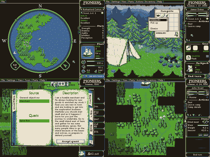
Original image : link
Pioneers . Developer EigenLenk . This indie game is made in four (4) colors. All. I would call it a small hymn to minimalism and skill in dealing with a small number of flowers. I have not seen anything like this in modern industry (for example, all the necessary links to the websites of the authors of projects and web resources will be given at the end of the publication)
Pixel artists of our time still follow the canons of minimalism and create images based on a limited number of points. The ability to use palettes with a small number of colors can be considered a sign of the artist's high skill. For example, from four (4) to sixteen (16). That is, to work in a limited color range. However, the creators of paintings, whose color arsenal has been increased to 256 or more colors, which do not limit themselves in terms of the resolution of the final work, are also valued in the same way. Artist known online under the pseudonym Fool. His pixel paintings fascinate detail and refinement.

Original image : link
Posted by: Fool. If the above project Pioneers is an ode to minimalism, then the artist Fool can be called a pixel-art jeweler, and his images are richly inlaid with rare podgorny stones and ornaments, which the modern world has long forgotten.
We are in our journey we will think the canons of antiquity. Namely - limited palette and low resolution. Our path will pass through the CGA, EGA and VGA eras, excluding Dark Times, which began for pixel art after the arrival of the SVGA tyrant. It was with the advent of high resolutions that pixel art began to lose ground, retreating under the onslaught of avant-garde "monitor resolution" and "work resolution of the game." The fact that pixel art was preserved half a century later as a phenomenon and as an art form almost unchanged means that these points on the screen were not just points, but were and remain something big.
Note: Already much later, another historical murder occurred, which changed the course of the gaming industry, when the biblical story repeated and Threemer killed Doumer. However, this is a topic for a separate, serious, and no less passionate publication.
Chapter II - In Search of the Lost Ark
Pixel art is not much different from any visual art. And this means that the concepts of light, shadow and form are relevant for him. And if we talk about what was first, then it will be Form. In a world where there were already pixels, but there were almost no colors, the shape of the object was of paramount importance. And we, being today by chance the furious adherents of Pixelism, will remember it once and for all. The shape of the object, its silhouette in pixel art are of great importance. Just like the silhouette was of great importance to the artists of the past. And speaking of the past, I do not mean the artists of the gaming industry. We are talking about artists whose images are dated eight, ten or even twenty thousand years before our era.
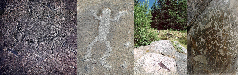
The photograph shows the White Sea and Onega petroglyphs. Most of the silhouette character. I traveled to the Onega petroglyphs as a child, when I was still dreaming of becoming an archaeologist. Perhaps this would be a better outcome for me than to combine my life with the development of games. Any mystery is capable of absorbing a person, but absorption is pleasant, and there is another nuance. Ancient human activity does not disappear and it is fundamental. What can not be said about the transience of today's day. Yesterday, loaf, today iphone, tomorrow some more ...
Not surprisingly, the first artists from the PC world repeated the reception of their elder brothers. The number of colors required to show some imagination, given their scarcity. And the key to all sorts of discoveries, as we well know, lies in history. Bow, crossbow, siege weapons did not appear immediately, being phenomena of an evolutionary order. And more than once the stone thrown by the opponent hit the future Newtons in the forehead from the world of weapons, until a sling appeared allowing the return of some of the arguments back. The story is always the same. First comes the simple, then the complicated.
So that this postulate is not unfounded, we will create with you our first pixel art. I prefer, however, to call our experiments only pixel images, since the presence of pixels on an abstract scene still does not make them art. In our case, the canvas will be the canonical resolution of 320x200. So that you can see the results without resorting to glasses, the images will be magnified multiple times. Let the present gods of the nameless world become the ball, sword and small kudu, which, being joined together, will never be a pyramid and never be mentioned in the history of the universe by the abbreviation MMM.
To get comfortable draw our trinity. And the ball will be the first petroglyph that we put on the stones of the nascent stronghold.

Fortunately, this area is not just another one of my many silly jokes. If I walked today with stops of stupidity, I would draw a single pixel on the screen, and then I would lay claim to Malevich’s laurels.
If you are ready to close this publication, putting the author on a stake, I can say with full seriousness that the ball, even using the four colors characteristic of the CGA era, can be drawn not in the only way. Please verify this.
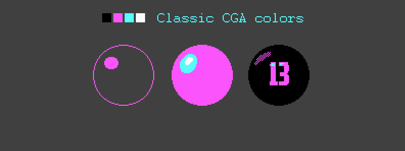
I apologize for the “pluck-the-eye-palette” of these images. In the publication, I decided to use the original CGA palette, and not modified as it was done in the Pioneers mentioned at the very beginning.
As you can see, the balls are made not only in the silhouette solution, but also in the form of lines, using gradient color rendering, when the gradient grid compensates for the lack of colors to create halftones. In the world of pixel art, the last mentioned halftoning method can be called a special case of hatching.
That is, pixel art uses the same principles as subjects of the visual arts. There is a stroke (a spot, or a pixel), there is a stroke (a discrete difference between two colors due to the alternating grid of pixels of different colors).
For the sake of additional practice, we sketch a couple of logos of fictional brands. Contrary to the well-known stereotype, the size is not important and resolution is also not important. The main thing is the form and idea embedded in the image. In order to complicate the task, we will add an additional condition. Let each logo begin with the Latin letter “S” and let it speak for itself.

Note: I plan to use two of the three logos presented here in my game project, so the copyright is not set up for advertising, as one might think. In the civilized world, if my memory serves me, this is enough to secure authorship over the image. Well, about the uncivilized world, we will not talk with you. In addition, I already looked out the window today.
With the naked eye, you can see that the shape of the object, its silhouette in such compositions is paramount. They have no clear light and no pronounced shadows, rare elements emphasizing the shape are rather the exception, confirming this position. The form is recognizable. The text is provided with an additional image allowing to interpret and identify the logo. In pixel art, I would recommend repelling it from the form, and after that supply the successful version with light, colors and details. That is, for starters, you should learn to give birth to some interesting image, and after everything else.
Fifty grams of lyrics on logos. Managing supervisors - categorically not recommended. Because you drank it already hundreds of times from your subordinates and only translated the product.
Unfortunately, the reality of the sample of any year, decade or century is always the same. There are creators, people doing business, and a stratum of drone-like people on top (often exceeding the number of creative people tens and hundreds of times) whose whole work consists in discussing other people's works. This is the way the world works, that something created by someone passes through the intestines of the corporate-digestive tract, in order to be changed, or not to be, but necessarily within a few days. When people have long reached their level of incompetence, they will discuss conceptual dissonance in relation to the pixels forming the tail of the cochlea, or will vote by the entire composition of the governing bodies to decide whether to add tail length, subtract, or vice versa - to leave.
A monstrous layer of meaningless, but incredibly necessary cells in the body of almost any office. I know perfectly well that they feel well, looking at their own reflections in the mirrors, and that the feeling of their own importance or significance is not alien to them. But the practical exhaust in the form of a useful result from this plankton is rather poor. Nevertheless, these people usually respond to such statements, admiring their own wits, “it only seems to you”.
What. It probably seems. Probably I don’t understand the benefits of such people. True, every time this happens, I remember the notorious “Expert” movie. I prefer the British version, rather than the Russian (mate and replay, do not mean the correct transfer of the overall color). And the actors of this short film, in my opinion, play much stronger, correctly conveying the emotions and halftones of this beautiful story by Alexei Berezin.
- Andersen, I understand, you are a narrow specialist and do not see the big picture
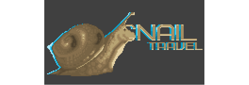
I do not really understand the value of moving a group of two or three pixels to the right or left. Thank God I don’t see the big picture. But then I know perfectly well that the snail depicted on the logo in combination with the words “journey” looks at least amusing. Mothers with wheelchairs passing under a road poster will show it to their babies (because it's cute), drunk teenagers will surely put a smile on a snail or a mustache with a marker (because they are teenagers), and no less drunk “Seeds” in kitchens for the next philosophical the passages, interspersed with pats on the shoulders, will note that “it would be more fun to make the logo of a taxi or a post office of the Russian Federation a snail” (because they are not freeloaders, but partners). With the general absurdity of the image, the snail will be noticed and remembered by the most diverse strata of society, therefore, it will spread around the district slowly but surely.
There is another category of people who should be sent to Magadan. Those who every time after viewing your work asks “what did you want to say with this image? What did you think when you drew it? What prompted you to do so and not otherwise? ". The first three questions are harmless. But after them you will be asked the question “why is there black here?”, “Why is there blue here?”, “Why are these colors exactly and not others?”
Their “fun” is that no matter what nonsense you put it, they will be satisfied with the explanation. But they need it. Without your text description, they cannot perceive your work. If all of a sudden, you are bent on the absurdity of what is happening, mumble that “the tail of a medium size is not too pretentious, but not small, which can personify the average representative of society, and that this will allow us to avoid any misunderstandings. And here a group of pixels in a certain sense balances the overall curiosity of the composition, which gives room ... ”, in a word you will carry utter nonsense, writing the worst fable you have written - they will be satisfied.
For those who are not a narrow specialist and can see the whole picture as a whole, these fables are a necessary tool. If you need them and fit the case. The folder will become thicker. On one sheet. And if the fable is printed on one sheet, and the image of the snail is on the other, and the tail is close-up on the third, then they can be shifted solidly. It helps to depict the thought process or the study of the subject during the meeting. Folder of papers, which is spread out of the bag emphasizes efficiency.
Extensive experience in working with different customers led me to the conclusion that a detailed text description is not an extra element. This adds weight, even if there is none. Unfortunately, business is often replete with absurdities and absurdities. The truth is - in a mad tent to remain normal, you can only pretend to be a clown.
Do you think there will be no clever man who would not ask if it is nine millimeter cartridges? Not because it matters to him, but because in any case he will have something to say to you. The sleeve is not the same. The bullet is not the same. The size is not the same. The scale is not the same. There will be great theorists who will tell you that the real dimensions of an object are the key to the correct perception of the logo on a psychological level! Say no? It can not be? Around is full of such people. And these are not only executives, executives and CEOs. , , . . , .
, «», , , . , . , . , .

A monstrous layer of meaningless, but incredibly necessary cells in the body of almost any office. I know perfectly well that they feel well, looking at their own reflections in the mirrors, and that the feeling of their own importance or significance is not alien to them. But the practical exhaust in the form of a useful result from this plankton is rather poor. Nevertheless, these people usually respond to such statements, admiring their own wits, “it only seems to you”.
What. It probably seems. Probably I don’t understand the benefits of such people. True, every time this happens, I remember the notorious “Expert” movie. I prefer the British version, rather than the Russian (mate and replay, do not mean the correct transfer of the overall color). And the actors of this short film, in my opinion, play much stronger, correctly conveying the emotions and halftones of this beautiful story by Alexei Berezin.
- Andersen, I understand, you are a narrow specialist and do not see the big picture
I do not really understand the value of moving a group of two or three pixels to the right or left. Thank God I don’t see the big picture. But then I know perfectly well that the snail depicted on the logo in combination with the words “journey” looks at least amusing. Mothers with wheelchairs passing under a road poster will show it to their babies (because it's cute), drunk teenagers will surely put a smile on a snail or a mustache with a marker (because they are teenagers), and no less drunk “Seeds” in kitchens for the next philosophical the passages, interspersed with pats on the shoulders, will note that “it would be more fun to make the logo of a taxi or a post office of the Russian Federation a snail” (because they are not freeloaders, but partners). With the general absurdity of the image, the snail will be noticed and remembered by the most diverse strata of society, therefore, it will spread around the district slowly but surely.
There is another category of people who should be sent to Magadan. Those who every time after viewing your work asks “what did you want to say with this image? What did you think when you drew it? What prompted you to do so and not otherwise? ". The first three questions are harmless. But after them you will be asked the question “why is there black here?”, “Why is there blue here?”, “Why are these colors exactly and not others?”
Their “fun” is that no matter what nonsense you put it, they will be satisfied with the explanation. But they need it. Without your text description, they cannot perceive your work. If all of a sudden, you are bent on the absurdity of what is happening, mumble that “the tail of a medium size is not too pretentious, but not small, which can personify the average representative of society, and that this will allow us to avoid any misunderstandings. And here a group of pixels in a certain sense balances the overall curiosity of the composition, which gives room ... ”, in a word you will carry utter nonsense, writing the worst fable you have written - they will be satisfied.
For those who are not a narrow specialist and can see the whole picture as a whole, these fables are a necessary tool. If you need them and fit the case. The folder will become thicker. On one sheet. And if the fable is printed on one sheet, and the image of the snail is on the other, and the tail is close-up on the third, then they can be shifted solidly. It helps to depict the thought process or the study of the subject during the meeting. Folder of papers, which is spread out of the bag emphasizes efficiency.
Extensive experience in working with different customers led me to the conclusion that a detailed text description is not an extra element. This adds weight, even if there is none. Unfortunately, business is often replete with absurdities and absurdities. The truth is - in a mad tent to remain normal, you can only pretend to be a clown.
Do you think there will be no clever man who would not ask if it is nine millimeter cartridges? Not because it matters to him, but because in any case he will have something to say to you. The sleeve is not the same. The bullet is not the same. The size is not the same. The scale is not the same. There will be great theorists who will tell you that the real dimensions of an object are the key to the correct perception of the logo on a psychological level! Say no? It can not be? Around is full of such people. And these are not only executives, executives and CEOs. , , . . , .
, «», , , . , . , . , .
Recall the second whale of our world. About the sword. The murder tools are no less than the paintings of great artists. Many of the blades of the past, created by craftsmen by hand, are nothing more than real works of art. We are not pulling on the masters yet, but we can flush at least one blade with pixels.
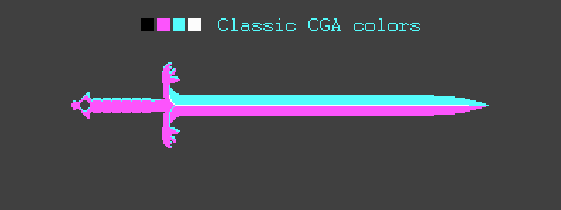
In our case, the sword is the perfect option for a well-planned hack. Simple shape, mostly linear, with the exception of the handle. This is probably why novices begin their journey into the world of pixel art with weapons. It would be a bit more difficult if we wanted to use exotic weapons. But we did not want to, because it is possible and overworked from habit. In this simple example, you can clearly remember - the first thing we do is form. Then light and shadow (or the play of light on different faces), then the details.
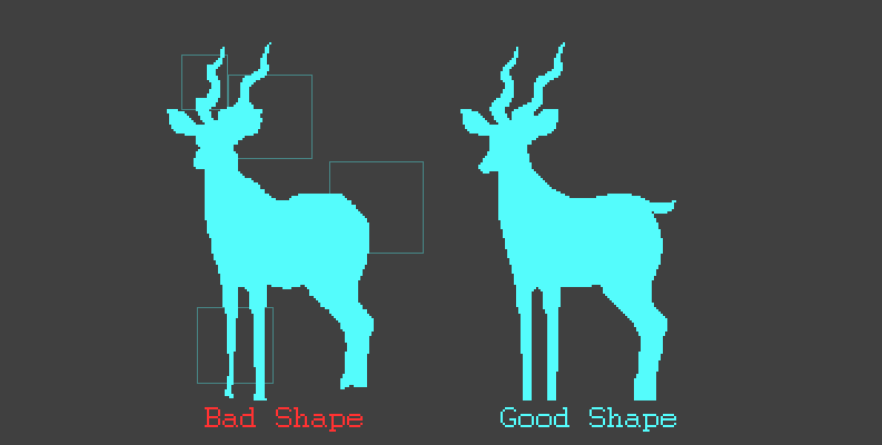
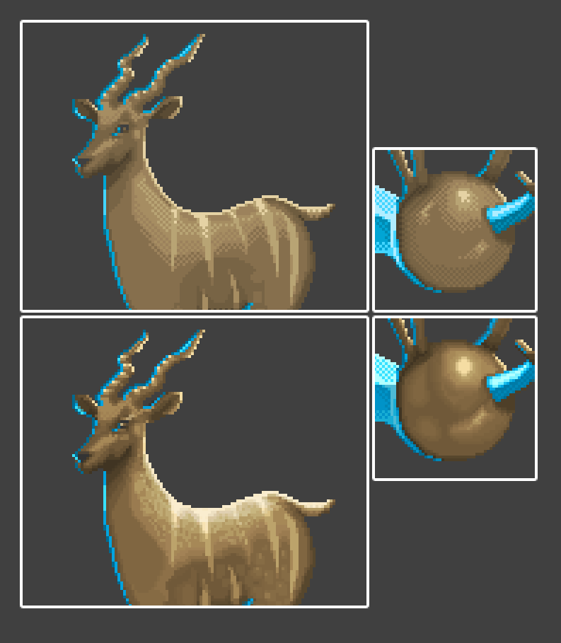
The last in the list, but not the last in importance, is kudu. In order to repeat its silhouette, you will need to carefully look at the photo of the animal. Or ... just circle it. There is no shame in this.

I will not argue - a scam of pure water, from the point of view of every second artist. Why every second? Do not be mistaken. Today's world is swift. You will draw a work week and even a crust of bread will not be on your desk. Many artists use photos and 3D models to speed up their work. It should be noted that our kudu is not yet pixel art, but only a silhouette. And if the silhouette can be taken anywhere (copy any object existing in the world), then no one will make pixel art for you. This image will have to be processed.
Take a look at the silhouette of what we cut out with a fourfold increase. Rough sharp forms, no smoothness and grace that is inherent in animals. Sharp elevation changes, holes, dents ... in short, a complete nightmare. We must trim our antelope.
. () (). , , . . . . , « » . , . , , .. ,
Organic objects are more complex than static. That is why I needed something alive. Firstly, I wanted to find an animal with the letter M. Secondly, it had to be graceful, preferably with horns, so the bear immediately fell away. Horn in our case is a complex and subtle form. Hell is for an animator (the problem that will be described in the third article of this cycle, dedicated to the simplest pixel-art animation), but also, in combination, an excellent object for learning.
Antelope is not over. On it we will examine a number of extremely important techniques. I have just spoken about smoothing shapes, contour lines forming a volume. And here it is necessary to note what I call the "pixel pitch." Although it would be more accurate to say “the step of any inclined line”.

Note.I took the top row, copied it and added one pixel at random locations. The naturalness of the form instantly disappeared. This effect is especially noticeable on a line located at an angle of 45 degrees relative to the horizontal, the first in the second row. Only two pixels turned it into a knobby stick. What happened? The step has changed.
If we were on a high-resolution canvas, no one would have noticed the flaws. But being adherents of the resolution of 320x200, we know that every incorrectly exposed pixel is no longer a blemish, but a flashing fiasco. Any slip destroys the integrity of the form. It is probably for this reason that the work of the masters is often appreciated by the enthusiastic "god-dam, but here each pixel is in its place."
What to do?Observe the pixel pitch dimension in relation to the line avoiding sharp and uncharacteristic for this form of differences. In order to understand the essence of such a phenomenon as a pixel pitch, there is a simple exercise. Let's call it a pipe. We take a straight vertical or horizontal line and try to make it a curve. The rules of the game are simple - each subsequent segment of the curve (the length of a line fragment in pixels) must be less than the previous one, there should not be any differences in height more than one pixel.

If you break these two rules, your pipe stops to resemble a curve. Smooth line breaks. Everything else is achieved by experience. The curve can be a sinusoid, it can be broken, the distortion in the line can be made deliberately and so on.

I continued polishing the mold. It seemed to me that the antelope is not elegant enough, so I took her to the fitness center, we identified the waist and chest more clearly, then we went to the polisher and trimmed the horns, at the same time we trimmed a few pixels on the ears at the hairdresser that spoiled the whole raspberry. And now we can say that the shape of the antelope (right) looks more graceful than our previous version (left).
To become finally and incredibly beautiful, we decided to also go to a beauty salon, but here we were in for a surprise. It turned out that someone restricted the import of flowers. The make-up artist mumbled something about the imposed sanctions and the protection of information about the colors of domestic pixels abroad. We did not understand, but came out of the cabin ... so.
Let's summarize this chapter. We found out that silhouette is an important part of the image. We also found that the form can exist by itself and at the same time transmit information to the observer. Now we know that when drawing pixel art, it is necessary to observe a certain step in relation to lines and shapes, so that the image is smooth, it looks natural and does not break. We will remember that if we cannot create the form ourselves, it can be spied on in the outside world, but if everything is completely bad we can copy it, and then process it, turning it into a good pixel image.
For those who still do not understand how all the same pixels are drawn, I prepared a short graphic lesson in one image.
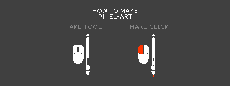
In spite of the risk of being on a coke today, I will quickly explain what lies behind this image. Unlike brushes and other traditional anointing tools, your pixel, at birth on the canvas (at the time of your click with any of your tools) does not react to the pressure of the pen, retaining only one gene given by the daddy - color. If you want to draw a point of a different color, refer to the mom-palette, choose the color you need with the pipette and just put it on the canvas.
Even if you use object smoothing by changing the tone of neighboring pixels - they have no dependence on the brush pressing at the time of applying to the canvas, have no dependence on the angle of the brush relative to the canvas, do not change the tone, no matter how you press the buttons. That is, to put a pixel on the canvas just one click of any input device in any graphics package.
This is binary graphics, if you will. If to operate with scientific terms - "effect of a gopher". Pixel is either there or not. The click was either done or not. Pixel either appeared on the screen or not. Zero and one. This is great facilitates the work of beginners. Do not believe?Let’s go over your disbelief.
Suppose you have ever picked up a pen, pencil, or, God forbid, a tablet. Suppose that you, like me, do not know how to draw. What do we usually hear on the forums of professional artists?
- You have disgusting proportions, anatomy is lame. Your touch needs to frighten children in kindergarten. Why do you paint at all? Why increase the amount of the terrible in this world, is not enough dollar rate? This is not a color, but some kind of nightmare, some kind of porridge! You have a disgusting color rendition. You do not know how to distribute light over the object.
Why not just hear enough of visiting specialized resources. Every second there, at least Aivazovsky. But here you are ... what do you say now about my color, eh? What is your verdict regarding my current successes in mastering the technique of drawing the knee caps? Am I successful enough in anatomy issues this week?

Note: , . , . , , - -, , , . , , . .
So far we have done well. We had a pinch of flowers and simple shapes in our hands. The time has come to fill our ark and, like Noah, to escape into the epoch a new CGA mode following the time. World EGA. With the same working permit, he promises us unprecedented wealth in the form of sixteen colors. And it will not be a pinch, but a handful.
Chapter III - Noah's Escape
I would venture to suggest that the reader is somewhat embarrassed by the presentation of material that is arrogantly applying for a training material. There is no indication where to move the mouse, which button to click and on which layer to draw. I will risk on the basis of the first risk assumption that the baby learns to walk without lessons. Simplest motor functions come with natural practice. That is, we, of course, can torment the baby and interfere with it. But it is better that everything happened in due time. Nature knows when to take the first step. Your task in this case is just to enjoy its first steps. Well ... or your own.
However, in this chapter there will be much more information about HOW. More colors impose additional responsibility on the artist due to the growing arsenal. Colors for a tick in the case of pixel art - does not exist. Each of them is in its place and each is used for its intended purpose. Therefore, first of all, you, as a real artist (well, and apparently me too), will have to choose a palette for the future canvas. You can even create an aesthetic analogue of real palettes, rather than a set of squares illustrating the colors available.
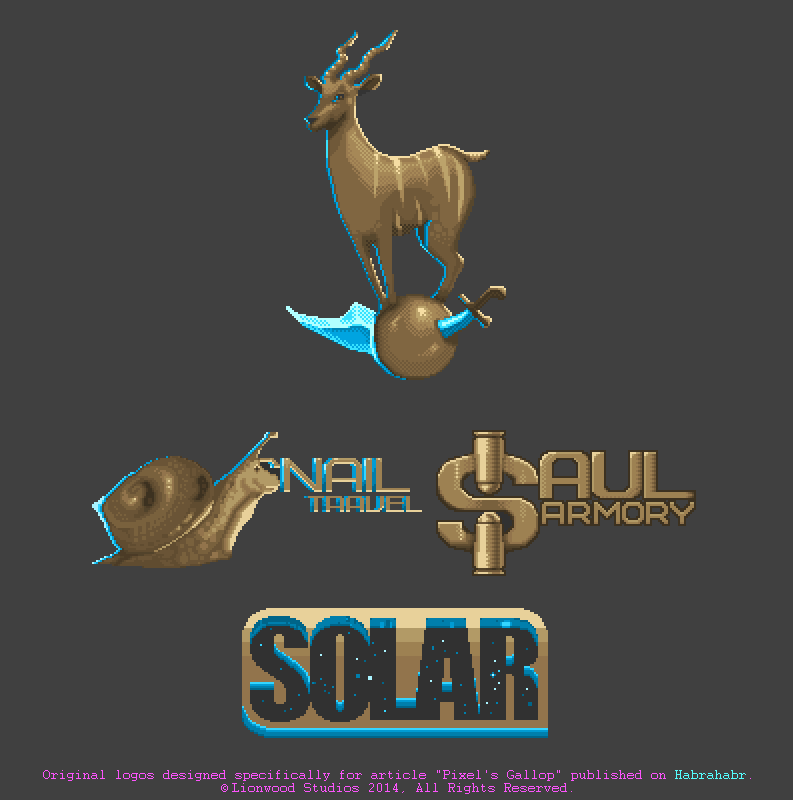
In order to reduce the number of images and make the material more visual, I will connect the kudu, the ball and the sword in one place, in the form of a certain logo. We are transforming our early petroglyphs into a whole image and will work with it already. To begin with, we modify the silhouette.

What happened to the sword? Why did the antelope at that moment, while we were translating the spirit after the second chapter, stroll through the pastry shop ?! And what kind of clown proportions? I will answer consistently for each of the three questions. If you looked under the spoiler in the previous chapter (and I hope not), then the Fable could begin in this place. However, you are not a customer, but my reader. And I will be very frank with you.
I ask you to proceed under the spoiler, in the halls of transformation.
When the gods of the nameless pixel world decided to get together for writing an article about pixel art, they somehow forgot to warn me that they would need a logo in chapter three. How to cross three different entities so that they look organically together? Would you be able to cross a plunger, a lion and a golf club together in fifteen minutes? Yes, and whether they are joined? The discrepancy between the ball, the sword and the small kudu is about the same. And I didn’t have time to think about reducing the number of pictures in a publication and working with one way. Just throw them on the canvas? Not interested. Need to somehow combine them. I will explain the course of thought so that you can understand exactly how Baron Munchhausen pulled himself out of the swamp by the hair. I believe that only by the power of fantasy.
As the drowning man clutches at something that can keep him afloat, I grabbed the ball. He also became the necessary ground. Some ground. Then everything is simple - you need to hoist the antelope on the ball. But how? The pose is not the same, the ball is too small, even this sword! There is always a solution. Need styling. It is necessary to stylize the image, to create a kind of grotesque. Something unreal proportions, but real in the outline of the overall image. To hypertrophic forms. Here is the solution. After all, often hypertrophy is the essence of pixel art. Grotesque heroes, whose legs are not thicker than a pixel, are mighty torsos. Sometimes these piles of pixels are much more humane than their three-dimensional counterparts.
I tilted the head of an antelope, enlarged its face, stretched its horns to emphasize the “compression of the image” from below, and pulled her legs so that they would converge, if not to the point, then they would fit on the ball (I agree, like we will hoist the word “maniac” in front of the word “pixel” everything will fall into place). Half done. The two main characters of our play have already been saved. Left a sword. Can not be thrown out. Sharks up. Rotate ninety degrees? Pierce the ball? Pierce the antelope? Pierce both? Not an option. Otherwise, the article will receive an age rating. Output?
Looking for curves forms. Distorted as well as antelope. Next, we recall that there are a great many blades. Something round and curved will suit to balance the tip of our “bogotype.” Any scimitar or scimitar. Drum roll, fanfare. Of the three, one was born. To find them all, put them together, and tie them together with a black will.
So let's get started. Remove the sword so that it does not interfere with us and does not confuse us. This is a tip. Separate complex entities into separate objects, so that they can be moved and hidden from the human eye. Sometimes it is useful to focus on the essentials. And what is our main thing?
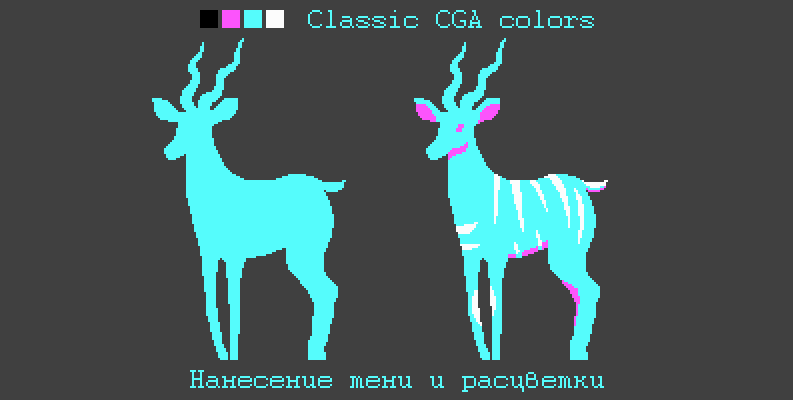
The main object on this stage is a small kudu. It would be time to give him a name, but it confuses that where, like, is masculine, and the antelope is female. Let it be, and we call it Kudya. Secondary object ball (a ball, nee sphere). Since he is fused with the legs of an antelope - we take him with us. As we remember, we need a palette and we only have 16 colors in stock. We will try to spend them economically. From this moment until the end of Qudi's wanderings, I will upload images in sets of six (counting from left to right, in rows). And then give comments so that it is clear what is happening and what we are striving for in the image.
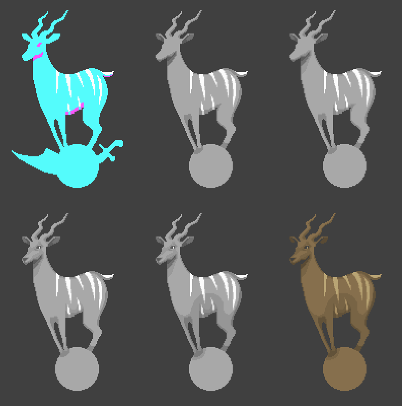
The first image is original. The second action we discolored the SGA disc (made it monochrome), and began to punch additional shadows. It seems to me that they are necessary in the area of the throat, legs and abdomen. Another color smoothed the white stripes on the back. All the colors I put on the palette, which is in the corner of the image (see example below). And it does not matter that now it is shades of gray.
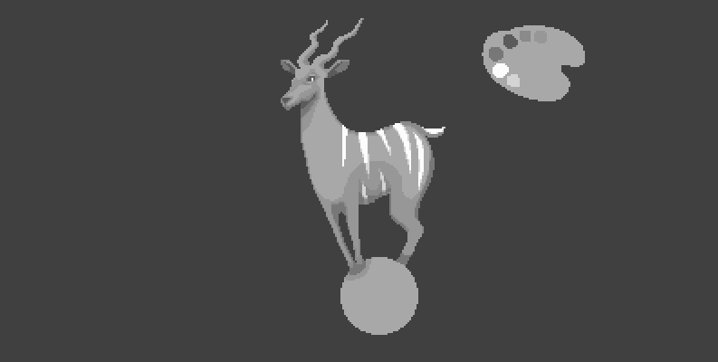
With the third action, we smooth out the shadows just applied, with a neat edging one pixel thick around the perimeter of all the shadows, with rare exception where there is no need for it. The fourth action is correcting those shadows that we have, podbivka crawling out of pixels, enriching the background, adding eyes, nose (all from the current palette). The fifth action - add an additional shadow volume around the perimeter of the lower part of the antelope. This pleasure eats two more colors. With the sixth and last action in this block, add any color you need, for example, taken with a pipette from a photo of kudu, and overlay it on top with any convenient method of blending (Overlay, Multiply, Color). Kudu becomes colored. In the same way our palette becomes color. The result is a blank of the right color with eight colors in the colors we need.
Note: Blend modes are a feature of professional image packages. That is, in the absence of such a package - the palette is created manually.

Why did we start work in black and white? First, we did not suffer from the selection of flowers, but took them in a crowd, since they are all shades of the same skin. That is, subsequently they will become one color scale. Secondly, a black and white image like no one can better show the observer the flaws of light and shadow. That is the flaws of illumination. When an artist works with a color image, he may not see his own mistakes. This is due to different color perception in people, and not the curvature of the hands. To draw immediately in color, you need a habit. It is produced by repeated drawing (classical and digital).
Go ahead. There comes a time when we should use shading. It would not be necessary if we were in the next chapter, basking in the feathers of the 256-color VGA mode. But as long as Kudya has 16 colors, we should stick to the chosen course.

Loved by some and hated by others. Not a person, but a welcome. Those who don’t like this effect call it “Hollywood Hollywood already!” (Meaning the blue light effect on the one hand and red or orange on the other hand), among those who work with him and who like him often referred to as "backlighting". It creates a bright accent on the verge of the object and emphasizes its shape. This is our first action in the new set.
The second action adds bright spots of light on the back in the area of the stripes, as if they were from a different material. The second virtual light source is on the other side of the antelope. The third action is a landmark one. The first hatch is added based on alternating pixels. This is most clearly seen on the flare of the sphere. Also made minor edits of blue lighting.
In the fourth point, we bring the same shading to the lighting of Cudy's back as on our sphere. With the fifth point we balance the appeared shading, creeping in different directions from the illumination on the back with the stroke “pattern” (eng. Pattern - regularly repeating element). The sixth point is the second source of illumination, which emphasizes kudu from the back.

I would like to dwell on the hatching separately and give it a close-up view so that you can see how the fragment of the back changes directly with the hatching. As you can see, it looks like a regular hatching with the only exception that the grid is, if possible, evenly spaced through a pixel, shifted to the next line. We can say that in a certain sense it is mechanical. To automate this process so that it looks good for the most part impossible, unless in the case of gradients in the sky. This is a rather painstaking work, especially if Kudya is not the only entity on the stage.
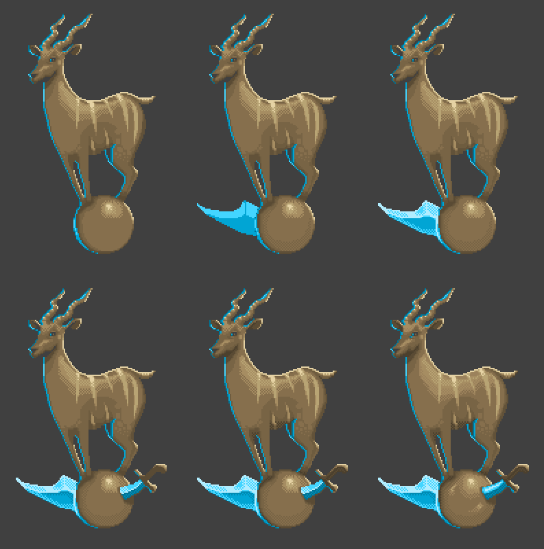
The first point is to strengthen the warm backlight so that it illuminates the joint of the leg Kudi. And we introduce another color. Bright blue. This is an important point. The presence of this bright color in some places of the image enhances the accents of light. It is interspersed gently and gently, so that it does not callus eyes, but only barely amplified the main blue light. It can be considered a glare. The second point we try on our sword blank and add hatching on the sphere in order to give volume (let Kudia be bored, we are almost done with it). The third point, we throw on the sword already familiar stroke. Only one color added on different sides of the weapon makes it rich and gradient.
We are close to completion. In the fourth point, we add the second side of the sword and the grip using the original palette. The number of colors used is fourteen (14) and I think it is worth making a couple of presents. The fifth action we introduce brown is darker than all existing ones and, by analogy with a bright glare, we shade only those places where the shadow should be by definition. At the very bottom of the antelope, where the hooves are in contact with the ball, on the stomach and on the throat under the head. Adding this color as in the case of a bright flare should be rare and not annoying. However, in the aggregate, the sense of volume will increase. With the sixth point, we add the last color and smooth out the main shading on the back of Kudi, and then “stretch” along its body with one of the old colors, covering more space with the hatching.
The result of part of our work in the third chapter was a small poem, an ode to the bronze and silver ages. CGA and EGA modes. We will give it the name "from four to sixteen."

Let us digress for a moment in order to find out what happened during this time with our logotypes from the second chapter. What they have become in the new century, and when using the same palette. In this case, we just study the image, but we will not be distracted by the stage.
I promised you not to look at logos in detail. Not that I lied to you, but there is some kind of misunderstanding. Another minute of your time. It can be either useful or interesting. Or both, together.
Since Cudi was made in the style that we have already seen, I decided to make logos in three different styles, which, anyway, differ despite the single color palette.
- Saul Armory - uses as a pattern not a lattice but something linear, similar to shredded metal, where only horizontal lines are pronounced.
- SOLAR - has almost no gradient drops and is painted with colorful and coarse lines. Minor anti-aliasing is present only at the corners of the logo. The main weather is made by the effect of extrusion and a sharp drop in colors in its zone.
- Snail Travel . It is executed in the smear equipment. There are no patterns. But there are spots of varying degrees of illumination and frequency, which, as expected, resemble similar drawings close to porridge, but being far away form an image much more realistic than others. The origin of this technique is traditional paint.
It should be noted that without the first petroglyphs, without understanding the form, these objects would not exist. Therefore, I would advise you to start working with the general shape of the object. With a silhouette. And only then turn it into something more. Not having mastered the breathing technique, there is no need to risk at depth.
Let's summarize this chapter:
First you make the silhouette you need. Denote the incident light, and, remembering that the light almost always creates a shadow, apply it. The silhouette ceases to be a silhouette and turns into a volume object. Only after a satisfactory verdict against the primary object do you begin the “second pass”. So I call the application of additional detail. That is, additional light and shadow accents, hatching, rebalancing of colors, working with gamma, etc.
The position of the “second pass” is also true for any other type of work (even in relation to your unfinished summer house). Three-dimensional model, sketch or texture - it does not matter what unit of content you produce, but it is important that the construction should be phased. It is important that any object should have a sketch. Base. Sketch. So what it all begins with, and not what it should come to. Only after the outline you begin to detail the form. Otherwise, you will be doomed to repeat the typical mistake of a beginner, who first draws one detailed piece, and then diligently tries to fit it to the object.
Note: Contrast operations, curve editing, changing color saturation are all signs of working with a professional image editing package. Nevertheless, this does not deny the idea that pixel art can be prepared in almost any graphic editor.
Note 2 : You must have noticed that the pixel art of this chapter looks pastel. Perhaps this is fatigue from the CGA mode. And maybe what I said before. When an artist in color allows for softer tones, more faded colors and, as it were, are afraid to afford something juicy. Regardless of what caused such a result, you can always “twist the curves,” that is, adjust the light levels of individual areas of the image or the contrast as a whole, and if necessary, you can also mute the color. In the proportions you need. Personally, I spun Kudyu and logos as follows.
Chapter IV - Concerning the Renaissance
The great era in the world of game development goes hand in hand with the arrival of two hundred and fifty six colors (256), which brought the VGA mode. The games were already rich in game play. Now they are equal in their playful glory with the beauty of the visual. It makes no sense to list the parade of masterpieces that followed this event. It is only worth noting that never before, and never again, were the games so rich in content, style, and bold experiments, both in terms of artistic solutions and in terms of game play (paradoxically, but the whole mind of the gaming industry seems to went into the resolution of monitors, the power of computers, shaders and triangles, focusing on rendering, which continues to grow from year to year).
Artists were no longer constrained in colors, which allowed them not only to create magnificent samples of pixel art, but also to transfer images from their real canvases to a computer. By the way, the images were scanned before that, but they were far from these symphonies of color.
The problems with “smoothing” disappeared, and in the presence of a large number of colors, smoothing was “not worth it” to lose one or two precious colors. Problems with semitones disappeared, the need to use patterns disappeared. Algorithm for the transmission of gradient images with a small number of colors can still be found in a number of packages, in particular when saving graphics for web resources. The gaming industry may be rushing at a gallop, but it is still customary in the network to minimize images in order to increase download speeds.
Any entity has two sides. Good and bad. Having more colors, making the image richer gave a good cuff pixel art. As Aramis would say in this case - “it happened.” Artists wanted more. And gradually, pure pixel art began to be replaced by digital art or digitized art, where on the heels should be the ubiquitous 3D.
Note: Digital art and digitized art are not the same. Digital art was originally created in digital packages using tablets and virtual brushes, while digitized art, there is a scanned replica of an image created in the traditional way (pencil, watercolor, oil, etc.) In the 90s there was no concept of “digital artist ”(English - Digital Artist).
In the beginning, there was digitized art (which was being developed to meet the needs of the application), software packages allowing to imitate techniques characteristic of traditional fine art appeared much later.
Until now, there are discussions about exactly how certain backgrounds were made in old games. For example, in quests from Lucas Arts. And speaking of quests, I mean such masterpieces as the game The Dig. Awesome canvas in every sense. Sound, video, striking in detail backgrounds and the same charming pixel-art characters.
Today, in our time with you, many developers go back in a spiral of time, going back to basics. Again the quest genre became popular, and moreover, the quest made in the old graphic solution, where the whole action is concentrated in a resolution of 320x240 so close to the canonical resolution of 320x200. The brightest examples of the “reverse round” can be considered adventure games (quests) - Gemini Rue, Resonance, Primordia. There are others, but the article and so breaks from the images.

I think that's great. In my understanding, the world of computer games, the world of digital art, as well as the world of fine art, must be represented using the greatest number of faces (works performed using different techniques and in different styles). The same provision should apply to game stuffing, but here, unfortunately, there are serious problems. With a visible variety of visualization, there is a serious degradation of the very essence of the games. People who played old tactical and role-playing games will most likely agree with me. Today, in the gaming industry, the approach prevails when there is the same game mechanics on which the developers follow the “skins”. This is more like a game of dolls, and not the development of games, when the developer, instead of developing, changes the dress to the draped Barbie. A lot of clothes, but Barbie is still the same.
Talk less, work more. Let's return to our images, being armed with a 256-color palette. Today, we are no longer pygmies and no longer hostage to technical restrictions. Today, the sword-kudo-ball will become a god (I hope that the latter still does not read Habr and will not throw lightning at one of his overly talkative creations).

What have we done?In short, we crawled for several hours with a magnifying glass smoothing out the previous picture. Where there were sharp transitions between the two colors characteristic of a limited palette, we added one, two, three, or four transition colors, turning a coarse two-color drop into a relatively smooth gradient. Usually, few people think about how much labor was hidden behind such images. It is not by chance that modern indie developers prefer earlier versions of pixel art with limited palette and small size of dynamic objects. Such pixel art is easier to do and just to animate. The fewer the colors, the simpler the character. In that case, of course, if the artist is well grounded. Theoretically, this is not bad, but only if, thanks to this simplification, the developer can afford to concentrate on the gameplay,and not on how to deliver another Barbie to your apartment.
Polishing Kudyu, I focused on the gold fund in the form of games from the famous gaming office of Westwood Studios. I have never had real teachers. But I always had games. They became my teachers. For example, I made an image from the EGA era with an eye to another well-known French office of Silmarils. Its name surprisingly corresponded to its own games, each of which may well be considered a special and rare stone in the treasury of the gaming industry.
The fourth chapter of our story turned out to be surprisingly short. It is quite difficult, without video and clearly, to show in the article the application of hundreds of pixels smoothing out a rough sketch so that later you do not have to wake up those who read it, who fell asleep in a deep sleep. Yes, and the need for this - no. In order to skillfully handle the pixels you need to know the basics, basic concepts, to be able to operate with the basics. With regular practice will increase the level, which will lead later to much more complex work than the local crook.
There is a concept of the golden mean. If you mix it with respect for the time (and yours, and mine) it turns out that the time has come to stop and take stock. However, I do not advise you to relax. Our results, nothing more than consolidating the material covered. Control.
Chapter V - Summing Up
It is necessary to take stock of our first trip to the world of pixel art. Make a squeeze of what we learned about him. That can be considered his cornerstones. Those that you will often encounter if you swear allegiance to him.
We list those entities that we now know. First, a list, and then more, but compressed. Without all sorts of jokes with small visual examples. Let it be a reminder when it will be possible to jump to the end of the article and refresh the material, without being distracted by playing ball games, cuts with the sword and abrasions from overly obstinate Kudi. What are we able now?
- Palette
- Shape (silhouette)
- Light and shadow
- Line
- Hatch
- Smoothing
Palette
To make your pixel art “honest” I would recommend using a palette. Same as that of real artists. Draw on the canvas where the colors you are working with will be located. Use only them. This will give the image some integrity. Teaches you to do little. Teach you to appreciate every color.
I would recommend to start working with four-color and eight color palettes. The main thing is that the number of colors is limited. In case you use more colors, they will turn your art into a mess. Only an ascetic can understand and feel the limitation of colors, just as one who has ever starved can fully enjoy food. It is impossible to understand the essence of pixel art without bowing to the roots, and even pilgrimage to them does not guarantee one hundred percent success.
Form (silhouette)
The object occupying a small area should have a good or readable form. When creating a character or any other object, immediately think about what you want the observer to focus on. Perhaps the best option would be to practice on the expressive silhouettes and only then proceed to the detailed details. Silhouette, in most cases, involves two colors. One for the background and one for the object on it.
The proportions of pixel objects may differ from the proportions of real objects. Often used is the use of hypertrophied accents or styling with the aim of better presentation (what we have done a little earlier with Kudei). This is also done to facilitate the work with the object, or in the case of following the doctrines of a certain style.
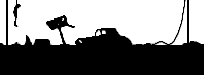
Since we decided to fix the material - we will fix. It will be easier for what you saw, it will contain fewer colors, a smaller volume on the screen and be more intuitive. Let's start with two colors. Black and white. The theme will be post-apocalyptic. Any dull landscape. Broken car, road sign, some little thing. Let's start with the shape of objects. And do not be afraid to spoil something. This is not a date. If you accidentally add extra pixels, remove and comb them. But first, create a composition. Once again, any editor and a regular mouse will do. And let it be at least one working button.
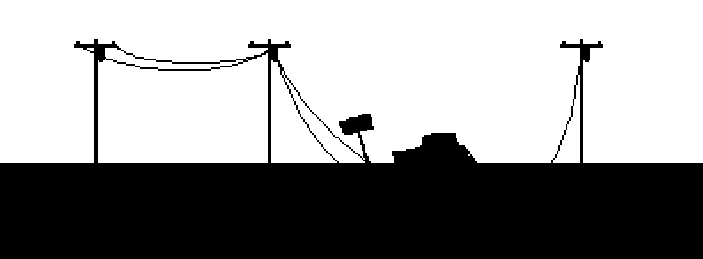
Such scribbles can figure out every second. It may be necessary to try a little around the wires. But in general, for a start - to fit. Now let's trim our car with a couple of pixels. Let's transform a sign into a mailbox. The fact that the mailbox as a silhouette is recognizable. And our road sign looks like a shovel.
We can say that we are almost done with the silhouette. Let's shoot a couple of holes in the mailbox and mark the window and door openings at the car. In the red circle I marked the problem with which we will understand the next paragraph when we get to the lines. Remember our trumpet exercise?

Line
You can build lines as you like. But the best option would be to follow a certain step (pixel shift) in the direction of the line. To practice the lines we drew the wires. But by a strange coincidence, they turned out pretty correct. Nevertheless, on the right wire is clearly visible hall. This is what I said earlier. The case when an incorrectly set pixel can turn a straight line into a knotted stick.
What is a step? At least the same distance. For healthy and not drunk people, of course. When we want to draw a line we decrease or increase the step. But we do it smoothly. Gradually. Let's draw to the left of the bad wire - the wire is good. Observing a uniform pitch.

Such a wire is not a sin and screwed to the post. Old we erase as useless. And dilute, by the way, a straight line of land with different debris. Stones, pieces of iron, all that relies post-apocalyptic landscape. Apply strokes like a god put on the soul. This is a silhouette. If anything, we will lie that this is a post-apocalyptic and here everything is perekorezheno. After nuclear explosions. If this does not satisfy your viewer - tell him a bike about stone-eaters. Who walk and gnaw a stone. Explain that it is for this reason that everything is uneven and rough.
Do not we remove those problematic wires, and do not replace them with a simple line, as if it were a piece of wire? Drawing a straight line is easier than messing around and correcting curves.

You know what? In my opinion, one element is missing. And even if it is not a line, but ... let it hang. So the picture will become more sad. And since this is not a tree, but a pillar, this time I will not be accused of plagiarism.

What am I talking about? Once I drew a similar plot and great critics from this world saw in it the logo of the game Dead Island, which, by the way, caused many scandals. People love to make trouble where there is no need for it. Rather, where nothing needs to be done, except for scandal. For example, seeing a corpse hanging from a tree in a game is the easiest to scandal a scandal. This is called care for the younger generation. It would be nice at the moment of this murderous and thoroughly hypocritical fuss to block the TV with the sirloin part, because there these bodies are shown in the hundreds during the daytime. Or learn not to spit on the streets, not to scatter cigarettes everywhere from cigarettes, to bring your garbage to garbage cans, not to foul the already filthy nature at rest. But you need to do something for this, right?
Smoothing
There are different anti-aliasing techniques. Smoothing the internal contours of objects, while maintaining the coarseness of the external form. Smoothing the outer contours of objects, and even smoothing with different levels of transparency at the edges of objects that can be considered dynamic (characters, moving objects). How and how to work out these aspects in detail, how deep you will go on your way is your business. We now just take the intermediate color between black and white and walk along the edge of the car.
This is an enlarged image. You see that I put a pixel of this color far from everywhere. If you start doing it around the perimeter of the car, then you will have a car with a pop gray edging.

I also propose to run through the rest of the picture and get the following result.

Let's add one more color to our tricolor palette. Lighter. And paint over the corners of our images again. This is especially true of such thin images as wires. The absence of anti-aliasing is always noticeable on thin elements.
Integrated machine for understanding the process.
We are done with the silhouette of our work, and with the smoothing of the contours. I think that you can go to the light. Putting my hand on my heart, I can say that the light is drawn before smoothing, since smoothing is a polished image or an additional, but not obligatory effect. It may not be at all.First form, then light and shadow to give volume. Then everything else.
Light and shadow
This couple I single out. In all its publications. For me, this is a brother and sister, tied together so that one can not exist without the other. If there is no Sveta, no Shadow will be born, which means there will be nothing. Strokes, glare, reflections, and other delights are meaningless without them. Inessential. Secondary. Light and shadow in pixel art are as important as Shape. Therefore, at the stage of birth of any object it is worth working with this trio. Even our two colors at the start - white and black, this is nothing but light and shadow erected in the abstract.
Let's not philosophize slyly and just emphasize our silhouette with a light blot of light. For example, let's mark the wings of our car. Make it a darker color than all the others, already the fifth in a row. At the same time we paint the inside of the car. Still, from this angle, theoretically, we should have seen a part of the cabin and a piece of the roof of the car. Plus, add two or three pixels of light flare with another bright color on these wings.

You see two pixels in the area where there should be a door. Charm, right? Two points, and the brain already grasps the visual information and confidently believes that he sees the door handle gleaming in the dark.
Hatch
Hatch. Do you remember Kudyu? Remember the principle of hatching? Alternating pixels. A point, followed by a void, a new point and again a “space”, on the next “line” shift and repeat everything again. So that appeared grille a certain color. Repeat the same technique here. The same color that we have, the color of the wing of the car.
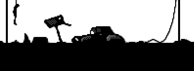
It worked perfectly on the wings. As if we were drawing pixels all our life. But with a letter box turned out to be complete nonsense. It seems to me that it is worth taking one more, last color. Darker. And smother the hatching on the drawer.

At the same time, let's give the same dark color as we have turned down the mailbox, suppress the bottom row of pixels of our improvised hatching. Feel pixel power? Only one color and the wings of the car became voluminous, began to bend and go down, as befits a volumetric object to behave when light falls on it. Just.A couple of shtrishkov, and we can already go to Kickstarter with the prototype of the swing hanging simulator for the “iphone”. Let's just before you do this nonsense - draw a few horizontal lines on the ground. No matter how. In any order. And three or four bright dots under the car. Let us represent broken glass.

On Kickstarter, of course, I wouldn’t recommend it. But, to practice more and more, to increase the number of colors and experiment with forms - I recommend. Without fail.
As you can see in our anchoring material, simplicity is the key to success. It is not necessary to litter the canvas with details and to show the wonders of waste regarding colors. Do not necessarily draw canvases. Enough to create a clear image of the observer, and then emphasize the accents. Neatly. I would say gently. Do not poke a person into one of the details of his drawing, but observe a sense of taste and moderation. It is best to develop from the position of harmony, and not from the position of "the main thing that they notice our N", where N is the effect, technology or feature of the game.
Epilogue
I think that today you have come to know the world of pixel art somewhat deeper than you thought when opening this article. And I must immediately warn you - this is only the tip of the monumental complex extending deep underground to the very roots of what is today known as the gaming industry.
The upper tiers of the temple are still accessible to visitors and tourists, but desolation reigns at the lower levels. Many ceilings collapsed, sagged entire floors, making inaccessible sources of knowledge. This world is truly huge and any of your favorite old games can be a breeding ground for research and analysis. As in the case of fine art, there are many techniques of creating pixel art, stylizing it with traditional and living techniques, adapting modern graphics to pixel art, and so on.
It is very sad for me to hear how the names of offices that released these or other games are confused, as buyers of online services, buying an old game, write angry reviews about it reproachfully outdated graphics. In the gaming industry, unfortunately, there is no concept of history as such. It is passed from mouth to mouth. And because each next version of the tale is overgrown with modern, relevant to the current generations of details. There are no institutes of knowledge, no chronicles of history, no names of pioneers carved on gold blocks that survive the apocalypse. And there are no Guardians who would preserve the purity of morals even in temples.
Of course, there are departments in certain institutions, but this is a drop in the ocean. Of course, there are gaming offices, which, within the framework of additional earnings, establish courses and give out to those who pass them, meaningless papers. Nothing meaningful because they are not listed in other offices. This is not a currency. This is not a document on education, which guarantees the subsequent employment. Wow!That's so funny. In my opinion, the first fun joke in the article. Employment education? Here?In Mordor? God have mercy, I was dreaming something this morning.
If you are a regular reader of my small opus on the gaming industry, you probably noticed that in almost every article there is an information block “backdating notes”. The fact is that not every information can be included in the publication without breaking the narrative thread. Nevertheless, some marks on the margins and additional information can and reveal the subject deeper, complement it. Allow to explain what was not included in the article, what remained behind the scenes, which prompted the author to do exactly as he did.
From this article, I decided not only to legitimize Herr Text's bunker (the comment block, which was previously called “backdating notes”), but also to introduce a new building called the Infosphere. In it, I intend to store all informational links, one way or another mentioned in the publication. Hyperlinks in the text are convenient, but with a large number of them, the body of the article begins to resemble a Wikipedia or someone’s website. A structured base from which you, with the help of null-T portals, go to the network resources you need will be a better solution than garbage the body of the article, distracting from the subject matter of the story.
Today I say goodbye to you. I would be glad if you rate this material. Express in the comments what you liked and what did not. What do you think is superfluous, and what was appropriate. Was the material useful and worth it, in your opinion, to develop.
At the moment, a block of four articles was planned. Where the first two are devoted directly to pixel art and the technique of working with it, and the last two, its animation. However, based on the results of the relevance of this article, I will decide to increase the excavation area, or, conversely, to reduce.
Best regards, and thank you for your attention! Until new meetings.
Bunker Herr Text
, .
. - . , , , . . , , . — . – .
. , , , Prince of Persia Flashback. . , . . , , .
, .
(2014) . ( ). , , . - . , , — , .. , ( ), . . , .
, « » .
, , . , . , 3D. , .
, . - , , ( ), - - - . , , -, -, 2100 .
, .
, , , , , . , « », , — . , . , , , , .
«». , , , . «» , ( , Wasteland 2). , ? , - . ? , , , , ?
, - . . , . . , , … . . , , , . . , , .
, . .
— ?
— , , … « »
. «» , .
. «».
Infosphere
Pioneers
: EigenLenk
:
IndieDB : —
Paratrooper
: Greg Kuperberg
-:
1982 , . , .
The Dig
: Lucas Arts
-:
point & click Lucas Arts. .
Resonance
: XII Games
Gemini Rue
: Joshua Nuernberger
Primordia
: Wormwood Studios
: . «, Wadjet Eye Games ». — . Wadjet Eye Games ( ), . AGS. , Blackwell. , Resonance, Gemini Rue Primordia .
, , Interplay , - Interplay . — «, , Fallout».
Last edited date in article: 01/14/2015 Time: 6:03
- Infosphere updated, section "Mentioned games"
- Updated Infosphere, section "Terms and definitions"
Source: https://habr.com/ru/post/247333/
All Articles