How to increase conversion and traffic online store only through internal optimization
A familiar owner of an online store asked me to help figure out why there are visitors on the site, but there are almost no orders: with 250-300 visitors per day, he had 1-2 orders. Two months later, about 500 people visit the site daily, and at least 10 of them make an order. In this publication, I will tell you what was done for this and how to achieve the same for any other project.

Despite the fact that some flaws immediately struck the eye, the first thing it was decided to install and configure the statistics collector. Analytics was on the site, but, firstly, it was in the form in which it was, except to watch attendance, and secondly, I personally prefer Yandex.Metrica from a domestic manufacturer. I set goals for visiting the basket page and the final checkout page (ideally, this goal should be made integral), and also included a web viewer. If with goals everything should be more or less clear: we need to see at what stage the client is lost, then everything is not so obvious with the web viewer. In fact, a web viewer is a kind of “recording from surveillance cameras” of every visit to your store: well, almost everything that a user has seen, entered or clicked, you can view in replay. And this is the most valuable information for the optimizer: you will be surprised how unexpected the actions of users can be. But more on that later. In the meantime, the hardworking script metrics collected data, I built assumptions, which later confirmed these same data.
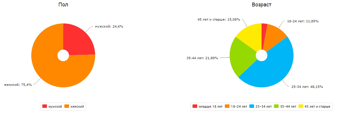
First of all, it is very important to determine the target audience as accurately as possible. The statistics service here will also have to be by the way, it will tell you at least the gender and age of the largest part of the audience. In the case of this experimental Central Asian - women from 25 to 35 years. The remaining assumptions about Central Asia will have to be built on the basis of logical conclusions. For example, in my case, since the site sells goods for needlework, I assume that women are housewives, and not sharks of business. Of course, anyone can go to the site, but it’s worth being guided, as in democracy, by the majority opinion.
')
This statement is true both for users and for the web designer: you need to clearly understand what we want from the visitor and try to help him with all his strength to do it. For any online store, the primary goal is to make a purchase by a visitor. This goal can be split up: making a purchase of a certain product, making a purchase for the maximum amount, making a purchase as many times as possible, and so on, but there should be no goals other than making a purchase on the store's website.
Despite the fact that the height, or, if you wish, the length of the page of the site is not technically limited, the information beyond the second - third screen will practically be ignored. Therefore, a competent layout of design elements is extremely important.
On the remake of the experimental site took a month. Most of the time was taken by sorting the catalog and changing the core of the store to MiniShop2, due to the limitations of Shopkeeper. The very same CMS MODx, as expected, passed the test of flexibility, for which it was awarded a new hosting from the creators.
I wrote at the beginning that customers simply canceled two thirds of orders. There were two reasons for this:
For each site, the problems can be their own: a long answer to users' questions, boorish operators or any other obstacles in the way of the buyer. Analyze the reasons for the loss of orders and either eliminate them or warn customers in advance.
After we launched the updated version of the site - we immediately saw the result! Well, well, they persuaded me, I will tell the truth, on the first day sending the order did not work for us and therefore there were no orders at all, but I quickly corrected the error and the result did not really take long. The number of orders grew, the owner was happy, and in the intervals between looking at the growing graphs in the metric and urgent affairs, I watched the records of the web visitor. I was surprised to find that in the mobile version, users poked at the search button in the directory in a completely non-obvious place for me (immediately put the button there) and looked through the catalog page by page without using the search (changed the inscription on the search button to a more understandable ).
Actually, this is what I would like to finish the story. New technologies appear every day, and this means new opportunities. There is no limit to perfection, and therefore the optimization process should not stop. Watch users, analyze behavior and adapt the site to their needs, not forgetting your goals.
Initial data
- CMS MODx Revolution in conjunction with Shopkeeper;
- Top 10 Yandex and Google on the main requests;
- Views per day 1000-1500;
- Unique visitors per day 250-300;
- Conversion of about 0.5%;
- About 70% of customers canceled orders;
- Average basket - 1500 rubles.
Search for problems and solutions
Despite the fact that some flaws immediately struck the eye, the first thing it was decided to install and configure the statistics collector. Analytics was on the site, but, firstly, it was in the form in which it was, except to watch attendance, and secondly, I personally prefer Yandex.Metrica from a domestic manufacturer. I set goals for visiting the basket page and the final checkout page (ideally, this goal should be made integral), and also included a web viewer. If with goals everything should be more or less clear: we need to see at what stage the client is lost, then everything is not so obvious with the web viewer. In fact, a web viewer is a kind of “recording from surveillance cameras” of every visit to your store: well, almost everything that a user has seen, entered or clicked, you can view in replay. And this is the most valuable information for the optimizer: you will be surprised how unexpected the actions of users can be. But more on that later. In the meantime, the hardworking script metrics collected data, I built assumptions, which later confirmed these same data.
Know your ca
First of all, it is very important to determine the target audience as accurately as possible. The statistics service here will also have to be by the way, it will tell you at least the gender and age of the largest part of the audience. In the case of this experimental Central Asian - women from 25 to 35 years. The remaining assumptions about Central Asia will have to be built on the basis of logical conclusions. For example, in my case, since the site sells goods for needlework, I assume that women are housewives, and not sharks of business. Of course, anyone can go to the site, but it’s worth being guided, as in democracy, by the majority opinion.
')
The clearer the goal, the easier it is to go to it.
This statement is true both for users and for the web designer: you need to clearly understand what we want from the visitor and try to help him with all his strength to do it. For any online store, the primary goal is to make a purchase by a visitor. This goal can be split up: making a purchase of a certain product, making a purchase for the maximum amount, making a purchase as many times as possible, and so on, but there should be no goals other than making a purchase on the store's website.
Despite the fact that the height, or, if you wish, the length of the page of the site is not technically limited, the information beyond the second - third screen will practically be ignored. Therefore, a competent layout of design elements is extremely important.
Rules of competent design
- Nothing more . Remember the joke about the gun on the wall in the first act of the performance? So, all that does not shoot - shoot. Informers of statistics services, banners on other resources, icons of semantically correct markup and valid style tables - I could not imagine a situation when it would push an ordinary user to make a purchase. Remember, the less on the page - the easier it will be to focus the user's attention on the item you need.
- Clear priorities . Do not dump everything, think over the priority of the objectives and arrange the elements in accordance with them. For example, first of all you need a person to select a product as independently as possible and make a purchase, so the phone is important though, in this case, there is no sense to write it in arshin letters, tell us in a few words about the conditions of delivery and payment. And the history of your company is generally better to put on a separate page, the link to which can be removed somewhere in the basement of the page.
- Remember the target audience . Focus not so much on your tastes, as on the tastes and preferences of the target audience. For example, if your audience is female housewives, then most likely they will like pastel colors, smooth transitions and elements with rounded edges.
- Offer help and hide from your eyes if you don’t need it . Ah, if real sales consultants would follow this rule! Give as many opportunities as possible to users, but do not impose their use. Make the elements that will be used infrequently by default minimized or placed on the periphery, but preferably in places familiar to the user. For example, catalog rubricator and filters should be placed on the left or on the top. Leave the filter visible by the most frequently used characteristic, for example, color, and hide the rest. You should also not get bored with chat suggestions. Do not ask more times per visit and give the opportunity to look around yourself at least half the average length of the visit
- Give more features . Follow the previous rule, but try to give the maximum opportunity for the buyer to find what they are looking for: site search, filters, sorting, recommendations, offers and promotions, an online consultant, a callback, a robotic assistant.
- A good site is an easy site . Use caching, minimize images and scripts, remove unnecessary media materials. The less the user waits for the site to load, the higher the chance that he will wait. If there is a large percentage of failures on a site, regardless of the sources of transition to the site, this is what you should pay attention to first.
- Let the site be accessible to all . Make the layout responsive or create a version for mobile devices. Besides the fact that it will become easier for users from phones and tablets to buy, the search engines will also be delighted by the new version and Google will even sign that the site is mobile-friendly! By the way, Google recently launched the “Test for viewing convenience on mobile devices” service .
- Make your site convenient for search engines . Use microdata. In short, it will allow search engines to provide data on price, delivery and availability of goods directly on the search page. As they (microdata) use already mentioned on this resource and on many others, so this time I will not focus on this. By the way, Yandex allows you to transfer the same data in xml, or rather, yml format via Yandex.Webmaster. The same file can later be used for Yandex.Market.
- Tell us about the product as much as possible . Add photos from different angles, give the opportunity to look closer, give technical information, show reviews of other users, but do not forget that first of all you should show only what is necessary.
- Make it easier to browse the catalog . Add the ability to move from offer to offer immediately, for example, by reference to the next and previous product. Make a quick review feature. Show that the buyer looked, offer on the basis of this similar products.
- Feedback should always be . Having performed any action, the user should immediately see the result. Let the pictures change the transparency when you hover, the links - the tone, and when loading a large amount of material, show rotating watches and progress, if this large load could not be avoided. Here it is worth referring to the theory of flow (author Michael Chiksentmihaia), which I do. For those who do not want to read psychological works briefly: if the buyer does not see the return from his actions, his mindset to finish the job (buy in this case) will disappear.
- Do everything you can without the participation of the buyer . Consider delivery, discount, store a basket, purchase history, determine the delivery address, ask for minimum information. But give the opportunity to change all this manually. (The second component of the right attitude - a sense of control over what is happening - see above, the theory of flow).
- Test and correct errors . Take time to troubleshoot bugs, typos, and anything that can annoy users and prevent them from making a purchase.
On the remake of the experimental site took a month. Most of the time was taken by sorting the catalog and changing the core of the store to MiniShop2, due to the limitations of Shopkeeper. The very same CMS MODx, as expected, passed the test of flexibility, for which it was awarded a new hosting from the creators.
Optimize offline processes
I wrote at the beginning that customers simply canceled two thirds of orders. There were two reasons for this:
- The discrepancy information about the availability of goods on the site real
- The obviousness of the need to make a prepayment to send an order outside the home region
For each site, the problems can be their own: a long answer to users' questions, boorish operators or any other obstacles in the way of the buyer. Analyze the reasons for the loss of orders and either eliminate them or warn customers in advance.
Optimization result
- CMS MODx Revolution in conjunction with the MiniShop2 with morphological search, search filters, basket storage, personal account and many other functions mentioned earlier;
- TOP-3 Yandex and Google on the main requests;
- Views per day 2000 (+ 20%);
- Unique visitors per day 500 (+ 100%);
- Conversion of about 2% (x4);
- About 20% (reduced threefold) customers cancel orders;
- Average basket - 3000 rubles. (+ 100%).
Do not stop there
After we launched the updated version of the site - we immediately saw the result! Well, well, they persuaded me, I will tell the truth, on the first day sending the order did not work for us and therefore there were no orders at all, but I quickly corrected the error and the result did not really take long. The number of orders grew, the owner was happy, and in the intervals between looking at the growing graphs in the metric and urgent affairs, I watched the records of the web visitor. I was surprised to find that in the mobile version, users poked at the search button in the directory in a completely non-obvious place for me (immediately put the button there) and looked through the catalog page by page without using the search (changed the inscription on the search button to a more understandable ).
Actually, this is what I would like to finish the story. New technologies appear every day, and this means new opportunities. There is no limit to perfection, and therefore the optimization process should not stop. Watch users, analyze behavior and adapt the site to their needs, not forgetting your goals.
Source: https://habr.com/ru/post/246181/
All Articles