Evil Icons: how we invented SVG icons

We almost completely transferred the projects to vector graphics, although six months ago we were adherents of symbolic fonts (just kidding, not such adherents). In the article I will tell you what difficulties we encountered in the process, what came out of it, and why you should switch to SVG in the next project.
As I said, we liked the icon fonts. Probably would have liked it further, if not for a dozen problems . But the font is easy to connect and use: put it and the styles in the folder, write in the layout <span class = "icon-search"> </ span> - and the icon appears in the right place. Conveniently!
Idea and challenge
Convenient, only the future of the vector. When we thought about switching to SVG, we decided to start not from technologies, as we programmers love, but from the interface. What do we want from graphics for web projects? How would we be comfortable working with her? Is this a convenience for the developer and the designer? If you make a set of SVG icons as a standalone product, what advantages should it have?
')

Questions helped to understand the task. We want:
- Easily connect icons to any project - from a blog on WP to a web application on Rails.
- Use declarative style: "Here should be the gear icon."
- Change color and transform icons with CSS.
- Less work with your hands, more to shift to the car.
Beginning of work
Of all the possible ways to connect, I chose the sprite as the most reliable. It looks like this:
<svg xmlns="http://www.w3.org/2000/svg" xmlns:xlink="http://www.w3.org/1999/xlink" style="display:none"> <symbol id="foo-icon" viewBox="0 0 50 50">...</symbol> <symbol id="bar-icon" viewBox="0 0 50 50">...</symbol> ... </svg> And the foo icon is shown like this:
<svg><use xlink:href="#foo-icon"></use></svg> The sprite is built using symbol, not defs, so that the icon view is defined only in one place - in the sprite itself, and we did not have to specify it when displaying the icons. In addition, it gives greater control over the appearance of the designer, because the proportions of the viewbox are always the same.
We are developing on Ruby on Rails, so we automated the process with the tools of this framework. I wrote a rake task for generating a sprite from a set of SVG files (after pre-cleaning with svgo) and a couple of helpers for connecting the compiled sprite and rendering icons.
At the very beginning, the icon builder was just part of one of the projects we were developing. After some time, a similar task arose on another project, and then on another. So we decided to draw a set of frequently used icons, select it into a separate library and make use simple not only in our projects, but also in others.
Design
I pass the keyboard romanshamin - the project designer.
Hi, Habr!
I formulated the task as follows: to make a practical set of icons. Only the basic icons needed in the use of most sites. Loupe - search, cross - close, that's all. The second limitation: do not show off with the author's style. On the contrary, let the style of icons dissolve in the mainstream and so will suit the majority.
Important Neighbor - Text
In the compositional universe of the interface, the text is the closest object to the pictograms. This is a strong link, and it would be a mistake to ignore it during development. Need an experimental sample, as a guide for graphics. Let's see how the text of an average modern site differs from a fellow of five years ago.
- The set has become larger. 16-24 pixels now, against 12-14 in the past.
- Fonts have become more diverse. Goodbye, Arial.
- Thanks to the high-density pixel screens for the main text, it became more common to choose bright outlines. Light and extra light compete with regular .
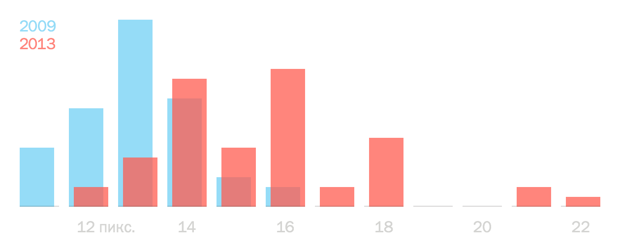
Source: Smashing Magazine. Section Average Font Size For Body Copy for 2009 and 2013 .
For websites and applications, sans serif fonts are more familiar, so I exclude antiqua. So, the portrait: a light grotesque large. I choose Helvetica Neue Light - let it be blown away for all the fonts of the Internet at first.
But what about the normal and bold outlines?
Need more restrictions
We decided to make two stylistic sets: contour and with solid fill. The first is suitable for light fonts. The second closes saturation from normal to super fat. The first is less practical, but it imposes more restrictions. So with him we will meet and solve more potential problems. Let's start with it.
The decision about the two sets is based on the long-standing idea of smart SVG icons, which can be adjusted to the saturation and font style with CSS. With common sense and experimentation we have driven excess fat from the idea, which could absorb an unpredictable amount of time, and focused on what we can do quickly.
Size, optics and clarity
Now you need to choose the size of the base square and circle. These figures will determine the optical weight of each icon. Optical weight is an interesting thing. If you put a square next to a height of 15 pixels and a circle of the same diameter, the circle will appear smaller. To compensate for the effect, the circle must be increased. For our square, the closest in optical weight will be a circle with a diameter of 17 pixels.
In general, in ideal conditions, the icons do not need any size. Ideal shapes increase and decrease without side effects. The ideal display environment has infinite resolution. Ideal icons in a perfect environment look clear in any size.
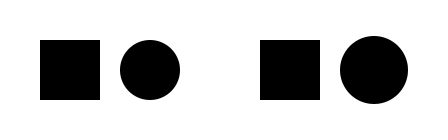
We are dealing with a screen - a low-resolution environment. Even on the retina, the experienced eye distinguishes pixels. In the graphic world, pixels like gravity affect everything that is visible to the eye. The shape on the screen looks clear if the boundaries of its contours coincide with the boundaries of the pixel grid of the screen. If the pixels are not taken into account, you get a mess (in the figure on the left). Therefore, you need to choose a base size - to know if there are enough pixels to create clear shapes.

It is worth mentioning that you can store different SVG-images for one icon and show each at the right time. Now this technology is used to obtain a detailed image on a large scale, and in a shallow one - easier. We plan to make several sizes of one icon optimized for a pixel grid and switch them depending on the size of the text side by side. Theoretically, something like a type hinting might come out.
Returning to the original problem: you need to find such a size of the base circle, so that it is tolerable for most of the popular sizes of the main text. I have three variables: the size of the text, the diameter of the circle and the thickness of the stroke of the letter. It was too lazy to sort through their relationships manually, and I washed down the instrument - it’s better to lose a day, then fly in five minutes. Placed on the page of the inscription from 13 to 24 pixels, next - the base circle, screwed the slider and began to compare.
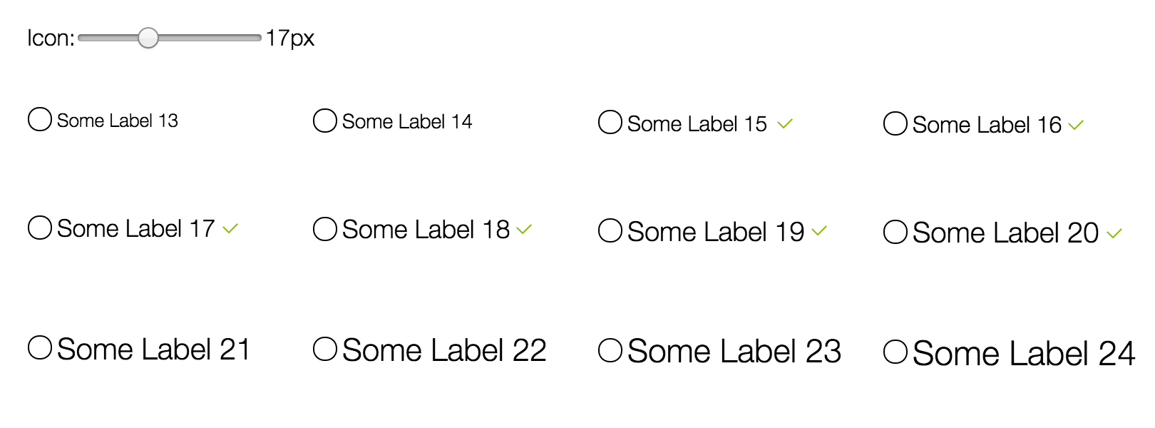
Won the circle size of 17 pixels. The contour circle passed my qualification for inscriptions from 15 to 20 pixels. Text outside this range looks either thinner than the outline of the icon, or thicker. Flooded circle, which has no limit on the thickness of the stroke, is suitable for the inscriptions from 13 to 22 pixels - then it becomes too small.
It's funny that in the script I set the number 17 as the default value for the diameter. To know right away that I would have guessed it would save time :-)
Now you can open Illustrator, think over the organization of the work file, invent an auxiliary grid, draw icons, doubt and redraw, re-choose clear images, clean the vector, monitor the optical weight, constantly checking how the fresh icon looks next to the text line. I'm afraid this narrow topic will not be interesting for everyone, so I’ll finish it here.
Thanks for attention!
The problems we are facing
At the time of writing the gem , I got rid of svgo in favor of the little-known svg_optimizer written in Ruby. Subsequently, this replacement caused the appearance of teeth when rendering icons — the optimizer over-diligently optimized the SVG structure and duplicated the icon code. As a result, instead of one, two were obtained, superimposed on each other.
After this puncture, svg_optimizer was replaced by svgo, and the svgo plug-in of mergePaths, spoiling the shape of the icons, was disabled.
We also wrapped the icon in an additional element, for which there are two reasons. The first problem was the reluctance of jQuery to change the classes of the SVG element (with vanilla JS, everything works fine). And the second problem is that the events directly on the SVG element are not caught - you need to listen to them on the wrapper.
From unsolvable at the moment: in Safari, the contours are slightly “chewed”.
Evil Icons
We immediately made icons on the principles of developing large products. Defined the target audience and competitive advantages. The project was originally intended as free and free. Despite this, we asked ourselves: if we took money for icons, then what should be good in them so that a person would agree to pay? This helped keep the mind in good shape and not be distracted by "just cool features."
We made a preliminary announcement and received the first feedback. Thanks to her, in just a couple of days, the icons have become noticeably better. Taking this opportunity, we thank everyone who pointed out the jambs and helped to correct them. Because of you guys, we love open source, thanks! :-)
Now it's time to share with habrazhiteli.
Introducing Evil Icons - a set of free SVG icons for websites and web applications. Included: Node.js package and Ruby gems for developers, .ai files and .sketch for designers.
evil-icons.io
Soon we will release additional styles, let us add our own icons to the set. We are thinking of making plug-ins for Grunt and Gulp, as well as connecting via CDN.
* * *
Icons develop along a path similar to fonts. Previously, drawing font was common, but today everyone uses other people's designs. Now even web designers are less likely to make icons on their own and increasingly use ready-made kits.
Undoubtedly, SVG has its own problems. However, it is very likely that the situation will be straightened. Browsers will increasingly support SVG, which is already visible. Screens with high pixel density will be more. In a couple of years, perhaps, monitors with even higher pixel density will appear. Those who work with raster will have to prepare assets in @ 2x— @ Nx and who knows how large N. will be.
Evil Icons is the most affordable way to upgrade to SVG right now in your next project.
Source: https://habr.com/ru/post/245583/
All Articles