Numbers, numbers and numerals
In the footsteps of Humralinich named after Rumkin we touch on the topic of the correct typographical design of numbers. The following topics came to mind, if something is suddenly forgotten - write in the comments, add to the article.
By the way, if the letter “OSF” appears in the font name at the end, it means that the font has minuscule digits ( o ld s tyle f igures) by default. “LF” usually means lustic numerals ( l ining f igures).
')
In addition, there are monospaced and proportional digits. The first are used for tabular set, and the second - for text.
Different types of numbers in Microsoft Constantia font
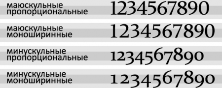
The picture shows a light gray font for the font and a darker one for the height of lowercase characters (x-height).
Appearance of monospaced and proportional digits in a tabular set
Here you can see the difference in the appearance of muscular, minuscule, proportional and monospaced numbers in the same font. The width of the numbers, depending on the font, can vary as a result of both the aprosy and the change in the width of the numbers.
Minusonic numbers are good for textual typing of art or other non-special editions, where numbers are found only occasionally in the text (in this sense, the “Lord of the Rings” mentioned is a good example of the correct use of minuscule numbers). Mayuskulnye digits are convenient for use in tables, publications with a large number of numbers in the text (stock analytics, financial reports, plans, and so on).
Various figures of figures are available only in some fonts, and even then they can only be used by software that supports OpenType technology (for example, Adobe design packages are capable of this). The fact is that minuscule and mauscoel digits do not have different codes in Unicode, since they simply represent different traces of the same characters. Therefore, Unicode support for displaying different figures figures is not enough.
Unfortunately, browsers are not yet able to select a drawing of numbers on demand from the designer. And even the current CSS3 draft does not imply this possibility. Therefore, the designer has to be content with the default font settings.
Of the “standard” web typographic fonts, only the Georgia Georgia font offers minuscule (proportional) numbers by default. All the rest — Impact, Lucida, Palatino, Tahoma, Times New Roman, Trebuchet, and Verdana, by default, use myo-muscular monospaced digits. Aloof is the amazing Arial, which in the usual and narrow outline has a narrow unit and all other digits of the same width. It turns out, "neither ours nor yours."
It is worth mentioning the really good new Microsoft fonts that come with Windows Vista. All of them, Constantia, Corbel, Calibri, Cambria, Candara and Consolas, have in their composition both minuscule and mayuscular patterns of numbers. Most surprised monospace Consolas, of course. By default, the mauskal numbers are in Calibri, Cambria and Consolas, and the minuscule figures are in Constantia, Corbel and Candara. If Apple starts supplying these fonts with the system (suddenly, someday), then web typographers will have at least some choice in the context of the figure of numbers.
The numbers denoting the year, the number (of documents, for example), and the make of machinery are not broken by spaces.
Right
The fractional part of the number does not beat off the space from the integer part: 6½, 1¾.
In classical typography, a fraction is typed through a fractional line (it has a gentler slope than the slash, which we all have on keyboards), the numerator is placed on the upper line of the font, and the denominator is on the bottom line. Fortunately, fonts and Unicode-enabled software give us a unique opportunity to use these rules.
- Minuscular and Muscular Numbers
- Integers and Decimal Frames
- Simple fractions
- Letter abbreviations (thousand, million, billion)
- Ranges
- Ordinal numbers and numerals in complex words
Minuscular and Muscular Numbers
The appearance of the Arabic numerals, to which we are accustomed, having a growth of capital letters and standing on the base line of the font, appeared only at the end of the XVIII century. Prior to this, numbers with hanging elements were generally accepted. Numbers of the first type are called “maximized” or “uppercase” (in English - lining or titling), and of the second type - “minus nibbled”, “lowercase” or “old-age” (in English - old-style, text, non-lining, lowercase, ranging, or hanging). If in the pre-revolutionary typography minuscule numbers were somehow used in the text set, in Soviet typography there was a rare incidence and rare title pages. Personally, I first saw the minuscule digits in a text set in 1991 in the “Lord of the Rings” dialed by the Garamon headset.By the way, if the letter “OSF” appears in the font name at the end, it means that the font has minuscule digits ( o ld s tyle f igures) by default. “LF” usually means lustic numerals ( l ining f igures).
')
In addition, there are monospaced and proportional digits. The first are used for tabular set, and the second - for text.
Different types of numbers in Microsoft Constantia font
The picture shows a light gray font for the font and a darker one for the height of lowercase characters (x-height).
Appearance of monospaced and proportional digits in a tabular set
Here you can see the difference in the appearance of muscular, minuscule, proportional and monospaced numbers in the same font. The width of the numbers, depending on the font, can vary as a result of both the aprosy and the change in the width of the numbers.
Minusonic numbers are good for textual typing of art or other non-special editions, where numbers are found only occasionally in the text (in this sense, the “Lord of the Rings” mentioned is a good example of the correct use of minuscule numbers). Mayuskulnye digits are convenient for use in tables, publications with a large number of numbers in the text (stock analytics, financial reports, plans, and so on).
Various figures of figures are available only in some fonts, and even then they can only be used by software that supports OpenType technology (for example, Adobe design packages are capable of this). The fact is that minuscule and mauscoel digits do not have different codes in Unicode, since they simply represent different traces of the same characters. Therefore, Unicode support for displaying different figures figures is not enough.
Minuscular and Muscular Numbers in Web Typography
Unfortunately, browsers are not yet able to select a drawing of numbers on demand from the designer. And even the current CSS3 draft does not imply this possibility. Therefore, the designer has to be content with the default font settings.
Of the “standard” web typographic fonts, only the Georgia Georgia font offers minuscule (proportional) numbers by default. All the rest — Impact, Lucida, Palatino, Tahoma, Times New Roman, Trebuchet, and Verdana, by default, use myo-muscular monospaced digits. Aloof is the amazing Arial, which in the usual and narrow outline has a narrow unit and all other digits of the same width. It turns out, "neither ours nor yours."
It is worth mentioning the really good new Microsoft fonts that come with Windows Vista. All of them, Constantia, Corbel, Calibri, Cambria, Candara and Consolas, have in their composition both minuscule and mayuscular patterns of numbers. Most surprised monospace Consolas, of course. By default, the mauskal numbers are in Calibri, Cambria and Consolas, and the minuscule figures are in Constantia, Corbel and Candara. If Apple starts supplying these fonts with the system (suddenly, someday), then web typographers will have at least some choice in the context of the figure of numbers.
Integers and Decimal Frames
- The integer part of multi-digit numbers (4 or more characters) when typing can be divided into groups of three digits, from right to left. The fractional part of the number (when writing in decimal) is also divided into groups, but from left to right.
- The breaking of the digits is done on thin space , and if this is not possible, then on the word word gap.
- To break a number into two lines is impossible. When making web pages, for this you need to use a construction
…, or aspanwith some class, in the attributes of which thewhite-space: nowrap;property is specifiedwhite-space: nowrap;. - A comma is used to separate the integer and fractional parts.
- To indicate the sign of a number, the digital minus "-" (& minus;) is used, and not the hyphen "-" or the dash "-".
- In the case of an exponential record, the numbers of the mantissa and the base are not separated by an asterisk "*", but by the central point "·" (), without beating with spurs.
The numbers denoting the year, the number (of documents, for example), and the make of machinery are not broken by spaces.
Right
- 2 480 965,312 4
- GOST 20289
- 1945
- VAZ 21110
- −273,15 ° C
- 4.5 · 10⁷
- 2480965,3124
- 2'480'965,3124
- 2.480.965,3124
- 5108
- 98 123.45
- 1,703 year
- -6 ° C
- 3.2 * 10⁹
Simple fractions
Let me remind you that a simple (ordinary, arithmetic) fraction is a number composed of an integer number of units of one. For example, ½ or ¾. A heavy typewritten legacy is also reflected in the computer set of simple fractions, which are usually typed in ordinary numbers through a slash: “1/2”, “3/4”.The fractional part of the number does not beat off the space from the integer part: 6½, 1¾.
In classical typography, a fraction is typed through a fractional line (it has a gentler slope than the slash, which we all have on keyboards), the numerator is placed on the upper line of the font, and the denominator is on the bottom line. Fortunately, fonts and Unicode-enabled software give us a unique opportunity to use these rules.
- HTML mnemonics can be used for a set of simple fractions:
¼ - & frac14; or & # 188;
½ - & frac12; or & # 189;
¾ - & frac34; or & # 190;
They look pretty decent on the screen. - Simple fractions up to ⅞ are in the Unicode table, but do not have mnemonics in HTML. Such fractions still look pretty decent on the screen.
Sign Hex Dec Sign Hex Dec ⅓ & # x2153; & # 8531; ⅙ & # x2159; & # 8537; ⅔ & # x2154; & # 8532; ⅚ & # x215A; & # 8538; ⅕ & # x2155; & # 8533; ⅛ & # x215B; & # 8539; ⅖ & # x2156; & # 8534; ⅜ & # x215C; & # 8540; ⅗ & # x2157; & # 8535; ⅝ & # x215D; & # 8541; ⅘ & # x2158; & # 8536; ⅞ & # x215E; & # 8542; - For a set of more complex fractions, you can use the set of upper and lower digits Unicode, as well as the slash character "⁄", U + 2044. Do not confuse a slash with a slash "/", U + 002F, - these are two different signs!
⁄ - & # x2044; or & # 8260;Upper digits Bottom numbers Sign Hex Dec Sign Hex Dec ⁰ & # x2070; & # 8304; ₀ & # x2080; & # 8320; ¹ & # x00B9; & # 185; ₁ & # x2081; & # 8321; ² & # x00B2; & # 178; ₂ & # x2082; & # 8322; ³ & # x00B3; & # 179; ₃ & # x2083; & # 8323; ⁴ & # x2074; & # 8308; ₄ & # x2084; & # 8324; ⁵ & # x2075; & # 8309; ₅ & # x2085; & # 8325; ⁶ & # x2076; & # 8310; ₆ & # x2086; & # 8326; ⁷ & # x2077; & # 8311; ₇ & # x2087; & # 8327; ⁸ & # x2078; & # 8312; ₈ & # x2088; & # 8328; ⁹ & # x2079; & # 8313; ₉ & # x2089; & # 8329;
Please note that the “top zero”, the degree sign “°” (U + 00B0) and the sign designation of the ordinal number “º” (U + 00BA) are different symbols!
Using the specified characters, you can type something like. Only it is necessary to monitor the font size, otherwise the result on the screen can be very illegible. :) Plus the use of Unicode characters - regardless of the style sheet, the layout will definitely not break. - Finally, when none of the options suits (and the latter does not suit readability in small size), you can use the HTML elements
supandsub(without forgetting to pre -set their styles normally ). Fraction bar is still used correctly, & # 8260 ;. The result with the correct design of the style sheet looks better, but Habr cuts the<sub></sub>tags, so the demonstration does not work.
Letter abbreviations (thousand, million, billion)
- The word "thousand" is reduced to "thousand" (with a dot!), And the number usually beats off the subsequent reduction with a fine spice: "250 thousand rubles." The abbreviation can not be torn off by the transfer of the line from the previous number.
- The words "million", "billion" and "trillion" are reduced to "million", "billion" and "trillion" (no point!), And the number usually bounces off the subsequent reduction with a fine spice: "6 trillion US dollars." The abbreviation can not be torn off by the transfer of the line from the previous number.
- When writing large round numbers, it is recommended to use abbreviations, for example, “5 billion” instead of “5 000 000 000”.
Ranges
To denote the interval of values, use either a dash "-" (& mdash;) or an ellipsis "..." (& hellip;).- It is recommended to put a dash in case of a verbal record of the boundaries of the interval: “fifteen to twenty centimeters long” A dash at the same time bounces an inseparable space from the preceding number and an interword word from the subsequent one. Consider that if an interval is used in the sense of “approximately, or-or,” a hyphen is used: “I drank seven or eight glasses.”
- Also, a dash is put when a digital recording of numbers is used and both numbers are positive: “15–20 kilometers long”. Dash while not fighting off the numbers.
- If one or both numbers are negative, then it is recommended to use dots: “tomorrow they promise −6 ... + 2 ° C”, “we have up to −25 ... −30 degrees”.
- If the boundaries of the interval of values are large numbers in a digital record, then it is necessary to keep the zeros in the record of the lower limit: “15,000–20,000 kg”, and not “15–20,000 kg”.
- When verbal digital recording of large numbers, the abbreviation for the first limit is recommended to be omitted: “15–20 thousand kg”, and not “15 thousand - 20 thousand kg”.
Ordinal numbers and numerals in complex words
- The case ending for an ordinal number should be one-letter if the last letter of the number is preceded by a vowel sound, and two-letter if it is a consonant. For example, "5th", "5th", "5th", "5th", "5th", "20th", but not "5th", "5th "," 5th "," 5th "," 20th. "
- If two numerals go through the dash in succession, then the end is increased only in the last number, if the endings match, and in each of the numbers, if the endings do not match: “50s – 60s”, “in 20s – 30s” but "in the 20th — 30th sectors".
- If the words preceding the first in the range of a numeral control only it, and do not control the second one, then the endings are increased also by each of the numerals: “in the early 1970s – 1980s”.
- The endings for numbers in dates are recommended not to be increased, if the month’s name or the word “year” immediately follow the number, and to increase otherwise: “in 1991”, “June 22, 1941”, but “in June, the number 22 "," The year 1991 "," the 22nd of March ".
- In verbal digital form, the numeral is shortened entirely: "150th anniversary", and not "150th anniversary", "20 centimeter", and not "20 centimeter".
- Reduction of words such as “so-and-percent” occurs according to the principle “12% solution”, “8% chance of success” (but not “12% solution” or “12% solution”). The percent sign in this case does not bounce off the number, in contrast to the usual writing of a number with a percent sign.
additional literature
- A.E. Milchin, L.K. Cheltsova, “Directory of the publisher and author. Editorial and publishing design edition "
- Robert Bringhurst, "Typography of Typography"
- Unicode subscripts and superscripts , Number Forms on English Wikipedia
Source: https://habr.com/ru/post/24544/
All Articles