Increase conversion Landing Page
Surely you have repeatedly encountered many landing pages and are tired of their aggressive behavior. Not having time to read the title from you immediately begin to demand contacts. And if initially this technique still gave less or less good results, then every day it becomes more and more ineffective.
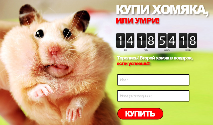
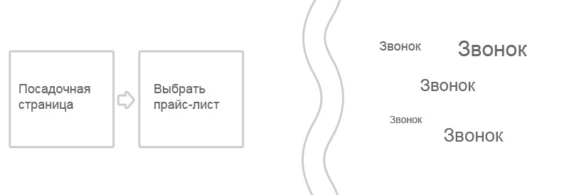
Visualization of typical aggression on the part of most landing pages
To understand the reasons for the deterioration of conversion with this approach, you need to go back a little and understand why these forms appeared at all.
')
And everything happened quite naturally. Most of the sites offered quite complex communication interfaces that required no long training and patience from users. Ultimately, the evolution of interfaces has reduced everything to a simple form: the name and phone number (or even just the phone number), filling in which users solved the communication tasks on the site and then they were already processed by the manager over the phone.
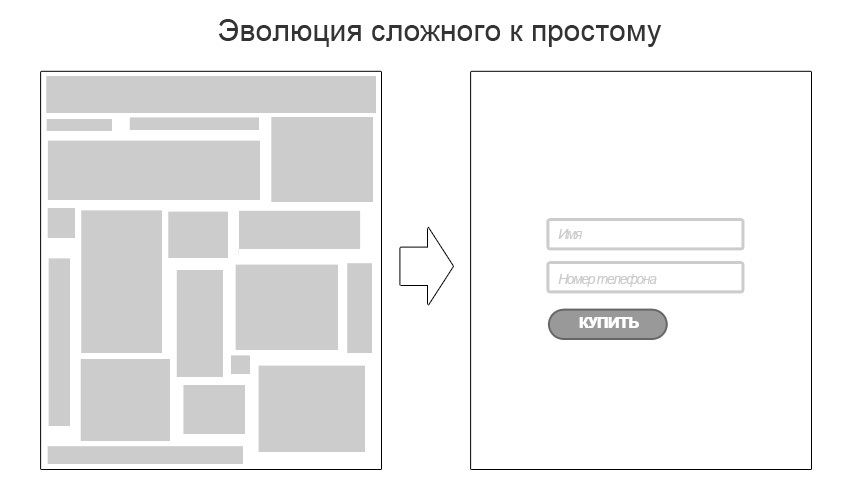
The obvious simplification of interfaces has had a positive effect on conversions and, like all good things, quickly spread across the Internet, becoming a widespread trend.
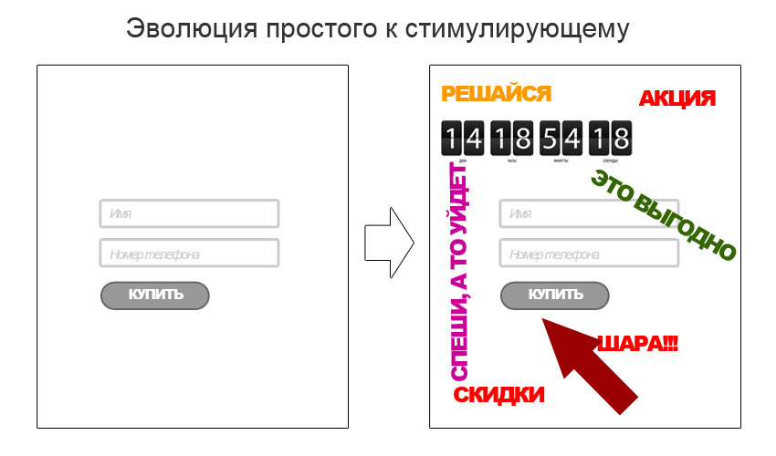
And all would be nothing, but the natural desire of people to get more began to play a cruel joke with a simple form of contact. So there were promotions, super offers, discounts and timers restricting the action of all of the above and pointing to the only right action - fill out the formor die .
In most cases, this talent of the main mass of landing-paging makers ends, from which we have thousands of “landings” made with a carbon paper, differing only in the size of the discount or the time of the action of the contrived action.
In detail about the problem of template solutions that do not take into account the needs of the target audience, I already wrote in my previous article: To everyone on the Landing Page. Sore and recommend it to read before continuing to read this article and even more so - try to implement the technique described below. Since the use of even very good solutions in bad landings will not give a significant improvement in conversion.
So, in the process of evolution of interfaces, people came to a simple request form, which gives a greater conversion than previous known solutions. Developers began to massively apply this technology and improve the conversion of artificial stimulants, gradually shifting the focus from content to targeted action. At some point, this displacement finally crowded out the content, leaving only the focus on the target action. This moment I think is a turning point.
If we draw an analogy from real life, now the process of dating a girl looks like this:
Obviously, this dialogue is absurd and the guy would definitely get at least a slap in the face. So why are you sure that most landing pages that work exactly the same way should be effective?
Demanding contacts without prior acquaintance, we only irritate the visitor. And as before, such solutions work well only for balloon seekers and customers who are really on fire. The latter is usually indifferent to the rest of the tinsel and they will buy, even if you have to look for your phone in the whois domain. But there are few of these.
Anticipating the cries of “But it works the same!”, I want to remind you that conversion is not only tsiferki in analytics. It is easy to specify in the portfolio after the next landing page "We have reached a conversion of 40%." And how many of them have become real customers? How many will be back? And how much business has lost money, distributing on the right and left discounts and gifts? This is usually silent.
Immediately upset - the magic pills do not happen, and my head still have to think.
In the process of long-term experiments, we came to the conclusion that before asking a person to perform the necessary action we need to communicate with him. In the context of the interface with this task well-known to all well-known wizard.
Thus, when a tourist agency’s landing page is clicked on the “Get current prices” button, the user sees not a form for entering a phone number, but a “virtual consultant” who asks him some clarifying questions: When do you want to fly out? For how many nights? Who will go?
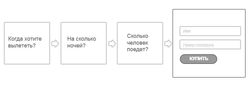
And only having received answers to these questions offers to leave contact details, explaining what will happen next.
Such an approach, together with the content-oriented content of the landing, gives a significantly better result, without causing a feeling of aggression. And there is an explanation.
People, even wanting to get a product or service, are mostly rather inert and not in a hurry to leave their contacts. Not everyone likes to talk on the phone, not everyone has time, not everyone knows what they want. They use the Internet to solve their questions and it is quite natural to first satisfy their needs and only then ask for the data for communication.
It is exactly the solution of needs that the master is engaged in (naturally, along with the rest of the landing page content). By asking the right questions, we help the person specify his intentions and thereby push him to perform the target action.
In addition to concretization of intentions, this approach works on an emotional level, having the client to empathy and trust.
In one form or another, this solution is applicable to most niches and is applied by us in such areas as “tourist services”, “plastic windows”, “plastic pipes” and a number of others.
The described example with the use of the wizard in the pop-up is only one of the possible interface solutions and it is not necessary to use only one of them. It is important to capture the very value of the approach: to help a person specify his intentions and create a feeling of trust.
For example, when designing a landing pipe for plastic pipes, we determined the key effect of the intention to obtain a price list of products. At that time, when all competitors tried to get a price immediately demanded contacts, we went further and satisfied the need of visitors by sending them to a page where you can immediately download the necessary price lists. On this page, together with the prices, we placed a special request form, but, as expected, the conversion on it was rather low, which cannot be said about price downloads.
The magic was different. The number of calls after downloading price lists went up sharply in comparison with the previous version of the interface, and their quality has increased significantly. If earlier, the manager had to communicate with the client and then still send him the price list, in this case the communication was already more constructive. Thus, we have reduced the load on the call center and increased the common denominator of conversion. Although not the traditional way.
The described interface solution is only a tool and requires careful attitude. I do not appeal to the general application of masters and similar solutions anywhere and how, but just pointing out that apart from the hard and ignoring the needs of visitors, the requirement to immediately leave contacts has other, softer and more effective solutions.
Stop producing clones. Learn to think about visitors and finally solve their problems. And in gratitude, they will surely fulfill your target action and when the manager calls them, they will meet his call with a smile, rather than demanding immediately and whatever they bring as a gift to this chic “hamster” whom they have so generously promised on the landing page.
Visualization of typical aggression on the part of most landing pages
What happened?
To understand the reasons for the deterioration of conversion with this approach, you need to go back a little and understand why these forms appeared at all.
')
And everything happened quite naturally. Most of the sites offered quite complex communication interfaces that required no long training and patience from users. Ultimately, the evolution of interfaces has reduced everything to a simple form: the name and phone number (or even just the phone number), filling in which users solved the communication tasks on the site and then they were already processed by the manager over the phone.
The obvious simplification of interfaces has had a positive effect on conversions and, like all good things, quickly spread across the Internet, becoming a widespread trend.
And all would be nothing, but the natural desire of people to get more began to play a cruel joke with a simple form of contact. So there were promotions, super offers, discounts and timers restricting the action of all of the above and pointing to the only right action - fill out the form
In most cases, this talent of the main mass of landing-paging makers ends, from which we have thousands of “landings” made with a carbon paper, differing only in the size of the discount or the time of the action of the contrived action.
So what's the deal?
In detail about the problem of template solutions that do not take into account the needs of the target audience, I already wrote in my previous article: To everyone on the Landing Page. Sore and recommend it to read before continuing to read this article and even more so - try to implement the technique described below. Since the use of even very good solutions in bad landings will not give a significant improvement in conversion.
So, in the process of evolution of interfaces, people came to a simple request form, which gives a greater conversion than previous known solutions. Developers began to massively apply this technology and improve the conversion of artificial stimulants, gradually shifting the focus from content to targeted action. At some point, this displacement finally crowded out the content, leaving only the focus on the target action. This moment I think is a turning point.
If we draw an analogy from real life, now the process of dating a girl looks like this:
"Hello. Get through with me! My offer is limited. Only 2 girls per day. Look how beautifully dressed I am. I am very technical. Do not waste my time. Sleep with me! ”
Obviously, this dialogue is absurd and the guy would definitely get at least a slap in the face. So why are you sure that most landing pages that work exactly the same way should be effective?
Demanding contacts without prior acquaintance, we only irritate the visitor. And as before, such solutions work well only for balloon seekers and customers who are really on fire. The latter is usually indifferent to the rest of the tinsel and they will buy, even if you have to look for your phone in the whois domain. But there are few of these.
Anticipating the cries of “But it works the same!”, I want to remind you that conversion is not only tsiferki in analytics. It is easy to specify in the portfolio after the next landing page "We have reached a conversion of 40%." And how many of them have become real customers? How many will be back? And how much business has lost money, distributing on the right and left discounts and gifts? This is usually silent.
Magic pill
Immediately upset - the magic pills do not happen, and my head still have to think.
In the process of long-term experiments, we came to the conclusion that before asking a person to perform the necessary action we need to communicate with him. In the context of the interface with this task well-known to all well-known wizard.
Thus, when a tourist agency’s landing page is clicked on the “Get current prices” button, the user sees not a form for entering a phone number, but a “virtual consultant” who asks him some clarifying questions: When do you want to fly out? For how many nights? Who will go?
And only having received answers to these questions offers to leave contact details, explaining what will happen next.
Such an approach, together with the content-oriented content of the landing, gives a significantly better result, without causing a feeling of aggression. And there is an explanation.
People, even wanting to get a product or service, are mostly rather inert and not in a hurry to leave their contacts. Not everyone likes to talk on the phone, not everyone has time, not everyone knows what they want. They use the Internet to solve their questions and it is quite natural to first satisfy their needs and only then ask for the data for communication.
It is exactly the solution of needs that the master is engaged in (naturally, along with the rest of the landing page content). By asking the right questions, we help the person specify his intentions and thereby push him to perform the target action.
In addition to concretization of intentions, this approach works on an emotional level, having the client to empathy and trust.
In one form or another, this solution is applicable to most niches and is applied by us in such areas as “tourist services”, “plastic windows”, “plastic pipes” and a number of others.
The described example with the use of the wizard in the pop-up is only one of the possible interface solutions and it is not necessary to use only one of them. It is important to capture the very value of the approach: to help a person specify his intentions and create a feeling of trust.
For example, when designing a landing pipe for plastic pipes, we determined the key effect of the intention to obtain a price list of products. At that time, when all competitors tried to get a price immediately demanded contacts, we went further and satisfied the need of visitors by sending them to a page where you can immediately download the necessary price lists. On this page, together with the prices, we placed a special request form, but, as expected, the conversion on it was rather low, which cannot be said about price downloads.
The magic was different. The number of calls after downloading price lists went up sharply in comparison with the previous version of the interface, and their quality has increased significantly. If earlier, the manager had to communicate with the client and then still send him the price list, in this case the communication was already more constructive. Thus, we have reduced the load on the call center and increased the common denominator of conversion. Although not the traditional way.
Disclaimer
The described interface solution is only a tool and requires careful attitude. I do not appeal to the general application of masters and similar solutions anywhere and how, but just pointing out that apart from the hard and ignoring the needs of visitors, the requirement to immediately leave contacts has other, softer and more effective solutions.
Stop producing clones. Learn to think about visitors and finally solve their problems. And in gratitude, they will surely fulfill your target action and when the manager calls them, they will meet his call with a smile, rather than demanding immediately and whatever they bring as a gift to this chic “hamster” whom they have so generously promised on the landing page.
Source: https://habr.com/ru/post/244953/
All Articles