Future [absence] of Yandex browser interfaces
Yandex has just taken an important step, which we hope brings us closer to the future of browsers and how the interfaces through which we interact with the Internet will look. We have presented a new alpha version of Yandex Browser, which is essentially a new approach to browser interfaces.
My name is Gena Lokhtin. In Yandex, I am responsible for designing the interface of the new Browser, and especially for Habr, I now want to tell why we came to such a new interface and what difficulties we managed to overcome along the way. Inside, for the new browser, we used the code name “Cousteau” (I’ll explain why below). So sometimes I will use it in the text.
')
It all started back in 2012 with a question that many browser authors ask themselves: how to make the interface take up less space and leave it to sites? The question seems simple. And the first ideas of the answers to it are also simple. Someone removes tabs in the window title, someone - extension icons to the address bar.
But no one has yet proposed such a radical solution as we. To come to him and solve all the problems that it poses, it took several years. After all, this is not only the removal of frames. It is necessary that the browser while it was convenient to use. Inside “Cousteau” there are a lot of new interface solutions that we have been working on for a long time and who have been testing for a long time. So.

I'll start with a couple of words about the title. The detail of the first browser that catches the eye is animated backgrounds with looped videos. At the very first of them were bushes swaying in the wind. And that is how everything inside and began to first call the new product. However, as our original idea developed, improved and changed, we felt hurt that the name reflects only the most superficial glance. Therefore, we came up with a new name, consonant with the past, but better reflecting the inner meaning of what we did. And called the project Cousteau - in honor of the famous scientist, researcher and traveler. The browser is a window into the world, the framework of which we decided not just to push apart, but to erase.
Over the past decades, the Internet has changed dramatically. The number of domains grew exponentially, and the sites themselves turned from simple html-pages with text, hyperlinks and rare pictures into full-fledged web applications with sophisticated infrastructure. Sites now are not only pages with information, but also graphic editors, office suites, music players, social networks, online cinemas — such programs are becoming cramped in modern browsers.
And what happened to the browser for all this time? There are tabs, largely simplified work in the network. A universal address-search line was invented, proving that search is an integral part of the Internet. In all other respects, a modern browser is still the same program for loading pages with a massive gray interface that dominates content.
The creators of browsers have tried to make the interface less noticeable before. But all the steps were taken gradually and there were no big changes in this program. Safari has recently become transparent, but as a decorator, the interface is still gray. Some examples of “hidden interfaces” can be found among video players. Remember what Quicktime.app looks like when it plays a video.

Or iA Writer text editor:

Nobody tried to make the browser interface invisible its most important property. The browser has become essentially the main program in the operating system. Many users do not leave it at all most of the time, solving all their tasks by means of web applications. It is on the use of sites as applications that have focused in Opera, creating Coast. But application sites are the reality of a desktop with which no one has yet reconciled it.
So maybe it's time to look at a familiar instrument differently? Browser as a program for viewing web pages would be good to go into the past.
It was these thoughts that ultimately led our team to abandon the usual forms and create a new Yandex Browser, combining a minimalistic interface and the recognition of sites as applications. But it didn’t happen right away.
Roma Voronezh has long paid attention to how sites look in modern browsers - striped.
This is the browser into which the attacker downloaded Facebook:

But in fact the browser is the window behind which we see the Internet. Remember the old massive windows with a wide frame, and then look at the modern ones.

The first thing that may come to mind when searching for an answer to this question is the idea to completely abandon any browser elements when viewing a site. The browser interface might become visible when essential. Similarly, progress has treated cell phones, depriving them of an analog keyboard in favor of the screen.
Imagine a window without frames and panels, the entire available area of which would be reserved for the content of the page, and the browser interface would arise if necessary (for example, when the mouse cursor approaches the screen border). Once upon a time we imagined it like this:

Such a radical idea did not last very long. In any case, the browser window should contain system elements for closing and minimizing. Placing such buttons on top of the site does not make sense because it will spoil the appearance of the page, and the buttons themselves will be difficult to find visually. If you dig deeper, it turns out that the main menu button should not be hidden. We would be happy to hide the “sandwich” in the context menu or come up with a pop-up option, but our experience in researching user behavior has shown that such a button simply has to be not only in the same place, but always in plain sight. Otherwise, there is a high risk that most users simply never know about the opportunities that lie behind it. Add to this the title of the site, which is now hiding all the other tools for working with the page. In general, the minimum panel in the browser header is still needed.
Browser header is not the only thing that should have been visible. The idea of tabs was so good that it is almost impossible to abandon them now. And we tried. That's just each of our options as a result turned out to be another reincarnation of all the same tabs. More details and some examples of earlier options can be found below, but now we will show one of the first pictures of the new browser:

It remains to understand how to enter the necessary interface into the new browser, but at the same time avoid the return of gray panels.
The very idea of transparency has existed in one form or another for many years. Remember the Aero interface in Windows. It would seem a simple and obvious solution. But using it, we face a number of difficulties, which, perhaps, did not allow all browser creators to turn gray panels into transparent panels.
Implementing true transparency was not difficult. We take the content of the page, hiding behind the interface, and impose on it several effects, including blur according to Gauss.

When creating a new Yandex Browser, we started from the very beginning from the idea that content is above all, so no interface should hang over it. And transparent panels are all the same transparent panels. Of course, they are visually not a rigid structure of the browser itself and allow to blur the boundaries between the site and the interface. But the interface does not disappear from this.

Above the cap had to work. The browser should be part of the page on sensations, painted in the average color of the pixels closest to itself and complementing it with a slight shaded reflection. The border between the site and the interface has disappeared.

It was hard to figure out exactly how transparency in the header should work if it is at the very beginning of the page. We refused to overlay the option on top of the first lines of the site right away - the browser should not overlap the page content. The next attempt was the idea to take the colors of the pixels nearest to the cap and to simulate transparency on this base. It turned out like this:

Not the worst option, but it is striking that the native interface of the Twitter service was visually distorted. Began to look for other options. For example, they took the color not of the nearest pixels, but the background of the page. Here's how it looked on Facebook:

Without distortion of content, but still looks artificial. Perhaps, we will miss our further torment with the selection of colors and their combinations and immediately proceed to the current version. Already, probably, no one will remember when the idea was proposed to use not the colors of pixels, but to take full reflections of the content nearest to the header. A bit of magic and this is the current version:
Resources with background video look especially impressive:
We will not call it the final version. The work on browser transparency is still ongoing, and the end result may be quite different. We also decided to give webmasters a special tool with which you can control the color and transparency of the panels. For example, the beta version of our Maps now looks like this:

When you download Cousteau, you can still look at tigran.ru/panorama , where tigran , one of the heads of the Yandex directions, puts out panoramas taken from the air. You can also try the transparency mode on your website. For this, we have prepared a special API .
In almost all modern browsers tabs look the same. Favicons, page headers and a massive add-on around it all. The main and most noticeable in this situation is the browser, not sites. Add to this that the tabs are still simply a collection of documents not related to each other, instead of impersonating running web applications and simplifying the user to work with them.

In an attempt to get rid of the unnecessary interface, but at the same time to maintain and develop the ability to switch between sites, we turned to the experience of the Board. If you have seen Yandex.Browser at least once, then you know that the Board is such visual bookmarks that simplify access to your favorite and frequently visited sites. There is nothing superfluous around - only links to sites that are designed to quickly find the desired resource with your eyes: in the form of logos, and not small screenshots of sites.

A few sketches and here our tabs began to look the same as the widgets in the scoreboard. And if the sites in the tabs and in the Board began to look the same, then why not combine these entities into one? So did. At the same time, we moved them to the bottom of the screen in the image of a panel of running applications in Windows or Mac OS X. As a result, at some point the tabs looked like this:

After some time, we moved the button for creating a new tab to the very corner of the window. We wanted to finally save the tabs from the interface surplus at least next to them.

Here are just the very first studies on living people showed that the button in the corner is much harder to find than her, but next to the tabs. I had to go back to the previous version. Where the big problem was that it was very difficult to distinguish open tabs from undiscovered ones (that is, from the widgets of the former Scoreboard). Whatever labels we invent, volunteer researchers continued to experience discomfort. Add to this that the Tablo widgets, which formed the basis for the appearance of the new tabs, could not be called rather miniature from the beginning. These drawbacks ultimately led us to the decision to abandon the union of the scoreboard and tabs. The scoreboard is back in almost the same place, and the tabs began to decrease in size.

Now our tabs look like this:

Pay attention to the three points at the Kinopoks tab. This is a grouping indicator. If sites are not just pages, but web applications, then why not add grouping by domain so that users can clearly see services running on the tab bar, rather than a mess of documents. Just click on the group to open it. At the same time, the pages of one site are presented in the same color in order not only to simplify the visual search, but also to preserve the logic of working with applications.

Yandex has a huge search knowledge, which could find its place in the new Yandex Browser. We could collect this information and offer it in a convenient format to the user, as an extended view of the data on the page currently being viewed. And work on this began before the start of designing a new browser. By some miracle, even a photograph with a sketch on the wall in the room was preserved:

This sketch, of course, was embodied in the prototype, which we called the Phenomenon:

And not even in one. Here is a particularly original version using the bookmark menu:

And who knows what else exotic options we could see if it were not for the idea to create a new transparent browser. The transparent thin interface did not leave us any options, except for how to add a new layer to the browser on top of the viewed site. So, the inside of it appeared - a special mode that contains not only the Smart String, the Scoreboard and everything else, from which we cleared the interface, but also the legacy of the Phenomenon in the form of recommendations and extensive information on the site. You can get to the wrong side by clicking on the page title:

By the way, please note that the screenshot above shows the headers from two different operating systems. We wanted our browser to look the same even on different systems.
The wrong side is not a new window, but a layer on top of an open page. In this mode, you can perform familiar actions with the page, for example, edit its address, add to bookmarks or tablo. In addition, in the lower part of the wrong side contains extensive information related to the site. For example, links to similar resources, a better offer for the product or a map with the address.

Work on the wrong side continues. There will be more types of contextual information in the future, and the regime itself may change.
The wrong side is not our only direction in the framework of integration with search technologies. You already know that our Smart String has a number of features. For example, he can answer simple questions right at the tips. Hints are, in general, a very convenient way to interact with the user, who receives the necessary information without directly going to the search service. Work on search answers in the tips has been going on since we prepared the very first version of Yandex Browser. For example, the earliest sketch:

In the current alpha version of the new Yandex. Browser, you can notice the appearance of rich answers that already contain not only text or icons, but fragments of text, pictures, and quick links to resource sub-pages.

In the plans for the near future we have other innovations. For example, the ability to get extended information through a simple word selection on the page. Here is one example:

And in conclusion we will briefly tell about, perhaps, the most spectacular feature of the alpha.
New tab in Yandex. Browser before it could be personalized with backgrounds. But the static does not compare with the warm tube video, which is now supported in the browser. Lively landscape, a fragment of beautiful local nature, laid in a 15-second loop. Words can’t convey - watch the video:
By the selection of videos, we approached seriously. Our design team shot them in various parts of Russia: on Lake Baikal, in the Sayan Mountains, in the Elbrus region. If desired, the animation can always be turned off.

Today we have shared our thoughts and early builds with you, which can be downloaded on browser.yandex.ru/future . I would like to repeat once again that this is only the alpha (but it can be safely installed in parallel with the current version of Yandex. Browser). Your feedback can strongly influence her fate and help us. For example, we are very interested to know the opinion of the Habrahabr audience about the idea of making a special “developer mode” in the new browser, the inclusion of which would allow some familiar elements to be returned (alternatively, displaying the site address in the header). We have a lot of work ahead, and the new browser itself should not be expected before next year.

Share your feedback and ideas with us?
My name is Gena Lokhtin. In Yandex, I am responsible for designing the interface of the new Browser, and especially for Habr, I now want to tell why we came to such a new interface and what difficulties we managed to overcome along the way. Inside, for the new browser, we used the code name “Cousteau” (I’ll explain why below). So sometimes I will use it in the text.
')
It all started back in 2012 with a question that many browser authors ask themselves: how to make the interface take up less space and leave it to sites? The question seems simple. And the first ideas of the answers to it are also simple. Someone removes tabs in the window title, someone - extension icons to the address bar.
But no one has yet proposed such a radical solution as we. To come to him and solve all the problems that it poses, it took several years. After all, this is not only the removal of frames. It is necessary that the browser while it was convenient to use. Inside “Cousteau” there are a lot of new interface solutions that we have been working on for a long time and who have been testing for a long time. So.
I'll start with a couple of words about the title. The detail of the first browser that catches the eye is animated backgrounds with looped videos. At the very first of them were bushes swaying in the wind. And that is how everything inside and began to first call the new product. However, as our original idea developed, improved and changed, we felt hurt that the name reflects only the most superficial glance. Therefore, we came up with a new name, consonant with the past, but better reflecting the inner meaning of what we did. And called the project Cousteau - in honor of the famous scientist, researcher and traveler. The browser is a window into the world, the framework of which we decided not just to push apart, but to erase.
Over the past decades, the Internet has changed dramatically. The number of domains grew exponentially, and the sites themselves turned from simple html-pages with text, hyperlinks and rare pictures into full-fledged web applications with sophisticated infrastructure. Sites now are not only pages with information, but also graphic editors, office suites, music players, social networks, online cinemas — such programs are becoming cramped in modern browsers.
And what happened to the browser for all this time? There are tabs, largely simplified work in the network. A universal address-search line was invented, proving that search is an integral part of the Internet. In all other respects, a modern browser is still the same program for loading pages with a massive gray interface that dominates content.
The creators of browsers have tried to make the interface less noticeable before. But all the steps were taken gradually and there were no big changes in this program. Safari has recently become transparent, but as a decorator, the interface is still gray. Some examples of “hidden interfaces” can be found among video players. Remember what Quicktime.app looks like when it plays a video.
Or iA Writer text editor:
Nobody tried to make the browser interface invisible its most important property. The browser has become essentially the main program in the operating system. Many users do not leave it at all most of the time, solving all their tasks by means of web applications. It is on the use of sites as applications that have focused in Opera, creating Coast. But application sites are the reality of a desktop with which no one has yet reconciled it.
So maybe it's time to look at a familiar instrument differently? Browser as a program for viewing web pages would be good to go into the past.
It was these thoughts that ultimately led our team to abandon the usual forms and create a new Yandex Browser, combining a minimalistic interface and the recognition of sites as applications. But it didn’t happen right away.
First idea
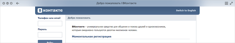
Roma Voronezh has long paid attention to how sites look in modern browsers - striped.
This is the browser into which the attacker downloaded Facebook:
But in fact the browser is the window behind which we see the Internet. Remember the old massive windows with a wide frame, and then look at the modern ones.
The first thing that may come to mind when searching for an answer to this question is the idea to completely abandon any browser elements when viewing a site. The browser interface might become visible when essential. Similarly, progress has treated cell phones, depriving them of an analog keyboard in favor of the screen.
Imagine a window without frames and panels, the entire available area of which would be reserved for the content of the page, and the browser interface would arise if necessary (for example, when the mouse cursor approaches the screen border). Once upon a time we imagined it like this:
Such a radical idea did not last very long. In any case, the browser window should contain system elements for closing and minimizing. Placing such buttons on top of the site does not make sense because it will spoil the appearance of the page, and the buttons themselves will be difficult to find visually. If you dig deeper, it turns out that the main menu button should not be hidden. We would be happy to hide the “sandwich” in the context menu or come up with a pop-up option, but our experience in researching user behavior has shown that such a button simply has to be not only in the same place, but always in plain sight. Otherwise, there is a high risk that most users simply never know about the opportunities that lie behind it. Add to this the title of the site, which is now hiding all the other tools for working with the page. In general, the minimum panel in the browser header is still needed.
Browser header is not the only thing that should have been visible. The idea of tabs was so good that it is almost impossible to abandon them now. And we tried. That's just each of our options as a result turned out to be another reincarnation of all the same tabs. More details and some examples of earlier options can be found below, but now we will show one of the first pictures of the new browser:
It remains to understand how to enter the necessary interface into the new browser, but at the same time avoid the return of gray panels.
Transparent browser
The very idea of transparency has existed in one form or another for many years. Remember the Aero interface in Windows. It would seem a simple and obvious solution. But using it, we face a number of difficulties, which, perhaps, did not allow all browser creators to turn gray panels into transparent panels.
Implementing true transparency was not difficult. We take the content of the page, hiding behind the interface, and impose on it several effects, including blur according to Gauss.
When creating a new Yandex Browser, we started from the very beginning from the idea that content is above all, so no interface should hang over it. And transparent panels are all the same transparent panels. Of course, they are visually not a rigid structure of the browser itself and allow to blur the boundaries between the site and the interface. But the interface does not disappear from this.
Above the cap had to work. The browser should be part of the page on sensations, painted in the average color of the pixels closest to itself and complementing it with a slight shaded reflection. The border between the site and the interface has disappeared.
It was hard to figure out exactly how transparency in the header should work if it is at the very beginning of the page. We refused to overlay the option on top of the first lines of the site right away - the browser should not overlap the page content. The next attempt was the idea to take the colors of the pixels nearest to the cap and to simulate transparency on this base. It turned out like this:
Not the worst option, but it is striking that the native interface of the Twitter service was visually distorted. Began to look for other options. For example, they took the color not of the nearest pixels, but the background of the page. Here's how it looked on Facebook:
Without distortion of content, but still looks artificial. Perhaps, we will miss our further torment with the selection of colors and their combinations and immediately proceed to the current version. Already, probably, no one will remember when the idea was proposed to use not the colors of pixels, but to take full reflections of the content nearest to the header. A bit of magic and this is the current version:
Resources with background video look especially impressive:
We will not call it the final version. The work on browser transparency is still ongoing, and the end result may be quite different. We also decided to give webmasters a special tool with which you can control the color and transparency of the panels. For example, the beta version of our Maps now looks like this:
When you download Cousteau, you can still look at tigran.ru/panorama , where tigran , one of the heads of the Yandex directions, puts out panoramas taken from the air. You can also try the transparency mode on your website. For this, we have prepared a special API .
Application Tabs
In almost all modern browsers tabs look the same. Favicons, page headers and a massive add-on around it all. The main and most noticeable in this situation is the browser, not sites. Add to this that the tabs are still simply a collection of documents not related to each other, instead of impersonating running web applications and simplifying the user to work with them.
In an attempt to get rid of the unnecessary interface, but at the same time to maintain and develop the ability to switch between sites, we turned to the experience of the Board. If you have seen Yandex.Browser at least once, then you know that the Board is such visual bookmarks that simplify access to your favorite and frequently visited sites. There is nothing superfluous around - only links to sites that are designed to quickly find the desired resource with your eyes: in the form of logos, and not small screenshots of sites.
A few sketches and here our tabs began to look the same as the widgets in the scoreboard. And if the sites in the tabs and in the Board began to look the same, then why not combine these entities into one? So did. At the same time, we moved them to the bottom of the screen in the image of a panel of running applications in Windows or Mac OS X. As a result, at some point the tabs looked like this:
After some time, we moved the button for creating a new tab to the very corner of the window. We wanted to finally save the tabs from the interface surplus at least next to them.
Here are just the very first studies on living people showed that the button in the corner is much harder to find than her, but next to the tabs. I had to go back to the previous version. Where the big problem was that it was very difficult to distinguish open tabs from undiscovered ones (that is, from the widgets of the former Scoreboard). Whatever labels we invent, volunteer researchers continued to experience discomfort. Add to this that the Tablo widgets, which formed the basis for the appearance of the new tabs, could not be called rather miniature from the beginning. These drawbacks ultimately led us to the decision to abandon the union of the scoreboard and tabs. The scoreboard is back in almost the same place, and the tabs began to decrease in size.
Now our tabs look like this:
Pay attention to the three points at the Kinopoks tab. This is a grouping indicator. If sites are not just pages, but web applications, then why not add grouping by domain so that users can clearly see services running on the tab bar, rather than a mess of documents. Just click on the group to open it. At the same time, the pages of one site are presented in the same color in order not only to simplify the visual search, but also to preserve the logic of working with applications.
Wrong side
Yandex has a huge search knowledge, which could find its place in the new Yandex Browser. We could collect this information and offer it in a convenient format to the user, as an extended view of the data on the page currently being viewed. And work on this began before the start of designing a new browser. By some miracle, even a photograph with a sketch on the wall in the room was preserved:
This sketch, of course, was embodied in the prototype, which we called the Phenomenon:
And not even in one. Here is a particularly original version using the bookmark menu:
And who knows what else exotic options we could see if it were not for the idea to create a new transparent browser. The transparent thin interface did not leave us any options, except for how to add a new layer to the browser on top of the viewed site. So, the inside of it appeared - a special mode that contains not only the Smart String, the Scoreboard and everything else, from which we cleared the interface, but also the legacy of the Phenomenon in the form of recommendations and extensive information on the site. You can get to the wrong side by clicking on the page title:
By the way, please note that the screenshot above shows the headers from two different operating systems. We wanted our browser to look the same even on different systems.
The wrong side is not a new window, but a layer on top of an open page. In this mode, you can perform familiar actions with the page, for example, edit its address, add to bookmarks or tablo. In addition, in the lower part of the wrong side contains extensive information related to the site. For example, links to similar resources, a better offer for the product or a map with the address.
Work on the wrong side continues. There will be more types of contextual information in the future, and the regime itself may change.
Rich search
The wrong side is not our only direction in the framework of integration with search technologies. You already know that our Smart String has a number of features. For example, he can answer simple questions right at the tips. Hints are, in general, a very convenient way to interact with the user, who receives the necessary information without directly going to the search service. Work on search answers in the tips has been going on since we prepared the very first version of Yandex Browser. For example, the earliest sketch:
In the current alpha version of the new Yandex. Browser, you can notice the appearance of rich answers that already contain not only text or icons, but fragments of text, pictures, and quick links to resource sub-pages.
In the plans for the near future we have other innovations. For example, the ability to get extended information through a simple word selection on the page. Here is one example:
New animated tab
And in conclusion we will briefly tell about, perhaps, the most spectacular feature of the alpha.
New tab in Yandex. Browser before it could be personalized with backgrounds. But the static does not compare with the warm tube video, which is now supported in the browser. Lively landscape, a fragment of beautiful local nature, laid in a 15-second loop. Words can’t convey - watch the video:
By the selection of videos, we approached seriously. Our design team shot them in various parts of Russia: on Lake Baikal, in the Sayan Mountains, in the Elbrus region. If desired, the animation can always be turned off.
Today we have shared our thoughts and early builds with you, which can be downloaded on browser.yandex.ru/future . I would like to repeat once again that this is only the alpha (but it can be safely installed in parallel with the current version of Yandex. Browser). Your feedback can strongly influence her fate and help us. For example, we are very interested to know the opinion of the Habrahabr audience about the idea of making a special “developer mode” in the new browser, the inclusion of which would allow some familiar elements to be returned (alternatively, displaying the site address in the header). We have a lot of work ahead, and the new browser itself should not be expected before next year.
Share your feedback and ideas with us?
Source: https://habr.com/ru/post/244343/
All Articles