How to find out more about your users? Application of Data Mining in Mail.Ru Rating

Any Internet project can be done better. Implement new features, add servers, remake an interface, or release a new version of the API. Your users will love this. Or not? And in general, what kind of people? Young or aged? Secured or rather the opposite? From Moscow? Peter? San Francisco, California? And why, in the end, those hundred warm blankets that you bought back in May, are gathering dust in the warehouse, and t-shirts with octocotes disperse like hot cakes? Get answers help project Rating Mail.Ru. This article is about how we use data mining to answer the most difficult questions.
Of course, it is impossible to tell about everything that we are doing in one post, so I will illustrate our approach with an example of solving a specific task - determining the category of user income. Suppose you run a blog about cars and show in it advertisements of expensive car dealerships. Having learned that your blog is read mostly by not very well-to-do users, you will reconsider your strategy and will show advertisements of spare parts. For Oka.
Where does the rating get its data? If you need to know the gender of a user, Mail.Ru Mail registration data is used (users who cheat during registration are quite few) and profiles from social networks. Need to know the city - IP to help. Determining whether a given user has a high income or not is much more difficult.
')
To begin, we will need a training set. To get such a sample is quite realistic - you can use the results of opinion polls, panel research or data from friendly projects. The training sample for the task of determining the category of income is compiled on the basis of data on the salary wishes of users of the HeadHunter service. We know a number of characteristics of users from the sample, including gender, age, city of residence, income category, area of employment. And the Rating ID Mail.Ru. The latter is especially important because we will model the behavior of users from the sample using the Rating data. Given this, we can formulate a problem that we will solve.
Objective: using a training sample containing about a million users with a known category of individual income, develop a model that allows, according to the Rating data, to predict which of the five categories the new untagged user belongs to: 1 - low income, 2 - income below average, 3 - average income , 4 - income above average, 5 - high income.
Input data - log of page visits
In order to get statistics on the site, you need to add a Rating counter code to the pages. Data on each visit is collected by the counter and sent to the server, where it is saved as a log. Each visit (synonym: hit) in the log corresponds to one line. For example, in the picture below, the first line corresponds to a visit to hi-tech.mail.ru by user A21CE around noon on April 9, and the second line corresponds to a visit to horo.mail.ru.

It turns out that having enough of such data on the pages visited by the user, one can quite successfully predict the category of income of this user. To illustrate the idea, the picture shows the radars of the distribution of users of several sites by income category.

(clickable)
The prior distribution is indicated by the blue area - for example, the share of users with income below the average is 0.39, and the share of users with high income is 0.08. On the left graph it is clear that this ratio is different for visitors to hi-tech.mail.ru: almost 12% of users of this site are rich, while the proportion of poor is less than in the general population. For the rabota.mail.ru website, the situation is reversed: among people who are looking for work, the proportion of the poor is greater than “usually”. For many other sites, the situation is similar - for example, wealthy users go to airline sites more, and the users are usually looking for poorer loans. Therefore, knowing what sites a user visits allows you to make reasonable assumptions about the category of income. This can be helped by other user information available in the logs, for example, gender (the average graph is higher for men) or the browser used (the right graph is Safari lovers suddenly richer than people who prefer IE).
Summing up the subtotal. Here is a plan of action: we analyze the sites visited by the user, and other available information, and make a reasonable assumption about the category of income. It sounds easy. But there is a problem: manual analysis is impossible, because there are many users. Tens of millions. And the size of the compressed log reaches 500MB per minute. Without data mining is not enough.
Convert log of visits to feature vectors
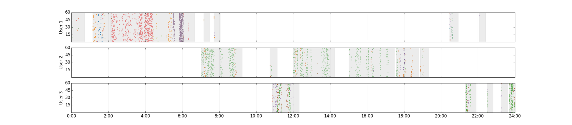
According to the KDD process (and any of its analogues: one , two ), the solution of the data mining problem begins with feature engineering. This stage is the most important and at the same time the most laborious. We select features from a semi-structured log of page visits. The figure shows day logs for three real users. Minutes of the day (0-1439) are plotted on the horizontal axis, seconds - in the corresponding minute (0-59) - on the vertical axis. Each point - visiting the site. For clarity, sites are shown in different colors. Users from the top graphics are mainly interested in dating (red hits correspond to the popular dating service) and computer hardware (blue and green hits). And the main activity falls on the night (someone recognized himself?). The second user is also not opposed to meet (green hits), but during working hours. The third spends on this non-working time - evening and presumably lunch break.
(clickable)
Although the users represented have a similar interest in dating, the pattern of behavior is different: the periods of activity, the number and frequency of hits differ. In order to smooth this difference, in web mining it is customary to break the flow of user hits into sessions - intervals of continuous activity on the Internet. There are many approaches to the allocation of sessions, we stopped at the following simple rules:
(1) two hits belong to the same session, if the interval between them does not exceed 20 minutes
(2) session lasts 20 minutes after the last hit
Sessions of our users on the graphs are highlighted in gray. Based on the received sessions, we will convert the history of user visits into a matrix that can be input to machine learning algorithms. Each row in this matrix corresponds to a user, each column corresponds to a feature. Habr is not rubber, so here I will focus on the simplest of the options we use: each sign is a word extracted from the URL of the visited page. For example, a piece of log already familiar to us:

converted to the following matrix:
| hi-tech | horo | example | ||
| A21CE | one | 2 | 2 | 0 |
| B0BB1 | 0 | one | 0 | one |
The value of the attribute for a specific user in this case is the number of user sessions in which this characteristic occurred. In principle, a sign value can be binarized using a threshold, or one of many weighing options can be applied, for example, by idf . Experiments show that any of these normalizations leads to an improvement in the quality of the model. We stopped on binarization.
Feature selection
Not all signs are equally helpful. Let's say that the presence of a non-zero value of the page attribute does not say anything about the user's income, because page is just a technical word for page numbering. In contrast, a user with a non-zero value of the jewelery tag may be looking for jewelry, and this will help to classify it into the “rich” category. When analyzing the signs, we use the following considerations:
(1) the trait should give statistically reliable estimates. For example, multinomial tests are used for verification.
(2) the sign should be informative. Information criteria such as redundancy are used for verification.
The figure shows the signs that best reflect each of the categories. For example, a large proportion of rich users have a non-zero weight in the matrix column corresponding to the IT-news feature. Apparently, being an IT professional is quite profitable. The categories of the poor are more suitable for signs related to low-skilled work (“seller-consultant”, “without experience”).

(clickable)
Selecting only informative and statistically reliable signs, we obtain a smaller matrix, which will become input data for machine learning algorithms. The element of this matrix x [i, j] is the weight of the j -th attribute of the i -th user. For the sake of fairness, I note that in addition to the training sample, which reflects the pages visited by the user, we are building a few more - for example, on demographic data and on the content of the pages. For each training sample, a separate model is built, after which all models are combined.
Simulation and results
The specificity of our classification problem is that the data matrices have a large dimension (millions of rows and tens of thousands of columns) and at the same time are very sparse. Therefore, implementations of learning algorithms capable of working with sparse matrices are used. Here we do not invent bicycles - we use linear model ensembles with cross-entropy loss functions: logistic regression and maxent. Such models are good for a number of reasons. First, cross-entropy naturally arises under rather general assumptions, in particular, when the distribution p (x | class) belongs to an exponential family of distributions (details can be found in Pattern Recognition and Machine Learning // C. Bishop and Machine Learning: A Probabilistic Perspective // K. Murphy). Secondly, the SGD algorithm allows you to effectively train such a model, including on sparse data. Thirdly, the model serialization is reduced to a simple storage of the weights vector, therefore, the saved model occupies the entire O (number of attributes) memory. Fourth, the application of the model requires only a quick calculation of the decision function. For our teaching matrix, we build an ensemble of linear models using bagging. The final prediction is made on the basis of ensemble voting.
To assess the quality of classification in our problems, the main metric is Affinity (the more commonly used name is Lift). This metric shows how our model is better than random. For example, consider the category of rich users. The share of such users in the total population is 7%. If our model with acceptable coverage (Recall) gives an accuracy (Precision) of 21%, then Affinity is counted as Affinity = 0.21 / 0.07 = 3.0. In this case, the recall is configured so that the output distribution of users by categories approximately coincides with the input. The table shows the cross-validation metrics of the constructed model. It is seen that the model gives a very good result.
| Class | Baseline distribution | The resulting distribution | Precision | Recall | Affinity |
| one | 69720 (0.125) | 18609 (0.033) | 0.281 | 0.075 | 2.245 |
| 2 | 223358 (0.400) | 274519 (0.492) | 0.492 | 0.605 | 1.229 |
| 3 | 134024 (0.240) | 93075 (0.167) | 0.316 | 0.220 | 1.317 |
| four | 91448 (0.164) | 118506 (0.212) | 0.246 | 0.319 | 1.502 |
| five | 39353 (0.071) | 53194 (0.095) | 0.233 | 0.315 | 3.301 |
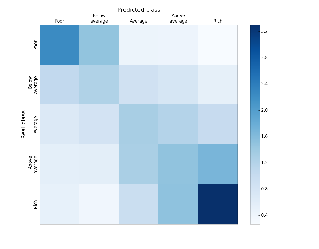
Let's take a closer look at the classification results. It is clear that in our case, due to the orderliness of the categories, not all errors are equally serious. It’s not scary to assign a “above average” category to a “rich” user, it’s quite another thing to call him “poor”. The figure shows an Affinity map for comparing the predicted and real categories of users. The value of each cell is calculated as:
In other words, the proportion of users of category i among those whom we predicted is j divided by the proportion of users of category i in the general population. On the diagonal so we have Precision / TrueFraction = Affinity. The ideal classifier gives nonzero values of the elements of such a matrix only on the diagonal. It can be seen from the figure that in our case the neighboring categories can be mixed up (3 "squares": rich - above average, medium - above average, poor - below average), but the proportion of gross errors is rather small. Given that the division into categories of income is rather conditional (try to honestly define your own), the blurring between neighboring categories is quite understandable. We also note that the extremes are best defined - the rich and the poor, and worst of all - the category of medium. This is successful because it is the extremes that usually interest a business (who is my economy or premium audience?).
The final step in the process is to apply the model on unallocated users. We have tens of millions of such users, for each of them a vector of selected features is calculated and a trained model is applied. The final quality check of the model is carried out on the basis of data on users participating in the panel study. The predicted income category is recorded in the Rating cookie. Counters read these cookies and counts the statistics for your service. It is these statistics that you see in the interface and can be used to make business decisions. The task is closed.
Final Considerations
In the article, using the example of the task of determining the category of income, I described the approach used to solve the problems of classifying users of the project. Rating Mail.Ru. The overview format of the article did not allow me to delve into the technical details, for example, in the subtleties of the implementation of certain stages of the process (mainly on Hadoop). Also for brevity, we had to omit several important subtasks - filtering bots and one-day users, constructing semantic features, composing ensembles from models built for different training samples, an approach to validating the constructed models, and much more. These are already slightly different stories, we will leave them for future publications.
Source: https://habr.com/ru/post/244285/
All Articles