Responsive images in practice (Part 3)
The last part of the story about responsive images that we started here and continued here , telling us about the use of srcset and sizes. Today we will talk about using the tag for wrapping images.
Second stage: picture and direction
So, for images that just need to be scaled, we list our source files and their width in pixels in srcset, let the browser choose which image width will be displayed using sizes, and let go of our insane desire to control everything. But! Sometimes we want to adapt our images, going beyond scaling. In this case, we need to return a small part of the control over the selection of sources. Enter the picture.
Our detailed images have a large aspect ratio of 16: 9. On large screens, they look great, but on the phone they become tiny. Stitching and embroidery, which need to be shown in detailed images, too small to consider.
')
It would be nice if we could “enlarge” the images on small screens, presenting them in a denser and higher form.

Such things — adjusting the content of images for individual environments — are called “directing”. Every time we crop or otherwise change the image to fit the control point (instead of resizing everything), we are directing.
If we include enlarged cropped images in the srcset, it is not known where they fit, and where - no. With the help of picture and source media we can make our wishes come true: loading wide rectangular frames only when the window is wider than 36 em. And in small windows always load square pictures.
The picture element contains any number of source elements and one img. The browser scans all image sources until it finds a media attribute that matches the current environment. It sends the srcset of the appropriate source to img, which still remains the element that we “see” on the page.
Here is a simpler example:
In windows with landscape orientation in img served landscape.jpg. With portrait orientation (or if the browser does not support the picture) img does not change, and portrait.jpg is loaded.
This behavior may seem a little surprising to you if you are used to audio and video. Unlike these elements, the picture is an invisible cover: a magic span that sets the image to srcset.
Another way to crop: img is not a step backwards. We are progressively improving img by wrapping it in a picture.
In practice, this means that any styles that we want to apply to our image on the screen must be customized to reflect img, not picture. Code picture {width: 100%} does nothing. Code picture> img {width: 100%} does what we need.
Here is our patchwork page with the pattern applied. We recall that the goal of using a picture was to provide users with smaller screens with more (and more useful) pixels, and look at how performance is developing:
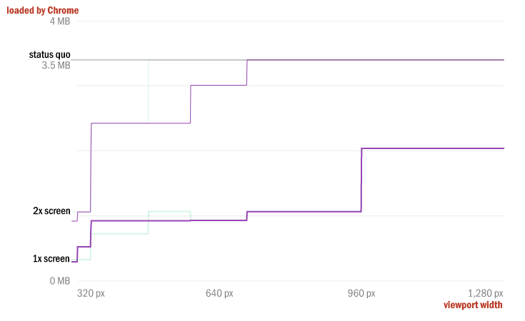
Not bad! We send a bit more bytes on 1x screens. But for some difficult reasons related to the size of our original images, we actually increased the range of screen sizes, which feel the performance increase by 2x. The savings in the first stage of the page change stopped at 480 pixels for 2-screens, but after our second stage it expanded to 700 pixels.
Now our page loads faster and looks better on smaller devices. But we are not done yet.
Third stage: we make several formats using the source type
For the 25-year history of the Internet, two raster formats dominated it: JPEG and GIF. PNG took ten agonizing years to join this exclusive club. New formats, such as WebP and JPEG XR, are already on the threshold, promising developers excellent compression and offering useful features such as alpha channels and lossless modes. But due to the lonely attribute of src images, implementation is very slow - developers need almost universal format support before they can use it. But not today. The picture makes it easy to use several formats, following the same model of the source type, which is set for audio and video:
If the browser supports the type attribute of the source, it will send the srcset of this source to img.
This is a pretty simple example, but when we layer source type switching over our existing patchwork page to, say, add WebP support, things get too complicated (and repetitive):
It turns out too much code for one image. In addition, we now also have a large number of files: as many as 12! Three resolutions, two formats and two types of framing for each image - this is really a lot. All that we have achieved in terms of performance and functionality, is obtained due to the preliminary collision with difficulties and the further possibility of tracking.
Automation is your friend; if it is assumed that your page will contain massive blocks of code that refer to a large number of different versions of the image, it is better not to do it all manually.
The same with the understanding that good should be a little. I used all the tools from the specifications in our example. This will almost never be reasonable. A huge increase in efficiency can be achieved using any of the new functions separately, and you should carefully consider all the complexities of their layering before you save and do everything necessary and unnecessary.
But still, let's see what WebP can do for our blankets.

An additional 25-30% savings over what we have already achieved - not only at the lower limit, but throughout the range - this is definitely not a joke! My methodology is by no means accurate; your performance with webp may vary. The bottom line is that new formats that provide significant gains over the current position of JPEG / GIF / PNG already exist and continue to appear. The picture and source type attributes reduce the access barrier, clearing forever the path to innovation in image format.
Use size today
Over the years, we have known that our responsive pages: images. Huge images created specifically for the huge screens that we sent to everyone. We also knew how to solve this problem: send different sources to different clients. New markup allows us to do exactly that. srcset allows you to offer several versions of the image to the browser, which with the help of the sizes attribute selects the most suitable source code from the pack and loads it. The picture and source attributes allow us to intervene and take on a bit more control, ensuring that some source code is selected based on either media queries or file type support.
Together, these features allow us to create responsive, flexible and responsive images. They allow us to send each of our users the source code created specifically for its device, providing a significant increase in performance. Armed with superb polyfill and having an understanding of the future, developers should start using such markup right now!
Second stage: picture and direction
srcset for the lazy, picture for the insane
Mat Marquez
So, for images that just need to be scaled, we list our source files and their width in pixels in srcset, let the browser choose which image width will be displayed using sizes, and let go of our insane desire to control everything. But! Sometimes we want to adapt our images, going beyond scaling. In this case, we need to return a small part of the control over the selection of sources. Enter the picture.
Our detailed images have a large aspect ratio of 16: 9. On large screens, they look great, but on the phone they become tiny. Stitching and embroidery, which need to be shown in detailed images, too small to consider.
')
It would be nice if we could “enlarge” the images on small screens, presenting them in a denser and higher form.
Such things — adjusting the content of images for individual environments — are called “directing”. Every time we crop or otherwise change the image to fit the control point (instead of resizing everything), we are directing.
If we include enlarged cropped images in the srcset, it is not known where they fit, and where - no. With the help of picture and source media we can make our wishes come true: loading wide rectangular frames only when the window is wider than 36 em. And in small windows always load square pictures.
<picture> <!-- 16:9 --> <source media="(min-width: 36em)" srcset="quilt_2/detail/large.jpg 1920w, quilt_2/detail/medium.jpg 960w, quilt_2/detail/small.jpg 480w" /> <!-- --> <source srcset="quilt_2/square/large.jpg 822w, quilt_2/square/medium.jpg 640w, quilt_2/square/small.jpg 320w" /> <img src="quilt_2/detail/medium.jpg" alt="Detail of the above quilt, highlighting the embroidery and exotic stitchwork." /> </picture> The picture element contains any number of source elements and one img. The browser scans all image sources until it finds a media attribute that matches the current environment. It sends the srcset of the appropriate source to img, which still remains the element that we “see” on the page.
Here is a simpler example:
<picture> <source media="(orientation: landscape)" srcset="landscape.jpg" /> <img src="portrait.jpg" alt="A rad wolf." /> </picture> In windows with landscape orientation in img served landscape.jpg. With portrait orientation (or if the browser does not support the picture) img does not change, and portrait.jpg is loaded.
This behavior may seem a little surprising to you if you are used to audio and video. Unlike these elements, the picture is an invisible cover: a magic span that sets the image to srcset.
Another way to crop: img is not a step backwards. We are progressively improving img by wrapping it in a picture.
In practice, this means that any styles that we want to apply to our image on the screen must be customized to reflect img, not picture. Code picture {width: 100%} does nothing. Code picture> img {width: 100%} does what we need.
Here is our patchwork page with the pattern applied. We recall that the goal of using a picture was to provide users with smaller screens with more (and more useful) pixels, and look at how performance is developing:
Not bad! We send a bit more bytes on 1x screens. But for some difficult reasons related to the size of our original images, we actually increased the range of screen sizes, which feel the performance increase by 2x. The savings in the first stage of the page change stopped at 480 pixels for 2-screens, but after our second stage it expanded to 700 pixels.
Now our page loads faster and looks better on smaller devices. But we are not done yet.
Third stage: we make several formats using the source type
For the 25-year history of the Internet, two raster formats dominated it: JPEG and GIF. PNG took ten agonizing years to join this exclusive club. New formats, such as WebP and JPEG XR, are already on the threshold, promising developers excellent compression and offering useful features such as alpha channels and lossless modes. But due to the lonely attribute of src images, implementation is very slow - developers need almost universal format support before they can use it. But not today. The picture makes it easy to use several formats, following the same model of the source type, which is set for audio and video:
<picture> <source type="image/svg+xml" srcset="logo.svg" /> <img src="logo.png" alt="RadWolf, Inc." /> </picture> If the browser supports the type attribute of the source, it will send the srcset of this source to img.
This is a pretty simple example, but when we layer source type switching over our existing patchwork page to, say, add WebP support, things get too complicated (and repetitive):
<picture> <!-- 16:9 --> <source type="image/webp" media="(min-width: 36em)" srcset="quilt_2/detail/large.webp 1920w, quilt_2/detail/medium.webp 960w, quilt_2/detail/small.webp 480w" /> <source media="(min-width: 36em)" srcset="quilt_2/detail/large.jpg 1920w, quilt_2/detail/medium.jpg 960w, quilt_2/detail/small.jpg 480w" /> <!-- --> <source type="image/webp" srcset="quilt_2/square/large.webp 822w, quilt_2/square/medium.webp 640w, quilt_2/square/small.webp 320w" /> <source srcset="quilt_2/square/large.jpg 822w, quilt_2/square/medium.jpg 640w, quilt_2/square/small.jpg 320w" /> <img src="quilt_2/detail/medium.jpg" alt="Detail of the above quilt, highlighting the embroidery and exotic stitchwork." /> </picture> It turns out too much code for one image. In addition, we now also have a large number of files: as many as 12! Three resolutions, two formats and two types of framing for each image - this is really a lot. All that we have achieved in terms of performance and functionality, is obtained due to the preliminary collision with difficulties and the further possibility of tracking.
Automation is your friend; if it is assumed that your page will contain massive blocks of code that refer to a large number of different versions of the image, it is better not to do it all manually.
The same with the understanding that good should be a little. I used all the tools from the specifications in our example. This will almost never be reasonable. A huge increase in efficiency can be achieved using any of the new functions separately, and you should carefully consider all the complexities of their layering before you save and do everything necessary and unnecessary.
But still, let's see what WebP can do for our blankets.
An additional 25-30% savings over what we have already achieved - not only at the lower limit, but throughout the range - this is definitely not a joke! My methodology is by no means accurate; your performance with webp may vary. The bottom line is that new formats that provide significant gains over the current position of JPEG / GIF / PNG already exist and continue to appear. The picture and source type attributes reduce the access barrier, clearing forever the path to innovation in image format.
Use size today
Over the years, we have known that our responsive pages: images. Huge images created specifically for the huge screens that we sent to everyone. We also knew how to solve this problem: send different sources to different clients. New markup allows us to do exactly that. srcset allows you to offer several versions of the image to the browser, which with the help of the sizes attribute selects the most suitable source code from the pack and loads it. The picture and source attributes allow us to intervene and take on a bit more control, ensuring that some source code is selected based on either media queries or file type support.
Together, these features allow us to create responsive, flexible and responsive images. They allow us to send each of our users the source code created specifically for its device, providing a significant increase in performance. Armed with superb polyfill and having an understanding of the future, developers should start using such markup right now!
Useful Paysto solutions for Habr readers:
→ Get paid by credit card right now. Without a site, PI and LLC.
→ Accept payments from companies via the Internet. Without a site, PI and LLC.
→ Acceptance of payments from companies for your site. With document circulation and exchange of originals.
→ Automation of sales and service transactions with legal entities. Without intermediary in the calculations.
→ Accept payments from companies via the Internet. Without a site, PI and LLC.
→ Acceptance of payments from companies for your site. With document circulation and exchange of originals.
→ Automation of sales and service transactions with legal entities. Without intermediary in the calculations.
Source: https://habr.com/ru/post/244241/
All Articles