Fixed table style or Fixed Table Layouts
This opus is a free translation of the publication of Chris Coiler [Chris Coyier] from July 2.
As you probably know, the CSS property table-layout is intended to control the mode of forming the widths of columns in a table. It can take the following values: auto, fixed or hereditary. By default, browsers use standard behavior to display the table: the browser calculates the width of the line as the sum of the width of all cells. Then, by the same principle, it calculates the width of the 2nd row, and if the size of a cell exceeds the size of the parent cell, rearranges the whole table. Next, it determines the width of the 3rd cell, the 4th, and so on. If the table has many, many rows, the calculation of the width may take a bit ...
However, it is possible (I would even say it is necessary) to use the simplified mode, which is expressed in the fact that the browser does not take into account the contents of subsequent cells when determining the width, but relies on the value of the width properties of the table, columns and cells in the first row.
In CSS (cascading style sheets), using the table-layout property, we can control which table generation mode we need. It is actually about this:
')
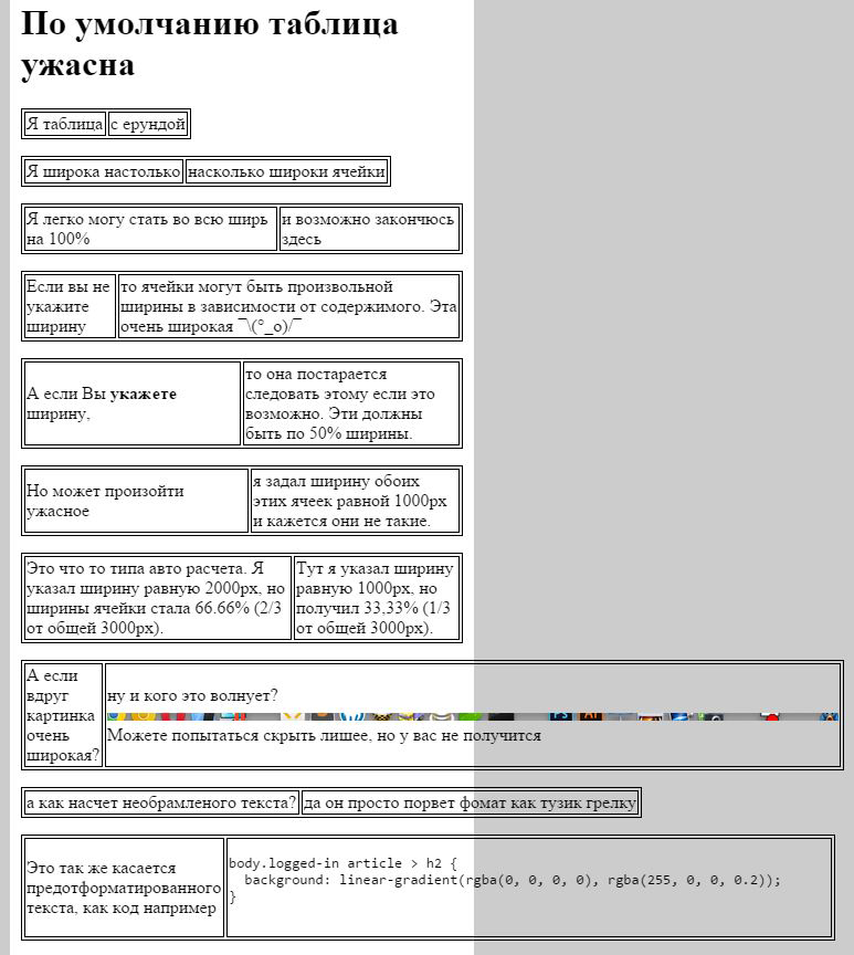
This property is very well maintained and very useful, as it allows you to create more predictable markup for your table. By default, this property is set to auto, and this is probably known to most of you. But this mode as for me is so very unreliable and unpredictable. Let's give an example:
If we now use the table-layout: fixed mode, we can confidently get quite a predictable result in place.
In the case of this mode, the calculation of the width of the columns goes on the first line and all subsequent use this value. Maybe it sounds weird to understand, but in fact everything is simple, we give an example:

Chris was puzzled by this question because he wanted to. so that his “Pen” s (in translation even more ridiculous sounds) on a sheet I look at CodePen displayed in columns with a unified width and did not spoil the whole picture for him, that's what he did:
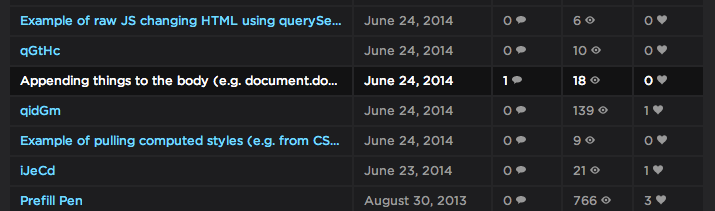
He was very pleased with this.
I hope everyone remembers that tables are needed for tabulated values and emails, and not for specifying page markup.
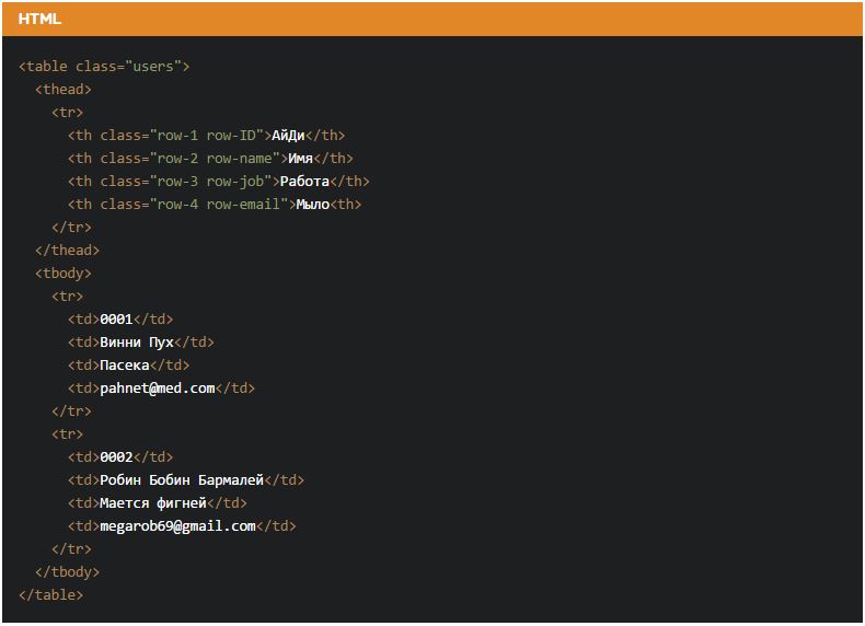
Look at this practical example (I assume that almost everyone will like it):
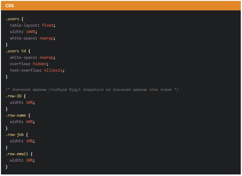

For the best example, you can try using the element to also set the width of the columns, since the rest will be calculated depending on the values in the first row.
As for speed, they say that this style of table formation is the fastest, and this is obvious - the rest of the lines are not analyzed, and therefore the generation time does not depend on the length of the table as such.
As for use in different email clients, this property, according to the monitoring service for supporting CSS properties in email clients , is perfectly supported.
I hope this translation will really help someone better understand how table-layout: fixed works and throw ideas on how to use it in their projects.
By the way, does anyone have any idea why this property is not used by default?
As an introduction
As you probably know, the CSS property table-layout is intended to control the mode of forming the widths of columns in a table. It can take the following values: auto, fixed or hereditary. By default, browsers use standard behavior to display the table: the browser calculates the width of the line as the sum of the width of all cells. Then, by the same principle, it calculates the width of the 2nd row, and if the size of a cell exceeds the size of the parent cell, rearranges the whole table. Next, it determines the width of the 3rd cell, the 4th, and so on. If the table has many, many rows, the calculation of the width may take a bit ...
However, it is possible (I would even say it is necessary) to use the simplified mode, which is expressed in the fact that the browser does not take into account the contents of subsequent cells when determining the width, but relies on the value of the width properties of the table, columns and cells in the first row.
CSS
In CSS (cascading style sheets), using the table-layout property, we can control which table generation mode we need. It is actually about this:
table { table-layout: fixed; } ')
This property is very well maintained and very useful, as it allows you to create more predictable markup for your table. By default, this property is set to auto, and this is probably known to most of you. But this mode as for me is so very unreliable and unpredictable. Let's give an example:
Table-layout mode: fixed
If we now use the table-layout: fixed mode, we can confidently get quite a predictable result in place.
In the case of this mode, the calculation of the width of the columns goes on the first line and all subsequent use this value. Maybe it sounds weird to understand, but in fact everything is simple, we give an example:
Application
Chris was puzzled by this question because he wanted to. so that his “Pen” s (in translation even more ridiculous sounds) on a sheet I look at CodePen displayed in columns with a unified width and did not spoil the whole picture for him, that's what he did:
He was very pleased with this.
I hope everyone remembers that tables are needed for tabulated values and emails, and not for specifying page markup.
Look at this practical example (I assume that almost everyone will like it):
For the best example, you can try using the element to also set the width of the columns, since the rest will be calculated depending on the values in the first row.
Speed
As for speed, they say that this style of table formation is the fastest, and this is obvious - the rest of the lines are not analyzed, and therefore the generation time does not depend on the length of the table as such.
Mailboxes
As for use in different email clients, this property, according to the monitoring service for supporting CSS properties in email clients , is perfectly supported.
Conclusion
I hope this translation will really help someone better understand how table-layout: fixed works and throw ideas on how to use it in their projects.
By the way, does anyone have any idea why this property is not used by default?
Source: https://habr.com/ru/post/244207/
All Articles