Responsive images in practice (Part 2)
Part 3
In the first part, the author mentioned the problems associated with the creation and placement of responsive images, and also gave an example in which the srcset property was used to help the browser find the optimal source, which significantly increases the speed of the site. However, with this approach, there is one problem: to select a suitable source, you need to know the size of the image layout. And we cannot ask the browser to postpone the selection until the HTML, CSS and JavaScript pages are loaded and interpreted. Therefore, we need to give the browser the opportunity to estimate the width of the image display using another new attribute: sizes.
How did I manage to hide this unpleasant truth from you until this moment? Detailed images on our sample page are a special case. They occupy the full width of the window —100vw — which, as it turned out by chance, has a default value of sizes. Our images of whole blankets, however, are tailored to the width of the paragraph and often take up a much smaller area. This helps us tell the browser the immediate width using the sizes attribute.
Sizes takes CSS lengths. Therefore:
... he tells the browser: this image will be displayed with a fixed width of 100px.
')
Our example is more complicated. Since the image of the blankets is stylized using the simple rule of width: 100%, the values that place it have a maximum width (max-width) of 33em. Fortunately, sizes allows us to do two things:
1. It allows you to specify multiple lengths in a comma-separated list.
2. It allows us to connect environment values to lengths.
For example:
Does this mean that if the window is wider than 33em? Then this image will be 33em wide. Otherwise, it will be 100vw.
This is closer to what we need, but not quite. The relative essence of em makes our example insidious. The font size of the body of our page has a value of 1.25em, so “1em” in relation to the CSS of our shape will be equal to 1.25 x standard browser font size. Within the handler (and therefore also within the sizes attribute), em is always equal to the standard font size. That is, multiplication by 1.25 is appropriate: 1.25 x 33 = 41.25.
Thus, the width of our blankets is pretty well captured and, frankly, it is good. This is 100% suitable for the sizes attribute so that it provides the browser with an approximate calculation of the width of the image layout; Often, sacrificing a small amount of accuracy in favor of increased readability and manufacturability is the right choice. On the other hand, let's go ahead and make our example more accurate by expanding it into em factors in the indents on both sides of the figure: 2 sides x 1.25 environmental conditions each = 2.5 em indented space.
Let's see what we did here. We provided the browser with a large wrapper and small versions of our image using srcset, and specified their width in pixels using the w parameter. We also told the browser how much space the images would occupy using sizes.
If this were a simple example, we would give the browser a simple CSS length in the form sizes = "100px" or sizes = "50vw". But we were so unlucky. We had to set the browser to two CSS lengths and specify that the first length should be used only when a certain condition occurs.
Fortunately, all this work was not in vain. With the help of srcset and sizes, we gave the browser everything it needed to select the source. When he knows the width of the source in pixels and the width of the image layout, the browser calculates the ratio of the width of the "source-layout" for each source. Therefore, suppose sizes are 620 pixels. The source width of 620w will be equal to 1x pixels of the image. The source width of 1240w will be equal to 2x. 310w? 0.5x. The browser calculates these ratios, after which it selects which one it likes from the source.
It is worth noting that conditions allow you to set ratios directly, and that source codes without a characteristic get a standard 1x ratio, allowing you to describe the markup as follows:
This is a good compact way to create high-resolution images. But! It works only for images with a fixed width. All the images on our patchwork blankets page are “liquid”, so this is the last time we mention feature x.
Measurement
Now that we rewrote our patchwork page with srcset and sizes, what did we get in terms of performance?
The weight of our page now (finally!) Meets the conditions of loading. It changes, so we can not represent it as a single number. I reloaded the page a bunch of times in Chrome and measured its weight on a large number of windows of different widths:
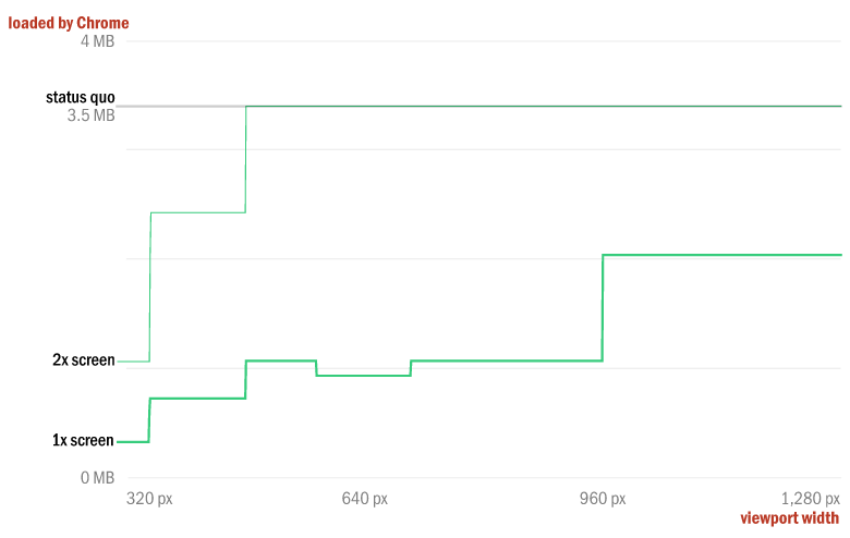
The smooth gray line at the top represents the weight of the original version of 3.5 MB. Thick (1x) and thin (2x) green lines represent the weight of our page, updated with srcset and size in windows with different widths from 320 to 1280 pixels.
On 2x with a width of 320 pixels, we reduce the weight of our page by two thirds - before the page weighed 3.5 MB; Now we ship only 1.1 MB. On 1x with a width of 320 pixels, our page weighs less than one tenth of its original size: 306 KB.
From this point, the sizes in bytes gradually increase when loading larger sources that fill larger windows. On 2x devices, we strongly jump to a window about 350 pixels wide and return to the status quo weight after 480 pixels. On 1x the difference is palpable - we cut from 70 to 80 percent of the initial weight of the page, until we cross the border at 960 pixels. Here we run into a page that is still 40% smaller than the original value.
Such cuts -40%, 70%, 90% should stop you. We cut about two and a half megabytes with each download on the iPhone with a Retina screen. Count all this in milliseconds or multiply by thousands of page views, and you will understand what all this fuss is about.
There is another approach to solving the problem of responsive images, which we will discuss in the third part.
Part 3
In the first part, the author mentioned the problems associated with the creation and placement of responsive images, and also gave an example in which the srcset property was used to help the browser find the optimal source, which significantly increases the speed of the site. However, with this approach, there is one problem: to select a suitable source, you need to know the size of the image layout. And we cannot ask the browser to postpone the selection until the HTML, CSS and JavaScript pages are loaded and interpreted. Therefore, we need to give the browser the opportunity to estimate the width of the image display using another new attribute: sizes.
How did I manage to hide this unpleasant truth from you until this moment? Detailed images on our sample page are a special case. They occupy the full width of the window —100vw — which, as it turned out by chance, has a default value of sizes. Our images of whole blankets, however, are tailored to the width of the paragraph and often take up a much smaller area. This helps us tell the browser the immediate width using the sizes attribute.
Sizes takes CSS lengths. Therefore:
sizes="100px" ... he tells the browser: this image will be displayed with a fixed width of 100px.
')
Our example is more complicated. Since the image of the blankets is stylized using the simple rule of width: 100%, the values that place it have a maximum width (max-width) of 33em. Fortunately, sizes allows us to do two things:
1. It allows you to specify multiple lengths in a comma-separated list.
2. It allows us to connect environment values to lengths.
For example:
sizes="(min-width: 33em) 33em, 100vw" Does this mean that if the window is wider than 33em? Then this image will be 33em wide. Otherwise, it will be 100vw.
This is closer to what we need, but not quite. The relative essence of em makes our example insidious. The font size of the body of our page has a value of 1.25em, so “1em” in relation to the CSS of our shape will be equal to 1.25 x standard browser font size. Within the handler (and therefore also within the sizes attribute), em is always equal to the standard font size. That is, multiplication by 1.25 is appropriate: 1.25 x 33 = 41.25.
sizes="(min-width: 41.25em) 41.25em, 100vw" Thus, the width of our blankets is pretty well captured and, frankly, it is good. This is 100% suitable for the sizes attribute so that it provides the browser with an approximate calculation of the width of the image layout; Often, sacrificing a small amount of accuracy in favor of increased readability and manufacturability is the right choice. On the other hand, let's go ahead and make our example more accurate by expanding it into em factors in the indents on both sides of the figure: 2 sides x 1.25 environmental conditions each = 2.5 em indented space.
<img srcset="quilt_3/large.jpg 1240w, quilt_3/medium.jpg 620w, quilt_3/small.jpg 310w" sizes="(min-width: 41.25em) 38.75em, calc(100vw - 2.5em)" src="quilt_3/medium.jpg" alt="A crazy quilt whose irregular fabric scraps are fit into a lattice of diamonds." /> Let's see what we did here. We provided the browser with a large wrapper and small versions of our image using srcset, and specified their width in pixels using the w parameter. We also told the browser how much space the images would occupy using sizes.
If this were a simple example, we would give the browser a simple CSS length in the form sizes = "100px" or sizes = "50vw". But we were so unlucky. We had to set the browser to two CSS lengths and specify that the first length should be used only when a certain condition occurs.
Fortunately, all this work was not in vain. With the help of srcset and sizes, we gave the browser everything it needed to select the source. When he knows the width of the source in pixels and the width of the image layout, the browser calculates the ratio of the width of the "source-layout" for each source. Therefore, suppose sizes are 620 pixels. The source width of 620w will be equal to 1x pixels of the image. The source width of 1240w will be equal to 2x. 310w? 0.5x. The browser calculates these ratios, after which it selects which one it likes from the source.
It is worth noting that conditions allow you to set ratios directly, and that source codes without a characteristic get a standard 1x ratio, allowing you to describe the markup as follows:
<img src="standard.jpg" srcset="retina.jpg 2x, super-retina.jpg 3x" /> This is a good compact way to create high-resolution images. But! It works only for images with a fixed width. All the images on our patchwork blankets page are “liquid”, so this is the last time we mention feature x.
Measurement
Now that we rewrote our patchwork page with srcset and sizes, what did we get in terms of performance?
The weight of our page now (finally!) Meets the conditions of loading. It changes, so we can not represent it as a single number. I reloaded the page a bunch of times in Chrome and measured its weight on a large number of windows of different widths:
The smooth gray line at the top represents the weight of the original version of 3.5 MB. Thick (1x) and thin (2x) green lines represent the weight of our page, updated with srcset and size in windows with different widths from 320 to 1280 pixels.
On 2x with a width of 320 pixels, we reduce the weight of our page by two thirds - before the page weighed 3.5 MB; Now we ship only 1.1 MB. On 1x with a width of 320 pixels, our page weighs less than one tenth of its original size: 306 KB.
From this point, the sizes in bytes gradually increase when loading larger sources that fill larger windows. On 2x devices, we strongly jump to a window about 350 pixels wide and return to the status quo weight after 480 pixels. On 1x the difference is palpable - we cut from 70 to 80 percent of the initial weight of the page, until we cross the border at 960 pixels. Here we run into a page that is still 40% smaller than the original value.
Such cuts -40%, 70%, 90% should stop you. We cut about two and a half megabytes with each download on the iPhone with a Retina screen. Count all this in milliseconds or multiply by thousands of page views, and you will understand what all this fuss is about.
There is another approach to solving the problem of responsive images, which we will discuss in the third part.
Part 3
Useful Paysto solutions for Habr readers:
→ Get paid by credit card right now. Without a site, PI and LLC.
→ Accept payments from companies via the Internet. Without a site, PI and LLC.
→ Acceptance of payments from companies for your site. With document circulation and exchange of originals.
→ Automation of sales and service transactions with legal entities. Without intermediary in the calculations.
→ Accept payments from companies via the Internet. Without a site, PI and LLC.
→ Acceptance of payments from companies for your site. With document circulation and exchange of originals.
→ Automation of sales and service transactions with legal entities. Without intermediary in the calculations.
Source: https://habr.com/ru/post/244177/
All Articles