Course pixel art 5
This is a translation of the publication "Les Forges Pixel Art Course" .
Part 1: The Right Tools
Part 2: Lines and curves
Part 3: Perspectives
Part 4: Shadow and light
Part 5: Color Palettes
Part 6: Smoothing
Part 7: Textures and Blur
Part 8: The World of Tiles
Good question, why in the end did I start about this? Just because the palette is 50% of the quality of your work. Throughout the game, it is important to have consistent palettes, because they significantly contribute to the overall atmosphere. In general, what makes the difference between good and bad graphics is to a large extent a palette. "Well, it is important to have a good choice, I will do it at the end." A-ta-ta, of course not! The palette works from start to finish when you draw pixel art. For me, this is the first and last thing I do: I start by creating a start palette in the corner of my image, then I adjust it as I move, then, as I finish, I spend time improving it. Improvements are mainly due to "flair", what you learn here can be questioned: this is just the starting point.
On a computer, all colors are represented by a hexadecimal code (which uses the characters 0 1 2 3 4 5 6 7 8 9 ABCDEF) of 6 characters. For example, code # 000000 is black, white is #FFFFFF, and # FF0000 is pure red. Nothing complicated. This code can be divided into three two-digit segments (# is just a sign): the first two numbers refer to the red component of the color, the next two numbers are green, and the last two are blue. By combining these three values, you get any color. For example, # FF0000 is pure red because the red part is maximized (FF), and the green and blue part is zero. Hex codes can be converted to decimal for ease of discussion (not everyone likes to read hex codes, like you and me) - each pair is between 00 and FF, a number from 0 to 255. Now I have chosen the color that I use in my pixel Arte, for example purple # 6A146A (Red 106 - Green 20 - Blue 106). Well, this color is not bad, but it doesn’t suit me very much ... I want something more lively, more intense. I tell myself that to make it more intense, I just need to increase the three components ... you say that it will only make the color more white and pale. Bad, I'll darken a little, reduce each component by 10 ... again, a miss! I blacked out my color, but I don't want gray ... ah ah. It is difficult to choose the exact colors in this way. But Zorro appears to save! (In this case, Zorro is the HSL palette). Of course, you know that it’s unnatural for our brain to divide color into three components (RGB - Red Green Blue, that is, Red Green Blue). The HSL palette is just another way to specify the color: it uses not the RGB components, but the three components that are visible and recognizable to the naked eye, Hue - hue, Saturation - saturation, Brightness - brightness. The hue between 0 and 360 is just a color: red (0), yellow (60), green (120), blue (180), blue (240), pink (300) and Red (360). If you are observant, you notice that the two colors on the edges are the same. Of course, all the intermediate colors between those that I mentioned exist. Saturation between 0 and 100 is the color intensity. The more saturated the color, the more intense it is. Saturation 0 is gray. And the brightness is from 0 to 100, the easiest to understand: it determines the color tends to black or white. In all pixel-art programs presented in 1 part, you can choose a color with HSL, and you have no reason not to use it. A little practice, and you can easily get the color that you presented, whereas with RGB it would take a lot of time.
')
Now that you know the tools to choose a color, let's move on to the main question: choosing a palette. A palette consists of a variety of “ramps”: a ramp is a group of colors whose shades are adjacent. For example, a palette may contain a red ramp, a green ramp, and a brown ramp. Let's see an example.

This is a bearded dwarf, and below is the palette that was used in its creation. This palette contains three ramps: blue, red and orange. (A small note, it is not necessary to organize a palette like me. Usually it is much more messy than this). In each ramp, I ordered the colors from dark (left) to light (right). Notice that pure white and pure black (large rectangles) are part of my two ramps: Because these two colors have a saturation of 0 (white and black, this is pure gray), they can belong to any ramp, also with any other gray. The oldest of you may have already seen images from the Commodore 64 games. The color palettes were displayed on this machine which contained many shades of gray to allow artists to create different ramps. -Now, when we know the basics, we are interested in the basic concepts of changing color shade. We tend to believe that all colors have the same hue and saturation, and only the brightness changes when you are in the light or in the shade. But it is not so! What I did not say in the last part is that your objects are lit up with a blue sky and a yellow sun, which means that your shade will change a little over the ramp. Most often, the reality of things is very complex, and requires knowledge of lighting that I did not mention, but in pixel art, you can safely use the following rules:
-at darkening increases saturation
- lightening decreases saturation
- when darkened, the shade becomes bluer
- when lightening, the shade becomes more yellow
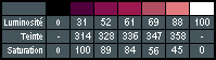
If you look closely at the red ramp of the dwarf palette, we will see these trends. The numbers speak for themselves, you can check that everything corresponds to the principles mentioned. You can reverse the rules for saturation, for a softer look.
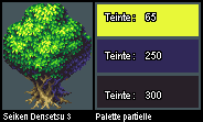
Here is a small example from our professional friends: a tree from “Seiken Densetsu 3” which contains a huge palette of colors changing from yellow to purple. The image does not show the entire range, only the brightest color, and two dark ones.
The Xenodrogen method, named after its inventor, is a method for choosing the exact color of your ramp, without (too large) error. This method is not an absolute rule to follow, but if you have a sense of color, it will allow you to create beautiful ramps. This method is based on a difficult-to-create, but easy-to-use rule: “In a ramp, hue, saturation and color change in the same direction. Their changes (the second derivative, mathematically speaking) also change in one direction. ” We have already discussed the first expression, and we even said in which direction the hue and saturation should change. The second expression will allow us to determine the number of these changes: in the ramp, each component change (hue, saturation and brightness) should be more and more or less during the ramp. Imagine a 5-color palette, which we will refer to as A, B, C, D and E. For example, I can change the saturation by 1 between A and B, and by 5 between B and C, again by 5 between C and D, and at 12 between D and E. On the other hand, it would be wrong to do something like 2 3 2 1 4, which could lead to a kind of “yo-yo” effect. To summarize, I can change the speed at which I change hue or saturation, but I have to change the speed in the same direction.
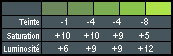
Let us take the green ramp as an example: here the color decreases incrementally, the saturation increases less and less, and the brightness increases more and more. Note that as described in the previous paragraph, we can reverse the relationship between brightness and saturation for softer (more pastel) rendering: on this ramp, these are the brightest colors that are more saturated. The last detail of the Xenodrogen method: the more colors on your ramp, the more you have to make small changes. This green ramp has 5 colors, so we make small changes. If we had only 3 colors, there would be variations in the range of 15-20 units.
The problem with using black and white deserves a whole paragraph. Usually, the use of these two colors in its pure form is not recommended. However, there are two exceptions (one for each color) and the dwarf at the beginning of this manual deals with these exceptions. We can use pure white, on very light surfaces (effects and magic spells) or very specular (metal, precious stones). Like for example the dwarf and his metal armor. The case of pure black is more subtle: it cannot be used for shadows, because in reality there is nothing completely black; There is usually a subtle color (sometimes magenta). It should not be used for decorations or contours. The only suitable case is a stroke, to make the characters more visible in the game, to distinguish them from the environment. Nevertheless, we strictly warn against using black “inside”, as black separates the details inside the sprite, and makes it look like a rough sketch.
Beginners have two trends:
-use of saturated flowers
-use colors based on assumptions instead of observations.
Remember that the grass is not always green, the water and the sky are not always blue, and the colors of the character can vary depending on skin tone and lighting. The time of day and the surrounding light change color; take a look around you and learn. (If you look at your colors in RGB, the color of your grass (for example) should not be 00 for the red and blue components. The sea and sky should not be pure blue, and even stones that seem gray to us should have some variations in color. by following these rules. Using HSL can help you avoid falling into this trap) I decided to complete this part as I began, and remind you that these rules are not carved in stone, but just tips. This part gives you a lot of rules on choosing good color palettes, but the most important things are good taste and practice. Also, if you think you can improve your palette beyond the rules, feel free to do so. Ultimately, the main result.
Part 1: The Right Tools
Part 2: Lines and curves
Part 3: Perspectives
Part 4: Shadow and light
Part 5: Color Palettes
Part 6: Smoothing
Part 7: Textures and Blur
Part 8: The World of Tiles
Part 5: Color Palettes
1. When and why choose a palette?
Good question, why in the end did I start about this? Just because the palette is 50% of the quality of your work. Throughout the game, it is important to have consistent palettes, because they significantly contribute to the overall atmosphere. In general, what makes the difference between good and bad graphics is to a large extent a palette. "Well, it is important to have a good choice, I will do it at the end." A-ta-ta, of course not! The palette works from start to finish when you draw pixel art. For me, this is the first and last thing I do: I start by creating a start palette in the corner of my image, then I adjust it as I move, then, as I finish, I spend time improving it. Improvements are mainly due to "flair", what you learn here can be questioned: this is just the starting point.
2. HSL magic
a. Overview
On a computer, all colors are represented by a hexadecimal code (which uses the characters 0 1 2 3 4 5 6 7 8 9 ABCDEF) of 6 characters. For example, code # 000000 is black, white is #FFFFFF, and # FF0000 is pure red. Nothing complicated. This code can be divided into three two-digit segments (# is just a sign): the first two numbers refer to the red component of the color, the next two numbers are green, and the last two are blue. By combining these three values, you get any color. For example, # FF0000 is pure red because the red part is maximized (FF), and the green and blue part is zero. Hex codes can be converted to decimal for ease of discussion (not everyone likes to read hex codes, like you and me) - each pair is between 00 and FF, a number from 0 to 255. Now I have chosen the color that I use in my pixel Arte, for example purple # 6A146A (Red 106 - Green 20 - Blue 106). Well, this color is not bad, but it doesn’t suit me very much ... I want something more lively, more intense. I tell myself that to make it more intense, I just need to increase the three components ... you say that it will only make the color more white and pale. Bad, I'll darken a little, reduce each component by 10 ... again, a miss! I blacked out my color, but I don't want gray ... ah ah. It is difficult to choose the exact colors in this way. But Zorro appears to save! (In this case, Zorro is the HSL palette). Of course, you know that it’s unnatural for our brain to divide color into three components (RGB - Red Green Blue, that is, Red Green Blue). The HSL palette is just another way to specify the color: it uses not the RGB components, but the three components that are visible and recognizable to the naked eye, Hue - hue, Saturation - saturation, Brightness - brightness. The hue between 0 and 360 is just a color: red (0), yellow (60), green (120), blue (180), blue (240), pink (300) and Red (360). If you are observant, you notice that the two colors on the edges are the same. Of course, all the intermediate colors between those that I mentioned exist. Saturation between 0 and 100 is the color intensity. The more saturated the color, the more intense it is. Saturation 0 is gray. And the brightness is from 0 to 100, the easiest to understand: it determines the color tends to black or white. In all pixel-art programs presented in 1 part, you can choose a color with HSL, and you have no reason not to use it. A little practice, and you can easily get the color that you presented, whereas with RGB it would take a lot of time.
')
b. Ramps and shades
Now that you know the tools to choose a color, let's move on to the main question: choosing a palette. A palette consists of a variety of “ramps”: a ramp is a group of colors whose shades are adjacent. For example, a palette may contain a red ramp, a green ramp, and a brown ramp. Let's see an example.
This is a bearded dwarf, and below is the palette that was used in its creation. This palette contains three ramps: blue, red and orange. (A small note, it is not necessary to organize a palette like me. Usually it is much more messy than this). In each ramp, I ordered the colors from dark (left) to light (right). Notice that pure white and pure black (large rectangles) are part of my two ramps: Because these two colors have a saturation of 0 (white and black, this is pure gray), they can belong to any ramp, also with any other gray. The oldest of you may have already seen images from the Commodore 64 games. The color palettes were displayed on this machine which contained many shades of gray to allow artists to create different ramps. -Now, when we know the basics, we are interested in the basic concepts of changing color shade. We tend to believe that all colors have the same hue and saturation, and only the brightness changes when you are in the light or in the shade. But it is not so! What I did not say in the last part is that your objects are lit up with a blue sky and a yellow sun, which means that your shade will change a little over the ramp. Most often, the reality of things is very complex, and requires knowledge of lighting that I did not mention, but in pixel art, you can safely use the following rules:
-at darkening increases saturation
- lightening decreases saturation
- when darkened, the shade becomes bluer
- when lightening, the shade becomes more yellow
If you look closely at the red ramp of the dwarf palette, we will see these trends. The numbers speak for themselves, you can check that everything corresponds to the principles mentioned. You can reverse the rules for saturation, for a softer look.
Here is a small example from our professional friends: a tree from “Seiken Densetsu 3” which contains a huge palette of colors changing from yellow to purple. The image does not show the entire range, only the brightest color, and two dark ones.
c. Xenodrogen method
The Xenodrogen method, named after its inventor, is a method for choosing the exact color of your ramp, without (too large) error. This method is not an absolute rule to follow, but if you have a sense of color, it will allow you to create beautiful ramps. This method is based on a difficult-to-create, but easy-to-use rule: “In a ramp, hue, saturation and color change in the same direction. Their changes (the second derivative, mathematically speaking) also change in one direction. ” We have already discussed the first expression, and we even said in which direction the hue and saturation should change. The second expression will allow us to determine the number of these changes: in the ramp, each component change (hue, saturation and brightness) should be more and more or less during the ramp. Imagine a 5-color palette, which we will refer to as A, B, C, D and E. For example, I can change the saturation by 1 between A and B, and by 5 between B and C, again by 5 between C and D, and at 12 between D and E. On the other hand, it would be wrong to do something like 2 3 2 1 4, which could lead to a kind of “yo-yo” effect. To summarize, I can change the speed at which I change hue or saturation, but I have to change the speed in the same direction.
Let us take the green ramp as an example: here the color decreases incrementally, the saturation increases less and less, and the brightness increases more and more. Note that as described in the previous paragraph, we can reverse the relationship between brightness and saturation for softer (more pastel) rendering: on this ramp, these are the brightest colors that are more saturated. The last detail of the Xenodrogen method: the more colors on your ramp, the more you have to make small changes. This green ramp has 5 colors, so we make small changes. If we had only 3 colors, there would be variations in the range of 15-20 units.
3. Good taste
a. Black and white
The problem with using black and white deserves a whole paragraph. Usually, the use of these two colors in its pure form is not recommended. However, there are two exceptions (one for each color) and the dwarf at the beginning of this manual deals with these exceptions. We can use pure white, on very light surfaces (effects and magic spells) or very specular (metal, precious stones). Like for example the dwarf and his metal armor. The case of pure black is more subtle: it cannot be used for shadows, because in reality there is nothing completely black; There is usually a subtle color (sometimes magenta). It should not be used for decorations or contours. The only suitable case is a stroke, to make the characters more visible in the game, to distinguish them from the environment. Nevertheless, we strictly warn against using black “inside”, as black separates the details inside the sprite, and makes it look like a rough sketch.
b. Traps
Beginners have two trends:
-use of saturated flowers
-use colors based on assumptions instead of observations.
Remember that the grass is not always green, the water and the sky are not always blue, and the colors of the character can vary depending on skin tone and lighting. The time of day and the surrounding light change color; take a look around you and learn. (If you look at your colors in RGB, the color of your grass (for example) should not be 00 for the red and blue components. The sea and sky should not be pure blue, and even stones that seem gray to us should have some variations in color. by following these rules. Using HSL can help you avoid falling into this trap) I decided to complete this part as I began, and remind you that these rules are not carved in stone, but just tips. This part gives you a lot of rules on choosing good color palettes, but the most important things are good taste and practice. Also, if you think you can improve your palette beyond the rules, feel free to do so. Ultimately, the main result.
Source: https://habr.com/ru/post/243775/
All Articles