7 key web design trends for 2015
Looking back at 2014, we can note some impressive trends that have appeared in web design: “no code” design platforms, parallax, one-page websites, and much more.
While many design trends are fleeting, some are a natural evolution of this industry. The growing range of devices on which we browse websites obliges developers to constantly adapt their technology to meet the dynamic changes that occur in web design.
To find out which trends will flourish over the next year, I turned to the members of the Webydo project team, the developers of the web design platform, to tell them what the top 7 main trends in web design will be in 2015.
')
The emphasis on content plays the role of a pronounced attempt to represent the word in accordance with evolving typographical principles.
The reality is that typography on the Internet is very different from print, and in 2015 we finally get rid of the latest old-fashioned beliefs, because of which the text still looks too small and dense on most sites.
There is nothing new in this: although the concept has been discussed since 2006, but the design community is not in a hurry to adapt. It is difficult to part with the principles that guide the design for many years.
There are three main aspects that affect the readability of text on a website:
Studies have repeatedly shown that large font sizes make reading on the Internet easier. Designers have already begun to implement flexible typography, together with responsive images and structures in their work. For text, you should always look your best, regardless of platform.
There was always some division of labor in web development: designers pored over the appearance, and coders ensured that everything worked. But this process is changing, as the tools for web design are getting smarter, more functional and more ambitious.
Today, designers can create websites without writing a single line of code, using the same powerful functionality of their graphics programs and getting W3C-valid, clean code.
This marks a paradigm shift, thereby reducing the entry threshold for designers, who now have convenient solutions for developing and implementing modern, professional websites for their clients.
As long as they focus on the quality of their design, the algorithms behind the chosen platform are being improved to make sure that this work is still relevant. Of course, there will always be a need for web programmers, but their area of responsibility is gradually moving away from front-end development.
A few years ago, the site was “responsive” if it simply worked on desktops, tablets and smartphones. With the advent of smart watches, televisions and other high-tech devices, the definition of “responsiveness” has expanded dramatically and continues to expand.
Each platform has its own unique requirements. Tablets and smartphones have very similar systems of interaction, and the main thing for them was the selection of the appropriate size of content and simple navigation.
However, for a smart watch, for example, even the navigation system must be completely revised in order to adapt to how we use the device. They are no longer suitable design, focused on smartphones, and a site optimized for desktop PCs will not necessarily work correctly on smart TV.
It will take some time to find a solution to these new problems, but by the end of 2015, a huge selection of various smart devices will make web designers adapt their methods.

Appearing in some industries of such giants as Microsoft, Google and Apple, the trend of flat design is at the peak of popularity.
Although debates about problems with a flat design in the field of user interfaces do not subside, the general opinion is that this is a suitable method for web design.
This is connected not only with the way we use content on the Web, but also with the web technology itself. Flat design is subject to the principles of minimalism, which in turn leads to the sites simple, orderly, fast and content-oriented.
This approach is not only aesthetically appealing, but also very practical, allowing visitors to interact with the content and evaluate it without being distracted by anything.
Not only text becomes larger - images too!
Once it was important to limit the size of images due to the limited bandwidth of networks, but with the passage of time this problem becomes less and less relevant. As a result, large images filled the Internet.
In 2015, the images will be in the spotlight thanks to new interesting features. Amazing methods will appear for responsive resizing, extracting primary colors for the background and optimizing images for minimal server load.
In addition, the main trend in 2015 will be the use of images as a background. Blur and various filters allow the text to "float on top" without compromising usability.
Gradually, designers get used to the fact that they can use huge images in their projects, which means that we can expect that such drawings will be encountered more and more often!
Perhaps the most impressive trend was the parallax scrolling effect.
We encounter it everywhere, even on the major sites of some products from Apple and Google. The results speak for themselves: the presence of parallax scrolling can improve the site by as much as 70%!
Using scrolling instead of clicks as a navigation method is a brilliant solution for several reasons. It takes less time to load the page, and, more importantly, it became possible to smoothly flow from one section to another without annoying page updates. Information arrives gradually.
In 2015, it is expected that even more designers will take a step towards parallax and will use it in their works.
As humans (a view that receives 70-90% of information through vision), we assimilate information better when it is presented in graphical form, which led to the popularity of infographics. Infographics - a simple way to transfer a large amount of information with a high degree of assimilation.
A new trend has emerged. Web graphics! Like infographics, web graphics also convey large amounts of information, but include interactive elements that allow the user to physically interact with the information. It is visually more attractive than infographics and significantly increases the degree of assimilation of information by the user.
In 2015, designers will realize that more and more customers will require interactive web graphics as an integral part of their personal design. We should expect the growing popularity of web graphics and its approval as one of the main components of modern web design.
Trends in web design come and go, but the creative ingenuity of designers leads to changes in web design standards. Designers transform ideas into trends, and trends into standards.
The trends listed here are quickly becoming commonplace in web design and will find even greater recognition in the coming year. Sites that do not use these elements will certainly die slowly in 2015.
Let us know in the comments what additional trends you think should be included in this list and will be noticeable in 2015!
PS: Thanks for the translation of the community manager Anya (@ 407th) of our Design and layout solution SketchBuilder , this is her first translation for Habr, we would appreciate comments, send them to me in the LAN.
While many design trends are fleeting, some are a natural evolution of this industry. The growing range of devices on which we browse websites obliges developers to constantly adapt their technology to meet the dynamic changes that occur in web design.
To find out which trends will flourish over the next year, I turned to the members of the Webydo project team, the developers of the web design platform, to tell them what the top 7 main trends in web design will be in 2015.
')
1. Flexible typography
The emphasis on content plays the role of a pronounced attempt to represent the word in accordance with evolving typographical principles.
The reality is that typography on the Internet is very different from print, and in 2015 we finally get rid of the latest old-fashioned beliefs, because of which the text still looks too small and dense on most sites.
There is nothing new in this: although the concept has been discussed since 2006, but the design community is not in a hurry to adapt. It is difficult to part with the principles that guide the design for many years.
There are three main aspects that affect the readability of text on a website:
- The size
- Column width
- Line height
Studies have repeatedly shown that large font sizes make reading on the Internet easier. Designers have already begun to implement flexible typography, together with responsive images and structures in their work. For text, you should always look your best, regardless of platform.
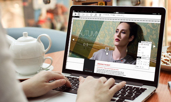
2. Automation layout
There was always some division of labor in web development: designers pored over the appearance, and coders ensured that everything worked. But this process is changing, as the tools for web design are getting smarter, more functional and more ambitious.
Today, designers can create websites without writing a single line of code, using the same powerful functionality of their graphics programs and getting W3C-valid, clean code.
This marks a paradigm shift, thereby reducing the entry threshold for designers, who now have convenient solutions for developing and implementing modern, professional websites for their clients.
As long as they focus on the quality of their design, the algorithms behind the chosen platform are being improved to make sure that this work is still relevant. Of course, there will always be a need for web programmers, but their area of responsibility is gradually moving away from front-end development.
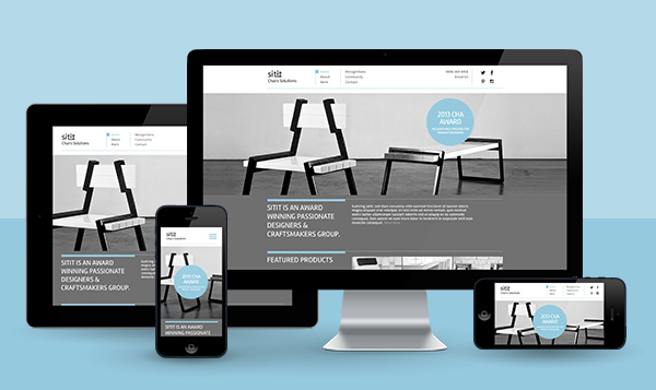
3. Responsive design
A few years ago, the site was “responsive” if it simply worked on desktops, tablets and smartphones. With the advent of smart watches, televisions and other high-tech devices, the definition of “responsiveness” has expanded dramatically and continues to expand.
Each platform has its own unique requirements. Tablets and smartphones have very similar systems of interaction, and the main thing for them was the selection of the appropriate size of content and simple navigation.
However, for a smart watch, for example, even the navigation system must be completely revised in order to adapt to how we use the device. They are no longer suitable design, focused on smartphones, and a site optimized for desktop PCs will not necessarily work correctly on smart TV.
It will take some time to find a solution to these new problems, but by the end of 2015, a huge selection of various smart devices will make web designers adapt their methods.
4. Flat design will fill every pixel.
Appearing in some industries of such giants as Microsoft, Google and Apple, the trend of flat design is at the peak of popularity.
Although debates about problems with a flat design in the field of user interfaces do not subside, the general opinion is that this is a suitable method for web design.
This is connected not only with the way we use content on the Web, but also with the web technology itself. Flat design is subject to the principles of minimalism, which in turn leads to the sites simple, orderly, fast and content-oriented.
This approach is not only aesthetically appealing, but also very practical, allowing visitors to interact with the content and evaluate it without being distracted by anything.
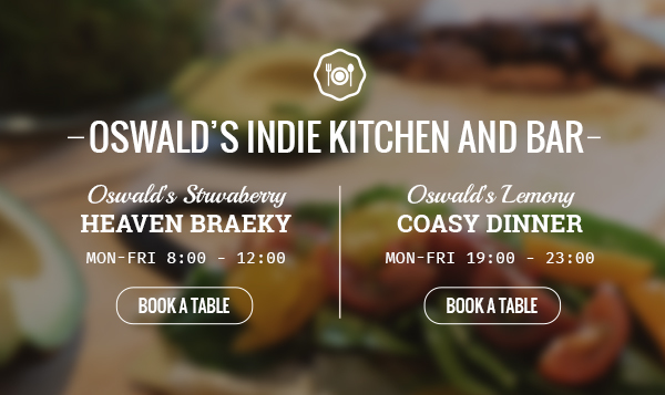
5. Large images
Not only text becomes larger - images too!
Once it was important to limit the size of images due to the limited bandwidth of networks, but with the passage of time this problem becomes less and less relevant. As a result, large images filled the Internet.
In 2015, the images will be in the spotlight thanks to new interesting features. Amazing methods will appear for responsive resizing, extracting primary colors for the background and optimizing images for minimal server load.
In addition, the main trend in 2015 will be the use of images as a background. Blur and various filters allow the text to "float on top" without compromising usability.
Gradually, designers get used to the fact that they can use huge images in their projects, which means that we can expect that such drawings will be encountered more and more often!
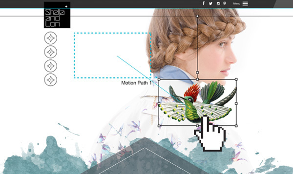
6. Scroll Animation, Parallax Effect and Micro-Interaction
Perhaps the most impressive trend was the parallax scrolling effect.
We encounter it everywhere, even on the major sites of some products from Apple and Google. The results speak for themselves: the presence of parallax scrolling can improve the site by as much as 70%!
Using scrolling instead of clicks as a navigation method is a brilliant solution for several reasons. It takes less time to load the page, and, more importantly, it became possible to smoothly flow from one section to another without annoying page updates. Information arrives gradually.
In 2015, it is expected that even more designers will take a step towards parallax and will use it in their works.
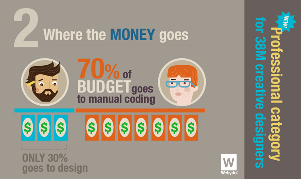
7. Dawn of web graphics
As humans (a view that receives 70-90% of information through vision), we assimilate information better when it is presented in graphical form, which led to the popularity of infographics. Infographics - a simple way to transfer a large amount of information with a high degree of assimilation.
A new trend has emerged. Web graphics! Like infographics, web graphics also convey large amounts of information, but include interactive elements that allow the user to physically interact with the information. It is visually more attractive than infographics and significantly increases the degree of assimilation of information by the user.
In 2015, designers will realize that more and more customers will require interactive web graphics as an integral part of their personal design. We should expect the growing popularity of web graphics and its approval as one of the main components of modern web design.
A look into the future
Trends in web design come and go, but the creative ingenuity of designers leads to changes in web design standards. Designers transform ideas into trends, and trends into standards.
The trends listed here are quickly becoming commonplace in web design and will find even greater recognition in the coming year. Sites that do not use these elements will certainly die slowly in 2015.
Let us know in the comments what additional trends you think should be included in this list and will be noticeable in 2015!
PS: Thanks for the translation of the community manager Anya (@ 407th) of our Design and layout solution SketchBuilder , this is her first translation for Habr, we would appreciate comments, send them to me in the LAN.
Source: https://habr.com/ru/post/243611/
All Articles