How we united the brand book of partners from Kamchatka to Kaliningrad (Part 2)
This is the promised second part of our rebranding story ... So that the article is not insanely long, I will try to tell only about the most interesting points of the rebranding.
PS: you can read the first part of the article here .
Before telling about the logos of products, which we already have 12 pieces, let me remind you what the company logo itself looks like: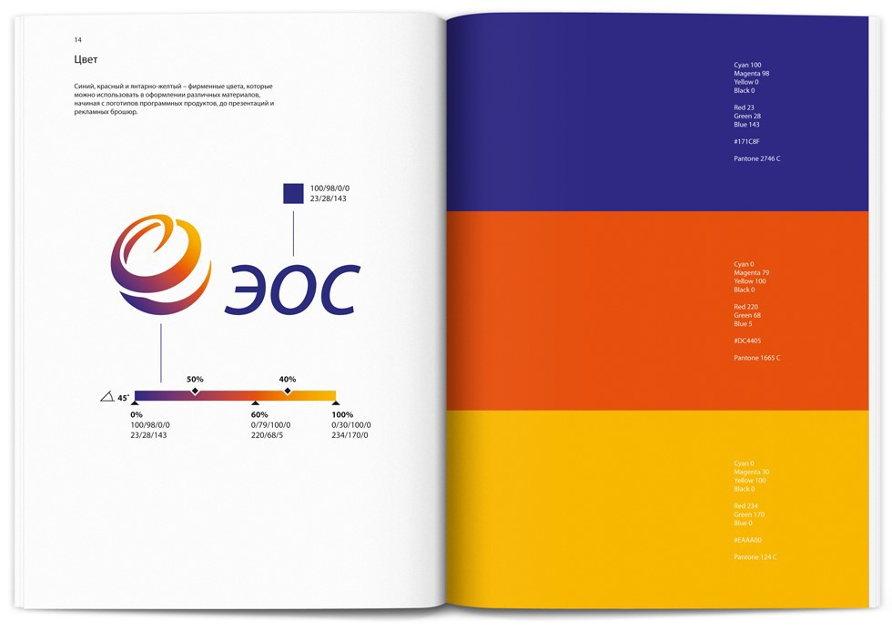 Spread the logo and corporate colors in the brand book
')

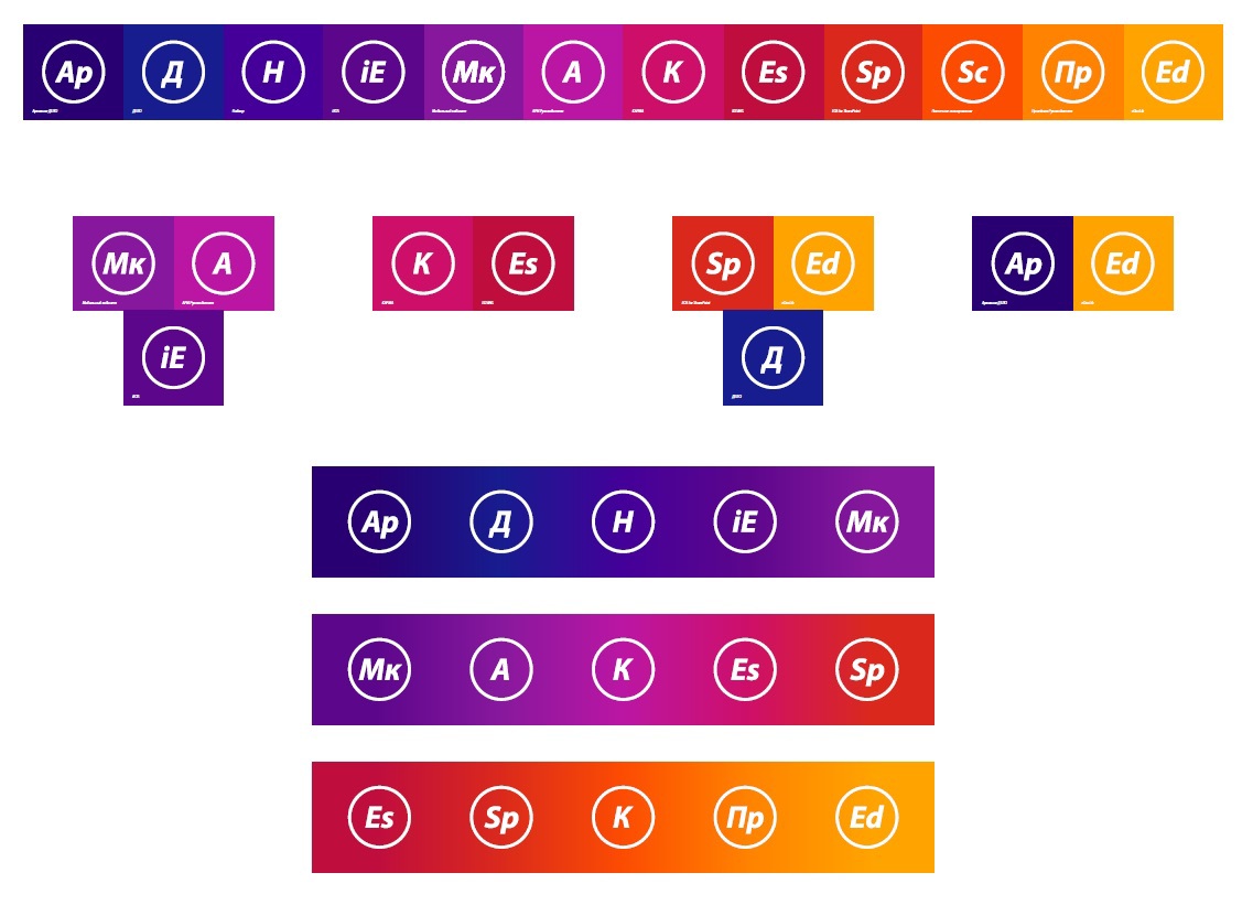
So, returning to the topic of product logos or, as we later called it, the "Periodic Table in IT" The ideas that we pursued when creating product logos: 1. they should be a logical continuation of the company logo; 2. should not repeat the colors of each other; 3. should be simple and concise, given the latest fashion trends; 4. should stand out among the variety of other icons so that the user can immediately find the product icon, and no matter what device it works on (PC or tablet). As a result, the colors of product logos should not merge, otherwise they will be difficult to distinguish, and at the same time, in some cases, show that we are talking about products that belong to one of the groups. For example, in a group of mobile applications, the primary color is purple. As a result, color solutions of some products had to be processed taking into account their belonging to certain groups. By the way, now on the site you can see how the colors of key products look together, and accordingly imagine what a mess it would be if we didn’t light them in different corners.

 Treasure of time and money ...
Before talking about treasures and money, I want to tell a couple of stories about our problems, which were before the rebranding and the creation of a single corporate style for the company and partners.
So…
Bug number 1. Infinity iterations ... A lot of advice, but few rules ...
The lack of a single and universal guide to the creation of marketing and PR tools. Oh, this independent creative ... I'll tell you on the example of presentation styles, which we used to have a great many (very old; old; seemingly new; surprise styles, which only the creator himself saw, etc.). Since Since our company is not a couple of departments and not a few employees (there are about 250 people in the company now), it’s quite often that our colleagues were sometimes especially distinguished by their creativity in designing and presenting information in presentations. And some, on the contrary, could not arrange the presentation themselves. Therefore, the lack of uniform rules for registration confused not one employee of the company. Accordingly, if earlier some employee of the company not from the “Marketing Department” himself made a presentation, then at the output this most often turned out to be a creative “Miracle”, which was then edited most often by the designer and, in some cases, by the marketing management staff, because . only they could lead presentations to a more or less common denominator. In the context of a simple case with presentations, a little about time (t) and money ($). With the axiom that t = $, I think everyone will agree. • Employee "A" - he needs to make a presentation (employee time - t "A") • Employee "B" - a designer or employee of the Marketing Department (t "B") + Do not forget about the risks that depend on the number of connections in the process. That is, the more connections, the more different risks there may be. Example:

Conclusion on the bug №1.
1. it is not necessary to involve in the process of registration of pptx employees of the Marketing Department (t1 "B"). And if help is needed, the number of iterations can be significantly reduced, and this is also the time;
2. no need to wait until the designer can get to the design of this pptx, and in fact he may have more priority tasks (Risk 1);
3. no need to spend time explaining some idea that the author wants to convey to the audience, but most often you have to explain more than once, because presentations describe IT products and processes, and pptx also tend to evolve and adapt to tasks (t3 "A" and t3 "B");
4. there is no dependence of the employee on the designer, therefore, there is no likelihood of meeting deadlines (Risk 2).
Total it turns out that the company saves the following amount of time:
$ 1 (company employees) = t1 "B" + Risk1 + t3 "A" + t3 "B" + Risk2
For example, $ 1 = 120 min + ... (skip) + 15 min (A) + 15 min (B) + ... (skip) = 150 min (2.5 h) PS: Let there be no risks and everything works like a Swiss watch, in order not to complicate the essence of the task
And this is only one presentation, but sometimes they can be on average 4 per week, which means S1 * 4 = 150 min * 4 presentations = 600 min (10 h)
PS: then, I think, everyone can estimate the cost of one hour of work for an employee and calculate the amount of $ you can save ...
Therefore, now we have absolutely for all employees and partners the following materials are available:
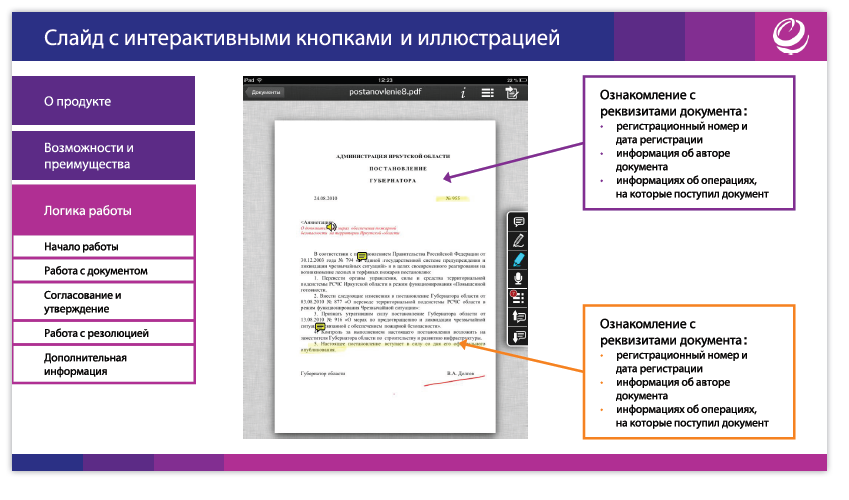
1) More than 30 presentation slide templates, describing various examples of text design, tables, charts, graphic elements, etc. Templates are complemented, if suddenly there appears some task described by current templates.
2) About 200 pictograms, icons, infographic schemes for presentations, flyers and other materials.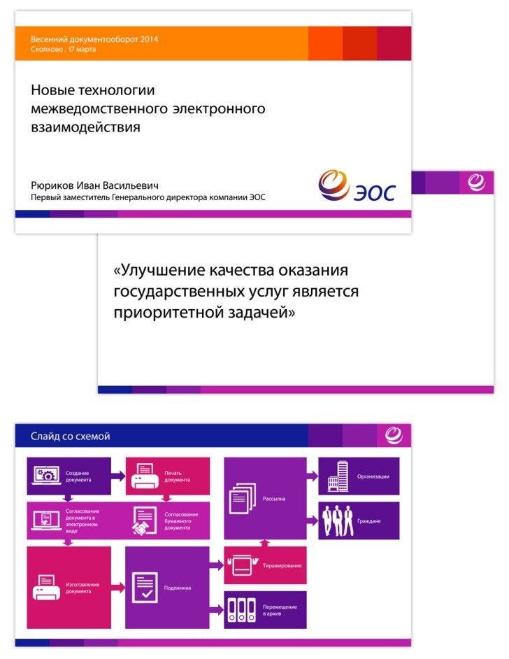
Presentation templates
By the way, we also use presentations, which are most often used for speeches or demonstrations, as an electronic textbook with integrated navigation. This is easy and saves time, because You do not need to create much again.
 Bug number 2. Unity is power. Banner, united and the team and partners of the company.
Brandbook seriously helped to unite the company's team and optimize more than one business process that ate time and money. By the way, our entire team is not sitting in the same building, so the opportunity to communicate live is not with all the staff.
However, in addition to the remotely distributed departments of the company, we have about 260 partners in Russia and the CIS, who to varying degrees also integrate into our company, becoming part of it, continuing to carry the ideas of our products and brand to customers. And each partner is also not a couple of people working. And this whole army also needs to be managed somehow, which in some cases is much more complicated than the employees of the company.
Just imagine an example from Baga Nos. 1 and 260 of partner companies, which also sometimes need to be helped with the design of some kind of marketing or PR toolkit. If at least 1/10 of our partners turn to us for help, we get the following conventional formula:
$ 2 (partners) = $ 1 * (1/10 * 260) In the role of "B" - now only partner acts
We continue our calculations a la as in Baga No. 1: $ 2 (partners of the company) = 150 min * (1/10 * 260) = 3900 min (65 hours or a little more than 8 working days)
TOTAL:
$ 1 (employees comp.) + $ 2 (partners comp.) = 3900 min + 600 min = 4500 min (75 h or slightly more than 9 working days)
PS: Wow time costs! Sometimes it was possible to engage only with presentations from morning till evening 5 days a week.
Conclusions on Bag No. 2 are somewhat similar to Bag No. 1, however there are other advantages:
- it was possible to quickly, simply and visually acquaint the partner with the rules of design of marketing and PR tools, so that he could start producing the materials that he needs for his tasks. For example, now a partner can independently create a leaflet for any of his tasks, using ready-made layouts and rules;
- a single language of communication appeared between the company and partners in the context of managing the company's brand policy and using common standards;
- the brand book was also vital and a number of our partners, who sometimes designed their regional grocery sites, looking at the EOS website. They also needed certain rules and application guidelines;
- a single format for the design and presentation of information throughout Russia and the CIS.
Bug number 3. Uniformity and modernity of spirit ...
Promotional products dedicated to the old products of the company, often differed in their design from promotional products for new products, because it was not always clear which requirements need to be updated. Accordingly, the answer was not always the answer, for example, to the question: “What should a modern leaflet look like that meets all of our requirements?”. However, both the old and most of the new promotional products did not meet the modern features of information perception. The buyer does not stand still. His requirements are developing, the perception of information is changing. For example, one of the tasks that we set for Studio Ippiart was clarity and speed of information perception when reading a leaflet: so that, literally running through the leaflet with your eyes, a potential client could understand what this product is for and what advantages it can give (And the IT products of our company, by the way, are not the most simple, with a ton of possibilities, which the client may not even guess). The spread of the brand book on the design of advertising booklets
Bug number 4. The unity of all feed channels ...
As you know, the channels for delivering information to the audience can be both online and offline. Everyone knows and understands this very well, but they just don’t always manage to ensure that both channels meet the same design rules and emphasize the unity of the corporate spirit of the company. The result is a strong heterogeneity of design of various channels of information presentation - from the website and promotional products to the business cards of employees. Moreover, earlier in the company, in fact, even there were no uniform rules for issuing employees' signatures in an e-mail. As a result, we had to create tools that would be perceived as a whole and a continuation of each other, and also conveyed the spirit of our company.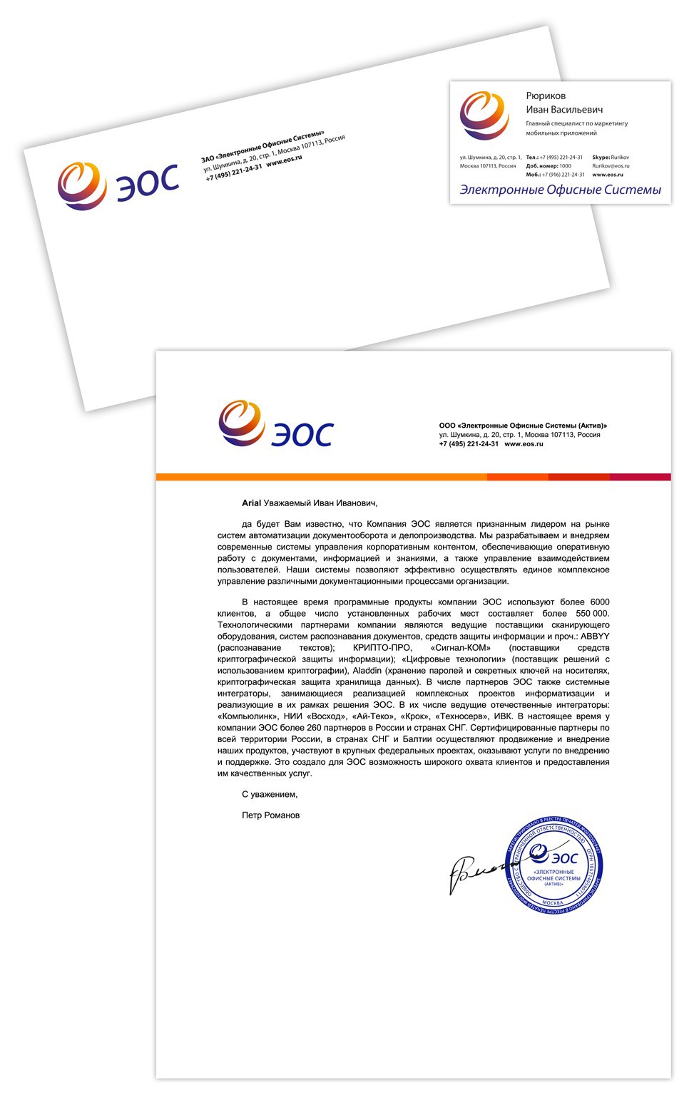 Business documentation
 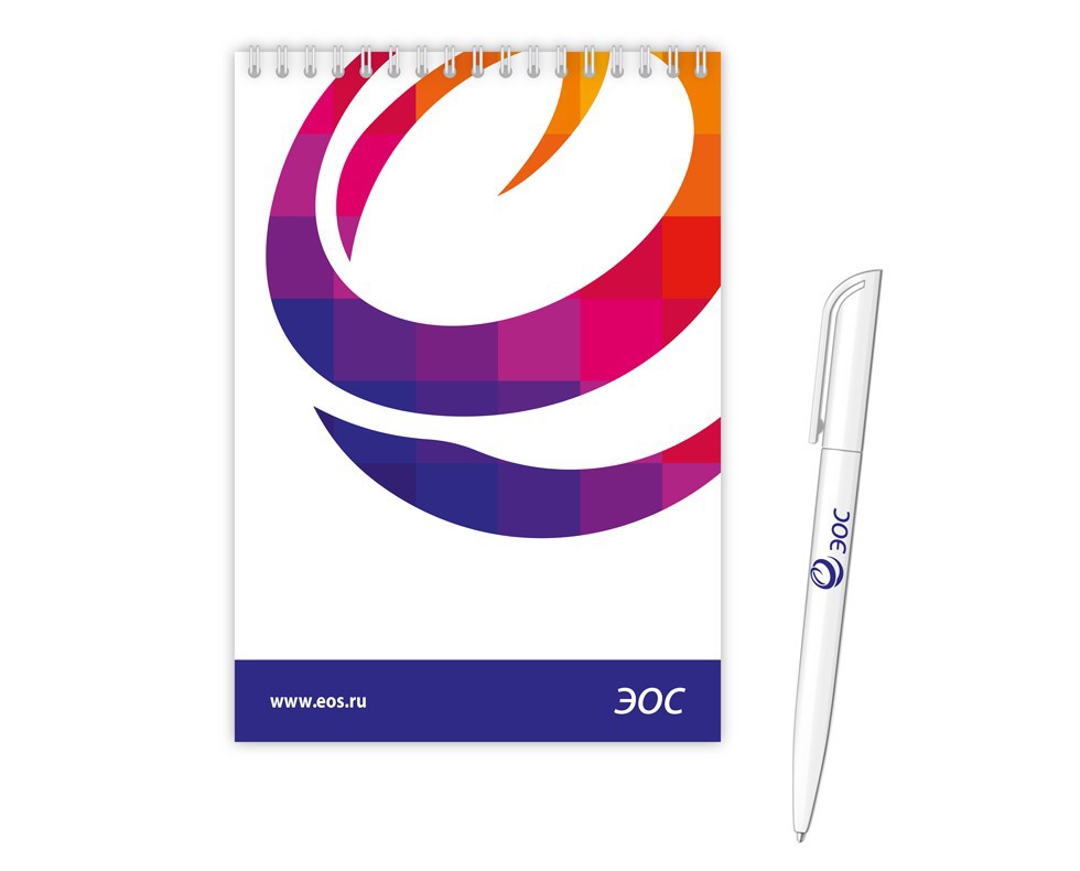 Company notebook and pen
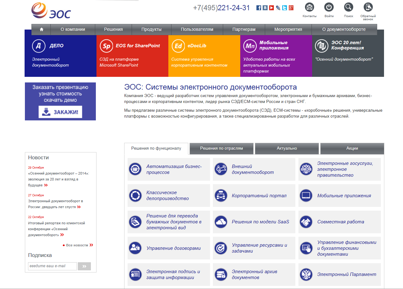
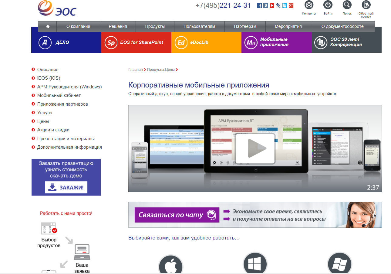 The site of the company
 And this is all the difficulties that at first glance seemed to be frivolous and not very priority, but upon close and detailed examination turned out to be very significant problems. 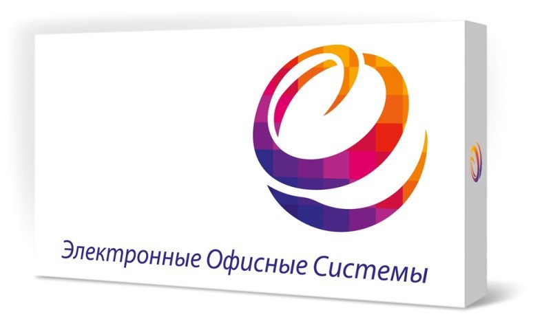

It is also one of the most common problems faced by our customers when contacting those. support, there was ignorance of the serial numbers of the products, which were usually lost immediately after the box was thrown away, and the DVD-box and the disc were all, of course, left. Now, all the client's serial numbers are printed on the inside of the DVD box cover, so the client has made it easier to find the cherished numbers for contacting those. support ...

The Klondike we discovered ...
With the advent of the brand book, we (EOS and partners) received a fairly clear guide to creating marketing and PR tools. No matter how you look, a brand book can help both from an economic position and from a position of moral satisfaction of employees.

From an economic position:
- saving man-hours on the development of marketing and PR-tools;
- reduction and optimization of a number of business processes;
- reduction of risk factors;
- reducing the number of iterations;
- association of employees and partners;
- promotion of a single branding idea in the market, etc.

From a moral position:
- the elimination of a number of routine works that have not yet given anyone great joy;
- no need to distract anyone, because All the necessary materials are in the open access to the building. portal and are constantly updated and updated;
- the nerves are no longer wasted on the arguments of “what is good and what is bad,” since there are approved corporate standards, etc .;
- more mutual understanding between colleagues and partners, etc.
PS: you can read the first part of the article here .
Periodic table in IT. Variety Grocery Logo
Before telling about the logos of products, which we already have 12 pieces, let me remind you what the company logo itself looks like:
Spread the logo and corporate colors in the brand book')
So, returning to the topic of product logos or, as we later called it, the "Periodic Table in IT" The ideas that we pursued when creating product logos: 1. they should be a logical continuation of the company logo; 2. should not repeat the colors of each other; 3. should be simple and concise, given the latest fashion trends; 4. should stand out among the variety of other icons so that the user can immediately find the product icon, and no matter what device it works on (PC or tablet). As a result, the colors of product logos should not merge, otherwise they will be difficult to distinguish, and at the same time, in some cases, show that we are talking about products that belong to one of the groups. For example, in a group of mobile applications, the primary color is purple. As a result, color solutions of some products had to be processed taking into account their belonging to certain groups. By the way, now on the site you can see how the colors of key products look together, and accordingly imagine what a mess it would be if we didn’t light them in different corners.
Treasure of time and money ... Before talking about treasures and money, I want to tell a couple of stories about our problems, which were before the rebranding and the creation of a single corporate style for the company and partners.
So…
Bug number 1. Infinity iterations ... A lot of advice, but few rules ...
The lack of a single and universal guide to the creation of marketing and PR tools. Oh, this independent creative ... I'll tell you on the example of presentation styles, which we used to have a great many (very old; old; seemingly new; surprise styles, which only the creator himself saw, etc.). Since Since our company is not a couple of departments and not a few employees (there are about 250 people in the company now), it’s quite often that our colleagues were sometimes especially distinguished by their creativity in designing and presenting information in presentations. And some, on the contrary, could not arrange the presentation themselves. Therefore, the lack of uniform rules for registration confused not one employee of the company. Accordingly, if earlier some employee of the company not from the “Marketing Department” himself made a presentation, then at the output this most often turned out to be a creative “Miracle”, which was then edited most often by the designer and, in some cases, by the marketing management staff, because . only they could lead presentations to a more or less common denominator. In the context of a simple case with presentations, a little about time (t) and money ($). With the axiom that t = $, I think everyone will agree. • Employee "A" - he needs to make a presentation (employee time - t "A") • Employee "B" - a designer or employee of the Marketing Department (t "B") + Do not forget about the risks that depend on the number of connections in the process. That is, the more connections, the more different risks there may be. Example:
Conclusion on the bug №1.
1. it is not necessary to involve in the process of registration of pptx employees of the Marketing Department (t1 "B"). And if help is needed, the number of iterations can be significantly reduced, and this is also the time;
2. no need to wait until the designer can get to the design of this pptx, and in fact he may have more priority tasks (Risk 1);
3. no need to spend time explaining some idea that the author wants to convey to the audience, but most often you have to explain more than once, because presentations describe IT products and processes, and pptx also tend to evolve and adapt to tasks (t3 "A" and t3 "B");
4. there is no dependence of the employee on the designer, therefore, there is no likelihood of meeting deadlines (Risk 2).
Total it turns out that the company saves the following amount of time:
$ 1 (company employees) = t1 "B" + Risk1 + t3 "A" + t3 "B" + Risk2
For example, $ 1 = 120 min + ... (skip) + 15 min (A) + 15 min (B) + ... (skip) = 150 min (2.5 h) PS: Let there be no risks and everything works like a Swiss watch, in order not to complicate the essence of the task
And this is only one presentation, but sometimes they can be on average 4 per week, which means S1 * 4 = 150 min * 4 presentations = 600 min (10 h)
PS: then, I think, everyone can estimate the cost of one hour of work for an employee and calculate the amount of $ you can save ...
Therefore, now we have absolutely for all employees and partners the following materials are available:
1) More than 30 presentation slide templates, describing various examples of text design, tables, charts, graphic elements, etc. Templates are complemented, if suddenly there appears some task described by current templates.
2) About 200 pictograms, icons, infographic schemes for presentations, flyers and other materials.
Presentation templates
By the way, we also use presentations, which are most often used for speeches or demonstrations, as an electronic textbook with integrated navigation. This is easy and saves time, because You do not need to create much again.
Bug number 2. Unity is power. Banner, united and the team and partners of the company.Brandbook seriously helped to unite the company's team and optimize more than one business process that ate time and money. By the way, our entire team is not sitting in the same building, so the opportunity to communicate live is not with all the staff.
However, in addition to the remotely distributed departments of the company, we have about 260 partners in Russia and the CIS, who to varying degrees also integrate into our company, becoming part of it, continuing to carry the ideas of our products and brand to customers. And each partner is also not a couple of people working. And this whole army also needs to be managed somehow, which in some cases is much more complicated than the employees of the company.
Just imagine an example from Baga Nos. 1 and 260 of partner companies, which also sometimes need to be helped with the design of some kind of marketing or PR toolkit. If at least 1/10 of our partners turn to us for help, we get the following conventional formula:
$ 2 (partners) = $ 1 * (1/10 * 260) In the role of "B" - now only partner acts
We continue our calculations a la as in Baga No. 1: $ 2 (partners of the company) = 150 min * (1/10 * 260) = 3900 min (65 hours or a little more than 8 working days)
TOTAL:
$ 1 (employees comp.) + $ 2 (partners comp.) = 3900 min + 600 min = 4500 min (75 h or slightly more than 9 working days)
PS: Wow time costs! Sometimes it was possible to engage only with presentations from morning till evening 5 days a week.
Conclusions on Bag No. 2 are somewhat similar to Bag No. 1, however there are other advantages:
- it was possible to quickly, simply and visually acquaint the partner with the rules of design of marketing and PR tools, so that he could start producing the materials that he needs for his tasks. For example, now a partner can independently create a leaflet for any of his tasks, using ready-made layouts and rules;
- a single language of communication appeared between the company and partners in the context of managing the company's brand policy and using common standards;
- the brand book was also vital and a number of our partners, who sometimes designed their regional grocery sites, looking at the EOS website. They also needed certain rules and application guidelines;
- a single format for the design and presentation of information throughout Russia and the CIS.
Bug number 3. Uniformity and modernity of spirit ...
Promotional products dedicated to the old products of the company, often differed in their design from promotional products for new products, because it was not always clear which requirements need to be updated. Accordingly, the answer was not always the answer, for example, to the question: “What should a modern leaflet look like that meets all of our requirements?”. However, both the old and most of the new promotional products did not meet the modern features of information perception. The buyer does not stand still. His requirements are developing, the perception of information is changing. For example, one of the tasks that we set for Studio Ippiart was clarity and speed of information perception when reading a leaflet: so that, literally running through the leaflet with your eyes, a potential client could understand what this product is for and what advantages it can give (And the IT products of our company, by the way, are not the most simple, with a ton of possibilities, which the client may not even guess).
The spread of the brand book on the design of advertising bookletsBug number 4. The unity of all feed channels ...
As you know, the channels for delivering information to the audience can be both online and offline. Everyone knows and understands this very well, but they just don’t always manage to ensure that both channels meet the same design rules and emphasize the unity of the corporate spirit of the company. The result is a strong heterogeneity of design of various channels of information presentation - from the website and promotional products to the business cards of employees. Moreover, earlier in the company, in fact, even there were no uniform rules for issuing employees' signatures in an e-mail. As a result, we had to create tools that would be perceived as a whole and a continuation of each other, and also conveyed the spirit of our company.
Business documentation Company notebook and pen The site of the company It is also one of the most common problems faced by our customers when contacting those. support, there was ignorance of the serial numbers of the products, which were usually lost immediately after the box was thrown away, and the DVD-box and the disc were all, of course, left. Now, all the client's serial numbers are printed on the inside of the DVD box cover, so the client has made it easier to find the cherished numbers for contacting those. support ...
The Klondike we discovered ...
With the advent of the brand book, we (EOS and partners) received a fairly clear guide to creating marketing and PR tools. No matter how you look, a brand book can help both from an economic position and from a position of moral satisfaction of employees.
From an economic position:
- saving man-hours on the development of marketing and PR-tools;
- reduction and optimization of a number of business processes;
- reduction of risk factors;
- reducing the number of iterations;
- association of employees and partners;
- promotion of a single branding idea in the market, etc.
From a moral position:
- the elimination of a number of routine works that have not yet given anyone great joy;
- no need to distract anyone, because All the necessary materials are in the open access to the building. portal and are constantly updated and updated;
- the nerves are no longer wasted on the arguments of “what is good and what is bad,” since there are approved corporate standards, etc .;
- more mutual understanding between colleagues and partners, etc.
Source: https://habr.com/ru/post/243557/
All Articles