QML: animated sandwich icon in Material Design style in 20 minutes
Hi, Habr.
Many developers interested in developing user interfaces (and just Android users) have already managed to familiarize themselves with the new concept of the Material Design interface, actively promoted by Google as part of the release of Android 5.0. Getting acquainted with the application design guide and carefully examining the recently updated Google Play, I noticed one very nice component - a menu icon (popularly known as hamburger icon), which animatedly turns into an icon “back”, and decided to implement such a component on Qt with using declarative QML interface description language.

')
In this article I will tell how to implement such a component and what problems and difficulties can be encountered in the process. Link to the full source code at the end of the post.
First, let's start Qt Creator and create a project like "Qt Quick Interface" - in this example we will use pure QML and do not write a single line of C ++ code.
We will immediately create a separate QML file for our component, since we intend to use it in future in other projects, and set the standard icon sizes for the AppBar from Material Design: 24 × 24.
MenuBackButton.qml
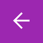
Prepare the root element of the project to display our icon and give it a bright background in the Material Design style:
main.qml
Let's take a close look at our component closely to figure out what it consists of and how to turn all this into code.

To begin with, we can immediately notice that our icon has two main states : the “menu” and “back”. All other states are intermediate parts of the animation when switching between these two. Immediately describe this in QML:
MenuBackButton.qml
For the convenience of debugging, we add a small fragment to the root element of main.qml, which allows us to switch the status of the icon with a mouse click:
main.qml
As it is easy to see, our icon consists of three rectangles, which in the “menu” state are the same size and are located above each other. To get an element pixel-to-pixel corresponding to the original one, I took several screenshots of the Google Play application on my smartphone and selected the coordinates and dimensions of the elements, comparing the resulting result with screenshots.
Let's add these elements to the code:
MenuBackButton.qml
Now you can run the resulting application and make sure that the icon in this state looks exactly the way we need it.

In order to go to the description of the state of "back", we will try again to look closely at what the animation looks like. If we don’t do this now, we will have to rewrite the already written code with some probability, which, of course, wouldn’t be desirable.
The transition between the states of the component consists of two parallel animations:
I, of course, did not immediately consider and tried to animate the rotation of each of the elements separately. I did not save the code and absolutely do not want to reproduce it, because it turned out terrible nonsense. Do not repeat my mistake :)
In fact, on a pixel-by-pixel basis, it turns out that the middle rectangle is also animated - its width decreases slightly.
Now that we know what rake we should not attack, let's describe the state of “back”. As we have already found out, it will consist of an “forward” icon, turned 180 ° around its axis.
In order to implement this in the code, we use the QML element PropertyChanges , which allows us to indicate how the properties of the element should change when moving to another state. Replace the “back” status description with the following code:
MenuBackButton.qml
Notice that the rotation property set for the root element also affects all its child elements. Run, click the mouse on the element ... Hooray! :)
When using these coordinates, everything looks great, but if you shift some of the elements by half a pixel or a pixel to the side, turned by an angle other than a multiple of 90 °, the rectangles may start to look, frankly, strange. The fact is that the antialiasing property of the Rectangle element is enabled by default only for rectangles with rounded corners. Therefore, to get a smoother looking animation and avoid various sorts of drawing problems, it is worth adding a property setting to each of the rectangles we declared:
Now, having described both the element states we need, it's time to take care of the animation of the transition between them. To do this, we will use the QML Transition and PropertyAnimation elements.
Also, for greater flexibility in use, we immediately declare an animationDuration property, which will allow us to further change the duration of the transition, without getting into the code of our element:
MenuBackButton.qml
In the Transition element, the “to” and “from” properties are usually specified, specifying which state transition this transition should take. But since in our case there are only two states and the animation of the transition to both sides is almost the same, these properties cannot be set.
Pay attention to the property easing.type - with this property we set the speed curve for the animation of elements. The fact is that the animation, which is performed at a constant speed, usually does not look very aesthetically pleasing. Any movement in the real world should have a period of increasing speed at the beginning of movement and a period of decreasing speed at its end. Actually, Google refers to the same thing in the Material Design document .
Checking:

We are almost done, but the rotation animation when switching back to the “menu” state does not quite work the way we would like. In principle, everything is logical: the rotation angle changes in the opposite direction from 180 ° to 0 °. But it's very easy to change:
The RotationAnimation element is designed specifically for such cases and allows you to specify in which particular direction the rotation will take place. If desired, we can add a property to our element that allows us to set the direction of the animation from the calling code.
This manual can be considered complete. We received a ready-to-use component that can be reused with minimal modifications. I can only offer to add the property “color” to set the color of the element in case it is used on a light background.
The great advantage of QML from my point of view is that the code of visual components on it in many cases is easily readable and very compact. The entire element I personally took only 60 lines of code, and it is even inconvenient for him to create a separate repository on github, so I give a link to gist .
Many developers interested in developing user interfaces (and just Android users) have already managed to familiarize themselves with the new concept of the Material Design interface, actively promoted by Google as part of the release of Android 5.0. Getting acquainted with the application design guide and carefully examining the recently updated Google Play, I noticed one very nice component - a menu icon (popularly known as hamburger icon), which animatedly turns into an icon “back”, and decided to implement such a component on Qt with using declarative QML interface description language.
')
In this article I will tell how to implement such a component and what problems and difficulties can be encountered in the process. Link to the full source code at the end of the post.
Notes
I apologize immediately for using gif-animation on the main page, but without it, unfortunately, it becomes completely incomprehensible what is being said.
All screenshots in the article will be scaled 3: 1 for ease of review. To understand what is written, a basic understanding of the syntax of the QML language and the capabilities it supports is required.
You can download the Qt library distribution kit and the Qt Creator development environment for your OS on the Qt official website .
By the way, the source tag supported by Habrom does not support highlighting for source code in QML, which can make it difficult to read the code slightly. It saves only that the amount of code we try to minimize as far as possible.
▌ Preparation
First, let's start Qt Creator and create a project like "Qt Quick Interface" - in this example we will use pure QML and do not write a single line of C ++ code.
We will immediately create a separate QML file for our component, since we intend to use it in future in other projects, and set the standard icon sizes for the AppBar from Material Design: 24 × 24.
MenuBackButton.qml
import QtQuick 2.2 Item { id: root width: 24 height: 24 } Prepare the root element of the project to display our icon and give it a bright background in the Material Design style:
main.qml
import QtQuick 2.2 Rectangle { width: 48 height: 48 color: "#9c27b0" MenuBackIcon { id: menuBackIcon anchors.centerIn: parent } } Component structure
Let's take a close look at our component closely to figure out what it consists of and how to turn all this into code.
To begin with, we can immediately notice that our icon has two main states : the “menu” and “back”. All other states are intermediate parts of the animation when switching between these two. Immediately describe this in QML:
MenuBackButton.qml
... state: "menu" states: [ State { name: "menu" }, State { name: "back" } ] ... For the convenience of debugging, we add a small fragment to the root element of main.qml, which allows us to switch the status of the icon with a mouse click:
main.qml
... MouseArea { anchors.fill: parent onClicked: menuBackIcon.state = menuBackIcon.state === "menu" ? "back" : "menu" } ... ▌ Status "menu"
As it is easy to see, our icon consists of three rectangles, which in the “menu” state are the same size and are located above each other. To get an element pixel-to-pixel corresponding to the original one, I took several screenshots of the Google Play application on my smartphone and selected the coordinates and dimensions of the elements, comparing the resulting result with screenshots.
Let's add these elements to the code:
MenuBackButton.qml
... Rectangle { id: bar1 x: 2 y: 5 width: 20 height: 2 } Rectangle { id: bar2 x: 2 y: 10 width: height: } Rectangle { id: bar3 x: 2 y: 15 width: 20 height: 2 } ... Now you can run the resulting application and make sure that the icon in this state looks exactly the way we need it.
▌ What is animation ?
In order to go to the description of the state of "back", we will try again to look closely at what the animation looks like. If we don’t do this now, we will have to rewrite the already written code with some probability, which, of course, wouldn’t be desirable.
The transition between the states of the component consists of two parallel animations:
- the upper and lower rectangles are reduced in width, rotated by 45 ° and shifted to the edge of the middle rectangle, forming an “arrow”
- all these elements are simultaneously turned 180 °
I, of course, did not immediately consider and tried to animate the rotation of each of the elements separately. I did not save the code and absolutely do not want to reproduce it, because it turned out terrible nonsense. Do not repeat my mistake :)
In fact, on a pixel-by-pixel basis, it turns out that the middle rectangle is also animated - its width decreases slightly.
▌ condition "back"
Now that we know what rake we should not attack, let's describe the state of “back”. As we have already found out, it will consist of an “forward” icon, turned 180 ° around its axis.
In order to implement this in the code, we use the QML element PropertyChanges , which allows us to indicate how the properties of the element should change when moving to another state. Replace the “back” status description with the following code:
MenuBackButton.qml
... State { name: "back" PropertyChanges { target: root; rotation: 180 } PropertyChanges { target: bar1; rotation: 45; width: 13; x: 9.5; y: 8 } PropertyChanges { target: bar2; width: 17; x: 3; y: 12 } PropertyChanges { target: bar3; rotation: -45; width: 13; x: 9.5; y: 16 } } ... Notice that the rotation property set for the root element also affects all its child elements. Run, click the mouse on the element ... Hooray! :)
When using these coordinates, everything looks great, but if you shift some of the elements by half a pixel or a pixel to the side, turned by an angle other than a multiple of 90 °, the rectangles may start to look, frankly, strange. The fact is that the antialiasing property of the Rectangle element is enabled by default only for rectangles with rounded corners. Therefore, to get a smoother looking animation and avoid various sorts of drawing problems, it is worth adding a property setting to each of the rectangles we declared:
antialiasing: true ▌ Transition animation
Now, having described both the element states we need, it's time to take care of the animation of the transition between them. To do this, we will use the QML Transition and PropertyAnimation elements.
Also, for greater flexibility in use, we immediately declare an animationDuration property, which will allow us to further change the duration of the transition, without getting into the code of our element:
MenuBackButton.qml
... property int animationDuration: 350 ... transitions: [ Transition { PropertyAnimation { target: root; duration: animationDuration; easing.type: Easing.InOutQuad } PropertyAnimation { target: bar1; properties: "rotation, width, x, y"; duration: animationDuration; easing.type: Easing.InOutQuad } PropertyAnimation { target: bar2; properties: "rotation, width, x, y"; duration: animationDuration; easing.type: Easing.InOutQuad } PropertyAnimation { target: bar3; properties: "rotation, width, x, y"; duration: animationDuration; easing.type: Easing.InOutQuad } } ] ... In the Transition element, the “to” and “from” properties are usually specified, specifying which state transition this transition should take. But since in our case there are only two states and the animation of the transition to both sides is almost the same, these properties cannot be set.
Pay attention to the property easing.type - with this property we set the speed curve for the animation of elements. The fact is that the animation, which is performed at a constant speed, usually does not look very aesthetically pleasing. Any movement in the real world should have a period of increasing speed at the beginning of movement and a period of decreasing speed at its end. Actually, Google refers to the same thing in the Material Design document .
Checking:
▌ Victory? Not really.
We are almost done, but the rotation animation when switching back to the “menu” state does not quite work the way we would like. In principle, everything is logical: the rotation angle changes in the opposite direction from 180 ° to 0 °. But it's very easy to change:
... RotationAnimation { target: root; direction: RotationAnimation.Clockwise; duration: animationDuration; easing.type: Easing.InOutQuad } ... The RotationAnimation element is designed specifically for such cases and allows you to specify in which particular direction the rotation will take place. If desired, we can add a property to our element that allows us to set the direction of the animation from the calling code.
▌ Result and links
This manual can be considered complete. We received a ready-to-use component that can be reused with minimal modifications. I can only offer to add the property “color” to set the color of the element in case it is used on a light background.
The great advantage of QML from my point of view is that the code of visual components on it in many cases is easily readable and very compact. The entire element I personally took only 60 lines of code, and it is even inconvenient for him to create a separate repository on github, so I give a link to gist .
Source: https://habr.com/ru/post/243355/
All Articles