9 basic principles of responsive web design

Responsive design is an excellent solution to the problem of correctly displaying the site on different screens. However, it is often difficult for beginners to understand the basics, learning only from books / articles. Every day there are more and more different devices with different screen sizes, so creating a design in pixels and only for desktops / smartphones is a thing of the past. That is why it is worthwhile to learn the principles of responsive design - a design that combines adaptability and rubberiness (if you are not familiar with adaptive design, then this article will be a good choice to start learning).
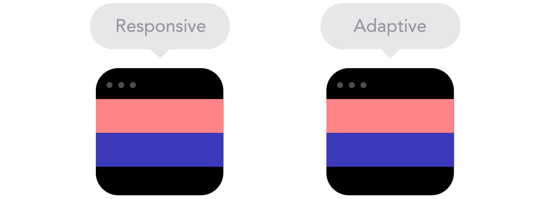
Responsive vs Responsive Web Design
It may seem like the same thing. However, both of these types of design complement each other and are suitable for each of their tasks.
')
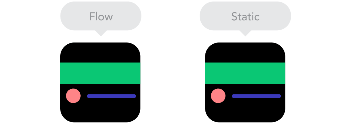
Flow
When the screen size is reduced, the page content begins to occupy more height, and the elements begin to shift downwards. This behavior is called a thread . This may be difficult to understand if you used fixed element sizes before. However, when you start using a stream, you will understand how it works.
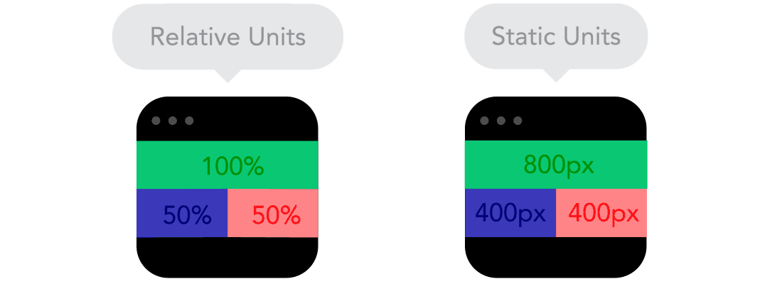
Relative Units
The page viewing area can be a monitor, a mobile screen or anything else. The density of pixels on different screens is also different, so we need flexible units of measurement that work everywhere. Responsive design is the case when relative units of measure like percentages become really useful. With the help of percentages, we can set the block to 50% width, and on any device it will occupy only half of the screen.
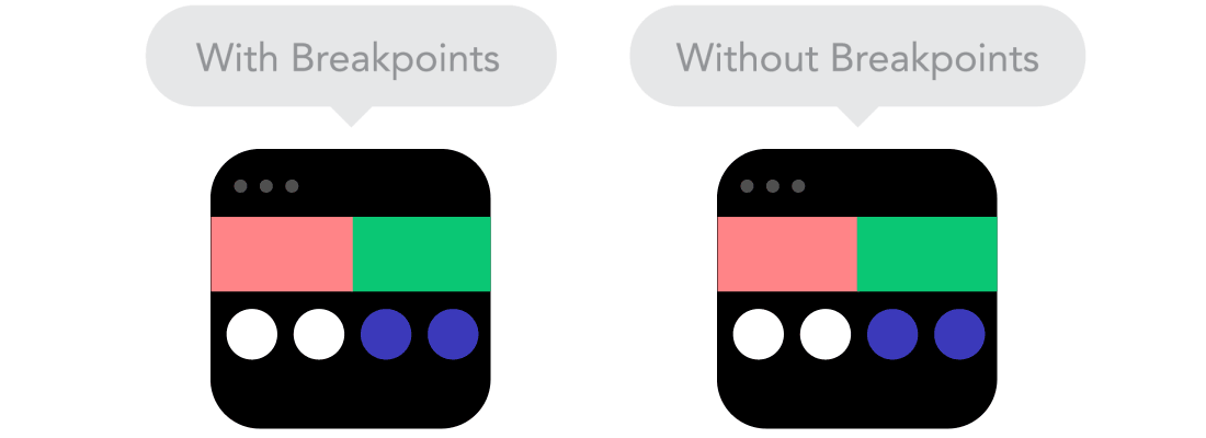
Breakpoints
Control points allow you to change the location of blocks on the page only in the case of using a screen with certain sizes. For example, on the desktop computers, the site will have three columns, and on mobile - only one. How you set the control points depends on the behavior of the content. If the content of the page is “crawling”, then a control point should definitely be added. However, control points should be used with caution - you may be confused.
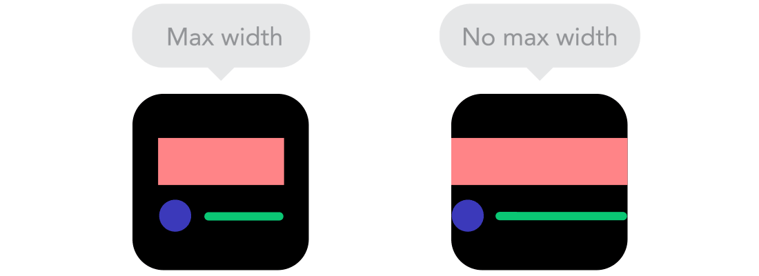
Max and min values
Content that occupies the entire width of the screen is great if it is displayed on the mobile. And if you open the page through your TV? It is unlikely that the seen picture will please you. Therefore, a reasonable solution would be to use the minimum and maximum values. For example, if you give the block the properties `width: 100%` and `
Nested objects
Remember
position: relative ? If you have a lot of elements depending on the location of other elements, they will be hard to control. It is much easier and more correct to wrap these items in one container. By the way, this is the case when static units like pixels will help you. They are useful for content that you do not want to adapt to the size of the screen — for example, it can be a logo or a button.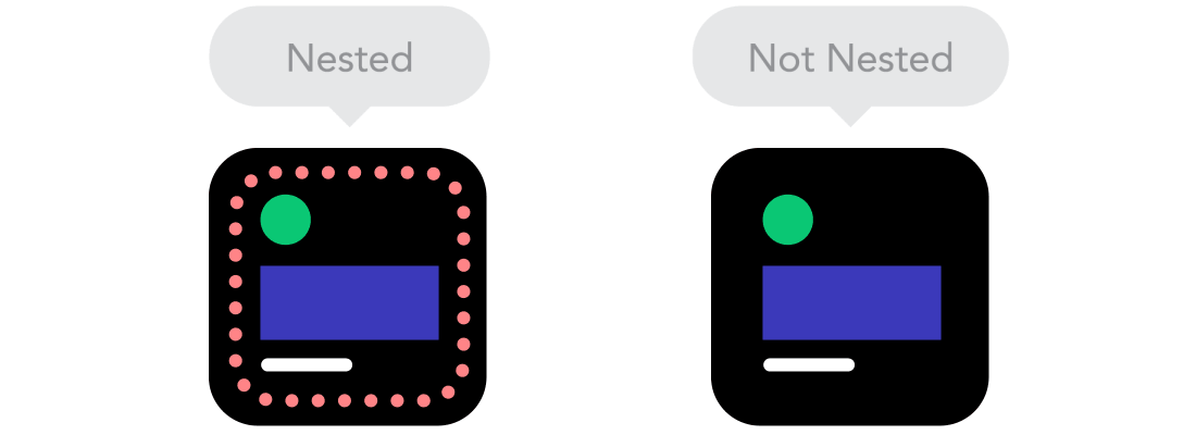
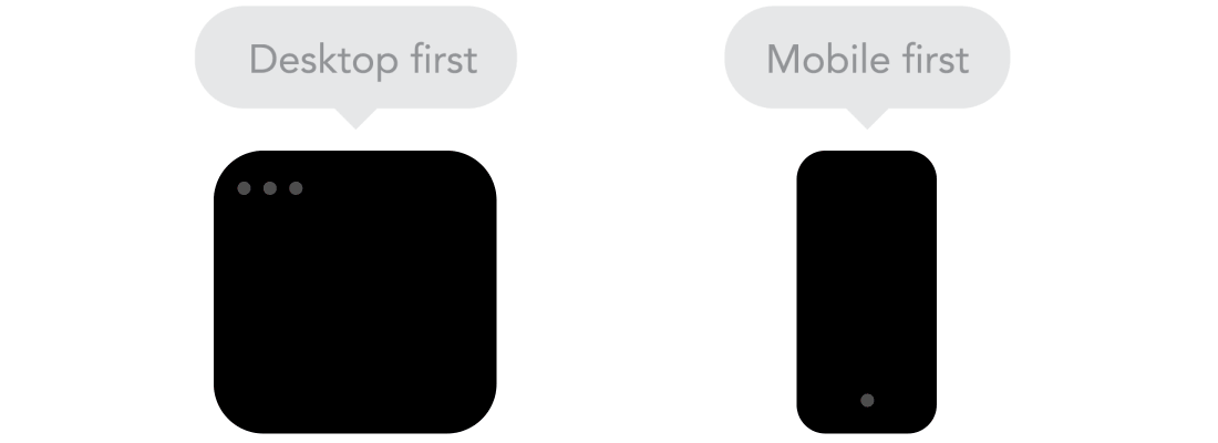
Desktop or mobile first
On the technical side, there are no differences: you can write basic markup for mobiles, and arrange key points for desktops (mobile first) and vice versa. Often people do not know which approach to choose. Think properly and select the appropriate approach.
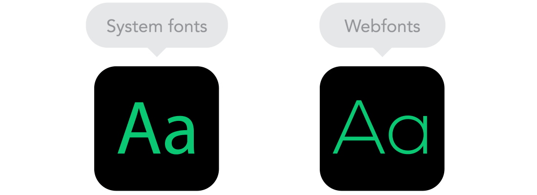
Web fonts vs system fonts
Do you want to use on your website cool looking headset Futura or Didot? Use
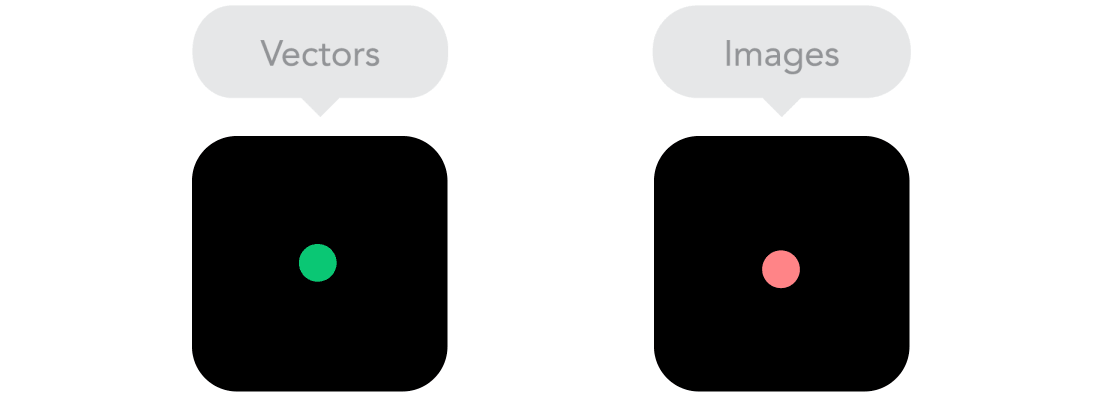
Raster vs vector images
Does your image have many small details and impressive effects? If yes, then use raster format. Otherwise use vector format. For bitmap images, use the jpg, png or gif formats, for vectors, SVG and icon fonts are the best choice. Each of the formats has its advantages and disadvantages. In any case, keep in mind the size of the images - no picture should go online without being optimized (compressed). Vector images are often free from oversize, but they are not supported by older browsers. It is also worth remembering that if the vector image contains a lot of details, then it may weigh more raster.
Source: https://habr.com/ru/post/243247/
All Articles