Website hosting provider redesign: errors and solutions
A distinctive feature of the development of startups is a constant lack of resources, which often forces project teams to resort to temporary solutions - all in favor of the rapid development and testing of hypotheses, to weed out all unnecessary and focus on key indicators for the business. In addition, during the testing of these hypotheses, the very concept of the business often changes.
There is nothing more permanent than temporarily, but to successfully reach a new level, sooner or later the company will have to replace the “bikes” with quality solutions.
')
Design and creation of product interfaces is one of the areas in which young projects are sometimes forced to compromise. And to abandon them in the future is not easy at all. Today we will talk about how to create a project site hosting provider 1cloud and how, shortly after launch, worked on its redesign.
Hypothesis Testing
The initial concept of the project was formulated as a “cloud solutions store” - we wanted to create a “marketplace”, that is, a platform into which anyone could upload their product and sell it. However, after the analysis and the first tests, an understanding emerged that it was better to move towards the creation of an IaaS & PaaS provider.
At the same time, a certain amount of time was already spent on testing the first hypothesis, so at the second stage I wanted to move faster. Unfortunately, this was not achieved - our project is a startup that does not have significant financial resources for maintaining a UX specialist in the state. Therefore, it was decided to resort to the services of external contractors - on the topic of interaction with them, you can write a separate material.
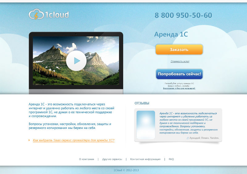
Below are the page layouts, the implementation of which we refused for various reasons (by clicking on the image they open in full size):
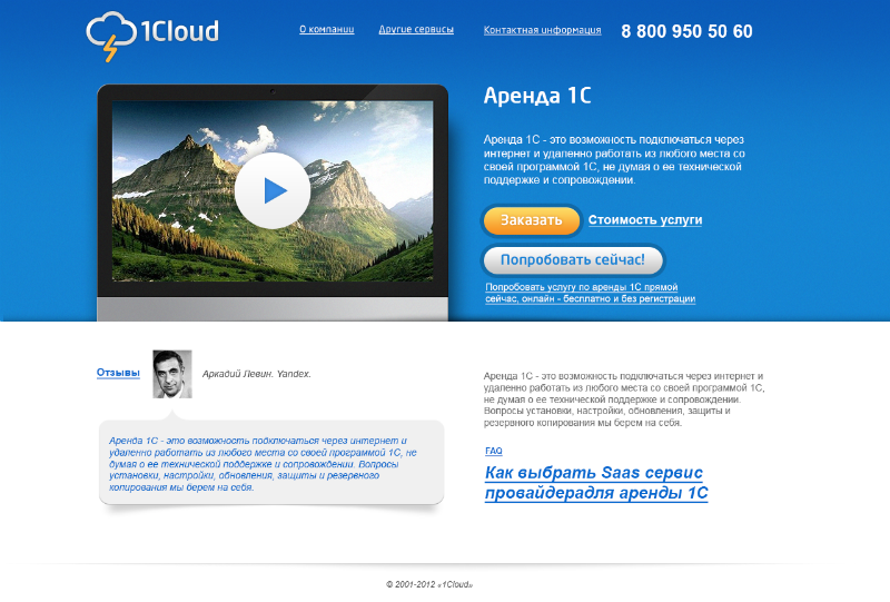
Option in different colors:

Ultimately, a new UI specialist was recruited. We managed to launch the project with him, but there were still some errors in the interface (especially in navigation).
Inner panel:
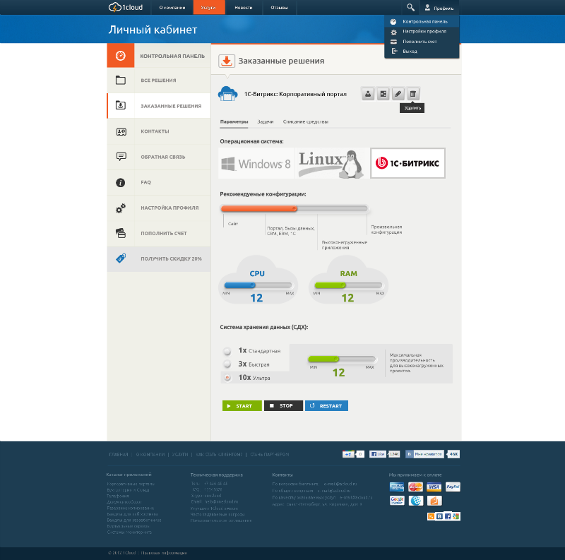
Time to create the interface was spent quite a lot, but the end result was still imperfect, plus questions remained about the viability of the new business model. It was necessary to move on to testing it, but the results could not have been influenced by the most elaborate interface of the site and the users personal account.
In order to compensate for the time spent, we decided to resort to an already working solution that proved its viability, and took the site of the popular western IT company DigitalOcean as a basis.
Waiver of temporary solutions
A new business model has proven its worth (despite a certain negative in relation to the adoption of design by some users of Habr, expressed in the comments to one of our materials ). Therefore, the next step was to develop a new interface that would be completely unique.
Among other things, the mentioned negative in relation to the creation of an interface similar to the site of a Western project, it was necessary to minimize, and therefore make the new design as different as possible on DigitalOcean.
Work on the design was carried out according to the classical scheme - a meeting with the contractor to discuss the concept and getting the first sketches on paper. Next, mokapy were created in Balsamiq - already at this stage some ideas had to be abandoned, but something was being finalized.
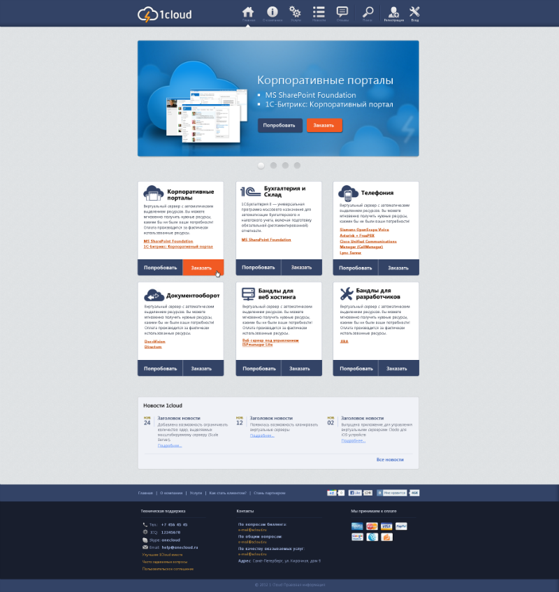
In the future, layouts in PSD with the actual interface screens were created. From the very beginning, the concept of minimalism was chosen, so there were not very many reworkings on design.
What was done
On Habré previously published excellent material with the analysis of the main errors in the interfaces and business processes of sites hosting providers. We have worked to avoid these problems.
Problem: Searching for Tariff Information
As stated in the material, most often users get to the home page of the site, which they may not need at all - people want to know the cost of service and immediately get information about tariffs. Users are too lazy to click for a long time in search of the necessary information, so they leave the site without solving their problem.
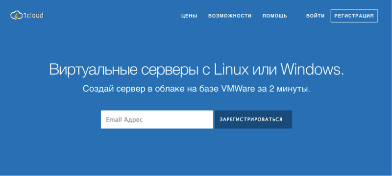
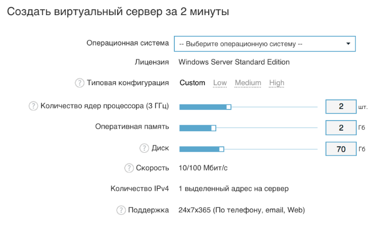
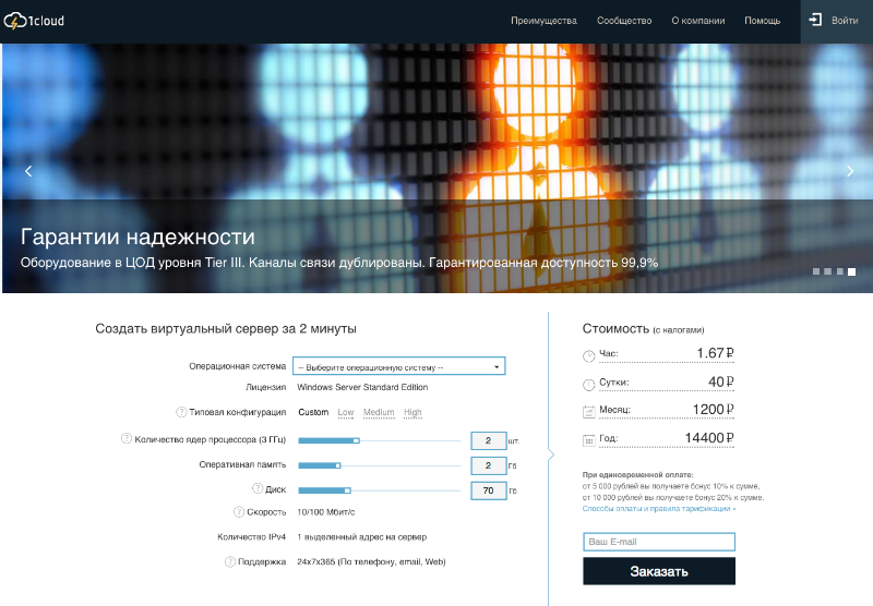
Solution: Bringing the price calculator to the main page
A price calculator was added to the main page, with which customers can select pre-configured tariff plans (Low, Medium, High), but also create a “custom” tariff to suit their needs, indicating any possible combinations of CPU, Storage and RAM.
Problem: Too many tariffs confuse users
With the growth of the business, the hosting provider often faces the need to introduce new tariffs that target customers with different needs and even located in different countries. At the same time, users do not always respond positively to a large spread of tariffs - if they differ only in not very significant nuances, then it will only make it more difficult to make a choice.
Solution: Configuration of three “hard” tariffs and one “custom”
As already noted above, we have configured three tariffs that are not subject to change and are quite seriously different - it is easier for the user to choose what suits him most. It is also possible to collect your own tariff plan using a special simple configurator.
Problem: No one likes to register
This is a common problem of the sites of many companies, not just hosters. Getting to the site, the user wants to solve his problem as quickly as possible, rather than fill out endless registration forms and deal with captcha. 54 users out of 100 will prefer to leave the site, rather than register on it - the business will lose more than half of potential customers. This should not be allowed.

Solution: For registration, just enter the email
A scheme was implemented in which to order a virtual server, you only need to specify the operating system you need and leave an email address. To register on the site, it is also enough just an email-address, which simultaneously performs the role of a user name when logging into the control panel.
Problem: Scant information in tariffs
People who buy hosting, as a rule, more or less versed in IT. At a minimum, they know whether they need a dedicated server or a virtual one, that is, they are not housewives and want to know what they are paying for, down to the smallest details.
Solution: Display all information in the configurator on the main page
The virtual server buyer needs to be informed about the type of virtualization, as well as tell about other important things, such as disk type, channel width and country of placement. All such information is available on the main page of the site 1cloud. Online help is available for basic configuration items.
Problem: It is not clear how to get support in an emergency
On the sites of many hosters it is not always possible to quickly find contact information, but almost everywhere users are annoyed by the pop-up windows of the online consultant (who is always offline when he needs it).
Solution: Enter round-the-clock technical support
In addition to the standard option with sending a letter to the email address of technical support, round-the-clock support was introduced both by local phone number in St. Petersburg (+7 (812) 313-88-33) and by a toll-free number throughout Russia (8 (800) 777 -18-23).
Problem: Doubts about the security of transmitted data
Recently, the number of diverse leaks and security problems of entire protocols have created a negative information background, around everything related to technology. One of the first things that consumers of IT services think about is whether they will be able to keep their data (including billing) safe. Some hosters do not use https - this may scare away some clients. Also, in no case can not use self-signed security certificates.
Solution: Use secure connections and certificate issued by a reputable registration center
Sites 1cloud.ru and panel.1cloud.ru use certificates SSL certificate issued by a certification center (Go Daddy Secure Certificate Authority-G2). At the moment, work is underway to connect the EV-certificate.
Problem: Intrusive Security
The other side of attention to security is the fact that it often becomes too much, in the user's understanding - that is, in pursuit of data integrity, using the service becomes inconvenient. For example, a common practice that many people do not like is the requirement of a user's phone number (for example, to make a purchase).
Solution: Possibility of ordering a server without SMS verification
We in 1cloud entered the test period of service use, during which the user's phone number is not asked. In the future, it is possible that the conditions of the test period will be extended after the phone number is specified.
Problem: Inconvenient Payment Methods
In Russia, a large number of various payment services and e-wallets used by a significant part of the Runet audience. Therefore, the lack of the possibility of paying for a favorite e-wallet on the site may frighten the user - the competition in the hosting market is great, and he will have someone to go to.
Solution: Adding most popular payment methods
For individuals, we added the ability to pay with Visa, Master Card, as well as electronic services and from mobile accounts (QIWI, Webmoney, Yandex Money, MTS, Megafon, Money@mail.ru, Web Wallet PSCB, EasyPay, LiqPay, Svyaznoy, Rapida, Euroset).
Legal entities can pay for services only through an account, but it can be generated directly in your account.
In addition to solving these problems, we were engaged in work on creating a more pleasant and convenient interface. As for navigation, before each section of the site looked like a separate resource, all menus were decorated differently - the current version of the interface 1cloud.ru is characterized by great uniformity.
Future plans include the creation of a mobile version of the site, but here we have to face the problem of preserving the functionality of the administrative user interface - in the absence of a mouse and keyboard and smaller physical screen sizes, many tasks for managing services will be more difficult and it will be necessary to minimize difficulties for users.
In addition, we are planning to release several new services (for example, DNS-aaS and Load Balance-aaS), which will require the integration of their management systems into the personal account interface.
After the release of the new site, quite a bit of time has passed, and we are still continuing tests and collecting data on whether the results have improved (increased time on the site, reduced failures, etc.). However, the positive dynamics is noticeable now, although it is too early to draw final conclusions — it is quite possible that some additional refinements will be needed.
That's all for today. We will be happy to answer questions and hear feedback on the implementation of certain interface elements in the comments.
Source: https://habr.com/ru/post/243133/
All Articles