Bearded designers are the last to think about design.
Which color is better is turquoise or olive, and the buttons are glossy or flat, and the font is antiqua or grotesque, and the layout is fixed, rubber, or adaptive ... and another 100,500 similar questions. Welcome to the head designer. Let's try to figure out what is superfluous and what is missing here.
So, it will be about designers in small companies. But not about those who draw disposable art promotional sites (where the “the more original the better” approach often works), but about those who create functional, useful applications and web interfaces designed for long-term use. It seems to be, what's the difference, what to draw - everywhere there are buttons, pages, pictures, text ... And here and not. These are completely different tasks and should be solved by people with completely different skills and talents. But first things first.
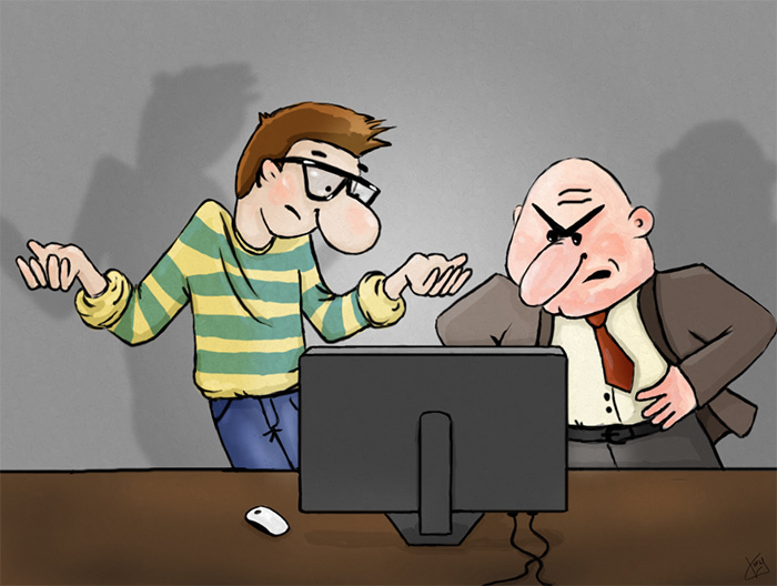
Let's look at the usual average company in which product development begins. The manager has a vision of the future system in his head, he understands that he wants to receive from it. Some schemes and pieces of the interface are drawn on paper, the functionality is partially described in the form of text and diagrams, it happens that even there is a TK. A designer is invited to draw a beautiful interface. The hitch is that setting the task for the designer, the director imagines only the main scenarios of the product, and the ideal situation. There are, as a rule, no separate architects, designers and usability specialists (we are talking about small companies). Therefore, often the task looks incomplete, contradictory and ill-conceived. Fill in the empty spaces and eliminate contradictions in the production have to the designer himself. And how well he does it depends on the success of the project.
In my experience, if the designer simply draws what he is told, then in most cases a carefully drawn useless picture is obtained. At the implementation stage, half of the beautiful layout disperses, because it is stretched to real data, inconsistencies in navigation are found, etc. The result is not liked by the designer himself or the director (or the customer). After that, either everything remains as it is, or tedious rework begins, leading to crutches and props. Who is to blame - the designer?
')
To avoid such a situation, at the beginning of the project, the designer needs to figure out what to draw on the page, what colors to make buttons, and what fonts to take, and which ones to solve. What we want to achieve from the user. How can we get this. And everything else will depend on it.
Starting with the goals of users and the main scenarios of their interaction with the product, we will be able to look at the “bird's-eye view” system. Focus on the main parts of the system and trace the user's main path from entering the application to the target action, and concentrate all his efforts on making this path the most understandable and convenient. This approach is called “goal-oriented” and is very well described in Alan Cooper's book On the Interface. Basics of interaction design.
If, when making interface decisions, we are guided by personal artistic taste, color preferences, or simply the desire to occupy an empty place on the page, then how will we make these decisions in front of the boss or customer?
We will have a much stronger position if we see that these decisions help in achieving our goals and if users understand what and how they can do on the page and behave as we want. As Eric Rees wrote in the book “Business from scratch. Lean Startup Method for Quickly Testing Ideas and Choosing a Business Model:
And this is the only objective criterion for good design. And here's another statement on this topic from the 37signals Getting Real company book. There is no “Designer” word here, but in my opinion, this phrase refers to us directly:
Often the designer is the only person responsible for how the application will be perceived by users, what and how they will do in it, how satisfied they will be, whether they will become regular customers or close the application and never return to it. Agree that changing the color of the button is unlikely to seriously affect it.
It turns out that you need to take into your own hands UX design, design, analysis of the needs and tasks of users and even understand the business goals of the organization. So what to do? Ce la vie, as the french say. The situation is often complicated by the fact that the director and manager treat the designer as a simple draftsman and are skeptical of his questions about the goals of the users and the design proposals. Success in this battle will depend on the perseverance of the hero designer.
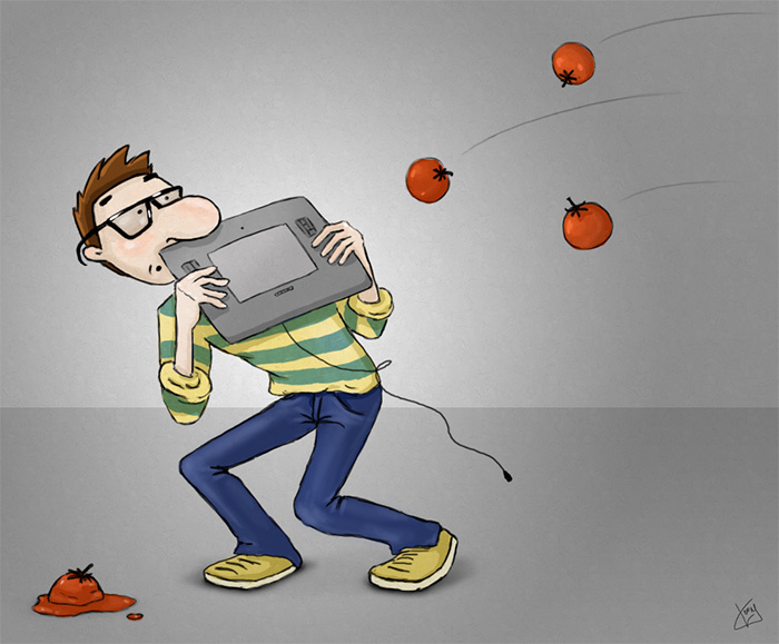
You can, of course, not stick out and carefully draw everything they say. And when another zombie project comes to light, shrug it out and say, “You yourself insisted on such a decision, I didn’t like it right away.” But, personally, my opinion is a weak position. We are designers - ambitious guys. It is important for us to be proud of our work and fill our portfolio with lively and spectacular works. Therefore, this approach is not for us.
Probably, many people will disagree with me and say that it is up to the designer to paint, not to turn the nuts. And if the manager did not give a normal TZ, then he himself is to blame, let him look for a designer or information architect so that he can think things through. For large companies, this makes sense, but for a brisk and easy start-up team this approach is unjustified. Here everyone should be a generalist, learn quickly and be responsible for the success of the project. So, learn to design, define user goals, and think about the whole project at once. And if at the same time you can write technical documentation and texts on the site, communicate with clients, make up a little and understand the architecture of the application, then you will become much more useful for the whole team and your design will only benefit from it.
Another important point. If we talk about a startup, the task itself is changing all the time, because The project develops iteratively, and the team adjusts the direction of movement on the move. On this occasion, do not get upset and get into the pose of an offended designer, whose work is thrown out. It is necessary to recognize at once that the task will change and what you draw is not final and most likely will be revised in the future. In fact, this is good, because it will allow you to treat design as an experiment. You can think not about how to perpetuate your creation in history, but about how to solve the current problem in the most effective and understandable way.
Again, if you keep in mind that the first option is not final, then you will strive to make it as simple and flexible as possible, don’t waste time drawing minor details and focus on the basic needs of users.
The share of visual design in the design of applications is negligible. Design, of course, should be beautiful and fashionable, on the grid and the golden section, but this is all secondary. To make really effective designs you need to think about a lot of things, and first of all, why you need an application, what tasks it solves, what we want from the user. You need to analyze and test your decisions all the time. Try, check and redo. All the while improving and doubting what seems to be the absolute truth. Poke his nose in adjacent areas and take part of the responsibility for the success of the project.
It's just that drawing beautiful buttons is boring and quickly annoying. To grumble about the fact that we have been given a bad task is unprofessional. We can easily turn our work into something much more interesting and useful, so why not do it?
So, it will be about designers in small companies. But not about those who draw disposable art promotional sites (where the “the more original the better” approach often works), but about those who create functional, useful applications and web interfaces designed for long-term use. It seems to be, what's the difference, what to draw - everywhere there are buttons, pages, pictures, text ... And here and not. These are completely different tasks and should be solved by people with completely different skills and talents. But first things first.
What's wrong
Let's look at the usual average company in which product development begins. The manager has a vision of the future system in his head, he understands that he wants to receive from it. Some schemes and pieces of the interface are drawn on paper, the functionality is partially described in the form of text and diagrams, it happens that even there is a TK. A designer is invited to draw a beautiful interface. The hitch is that setting the task for the designer, the director imagines only the main scenarios of the product, and the ideal situation. There are, as a rule, no separate architects, designers and usability specialists (we are talking about small companies). Therefore, often the task looks incomplete, contradictory and ill-conceived. Fill in the empty spaces and eliminate contradictions in the production have to the designer himself. And how well he does it depends on the success of the project.
In my experience, if the designer simply draws what he is told, then in most cases a carefully drawn useless picture is obtained. At the implementation stage, half of the beautiful layout disperses, because it is stretched to real data, inconsistencies in navigation are found, etc. The result is not liked by the designer himself or the director (or the customer). After that, either everything remains as it is, or tedious rework begins, leading to crutches and props. Who is to blame - the designer?
')
From large to small
To avoid such a situation, at the beginning of the project, the designer needs to figure out what to draw on the page, what colors to make buttons, and what fonts to take, and which ones to solve. What we want to achieve from the user. How can we get this. And everything else will depend on it.
Starting with the goals of users and the main scenarios of their interaction with the product, we will be able to look at the “bird's-eye view” system. Focus on the main parts of the system and trace the user's main path from entering the application to the target action, and concentrate all his efforts on making this path the most understandable and convenient. This approach is called “goal-oriented” and is very well described in Alan Cooper's book On the Interface. Basics of interaction design.
If, when making interface decisions, we are guided by personal artistic taste, color preferences, or simply the desire to occupy an empty place on the page, then how will we make these decisions in front of the boss or customer?
We will have a much stronger position if we see that these decisions help in achieving our goals and if users understand what and how they can do on the page and behave as we want. As Eric Rees wrote in the book “Business from scratch. Lean Startup Method for Quickly Testing Ideas and Choosing a Business Model:
“Good design is one that changes consumer behavior for the better.”
And this is the only objective criterion for good design. And here's another statement on this topic from the 37signals Getting Real company book. There is no “Designer” word here, but in my opinion, this phrase refers to us directly:
“The best designers and the best programmers — not those with the best skills, or the most nimble fingers, or the ones who can make a beautiful layout in Photoshop — are those who can determine what matters. They are the ones who make the benefits of the decision. ”
No need to draw
Often the designer is the only person responsible for how the application will be perceived by users, what and how they will do in it, how satisfied they will be, whether they will become regular customers or close the application and never return to it. Agree that changing the color of the button is unlikely to seriously affect it.
It turns out that you need to take into your own hands UX design, design, analysis of the needs and tasks of users and even understand the business goals of the organization. So what to do? Ce la vie, as the french say. The situation is often complicated by the fact that the director and manager treat the designer as a simple draftsman and are skeptical of his questions about the goals of the users and the design proposals. Success in this battle will depend on the perseverance of the hero designer.
You can, of course, not stick out and carefully draw everything they say. And when another zombie project comes to light, shrug it out and say, “You yourself insisted on such a decision, I didn’t like it right away.” But, personally, my opinion is a weak position. We are designers - ambitious guys. It is important for us to be proud of our work and fill our portfolio with lively and spectacular works. Therefore, this approach is not for us.
Probably, many people will disagree with me and say that it is up to the designer to paint, not to turn the nuts. And if the manager did not give a normal TZ, then he himself is to blame, let him look for a designer or information architect so that he can think things through. For large companies, this makes sense, but for a brisk and easy start-up team this approach is unjustified. Here everyone should be a generalist, learn quickly and be responsible for the success of the project. So, learn to design, define user goals, and think about the whole project at once. And if at the same time you can write technical documentation and texts on the site, communicate with clients, make up a little and understand the architecture of the application, then you will become much more useful for the whole team and your design will only benefit from it.
Task variability
Another important point. If we talk about a startup, the task itself is changing all the time, because The project develops iteratively, and the team adjusts the direction of movement on the move. On this occasion, do not get upset and get into the pose of an offended designer, whose work is thrown out. It is necessary to recognize at once that the task will change and what you draw is not final and most likely will be revised in the future. In fact, this is good, because it will allow you to treat design as an experiment. You can think not about how to perpetuate your creation in history, but about how to solve the current problem in the most effective and understandable way.
Again, if you keep in mind that the first option is not final, then you will strive to make it as simple and flexible as possible, don’t waste time drawing minor details and focus on the basic needs of users.
Shortly speaking
The share of visual design in the design of applications is negligible. Design, of course, should be beautiful and fashionable, on the grid and the golden section, but this is all secondary. To make really effective designs you need to think about a lot of things, and first of all, why you need an application, what tasks it solves, what we want from the user. You need to analyze and test your decisions all the time. Try, check and redo. All the while improving and doubting what seems to be the absolute truth. Poke his nose in adjacent areas and take part of the responsibility for the success of the project.
It's just that drawing beautiful buttons is boring and quickly annoying. To grumble about the fact that we have been given a bad task is unprofessional. We can easily turn our work into something much more interesting and useful, so why not do it?
Source: https://habr.com/ru/post/242833/
All Articles