Create a portfolio based on photos from Instagram

Hello, dear habradrug! In this tutorial, we will create a simple portfolio site that will be based on photos from your Instagram account. The design of the site made Tomas Laurinavicius , and it turned out to be simple, functional and spacious. So, let's begin.
Download source | Demo
')
Instruments
To make your life easier, we will rely on several useful tools and libraries. Before starting work, we need to prepare a couple of tools:
- Sass
- Twitter Bootstrap (Sass version)
- Instafeed.js
- Modernizr
First of all, you need a Sass tool that works on your computer. The easiest way to use the Koala application is that it is cross-platform, free and, most importantly, easy to use. In addition, there are alternative programs: Scout , Prepros and Compass app . All of them offer similar functionality, so the choice is yours!
Now Bootstrap. We will use Bootstrap at a basic level to manage some elements of the page. You need to download the Sass version to include it in our style sheet.
Almost done! Now you need to download Instafeed.js, a plugin that takes photos from Instagram. It is worth noting that in order for the script to be able to take photos from Instagram, it is necessary to provide it with a client ID, which can be generated on the developer page .
Finally, we need to download the latest version of Modernizr, a JavaScript library that learns that the user's browser is able to use HTML5 and CSS3.
So, we have collected all the necessary tools, we begin the construction of the site.
Site structure
We need to create several files and folders for our project:
- css /
- images /
- js /
- index.html
This is our foundation. Now open the
assets folder, which you can find in the archive with Bootstrap:
Copy the
fonts folder to the project root folder. Open the javascripts folder and copy the bootstrap.js file in the js folder. Finally, open the stylesheets folder and copy the bootstrap.scss file and bootstrap folder to the css directory. The structure of our project should look like this: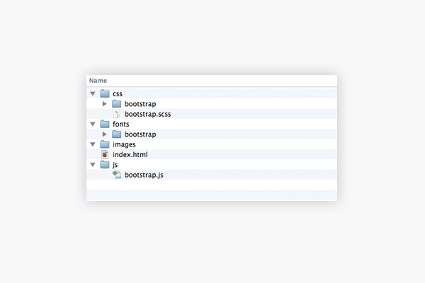
Fine! Now copy the files
instafeed.min.js and Modernizr to the js folder. Now we need to customize something else before we start building the template.Sass Setup
Now it's time to set up our project to use Sass. In the Koala application, the entire setting is to transfer the folders to the application window. I think that the same process is typical for other similar programs.
Adding Files
Open the project in the program you have chosen so that we can add the necessary files.
First in the
css folder Add a file called style.scss . Then in the js folder, add a file called app.jsI advise you to update the application that you use to configure Sass so that it will “pick up” new files. Some applications do this automatically, but it is still better to be safe.
I think we are done with pre-tuning. Now let's proceed directly to the frame!
We are starting construction
Open the
index.html file and paste in the following HTML code: <!DOCTYPE html> <html> <head> <meta name="viewport" content="width=device-width,user-scalable=no"> <title>Instagram Portfolio</title> <link href='http://fonts.googleapis.com/css?family=Lato:400,700|Kaushan+Script|Montserrat' rel='stylesheet' type='text/css'> <link rel="stylesheet" type="text/css" href="css/style.css"> <script type="text/javascript" src="js/modernizr.js"></script> </head> <body> <header> </header> <section class="instagram-wrap"> </section> <footer> </footer> <section class="footer-bottom"> </section> </body> </html> Let's take a closer look at our template.
So, the
<head> section contains the required viewport tag for correct media queries. We then assigned a <link> for various Google fonts . Next, we have prescribed tags containing style.css and Modernizr.The section with the
<body> contains four main elements to which we applied classes in order to understand what it serves for.Adding JavaScript Files
Add the following code below the
footer-bottom section: <script src="https://ajax.googleapis.com/ajax/libs/jquery/1/jquery.min.js"></script> <script type="text/javascript" src="js/bootstrap.js"></script> <script type="text/javascript" src="js/instafeed.min.js"></script> <script type="text/javascript" src="js/app.js"></script> Styles
Let's customize our
style.scss file. /* * */ $main-font: 'Lato', sans-serif; $sub-font: 'Montserrat', sans-serif; $fancy-font: 'Kaushan Script', cursive; $font-size: 16px; $black: #000; $white: #FFF; $grey: #585c65; $mediumgrey: #9b9b9b; $lightgrey: #eeeeee; $blue: #3466a1; $padding: 10px; $margin: 10px; /* * Bootstrap */ $font-family-sans-serif: $main-font; @import 'bootstrap'; Here we set up the fonts, then the colors of our site, as well as the padding and margin variables.
More styles
We continue to prescribe the styles we need:
* { position: relative; box-sizing: border-box; } body { color: $grey; font-size: $font-size; } header { max-height: 600px; height: 600px; overflow: hidden; } Here we use the universal selector
* to give all objects the position: relative parameter. In addition, it is practical to set the box-sizing parameter to the border-box so that we can use percentages in the future when setting the width of objects.Next, we set the font color and default size, and also set the height of our
<header> section.Give shape to the site header
Since the design of our cap is rather simple, it is easy to write code for it:
<img src="images/mountains.jpg" alt="Mountains"> <div class="name fancy-font"> Jonathan </div> <div class="titles"> <h1>Hello! <span>I'm Jonathan</span></h1> <h2>I love to travel all around the world and design beautiful things</h2> </div> <div class="social"> <a class="facebook" href="#">Facebook</a> <a class="twitter" href="#">Twitter</a> <a class="instagram" href="#">Instagram</a> </div> This code will go to the
<header> section.Cap styles
Let's start by adding a few lines of code to the
header section, which is in our Sass file. img { position: fixed; /* */ top: 0px; left: 50%; margin-left: -600px; width: 1200px; @media screen and (min-width: $screen-lg) { top: auto; /* */ left: auto; margin: 0; width: 100%; } } That's what we do!

We continue ...
.name { font-size: 21px; position: absolute; top: 50px; left: 50px; color: $white; } .titles { position: absolute; bottom: 40%; width: 100%; text-align: center; @media screen and (min-width: $screen-lg) { bottom: 50%; } } h1, h2 { width: 100%; color: $white; margin: 0; } 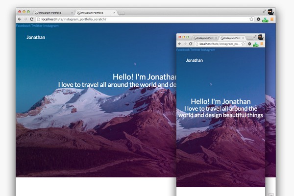
Looks good! Edit some titles.
h1 { text-transform: uppercase; font-weight: 700; font-size: 36px; letter-spacing: 0.06em; margin-bottom: $margin; span { display: block; @media screen and (min-width: $screen-md) { display: inline; } } } h2 { font-size: 16px; width: 70%; margin: 0 auto; @media screen and (min-width: $screen-lg) { width: 100%; margin: 0; } } 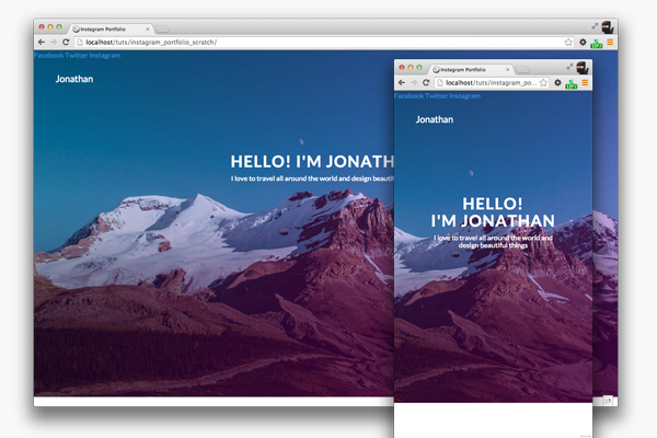
Trendy Font
Need to change the style of the title in the upper left corner. Put the following code at the end of the Sass file:
.fancy-font { font-family: $fancy-font; } We will use our trendy font with all the element with the class fancy-font.
Social Icons
In our case, you need to pay attention to the social icons that we will build with the help of sprites for display on conventional displays and high-resolution screens.
Go to the Iconfinder website and select the desired icon. It is best to choose a large icon size, for example, 256px.
In your favorite image editor, create a 152x52px file. Place icons in the document and resize them to 48x48px. Paint the icons in white.
Between the icons should be a distance of 2px. So place the first icon to the very edge and then move it down and to the right by 2px. In the same way, place the other two icons. Here's what you should get:

This is our version for Retina. Do not pay attention to the black background, I made it just so that you can clearly see the icons.
Using Photoshop Save for Web, save the image by calling it
social-sprite@2x.png in the image folder. Now you need to save images with sizes for standard displays (not Retina). This can be done directly in the Save for Web window. It is important that the image size is 76px by 52px. Save the file as social-sprite.png and also place it in the folder with the images.So, now we need to write the code for our sprite. Place the following code in the
header section immediately after the h1 and h2 styles. .social { position: absolute; top: 55px; right: 50px; overflow: hidden; a { float: left; width: 26px; height: 26px; margin: 0 5px; text-indent: -9999px; /* */ background: url(../images/social-sprite.png) no-repeat; opacity: 0.8; &:hover { opacity: 1.0; } @media screen and (-webkit-min-device-pixel-ratio: 2), screen and (-min-device-pixel-ratio: 2) { background: url(../images/social-sprite@2x.png) no-repeat; background-size: 76px 26px; } &.facebook { background-position: 0px 0px; } &.twitter { background-position: -25px 0px; } &.instagram { background-position: -50px 0px; } } } 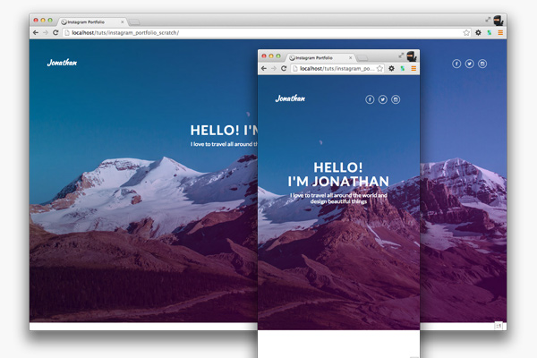
Now let's take the main content of the site, that is, Instafeed.js - a script that will display photos on our site.
Instagram feed
Let's start by adding some markup on the
index.html page, so insert the following year into it in the <section class="instagram-wrap"> <div class="container"> <div class="row"> <div class="col-xs-12"> <div class="instagram-content"> <h3>Latest Photos</h3> <div class="row photos-wrap"> <!-- div Instafeed --> <div id="instafeed"></div> <!-- --> <div class="col-xs-12 col-sm-6 col-md-4 col-lg-3"> <div class="photo-box"> <div class="image-wrap"> <img src=""> <div class="likes">309 Likes</div> </div> <div class="description"> Fantastic Architecture #architecture #testing <div class="date">September 16, 2014</div> </div> </div> </div> </div> </div> </div> </div> </div> Bootstrap Grid
So, for our site we will use the classes
col-xs-xx , col-sm-xx , col-md-xx , col-lg-xx to optimize the display of all elements on screens of various resolutions. The Bootstrap grid consists of containers (containers), rows (rows) and columns (column). Each row is inside the container and each column is inside the row . In addition, there should be a total of 12 columns in each row.
Instagram Styles
Now that we have a frame, add styles:
.instagram-wrap { background: $lightgrey; } .instagram-content { h3 { text-transform: uppercase; letter-spacing: 0.5em; font-size: 12px; font-weight: 700; text-align: center; padding: $padding*5 0; color: darken($lightgrey, 20%); } } This code should be placed immediately after the
header block in our Sass file.
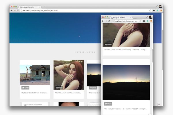
This piece of code has made a solid change. But we need to make our site even more beautiful, so add the following lines of code to the Sass file:
.photo-box { margin: 0 0 $margin*3 0; .image-wrap { img { width: 100%; } .likes { position: absolute; bottom: 5px; left: 15px; padding: $padding/2; background: $black; background: rgba($black, 0.4); color: $white; } } .description { font-family: $sub-font; font-size: 12px; background: $white; color: $mediumgrey; letter-spacing: 1px; padding: $padding*1.5; height: 75px; overflow: hidden; white-space: nowrap; text-overflow: ellipsis; } } This piece should go immediately after the
h3 element, which is located in the .instagram-content section. Let's see what we got: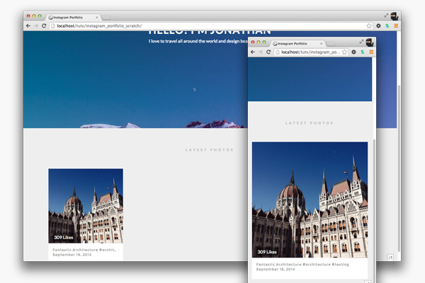
Looks pretty good! Now we need to replace the images with photos from this Instagram feed. We will do this with Instafeed.js.
Use Instafeed.js
The way the plugin works makes it easy to use. However, you will need to create a Client ID on the Instagram website in order to use the plugin. You can do this on the developer page .
Once you have the client ID, add the following code to the
app.js file: $(function() { // instafeed var feed = new Instafeed({ clientId: '97ae5f4c024c4a91804f959f43f2635f', target: 'instafeed', get: 'tagged', tagName: 'photographyportfolio', links: true, limit: 8, sortBy: 'most-recent', resolution: 'standard_resolution', template: '<div class="col-xs-12 col-sm-6 col-md-4 col-lg-3"><div class="photo-box"><div class="image-wrap"><a href="{{link}}"><img src="{{image}}"></a><div class="likes">{{likes}} Likes</div></div><div class="description">{{caption}}<div class="date">{{model.date}}</div></div></div></div>' }); feed.run(); }); So let's discuss what's what.
Set the
feed variable and give it the value of Instafeed .Then we attach various parameters to Instafeed:
clientId- Client ID that you received on Instagram.target- the ID of the element on the page on which images will be displayed.get- Instafeed plugin mode. Using 'tagged', we tell Instafeed to look for photos on the hashtag.tagName- The name of the tag to search by.links- When you click on the image, the link directs the user to Instagramlimit- Limit received images. Useful for creating pages.sortBy- How will the resulting images be sorted. The parametermost-recentmeans that the images will be sorted by date.resolution- Image size.template- A template for HTML image processing on a page.
When you save the file and refresh the page in the browser, you will see the following:
If you did everything right, you should see eight images with likes and descriptions .
Tidy
Now we need to put our HTML code in order, as we still have the original template. Go back to the
index.html file and find the following code: <div class="col-xs-12 col-sm-6 col-md-4 col-lg-3"> <div class="photo-box"> <div class="image-wrap"> <img src=""> <div class="likes">309 Likes</div> </div> <div class="description"> Fantastic Architecture #architecture #testing <div class="date">September 16, 2014</div> </div> </div> </div> Either erase or comment out this code.
Basement
Let's go back to the
index.html file and add the following code inside the <footer> element. <div class="container"> <div class="row"> <div class="col-xs-12"> <h4>Get in touch</h4> <p class="about-text">I shoot, design and write. Don't hesitate and get in touch with me if you need some creative work done. I always work to achieve my best and fulfil client needs</p> <a class="contact-now-btn" href="#">Contact Now</a> </div> </div> </div> Basement styles
Now we need to add styles to our basement.
footer { background: $white; padding: $padding*3 0; text-align: center; @media screen and (min-width: $screen-lg) { padding: $padding*10 0; } h4 { font-size: 36px; text-align: center; font-weight: 700; text-transform: uppercase; letter-spacing: 2px; } .about-text { padding: 0 $padding*3; @media screen and (min-width: $screen-lg) { width: 650px; margin: 0 auto; } } .contact-now-btn { display: inline-block; width: 70%; padding: $padding*2 $padding*5; margin-top: $margin*2; color: $white; background: $grey; font-size: 13px; letter-spacing: 1px; text-decoration: none; text-transform: uppercase; @media screen and (min-width: $screen-md) { width: 60%; } @media screen and (min-width: $screen-lg) { width: 20%; margin-top: $margin*5; } &:hover { background: lighten($grey, 5%); } } } 
Let's finish our site on finalizing the very bottom of the basement,
.footer-bottom .Basement bottom
<section class="footer-bottom"> 2014 © Jonathan White. All rights reserved. </section> Add some text to the HTML file, then open the Sass file and add styles:
.footer-bottom { background: $white; padding: $padding $padding*6; border-top: 2px solid $lightgrey; letter-spacing: 2px; text-align: center; color: $mediumgrey; text-transform: uppercase; @media screen and (min-width: $screen-md) { padding: $padding*4 0; } } 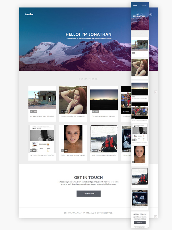
That's all! The site looks cool both on the desktop and on the mobile device. Good job!
Conclusion
What I like about our site is that it can be adapted to any kind of portfolio. I hope you went through all the stages without any problems and learned something new. Leave your comments and suggestions for improvement in the comments! Thanks for attention.
From the translator. With all the wishes and comments about the translation, please contact me in PM. Thank!
Source: https://habr.com/ru/post/242643/
All Articles