5 killer dull landings
Recently, I noticed an active growth in the number of creative landing pages, as well as the emergence of new strategies to increase conversion. For a long time, the landing pages were quite similar - a headline, several triggers, and an application form.
They were boring, dull and often ineffective. You can do split testing of the placement of the header and change the colors of the buttons at least until the end of the century, and not get a significant increase in conversion. There is a need for radical changes in the approach and disruptive innovations that will really amaze the imagination.
We have entered a new era of optimizing landing pages. Designers, professional marketers, SEO-optimizers, CRO, UX-experts and other experts combined their collective wisdom to develop a new type of landing pages that go beyond the standard framework and are not amenable to traditional logic. These will be the landing pages of the future.
')
Here are some of the innovative elements in optimizing landing pages, which, I believe, signal the beginning of a new era in the design of landing pages.

Common sense: use one quality call to action;
New strategy: use several calls to action on the entire landing page. Placing a call to action after each trigger you increase the likelihood of conversion at various points across the page.
It may seem that the use of multiple calls to action should confuse the user. But this will not happen if everything is done correctly.
First of all, let me tell you about the wrong way:
You should not have different methods for a call to action. In other words, there should be only one goal;
You should not ask the user to subscribe to the newsletter at the same time, like Facebook, get a free trial version and buy your product;
Do not do this at all. One action! Only one action!
Even if you have several different calls to action, they all have to perform the same function.
Adding more calls to action can increase the likelihood of a conversion. Below you can find examples of how the multiple call-to-action technique is used.
Long landing pages
Placing several calls to action on a short page in most cases leads to a zero result. Most often, the pages where you can find several calls to action occupy more than one screen in length.
Parallax effect
Pages with a parallax effect or dynamic elements can increase the effectiveness of the landing page, since each section of the page can include its own landing page inside the main site. The section that the user sees at a given time can have its own title, image, advantage, and a separate call to action.
Fluency of narration
The most reasonable way to use multiple calls to action is to place them according to your user's mind. For example, everything that a user sees in the first block of the landing page, namely images, title and text, usually answer the question “What is this service or product about?”. Some impulsive users have enough of this information to perform a targeted action, and usually these guys do not like to read. You do not want to force them to do this? Therefore, the right strategy would be to place a call to action on this part of the page.
If the user is not yet ready to take an action, he scrolls down the page to the next section. This section answers the question: “How can this solve my problem?” Again, after convincing content there should be a call to action. There is a chance that the user will order at this moment. If not, then there is an additional section below that draws attention to additional benefits - cost, warranty, comparison, etc. Each section has its own separate call to action.
Let's take a look and evaluate this technique on the example of several landing pages.
The Basecamp landing page looks like a non-scrolling page with a bold header and a BIG order button:

But in fact, their landing page is much longer.
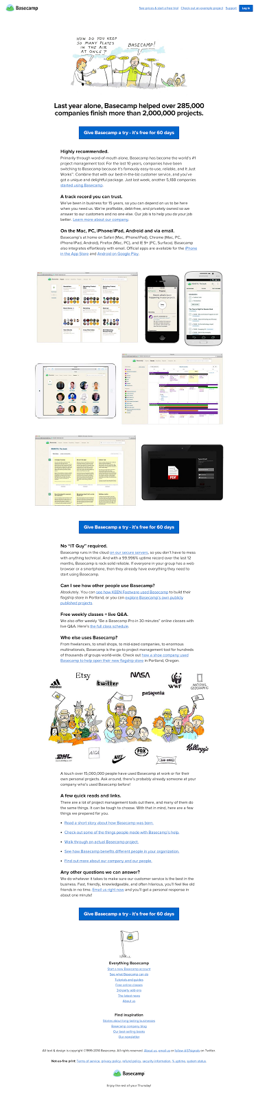
Each section of the landing page has a separate call-to-action button. Three large buttons provide an opportunity to attract users to order at any given point on the landing page.
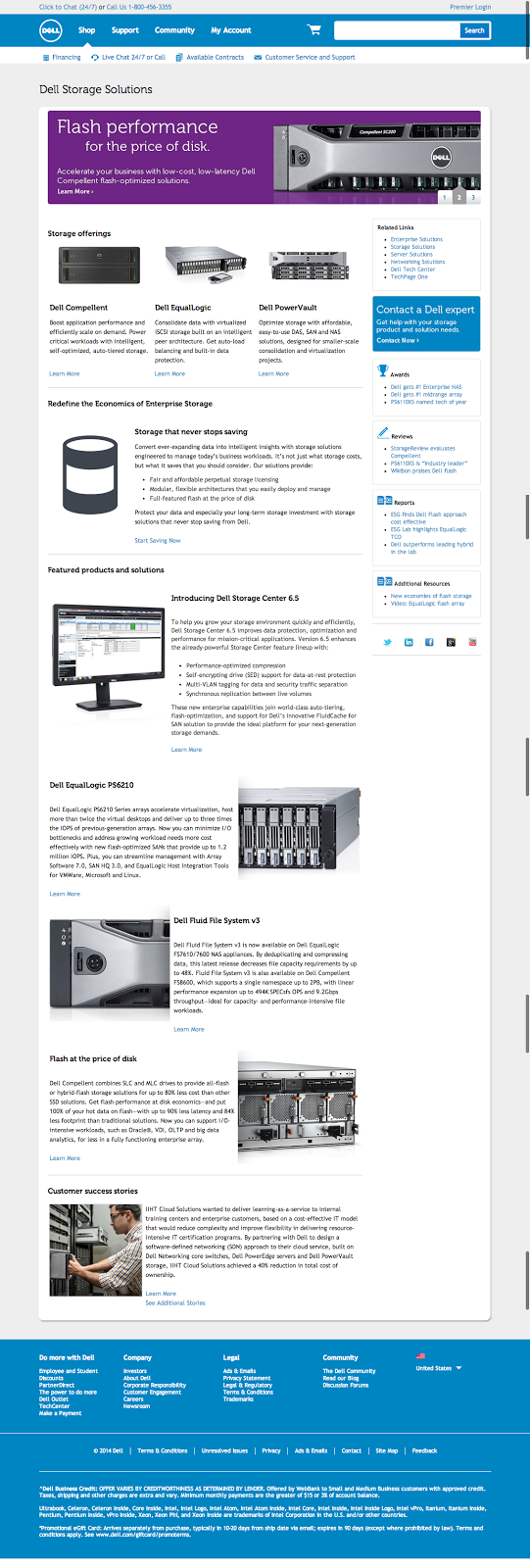
The look and feel of Dell’s target page for storage devices shows a similar approach. The harmless text “Learn More” is not the strongest call to action I've seen, but you can find it more than 15 times on one page.
Landing pages with more calls to action increase the chance of ordering. The more intuitively and reasonably placed these calls, the better.
Common sense: make your landing page short;
New strategy: fill with a lot of information to fully answer all the user's questions, provide guarantees, and give him all the necessary information to make an order.
The idea of short landing pages is to reduce the time to think. If the text is convincing enough and brief, the landing page will be effective.
But this does not always work. Perhaps users want more information before they can apply. Maybe the whole idea of a landing page is to give the user everything he needs to know before registering, buying, or sending an email address.
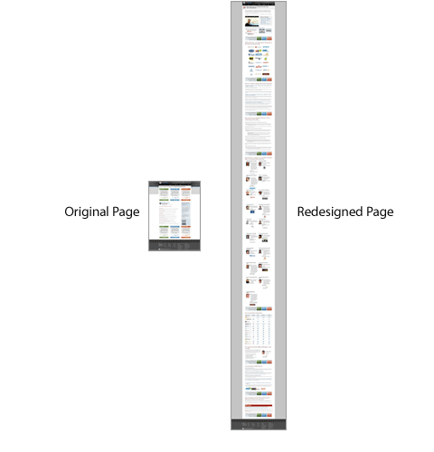
During A / B testing, we found that the performance of a full-size landing page is 220% higher than that of a short page with the same appeal:
Long landing pages have an inherent SEO advantage because of their extensive content. In addition, they provide you with the opportunity to use a wide range of tools to convince the user, which ultimately increases the chance of converting a visitor to a client.
There are different approaches to convincing different customers. There are three main types of buyers - wasteful, stingy and hesitant. It is important to create a landing page that contains content that satisfies each customer.
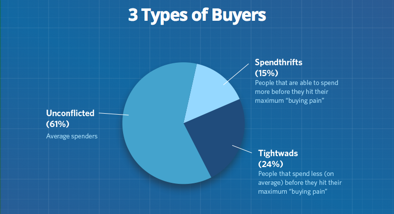
Image from www.helpscout.net/resources/consumer-behavior
Experts from Conversion Rate Experts created a landing page for Moz, which was effectively used to sell millions of dollars. And that's what they told:
“We created the page long enough to tell the whole story. Among Internet marketers, there is a popular myth “long pages don't sell.” These people believe that it is much more important to have short pages that do not require scrolling. What we discovered in the process of many dialogues with our clients around the world is this: it’s not how big your landing page is, but how much it attracts attention. ”
When Conversion Rate Experts completed the Moz landing page redesign, it was 6 times longer than the original.
And it has become a dozen times more effective.
The Kindle landing page is huge. If you have any questions about the Kindle, then you can find the answers to all these questions on their landing page.

Common sense: the landing pages should be as simple as possible to understand.
New strategy: add visual elements, attract the user's attention, increase the page efficiency.
Lack of visual content on the page will have a bad effect on user response. The simple truth is that your visitors love beautiful things. If the landing page is not attractive, the user may think that the product itself will be the same. In turn, if the landing page has several visual improvements, they have an excellent effect on the user's reaction.
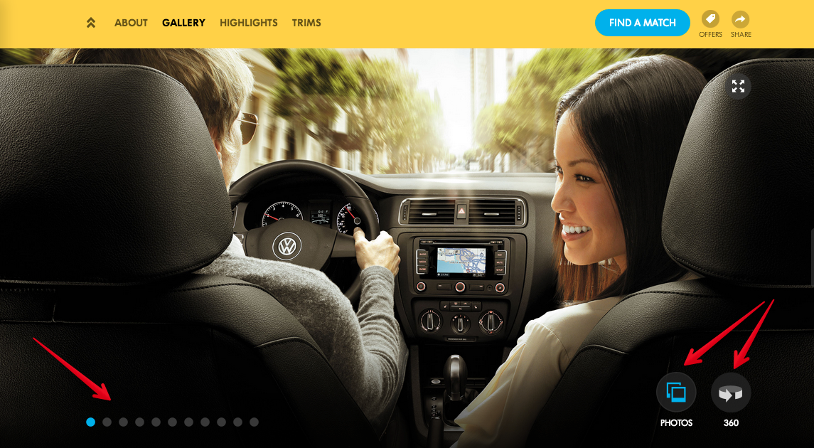
VW.com uses landing pages with many visual elements. This company sells cars, and it is important for their customers to know how they look. Pay attention to the photos on this landing page.
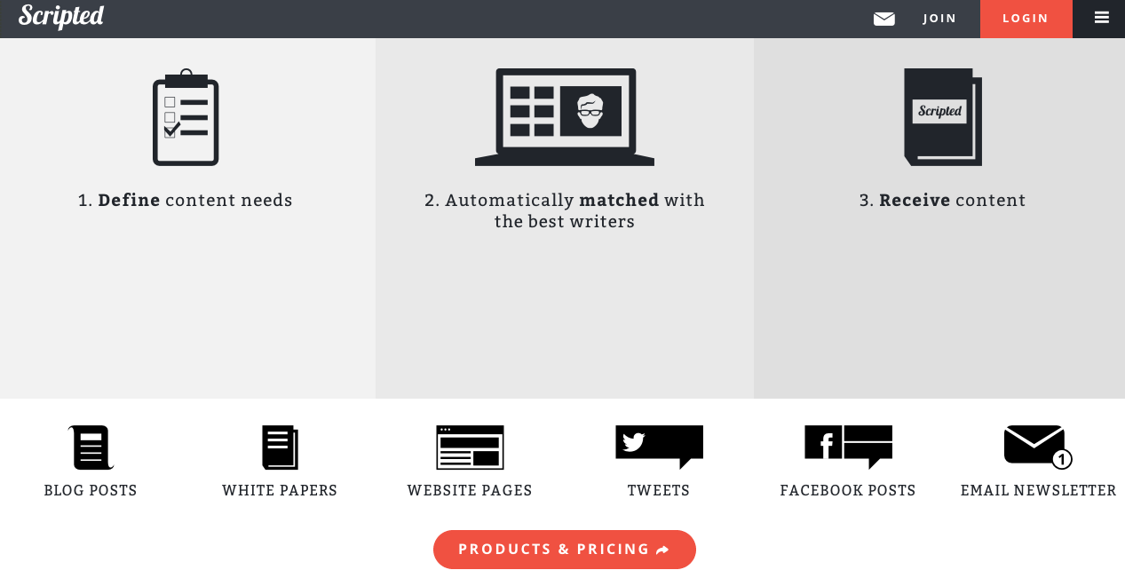
The “Scripted” landing page is more like an infographic than a landing page:
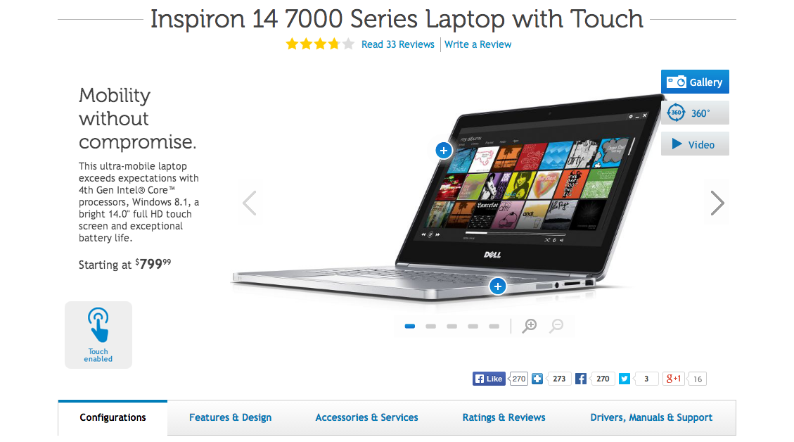
Dell Inspiron does not offer virtual services, but a real device, so it becomes clear that people want to see the product before they buy it. That is why the Inspiron landing page has a large, high-quality and well-visible image, as well as various additional photos taken from various angles.
I also found that the video is part of the page's attracting power. Vidyard recently inserted a test video on its page, which ultimately led to an increase in conversion by 100%.
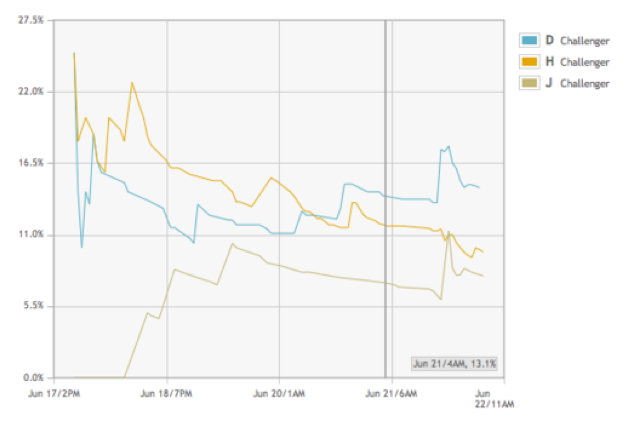
Challenger “D” - lightbox video.
Challenger “H” - video in the inline frame.
Challenger “J” - version of the page without video.
Images and videos are an important part of the sales process. Landing pages do not exist simply to tell about your product. They are part of the sales funnel. Without images and quality design, landing pages are inconclusive.
Common sense: the only task of the landing page is the motivation to fill out a form or to send an e-mail.
New strategy: interacting with the user you attract attention, which leads to an increase in conversion.
When I think about optimizing the landing page, the first thing that comes to my mind is the interactive elements. By interactive elements, I mean the elements with which the user must interact, and this is not only the sliders and scrolling effects. I would add to this list videos, especially those that are started with a mouse click.
There are many more ways to attract visitors to interact with your landing page. Allow your visitors to click and select something, this will allow the user to engage in work with your site.
CommVault uses an interactive calculator on its landing page:
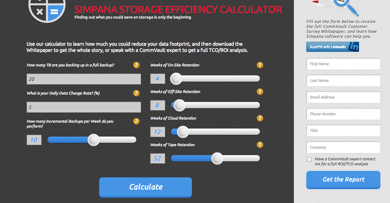
An invitation to calculate the cost without an obvious sale is a classic way to promote a customer through a sales funnel.
Common Sense: Each landing page should have a heading, a sentence, and a set of benefits.
New strategy: use one disruptive technique to increase conversion.
I usually do not recommend the use of technology for short landing pages, but I have seen several examples when they are a very effective solution.
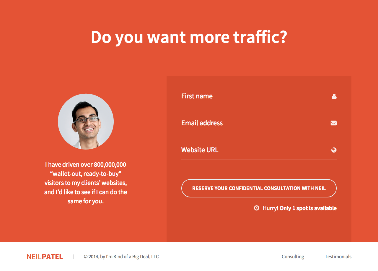
My personal site, Neilpatel.com, is short but very effective. Using less than fifty words, one image and one fill color, I multiplied the conversion many times over.
Simplicity is the main thing.
I support the idea of long landing pages, but only for certain types of conversion actions.
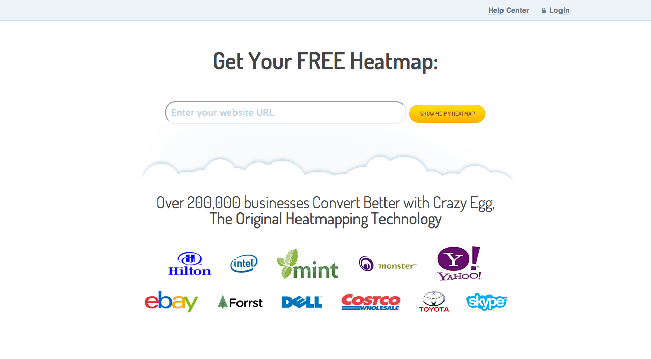
“CrazyEgg” tested the same model - the shortest landing page.
This page has all the elements you need to immediately perform the target action. Everything is so simple and clear that the user has no choice but to perform the target action.
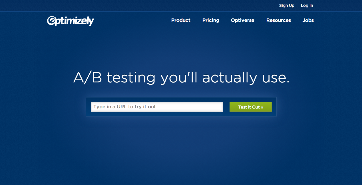
For example, Optimizely uses a similar technique. Short and simple.
There is no such thing as a perfect landing page formula. What was previously accepted as a standard is now being destroyed by powerful innovations.
But even in the modern world and in the process of developing landing pages, the new is not necessarily the best. For example, in this article, I offered both short and long landing pages. And which of these options is better?
The right decision depends on your product or service, your client and the task of the page. The right decision should always be strategic, and should never be a template.
My advice is to go beyond pattern thinking, experiment, discover the unknown power of innovative tools (and do not forget about A / B testing ).
Best regards, Generate.club and Multi-landing project team
They were boring, dull and often ineffective. You can do split testing of the placement of the header and change the colors of the buttons at least until the end of the century, and not get a significant increase in conversion. There is a need for radical changes in the approach and disruptive innovations that will really amaze the imagination.
We have entered a new era of optimizing landing pages. Designers, professional marketers, SEO-optimizers, CRO, UX-experts and other experts combined their collective wisdom to develop a new type of landing pages that go beyond the standard framework and are not amenable to traditional logic. These will be the landing pages of the future.
')
Here are some of the innovative elements in optimizing landing pages, which, I believe, signal the beginning of a new era in the design of landing pages.
1. Multiple calls to action
Common sense: use one quality call to action;
New strategy: use several calls to action on the entire landing page. Placing a call to action after each trigger you increase the likelihood of conversion at various points across the page.
It may seem that the use of multiple calls to action should confuse the user. But this will not happen if everything is done correctly.
First of all, let me tell you about the wrong way:
You should not have different methods for a call to action. In other words, there should be only one goal;
You should not ask the user to subscribe to the newsletter at the same time, like Facebook, get a free trial version and buy your product;
Do not do this at all. One action! Only one action!
Even if you have several different calls to action, they all have to perform the same function.
Adding more calls to action can increase the likelihood of a conversion. Below you can find examples of how the multiple call-to-action technique is used.
Long landing pages
Placing several calls to action on a short page in most cases leads to a zero result. Most often, the pages where you can find several calls to action occupy more than one screen in length.
Parallax effect
Pages with a parallax effect or dynamic elements can increase the effectiveness of the landing page, since each section of the page can include its own landing page inside the main site. The section that the user sees at a given time can have its own title, image, advantage, and a separate call to action.
Fluency of narration
The most reasonable way to use multiple calls to action is to place them according to your user's mind. For example, everything that a user sees in the first block of the landing page, namely images, title and text, usually answer the question “What is this service or product about?”. Some impulsive users have enough of this information to perform a targeted action, and usually these guys do not like to read. You do not want to force them to do this? Therefore, the right strategy would be to place a call to action on this part of the page.
If the user is not yet ready to take an action, he scrolls down the page to the next section. This section answers the question: “How can this solve my problem?” Again, after convincing content there should be a call to action. There is a chance that the user will order at this moment. If not, then there is an additional section below that draws attention to additional benefits - cost, warranty, comparison, etc. Each section has its own separate call to action.
Let's take a look and evaluate this technique on the example of several landing pages.
The Basecamp landing page looks like a non-scrolling page with a bold header and a BIG order button:
But in fact, their landing page is much longer.
Each section of the landing page has a separate call-to-action button. Three large buttons provide an opportunity to attract users to order at any given point on the landing page.
The look and feel of Dell’s target page for storage devices shows a similar approach. The harmless text “Learn More” is not the strongest call to action I've seen, but you can find it more than 15 times on one page.
Landing pages with more calls to action increase the chance of ordering. The more intuitively and reasonably placed these calls, the better.
2. Full content
Common sense: make your landing page short;
New strategy: fill with a lot of information to fully answer all the user's questions, provide guarantees, and give him all the necessary information to make an order.
The idea of short landing pages is to reduce the time to think. If the text is convincing enough and brief, the landing page will be effective.
But this does not always work. Perhaps users want more information before they can apply. Maybe the whole idea of a landing page is to give the user everything he needs to know before registering, buying, or sending an email address.
During A / B testing, we found that the performance of a full-size landing page is 220% higher than that of a short page with the same appeal:
Long landing pages have an inherent SEO advantage because of their extensive content. In addition, they provide you with the opportunity to use a wide range of tools to convince the user, which ultimately increases the chance of converting a visitor to a client.
There are different approaches to convincing different customers. There are three main types of buyers - wasteful, stingy and hesitant. It is important to create a landing page that contains content that satisfies each customer.
Image from www.helpscout.net/resources/consumer-behavior
Experts from Conversion Rate Experts created a landing page for Moz, which was effectively used to sell millions of dollars. And that's what they told:
“We created the page long enough to tell the whole story. Among Internet marketers, there is a popular myth “long pages don't sell.” These people believe that it is much more important to have short pages that do not require scrolling. What we discovered in the process of many dialogues with our clients around the world is this: it’s not how big your landing page is, but how much it attracts attention. ”
When Conversion Rate Experts completed the Moz landing page redesign, it was 6 times longer than the original.
And it has become a dozen times more effective.
The Kindle landing page is huge. If you have any questions about the Kindle, then you can find the answers to all these questions on their landing page.
3. Strong visual advantages
Common sense: the landing pages should be as simple as possible to understand.
New strategy: add visual elements, attract the user's attention, increase the page efficiency.
Lack of visual content on the page will have a bad effect on user response. The simple truth is that your visitors love beautiful things. If the landing page is not attractive, the user may think that the product itself will be the same. In turn, if the landing page has several visual improvements, they have an excellent effect on the user's reaction.
VW.com uses landing pages with many visual elements. This company sells cars, and it is important for their customers to know how they look. Pay attention to the photos on this landing page.
The “Scripted” landing page is more like an infographic than a landing page:
Dell Inspiron does not offer virtual services, but a real device, so it becomes clear that people want to see the product before they buy it. That is why the Inspiron landing page has a large, high-quality and well-visible image, as well as various additional photos taken from various angles.
I also found that the video is part of the page's attracting power. Vidyard recently inserted a test video on its page, which ultimately led to an increase in conversion by 100%.
Challenger “D” - lightbox video.
Challenger “H” - video in the inline frame.
Challenger “J” - version of the page without video.
Images and videos are an important part of the sales process. Landing pages do not exist simply to tell about your product. They are part of the sales funnel. Without images and quality design, landing pages are inconclusive.
4. Interactive elements
Common sense: the only task of the landing page is the motivation to fill out a form or to send an e-mail.
New strategy: interacting with the user you attract attention, which leads to an increase in conversion.
When I think about optimizing the landing page, the first thing that comes to my mind is the interactive elements. By interactive elements, I mean the elements with which the user must interact, and this is not only the sliders and scrolling effects. I would add to this list videos, especially those that are started with a mouse click.
There are many more ways to attract visitors to interact with your landing page. Allow your visitors to click and select something, this will allow the user to engage in work with your site.
CommVault uses an interactive calculator on its landing page:
An invitation to calculate the cost without an obvious sale is a classic way to promote a customer through a sales funnel.
5. As short as possible
Common Sense: Each landing page should have a heading, a sentence, and a set of benefits.
New strategy: use one disruptive technique to increase conversion.
I usually do not recommend the use of technology for short landing pages, but I have seen several examples when they are a very effective solution.
My personal site, Neilpatel.com, is short but very effective. Using less than fifty words, one image and one fill color, I multiplied the conversion many times over.
Simplicity is the main thing.
I support the idea of long landing pages, but only for certain types of conversion actions.
“CrazyEgg” tested the same model - the shortest landing page.
This page has all the elements you need to immediately perform the target action. Everything is so simple and clear that the user has no choice but to perform the target action.
For example, Optimizely uses a similar technique. Short and simple.
Conclusion
There is no such thing as a perfect landing page formula. What was previously accepted as a standard is now being destroyed by powerful innovations.
But even in the modern world and in the process of developing landing pages, the new is not necessarily the best. For example, in this article, I offered both short and long landing pages. And which of these options is better?
The right decision depends on your product or service, your client and the task of the page. The right decision should always be strategic, and should never be a template.
My advice is to go beyond pattern thinking, experiment, discover the unknown power of innovative tools (and do not forget about A / B testing ).
Best regards, Generate.club and Multi-landing project team
Source: https://habr.com/ru/post/242139/
All Articles